Greens
The saturated jewel green built for a door or an accent wall, reviewed honestly: where it earns its drama, the light that kills it, and what to pick instead.

Jessica has spec'd whites and neutrals for more than 300 rooms and keeps a sample wall of painted drawdowns in her studio. Every color review is checked against real reader rooms in the comments and re-tested when a formula changes. About the testing process →
- 1Hunter Green5
- 2Greens10
- 3Sage Green22
- 4Evergreen Fog30
The Fast Verdict
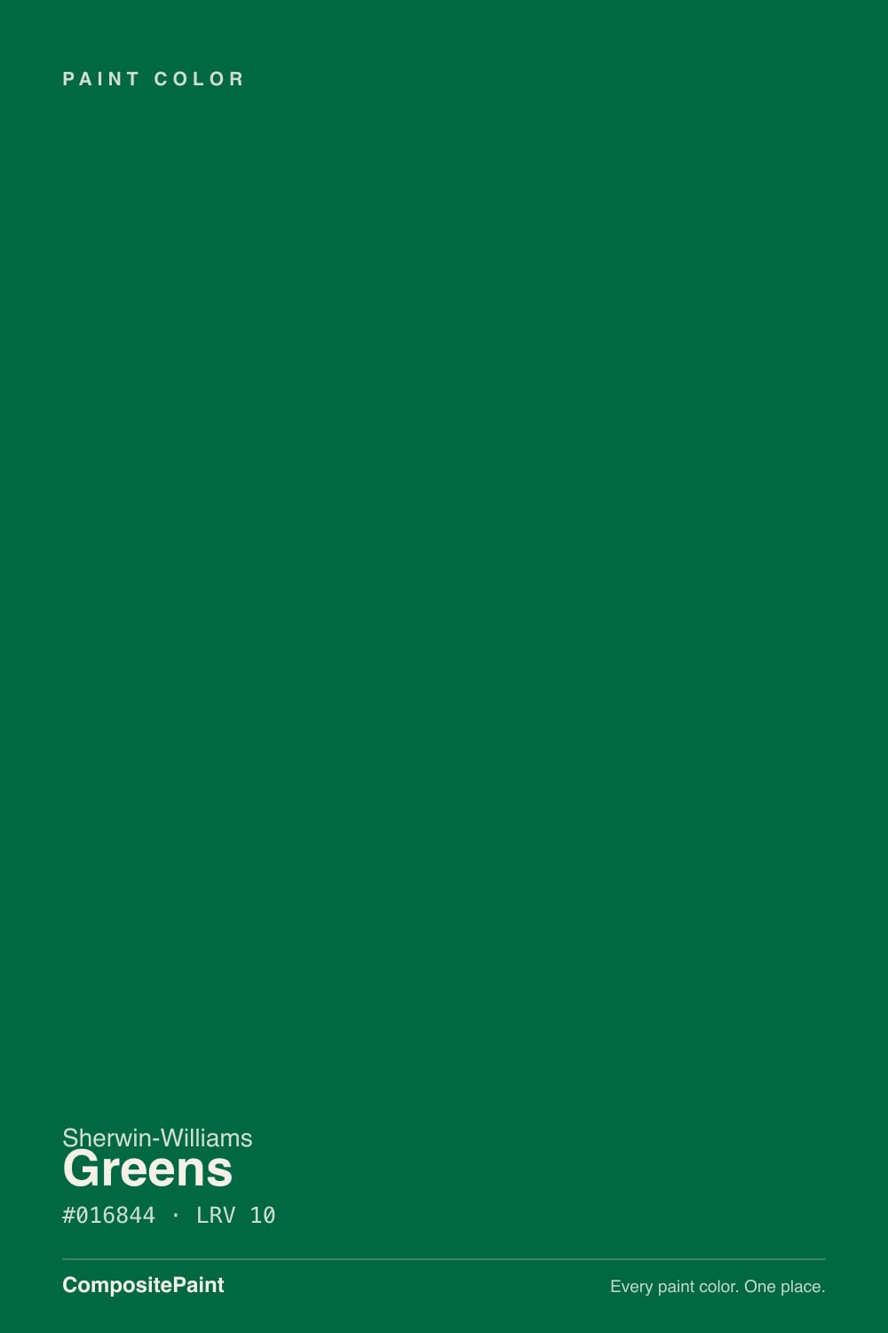
Greens is Sherwin-Williams at its most literal: a true, saturated emerald at LRV 10, deep enough to read as ink in the wrong light and rich enough to look expensive in the right one. It is not a paint for four walls in a daylight-starved room — it is a paint for one door, one vanity, one wall of built-ins, where the depth becomes the point instead of a problem. Give it brass hardware, walnut, and a lamp, and it looks like a decorator's decision, not a swatch you regretted.
Front doors and shutters · powder rooms and small vanities · library or den built-ins · kitchen island or lower cabinets · anyone who wants a jewel tone that isn't sage
You want it on four walls in a room with one small window · your trim stays bright white with no darker company · you're repainting to sell soon · you actually want an easy, soft sage — this is the opposite
- A genuinely saturated, true emerald — no gray, no olive drift, no confusion about whether it's "green"
- Reads expensive against brass, gold hardware, and warm wood
- Small-room drama: powder rooms and vanities take the full depth without feeling cramped
- A proven, confident front-door and shutter color against almost any house body
- Stands apart from the sage-and-olive crowd currently dominating the green aisle
- At LRV 10, dim rooms make it read almost black rather than green
- Too dark and heavy for whole rooms without strong daylight
- Needs real primer and multiple coats to cover before resale
- Looks flat and cold without metallic or warm-wood company nearby
What Color Is Greens, Really?
A true, saturated, blue-leaning emerald — the "jewel tone" label Sherwin-Williams itself uses for it is accurate, and it is worth noting how different that makes it from most of the green paint conversation right now. The current green wave is almost entirely sage and olive: grayed-down, warm, forgiving. Greens is none of those things. It is a cool, clean, high-chroma color built to read as green, not gray-green-maybe, in any light strong enough to show color at all.
At LRV 10 it is a genuinely dark color — reflecting only about a tenth of the light that hits it, in the same depth bracket as Benjamin Moore's own Green (LRV 9) and not far off a near-black. That depth is what gives it the jewel-box richness on a door or a vanity, and it is also exactly why a whole room of it, without strong daylight, goes flat and nearly black. There is no middle setting with a color this saturated at this depth — it either glows or it disappears.
Undertone in one line: cool and blue-leaning, never yellow, never gray. It will not drift toward olive or khaki the way a warm sage does. In low light it does not turn a different color so much as it turns off — the saturation just goes dark and hard to read as "green" at all, which is the most common surprise buyers report.
Where It Shines
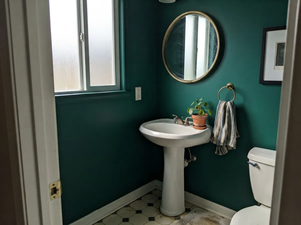
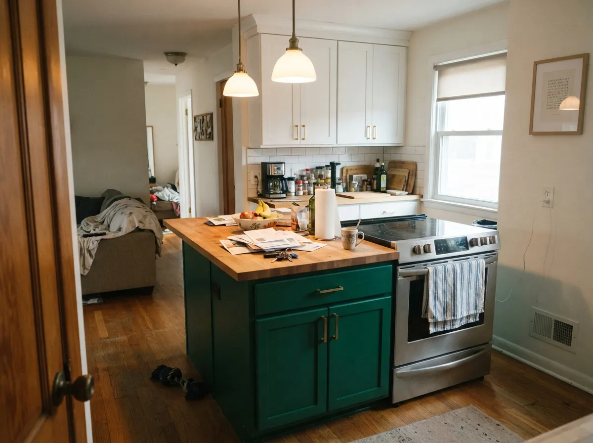
This is a color for one surface, not a floor plan, and it is at its best exactly where Sherwin-Williams itself points people: a front door, a powder room, a run of library built-ins, a kitchen island. In bright indirect daylight the emerald reads true and rich; next to brass or unlacquered gold hardware it goes properly regal instead of just dark. Design writers who've covered it keep returning to the same pairings — black-and-white patterned tile, caramel and walnut wood, live or faux greenery for texture — and those pairings work because they all give the color something warm or metallic to bounce off, which a bare white wall does not.
Where It Fails
Almost every disappointing report about Greens comes from treating it like an ordinary wall color instead of a jewel tone, and all three mistakes are avoidable before the first coat.
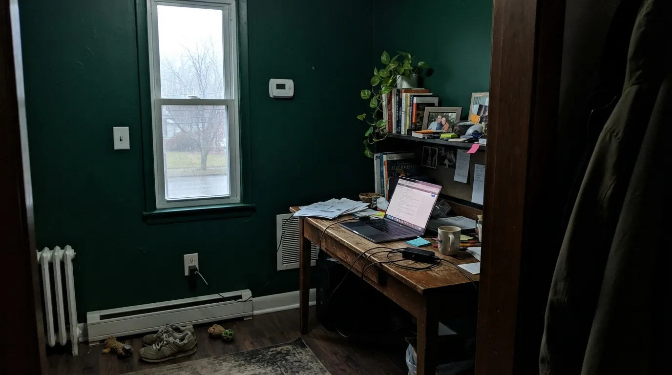
Sherwin-Williams' own guidance is blunt about this one: full-room coverage in anything but strong daylight makes the room look smaller and the color read almost black. The depth that looks rich as an accent turns cave-like across four walls without real light pouring in.
Against plain white trim and nothing else, the color reads flat and a little cold. It wants company — brass or gold hardware, walnut or caramel wood tones, a warm lamp — the same ingredients that make it look expensive on a front door also keep it from looking dead on a wall.
Like most saturated jewel tones this deep, it takes real primer and multiple coats to cover for the next buyer. If a sale is on the near horizon, keep it to a door or a small vanity — not a room you'll need to neutralize before listing.
Room by Room
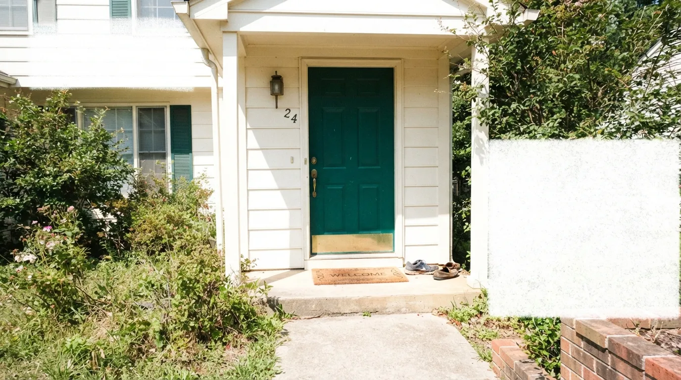
Deep saturated greens are a proven front-door move for a reason: they read confident against nearly any siding or brick, and against a warm white or cream house body the door becomes the whole story. Semi-gloss, and brass or matte-black hardware finishes the look.
A powder room is small enough to take the full saturation without going cave-like, and dark walls in a tiny room read intentional rather than cramped. Pair with a warm white trim and a brass or unlacquered-gold mirror frame.
On a lower cabinet run or a single island it is a genuine showstopper against white uppers and walnut or butcher-block counters. A full kitchen of it needs serious daylight to avoid going murky; most kitchens don't have that much.
On a bookcase or a run of built-ins, with lamp light and leather, it earns the "library green" reputation honestly. As a full wall color it depends entirely on the room having real daylight during the day, since lamp light alone at LRV 10 reads closer to black than green.
A single accent wall behind the headboard, or a run of trim on a window seat, can work beautifully with cream bedding and warm light. Four walls of it in a typical bedroom with modest windows is a common regret — the room reads dark rather than cozy.
In an open-plan main living space it is best used the way stylists actually recommend it: pillows, drapery, a single accent wall, or furniture — not the entire room. A whole open-plan living room in this depth fights daylight from every angle and rarely wins.
Your Light Is the Risk
The emerald reads true and rich, and brass or gold hardware nearby goes properly jewel-toned. This is the light the color needs to look like the swatch.
The saturation just goes dark — not a different color, just a much darker, harder-to-read one. This is the single biggest source of disappointment with this color.
Cooler and more blue-leaning in flat morning light, a touch warmer and more true-green once direct afternoon sun reaches it. The shift is real but gentle.
Warm 2700K bulbs pull it toward a mossy bottle-green and keep it readable at night. Cool white LEDs flatten it further toward black — swap the bulbs before blaming the paint.
Most complaints about Greens are a light mismatch. Upload a photo of your actual room and see it on your walls — then ask for the same wall in north light or evening lamps before you buy a single sample.
Need It From Another Brand?
Any paint counter can custom-tint Sherwin-Williams SW 6748 directly. If you would rather stay in one brand's own deck, these are the closest stock matches, measured as ΔE2000. Under 2 is a difference you will not see on the wall.
| Brand | Closest color | ΔE | LRV | |
|---|---|---|---|---|
| Behr | Billiard TableS-H-490 · Behr | 2.1 | 11 | Color page → |
| Benjamin Moore | Celtic Green2038-10 · Benjamin Moore | 1.7 | 11 | Color page → |
| Valspar | Green Suede5009-6 · Valspar | 3.4 | 11 | Color page → |
| PPG / Glidden | BrunswickPPG1132-7 · PPG / Glidden | 2.7 | 11 | Color page → |
| Glidden | Peacock GreenPPG1140-7 · Glidden | 3.5 | 11 | Color page → |
| Dutch Boy | Simply Green130-7DB · Dutch Boy | 2.8 | 11 | Color page → |
Similar Sherwin-Williams Colors
The nearest shades to Greens within Sherwin-Williams's own range, ranked by perceptual color distance — useful when you want the same look a touch lighter, darker, or warmer.
WCAG 2.1: AA is 4.5 : 1 for normal text, 3 : 1 for large text, AAA is 7 : 1.
Greens vs the Colors You're Also Considering
Every Greens sample board has the same rivals on it. The numbers show the real lightness gap — then it comes down to which risk you would rather live with.
Pick this for the brighter, more blue-leaning true emerald — Greens reads more distinctly "green" in the same low light.
Benjamin Moore 2044-10 · LRV 9GreenPick this for a slightly warmer, blacker-bottle-green jewel tone at almost the same depth.
Pick this when you want a jewel green that still reads clearly green in modest daylight, not just in full sun.
Benjamin Moore 2041-10 · LRV 5Hunter GreenPick this for the classic, more traditional hunter green — deeper still, and even more dependent on real light to prove it's not black.
Greens Coordinating Colors
The rule for coordinating with Greens: give it something warm or metallic to bounce off, and keep the near-neutrals warm rather than stark. It pairs beautifully with warm whites and creams, near-black charcoals for contrast, and a genuine navy for a two-jewel-tone scheme. These are the partners that keep showing up in rooms that work:
Why a Jewel Green Front Door Works
Deep saturated greens have been a dependable front-door move for as long as people have painted front doors, and Greens is built for exactly that job. At LRV 10 it holds its color in full outdoor sun far better than it does indoors, since daylight outside is simply more abundant than what most rooms get through a window. Against a warm white, cream, or gray house body, the door reads confident rather than aggressive — closer to a well-tailored navy suit than a loud statement color.
The pairing that makes it work every time is brass or unlacquered-gold hardware; the metal catches light the flat paint can't reflect on its own, and the combination is what design writers mean when they call this color "regal." Matte black hardware reads more modern and slightly cooler. Either way, keep the door in semi-gloss — a flat or eggshell finish on a color this dark looks chalky and uneven outdoors.
Greens With Wood Tones and Metals
This color needs warmth nearby, and wood is the easiest way to supply it. Walnut, caramel-toned oak, and butcher block all sit well against the cool emerald because their warmth balances the blue lean in the paint; the two together are the pairing behind almost every photo of this color that actually looks good rather than murky.
Metals matter just as much as wood. Brass and unlacquered gold are the classic match and the reason the color gets called a jewel tone in the first place; matte black is the modern alternative and still reads well. Polished chrome and cool nickel are the one combination to be careful with — next to a color this cool and saturated, chrome can tip the whole vignette cold instead of rich.
Three Ready Palettes Built on Greens
A color is never alone on the wall. These are complete combinations in the 60-30-10 pattern, with the reason each one holds together. Every one opens in the visualizer.
A warm white body lets the door do all the talking; near-black shutters echo the door's depth without competing with it, so the whole facade reads deliberate rather than busy.
Try this palette in your roomTwo saturated darks in the same depth range — emerald and navy — hand off cleanly from room to room without one reading as a mistake next to the other, and crisp white trim keeps the built-ins from swallowing all the light.
Try this palette in your roomA small room takes the full-strength emerald without feeling cramped; a warm charcoal vanity keeps the palette from reading as one flat block of dark, and brass fixtures do the rest of the work.
Try this palette in your roomGreens FAQ
Is Greens warm or cool?
Cool — it's a blue-leaning true emerald, not a warm olive or sage. It won't drift toward yellow or khaki the way most of today's popular greens do; in low light it just goes darker, not a different color family.
Can I paint a whole room in it?
Only with strong daylight. Sherwin-Williams' own guidance recommends using it in doses — an accent wall, a door, furniture — because full coverage in a typical room reads smaller and darker than the chip promises. A bright, well-lit room can carry it; a north-facing room with one window usually can't.
Does it work on a front door with brick or siding?
Yes — this is one of its strongest jobs. A cool jewel green reads confidently against warm brick, gray siding, or a white or cream house body. Semi-gloss and brass or matte-black hardware are the standard finish.
Is it good for kitchen cabinets?
On an island or lower cabinets, yes — it's a genuine showstopper against white uppers, butcher block, or walnut. A full kitchen of it needs more daylight than most kitchens actually get, so it's safer as a partial-cabinet or island color.
What if it reads almost black on my walls?
That's the expected behavior at LRV 10 in anything less than strong daylight — the color isn't shifting hue, the saturation is simply too deep to register as green without light. Add warm bulbs, move the sample near a window, or accept it as a near-black and lean into that instead.
How does it compare to Benjamin Moore Green?
They're close cousins — both true jewel greens at nearly the same depth (LRV 9 vs. 10) — but Greens leans a touch more blue, and BM Green leans a touch warmer and blacker. Either one needs the same daylight and metallic-and-wood company to shine.
Have you painted with Greens?
Rate it — one tap helps the next reader decide.
Ask a Question