Julep
The mid-tone jade Sherwin-Williams named after a mint drink, reviewed honestly: the rooms where the color sings, the light that mutes it, and why it is not the pastel on your Pinterest board.

Jessica has spec'd whites and neutrals for more than 300 rooms and keeps a sample wall of painted drawdowns in her studio. Every color review is checked against real reader rooms in the comments and re-tested when a formula changes. About the testing process →
- 1Vintage Vogue12
- 2Sage Green22
- 3Julep32
- 4Clary Sage41
- 5October Mist47
The Fast Verdict
Julep is a real green — not another gray-green sage pretending to be a neutral. It sits at LRV 32 with enough chroma to color a room, and it leans just far enough toward blue to read jade rather than grass. In daylight it is fresh, clean and genuinely cheerful, which is why it works in kids' rooms, bathrooms and on cabinets.
The catch is in the name: people picture pale mint and get a mid-tone jade that puts color on everything nearby.
Kids' rooms and playrooms with real daylight · cabinets, vanities and laundry lockers · small rooms that can take a saturated color · anyone tired of gray-green sage
You want soft mint or a muted sage · the room is small, north-facing and lamp-only · your floors and trim are honey oak · you need a quiet background color that stays out of the way
- An actual green — clean and clear, not another gray-green sage
- The blue lean keeps it off grassy and far from avocado
- LRV 32 holds its color in bright rooms without going dark
- Outstanding on cabinets, vanities and laundry lockers
- Rare crossover: fresh enough for a kid's room, composed enough for a bath
- The name promises mint; the wall delivers jade — the usual regret
- Saturated enough to bounce green onto white trim, ceilings and bedding
- Dim north rooms drain it to a murky gray-teal
- Reads dated against honey-oak floors and orange-stained trim
What Color Is Julep, Really?
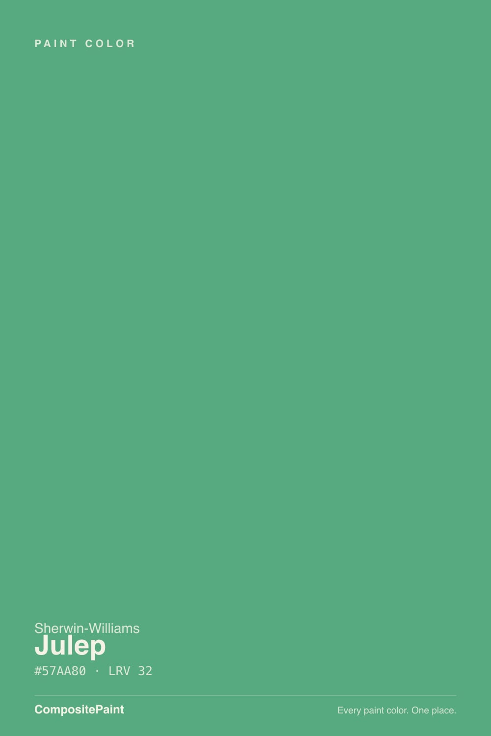
A mid-tone jade green with a clear blue lean — and it is worth being blunt about how much color is in it. Most of the greens people paint today are grayed almost to neutral: sages, olives, green-grays that behave like a warm gray with an opinion. Julep is not one of them. Its RGB spread is roughly twice as wide as a typical sage, which in plain terms means it reads as an actual color on the wall, not as atmosphere. Sherwin-Williams files it in the Green family, and it belongs there — the blue is a lean, not a takeover.
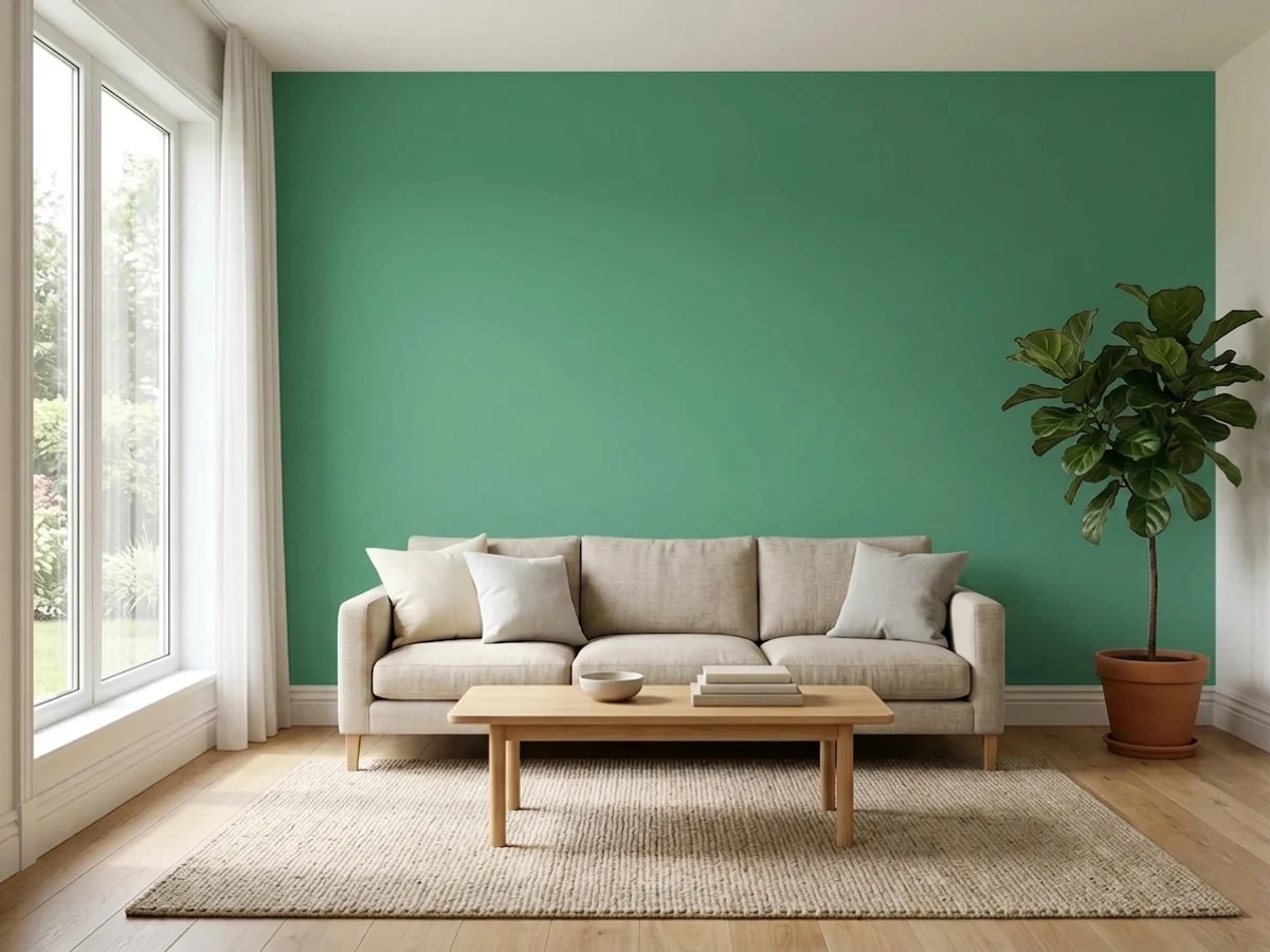
At LRV 32 it is a genuine mid-depth tone: dark enough to hold its color under a bright south window, light enough that a whole small room in it still feels like a room rather than a cave. That combination — real saturation plus mid depth — is what makes it a cabinet and accent-wall color first and a four-wall color second. Expect the painted wall to look a step more saturated than the chip, because chroma multiplies with area on every color and especially on this one.
Undertone in one line: green first, blue second — never yellow, never gray. If your sample looks murky and gray-teal, the room is short on light; if it briefly looks almost grassy, that is low golden sun warming it. Both are the same paint reporting on your room honestly.
Where It Shines
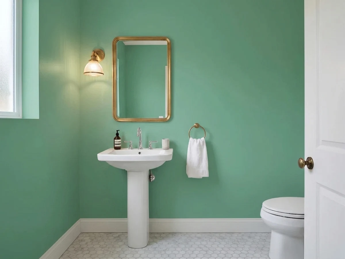
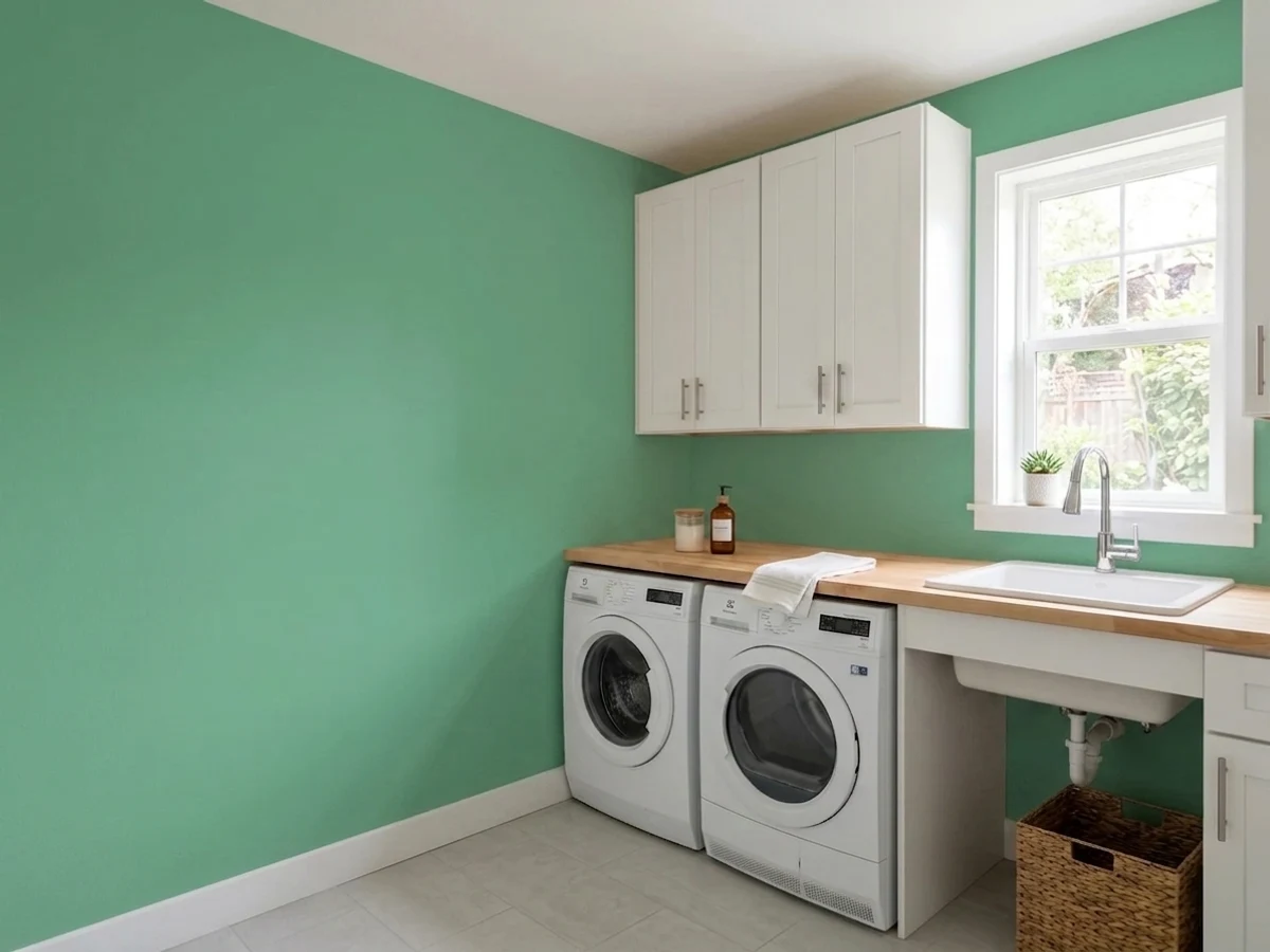
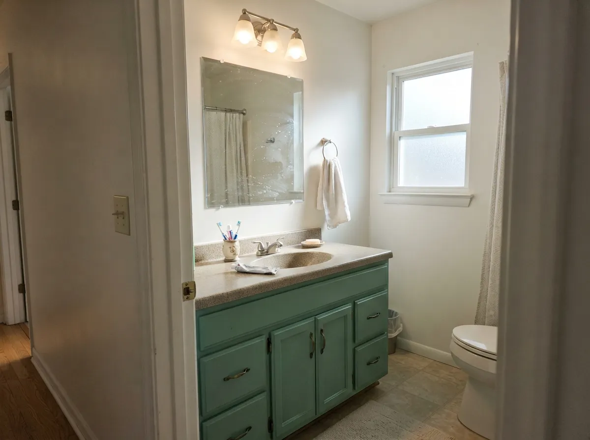
Give it daylight and one job and it is excellent. Its natural home is cabinetry — a vanity, a laundry bank, mudroom lockers, a kitchen island — where a mid-depth saturated green reads custom and expensive against white walls and brass. Its second home is the kid's room accent wall: clean, cheerful, not babyish, and old enough to survive the child turning eleven. Small wet rooms are the third: a powder room or bath in full Julep with white trim reads spa-fresh instead of dark, which is exactly what LRV 32 buys you.
Where It Fails
Nearly every disappointed Julep story comes from one of three situations, and all three are predictable before you open the can. None of them mean the paint is bad — but if your room matches one, a bigger sample will only confirm it faster.
The name says julep, the chip in the store light looks soft, and then four walls arrive as a confident jade. This is the number-one surprise with this color. If what you actually pictured was a pale, airy mint, you want SW Refresh at LRV 59 — same family, half the commitment. Julep is what you buy when you want people to notice the color.
Saturated color plus low light is a bad trade. In a lamp-only north bedroom or an interior bathroom with one fixture, Julep drops its freshness and settles into a murky gray-teal that owners describe as aquarium-ish. The saturation also bounces: white bedding, a white ceiling and white trim will pick up a faint green cast in a small room. One wall, or good light, or a different color.
Blue-leaning green against golden-orange oak is the 1990s kitchen, and the eye recognizes it instantly. The temperature split is too wide: the floor reads more orange, the wall reads more minty, and the room reads dated no matter how new everything else is. Pale white oak, walnut, black-stained wood and gray-toned LVP all work. With wall-to-wall honey oak, pick a warmer green.
Room by Room
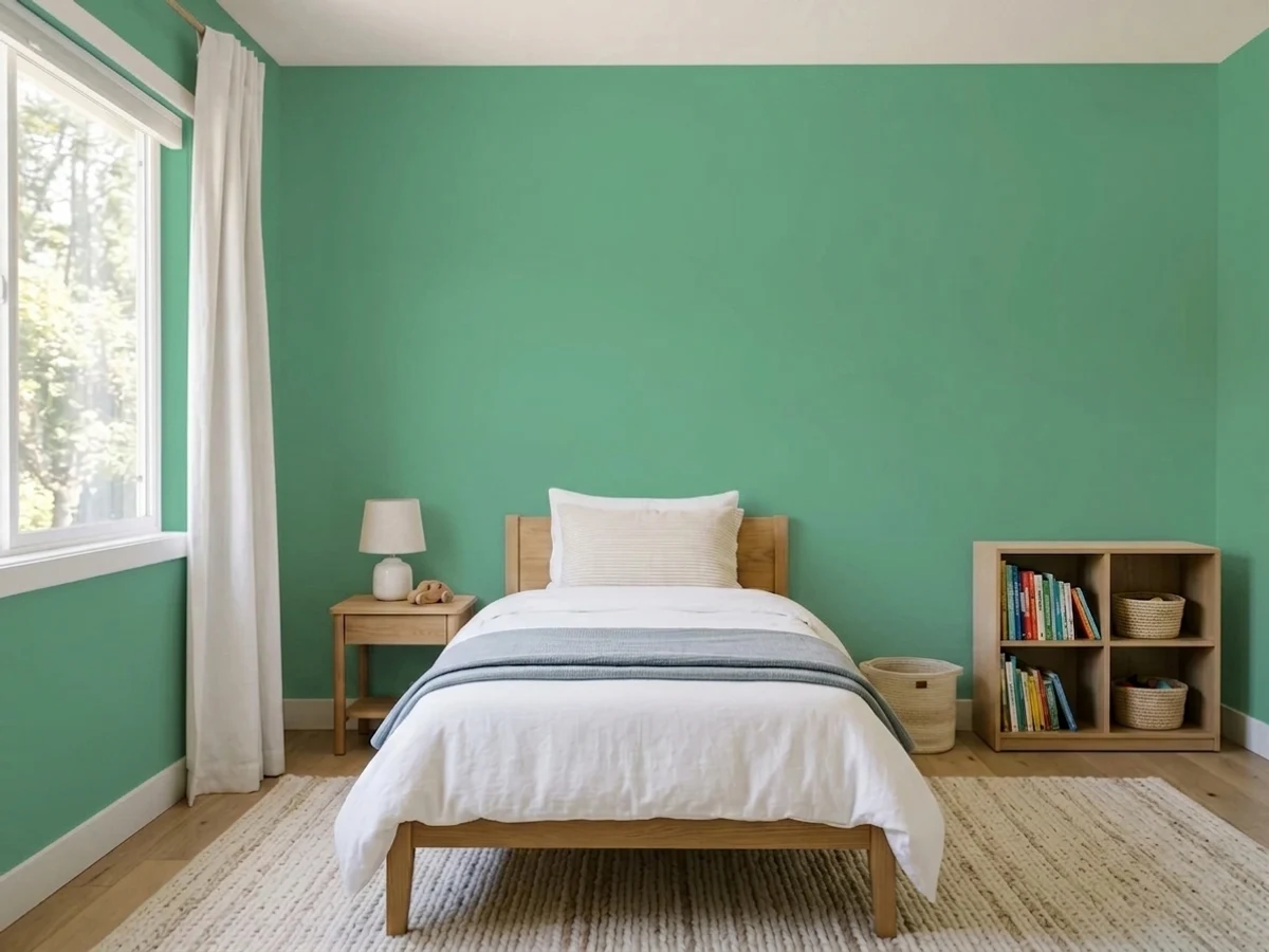
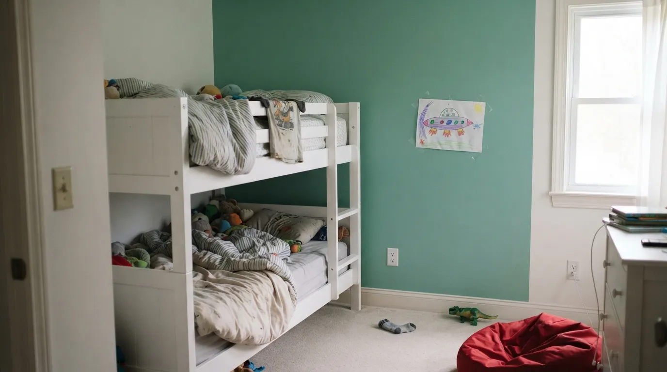
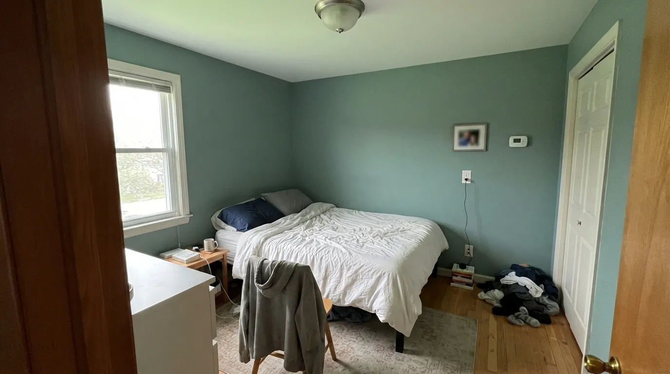
A single Julep wall behind the bed or bunks, everything else soft white, is the version that works in almost every house. It is a clean, real green that reads playful without reading nursery, and it does not need replacing when the dinosaurs come down. Scrubbable matte or eggshell so crayon comes off. Four walls only if the room has a decent window.
Playrooms are the one place the full-saturation version earns its keep: energy is the point, and Julep supplies it without going neon the way a true grass green does. Pair it with plain white trim and let the toys be the other colors. In a basement playroom with no windows, keep it to one wall or the built-ins.
This is where LRV 32 pays off: deep enough to feel like a decision, light enough that a windowless powder room does not go gloomy. Full walls with white trim reads fresh; on the vanity alone under a white or warm-cream wall it reads like a design fee. Satin on the vanity, eggshell or matte on walls.
Cabinetry is the use every write-up of this color lands on, and the recommendation is earned. A Julep island under white uppers, or a green built-in bookcase in a white room, gives you real color in a dose you can undo in a weekend. Use a satin urethane-fortified cabinet enamel and expect brass or matte black hardware to both work.
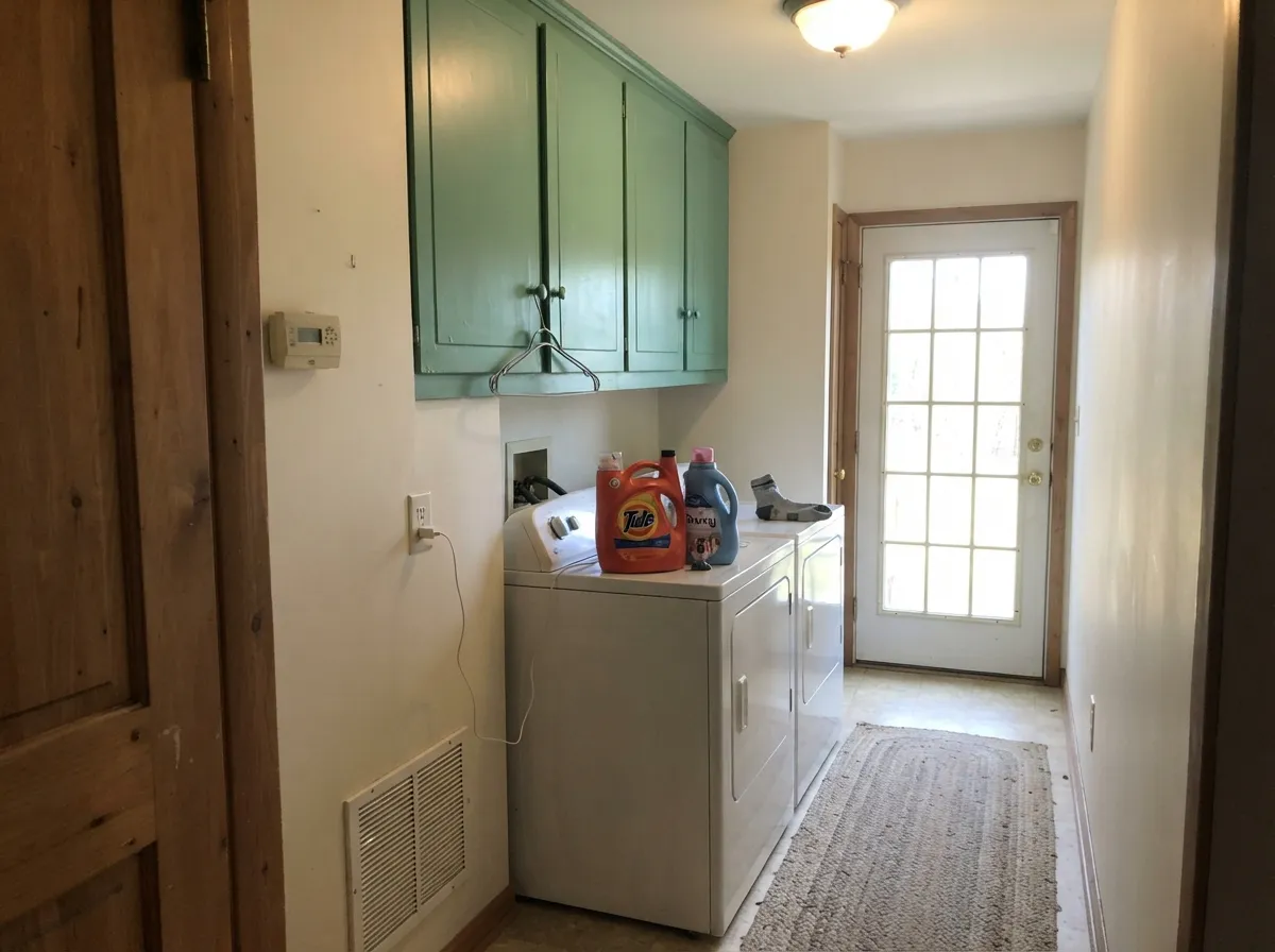
Small, hardworking, usually lit by one fixture, and nobody lingers there — which makes it the perfect room to be brave. Julep lockers, a green washer wall or full cabinets turn a utility room into the most photographed corner of the house. It also hides the scuffs a white locker bank broadcasts.
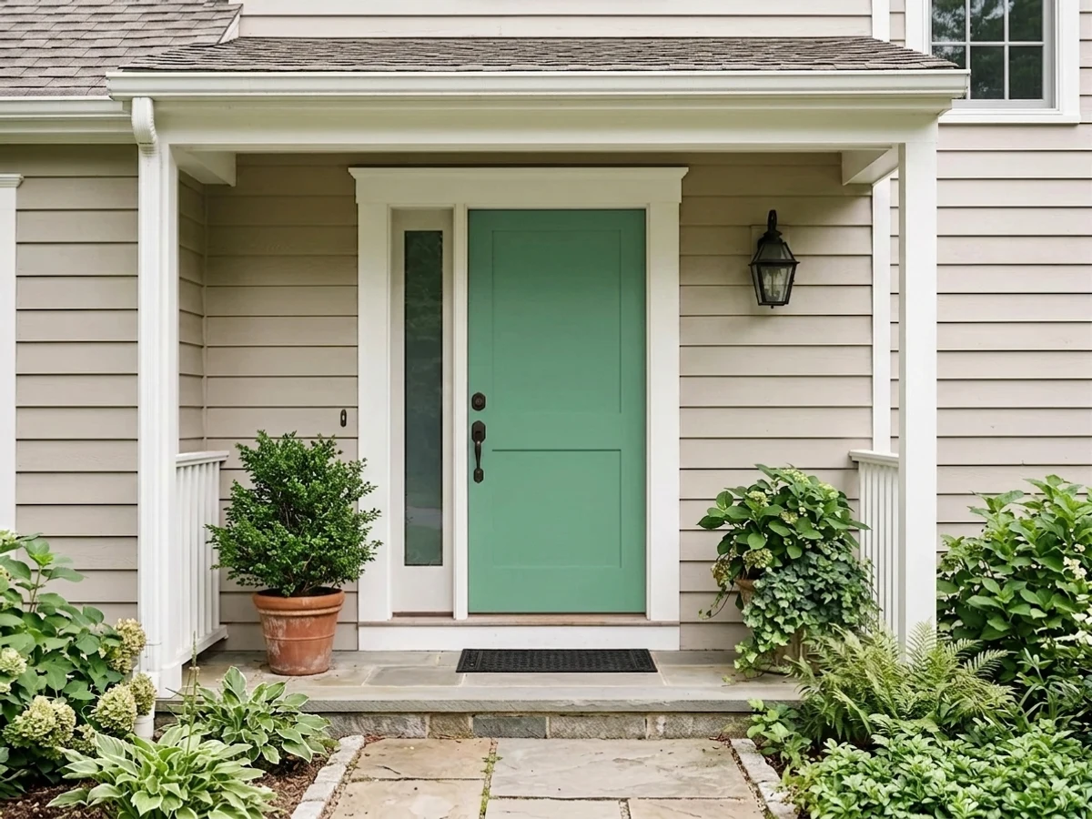
A primary bedroom in full Julep is a lot of color for a room you use mostly at night, when warm bulbs mute it; keep it to a headboard wall unless the room is bright. Outside, it is a front-door color rather than a body color — jade green on a white or pale-gray house with black trim looks deliberate, while a whole facade in it is a very loud bet.
Your Light Is the Risk
Strong, steady daylight is where the color reads clean jade and genuinely fresh. This is the light the color was built for — sample here first.
Cool, weak light with no lamps flattens it into a murky gray-teal. At LRV 32 there is not enough reflected light left to keep the green looking clear.
Morning east light pulls the blue forward and it reads cooler, almost aqua. Late golden sun swings it the other way for an hour, closer to a true leaf green.
This one runs backwards from most colors: 2700K warm bulbs mute it and dull the green, while 4000K and cooler LEDs render it truer and livelier. In a room you use at night, bulb choice matters as much as the paint.
Most complaints about Julep are a light mismatch. Upload a photo of your actual room and see it on your walls — then ask for the same wall in north light or evening lamps before you buy a single sample.
Need It From Another Brand?
Any paint counter can custom-tint Sherwin-Williams SW 6746 directly. If you would rather stay in one brand's own deck, these are the closest stock matches, measured as ΔE2000. Under 2 is a difference you will not see on the wall.
| Brand | Closest color | ΔE | LRV | |
|---|---|---|---|---|
| Behr | EdgewaterT14-4 · Behr | 1.0 | 33 | Color page → |
| Benjamin Moore | Island Getaway593 · Benjamin Moore | 3.5 | 30 | Color page → |
| Valspar | Divot6003-10B · Valspar | 2.6 | 32.2 | Color page → |
| PPG / Glidden | Laurel WreathPPG1228-5 · PPG / Glidden | 2.7 | 32 | Color page → |
| Glidden | Laurel WreathPPG1228-5 · Glidden | 2.8 | 31 | Color page → |
| HGTV Home by Sherwin-Williams | Tender SeedlingHGSW 1293 · HGTV Home by Sherwin-Williams | 0.0 | 32 | Color page → |
Similar Sherwin-Williams Colors
The nearest shades to Julep within Sherwin-Williams's own range, ranked by perceptual color distance — useful when you want the same look a touch lighter, darker, or warmer.
WCAG 2.1: AA is 4.5 : 1 for normal text, 3 : 1 for large text, AAA is 7 : 1.
Julep vs the Colors You're Also Considering
Every Julep sample board has the same rivals on it. The numbers show the real lightness gap — then it comes down to which risk you would rather live with.
Pick this when you want the room to look green on purpose, not just warm-ish.
Behr N390-5 · LRV 32Eucalyptus WreathPick this for the same depth in a warmer, yellower, much less saturated green — real color, lower volume.
Pick this to stay on the green side of the line; Julep never reads blue in a room.
Benjamin Moore 2049-40 · LRV 35Peacock BluePick this if every sample you like keeps drifting toward teal — this is the jewel-tone version of the same brightness.
Julep Coordinating Colors
The rule for coordinating with Julep: give it white or cream to breathe against, one dark note to anchor it, and keep every other saturated color out of the room. It does not need a second color to look finished — it needs contrast in value, not competition in hue. These are the partners that keep working:
The Name Problem: Why People Expect Mint And Get Jade
A julep is a pale, frosted, mint-leaf drink, and the name does most of the damage before anyone opens a sample pot. Search results reinforce it — write-ups about this color reach for words like minty and soft — and then the wall arrives at LRV 32 with real saturation in it. Nothing about the paint is wrong. The expectation was set by a cocktail.
The useful way to place it is by depth. Sherwin-Williams sells the pale version of this idea as Refresh, a quiet spa aqua at LRV 59; Julep is roughly two full steps down from that, which is why it can carry a whole powder room and Refresh cannot. If you have been saving photos of airy pastel-green bathrooms, those rooms are almost never painted in a color this deep — they are painted in something closer to Refresh with a lot of white tile doing the work.
One practical note if you are shopping for it: the color also appears in the HGTV Home by Sherwin-Williams line sold at Lowe's under the number HGSW6746, so you do not necessarily have to make a trip to a Sherwin-Williams store to get it mixed.
Julep With Wood Tones And Floors
This decision gets made at the floor. Pale white oak is the easiest match — its low-color, slightly cool character lets the green be the only saturated thing in the room. Walnut and black-stained wood are the designer version: the dark brown makes the jade look richer and more expensive, which is why green cabinets over dark floors keep showing up in kitchens. Gray-toned LVP is fine and reads modern.
The honest no is golden. Honey oak floors, orange-stained trim and yellow-toned builder cabinets sit far enough from Julep in temperature that the eye reads the pairing as a period reference rather than a scheme — specifically the mint-green-and-oak kitchens of the early 1990s. This is not a subtle effect and no sheen or second coat softens it. If the golden oak is staying, go to a warmer, less blue green and keep the same depth.
Metals are easy: unlacquered brass and antique bronze warm it up, matte black sharpens it, and brushed nickel disappears politely. Chrome is the only one that leans cold enough to make the whole room feel like a bathroom — which, in a bathroom, is fine.
Three Ready Palettes Built on Julep
A color is never alone on the wall. These are complete combinations in the 60-30-10 pattern, with the reason each one holds together. Every one opens in the visualizer.
One saturated wall against a soft warm white is the whole trick — Alabaster keeps the room bright enough that the jade never closes it in. First Light sits nearly opposite Julep on the color wheel, so the blush reads as a deliberate partner rather than a second theme, and it is pale enough to behave like a warm off-white on doors.
Try this palette in your roomUtility rooms are where a saturated green is safest, and Pure White walls give it the reflected light a windowless laundry cannot. Cascades is the near-black anchor — it sits in the same cool green-blue direction as Julep, so the dark note reads related instead of borrowed from another scheme.
Try this palette in your roomJulep is a cool color, and cool color on white-white walls can tip toward hospital-clean. A warm off-white wall solves it without muddying anything: Natural Cream supplies the warmth, White Dove trim keeps the edges soft, and the green stays the only saturated thing in the room.
Try this palette in your roomJulep FAQ
Is Julep a mint green?
No, and this is the most common misread. Mint is a pale, low-saturation pastel; Julep is a mid-tone jade at LRV 32 with enough chroma to color everything near it. It sits in the same family as mint, several steps deeper and stronger. If you want true mint from the same deck, SW Refresh at LRV 59 is the color you are picturing.
Is Julep too bright for a kid's bedroom?
On one wall, no — that is arguably its best use in a house, and it stays appropriate as the child gets older. On all four walls of a small or dim bedroom, quite possibly yes: the green bounces onto the ceiling and the bedding, and the room can feel enclosed. Sample a large piece on the wall you intend to paint and look at it at bedtime, not just at noon.
What white trim goes with Julep?
A soft warm white is the safer default — Alabaster or White Dove — because it takes the cool edge off without competing. Pure White is the pick when you want the trim to look crisp and modern against the green, which suits cabinets and laundry rooms. Avoid a very bright, cool white next to it in a dim room; the contrast makes the green look duller than it is.
Is Julep good for cabinets?
It is the best thing it does — and it is the use nearly every listing and write-up of this color recommends first. A mid-depth saturated green reads custom on a vanity, an island, a laundry bank or a built-in bookcase. Use a satin urethane-fortified cabinet enamel over a proper bonding primer, and plan two finish coats — saturated mid-tones show roller lap marks more than whites do.
Does Julep work with oak floors?
Depends entirely on which oak. Pale white oak, gray-washed floors and walnut are all good, and black-stained wood is excellent. Golden honey oak with an orange cast is the real clash — blue-green over orange oak is a combination the eye files as 1990s. A large rug helps in a bedroom, but in a kitchen where the floor and the cabinets meet, choose a warmer green instead.
Will it look green or blue on the wall?
Green first, with a blue lean that the light turns up or down. Cool morning light and cool LEDs push it toward aqua; low golden sun swings it toward a truer leaf green. Nobody walking into the room will call it blue — but if you are hoping for a warm, herbal green, the blue in it will read as a wrong turn.
Have you painted with Julep?
Rate it — one tap helps the next reader decide.
Ask a Question