Misty
The quiet blue-green-gray Sherwin-Williams files under Blue, reviewed honestly: where it turns foggy seafoam, where it goes flat gray, and what to pick if you actually want plain gray.

Jessica has spec'd whites and neutrals for more than 300 rooms and keeps a sample wall of painted drawdowns in her studio. Every color review is checked against real reader rooms in the comments and re-tested when a formula changes. About the testing process →
- 1Stardew43
- 2Upward57
- 3Misty64
- 4Glass Slipper70
- 5Spring Thaw83
The Fast Verdict
Misty is the grayer, quieter member of Sherwin-Williams' small family of foggy coastal colors — the one people switch to after deciding Sea Salt tested too green on their actual wall. In real daylight it is genuinely calm: pale, cool, a little misty, never shouting blue or green from across the room. Sherwin-Williams even files it under Blue on their own site, though most owners call it gray first and green second — that faintness is both the whole appeal and the whole risk.
Bathrooms with real window light · Cape Cod and coastal exteriors with white trim · small kitchens and ceilings that need brightness without stark white · anyone who found Sea Salt too green
You want a guaranteed, unambiguous gray · your room is dim, north-facing and runs on cool LEDs · your wood trim or floors lean strongly honey-yellow · you're chasing Sea Salt's specific farmhouse fame
- Genuinely quiet — reads gray, green, or blue depending on the room, never loud
- The calmer, grayer alternative when Sea Salt tests too green
- Brightens small kitchens and bathrooms without stark-white starkness
- One of the better ceiling colors in the SW deck
- A real Cape Cod / coastal exterior with white trim and a dark door
- Goes flat and chilly gray-green in dim, north-facing rooms
- Green undertone strengthens under warm bulbs and near yellow-leaning wood
- Not an actual gray — disappoints buyers who wanted one
- Chameleon behavior means the store chip is a poor predictor of the whole room
What Color Is Misty, Really?
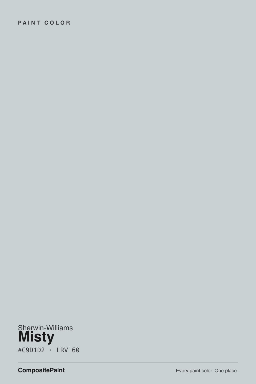
Misty is a pale, cool-leaning blue-green-gray — heavy on the gray, with just enough color in reserve to read as "foggy coastal" instead of "builder beige-gray." Sherwin-Williams' own website files it under their Blue family, but ask anyone who has actually painted a room with it and they will usually call it gray first, green second, and blue a distant third — the color holds all three in such a light hand that the room and the light decide which one shows that day. It sits in the same loose, unofficial family as Sea Salt, Silver Strand and Rainwashed — SW's cluster of quiet, hard-to-pin-down coastal neutrals — and it is routinely the paint people land on after trying Sea Salt on the wall and finding it ran too green for their taste.
At a deck LRV of 60 it sits mid-light: brighter and airier than a true greige, with more body than the palest members of its family. That extra depth keeps it from washing out in a small room, which is why it turns up so often as a recommendation for kitchens and bathrooms that need brightness without the flatness of a stark white. It also photographs differently room to room — someone who painted it after admiring a sunny listing photo can be genuinely surprised by a cooler, grayer version of the same paint in their own north-facing hallway.
Undertone in one line: gray first, blue-green second, and which of the two shows up depends on the room. Morning east light and late west light bring the color forward and read distinctly foggy blue-green; flat north light and warm 2700K bulbs both push it toward plain gray, or — confusingly — toward more green if there is any yellow nearby. If your sample looks like three different colors across one day, that is not a bad batch. That is Misty being Misty.
Where It Shines
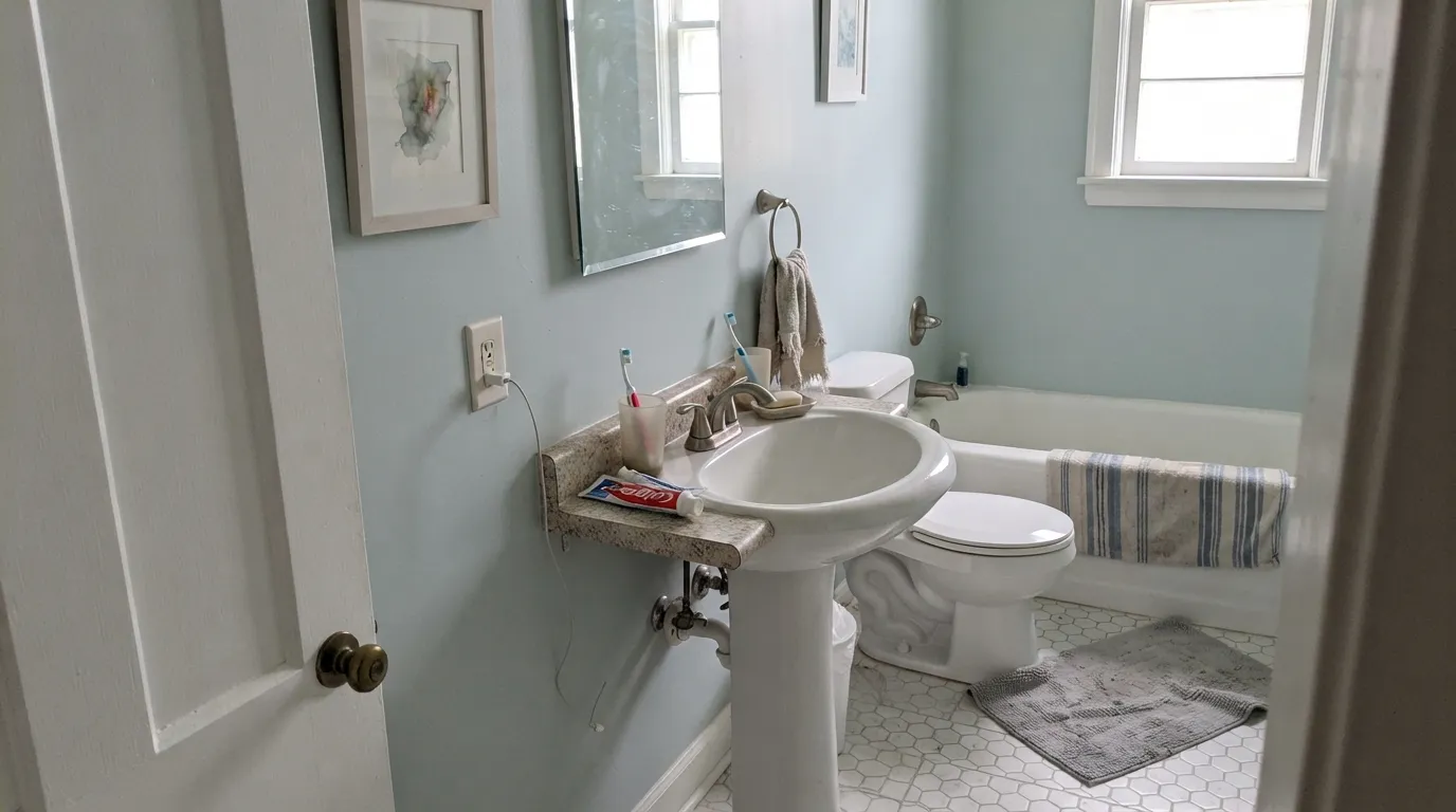
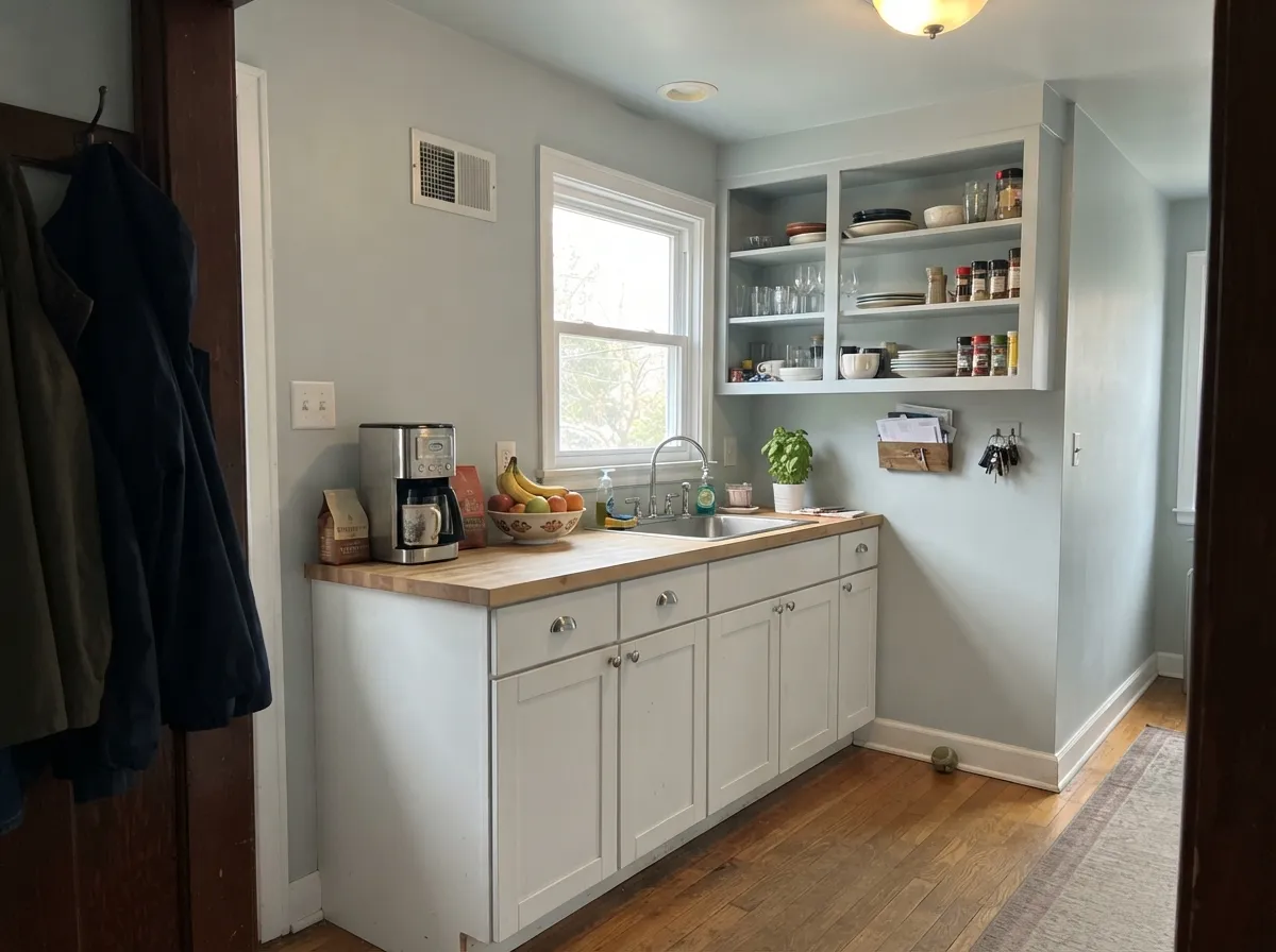
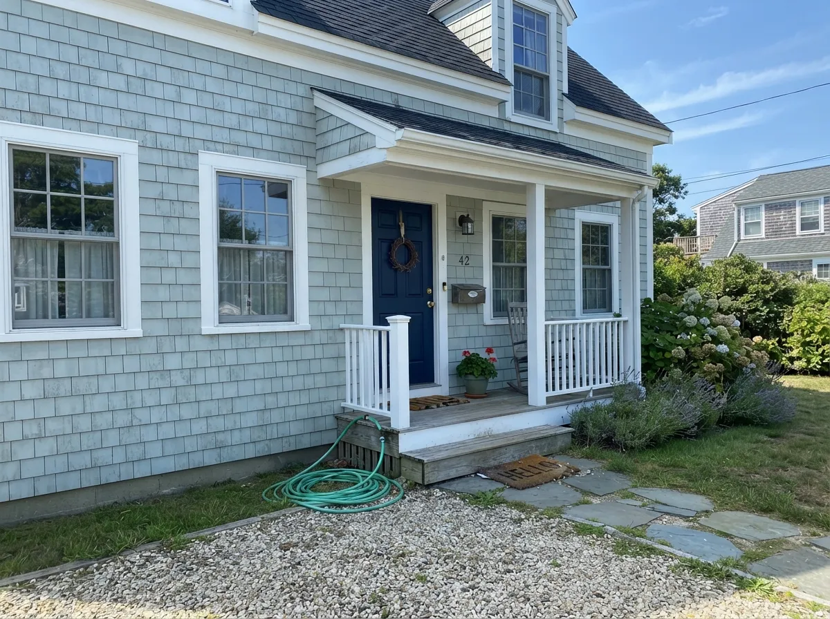
Give it real daylight — a morning-facing kitchen, an evening-lit bathroom window — or a genuinely sunny exterior wall, and Misty is the calm, spa-like color people search for Sea Salt and end up buying this instead. Cape Cod and coastal exteriors are its other home: paired with crisp white trim and a dark door, it reads exactly like the shingle-style beach houses it seems built to match. It also quietly does a job most colors this pale skip — a genuinely good ceiling, softer than stark white but with enough presence not to disappear.
Where It Fails
Almost every disappointed review of Misty comes down to one of three mismatches, and every one of them was visible on the sample chip to someone who knew what to look for. None of them are the paint's fault — but if your room matches one, sample bigger before you commit to five gallons.
Misty is gray-based, but it is not a gray — under real daylight the blue-green shows, and buyers who wanted a true, unambiguous gray for a resale-ready room end up bothered by the tint. If plain gray is the actual goal, Silver Strand commits to it in a way Misty never will.
North light is cool to begin with, and it flattens Misty into a chilly, faded gray-green with almost none of the foggy character that makes people choose it in the first place. It is not a broken paint — it is the one light this color was never built for. Warm lamps help; a different color helps more.
The green in Misty gets more assertive under 2700K bulbs and next to anything with a yellow undertone — honey oak trim, brass under warm light, cream carpet. Buyers who picked it for a cool spa-blue bathroom sometimes end up with a wall that reads seafoam green at night. Cooler bulbs and white oak or chrome keep it in its blue-gray lane.
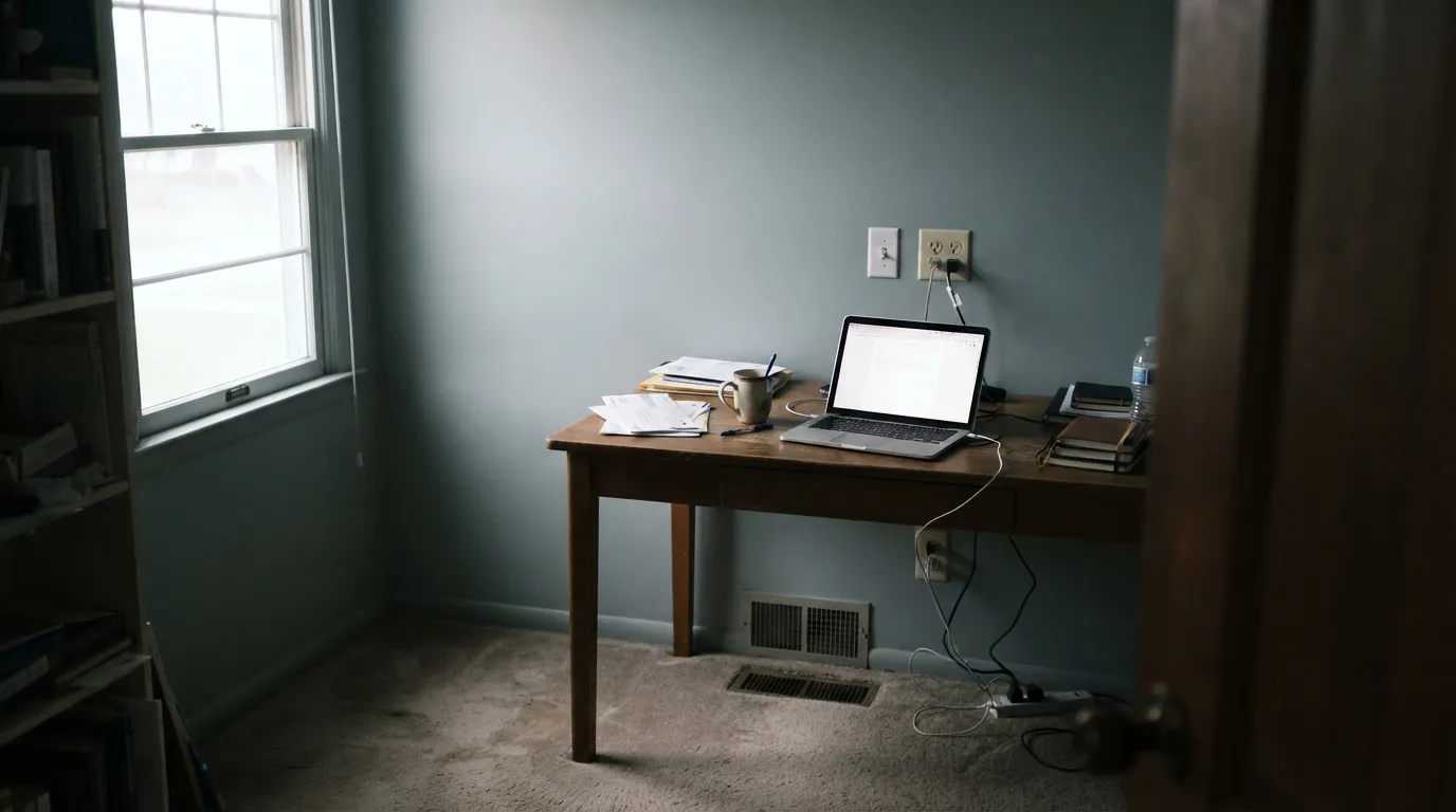
Room by Room
Calm and foggy without being dark; eggshell softens wall texture. Skip it in a north-facing bedroom that runs on overhead LEDs — that combination is where the color goes flattest.
Natural window light and humidity bring out the genuine light blue-green owners describe as spa-like. Pair with white or nickel fixtures; satin or semi-gloss handles the moisture.
In a small kitchen it brightens without white's starkness, especially against chrome. On cabinets it is a legitimate but less common choice — most cabinet buyers in this family reach for Sea Salt's stronger green instead.
Softer than a stark white ceiling, but with enough presence not to disappear. One of the honest good uses forums keep recommending, and one most reviews of colors this pale skip entirely.
East or west rooms with real daylight hours show the full foggy blue-green range. A north-facing living room with minimal daylight is the single most common regret story tied to this color.
With white trim and a navy or black door it reads like classic shingle-style coastal architecture. In flat, overcast climates it can look like plain washed-out gray rather than foggy blue-green — it wants at least some direct sun.
Your Light Is the Risk
Soft morning sun brings the foggy blue-green forward without washing it out — the light most owners call its best.
Cool and flat — drains the color to a chilly, faded gray-green with almost none of its usual character. Test here first.
South sun reads warmer and can wash out lighter at midday; west light turns it noticeably paler and softer by evening.
2700K warm bulbs push the green forward, sometimes more than owners expect. Cool LEDs hold it closer to blue-gray — pick the bulb for the mood you want.
Most complaints about Misty are a light mismatch. Upload a photo of your actual room and see it on your walls — then ask for the same wall in north light or evening lamps before you buy a single sample.
Need It From Another Brand?
Any paint counter can custom-tint Sherwin-Williams SW 6232 directly. If you would rather stay in one brand's own deck, these are the closest stock matches, measured as ΔE2000. Under 2 is a difference you will not see on the wall.
| Brand | Closest color | ΔE | LRV | |
|---|---|---|---|---|
| Behr | Silver ShadowN510-1 · Behr | 1.2 | 64 | Color page → |
| Benjamin Moore | Sterling1591 · Benjamin Moore | 2.0 | 64 | Color page → |
| Valspar | Pelican4007-1A · Valspar | 0.6 | 64.4 | Color page → |
| PPG / Glidden | ElementalPPG1011-2 · PPG / Glidden | 1.0 | 64 | Color page → |
| Glidden | Ghost WhispererPPG1039-1 · Glidden | 0.8 | 63 | Color page → |
| Dutch Boy | Moonlit Walk434-1DB · Dutch Boy | 0.5 | 64 | Color page → |
Similar Sherwin-Williams Colors
The nearest shades to Misty within Sherwin-Williams's own range, ranked by perceptual color distance — useful when you want the same look a touch lighter, darker, or warmer.
WCAG 2.1: AA is 4.5 : 1 for normal text, 3 : 1 for large text, AAA is 7 : 1.
Misty vs the Colors You're Also Considering
Every Misty sample board has the same rivals on it. The numbers show the real lightness gap — then it comes down to which risk you would rather live with.
Pick this for the calmer, cooler version of the same idea — Misty is what people switch to when Sea Salt tested too green on the wall.
Sherwin-Williams SW 6204 · LRV 63Sea SaltPick this if you want more green in the mix — Sea Salt leans distinctly greener and carries the family's farmhouse-blog fame.
Pick this for real blue-green personality — Silver Strand plays it safer and grayer than this.
Sherwin-Williams SW 7057 · LRV 59Silver StrandPick this if a true chameleon gray with almost no green is closer to what you actually want — near-identical LRV, less color commitment.
North Star SW 6246 at LRV 62 is the closest neighbor in the same line. It is a touch lighter and holds less green, so it reads as a plainer cool gray. Pick it if Misty looks too watery on your wall. Evening Shadow SW 7662 shares the same LRV of 60, but its hex #C9CCCD carries almost no green, making it the more straightforward gray of the two. Sea Salt SW 6204 at LRV 63 pulls green instead of blue and feels warmer and more sage in the same light.
Across brands the matches are unusually tight. Dunn-Edwards Salina Springs DEC794 at deltaE 0.59 and C2 Paint Overcast C2-738 at 0.61 are the same color for practical purposes, as are PPG Winter Chill PPG1036-2 at 0.77 and Benjamin Moore Palace Pearl CW-650 at 0.92. Farrow and Ball Skylight No. 205 at 1.68 is visually identical in normal room light. Behr Silver Bullet N520-2 at 2.19 is very close, so sample it first.
Misty's Coastal Family: Sea Salt, Silver Strand, Rainwashed
Sherwin-Williams doesn't officially group these four into one collection, but designers effectively treat them as one family: pale, gray-based, blue-green colors clustered within a few LRV points of each other. Which one you actually want comes down to a single question — how much green are you willing to commit to? Silver Strand has the least, Misty a little more, Sea Salt more still, and Rainwashed — deeper and more saturated — is the one that reads unmistakably green-blue the moment it's on the wall.
This is also why sample chips fail people in this family more than almost any other. All four look nearly identical in a paint store under fluorescent light and diverge completely once they're on an actual wall in actual daylight. If you're choosing between them, paint a real sample of at least two on the actual wall, and look at it morning and night before buying five gallons.
Misty on Exteriors
Outside, Misty settles into the role it seems built for: a quiet, foggy body color for Cape Cod, shingle-style and coastal homes. Direct sun brings out the blue-green; without it — a shaded lot, an overcast climate — it can read closer to plain gray, which is not a flaw so much as a different, still perfectly good result. Either way it wants a genuinely white trim, not a cream one, to stay in its cool lane.
The door is where the palette gets decided. Navy or black reads classic and confident against Misty's pale body; a bright color fights it, since Misty itself is too quiet to hold its own next to anything saturated. Walk the lot at different times of day before committing — the color's whole personality depends on how much direct light the facade actually gets.
Misty With Wood, Metal, and Fabric
Cool metals are the easy pairing: brushed nickel, chrome and unlacquered pewter all sit comfortably against Misty's blue-gray base. Warm brass works too, but mostly in daylight-heavy rooms — under warm lamps, brass and Misty's green undertone can push each other further green than either was meant to go.
Wood is where the color asks for restraint. Pale oak and white oak keep the room cool and coastal; honey oak or anything with a strong yellow-orange cast fights the undertone and drags the walls toward a murkier green than the chip promised. Cream and off-white fabrics are safer neighbors than true white, which can make the wall look faintly dingy by contrast — the same one-color-family logic that governs every color in this group.
Three Ready Palettes Built on Misty
A color is never alone on the wall. These are complete combinations in the 60-30-10 pattern, with the reason each one holds together. Every one opens in the visualizer.
Misty siding with crisp Extra White trim is the classic shingle-style coastal look, and Naval on the door supplies the one dark, confident note the palette needs — the combination forums point to again and again for Cape Cod exteriors.
Try this palette in your roomTwo grayed-down cousins in the same family read as one calm palette instead of two competing colors — Silver Strand on the vanity is close enough in value to disappear, while Pure White keeps the ceiling from going dark. Best under real window light, where the blue-green genuinely shows.
Try this palette in your roomThe fifth-wall trick: Misty overhead keeps the ceiling soft instead of stark, while Sea Salt on the cabinets carries the same coastal family down to counter height. Extra White walls hold the brightness a small kitchen actually needs.
Try this palette in your roomMisty FAQ
Is Misty blue, green, or gray?
All three, genuinely, depending on the light. Sherwin-Williams files it under Blue on their own site, but most people who live with it call it gray first and green second — blue is the faintest of the three and mostly shows up at dusk or in cool light. If you need one guaranteed color, Misty is not that paint.
What's the difference between Misty and Sea Salt?
Both come from the same loose SW coastal family and sit close in LRV, but Sea Salt leans green and Misty leans gray. Misty is the color people switch to specifically when Sea Salt tested too green on their actual wall — same mood, quieter color.
Does Misty work on kitchen cabinets?
It can, especially in a small kitchen with chrome or nickel hardware, but it is not the common choice — most cabinet buyers in this family reach for Sea Salt's stronger green instead. If you want Misty's calmer gray-blue on cabinets, sample it under your actual kitchen lighting first; warm bulbs push it greener than the chip suggests.
Is Misty a good exterior color?
Yes — it's one of the more reliable choices in the SW coastal lineup for Cape Cod and shingle-style homes, especially with white trim and a navy or black door. In flat, overcast climates it can read as plain gray rather than foggy blue-green; it wants at least some direct sun to show its color.
What trim white goes with Misty?
A crisp cool white — Extra White or Pure White — is the standard pairing and keeps the trim from looking dingy next to Misty's cool base. A warm white like Alabaster can make the wall look faintly green by contrast.
Does Misty work on a ceiling?
Better than most colors this pale usually do. It's soft enough not to lower a room the way a darker color would, but it has more presence than a stark white ceiling — one of the genuinely underrated uses for this paint, and one forums keep recommending.
Have you painted with Misty?
Rate it — one tap helps the next reader decide.
Ask a Question