Sage Wisdom
The warm sage-gray Benjamin Moore never turned into a headline: reviewed honestly, including the famous color it's almost identical to and nobody notices.

Jessica has spec'd whites and neutrals for more than 300 rooms and keeps a sample wall of painted drawdowns in her studio. Every color review is checked against real reader rooms in the comments and re-tested when a formula changes. About the testing process →
- 1Sage Green22
- 2Evergreen Fog30
- 3Sage Wisdom44
- 4Softened Green49
- 5Soft Fern57
The Fast Verdict
Sage Wisdom is a warm, gray-leaning sage that Benjamin Moore buried in its Affinity Collection under a code most people will never learn to spell — AF-430 — while a near-identical shade elsewhere in the deck became the 2022 Color of the Year. On the wall it plays the same quiet trick: equal parts warm gray and soft green, calm in good light, drab in bad light, and completely unbothered by trend cycles because nobody picked it for the trend in the first place.
Kitchens and studies with warm wood and brass · anyone who wants a near-twin of a famous color without the name recognition · dens and living rooms with real daylight · cabinets and islands
You want a true, green-free gray · your room is dim, north-facing, and short on warm lamps · your counters or fixtures are cool white and stainless · you're chasing the exact sage everyone else already has
- Warm, settled sage-gray that reads as a neutral more than a bold green
- Holds its color at LRV 44 — doesn't wash out, doesn't go near-black
- Genuinely handsome on cabinets, islands, and studies
- Behaves almost identically to a Color of the Year, at a fraction of the name recognition
- Won't read as "the trendy sage everyone already has" — almost nobody knows its name
- Goes flat and khaki-drab in cool north light or under cool LEDs
- Reads distinctly green on four walls, even to buyers hoping for gray
- Clashes with cool white counters, chrome, and stainless steel
- Almost no independent room photos or owner reviews exist online to check against your own space
What Color Is Sage Wisdom, Really?
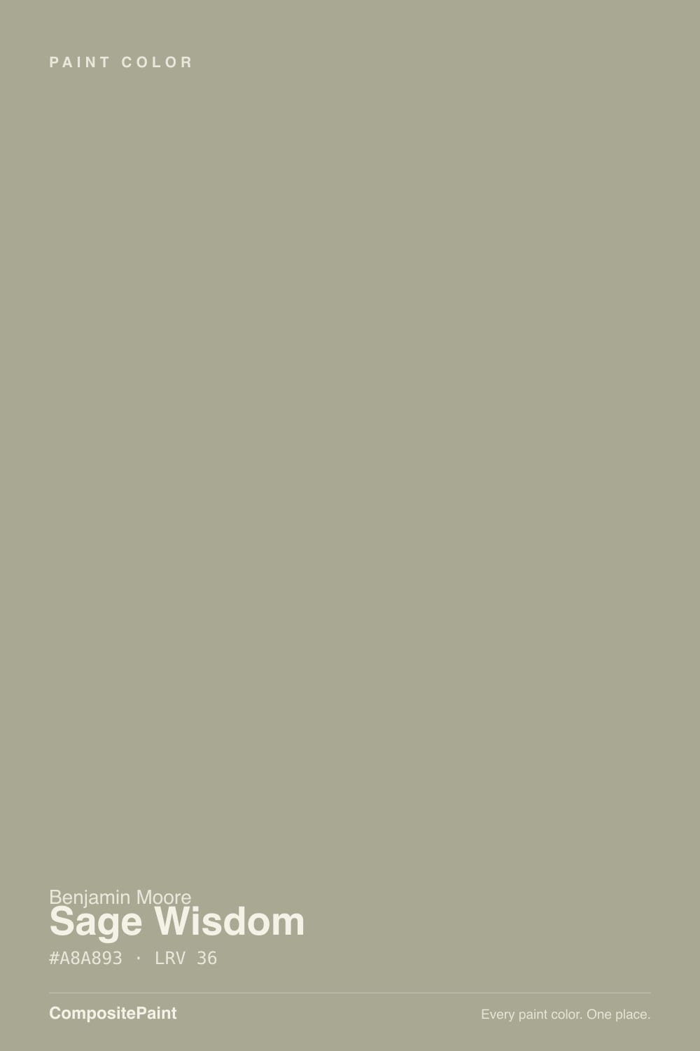
Sage Wisdom lives in Benjamin Moore's Affinity Collection — the roughly 144-color curated deck the brand built so a homeowner or designer could grab almost any color in it and know it would work together with the rest. That's the whole reason it carries a code (AF-430) instead of a name anyone remembers: Affinity colors were built to be picked off a fan deck by category, not marketed on their own. In our deck its hex reads #A8A893 — equal parts red and green light with noticeably less blue — which is the optical recipe for a warm, gray-leaning sage: not the cool blue-green of a spa color, not the saturated leafy green of a garden-shed door, just a settled, grayed-down olive that reads more "neutral" than "green" from across the room.
At LRV 44 it sits at a genuine mid-depth — deeper than a pale sage that risks washing out in a bright room, lighter than the near-black greens Benjamin Moore also sells. That depth is doing real work: it's dark enough to hold its color without going pastel, and light enough that it doesn't collapse into a moody near-black the way some of BM's darker greens do in a dim room. Practically, that puts it in the same working range as colors like Sherwin-Williams Dorian Gray or Benjamin Moore's own October Mist — a wall color you can live with daily, not a drama color reserved for one accent wall.
Undertone in one line: warm and yellow-leaning, never blue or teal. If it reads flat, khaki, or slightly muddy on your wall, that's cool light doing it — a cloudy north room or cool white LEDs strip the warmth and leave a duller, grayer green behind. Warm light and warm materials bring the sage back out.
Where It Shines
Give it warm wood, brass, and real daylight and it does the quiet-workhorse job extremely well — the same job October Mist got a magazine cover for. It's genuinely at its best on cabinets and islands, where the depth reads as a deliberate, custom color choice rather than an accidental green, and in dens or studies where low-key color is the whole point. Because almost nobody recognizes the name, it has one strange advantage over its famous relatives: it never reads as "that popular paint color" the way an era-defining shade sometimes does once everyone's seen it.
Where It Fails
Almost every regret story that would apply to Sage Wisdom follows one of three scripts, and all three are predictable before the first coat. None of them are the paint's fault — but if your room matches one, this is not your color.
On a small chip it can pass for a moody warm gray. On four real walls the green is unmistakable — depth and square footage multiply undertone. If the goal was "gray with maybe a hint of something," this has more hint than gray; look at a true greige like Sherwin-Williams Dorian Gray instead.
Cold light does to this color what it does to every muted green: kills the warmth and leaves a flat, khaki-tinted gray behind. Warm 2700K bulbs are part of the paint job here, not an accessory. If the room stays dim and you refuse lamps, pick a color that doesn't depend on warmth to look finished.
Sage Wisdom is a warm color; cold white quartz and polished chrome sit at the opposite temperature and can push it toward a flat, slightly institutional green rather than a sophisticated one. Warm butcher block, brass, and wood soften the same wall dramatically. Sample it against your actual counters before committing a whole kitchen.
Room by Room
In a sunlit room it settles into a calm, sophisticated gray-green that reads as a deliberate neutral more than a bold green choice. Eggshell on the walls; keep the trim warm rather than stark white.
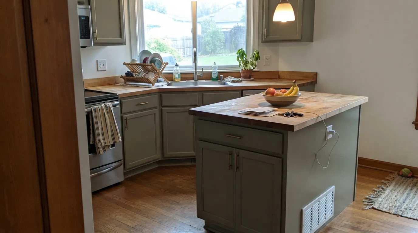
On cabinets and islands it flatters brass hardware and butcher block, and the mid-depth reads as a considered design decision rather than an odd wall color. Cool white quartz or stainless is the one pairing worth sampling first. Satin cabinet enamel wipes clean.
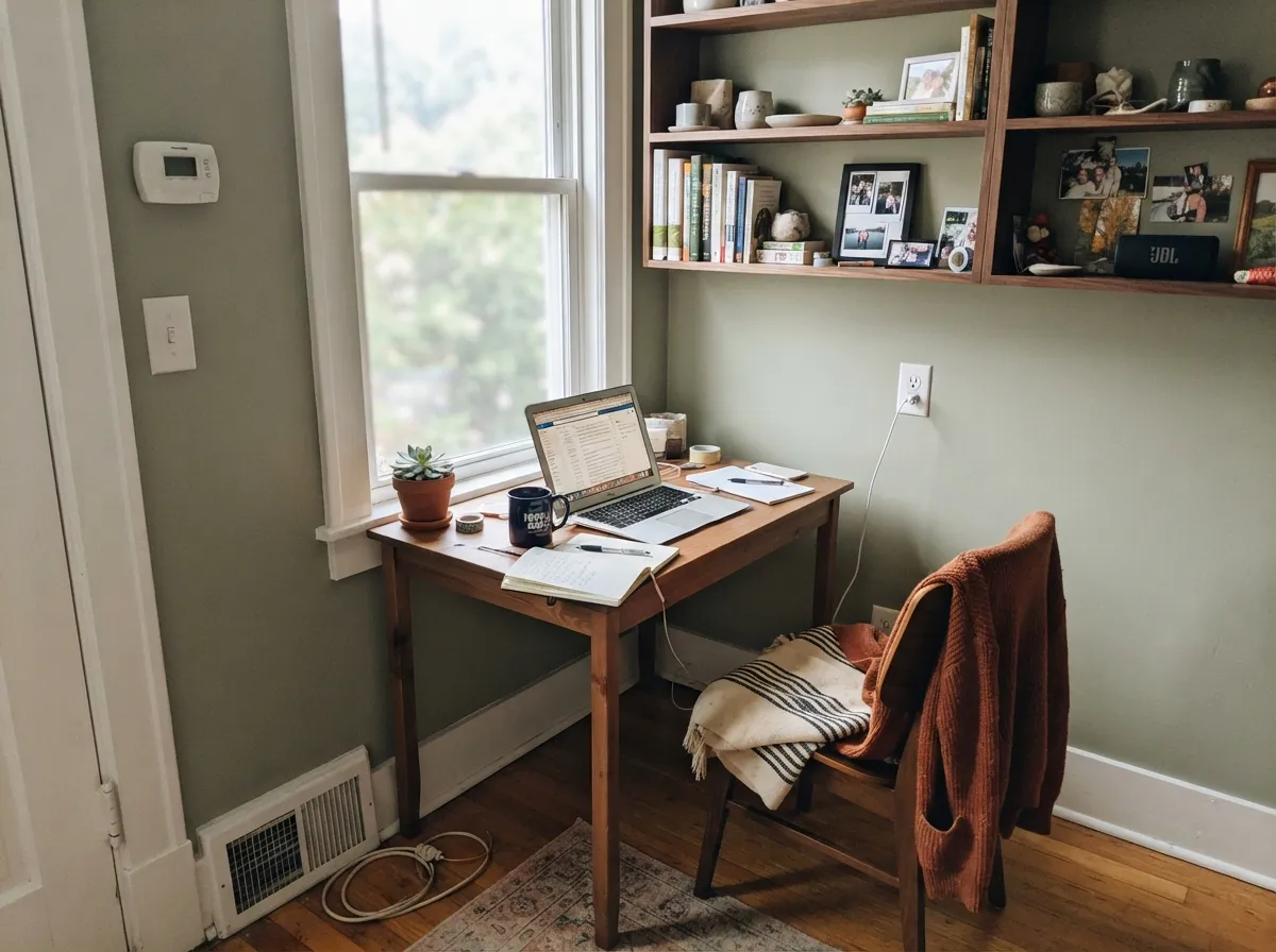
Low-saturation green-grays are one of the few colors people consistently describe as calming without being sleepy, and the mid-depth keeps a small office from feeling clinical. Walnut shelving and a warm desk lamp are its natural company.
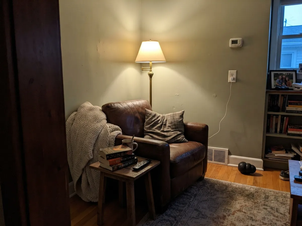
Under 2700K bulbs it turns soft and settled rather than dull. If the room is north-facing and stays dim during the day, add lamps or size up to a paler sage instead.
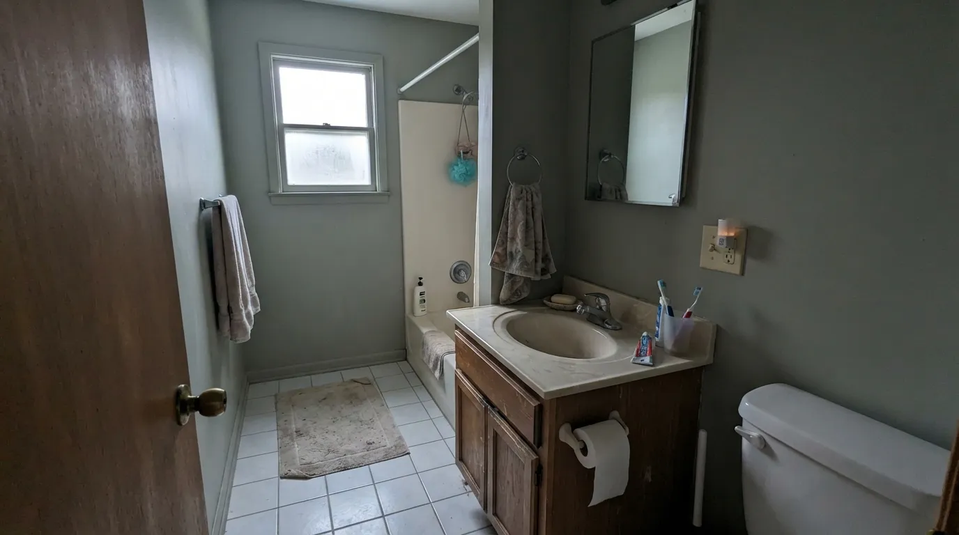
With warm wood vanities and brass it's genuinely pretty. With cool white tile, chrome fixtures, and fluorescent light it drifts toward institutional — test a large sample before painting all four walls.
Full outdoor sun can push a warm sage-gray toward a flat, slightly dated green without enough architectural detail to break it up. It reads better as a shutter or front-door color against a cream or white house than as the main body color on a plain facade.
Your Light Is the Risk
Full warm daylight is where the sage settles into its calm, grayed-green best — closest to the chip, all day.
Cool, indirect daylight drains the warmth and leaves a flatter, more khaki-toned gray-green behind. Sample here first if this is your room.
Morning and evening sun bring the green forward; midday light flattens it toward gray. The swing is gentle, not dramatic.
2700K bulbs deepen it into a settled, sophisticated sage at night. Cool white LEDs push it toward a colder, more institutional green — swap bulbs, not paint.
Most complaints about Sage Wisdom are a light mismatch. Upload a photo of your actual room and see it on your walls — then ask for the same wall in north light or evening lamps before you buy a single sample.
Need It From Another Brand?
Any paint counter can custom-tint Benjamin Moore CSP-775 directly. If you would rather stay in one brand's own deck, these are the closest stock matches, measured as ΔE2000. Under 2 is a difference you will not see on the wall.
| Brand | Closest color | ΔE | LRV | |
|---|---|---|---|---|
| Sherwin-Williams | Forever GreenSW 9653 · Sherwin-Williams | 1.5 | 44 | Color page → |
| Behr | AquatonePMD-100 · Behr | 1.9 | 44 | Color page → |
| Valspar | Green Trellis5006-3C · Valspar | 2.0 | 43.3 | Color page → |
| PPG / Glidden | GargoylePPG1127-4 · PPG / Glidden | 1.9 | 43 | Color page → |
| Glidden | GargoylePPG1127-4 · Glidden | 2.4 | 43 | Color page → |
| Dutch Boy | Foggy Gray424-2DB · Dutch Boy | 2.6 | 45 | Color page → |
Similar Benjamin Moore Colors
The nearest shades to Sage Wisdom within Benjamin Moore's own range, ranked by perceptual color distance — useful when you want the same look a touch lighter, darker, or warmer.
WCAG 2.1: AA is 4.5 : 1 for normal text, 3 : 1 for large text, AAA is 7 : 1.
Sage Wisdom vs the Colors You're Also Considering
Every Sage Wisdom sample board has the same rivals on it. The numbers show the real lightness gap — then it comes down to which risk you would rather live with.
Pick this if you want the same idea without the déjà vu — Sage Wisdom is the identical family of color sold under an anonymous code, not a magazine cover.
Benjamin Moore 1495 · LRV 39October MistPick this if you want the same warm sage-gray with a name everyone recognizes — it's the 2022 Color of the Year, so your painter has almost certainly mixed it before.
Pick this for a slightly lighter, grayer sage that reads more like a wall neutral than a green statement.
Sherwin-Williams SW 9130 · LRV 30Evergreen FogPick this if your painter works in Sherwin-Williams and you want it a shade deeper and greener, especially on cabinets.
Weekend Getaway 473 and Nature Lover CC-726 share hex #A5AA92 at LRV 39. Both are a little lighter than Sage Wisdom and slightly greener, so they read more clearly as sage and less as warm gray. Dried Basil 1510 and Herbes de Provence CC-634, both #AEA98F at LRV 39, go the other way: lighter and more yellow, closer to a soft khaki. Jockey Hollow Gray HC-108 at #AEA897 and LRV 39 is the most neutral of the group.
Across brands the matches are unusually tight. Behr Simply Sage PPU10-16 at deltaE 1.54, Sherwin-Williams Frosted Fern SW 9648 at 1.55, and PPG Wandering Willow PPG1031-3 at 1.68 all look visually identical in normal room light. Dunn-Edwards River Birch DEGR36 at deltaE 2.87 and Kompozit Historic Shade 0372 at 2.87 are very close but should be sampled first. Diamond Vogel Big Fish 0435 at 3.98 is close yet visibly different side by side.
Sage Wisdom Coordinating Colors
The rule for coordinating with Sage Wisdom is the same one that works for any warm, grayed-down green: keep the whites and neutrals warm, keep the darks soft rather than stark, and let warm wood do the rest of the work. These are the partners that keep it looking deliberate instead of accidental:
Sage Wisdom vs. October Mist: The Same Color, Two Different Lives
Benjamin Moore's own deck tells an odd story here: Sage Wisdom and October Mist sit in nearly the same place on the color wheel, a few points of depth apart, and yet one became a global phenomenon while the other stayed a fan-deck number nobody memorized. October Mist was named 2022 Color of the Year, splashed across paint-store windows and a thousand design boards, while Sage Wisdom quietly did the same job inside the Affinity Collection — the curated deck Benjamin Moore built specifically so any color in it would work without a design degree.
That gap is entirely reputation, not performance. If you love October Mist's look but don't want the "I know exactly which paint color this is" recognition it now carries in a lot of neighborhoods, Sage Wisdom is the honest alternative: the same warm sage-gray behavior, the same light sensitivity, with a code for a name instead of a magazine credit.
Sage Wisdom With Wood Tones and Floors
Warm, mid-to-dark woods are this color's best company. Walnut, espresso stain, and white oak all sit comfortably against it, and butcher block on an island practically completes the look on its own.
The pairing worth testing first is a bright honey-oak or golden-toned floor: yellow-heavy wood can push a warm green toward muddy or swampy rather than sophisticated, especially in a room that's already short on daylight. In that situation, either lean harder into warm lighting and brass, or sample big before committing to four walls.
Three Ready Palettes Built on Sage Wisdom
A color is never alone on the wall. These are complete combinations in the 60-30-10 pattern, with the reason each one holds together. Every one opens in the visualizer.
White Dove's warm base keeps the green from tipping institutional at the trim line, and Kendall Charcoal supplies one grounding near-black note without adding a second undertone to argue with.
Try this palette in your roomSwiss Coffee keeps the room bright and warm while the cabinets carry all the color, and Wrought Iron's soft near-black finishes the kitchen without a single cold-gray note anywhere in the room.
Try this palette in your roomPale Oak's warm light neutral flows straight into a Sage Wisdom room without a jarring handoff, and Chelsea Gray's smoky charcoal grounds both without competing with the green for attention.
Try this palette in your roomSage Wisdom FAQ
Is Sage Wisdom a gray or a green?
Technically both, and that's the whole personality: equal red and green light with less blue gives it a warm, grayed-down olive cast. Our own deck files it under Gray because it's muted enough to work as a neutral, but on four real walls in daylight most people call it green, not gray. If you want a color nobody argues about, look at a true greige instead.
Is it warm or cool?
Warm — the yellow-green lean never goes blue or teal. Under cool light it can look duller and more khaki, but it never turns cold the way a true blue-green would.
What trim white goes with Sage Wisdom?
A warm white — White Dove or Swiss Coffee — keeps the pairing soft. A stark, cool white makes the sage look slightly dingy by comparison; if you want real contrast, go darker instead of brighter.
How does Sage Wisdom compare to October Mist?
They sit close enough that most painters would struggle to tell the two apart on a wall — the same family of warm sage-gray, a few points of LRV apart in depth. The real difference isn't the paint, it's the reputation: October Mist was Benjamin Moore's 2022 Color of the Year and has been photographed in thousands of rooms; Sage Wisdom is the same idea sold under an anonymous Affinity Collection code that almost nobody searches for by name.
Does it work on kitchen cabinets?
Yes — it's arguably the color's best use. Warm wood, butcher block, and brass all sit well against it, and the mid-depth reads as a deliberate design choice rather than an odd green. Test it against cool white counters or stainless steel first; that's the one pairing that can go institutional.
Will a sage color like this date itself?
Less than most trend greens. Muted, grayed-down sages like this one have been a Benjamin Moore Affinity Collection color for years, not something invented for the current green moment, so it ages more like a greige than like a saturated trend color. The bigger risk isn't the color dating — it's picking it hoping for gray and getting green.
Have you painted with Sage Wisdom?
Rate it — one tap helps the next reader decide.
Ask a Question