Sherwin-Williams Repose GrayvsBenjamin Moore Stonington Gray
Repose Gray and Stonington Gray sit at nearly the same lightness and behave nothing alike. One is a warm greige with violet underneath, the other is a true cool gray with blue underneath, and your windows decide which one you can live with.

Built from our full reviews of both colors — same measured data, same real-room photos. About the testing process →
The Numbers
LRV is essentially equal (58 vs 59) — both reflect light the same.
The Real Difference on a Wall
Put them on the same wall and the difference is obvious in about three seconds. Stonington Gray looks like the gray you asked for: mineral, silvery, a little nautical, clearly a color. Repose Gray next to it looks like a lightly dirtied white. That is not a knock on Repose. It is the whole reason people buy it. Repose is built to disappear into a room and let the floors, the wood and the hardware do the talking. Stonington is built to be seen.
They also move in opposite directions through the day. In south and west light Repose warms up and calms down until by mid-afternoon it is barely a color at all, close to a warm off-white. Stonington ignores the sun. Warm light does not push it warm; it stays gray and keeps the shape of the room, which is why it holds up on siding and in big bright rooms without washing out. Then the light goes cool and both give you their real base. Repose shows the violet sitting under the gray and starts reading lavender or, in a bad room, baby blue. Stonington shows its blue and goes slate and chilly. Same north room, two different failures.
The fixed materials in the house usually settle the argument before you do. Repose gets into trouble beside cream and ivory. Warm cabinets push it the opposite way on the color wheel and the two feet of wall next to the cabinet run goes visibly violet. It is happy against warm oak, brass and matte black. Stonington gets into trouble beside honey oak. Cool blue-gray and orange wood make each other look worse, the floor reads more orange, the wall reads more blue and flat. Give Stonington white oak, walnut, gray-washed floors, painted trim, cool marble and chrome and it is excellent.
Repose Gray goes lavender, sometimes flat-out baby blue, in dim north light and along any wall that meets cream or ivory cabinets. Stonington Gray does not go purple, but in that same north room its blue undertone steps forward and the walls read cold slate. Cool 4000K bulbs do the same thing to both.
What Each Color Really Is
A light greige built on a violet base. That last part is the whole story. Most warm grays get their softness from yellow or brown pigment; Repose Gray gets a good share of its from a whisper of purple, with a faint green thread underneath it. In warm light the purple reads as "soft" and "not cold," which is exactly the effect people are after. Take the warm light away and the same pigment reads as what it is. Nothing about the mix changes room to room — only what the light lets you see.
At LRV 58 it sits almost exactly where Agreeable Gray does at 60, so the two are not a light-versus-dark decision — they are a temperature decision. Repose leans slightly cool and clean; Agreeable leans slightly tan. That two-point gap also tells you something people miss: 58 is mid-light, not pale. It is a real, visible color on the wall, roughly halfway between a white ceiling and a mid-tone gray sofa, and it will read as gray from across the room rather than disappearing like an off-white.
A true gray with a blue undertone that never fully disappears — and a faint green ghost that shows up in shade and shadow. Benjamin Moore's own description, "all-purpose silvery gray," is unusually accurate: unlike its warmer HC-deck cousins (Revere Pewter, Edgecomb Gray), Stonington Gray does not lean beige or tan under any light. It reads as gray in the paint can, gray on the swatch, and gray on the wall. That consistency is the whole reason it became a Benjamin Moore staple rather than a passing trend color.
It belongs to the Historical Collection's HC gray run: Wickham Gray (HC-171, LRV 68) sits a step lighter and softer, Coventry Gray (HC-169) and Chelsea Gray (HC-168) sit darker and moodier, and Stonington Gray (HC-170, LRV 59) holds the middle — light enough for whole-house walls, with enough depth to read as a real color choice rather than an off-white. At LRV 59 it is a genuine mid-tone: not the pale ghost-gray of Classic Gray, not the charcoal of Kendall Charcoal, just a confident medium gray.
Specs Side by Side
| Spec | Repose Gray | Stonington Gray |
|---|---|---|
| Brand | Sherwin-Williams | Benjamin Moore |
| SKU | SW 7015 | HC-170 |
| Hex | #CCC9C0 | #CACBC5 |
| RGB | 204, 201, 192 | 202, 203, 197 |
| LRV | 58 | 59 |
| Undertone | red-orange / warm | yellow / warm |
| Family | Neutral | Gray |
How Light Changes Them
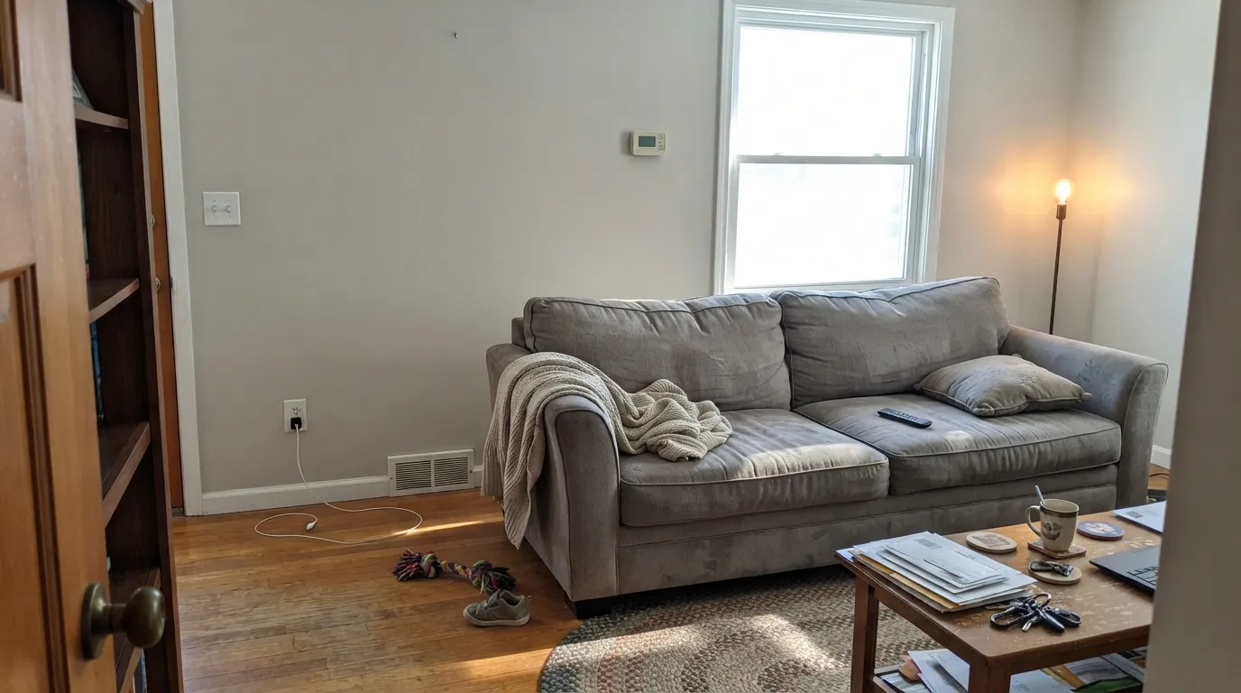
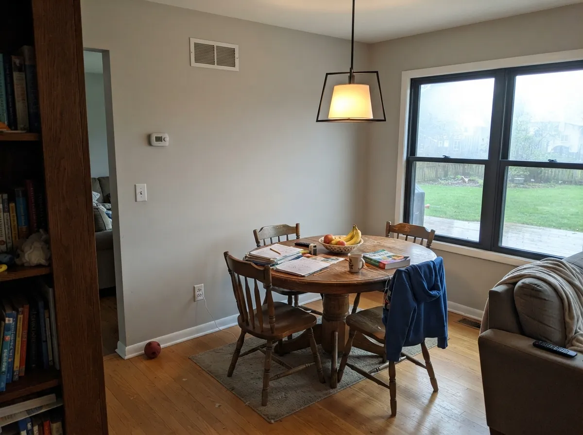
Warm daylight all day keeps the greige balanced and soft. This is the room it was made for.
Cool light kills the warmth and the violet base surfaces. Expect lavender or baby blue. Sample large, or go warmer.
4000K LEDs push it blue-gray and lifeless after dark. Swap to 2700K bulbs before you blame the paint — it usually fixes it outright.
West windows at 4pm bleach it close to an off-white. Fine on a big wall, disappointing if you wanted visible gray.
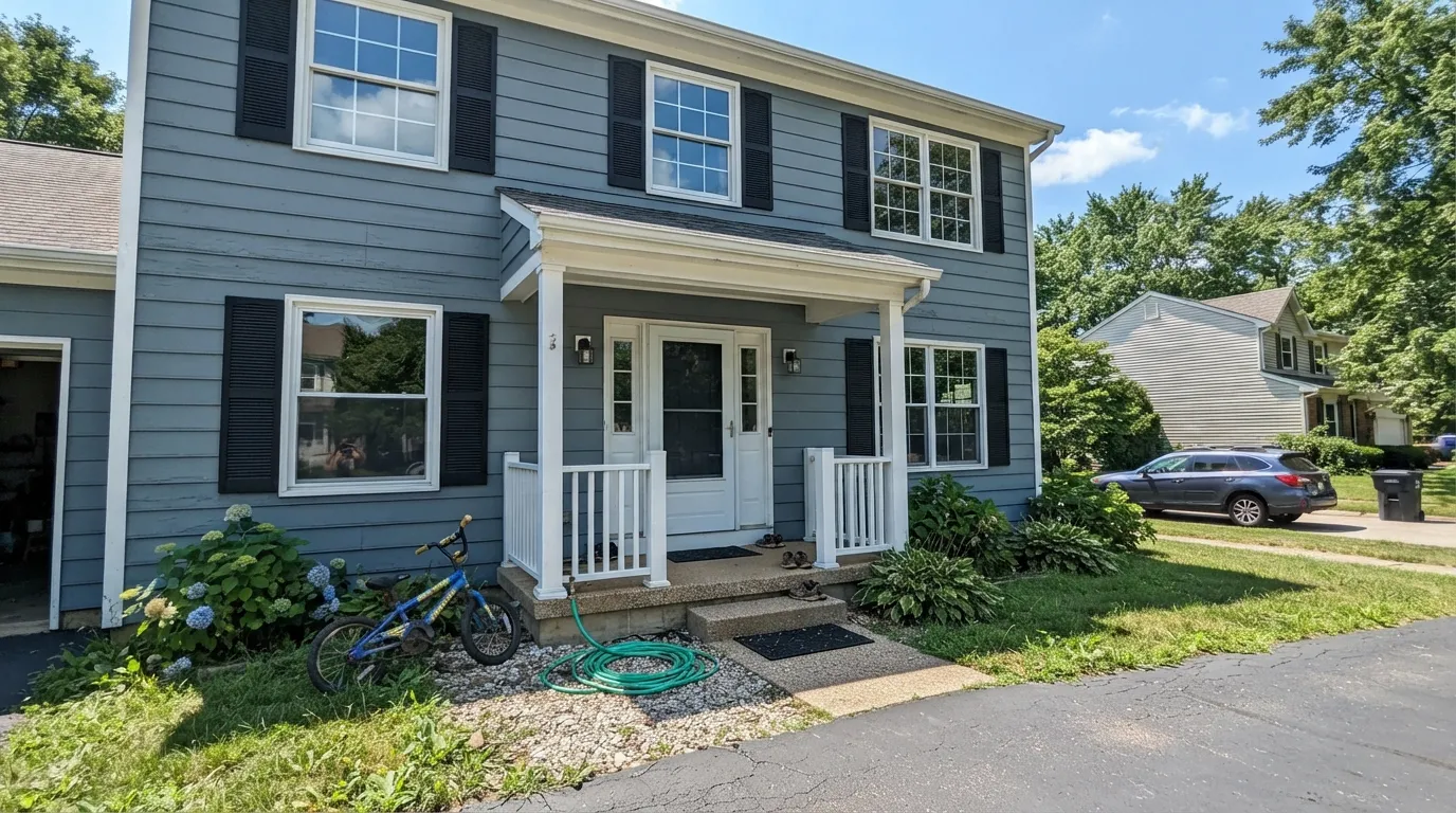
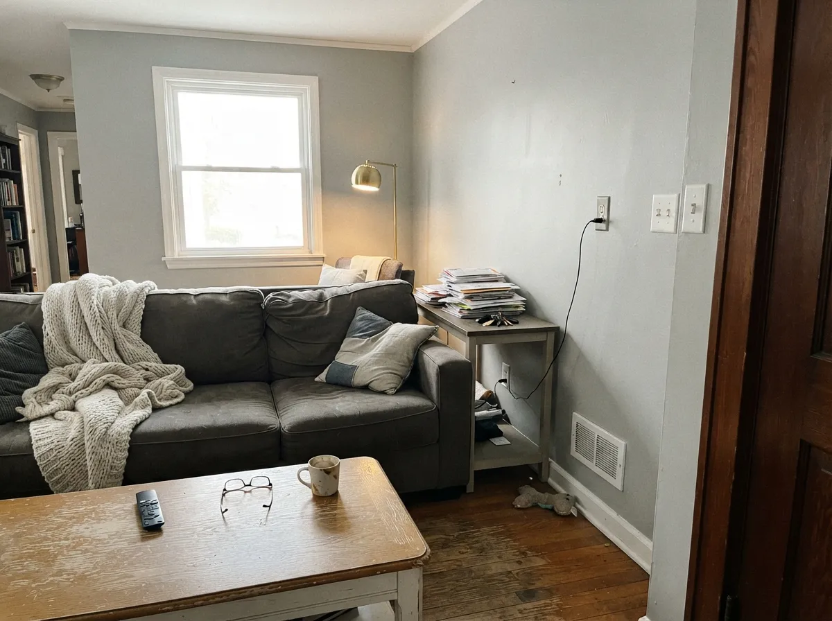
The blue calms into a clean, confident silvery gray. This is the light the official swatch photos are shot in.
Cool, blue-toned daylight pushes Stonington Gray's own blue forward — walls can read distinctly slate-blue and cold. Test a big sample first.
A soft blue tint in morning or evening light, a truer gray at midday. Outdoors this reads as pleasant depth through the day.
2700K bulbs warm it just enough to feel cozy rather than cold. Cool white LEDs push it further blue — swap bulbs before you second-guess the paint.
Both Colors in Real Rooms
Photos from our full reviews — the same rooms and captions, so you can judge each color where it actually lives, not on a chip.
When to Pick Which
Choose Repose Gray if your fixed finishes run warm and you want the walls to sit back quietly. It is the better whole-floor color in a house with real south or west daylight, warm wood floors and brass or black hardware. Pick it if the word you keep using is soft, not gray.
Choose Stonington Gray if you said gray and you meant gray. It is the right answer for exteriors, for coastal and modern-farmhouse houses, and for rooms with white oak, painted trim or cool stone. Pick it if every greige you have sampled looked muddy or beige to you.
No comparison page can see your light. Upload one photo of your room and try both colors on the same walls, seconds apart.
Repose Gray vs Stonington Gray FAQ
Which one is safer in a north-facing room?
Honestly, neither is a safe bet. Repose Gray is the more common regret because lavender surprises people, while Stonington just goes cold and most buyers expect a cool gray to be cool. If the room has one small north window, step out of this matchup entirely and use a warmer greige like Accessible Beige SW 7036 or Edgecomb Gray HC-173, which both hold their warmth in cool light.
Can I use either on kitchen cabinets?
Both work, and both are picky about the counter. Repose Gray cabinets need a warm or cream-veined counter and warm hardware, otherwise the violet shows up along the doors. Stonington Gray cabinets want cool quartz, marble or a gray-veined stone with nickel or chrome. Use satin on cabinets either way.
Which trim white goes with each one?
Repose Gray likes a clean white that is not creamy. Pure White SW 7005 is the standard answer and it keeps the walls from tipping violet. Stonington Gray wants a crisper white still, so Chantilly Lace OC-65 or Decorator's White OC-149. Avoid heavy cream trim with either color.
Is Stonington Gray really better for an exterior?
For most houses, yes. Exterior light is huge and open, and it flattens warm greiges, so Repose Gray on siding can drift lavender on north and east elevations under open sky. Stonington was built to be a gray in that light and stays a gray. It is one of the most-used siding colors in the Benjamin Moore deck for exactly that reason.
What happens to each at night under LED bulbs?
Bulb temperature matters more than people expect. Under warm 2700K lamps Repose Gray settles into soft putty and looks its best, while Stonington softens into a quiet dove gray. Under 4000K daylight bulbs the whole thing reverses: Repose shows violet and Stonington goes hard and cold. If you are committed to either color, buy 2700K bulbs at the same time as the paint.
Ask a Question