Gray Cashmere
Benjamin Moore's blue-green chameleon, reviewed honestly: the light where it turns green, the light where it turns surprisingly blue, and the true grays to pick instead.

Jessica has spec'd whites and neutrals for more than 300 rooms and keeps a sample wall of painted drawdowns in her studio. Every color review is checked against real reader rooms in the comments and re-tested when a formula changes. About the testing process →
- 1Stardew43
- 2Palladian Blue60
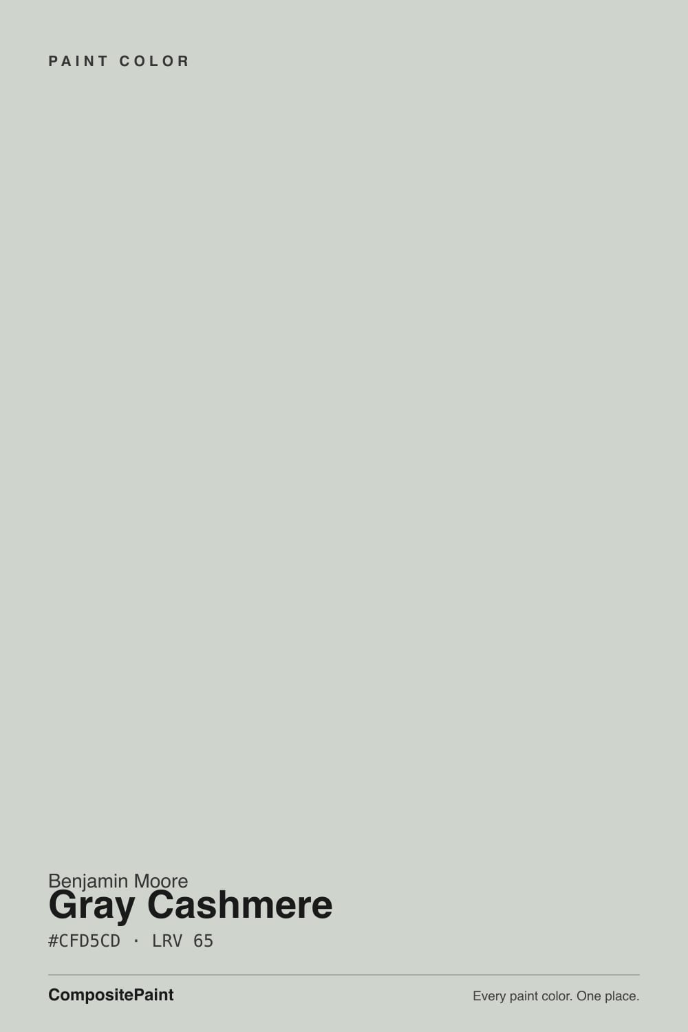
- 3Gray Cashmere65
- 4Glass Slipper70
- 5Spring Thaw83
The Fast Verdict
Gray Cashmere is a blue-green gray that never quite settles on being either. In bright, warm light it leans into a soft, earthy green — genuinely close to Benjamin Moore's own description. In shaded or north-facing light it swings the other way, toward a cool, sometimes distinctly blue-gray, which is exactly what trips up buyers who expected "gray with a hint of green." At LRV 65 it reflects enough light to stay airy in most rooms, and it has become one of the most cross-shopped neutrals in the BM deck — the Benjamin Moore answer whenever someone loves Sherwin-Williams Sea Salt. It has never chased a Color of the Year label; it's a dependable, mood-shifting neutral that rewards a bright room and can genuinely surprise a dim one.
Bright rooms with real daylight · kitchens and vanities wanting more depth than white · anyone who likes Sea Salt but wants Benjamin Moore · south-facing spaces that can show off the green
You want a true, unambiguous gray · your room stays dim or north-facing most of the day · your wood floors run deep honey-orange · you're picking a color for sun-exposed exterior siding
- Genuine chameleon range — reads green, blue-gray, or plain gray depending on light
- LRV 65 keeps it light and livable, not heavy
- A favorite on kitchen cabinets and bathroom vanities
- Flatters both brass and nickel hardware
- A safe cross-brand pick if you love Sea Salt but want Benjamin Moore
- Goes distinctly blue, not just flat, in dim or north-facing rooms
- The color is real — disappointing if you wanted a true gray
- Fights deep honey-orange oak floors
- Not a reliable exterior siding color despite how well it works indoors
What Color Is Gray Cashmere, Really?
A gray with real blue and real green in it, and which one shows up depends entirely on the room. Benjamin Moore's own listing leans gray-green, but the color behaves more like a three-way chameleon: strong south-facing daylight pulls the green forward and the wall reads soft and earthy, while north-facing or overcast light pulls the opposite direction, cooling it toward a distinct blue-gray. It has never carried a Color of the Year title or a single viral moment; its following built the slow way, through design-blog reviews and a steady stream of comparisons to Sherwin-Williams Sea Salt, the color everyone asks about in the same breath.
At LRV 65 it sits in the same light-reflecting range as Sherwin-Williams Sea Salt (LRV 63) and BM's own Gray Owl (LRV 65) — all three stay pale enough to keep a room open without being flat, bright neutrals. Put Gray Cashmere in a shaded room and it can read more like a hint of blue than a hint of green; put it in strong warm sun and the green takes over instead. That swing is exactly why it gets cross-shopped so hard against Sea Salt — and exactly why it has a real pile of "this looked nothing like the chip" stories online, almost always from rooms with limited daylight.
Undertone in one line: gray with blue and green both waiting in the wings — south sun brings the green forward, shade and north light bring the blue forward, and only in the middle does it settle into something close to a plain gray. If your sample reads distinctly baby-blue in a dim room, that is the paint being honest about low light, not a bad batch.
Where It Shines
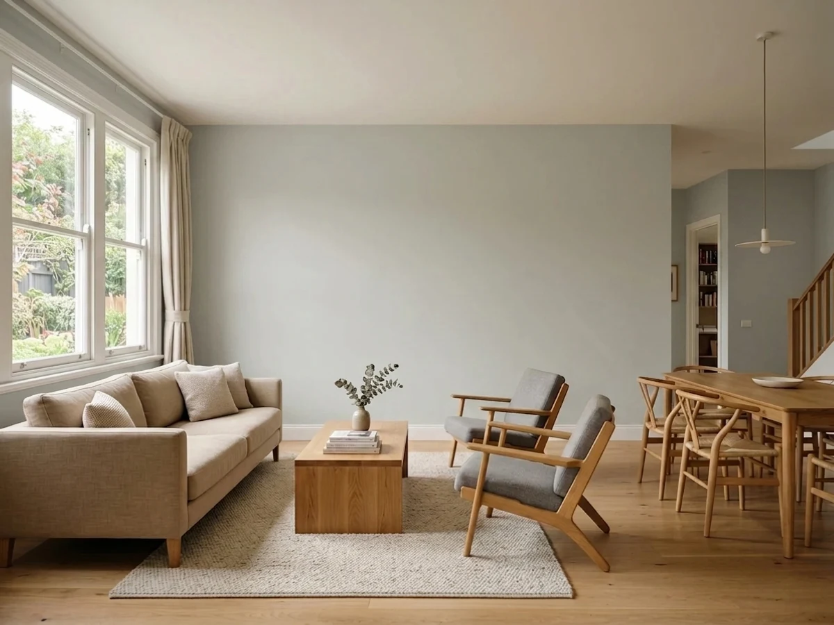
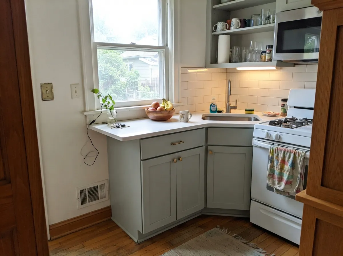
Give it real daylight and it becomes one of BM's most versatile neutrals — genuinely green in the sun, genuinely blue-gray in the shade, and interesting either way. It's an interior color first: cross-shopped constantly against Sherwin-Williams Sea Salt by anyone who wants the same chameleon effect from Benjamin Moore, and it shows up again and again on kitchen cabinets and bathroom vanities, where a shinier sheen and good task lighting keep it looking soft and expensive rather than murky.
Where It Fails
Almost every regret story about Gray Cashmere follows one of three scripts, and all three are predictable before the first coat. None of them are the paint's fault — but if your room matches one, this is not your color, and sampling bigger will only confirm it.
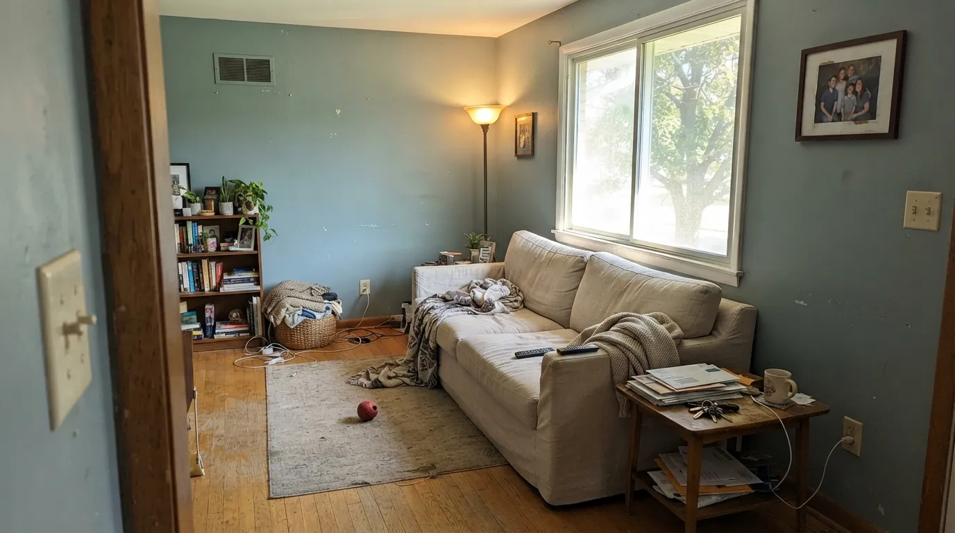
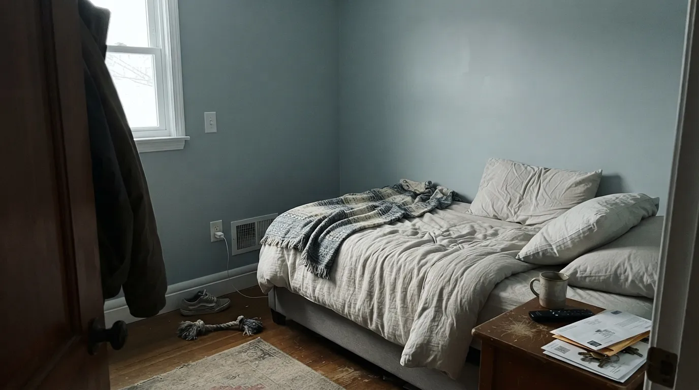
The best-documented Gray Cashmere complaint online is a guest room that read distinctly baby-blue instead of the soft gray-green the owner expected. Low light pulls this color toward blue, not toward a flattering neutral gray. If your room doesn't get real daylight, sample big and expect blue before you commit whole walls.
In good light the green is unmistakable, and in poor light the blue is unmistakable — either way, it never settles into a flat, uncomplicated gray. If the mood board said "just gray," look at Stonington Gray instead: a true gray with none of Gray Cashmere's mood swings.
Orange-leaning oak sits close to green's complement on the color wheel, and the two argue: the floor looks more orange, the walls look more washed-out on their green side. Pale oak, walnut, or gray-washed floors are calmer company; test a big sample over the actual floor before committing a whole room.
Room by Room
In a room with real daylight it's a soft, grounded neutral that reads more interesting than beige without committing to a full sage wall. Eggshell finish, White Dove or Chantilly Lace trim.
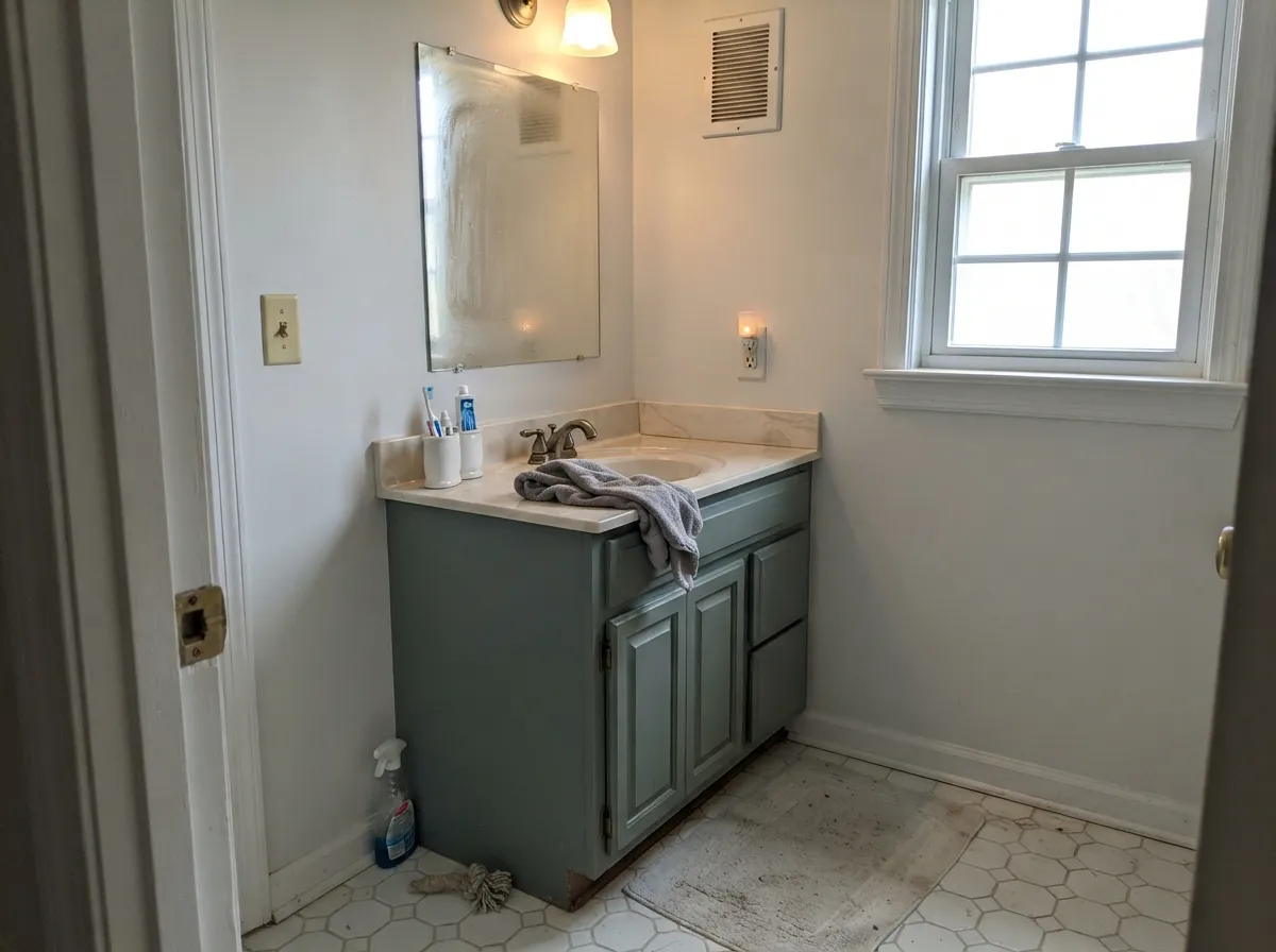
On cabinets under bright light it reads as a sophisticated blue-green-gray that flatters brass and nickel equally, and the satin sheen keeps fingerprints from showing. Pair with white or pale quartz rather than heavily veined cool marble, which can push it colder and bluer.
With a window and warm-toned tile it's genuinely lovely. In a windowless powder room under cool LEDs it can slide toward the blue side and read colder than the chip promised — test under your actual bathroom lighting, not the paint store's.
At night under warm 2700K bulbs it settles into a calm gray-green. Under cool LED bulbs, or with no lamps at all, it can read distinctly blue and less interesting than the chip promised.
This is an interior color first. Full outdoor sun can wash it out toward a pale, minty look rather than the balanced blue-green it shows indoors, and it isn't a widely recommended siding pick. A fully shaded elevation or a covered-porch ceiling is the one exterior spot where it still behaves.
It sits comfortably as a wall color under White Dove or Chantilly Lace trim, and works as a slightly deeper companion to lighter chameleon grays like Gray Owl in an open floor plan.
Your Light Is the Risk
Full sun brings the green forward and the color reads soft, earthy, and alive. This is the light Gray Cashmere was built for.
Cool, flat daylight pulls it toward a distinctly blue-gray — sometimes surprisingly blue, not just duller. This is the light behind most "it looked nothing like the chip" stories.
Genuinely chameleon: cooler and bluer in the morning, warmer and greener by afternoon. Most owners like the movement; some find it hard to pin down.
2700K lamps keep the gray-green calm and warm. Cool LEDs push it toward the blue side — swap the bulbs before you blame the paint.
Most complaints about Gray Cashmere are a light mismatch. Upload a photo of your actual room and see it on your walls — then ask for the same wall in north light or evening lamps before you buy a single sample.
Need It From Another Brand?
Any paint counter can custom-tint Benjamin Moore 2138-60 directly. If you would rather stay in one brand's own deck, these are the closest stock matches, measured as ΔE2000. Under 2 is a difference you will not see on the wall.
| Brand | Closest color | ΔE | LRV | |
|---|---|---|---|---|
| Sherwin-Williams | Pine FrostSW 9656 · Sherwin-Williams | 0.9 | 65 | Color page → |
| Behr | Ground FogBNC-05 · Behr | 1.4 | 66 | Color page → |
| Valspar | Winter in Paris5002-1A · Valspar | 0.6 | 65 | Color page → |
| PPG / Glidden | Wright Cloud WhiteFLLW961 · PPG / Glidden | 3.3 | 65 | Color page → |
| Glidden | Silver Maple50GY 64/057 · Glidden | 0.5 | 64 | Color page → |
| Dutch Boy | White Rapids425-1DB · Dutch Boy | 0.8 | 63 | Color page → |
Similar Benjamin Moore Colors
The nearest shades to Gray Cashmere within Benjamin Moore's own range, ranked by perceptual color distance — useful when you want the same look a touch lighter, darker, or warmer.
WCAG 2.1: AA is 4.5 : 1 for normal text, 3 : 1 for large text, AAA is 7 : 1.
Gray Cashmere vs the Colors You're Also Considering
Every Gray Cashmere sample board has the same rivals on it. The numbers show the real lightness gap — then it comes down to which risk you would rather live with.
Pick this for the Benjamin Moore version of the same idea, with a slightly warmer, more muted read.
Sherwin-Williams SW 6204 · LRV 63Sea SaltPick this if your painter works in Sherwin-Williams — it's the closest thing to a twin, same blue-green chameleon energy, a touch cooler and more overtly blue.
Pick this for the more restrained, more gray-leaning version of the same green-gray family.
Benjamin Moore 1562 · LRV 68Healing AloePick this when you want the green confirmed, not optional — Healing Aloe commits harder to the sage side.
Several other brands land on this color almost exactly. Glidden Silver Maple 50GY 64/057 at #CDD4CC and LRV 64 is 0.52 away, Valspar Winter in Paris 5002-1A at #CED5CE and LRV 65 is 0.58, Dutch Boy White Rapids 425-1DB at LRV 63 is 0.79, and Sherwin-Williams Pine Frost SW 9656 at #D0D5CB and LRV 65 is 0.93. At those deltaE values you are looking at the same color.
Behr Ground Fog BNC-05 at #D0D6D1 and LRV 66 is 1.44 and Diamond Vogel Marble Green 0454 at LRV 65 is 1.67, both visually identical in normal room light. HGTV Home by Sherwin-Williams Filmy Green HGSW 3257 at 2.33 and Dunn-Edwards Particular Mint DE6269 at LRV 59 and 2.67 are very close, but sample first, since Particular Mint is also six points darker.
Rodda Silver CA037 at 3.82 and Farrow and Ball Dimpse No. 277 at #D4D4D2 and LRV 66 at 4.5 are close but visibly different side by side, with Dimpse reading grayer. Benjamin Moore is sold through independent dealers.
Gray Cashmere Coordinating Colors
The easiest partners for Gray Cashmere stay on the cool-to-neutral side and let a little warmth in through trim, not through the wall color itself. It handles a warm white trim, a near-black door, and a deeper true gray in an adjoining room without any of them fighting its blue-green. These are the pairings that keep showing up in real rooms:
Gray Cashmere vs. Sea Salt: Same Chameleon, Two Brands
Ask for "the Benjamin Moore version of Sea Salt" and Gray Cashmere is usually the answer design blogs give. Both are blue-green grays with an LRV in the low-to-mid 60s (65 vs 63), and both are certified chameleons — green in strong sun, blue-gray in shade — which is exactly why anyone who loves one but is locked into the other brand's dealer network goes looking for a twin.
The difference is subtle rather than dramatic. Side by side, Gray Cashmere tends to read slightly warmer and more muted, closer to a soft greige-green, while Sea Salt stays a touch cooler and more overtly blue. Swap either into a bright room with white trim and most people would need the chips in hand to tell them apart. Gray Cashmere has never carried a Color of the Year title or a viral moment — it built its reputation the slow way, through design-blog recommendations and a steady stream of "is this the BM version of Sea Salt?" questions.
Gray Cashmere With Wood Tones and Floors
Cooler, paler woods are the easiest match: white oak, ash, and gray-washed floors let the blue-gray side of Gray Cashmere stay in charge, and the result reads calm and current. Walnut works too — dark enough that the wood, not the wall, sets the room's temperature.
Deep honey-orange oak is the one real caution. Orange sits close to green's complement on the color wheel, so a strongly orange floor pulls the wall's green forward while the wall pulls the floor toward looking dated — neither side wins. If that's the floor you have, a large rug between the two, or a warmer alternative like Edgecomb Gray, will save the room more reliably than hoping the paint compromises.
Three Ready Palettes Built on Gray Cashmere
A color is never alone on the wall. These are complete combinations in the 60-30-10 pattern, with the reason each one holds together. Every one opens in the visualizer.
Gray Cashmere needs a warm white to play off, not a stark one — White Dove keeps the trim soft so the wall's color doesn't look accidental. Wrought Iron supplies the one near-black note the scheme needs without going cold.
Try this palette in your roomA window and real daylight are what make Gray Cashmere shine in a bathroom; White Dove keeps the vanity soft rather than stark, and Kendall Charcoal gives one dark note for hardware and mirror frames without fighting the wall's blue-green.
Try this palette in your roomSimply White keeps the room bright enough for the cabinets' blue-green to read as intentional rather than dingy, and Hale Navy on an island supplies the one deep, confident color the palette needs.
Try this palette in your roomGray Cashmere FAQ
Is Gray Cashmere gray, green, or blue?
All three, depending on the light. In bright, warm daylight it leans into a soft, earthy green — Benjamin Moore's own listing calls it out directly. In shaded or north-facing light it swings the other way, toward a distinct blue-gray that has surprised more than one buyer expecting a hint of green. If you need it to commit to one read, sample it in your actual room, in your actual light, before buying gallons.
What is the Sherwin-Williams equivalent of Gray Cashmere?
Sea Salt (SW 6204) is the color designers reach for as the cross-brand match — nearly identical LRV, same blue-green chameleon behavior. Side by side, Sea Salt tends to read a touch cooler and more overtly blue, while Gray Cashmere reads slightly warmer and more muted.
Does Gray Cashmere work on exteriors?
Not reliably. It's built as an interior color, and full outdoor sun can wash it out toward a pale, minty look instead of the balanced blue-green it shows on interior walls. It isn't a widely recommended siding color; a fully shaded elevation or a covered porch is about as far as it should go outside.
What trim color goes with Gray Cashmere?
A warm white like White Dove keeps the pairing soft; Chantilly Lace gives more contrast if you want the walls to read crisper by comparison. Avoid a stark builder white, which can make the wall's undertone look like a mistake rather than a choice.
Does it work with honey oak floors?
Only carefully. Deep orange-leaning oak sits close to green's complement on the color wheel, so the two amplify each other in the wrong way — the floor looks more orange, the wall looks more washed-out. Pale oak, walnut, or gray-washed floors are much easier company.
Why did my Gray Cashmere room turn out blue instead of green?
Low light. The color's whole character depends on daylight: strong warm sun pulls the green forward, but a dim or north-facing room pulls the opposite direction and can read distinctly baby-blue — a documented complaint from owners who expected "gray with a hint of green" and got something cooler. It's not a bad can of paint; it's the room's light. Sample big before committing a low-light space.
Have you painted with Gray Cashmere?
Rate it — one tap helps the next reader decide.
Ask a Question