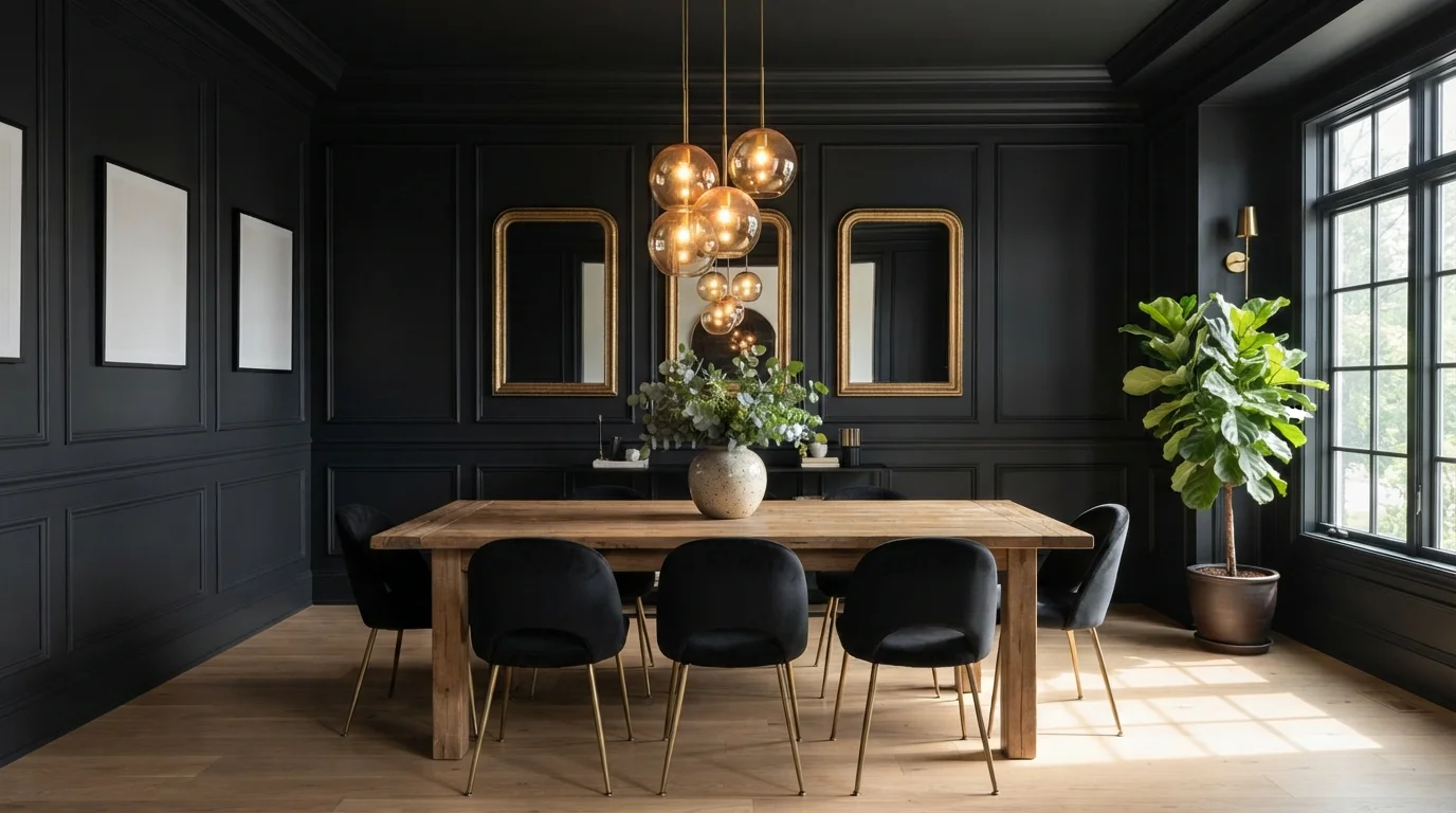
Room Colors · Purple Dining Room
8 Best Purple Dining Room Paint Colors for 2026
ideas, combinations, and real rooms
8 curated picks from real purple dining rooms — with the exact colors, honest reasons why, and the combinations that hold the room together.

Former interior stylist who can spot a green undertone from across a room. Jessica writes the color and mood pieces — what to choose, what pairs, and why your "white" looks pink.
The Fast Answer
Don't want to read 8 picks? These four are the safe answers.

Top Picks for the Purple Dining Room
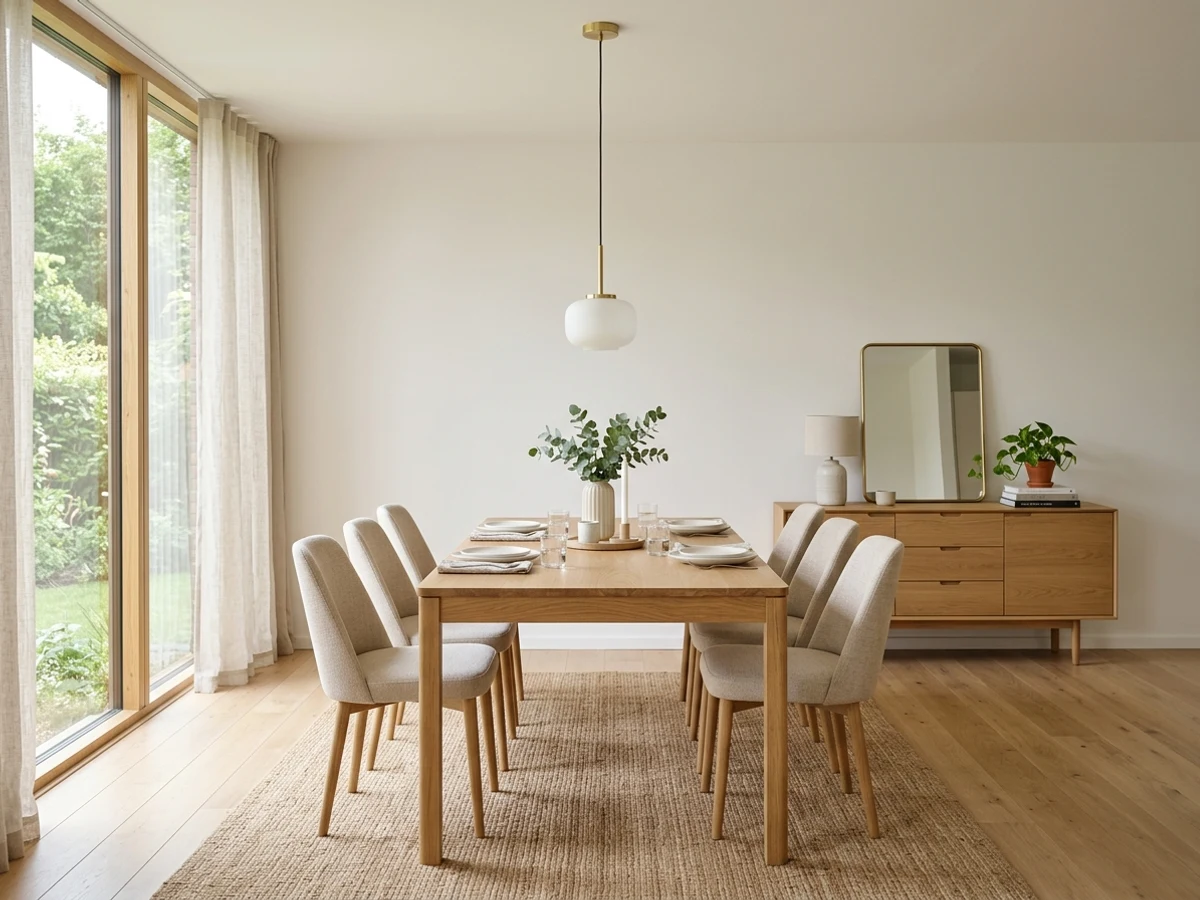
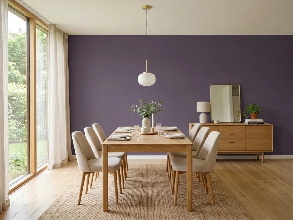
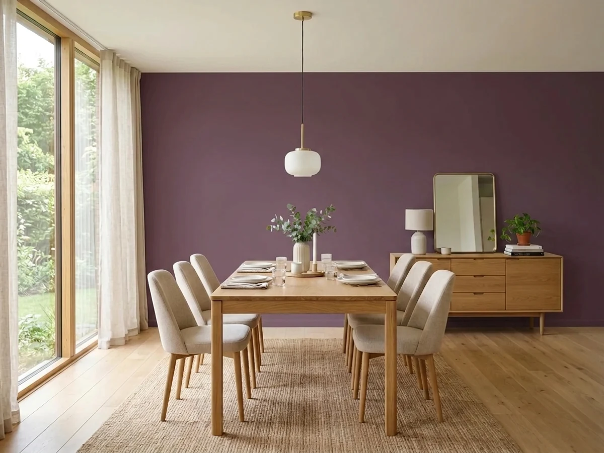
Tap a shade to see the purple dining room in it, then try it on your own room.
Purple Dining Room Color Trends 2026 — What's In, What's Out


- Pastel Lavender Walls — Soft, powdery lavender that reads more nursery than dining room is losing ground to deeper, richer purples with real pigment.
- Purple Paired With Silver Accents — Cool lavender walls matched with silver chargers and chrome fixtures feels dated next to 2026's warmer brass and wood pairings.
- All-Over Pale Purple Sheen — Shiny, high-sheen pale purple walls read glossy and formal in a way 2026's matte, moody dining rooms have moved past.
The 8 Best Purple Dining Room Paint Colors
Every pick below is a real rendered purple dining room, not a chip. The lead color first; the swatches are the full scheme in the photo — walls, furniture, textiles, accent.

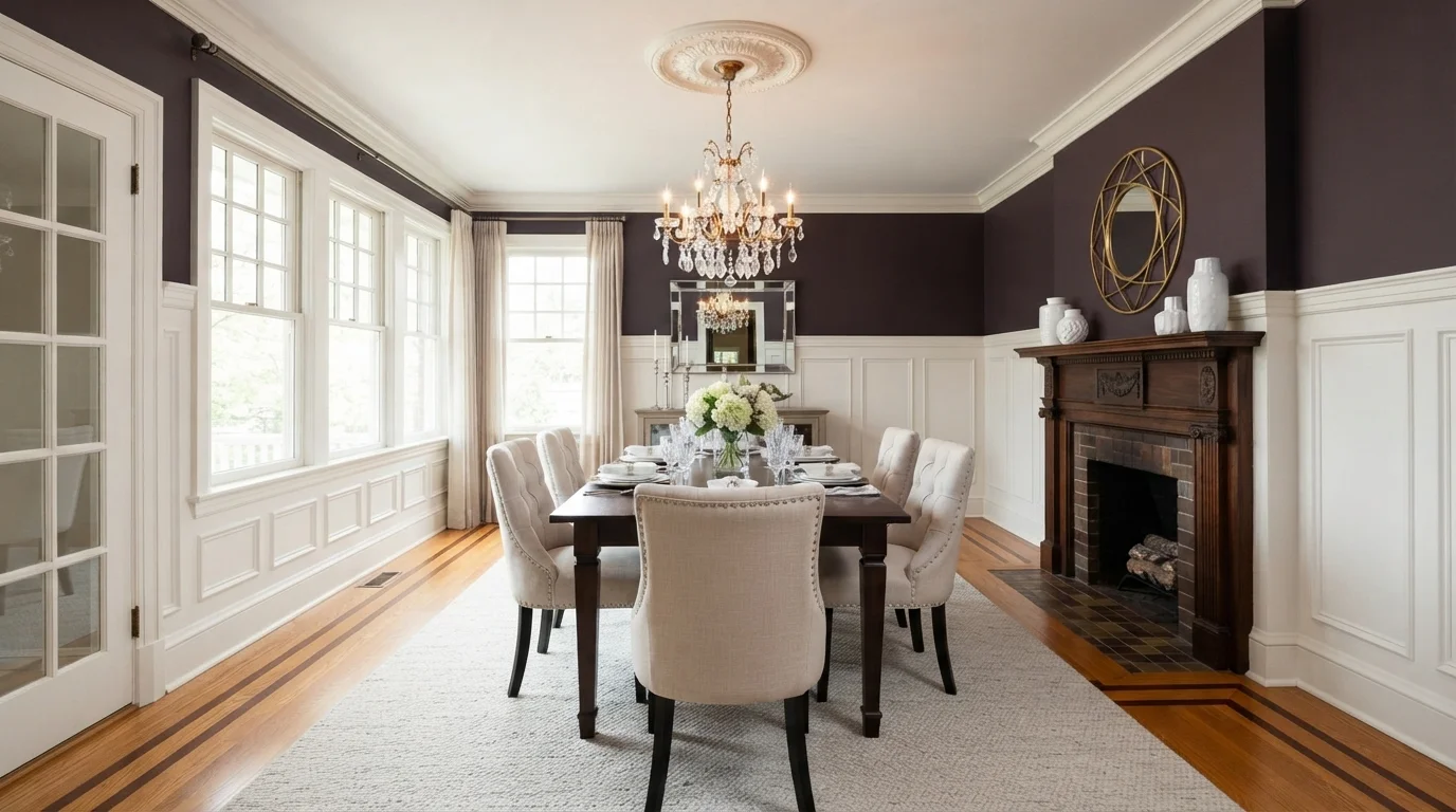
Rich deep plum walls paired with bright white wainscoting create a stately and intimate dining space.
Aubergine is a deep, velvety wine-purple. Here, rich plum coats the upper walls while crisp white covers the extensive wainscoting and window trim. A dark wood dining table sits on a soft cream rug, surrounded by tufted linen chairs under a sparkling crystal chandelier. The room feels regal, intimate, and effortlessly refined. The combination works because the bright white millwork keeps the dark walls from feeling heavy or enclosed. It is perfect for anyone wanting a bold, formal dining room full of classic charm.
SEE VELVET CLOAK ON YOUR WALLS →
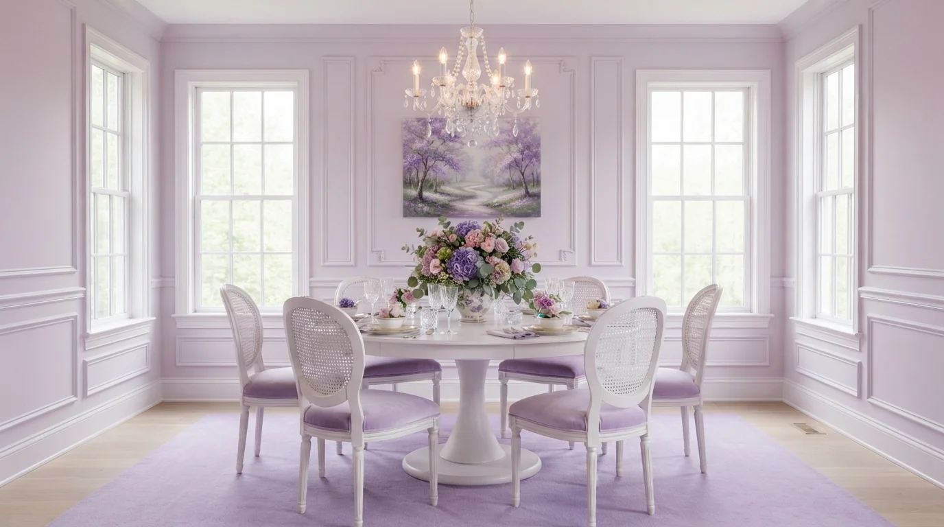
Bathed in bright daylight, this dining space pairs dreamy lilac walls with romantic floral arrangements and painted French furniture.
Lilac is a soft, powdery pastel purple that feels calm and romantic. In this space, gentle lilac washes over the upper walls and plush area rug, while crisp white wainscoting, a pedestal table, and cane-back chairs with lilac velvet cushions keep the room grounded. The space feels dreamy, airy, and gracefully refined. The setup works because using fresh white furniture balances out the all-over purple tones, keeping the monochrome look bright. It is ideal for anyone wanting a sweet, whimsical spin on classic French style.
SEE PLUM CAKE ON YOUR WALLS →
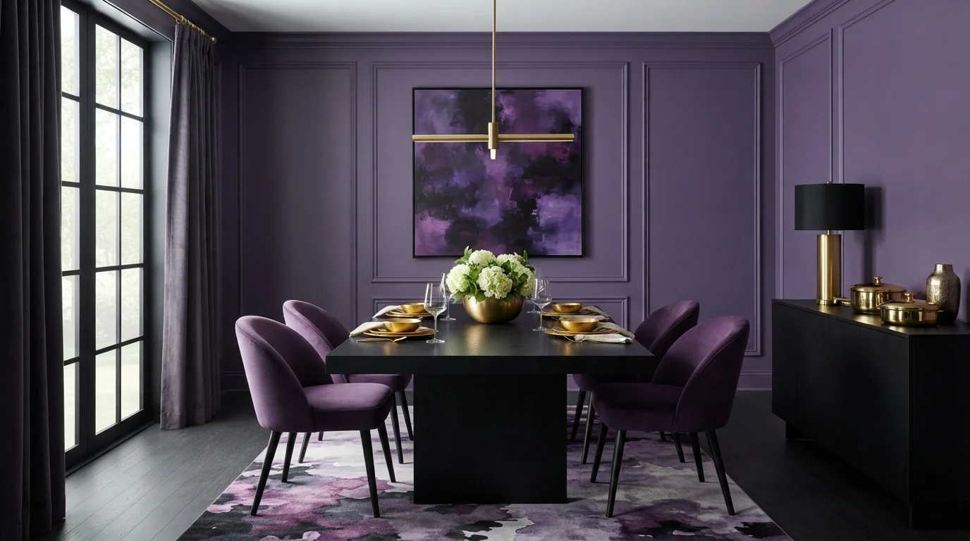
Deep violet walls and plush velvet seating create an intensely luxurious setting warmed by glowing brass details.
Royal purple is a rich, jewel-toned violet that immediately commands attention. In this space, the deep purple covers the paneled walls, matching the plush velvet dining chairs and the swirling watercolor rug underfoot. A solid black dining table and matching credenza ground the intense color, while gleaming brass accents add a touch of sparkle. The room feels dramatic, opulent, and wonderfully intimate for evening meals. Saturated jewel tones naturally pop against dark neutrals and warm metals. It is made for anyone who loves theatrical, unapologetic glamour.
SEE MYSTICAL GRAPE ON YOUR WALLS →
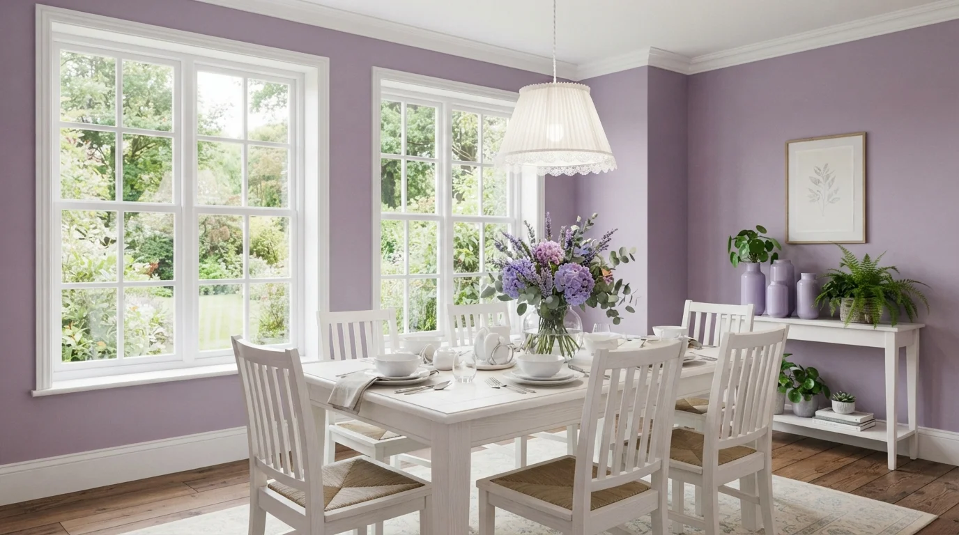
Gentle lilac walls meet crisp white woodwork and garden sunlight for an enchanting, airy cottage dining nook.
Lilac is a sweet, powdery purple with soft floral warmth. In this room, dusty purple coats the walls, creating a lovely backdrop for the crisp white dining table, matching chairs, and window frames. The space feels bright, romantic, and effortlessly peaceful. The combination works because clean white woodwork keeps the pastel walls fresh and prevents the color from feeling too heavy. It is a wonderful look for anyone wanting a cheerful, vintage-inspired dining space.
SEE NAPLES SUNSET ON YOUR WALLS →
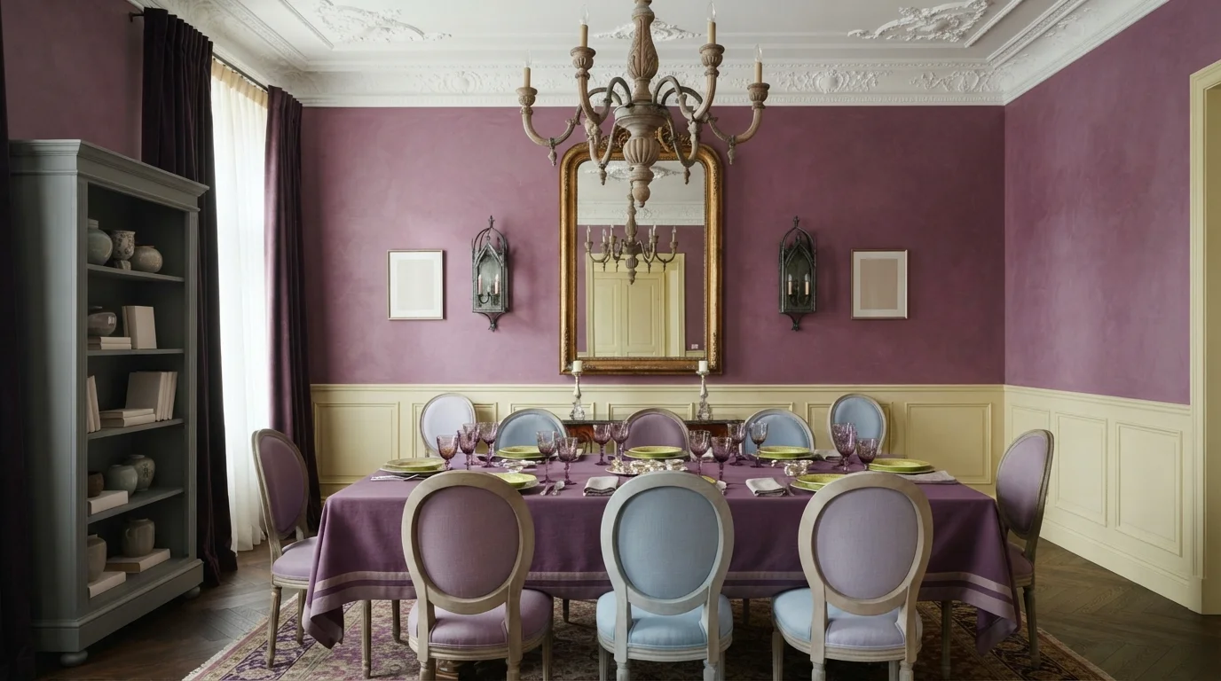
Rich purple walls paired with soft cream wainscoting and layered vintage accents create an eclectic, theatrical dining atmosphere.
Plum is a rich, expressive purple with deep warmth. In this room, the color covers the upper walls with a soft brushed texture, balanced by creamy wainscoting and a muted grey built-in cabinet. The dining area feels dramatic, creative, and snug. It works because the light, creamy trim keeps the saturated walls from overwhelming the space. If you adore vintage charm and bold, theatrical color, this look is made for you.
SEE IT ON YOUR WALLS →
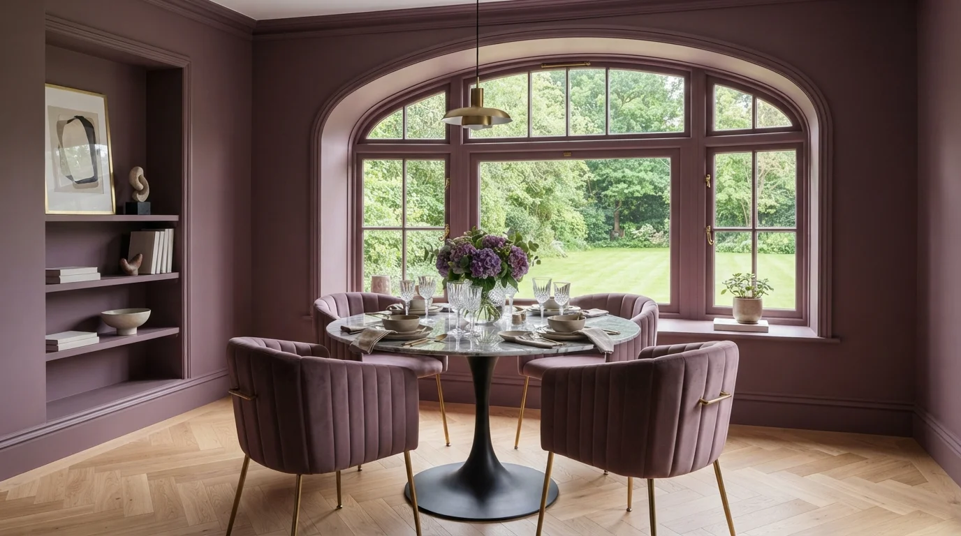
Rich plum walls envelop plush velvet seating and cool marble for an intimate, luxurious dining experience.
Plum is a rich, dusty purple with a cozy and regal feel. Here, the walls and detailed window trim are fully covered in muted plum, paired with ribbed velvet dining chairs and a grey marble pedestal table. The room feels deeply intimate, dramatic, and luxurious. Drenching every surface in one bold shade creates seamless depth while making the lush green views outside truly pop. It is perfect for anyone who loves moody glamour and wants dinner parties to feel like an exclusive evening out.
SEE EXOTIC ORCHID ON YOUR WALLS →
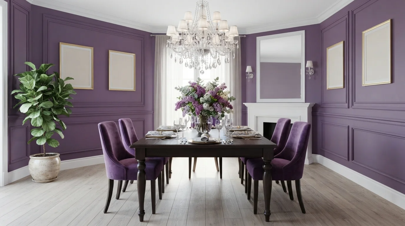
Rich purple walls and plush velvet chairs create a bold, theatrical dining experience bursting with regal personality.
Royal purple is a deep, saturated violet with tons of energy. In this room, vivid purple covers the ornate paneled walls and extends right into the plush velvet dining chairs, balanced by crisp white ceiling trim and a dark wood dining table. The space feels dramatic, luxurious, and unapologetically bold. The look works because grounding the room with a pale floor and dark wood table keeps the saturated walls from overwhelming your senses. It is perfect for anyone who loves dramatic, jewel-toned sophistication.
SEE SONIC PLUM ON YOUR WALLS →
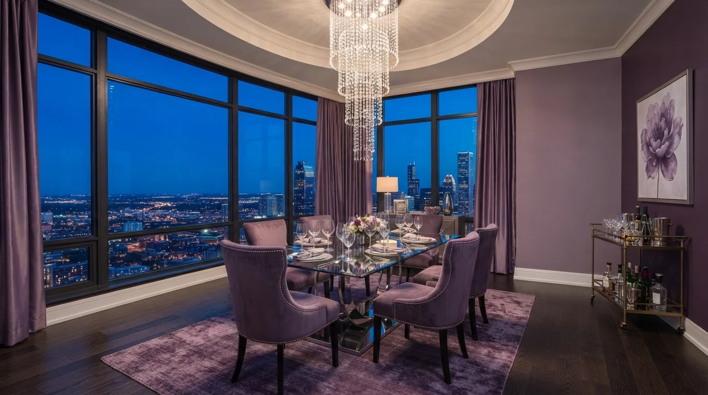
Rich purple velvet and glittering crystal glow against moody twilight city views for an unforgettable evening dining experience.
Orchid is a dusty, medium-tone purple with a soft and elegant vibe. In this space, muted purple walls wrap around vibrant plum velvet chairs, a lush violet area rug, and heavy jewel-toned curtains. The room feels incredibly dramatic, sultry, and made for late-night entertaining. Layering different shades of the same purple tone across soft velvet, sleek glass, and shimmering crystal keeps everything cohesive without falling flat. It is the ultimate design for anyone who loves unapologetic glamour and lavish dinner parties high above the city.
SEE FELICIA ON YOUR WALLS →Purple Dining Room Wall Color Combinations
A wall color never works alone. These are the full schemes from the rooms above — the lead color first, then the supporting colors that make the photo work.
Rich deep plum walls paired with bright white wainscoting create a stately and intimate dining space.
TRY THIS PALETTE →Bathed in bright daylight, this dining space pairs dreamy lilac walls with romantic floral arrangements and painted French furniture.
TRY THIS PALETTE →Deep violet walls and plush velvet seating create an intensely luxurious setting warmed by glowing brass details.
TRY THIS PALETTE →Gentle lilac walls meet crisp white woodwork and garden sunlight for an enchanting, airy cottage dining nook.
TRY THIS PALETTE →French Lilac is the easy pairing: it reads as a warm gray more than a purple, so it sits comfortably next to a standard white trim without either one fighting for attention, and it lets a wood table with brass or warm-metal hardware stay the visual center of the room. For the dark end of the palette — Mystical Grape, Eggplant, Mature Grape, Pelt, Plumage, and Nocturne Shade — the trim decision matters more than usual. A crisp bright white trim gives the room a tailored, classic edge and keeps moldings visible at night; painting trim and walls the same dark purple in a semi-gloss finish instead gives up that contrast on purpose, wrapping the whole room in one color for the cocoon effect designers call color drenching, which is a common move with deep dining room colors.
Avoid pure stark white trim with any of the darkest picks — Pelt, Mature Grape, and Nocturne Shade especially — since a bright cool white next to LRV 7 can look chalky and harsh rather than crisp; an off-white or warm white trim reads better against them. All of these dark purples pair naturally with a wood dining table, since Nocturne Shade's warm, velvety cast was picked specifically to sit well against wood tones, and the same logic carries to Eggplant and Mature Grape over a walnut or oak table.
More Dining Room Color Ideas
Set on a color family already? Each page has its own real rooms and picks.
Light or Dark Purple Dining Room Colors?
Go Light (LRV 60+) If…
The room is small, faces north, or has to work at every hour. Light warm colors make it feel bigger and stay calm in evening light — the light you actually live in.
Go Dark (LRV Under 20) If…
You want the cocoon effect and the room has real daylight. Dark works best on one feature wall — or fully color-drenched in a large room with good windows.
French Lilac is the pick for a dining room that gets real daylight, or one that pulls double duty as a home office or kids' homework spot outside of dinner hours — at LRV 56 it stays soft and won't feel like a cave at 2pm. Everything else on this list sits at LRV 12 or below, which means walls, not just an accent, that genuinely absorb light rather than reflect it. That's a deliberate choice for a room used mostly at night, but it backfires in a dining room with one small window and no statement light fixture — designers warn that a deep, cool purple used carelessly can make a windowless or north-facing dining room feel boxed in and dreary rather than dramatic.
If your dining room only has a single overhead bulb, test the color first, because Mystical Grape, Pelt, Eggplant, Mature Grape, and Nocturne Shade all want a real light source to work with — a chandelier, pendant, or a run of dimmable sconces — so the color has candlelight to catch instead of just going flat and murky. Rooms with big windows or a lot of glass in the china cabinet handle the dark end easily; small, enclosed dining rooms with one lamp do better with French Lilac or a lighter neighbor a step or two up the same strip.
See It. Love It.
Paint It.
Upload one photo of your purple dining room and try every color on this page on your own walls — in your own light, before you buy a drop of paint.

PlumageBeforeSheen And Finish For A Purple Dining Room
Walls in eggshell or satin are the standard call for a dining room in any of these colors — enough sheen to wipe down spilled wine or sauce splatters near the table, without going glossy enough to show every roller mark. That matters more with the dark picks than the light one: Mystical Grape, Pelt, Eggplant, Mature Grape, and Nocturne Shade all sit at LRV 12 or below, and dark, saturated paint shows surface texture, patchy rolling, and drywall imperfections far more readily than a pale color like French Lilac does.
For trim, semi-gloss or gloss is the right call whether you're going crisp white or the monochromatic same-color-as-the-walls route. If you're color-drenching the trim in Mystical Grape or Pelt to match the walls, bump the sheen up on the trim specifically — it's what separates the moldings from the flat wall visually even when the color is identical, and it holds up to the wear a dining room's chair rails and door frames take.
Getting The Lighting Right
Every dark pick on this list — Mystical Grape, Eggplant, Mature Grape, Pelt, Plumage, Nocturne Shade — was chosen with warm, low evening light in mind, not overhead fluorescent or cool LED daylight bulbs. A dimmable chandelier or a few warm-white sconces at 2700K is what makes these colors look rich instead of flat and gray; cool white bulbs pull the warmth out of a deep purple and can make it read muddy.
If your dining room gets strong daylight and you still want a purple that reads true during the day, French Lilac at LRV 56 is the safer bet — it doesn't rely on evening light to look good, so it works for a dining room that also functions as a daytime workspace or a breakfast spot before it becomes the dinner table.
The Mistake To Avoid
The biggest misstep with a dark dining room purple is picking it off a small paint chip and being surprised by how saturated it looks across four full walls — a color that reads as a muted, elegant plum on a 2-inch swatch can turn bold and heavy at full wall size. Buy a sample pot of whichever pick you're considering — Mystical Grape, Pelt, Eggplant, or Mature Grape — and brush it on a 2-foot-square poster board so you can move it around the room and see it under your actual evening lighting before committing to gallons.
The other common mistake is going dark in a dining room with only one small window and a single overhead bulb, then wondering why the room feels closed-in rather than cozy. If that's your room, either add a real light source before you paint, or step down to French Lilac, which doesn't need dramatic lighting to carry the room.
About Purple Dining Room Paint Colors
A dining room is the one room in the house that mostly gets used after dark, over candles, wine, and a table full of people who are staying a while. That's exactly why purple works here in a way it doesn't in a living room or a hallway: the color reads richest under warm, low light, which is when most people actually see this room. Deep picks like Benjamin Moore Mystical Grape (2071-30, LRV 12) and Farrow & Ball Pelt (No. 254, LRV 7) both lean into that — they're built for chandelier and candlelight, not noon sun through the window.
Not every dining room can go that dark, though, and that's where a color like Benjamin Moore French Lilac (1403, LRV 56) earns its spot on this list. At an LRV of 56 it's a genuinely light color — closer to a soft gray-lavender than a true purple — so it works in dining rooms that double as breakfast nooks or get used during the day, where a wall this pale can bounce daylight around instead of eating it.
Between those two ends sit the classic, more saturated purples: Benjamin Moore Eggplant (1379, LRV 11), Sherwin-Williams Mature Grape (SW 6286, LRV 7), and Behr Nocturne Shade, plus Plumage as a softer, less red alternative to a straight oxblood. All of these are mix-on-demand at any paint store carrying that brand — you're not locked into buying from us or waiting on a special order, you can walk in and get a gallon tinted this weekend.
The Questions Everyone Asks
What color should I paint my purple dining room?
If you want one answer, start with the safe picks above — Mystical Grape, Velvet Cloak, Plum Cake, Naples Sunset. They read well in any light and survive furniture changes. Then check the light: strong afternoon sun wants a step cooler, a north-facing room wants a step warmer.
is purple a good color for a dining room?
Yes, and it's one of the better rooms in the house for it, since dining rooms get used mostly at night under warm light, which is when deep purples like Benjamin Moore Mystical Grape and Farrow & Ball Pelt look their richest. The color falls flat in a dining room that only gets used for daytime meals with no real light fixture — for that, a lighter pick like French Lilac works better.
should i paint my dining room a light or dark purple?
Go dark — Mystical Grape (LRV 12), Eggplant (LRV 11), or Mature Grape (LRV 7) — if the room has a chandelier or dimmable lighting and gets used mainly for dinner. Go light with French Lilac (LRV 56) if the room doubles as a daytime space, has only one small window, or you want purple without the drama of a fully saturated wall.
what trim color goes with a purple dining room?
With lighter purples like French Lilac, standard white trim works fine. With the dark picks — Pelt, Mature Grape, Eggplant, Nocturne Shade — an off-white or warm white trim looks better than a stark bright white, which can read chalky next to a deep, low-LRV purple. Painting trim the same dark color in semi-gloss, called color drenching, is the other common route and gives the room a cocoon-like, fully committed look.
what colors pair with purple in a dining room?
Warm wood tones, brass and gold hardware, and off-white or bone-colored trim all pair naturally with these picks — Nocturne Shade in particular was chosen for how it sits against a wood table. Beyond the trim and furniture, purple dining rooms often layer in dusty ochre, moss green, or smoky blue through linens and artwork rather than a second wall color.
will a dark purple dining room feel too small or dark?
It can, if the room has weak lighting to begin with — a deep, cool purple used without a real light source makes a small or windowless dining room feel boxed in rather than cozy. With a chandelier or warm sconces, colors like Mystical Grape and Eggplant read as intimate, not cramped. If you're not confident about the lighting, French Lilac at LRV 56 avoids the risk entirely.
What two-color combination works best in a purple dining room?
The reliable pattern is a quiet main color plus one deep accent on a single wall. Keep trim and ceiling in one warm white so the two colors are the only event in the room — the combination cards above show complete schemes from real rooms.
What colors make a purple dining room look bigger?
High-LRV, slightly warm colors — LRV 60–75 is the sweet spot. Paint the walls and trim close to the same light color so the corners blur, and keep the ceiling white. Stark cool white actually works against you; it creates hard shadows that show the room's edges.

Ask a Question