Room Colors · Red Dining Room
8 Best Red Dining Room Paint Colors for 2026
ideas, combinations, and real rooms
8 curated picks from real red dining rooms — with the exact colors, honest reasons why, and the combinations that hold the room together.

Former interior stylist who can spot a green undertone from across a room. Jessica writes the color and mood pieces — what to choose, what pairs, and why your "white" looks pink.
The Fast Answer
Don't want to read 8 picks? These four are the safe answers.

Top Picks for the Red Dining Room
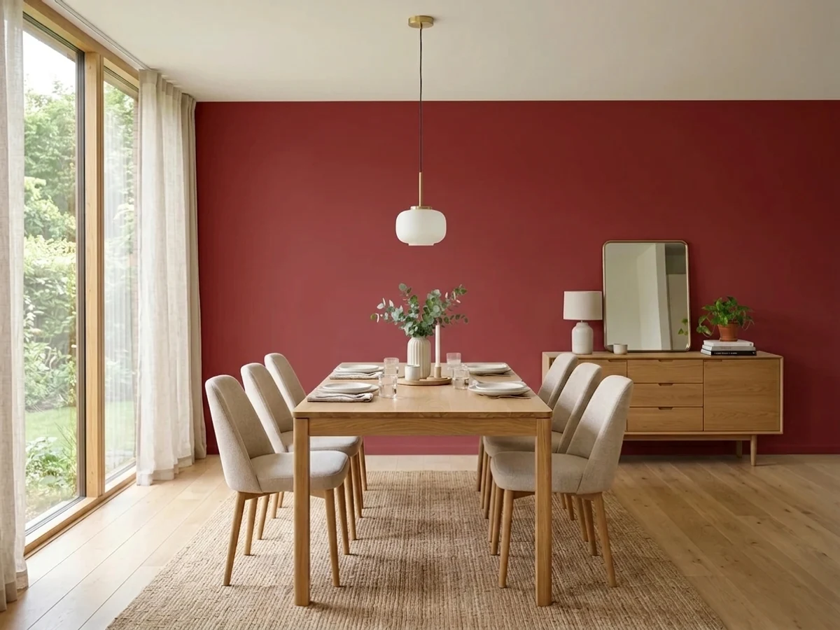
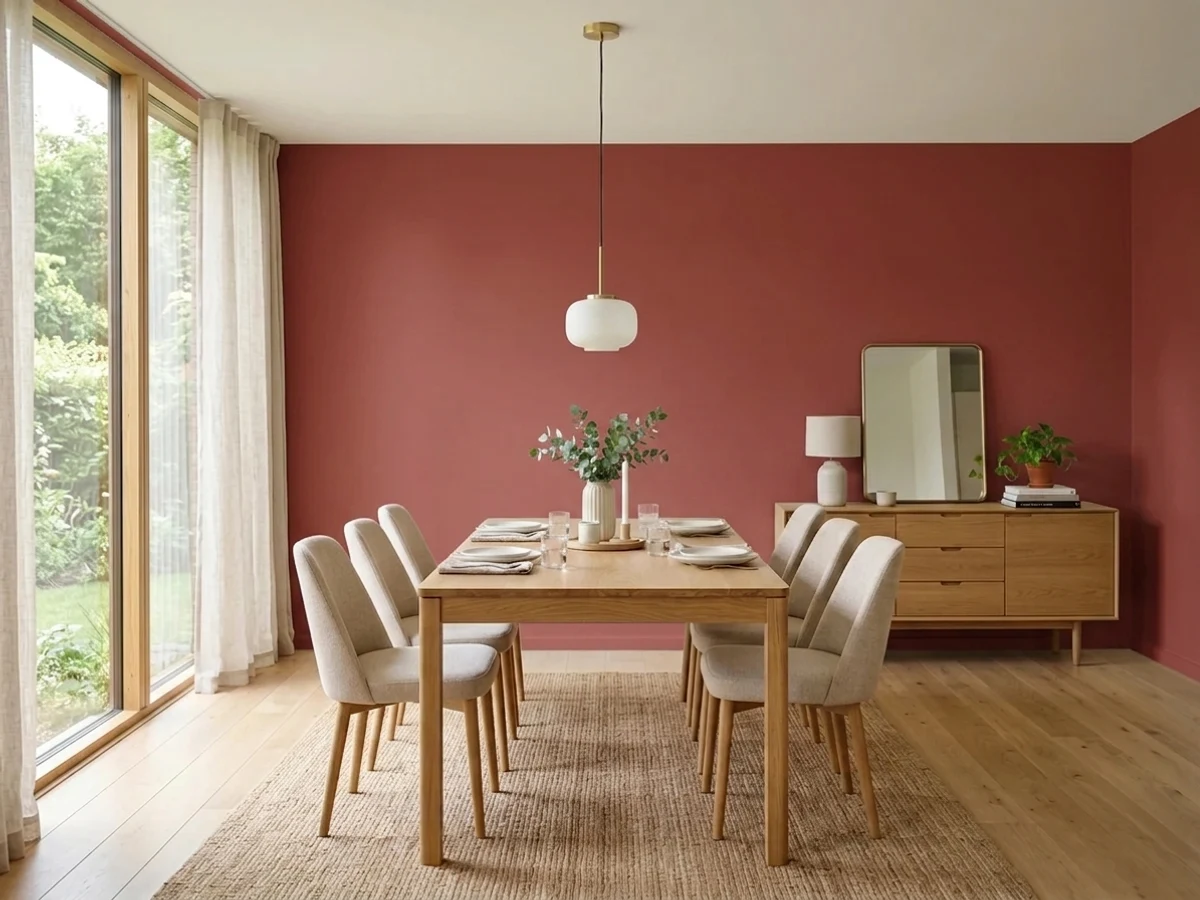
Tap a shade to see the red dining room in it, then try it on your own room.
Red Dining Room Color Trends 2026 — What's In, What's Out


- Fire-Engine Bright Red — Pure, primary fire-engine red feels like a decorating cliche in 2026; dining rooms now lean toward deeper, browned-down reds instead.
- All-Red Everything — Painting walls, trim, and ceiling all in the same bright red with no breathing room reads dated next to layered neutrals and wood tones.
- Red Paired With Cool Gray — Red walls set against cool, blue-based gray furniture and trim clash with 2026's warmer, more cohesive color pairings.
The 8 Best Red Dining Room Paint Colors
Every pick below is a real rendered red dining room, not a chip. The lead color first; the swatches are the full scheme in the photo — walls, furniture, textiles, accent.

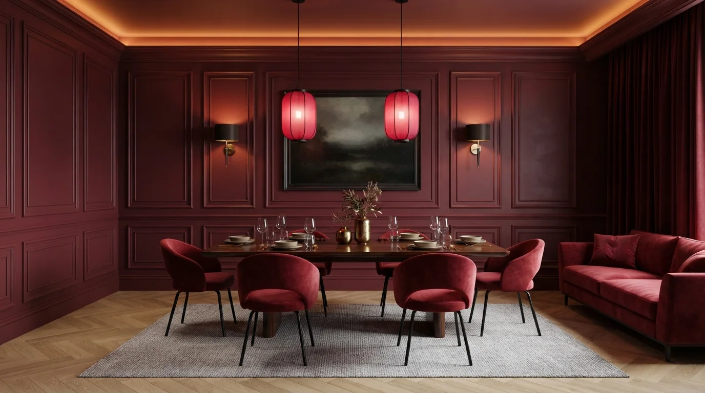
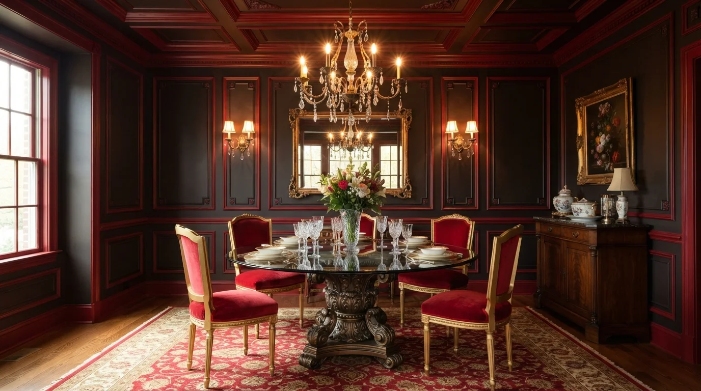
Immerse yourself in rich wine tones, glowing ambient lighting, and plush velvet seating for an unforgettable dinner setting.
Deep crimson is a rich, velvety wine red. In this room, the bold red covers the paneled walls, crown moldings, and plush velvet chairs, balanced by a dark wood dining table and a soft light-gray rug. The space feels intimate, dramatic, and wrapped in luxury. Sticking to one enveloping color lets the warm glowing lanterns and sconces pop without creating visual clutter. It is ideal for anyone who loves romantic, after-dark dinner spaces made for entertaining.
SEE RED BRICK ON YOUR WALLS →
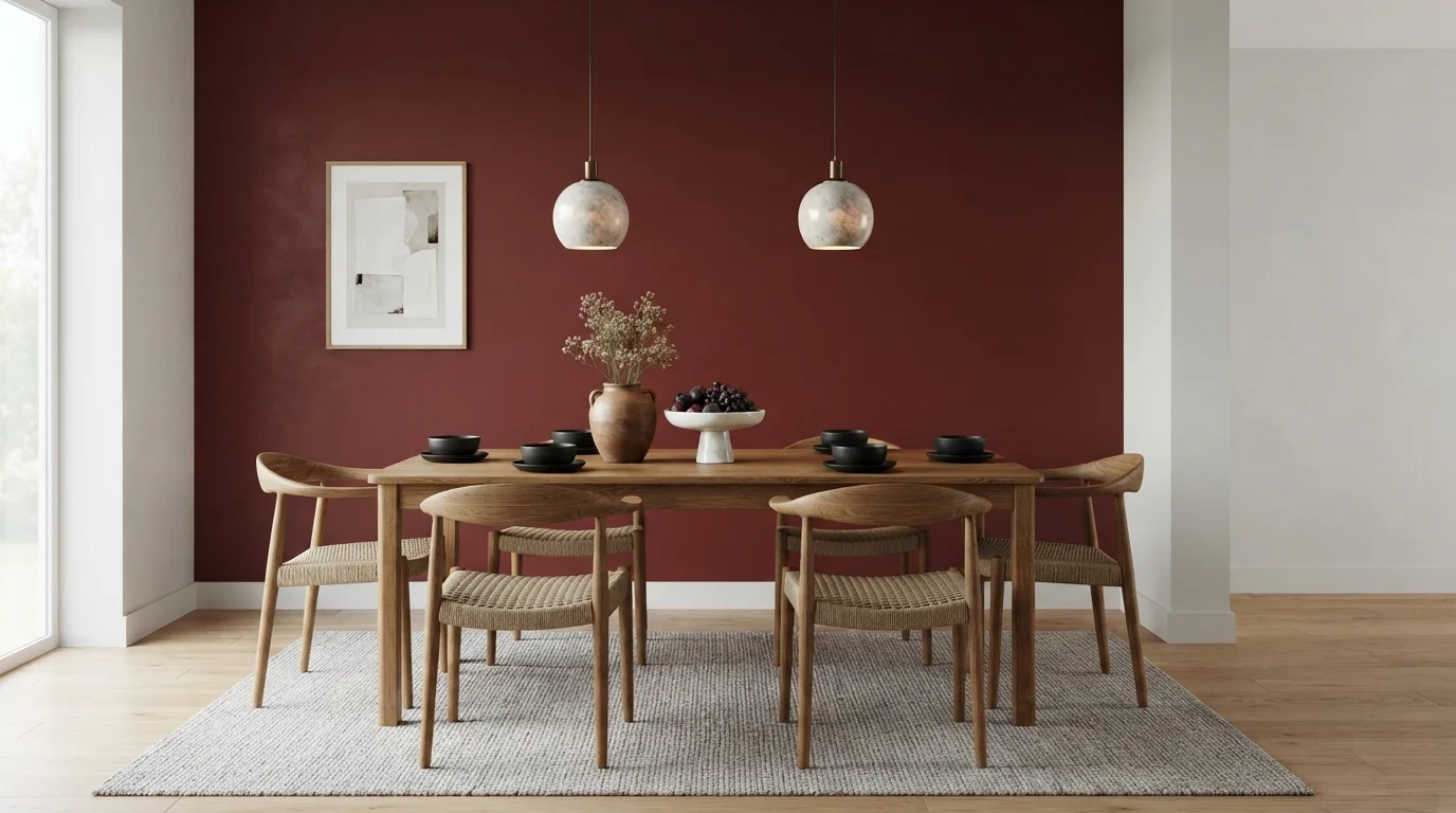
Deep wine walls pair with warm oak and woven seats to create a deeply intimate, candlelit dinner mood.
Burgundy is a rich, velvety wine red that brings instant drama. In this space, the deep red accent wall makes a stunning backdrop for a natural oak dining table, woven cord chairs, and a soft neutral rug. The room feels incredibly cozy and grounded without feeling overly formal. The combo works because warm, organic woods and earthy pottery balance the boldness of the dark wall. It is ideal for anyone who wants a sophisticated, welcoming dining area built for lingering dinner parties.
SEE SPANISH TILE ON YOUR WALLS →
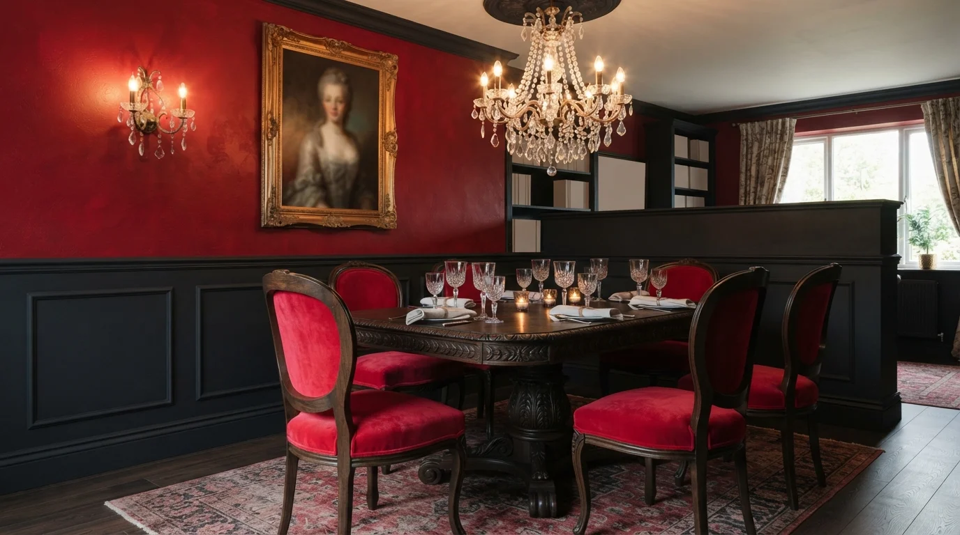
Rich crimson walls and glowing crystal candlelight create an intensely romantic, opulent space made for lingering late dinners.
Ruby red is a deep, passionate crimson that instantly commands attention. In this space, dramatic textured red upper walls pair with charcoal black wainscoting, mirrored by plush red velvet chairs around a dark pedestal table. The room feels intensely dramatic, cozy, and lavishly romantic. This combo works because the dark black paneling anchors the vibrant red, letting the warm candlelight bounce off the rich textures. It is perfect for anyone wanting an unforgettable dining space full of vintage luxury.
SEE HERITAGE RED ON YOUR WALLS →
Saturated red paneled walls meet glowing candlelight and ornate gold finishes for a fiercely dramatic dinner setting.
Crimson is a deep, fiery red full of passion and luxury. In this space, the paneled walls, ceiling trim, plush carpet, and velvet dining chairs are completely drenched in bold red. The entire room feels dramatic, intimate, and undeniably grand. The monochrome look works because the ornate gold frames, warm glowing sconces, and gleaming glass reflect light across the saturated surfaces. It is the perfect choice for anyone who loves vintage opulence and high-impact dinner parties.
SEE LICORICE STICK ON YOUR WALLS →
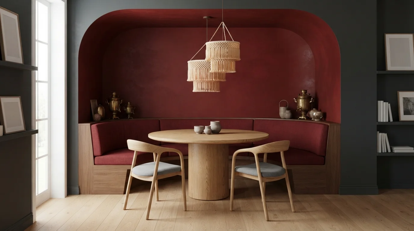
Rich crimson walls and woven cream chandeliers wrap this cozy dining alcove in dramatic, intimate warmth.
Crimson is a deep, luxurious ruby red with rich earthy warmth. In this dining nook, saturated red coats the arched walls and curved ceiling, framing a round oak table and tailored grey chairs. The room feels dramatic, intimate, and wonderfully snug. The combination works because natural light wood and cream woven textures soften the intense wall color so it never feels heavy. This look is perfect for anyone who loves bold, moody spaces packed with cozy bohemian personality.
SEE CALIENTE ON YOUR WALLS →
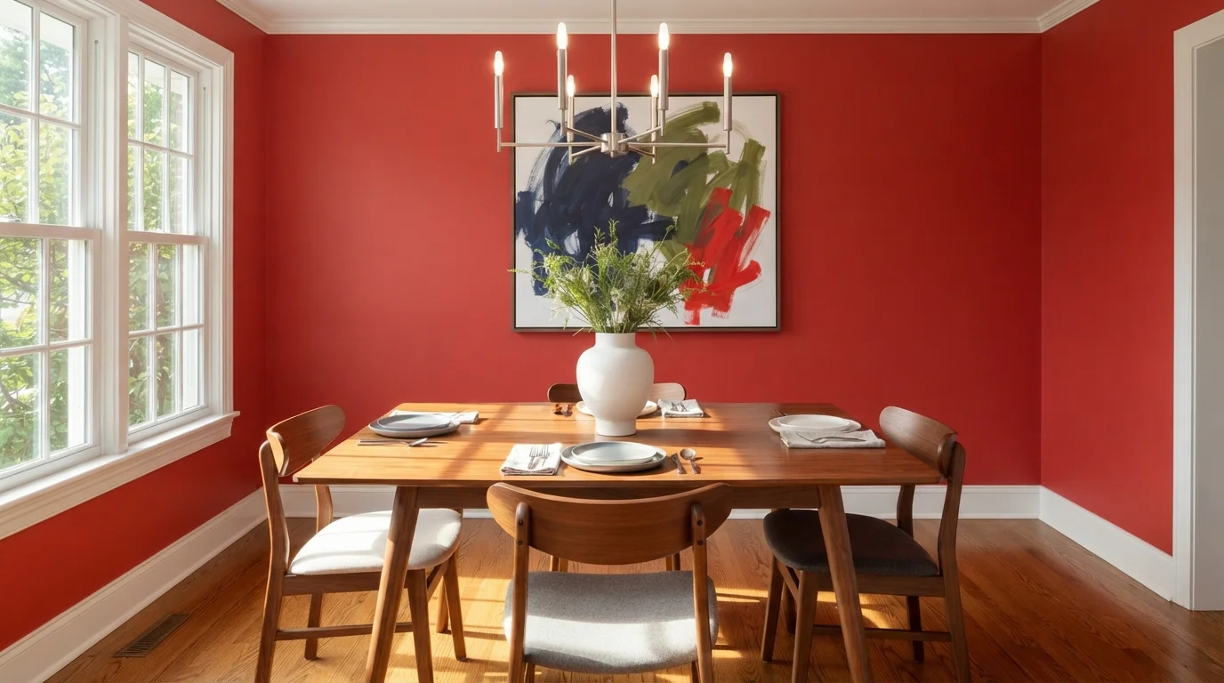
Saturated crimson walls paired with mid-century walnut furniture create a spirited, artful space bathed in bright daylight.
Crimson is a bold, energetic red. In this room, vivid red wraps every wall, balanced by a rich walnut dining table, sculpted wood chairs, and clean white trim. The space feels dramatic, warm, and ready for entertaining. The combination works because natural walnut tones and pure white borders ground the fiery wall color so it never overwhelms. It is a fantastic look if you want a dining space full of personality and lively energy.
SEE STOP ON YOUR WALLS →
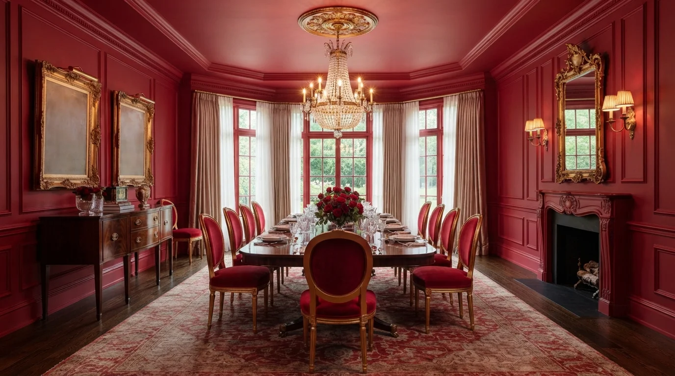
Deep crimson walls and radiant crystal create an opulent, candlelit dining space wrapped in pure vintage drama.
Crimson is a rich, passionate red with deep wine tones. In this dining room, bold red covers the walls, crown molding, and ceiling, echoed by velvet dining chairs and a classic Persian rug. The space feels instantly dramatic, warm, and theatrical. The look works because the brilliant sparkle of the crystal chandelier and gold accents break up the rich wall color. It is a stunning choice for anyone who loves old-world glamour and entertaining in unforgettable style.
SEE POMEGRANATE ON YOUR WALLS →
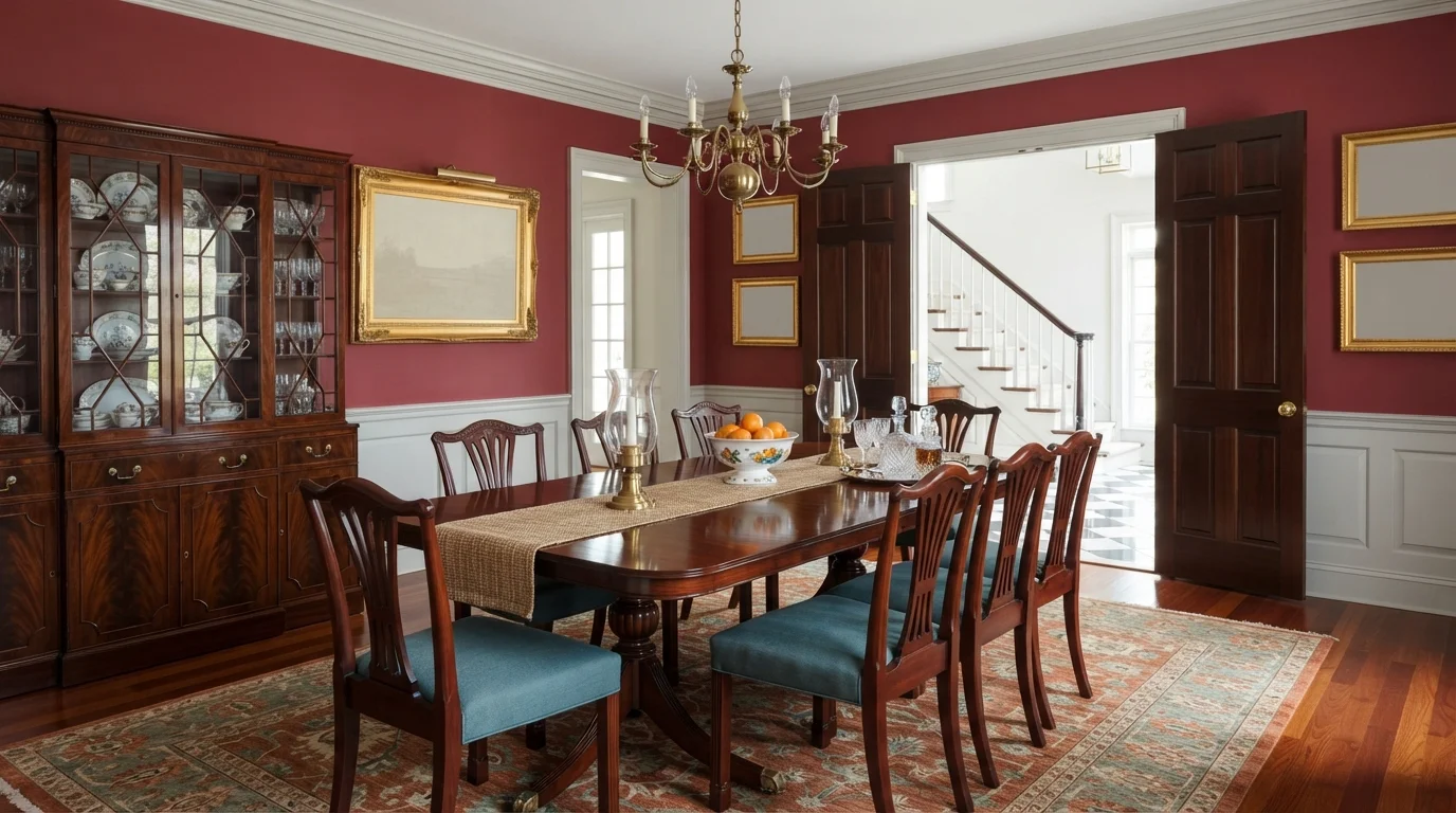
Rich crimson walls wrap polished mahogany furniture in a warm, timeless glow fit for unforgettable dinner parties.
Crimson is a deep, rich heritage red. In this space, velvety red covers the upper walls, sharply framed by crisp white crown molding and soft pale wainscoting. A dark mahogany table, ribbon-back chairs with teal cushions, and a detailed Persian rug anchor the room. The space feels regal, warm, and wonderfully dramatic. The deep wall color flatters glowing wood finishes and shiny brass fixtures without competing with them. This look is made for anyone who loves traditional, old-world elegance that stands the test of time.
SEE ROSEBUD RED ON YOUR WALLS →Red Dining Room Wall Color Combinations
A wall color never works alone. These are the full schemes from the rooms above — the lead color first, then the supporting colors that make the photo work.
Immerse yourself in rich wine tones, glowing ambient lighting, and plush velvet seating for an unforgettable dinner setting.
TRY THIS PALETTE →Deep wine walls pair with warm oak and woven seats to create a deeply intimate, candlelit dinner mood.
TRY THIS PALETTE →Rich crimson walls and glowing crystal candlelight create an intensely romantic, opulent space made for lingering late dinners.
TRY THIS PALETTE →Saturated red paneled walls meet glowing candlelight and ornate gold finishes for a fiercely dramatic dinner setting.
TRY THIS PALETTE →For the lighter reds — Cinnamon Slate and Rosy Apple — white or off-white trim keeps the room from feeling closed in, and a soft warm white (parchment or linen tones rather than a stark bright white) avoids the harsh contrast that can make red look garish next to it. Mid-tone wood, like an oak or walnut table, grounds both of these without competing.
For the deeper, more saturated reds — Cottage Red, Raspberry Truffle, Million Dollar Red, Caliente, and Rumors — darker or wood-tone trim tends to look more intentional than bright white, which can make a deep red wall look like it's fighting its own trim. Black or dark bronze hardware and a darker wood table pull these reds toward a moodier, more formal dining room. If the room opens into a kitchen or living area painted a neutral, keep the red contained to the dining room's four walls rather than carrying it through — that containment is what keeps a saturated red feeling like a deliberate choice instead of an overwhelming one.
More Dining Room Color Ideas
Set on a color family already? Each page has its own real rooms and picks.
Light or Dark Red Dining Room Colors?
Go Light (LRV 60+) If…
The room is small, faces north, or has to work at every hour. Light warm colors make it feel bigger and stay calm in evening light — the light you actually live in.
Go Dark (LRV Under 20) If…
You want the cocoon effect and the room has real daylight. Dark works best on one feature wall — or fully color-drenched in a large room with good windows.
Cinnamon Slate, at LRV 19, is the pick to reach for if the dining room is small, north-facing, or shares light with an open kitchen — it's still a red, but it won't swallow the room the way the deeper options can. Rosy Apple (LRV 15) and Red Tomato (LRV 14) are the middle ground: saturated enough to commit to, forgiving enough for a room that gets some daytime use for homework or laptops.
Cottage Red (LRV 11) and Raspberry Truffle (LRV 9) start to need real commitment — good overhead lighting and a dedicated dining function, since they read very differently in daylight than under a chandelier at night. Million Dollar Red, Caliente, and Rumors, all sitting at LRV 8, are the darkest picks here and work best in dining rooms with a window or two and warm bulbs (2700K), not rooms relying only on daylight. In a windowless or dim dining room, any of these three can read almost black by day and only come alive once the lights go on.
See It. Love It.
Paint It.
Upload one photo of your red dining room and try every color on this page on your own walls — in your own light, before you buy a drop of paint.

Punk RockBeforeSheen And Finish For Red Dining Rooms
Dining room walls take more contact than people expect — chairs get pushed back into them, serving trays brush past — so an eggshell or satin finish holds up better than flat, especially in the deeper reds like Caliente or Million Dollar Red where a scuff shows more against the saturated color. Flat can still work on a red accent wall away from chair traffic, but on walls behind the table, eggshell is the safer call.
For a small dining room, painting all four walls in a mid-saturation red like Red Tomato or Rosy Apple keeps the room cohesive rather than choppy. In a larger or open-concept dining area, a single accent wall in a deeper red like Rumors or Raspberry Truffle, with the remaining walls in a lighter neutral, lets the red do its job as a focal point without demanding total commitment.
Coverage Mistakes With True Reds
True reds are notoriously hard to cover in one or two coats because of the pigments used to make them — this applies to Million Dollar Red, Caliente, and Rumors especially. Skipping a gray or red-tinted primer is the most common mistake here; painting straight over white primer usually means an extra coat or two of the topcoat just to get even saturation, which costs more paint and more time than people budget for. Ask for a tinted primer at the paint counter when buying any of the deeper reds on this page.
It's also worth testing a large swatch, at least a two-foot square, on the actual wall before committing. Red shifts more than most colors between daylight and warm bulb light, and a color that looks brick-red in an afternoon photo can read almost brown or purple-black by candlelight.
About Red Dining Room Paint Colors
Red has been the go-to dining room color for centuries for a practical reason, not just a decorative one: it's associated with stimulating appetite, and unlike a living room or bedroom, a dining room is a space you use in short, social bursts rather than all day. That's why the regret so many designers report with bold red in bedrooms and kitchens doesn't apply the same way here. The picks on this page span a real range, from Benjamin Moore Cinnamon Slate (2113-40, LRV 19), a muted terracotta-brown red that reads almost like a warm neutral, down to saturated, low-light-reflectance reds like Benjamin Moore Caliente (AF-290, LRV 8) and Behr Rumors (MQ1-15, LRV 8), which are true showstoppers.
In between, Benjamin Moore Rosy Apple (2006-30, LRV 15) leans pink-red and cheerful, good for a dining room that wants warmth without heaviness. Sherwin-Williams Red Tomato (SW 6607, LRV 14) and Benjamin Moore Cottage Red (HC-184, LRV 11) sit in classic brick-and-barn-red territory, the kind of red that reads traditional next to a farmhouse table. Benjamin Moore Raspberry Truffle (2080-10, LRV 9) and Million Dollar Red (2003-10, LRV 8) push into wine and true-red saturation, the shades that make a dining room feel like a destination rather than a pass-through space.
What makes red work in a dining room specifically is that most dining rooms are used at night, under warm artificial light or candlelight, not under harsh daytime sun. A deep red like Caliente or Rumors that would feel oppressive in an all-day living room reads rich and flattering at dinner, when the lighting is doing the color's work for it.

The Questions Everyone Asks
What color should I paint my red dining room?
If you want one answer, start with the safe picks above — Heritage Red, Caliente, Red Brick, Spanish Tile. They read well in any light and survive furniture changes. Then check the light: strong afternoon sun wants a step cooler, a north-facing room wants a step warmer.
is red a good color for a dining room?
Yes — red is one of the most traditional dining room colors because it's associated with stimulating appetite and conversation, and dining rooms are typically used in short evening sessions rather than all day, which makes a bold color like Caliente or Million Dollar Red feel dramatic rather than tiring the way it might in a living room.
what red paint color is best for a small dining room?
Cinnamon Slate (Benjamin Moore 2113-40, LRV 19) is the best starting point for a small dining room — it's a muted, warm red-brown with enough light reflectance that it won't close the room in the way a deeply saturated red like Rumors or Caliente can in a tight space.
does a red dining room feel too dark?
Deep reds at LRV 8, like Caliente, Million Dollar Red, and Rumors, can feel very dark in daylight, sometimes almost black in a room without much natural light. They come alive under warm evening lighting, which is when most dining rooms get used, so the darkness reads intentional at dinner rather than gloomy during the day.
what colors go with red dining room walls?
Warm white or cream trim (parchment tones rather than stark white) softens lighter reds like Rosy Apple, while mid-tone or dark wood furniture and black hardware ground deeper reds like Cottage Red or Raspberry Truffle. Keep neighboring open rooms in a neutral so the red stays contained to the dining room.
how many coats of paint does a red dining room need?
Plan on a tinted primer plus two coats of the red topcoat, sometimes three for the most saturated colors like Million Dollar Red or Caliente. Red pigments are harder to achieve full, even coverage with than most other colors, and skipping the tinted primer usually means buying an extra can of topcoat to fix patchy results.
What two-color combination works best in a red dining room?
The reliable pattern is a quiet main color plus one deep accent on a single wall. Keep trim and ceiling in one warm white so the two colors are the only event in the room — the combination cards above show complete schemes from real rooms.
What colors make a red dining room look bigger?
High-LRV, slightly warm colors — LRV 60–75 is the sweet spot. Paint the walls and trim close to the same light color so the corners blur, and keep the ceiling white. Stark cool white actually works against you; it creates hard shadows that show the room's edges.


Ask a Question