Terra Mauve
Benjamin Moore's burnt-sienna with a mauve secret, reviewed honestly: where the clay glows, the exact light that flattens it, and what to pick if you actually wanted purple.

Jessica has spec'd whites and neutrals for more than 300 rooms and keeps a sample wall of painted drawdowns in her studio. Every color review is checked against real reader rooms in the comments and re-tested when a formula changes. About the testing process →
- 1Burnt Cinnamon9
- 2Terra Mauve16
- 3Caramelized35
- 4Venetian Plaster42
The Fast Verdict
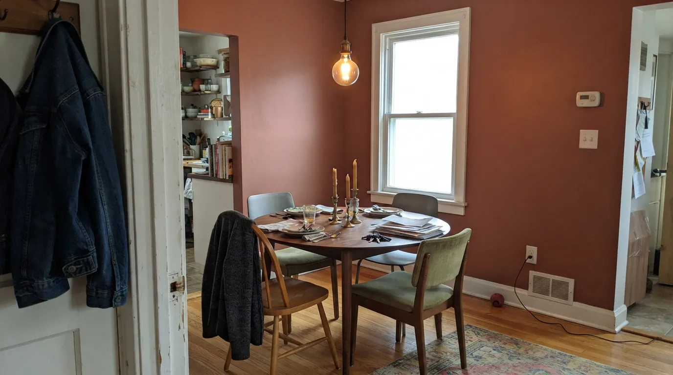
Terra Mauve reads first as a deep, sun-baked clay — the burnt sienna Benjamin Moore's own description promises — and only second as the dusty rose the name hints at. In warm daylight and lamplight it glows: rich, earthy, genuinely luxurious on a door, a vanity, or a dining room that wants drama. Cool light strips the rose out fast and leaves a flatter rust-brown, so this is a color to sample in your actual room before committing a whole wall.
Dining rooms and dens with real daylight · front doors and exterior trim (it comes in an exterior stain and a high-gloss alkyd) · powder-room vanities and kitchen islands · anyone who wants terracotta with more depth than the usual clay trend colors
You actually want a true dusty purple or mauve · your room runs on cool white LEDs with no lamps · you're painting a large open room and want it to feel airy · your stone or quartz counters are cool blue-gray
- Genuine burnt-sienna depth that reads expensive, not orange-loud
- The rose secret keeps it from tipping into pure Halloween-orange
- LRV 16 holds its color in bright rooms without washing out
- Small-space drama: a vanity, a door, or an island reads custom fast
- A Classics-collection color that predates the clay-and-terracotta trend rather than chasing it
- Too heavy for most whole rooms without real daylight
- Fights cool blue-gray stone, quartz, and anything cold nearby
- Cool LEDs and north light drain the rose, leaving a flat, muddy rust-brown
- Buyers expecting a true purple mauve are consistently surprised how orange it reads on the wall
What Color Is Terra Mauve, Really?
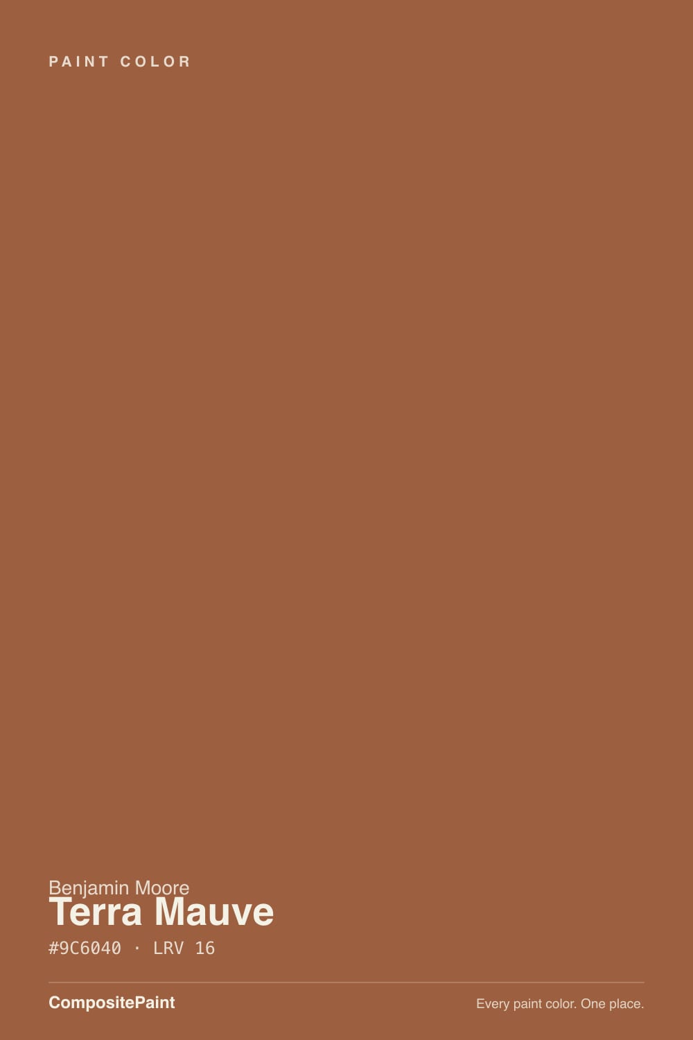
Benjamin Moore files Terra Mauve in the orange family and describes it as a deep shade of burnt sienna — and that is the honest starting point, not the name. "Mauve" promises purple; what actually goes on the wall is a saturated clay-brown with a rose undertone riding underneath it, terracotta first and mauve a distant second. It sits in the brand's Classics collection, which means it predates the current clay-and-terracotta trend by decades rather than chasing it.
At LRV 16 it is a genuinely deep, saturated color — closer in weight to a mid-brown than to a pastel blush. That depth is what keeps it from reading candy-colored: compare it to a true dusty rose sitting up around LRV 40-plus and Terra Mauve is a different animal entirely, heavier and more earth than pink. It holds its color in a bright room instead of washing out, which is also why it needs real light to look its best rather than looking merely dark.
Undertone in one line: burnt-sienna orange-brown first, a whisper of rose-mauve underneath — never truly purple, never candy-pink. If your sample reads flat brick-red, that is warm sun pulling the orange forward; if it reads dustier and grayer, that is cool light pulling the mauve forward instead. Both are the same paint, honestly reporting your light.
Where It Shines
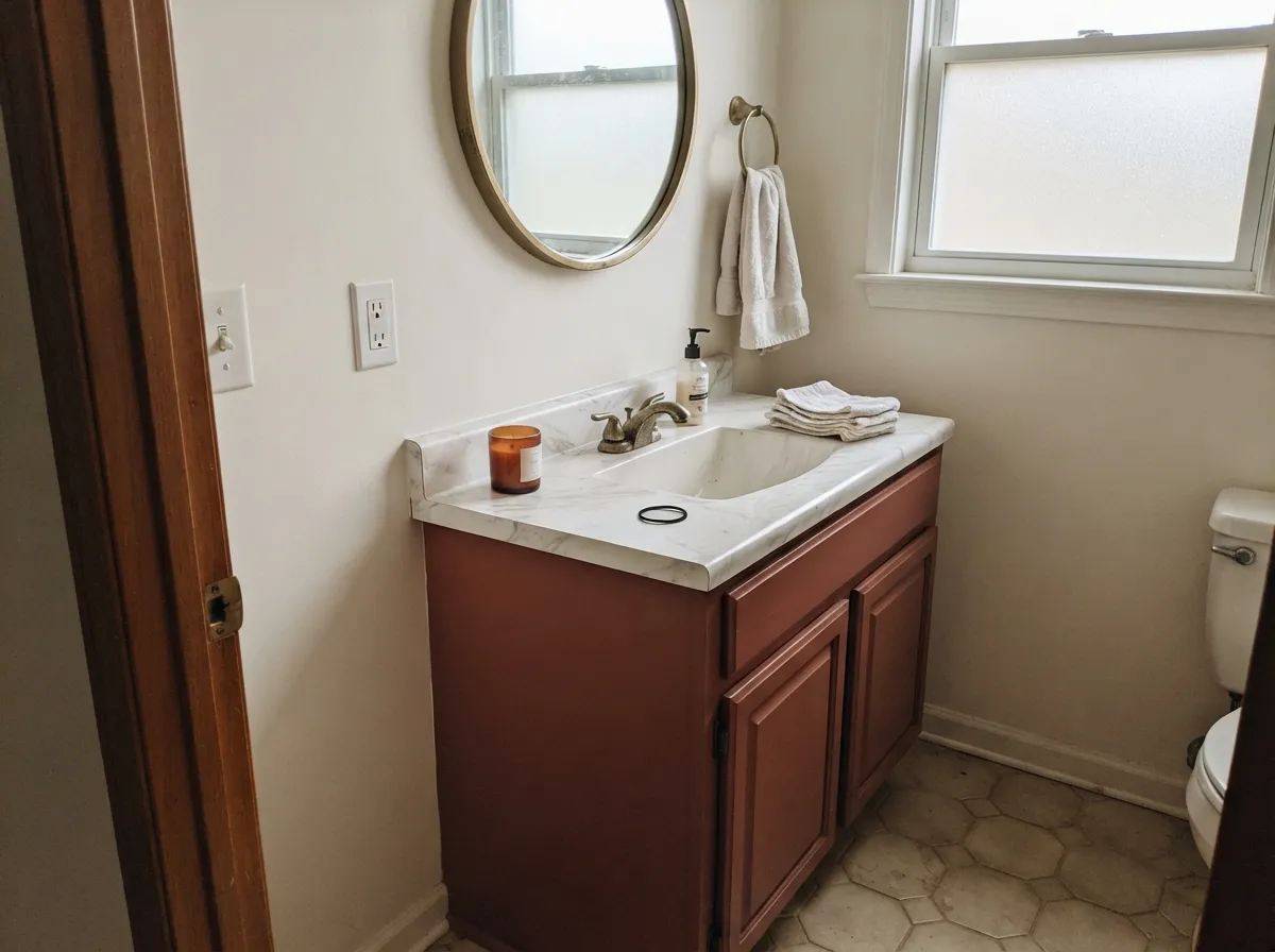
Give it warm daylight or evening lamplight and it earns the "understated luxury" Benjamin Moore claims for it. A dining room at dusk, one pendant glowing over a walnut table, brass candlesticks catching the light — this is the color's natural habitat. Its second home is the small, deliberate commitment: a front door, a powder-room vanity, a kitchen island, where the depth reads custom and expensive without betting an entire open floor plan on rust-brown.
Where It Fails
Almost every regret story about Terra Mauve comes from one of three mismatches, and all three are predictable before the first coat. None of them are the paint's fault — but if your plan matches one, this is not your color, and a bigger sample will only confirm it.
The name promises purple; the wall delivers burnt-sienna orange-brown with a rose whisper underneath. Buyers hoping for a true dusty purple are consistently surprised at how orange it reads in person. If purple is actually the goal, Benjamin Moore Sleepy Hollow is the grown-up way to paint purple — Terra Mauve is not a substitute for it.
A north-facing room or cool white LED overheads drain the rose out fast and leave a flatter, muddier rust-brown than the chip suggested. This color depends on warm light — either sun or 2700K bulbs — to earn its "luxury" reputation. Skip it if the room only ever runs on cool overhead light.
At LRV 16 it is heavy, and a large open-plan space wrapped entirely in it can feel closed-in rather than cozy. It was built for a dining room, a den, a door, a vanity — a room with an edge, not an open floor plan without one.
Room by Room
Real candlelight, brass fixtures and a walnut table let the burnt-sienna deepen instead of flatten. Eggshell or matte on the walls; this is the room the color was built for.
Low, warm light flatters it the same way it flatters other moody colors in the deck: leather, walnut shelving, one warm lamp. Eggshell for durability where chairs scuff the wall.
A Terra Mauve vanity under a light warm wall is a weekend project that reads like a design fee. The high-gloss alkyd formula on a vanity wipes clean and deepens the clay color further.
On an island under a cream wall it is genuinely striking without betting the whole kitchen on rust-brown. A full kitchen of Terra Mauve cabinets is a bold, heavy commitment — sample big before committing.
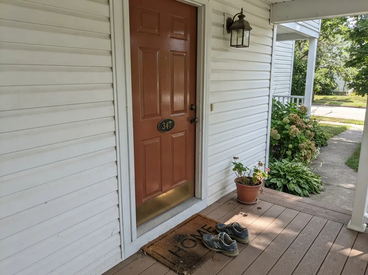
Terra Mauve comes in Benjamin Moore's exterior wood stain line and a high-gloss exterior alkyd, which is the brand's own signal that it is meant for doors and trim as much as walls. Full sun reads it brighter and more orange than it does indoors; pair it with a light warm body color so the door does the work.
All four walls is heavy for most bedrooms; as a single headboard wall against a lighter neutral it gets the warmth without the cave feeling. Skip it if what you actually wanted was a purple mood — that job belongs to Sleepy Hollow.
Your Light Is the Risk
Warm daylight pulls the rose forward and the clay reads rich and glowing — the closest match to the chip.
Cool indirect daylight drains the rose and flattens it toward a dull, muddy rust-brown. Sample first.
Bright orange-red at the sun hours, quieter clay-brown the rest of the day. The swing is real but predictable.
2700K lamps deepen the mauve-rose and make it glow. Cool white LEDs flatten it to a muddy brown — swap bulbs, not paint.
Most complaints about Terra Mauve are a light mismatch. Upload a photo of your actual room and see it on your walls — then ask for the same wall in north light or evening lamps before you buy a single sample.
Need It From Another Brand?
Any paint counter can custom-tint Benjamin Moore 105 directly. If you would rather stay in one brand's own deck, these are the closest stock matches, measured as ΔE2000. Under 2 is a difference you will not see on the wall.
| Brand | Closest color | ΔE | LRV | |
|---|---|---|---|---|
| Sherwin-Williams | Antiquarian BrownSW 45 · Sherwin-Williams | 4.2 | 16 | Color page → |
| Behr | Antique CopperUL120-4 · Behr | 1.8 | 17 | Color page → |
| Valspar | Pale Cordovan3010-7 · Valspar | 2.0 | 16.6 | Color page → |
| PPG / Glidden | Muted CopperPPG16-30 · PPG / Glidden | 1.7 | 16 | Color page → |
| Glidden | Muted CopperPPG16-30 · Glidden | 2.0 | 16 | Color page → |
| Dutch Boy | Brandi-ed Orange308-6DB · Dutch Boy | 3.6 | 17 | Color page → |
Similar Benjamin Moore Colors
The nearest shades to Terra Mauve within Benjamin Moore's own range, ranked by perceptual color distance — useful when you want the same look a touch lighter, darker, or warmer.
WCAG 2.1: AA is 4.5 : 1 for normal text, 3 : 1 for large text, AAA is 7 : 1.
Terra Mauve vs the Colors You're Also Considering
Every Terra Mauve sample board has the same rivals on it. The numbers show the real lightness gap — then it comes down to which risk you would rather live with.
Pick this for more depth and a real rose undertone Cavern Clay doesn't carry.
Sherwin-Williams SW 7701 · LRV 24Cavern ClayPick this for a lighter, more purely orange terracotta — Cavern Clay skips the mauve secret but needs strong light to earn its glow.
Pick this for more weight and a browner, less pink-forward version of the same clay family.
Sherwin-Williams SW 9081 · LRV 27Redend PointPick this for a lighter, pinker clay that reads gentler in daylight — the color that split the internet in half.
Terra Mauve Coordinating Colors
Benjamin Moore's own coordinating picks for Terra Mauve lean cream and warm white — proof the brand designed it to anchor a room rather than run one alone. Stay warm with the trim and keep the metals warm too, and it settles in fast:
Terra Mauve On Exteriors And Front Doors
Terra Mauve isn't only an interior color — Benjamin Moore sells it in its exterior wood-stain line and in a high-gloss exterior alkyd, which is the brand's own signal that it's built for doors, shutters and trim as much as walls. Full outdoor sun pushes it brighter and more orange than it reads indoors, so expect a livelier clay-red on the actual door than the paint chip suggested.
The pairing that works: a light, warm body color lets the door carry all the color, and a near-black trim keeps the whole facade from feeling too matched. Avoid pairing it with cool blue-gray siding or stone — the door's warmth reads muddier next to a cold body color instead of standing out the way it should.
Terra Mauve With Wood Tones And Stone
Warm wood is this color's ally, not its rival — walnut, white oak and butcher block all sit comfortably beside Terra Mauve because they share the same warm family instead of fighting across the color wheel. Even honey oak, which trips up cooler colors, generally reads fine here since both are warm-orange by nature.
Stone and countertops are the real test. Warm-veined marble, soapstone and butcher block let the clay glow; cool blue-gray quartz or stark white Carrara-style marble pull the opposite direction, and the wall can start to look muddy next to the cold stone instead of rich. Brass and matte black metals both work well; polished chrome is the one finish that reads cold against it.
Three Ready Palettes Built on Terra Mauve
A color is never alone on the wall. These are complete combinations in the 60-30-10 pattern, with the reason each one holds together. Every one opens in the visualizer.
Swiss Coffee is Benjamin Moore's own coordinating trim pick for Terra Mauve, and the cream keeps the deep clay from feeling like a cave. Kendall Charcoal on the chairs or a chandelier gives the room one near-black anchor so the terracotta reads deliberate, not accidental.
Try this palette in your roomCloud White is Benjamin Moore's own coordinating white for Terra Mauve, so the small room stays bright while the vanity carries all the color. Wrought Iron on the mirror frame or door gives the palette one dark note; brass hardware finishes the argument.
Try this palette in your roomWhite Dove keeps the house body soft and warm so the door carries all the color instead of fighting the siding for attention. Kendall Charcoal shutters ground the look without competing with the clay-red door.
Try this palette in your roomTerra Mauve FAQ
Is Terra Mauve more orange or more purple?
More orange. Benjamin Moore files it in the orange family and describes it as a deep burnt sienna. On the wall it reads as a saturated clay-brown with a dusty rose undertone underneath — never a true purple mauve. Manage the name's expectations before you buy the gallon.
Is it too dark for a whole room?
At LRV 16 it is genuinely deep, and most whole rooms without strong daylight will feel heavy in it. It works best as a dining room or den with real light, or as a smaller commitment — a door, a vanity, an island, a single accent wall.
What trim white goes with Terra Mauve?
Swiss Coffee or Cloud White — both are Benjamin Moore's own coordinating picks for this color. Either keeps the room bright and warm while the deep clay does the talking on the walls or the feature surface.
Does it work on a front door?
Yes. It comes in Benjamin Moore's exterior wood-stain line and a high-gloss exterior alkyd, which tells you it was built for doors and trim as much as interior walls. Expect full sun to read it brighter and more orange than any indoor sample.
What's the best light for Terra Mauve?
South-facing daylight or warm 2700K lamplight. Both pull the rose forward and let the burnt-sienna glow. Cool north light or cool white LEDs drain the color toward a flatter, muddier rust-brown.
Does Terra Mauve clash with anything?
Cool blue-gray stone, cool white quartz, and true purple or lavender accents all fight it — the warmth reads muddier next to cold stone, and pairing it with real purple turns the room candy-colored instead of earthy. Warm woods and brass are its natural company.
Have you painted with Terra Mauve?
Rate it — one tap helps the next reader decide.
Ask a Question