Burnt Sienna
The artist's-pigment rust everyone half-remembers from the crayon box, reviewed honestly: the rooms where it glows like terracotta, the light that flattens it to mud, and what to pick instead.

Jessica has spec'd whites and neutrals for more than 300 rooms and keeps a sample wall of painted drawdowns in her studio. Every color review is checked against real reader rooms in the comments and re-tested when a formula changes. About the testing process →
- 1Burnt Cinnamon9
- 2Burnt Sienna17
- 3Caramelized35
- 4Venetian Plaster42
The Fast Verdict
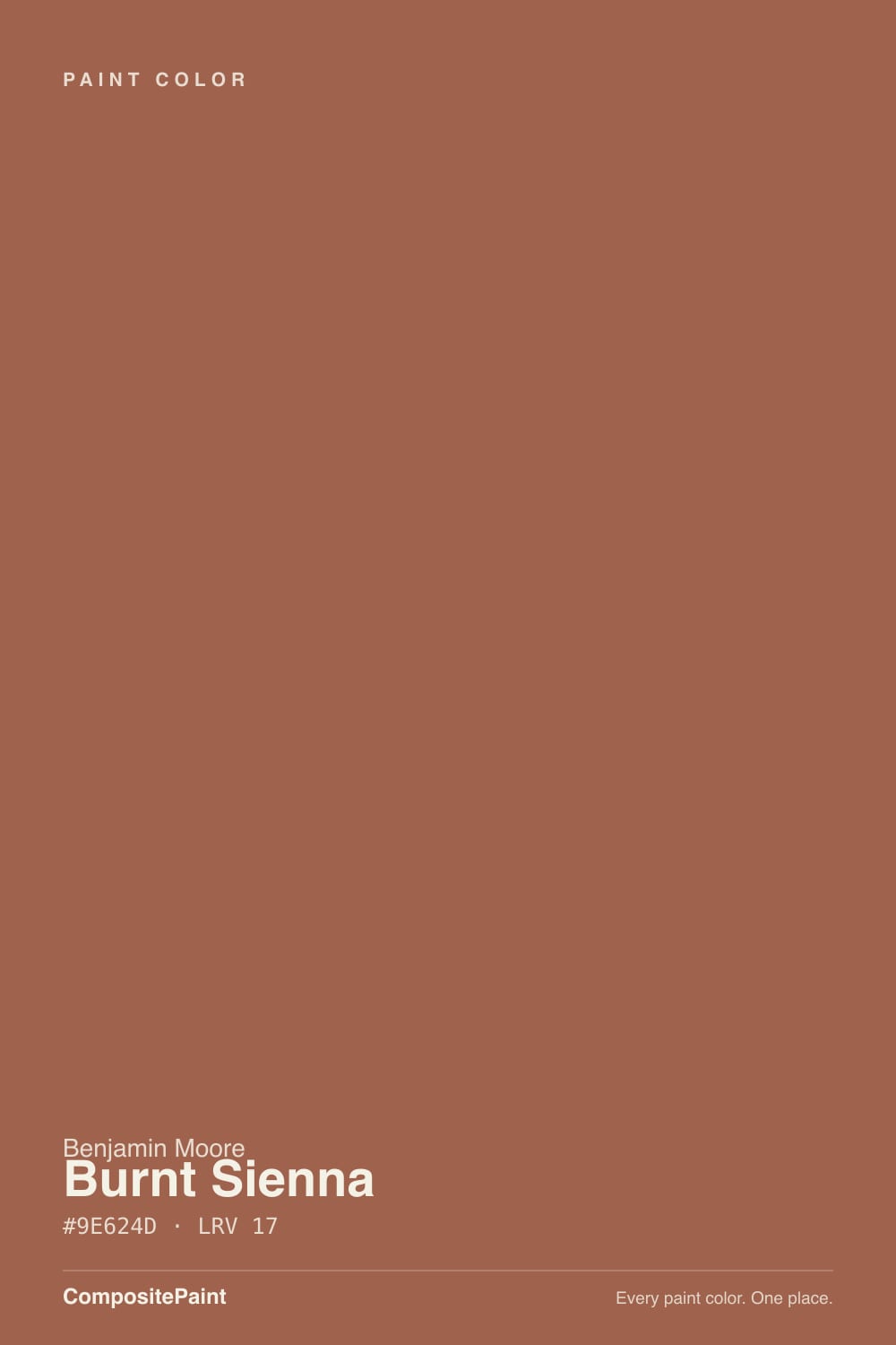
Burnt Sienna is the deck's most literal color name: a genuine artist's-pigment rust, red-orange with a heavy dose of brown, at a dark LRV 17. Give it a warm room with real daylight, walnut or oak, and brass or black hardware, and it reads rich and grounded — a front door, an island, a bedroom accent wall that feels like a good idea for years. Put it in a cold north room under blue-white LEDs and the same paint goes flat and muddy, closer to a stain than a color. It rewards commitment to one wall or one piece of furniture far more than four walls of a dim room.
Front doors and entryways · a bedroom or dining-room accent wall · kitchen islands and cabinetry with brass or black hardware · dens and studies with walnut wood · anyone who wants a warm, earthy color that reads expensive, not trendy
Your room is north-facing and dim · you're painting all four walls of a small room in it · your fixtures and trim are cool white or chrome · you want something that reads clearly orange, not brown
- A genuinely earthy, sophisticated rust — not a flat crayon-box orange
- Reads expensive on a front door, island, or single accent wall
- Flatters walnut, leather, brass, and warm stone
- Deep enough (LRV 17) to hold real color instead of washing out
- A historic pigment name, not a trend color chasing a moment
- Goes flat and muddy in north light or any dim room
- Fights cool white trim, chrome, and gray stone
- Too dark and heavy for four walls of a small, low-light room
- Easy to read as plain brown if the light isn't warm enough to bring out the red
What Color Is Burnt Sienna, Really?
Burnt Sienna is not a marketing name — it is the actual pigment. Real burnt sienna is a natural iron-oxide earth pigment, calcined (heat-treated) to shift it from a golden-brown raw sienna into a deeper red-orange, and painters have used it for shading and warm shadow since the Renaissance. Benjamin Moore's version keeps that pedigree: it is a deep, warm red-brown built on an orange undertone, with enough red in it to avoid reading like plain brown but not enough to read like a clean orange. The result is muted and grounded rather than saturated — closer to rust or terracotta than to a Halloween-pumpkin orange.
At LRV 17 it is a genuinely dark color, in the same depth band as two of its own BM siblings: Rust (LRV 19), which is brighter and more purely orange-red, and Terra Mauve (LRV 16), which carries the same weight but leans rosier and dustier instead of true rust. Burnt Sienna sits between them — more orange than Terra Mauve, more brown and less saturated than Rust. That depth is the whole personality: on a small dose (a door, an island, one wall) it reads rich and confident; spread across every wall in a room with little light, it can go heavy and cave-like fast.
Undertone in one line: warm red-orange over a brown base — never a clean orange, never a true red. If your sample reads muddy or grayish-brown, that is cool or dim light stripping the red out; if it flushes noticeably pink or salmon, that is warm afternoon sun or 2700K bulbs pushing the red forward. Both are the same paint responding honestly to the room.
Where It Shines
This is a color built for real daylight and warm materials. In south or west light, against walnut, oak, leather, brass, or a warm stone counter, Burnt Sienna reads like a professionally chosen accent — the kind of rust-brown designers reach for on a front door or a kitchen island specifically because it is confident without being loud. It is at its best in doses: a door, an island, a single accent wall, a piece of furniture, rather than a whole room, and it rewards being paired with black or brass hardware and warm wood rather than chrome and cool stone.
Where It Fails
The complaints about Burnt Sienna cluster around the same handful of predictable situations, and every one of them traces back to the same root cause: this is a dark, warm color, and dark warm colors are unusually sensitive to the light and materials around them.
Cool, indirect north daylight is the enemy of every red-orange earth tone, and at LRV 17 there is not enough reflected light to fight back. The red drains out and what is left reads like a flat, muddy brown — not the rust anyone bought it for. If your only wall is north-facing, this is not that wall; save Burnt Sienna for a door, island, or a room with real sun.
Burnt Sienna needs warm company. Bright cool-white trim, chrome fixtures, or cool gray quartz all sit at the opposite temperature and make the rust look dirty and orange instead of rich and earthy. Swap in a warm white trim (White Dove, Swiss Coffee), black or brass hardware, and warm-veined stone, and the same paint looks intentional.
One dose of Burnt Sienna reads confident; four walls of it in a small room with limited light reads like a cave, and it will visibly shrink the space. It is a far safer bet as an accent wall, a door, or cabinetry than as the only color in a room that doesn't get much sun.
Room by Room
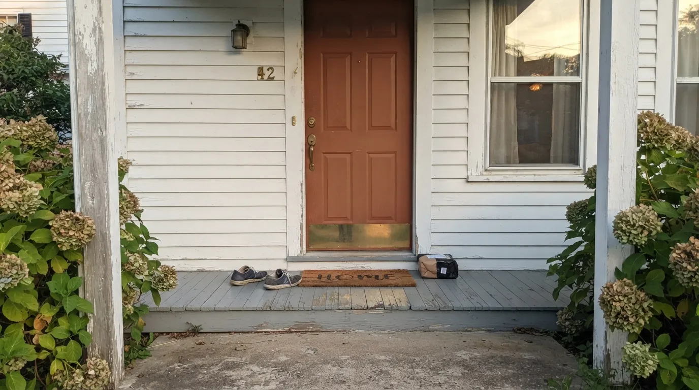
This is the color's best-known role: a warm rust front door against a white, gray, or greige house reads classic and welcoming without the starkness of true red or black. Semi-gloss or gloss (BM Advance) holds up to weather and wipes clean.
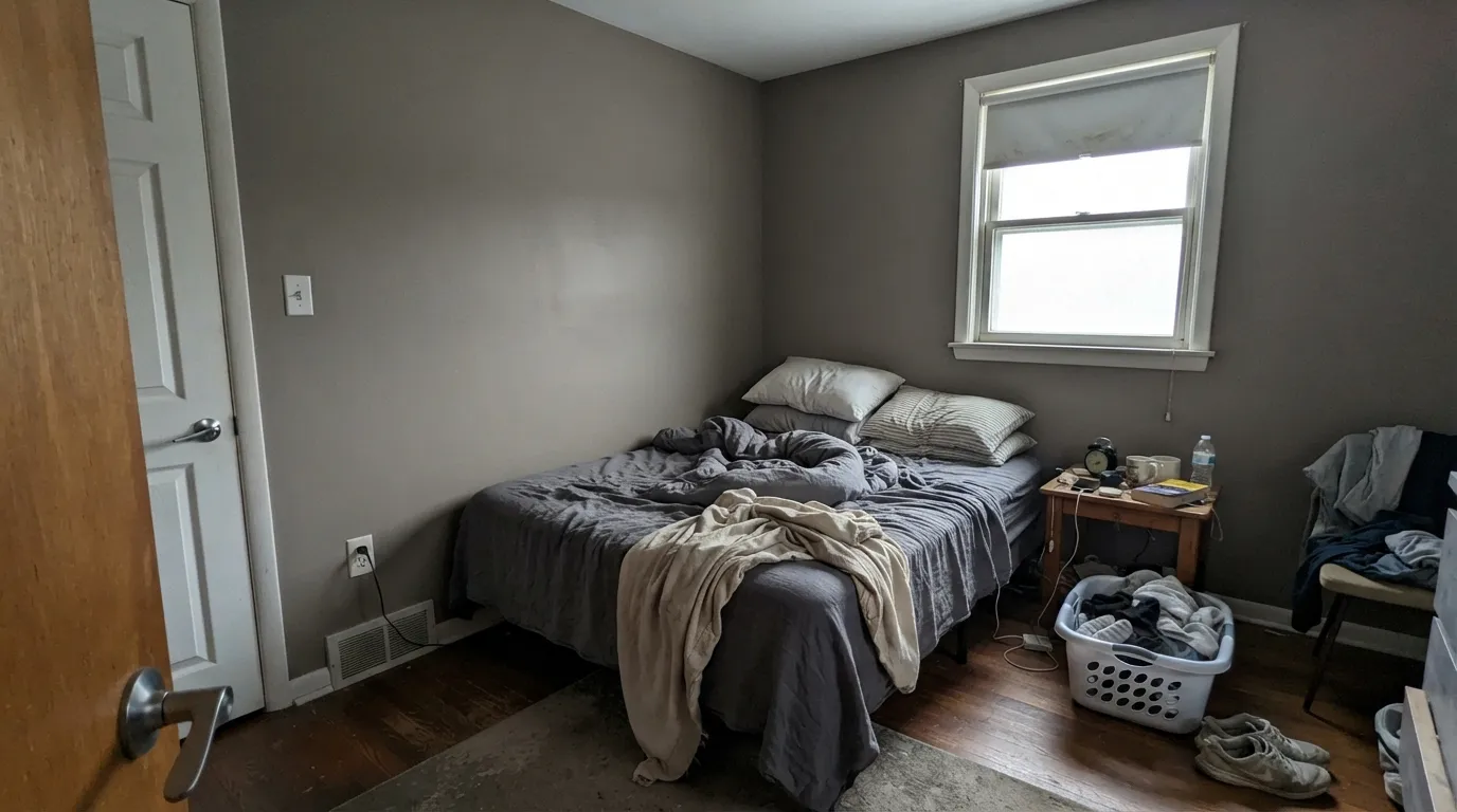
One wall behind the headboard, warm lamps, cream or white bedding, and it reads like a good hotel room — grounded, not moody-dark. Skip it as a whole-room color unless the space gets strong daylight; matte or eggshell softens the depth.
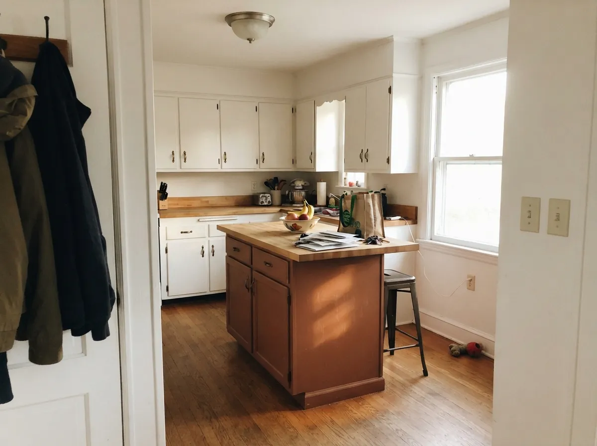
On an island or a run of lower cabinets under white or cream walls, Burnt Sienna is genuinely striking with brass pulls, butcher block, and warm stone. Satin or semi-gloss cabinet enamel; keep the rest of the kitchen light so the color has something to contrast against.
A closed dining room with warm lamplight and a walnut table takes this color well — it reads formal and a little dramatic without going full dark-academia. Open-plan dining that borrows light from a cooler adjacent space is a harder sell.
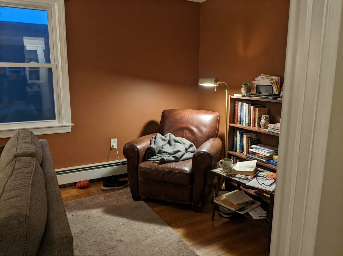
Low light actually flatters this color rather than hurting it here, because dens and studies are used mostly with lamps on anyway. Leather, walnut shelving, and brass reading-lamp light are its natural company.
A single wall works; four walls in an open-plan living room that shares light with a kitchen or hallway is a common regret, because the color has to negotiate with every adjoining space's undertone. Pale Oak or Swiss Coffee on the connecting walls keeps the handoff calm.
Your Light Is the Risk
Strong warm sun brings the red-orange forward and keeps it reading as rust, not brown. The color's best possible light.
Cool, low daylight strips the red out and leaves a flat, muddy brown-gray. This is the light behind almost every disappointed review.
Warmest and richest at the sun hours, quieter and more brown-toned once the direct light passes. Expect real movement through the day.
2700K warm bulbs push it toward a glowing terracotta at night. Cool white or daylight LEDs flatten it back toward plain brown — check your bulb temperature before you blame the paint.
Most complaints about Burnt Sienna are a light mismatch. Upload a photo of your actual room and see it on your walls — then ask for the same wall in north light or evening lamps before you buy a single sample.
Need It From Another Brand?
Any paint counter can custom-tint Benjamin Moore 1196 directly. If you would rather stay in one brand's own deck, these are the closest stock matches, measured as ΔE2000. Under 2 is a difference you will not see on the wall.
| Brand | Closest color | ΔE | LRV | |
|---|---|---|---|---|
| Sherwin-Williams | Roycroft AdobeSW 40 · Sherwin-Williams | 2.9 | 17 | Color page → |
| Behr | Antique CopperUL120-4 · Behr | 3.0 | 17 | Color page → |
| Valspar | Tuscan RooftopsM113 · Valspar | 1.2 | 16.3 | Color page → |
| PPG / Glidden | Muted CopperPPG16-30 · PPG / Glidden | 2.4 | 16 | Color page → |
| Glidden | Classic Brick Red50YR 16/295 · Glidden | 1.2 | 16 | Color page → |
| Dutch Boy | Brandi-ed Orange308-6DB · Dutch Boy | 2.0 | 17 | Color page → |
Similar Benjamin Moore Colors
The nearest shades to Burnt Sienna within Benjamin Moore's own range, ranked by perceptual color distance — useful when you want the same look a touch lighter, darker, or warmer.
WCAG 2.1: AA is 4.5 : 1 for normal text, 3 : 1 for large text, AAA is 7 : 1.
Burnt Sienna vs the Colors You're Also Considering
Every Burnt Sienna sample board has the same rivals on it. The numbers show the real lightness gap — then it comes down to which risk you would rather live with.
Pick this for the more grounded, more brown-forward earth tone — Rust reads younger and louder.
Benjamin Moore 2175-30 · LRV 19RustPick this if you want the brighter, more purely orange-red version with less brown in it.
Pick this for the more clearly orange, more classic "burnt" earth tone.
Benjamin Moore 105 · LRV 16Terra MauvePick this if you want the same depth with a rosier, dustier undertone instead of true rust-orange.
Pick this for more depth and more red — Cavern Clay is paler and dustier by comparison.
Sherwin-Williams SW 7701 · LRV 24Cavern ClayPick this if your painter works in Sherwin-Williams and you want a lighter, more terracotta-leaning cousin — it only glows in the right light too.
Mayflower Red HC-49 shares the exact hex #9E624D and the same LRV of 17, so it is the same color under a different name and deck. Within the Benjamin Moore range, Copper Kettle 1218 at LRV 16 and hex #9C664B is a touch browner and less red. Salmon Stream 2173-30 at LRV 17 and #9E5D4B pushes further toward pink-red. Terra Mauve 105 and Rusty Nail CC-390, both at LRV 16, are more clearly orange.
Across brands, Valspar Tuscan Rooftops M113 at LRV 16.3 with a deltaE of 1.17 and Glidden Classic Brick Red 50YR 16/295 at LRV 16 with deltaE 1.18 are both visually identical in normal room light. Sherwin-Williams Roycroft Adobe SW 40 at LRV 17 and deltaE 2.9 is very close but worth sampling first.
Behr Antique Copper UL120-4 at deltaE 3, C2 Wulfenite C2-556 at deltaE 3.9, and Farrow and Ball Book Room Red No. 50 at LRV 19 and deltaE 4.15 all sit far enough away to look visibly different side by side.
Burnt Sienna Coordinating Colors
The coordinating rule is simple: everything warm works, everything cool argues. Warm whites, black near-blacks, and other earth tones from the same family all sit easily next to it; icy whites, chrome, and blue-gray stone all fight it. These are the partners that keep showing up in rooms that work:
The Real Pigment Behind the Name
Unlike most paint-chip names, "burnt sienna" is not marketing invention — it is a real, centuries-old artist's pigment. Raw sienna is a natural iron-oxide earth pigment, originally mined near Siena, Italy; heating ("burning" or calcining) it drives off water and shifts the color from a yellow-brown to a deeper red-orange, which is where the name comes from. Painters have used it for warm shadows, skin undertones, and earthy backgrounds since the Renaissance, and it is still a standard tube in most artist palettes today.
Benjamin Moore's Burnt Sienna borrows that pigment's character rather than its literal chemistry — it is a mixed paint color engineered to read the way the pigment looks on canvas: warm, red-leaning brown, muted rather than bright. That heritage is also why the color behaves so predictably by light: real earth pigments have always needed warm light to show their red, and this paint is no exception.
Burnt Sienna With Wood Tones and Stone
This color was built to sit next to natural materials, and the pairing logic is straightforward: warm wood and warm stone bring out its best qualities, cool versions of both fight it. Walnut, oak, cedar, and butcher block all read richer next to Burnt Sienna; warm-veined marble, soapstone, and honed granite hold their own against it without competing.
The materials to test carefully first are cool gray quartz, blue-gray porcelain tile, and pale ashy oak floors — all three sit at a colder temperature and can make Burnt Sienna look muddier and less red than it does on the chip. If those cooler materials are already in the room and staying, a large sample board held up next to them, in the room's actual light, is worth doing before committing a whole door or island to this color.
Three Ready Palettes Built on Burnt Sienna
A color is never alone on the wall. These are complete combinations in the 60-30-10 pattern, with the reason each one holds together. Every one opens in the visualizer.
A warm white house lets the rust door do all the talking; Wrought Iron's soft near-black on shutters and hardware frames it without competing for the same warm-red attention.
Try this palette in your roomSwiss Coffee keeps the perimeter cabinets and walls warm and light, so the island carries all the color; Kendall Charcoal on a hood or open shelving gives the room one deep, best-behaved neutral to anchor the rust.
Try this palette in your roomA low-light den is the one room where Burnt Sienna's depth is an asset, not a risk — White Dove trim keeps the edges from disappearing, and Chelsea Gray's charcoal-greige on built-ins gives the room a second grounded neutral without fighting the rust for warmth.
Try this palette in your roomBurnt Sienna FAQ
Is Burnt Sienna orange or brown?
Both, at once, by design — it is a genuine artist's-pigment name for a red-orange earth tone with a heavy brown base. In warm light it reads clearly rust-orange; in cool or dim light the brown takes over and it can look like plain brown. That is not a defect, it is the pigment behaving the way real burnt sienna always has.
Will it work in a north-facing room?
Test it hard before committing. North light is cool and this is a dark, warm color at LRV 17 — the combination is the single most common source of disappointment with this paint, where the red drains out and the wall reads flat and muddy. A door, an island, or a lamplit den handles a lack of direct sun far better than a north-facing living room.
What trim and hardware go with it?
Warm whites (White Dove, Swiss Coffee), black or unlacquered brass hardware, and walnut or oak wood tones. Avoid bright cool-white trim, chrome fixtures, and cool gray stone — all three fight the warmth and make the color look dirty instead of rich.
Is it good for a front door?
Yes — this is one of its best-known jobs. Against a white, gray, or greige house it reads as a classic, welcoming rust that avoids the starkness of true red or black. Use an exterior semi-gloss or gloss formula built for doors, like Benjamin Moore Advance, for durability and a wipeable finish.
How many coats does it need?
Two coats over a similar mid-to-dark base color. Going over white or a light color, expect to prime with a tinted primer first — jumping straight to a dark warm color like this without priming usually means an expensive third coat.
Does it work on kitchen cabinets or an island?
Very well, especially as an island or a lower-cabinet accent under lighter walls and countertops. It pairs naturally with brass hardware, butcher block, and warm stone. Use a satin or semi-gloss cabinet-grade enamel; a full kitchen of it is a bold, dark commitment best reserved for kitchens with strong natural light.
Have you painted with Burnt Sienna?
Rate it — one tap helps the next reader decide.
Ask a Question