Crisp Linen
The workhorse Behr beige almost nobody blogs about, reviewed honestly: the light that turns it pale yellow, the near-identical Behr color it gets confused with, and what to pick instead.

Jessica has spec'd whites and neutrals for more than 300 rooms and keeps a sample wall of painted drawdowns in her studio. Every color review is checked against real reader rooms in the comments and re-tested when a formula changes. About the testing process →
- 1Agreeable Gray60
- 2Pale Oak69
- 3Crisp Linen74
- 4Dover White83
- 5Moonlit Beach88
The Fast Verdict
Crisp Linen is a true beige doing an off-white's job: a warm yellow-and-peach neutral that Behr never turned into a marketing moment, which is exactly why nobody has heard of it. In a north- or east-facing room with travertine, walnut, and brass it looks quietly expensive. Point real sun at it and the peach undertone stops being subtle. It is a solid, inexpensive pick for the right room — not a color to buy on faith.
North- or east-facing rooms that need warmth · living rooms and bedrooms with travertine, walnut, or brass · buyers who want a Behr beige without paying for a designer name · kitchens with warm stone, not gray quartz
Your room faces south or west with strong sun · your sofa or countertop is cool gray · you have Carrara-style marble anywhere nearby · you might need a touch-up years later and won't save the leftover can
- Warm beige-white that reads finished, not sterile, in north- and east-facing rooms
- Holds real color at LRV 74 — doesn't wash out to near-white the way paler creams do
- Flatters travertine, walnut, and unlacquered brass
- An inexpensive, no-special-order Behr pick for warmth without a designer price tag
- One warm register works across walls, trim, and cabinets without buying three different whites
- South- or west-facing sun amplifies the yellow-peach undertone into pale creamy yellow
- Clashes with cool gray upholstery and Carrara-style marble — both look dingy next to it
- Touch-ups can flash visibly if sheen or coat count doesn't match — keep the leftover can
- Nearly identical to Behr's own Cotton Knit, so shoppers sometimes buy the wrong twin
What Color Is Crisp Linen, Really?
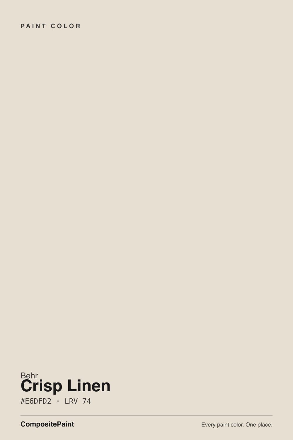
A warm beige with a genuine yellow-and-peach undertone — not a near-white with a hint of cream, but a color that reads as true beige the moment you roll it on a wall. Behr never gave it a Color of the Year push or a designer campaign; it sits in the deck as one of dozens of safe, warm Behr neutrals, which means most of what gets said about it online comes from Home Depot Q&A threads and paint-database sites, not magazine features. That obscurity is not a defect. It is an honest, dependable beige that does its job without asking for attention.
At LRV 74 it holds real color — this is not a pale-cream-that-reads-white the way a 84+ LRV off-white does. That depth is the whole trade-off: in gentler north or east light it stays a settled, warm beige that flatters wood and stone. Put real south or west sun on it and the yellow-peach base amplifies fast, pushing the wall toward a pale creamy yellow rather than a neutral beige. Reviewers who tested it in strong sun and reviewers who tested it in shade are describing two different-looking walls, and both are telling the truth.
Undertone in one line: warm, yellow with a whisper of peach — never gray, never a true cream. If your sample reads dingy or dirty, that is a cool gray or marble surface nearby fighting it, not the paint misbehaving.
Where It Shines
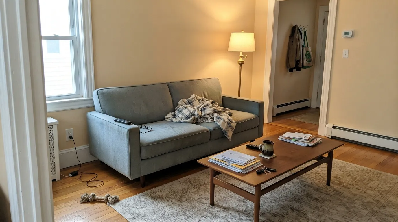
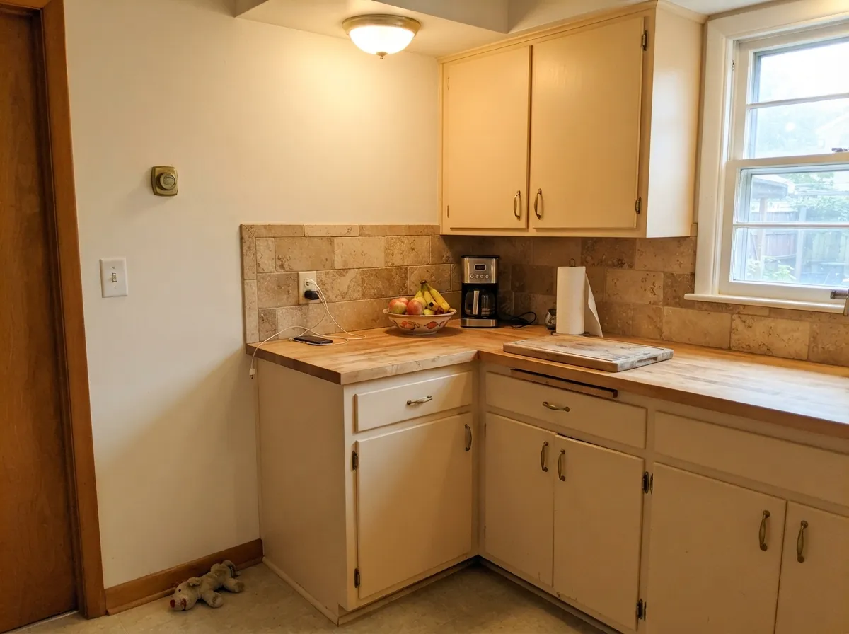
Give it a room with modest, indirect daylight and warm materials and it earns its keep. Travertine, walnut, butcher block, and unlacquered brass all meet its warmth halfway, and because it holds real color at LRV 74 it does not wash out to nothing the way a paler cream does in the same light. It is also a genuinely inexpensive way to get a warm, finished-looking wall without special-ordering a boutique brand — a Home Depot can and a Saturday afternoon.
Where It Fails
The complaints about Crisp Linen fall into three predictable buckets, and none of them are mysterious once you know the color's undertone. If your room or your habits match one of these, this is not your beige.
Strong direct sun amplifies the yellow-peach undertone fast, and the wall reads pale creamy yellow instead of a warm neutral by early afternoon. This is the single most repeated observation across reviews of the color — it is built for gentler light, not a sun-flooded great room.
Cool gray sofas and white-and-gray marble sit at the opposite temperature and make Crisp Linen's warmth look dirty by comparison instead of cozy. If your furniture and stone already lean cool gray, this beige will fight both of them.
Sheen and batch differences show up as visible flashing on this color more than on a plain white — owners report patchy-looking touch-ups even with paint from the same can if the roller nap or coat count doesn't match. Save the leftover can, note the sheen, and roll full walls rather than spot-fixing when you can.
Room by Room
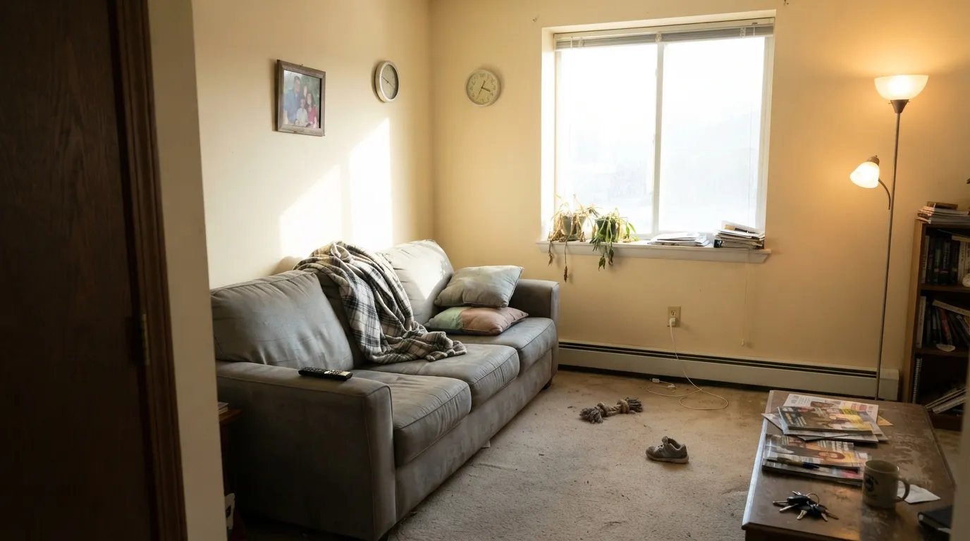
North- or east-facing rooms get a warm, settled beige that never feels cold. In a south-facing room with big windows, expect the wall to lean pale creamy-yellow by early afternoon — sample there before committing. Eggshell finish.
Against travertine, butcher block, and brass hardware the peach undertone reads as warmth, not a mistake. In a kitchen built around cool gray quartz or heavy stainless, the same beige starts to look dated instead of cozy. Satin on cabinets.
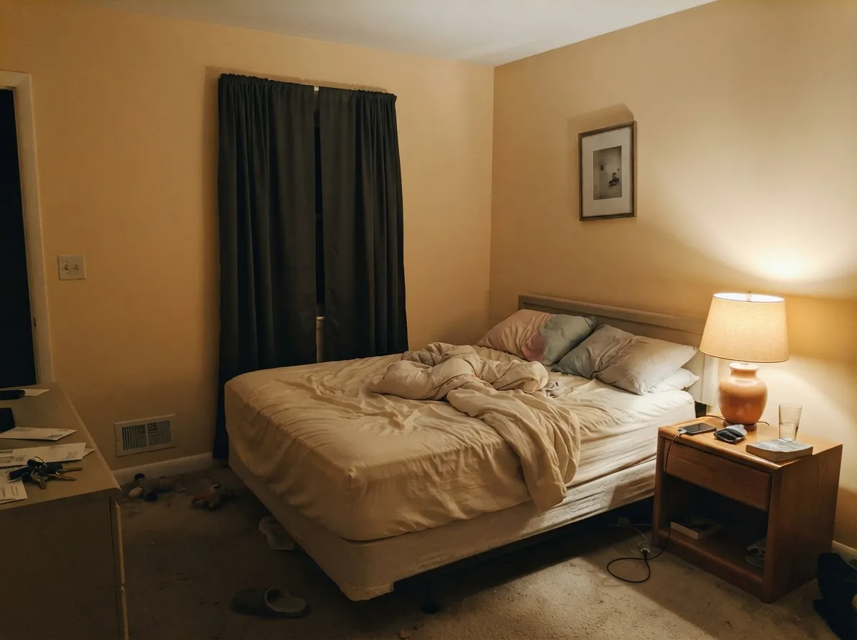
A calm beige for a room that mostly runs on lamp light rather than noon sun. Warm 2700K bulbs deepen the cream at night; cool LEDs flatten it back toward plain beige. Matte or eggshell.
Warm stone and wood vanities suit it well. Cool gray tile or Carrara-look marble make the beige read dirty by contrast — pick a cooler off-white instead if that's your vanity top. Satin or semi-gloss for moisture.
Works as a warm trim under a deeper wall color, but it carries enough beige that it will not vanish next to a bright white ceiling — expect a visible line where the two meet. Semi-gloss.
There isn't much real-world exterior documentation on this color. Treat it as an interior pick unless you've sampled it on your own facade first — full outdoor sun will push the yellow undertone harder than it does indoors.
Your Light Is the Risk
Gentle, indirect light keeps the beige warm and settled without tipping into yellow. This is the light it was built for.
Direct afternoon sun amplifies the yellow-peach undertone fast — expect the wall to read pale creamy yellow, not neutral beige. Test first.
Cooler and more neutral in early light, visibly creamier by mid-afternoon in any room with real sun exposure. The shift is gradual, not subtle.
2700K lamps deepen the cream and peach at night. Cool LEDs flatten it back toward a plainer, less interesting beige.
Most complaints about Crisp Linen are a light mismatch. Upload a photo of your actual room and see it on your walls — then ask for the same wall in north light or evening lamps before you buy a single sample.
Need It From Another Brand?
Any paint counter can custom-tint Behr MQ3-13 directly. If you would rather stay in one brand's own deck, these are the closest stock matches, measured as ΔE2000. Under 2 is a difference you will not see on the wall.
| Brand | Closest color | ΔE | LRV | |
|---|---|---|---|---|
| Sherwin-Williams | Shoji WhiteSW 7042 · Sherwin-Williams | 0.4 | 74 | Color page → |
| Benjamin Moore | EtiquetteAF-50 · Benjamin Moore | 1.1 | 74 | Color page → |
| Valspar | Wispy White7006-1 · Valspar | 1.1 | 74.9 | Color page → |
| PPG / Glidden | HourglassPPG1022-1 · PPG / Glidden | 1.4 | 75 | Color page → |
| Glidden | Elegant Lace60YY 74/072 · Glidden | 1.0 | 74 | Color page → |
| Dutch Boy | Worn Pages016W · Dutch Boy | 0.5 | 74 | Color page → |
Similar Behr Colors
The nearest shades to Crisp Linen within Behr's own range, ranked by perceptual color distance — useful when you want the same look a touch lighter, darker, or warmer.
WCAG 2.1: AA is 4.5 : 1 for normal text, 3 : 1 for large text, AAA is 7 : 1.
Crisp Linen vs the Colors You're Also Considering
Every Crisp Linen sample board has the same rivals on it. The numbers show the real lightness gap — then it comes down to which risk you would rather live with.
Pick this for walls — the two read nearly identical at the same LRV, so buy whichever your store has in stock rather than special-ordering both hoping to see a difference.
Behr PPU7-11 · LRV 74Cotton KnitPick this if you're painting cabinets — Behr positions Cotton Knit for cabinet work and it sits close enough to be interchangeable with Crisp Linen on trim.
Pick this when you want more color depth in a large room — Crisp Linen holds its beige better than Blank Canvas's lighter LRV allows.
Behr DC-003 · LRV 79Blank CanvasPick this if you want the same warm register a full shade lighter, with a similarly honest peach undertone.
Pick this when you specifically want the warmth, and you've already tested it against your room's sun exposure.
Sherwin-Williams SW 7008 · LRV 82AlabasterPick this if the peach undertone is the dealbreaker — Alabaster reads cooler and more neutral in the same north or east light.
The most useful comparison is cross-brand. Sherwin-Williams Shoji White SW 7042 also sits at LRV 74 and measures a deltaE of just 0.44 from Crisp Linen, so for practical purposes they are the same color. Magnolia Home Soft Linen JG-108 at LRV 74 and Dutch Boy Worn Pages 016W at LRV 74 are equally close at deltaE 0.49 and 0.50, as is Farrow and Ball Slipper Satin No. 2004 at LRV 75 with deltaE 0.78.
Benjamin Moore Etiquette AF-50 at LRV 74 and Valspar Wispy White 7006-1 at LRV 74.9 both come in at deltaE 1.09, visually identical in normal room light but with a slightly grayer cast in #E5E0D5.
Dunn-Edwards Stucco Tan DE6205 is the interesting outlier. Its deltaE is only 1.54, but its LRV is 68, six points darker, so it will look noticeably deeper on a wall even though the hue is nearly the same. Backdrop Cookies and Cream at deltaE 4.19 is close but visibly more yellow side by side.
Crisp Linen Coordinating Colors
The rule for coordinating with Crisp Linen is the same as with any true beige: stay warm, and keep cool grays at a distance. It pairs cleanly with warm trim whites, walnut-toned darks, and warm charcoal accents — these are the partners that keep it from reading dingy instead of cozy:
A Quiet Beige, Not a Famous One
Crisp Linen has no Color of the Year moment, no viral room, no designer attached to its name — and that is worth saying plainly rather than inventing a story it doesn't have. It is one of dozens of warm neutrals in Behr's deck, most of the online discussion about it comes from retailer Q&A pages rather than design blogs, and it sits close enough to Behr's own Cotton Knit that the two get mixed up at the paint counter.
None of that makes it a bad color. It makes it an honest, inexpensive workhorse beige: buy it because your room's light and materials suit it, not because it has a reputation to live up to.
Crisp Linen With Wood Tones and Stone
Warm materials are this color's natural company. Travertine, walnut, butcher block, and unlacquered brass all sit at the same temperature as Crisp Linen's yellow-peach undertone, so the pairing reads as deliberate warmth rather than an accident.
Cool gray quartz, stainless-heavy kitchens, and Carrara-style marble are the honest no. Those surfaces sit at the opposite temperature, and next to them the beige reads dirty instead of cozy — no amount of extra coats fixes a temperature mismatch. If your stone or countertop already leans cool gray, look at Sherwin-Williams Alabaster instead and let the warmth go.
Three Ready Palettes Built on Crisp Linen
A color is never alone on the wall. These are complete combinations in the 60-30-10 pattern, with the reason each one holds together. Every one opens in the visualizer.
Polar Bear stays warm enough not to make Crisp Linen look dingy the way a stark white trim would, and Sable stands in for the walnut this beige naturally flatters — one deep warm note anchors the room.
Try this palette in your roomNatural Linen and Crisp Linen share the same warm, non-gray family, so the wall-to-cabinet handoff stays quiet; Urbane Bronze grounds the room and loves the brass hardware travertine kitchens tend to use.
Try this palette in your roomA bedroom that leans on lamp light rather than noon sun is exactly where Crisp Linen behaves best; Peppercorn's warm-leaning dark gray gives one restful contrast note without introducing anything cool.
Try this palette in your roomCrisp Linen FAQ
Is Crisp Linen warm or cool?
Warm — a genuine yellow undertone with a whisper of peach, not a near-white with a hint of cream. It reads as true beige on the wall, which is why it needs warm company: cool gray or marble nearby will make it look dirty rather than soft.
What's the difference between Crisp Linen and Cotton Knit?
Very little. Both are Behr, both sit at LRV 74, and their hex values are a single shade apart — close enough that most eyes cannot tell them apart on a wall. Cotton Knit is positioned more for cabinet work; for walls, buy whichever your store has on the shelf rather than special-ordering both.
Will Crisp Linen look yellow in a sunny room?
Yes, if the sun is direct and the exposure is south or west. The yellow-peach undertone amplifies fast in strong light and the wall can read pale creamy yellow by afternoon. In north or east light it stays a settled warm beige. Sample it in your actual room before committing to the whole house.
What trim white goes with Crisp Linen walls?
A warm trim white like Behr Polar Bear, not a stark cool white. Because Crisp Linen carries real beige at LRV 74, a bright cool trim will make the wall look dingy by contrast — the same problem as pairing it with cool gray furniture.
Does it work with gray countertops or marble?
Not well. Cool gray quartz and Carrara-style marble sit at the opposite temperature and make the beige look dirty instead of warm. Travertine, warm stone, and wood surfaces are the better match.
Why do my Crisp Linen touch-ups look patchy?
This color shows sheen and batch mismatches more visibly than a plain white. If the roller nap, coat count, or paint batch is even slightly different from the original job, the patch can flash. Keep the leftover can, note the sheen used, and roll a full wall rather than spot-touching when the difference matters.
Have you painted with Crisp Linen?
Rate it — one tap helps the next reader decide.
Ask a Question