Room Colors · Cottage Exterior
5 Best Cottage Exterior Paint Colors for 2026
ideas, combinations, and real rooms
5 curated picks from real cottage exteriors — with the exact colors, honest reasons why, and the combinations that hold the room together.

Former interior stylist who can spot a green undertone from across a room. Jessica writes the color and mood pieces — what to choose, what pairs, and why your "white" looks pink.
The Fast Answer
Don't want to read 5 picks? These four are the safe answers.

Top Picks for the Cottage Exterior
Pick a color family, tap a shade to see the cottage exterior in it, then try it on your own room.
The 5 Best Cottage Exterior Paint Colors
Every pick below is a real rendered cottage exterior, not a chip. The lead color first; the swatches are the full scheme in the photo — walls, furniture, textiles, accent.

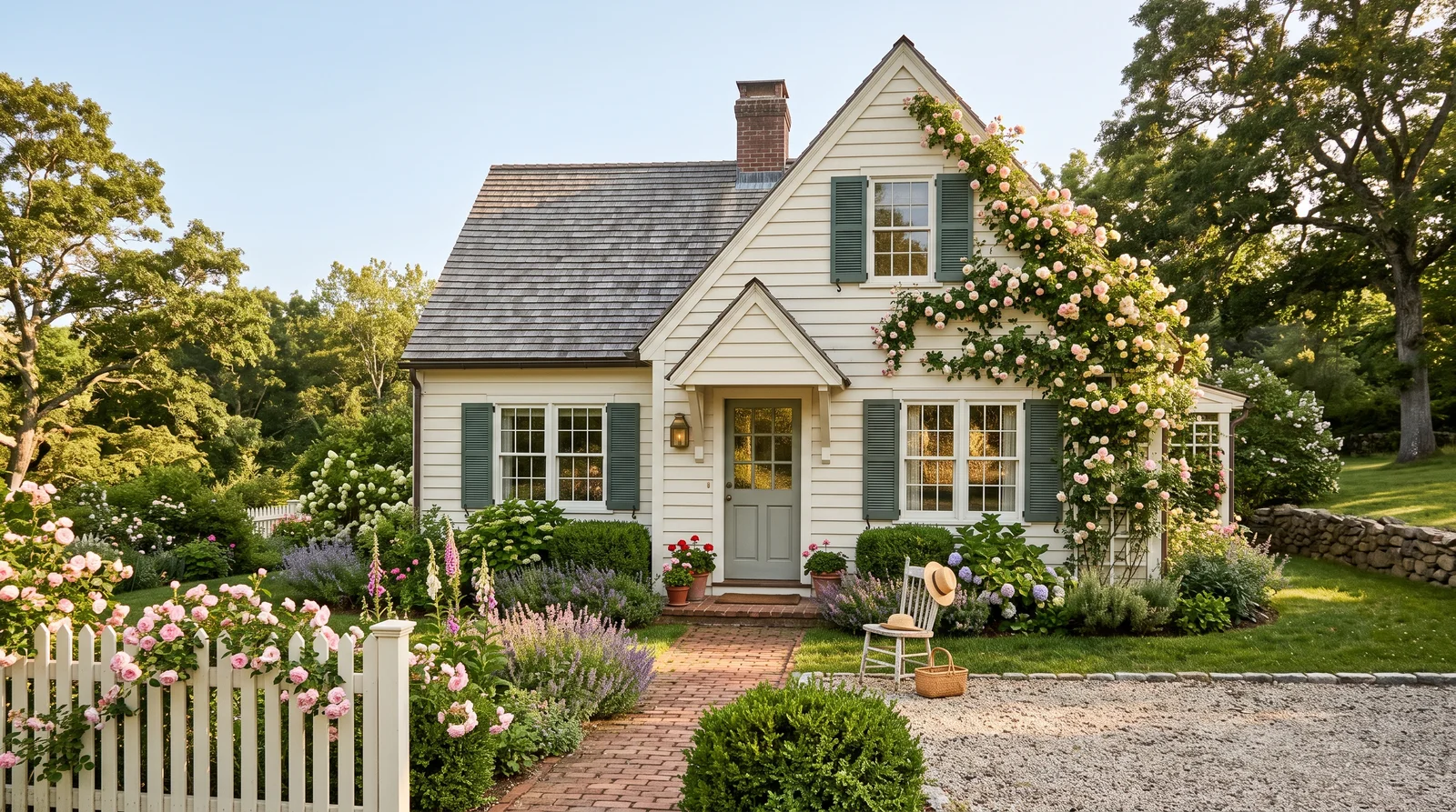
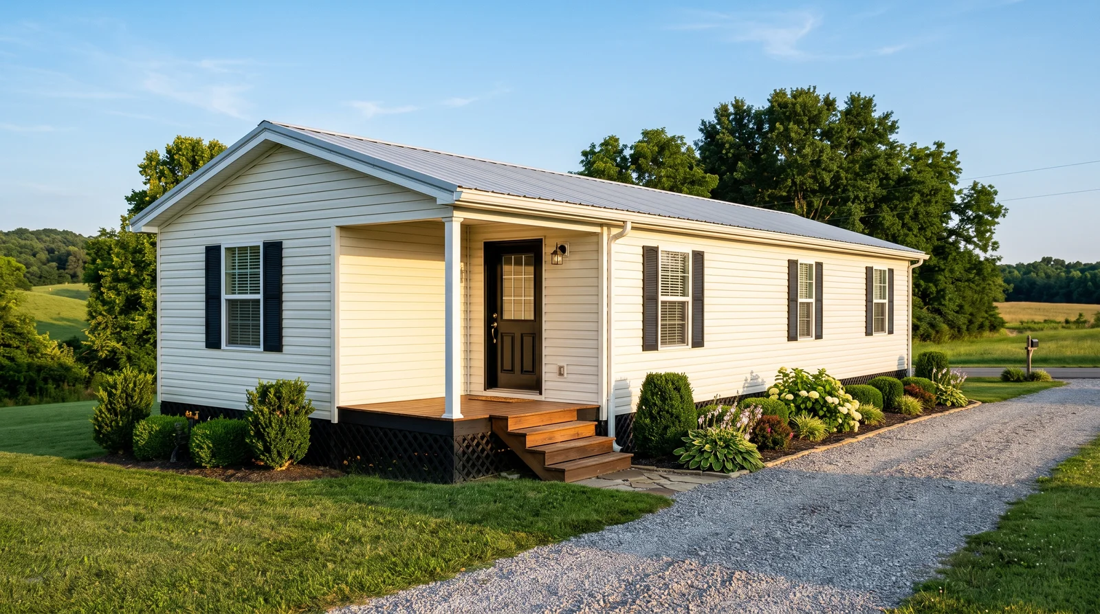
Warm cream siding, near-matching trim and a soft muted green door — the cottage look almost everyone pictures first.
Benjamin Moore Linen White (OC-146) is a true old-house cream: warm, slightly yellow, and forgiving on wavy clapboard where a bright white would show every ripple. Keep the trim close with White Dove (OC-17) so the house reads as one soft mass rather than a white grid. The color story lives at the door — Farrow & Ball Green Smoke (No. 47) is grayed enough to look like it faded there — with deeper Sherwin-Williams Rosemary (SW 6187) shutters tying the house to the hedge. In heavy shade Linen White can go buttery; sample it on the north wall first.
SEE LINEN WHITE ON YOUR WALLS →
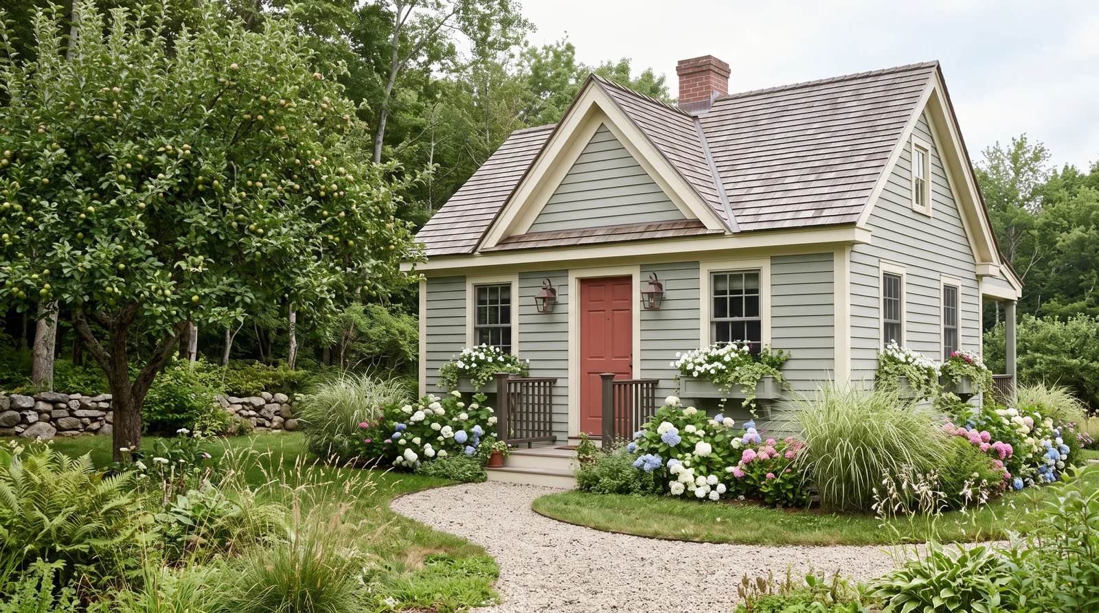
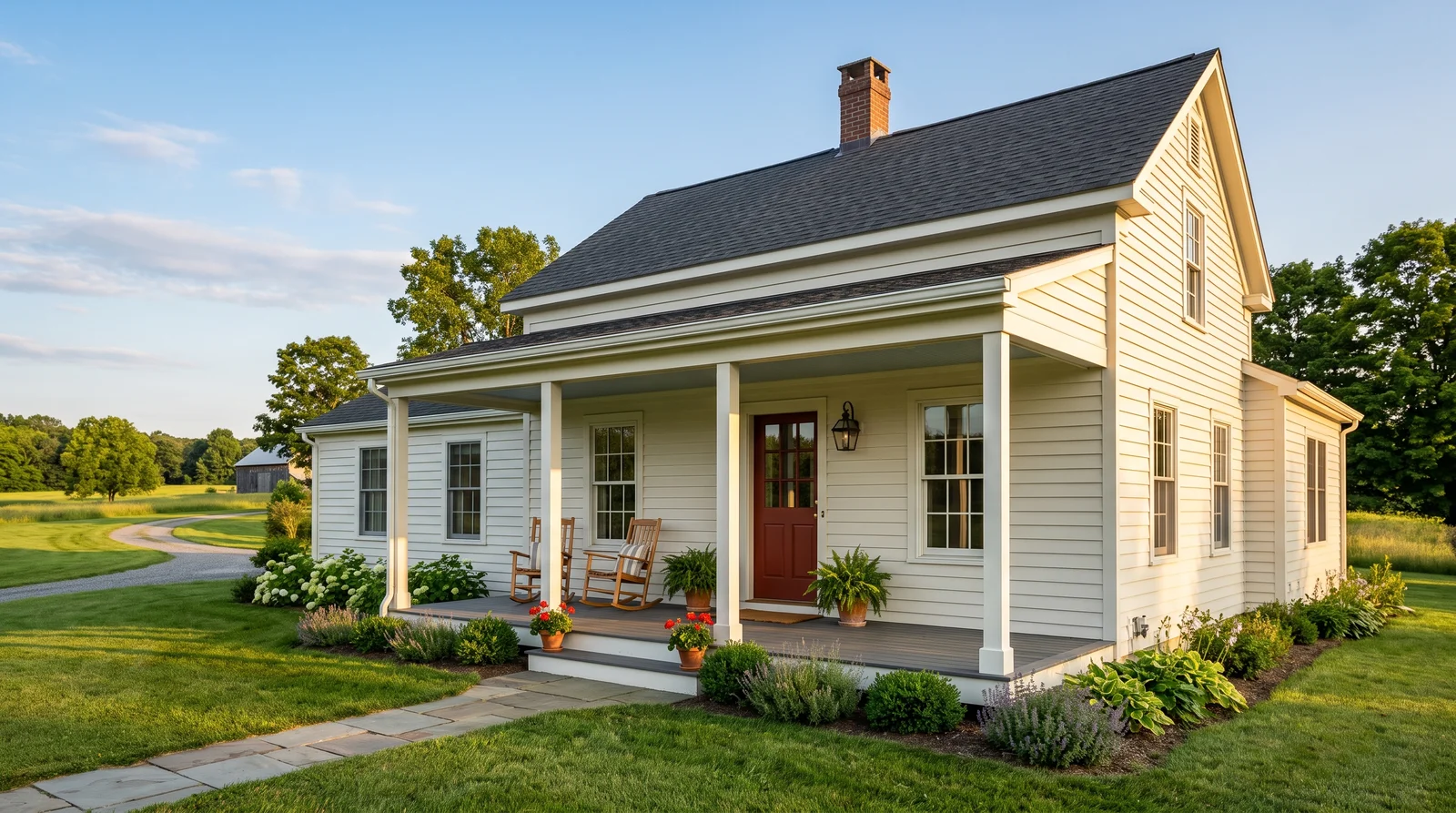
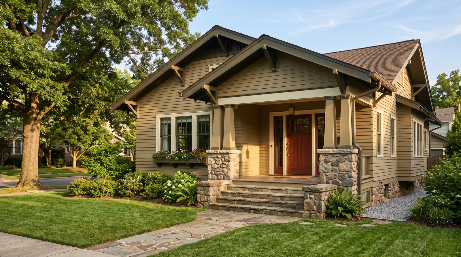
A gray-green body that disappears into the garden, warmed up by a faded brick-red door.
Sherwin-Williams Clary Sage (SW 6178) is the safest way to paint a cottage green without turning it into a statement. It is more gray than green in full sun and settles into the landscape rather than competing with it. Behr Swiss Coffee trim keeps the edges creamy instead of clinical — a stark white here would make the sage look cold. Farrow & Ball Book Room Red (No. 50) gives the door an old, dusty brick tone that reads antique, and Sherwin-Williams Urbane Bronze on railings and lanterns anchors the whole thing without going black.
SEE CLARY SAGE ON YOUR WALLS →
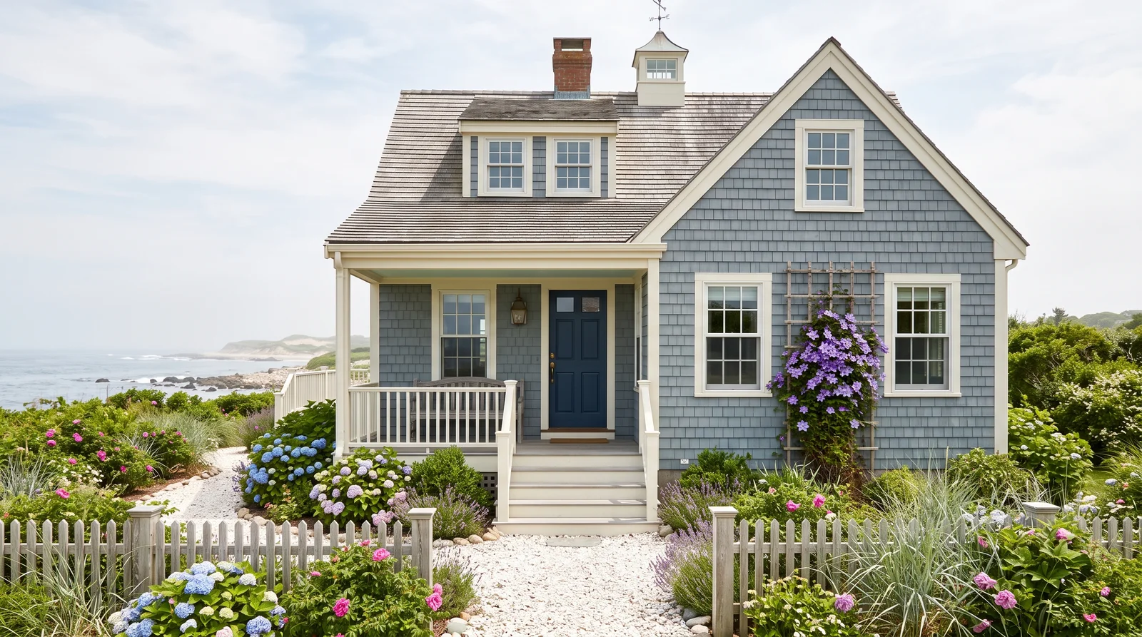
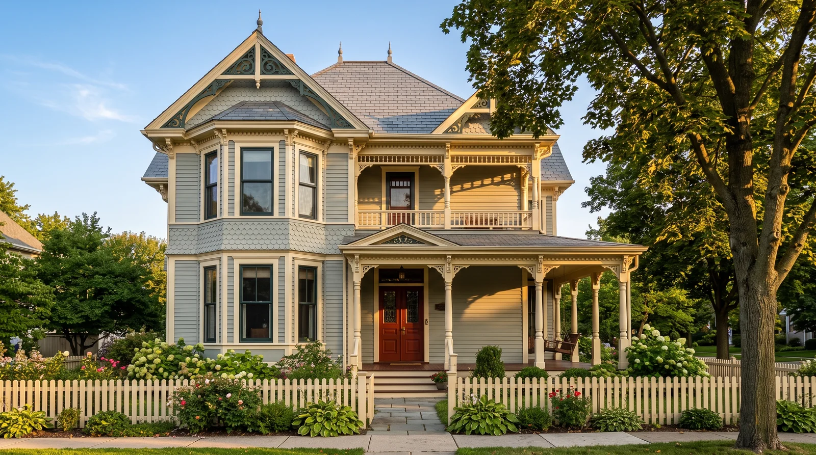
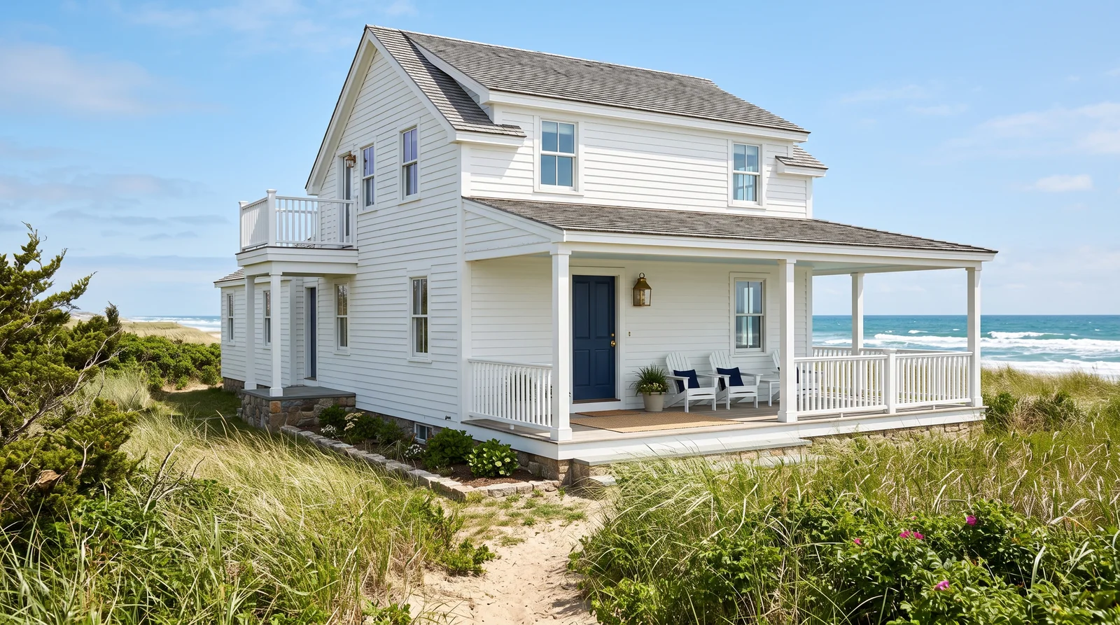
Soft weathered blue siding with a deep navy door and a haint-blue porch ceiling.
Benjamin Moore Wedgewood Gray (HC-146) is a dusty, gray-leaning blue that looks salt-washed instead of pastel, which is exactly why it survives on beach cottages where brighter blues go sugary. Valspar Bistro White trim keeps things warm and slightly aged. The door needs real depth to hold up against sky and water, so Sherwin-Williams Naval does the heavy lifting. Then paint the porch ceiling Sherwin-Williams Tidewater — the old Southern haint blue — for the one detail that makes visitors look up. Blues read a full step lighter outdoors than on a chip.
SEE WEDGEWOOD GRAY ON YOUR WALLS →
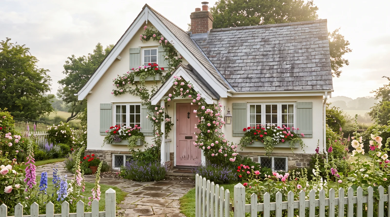
A creamy white cottage built to be a backdrop for roses, a blush door and sage window boxes.
This is the cottagecore scheme: the house steps back and the garden becomes the color. Farrow & Ball White Tie (No. 2002) is a warm, slightly yellowed white with no gray in it, so it glows under climbing roses instead of going flat. Behr Polar Bear trim is just crisp enough to read as trim. The door in Farrow & Ball Setting Plaster (No. 231) brings the dusty pink that ties into the roses, and Sherwin-Williams Evergreen Fog on shutters and window boxes echoes the foliage. Warm whites can look chalky in dense shade — check yours at noon and dusk.
SEE WHITE TIE ON YOUR WALLS →
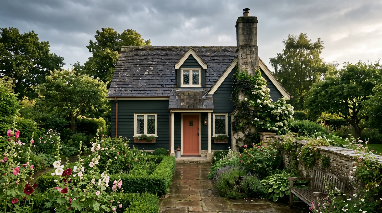
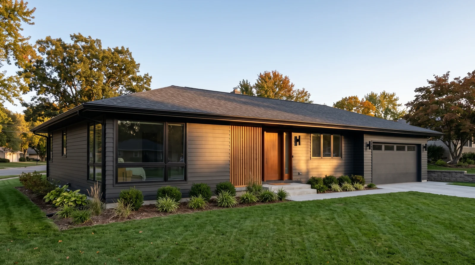
A deep, almost-black green body with pale trim and a terracotta door — small, old and cozy on purpose.
Dark bodies make small houses look older and more solid, which is why English cottages have worn deep green for two centuries. Farrow & Ball Studio Green (No. 93) reads near-black in shade and unmistakably green in sun, so the house changes all day. Benjamin Moore Mascarpone (AF-20) keeps the trim soft and creamy rather than a hard white line. Sherwin-Williams Cavern Clay gives the door a warm terracotta lift, and Valspar Montpelier Ashlar Gray on porch floor and sash ties into stone. Dark exteriors run hot — use an exterior-grade dark-tint base.
SEE STUDIO GREEN ON YOUR WALLS →Cottage Exterior Wall Color Combinations
A wall color never works alone. These are the full schemes from the rooms above — the lead color first, then the supporting colors that make the photo work.
Warm cream siding, near-matching trim and a soft muted green door — the cottage look almost everyone pictures first.
TRY THIS PALETTE →A gray-green body that disappears into the garden, warmed up by a faded brick-red door.
TRY THIS PALETTE →Soft weathered blue siding with a deep navy door and a haint-blue porch ceiling.
TRY THIS PALETTE →A creamy white cottage built to be a backdrop for roses, a blush door and sage window boxes.
TRY THIS PALETTE →More Exterior Color Ideas
Set on a color family already? Each page has its own real rooms and picks.


Light or Dark Cottage Exterior Colors?
Go Light (LRV 60+) If…
The room is small, faces north, or has to work at every hour. Light warm colors make it feel bigger and stay calm in evening light — the light you actually live in.
Go Dark (LRV Under 20) If…
You want the cocoon effect and the room has real daylight. Dark works best on one feature wall — or fully color-drenched in a large room with good windows.
See It. Love It.
Paint It.
Upload one photo of your cottage exterior and try every color on this page on your own walls — in your own light, before you buy a drop of paint.

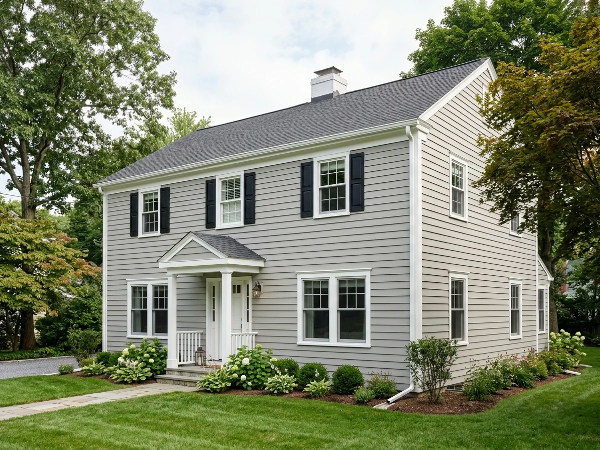
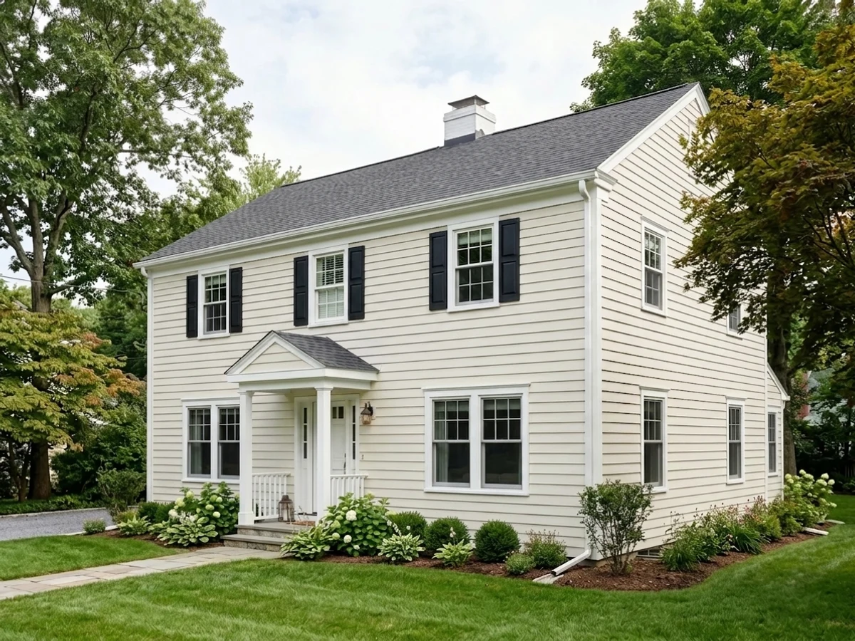
AlabasterBeforeAbout Cottage Exterior Paint Colors
Cottage color is softer than modern color. A farmhouse scheme wants crisp white and a hard black door; a cottage wants everything one step faded, as if the sun and forty winters already got to it. That means creams instead of bright whites, sage and moss instead of forest green, dusty blue instead of navy, and trim that sits close to the siding rather than fighting it. Low contrast is the whole trick. The other half of the palette is the garden — roses, boxwood, a brick path, weathered cedar — so pick colors that flatter green and terracotta, not colors that shout over them.
Most cottage schemes fall into two camps. Storybook cottages go light: cream or warm white siding, a painted door in green, blue or blush, shutters and window boxes doing the color work. English cottages go the other way: a deep green, slate or charcoal body with pale trim, so the house reads small, cozy and old. Both work on the same little house — it is a mood choice, not a rule. One honest tip: cottage colors are almost always low-chroma, and low-chroma colors shift hard in shade. Paint a two-foot sample board and walk it around the house across a full day before you commit a gallon.
The Questions Everyone Asks
What color should I paint my cottage exterior?
If you want one answer, start with the safe picks above — Clary Sage, Linen White, Wedgewood Gray, Studio Green. They read well in any light and survive furniture changes. Then check the light: strong afternoon sun wants a step cooler, a north-facing room wants a step warmer.
What are the classic cottage exterior colors?
The traditional set is warm cream, soft sage green, dusty blue and weathered white, all with creamy rather than stark trim. Benjamin Moore Linen White (OC-146) and Behr Swiss Coffee are the two most-used cottage creams, and Sherwin-Williams Clary Sage (SW 6178) is the safest cottage green because it stays gray enough not to shout. For blue, Benjamin Moore Wedgewood Gray (HC-146) is the classic. What makes any of these read cottage is low contrast — trim only a shade or two off the siding, never a bright white grid over a colored body.
What colors make a cottagecore palette?
Cottagecore is a warm white house plus garden colors, not a bright house. Start with a creamy white body like Farrow & Ball White Tie (No. 2002) or Benjamin Moore White Down (OC-131), then put the color in small doses: a dusty pink door in Farrow & Ball Setting Plaster (No. 231), sage window boxes in Sherwin-Williams Evergreen Fog (SW 9130). Skip anything with high chroma — clear pink, bright yellow or true red will look costume-y next to real flowers. The plants should be the brightest thing in the photo.
What front door color goes with a cream cottage?
Cream siding is warm, so warm or muted doors land best. Muted green is the storybook choice — Farrow & Ball Green Smoke (No. 47) or Sherwin-Williams Rosemary (SW 6187) if you want it deeper. A faded brick red like Farrow & Ball Book Room Red (No. 50) reads antique and never looks new. Dusty blue works too: Benjamin Moore Van Deusen Blue (HC-156) is a good middle ground. Avoid pure black on cream — it is a farmhouse move and it makes the cream look yellow by comparison.
Should window boxes and shutters be the same color?
Yes, in almost every case — matching shutters and window boxes is what makes the trim work look intentional instead of scattered. Pick one accent green or one deep tone and use it for both: Sherwin-Williams Evergreen Fog (SW 9130) for a soft look, Sherwin-Williams Rosemary (SW 6187) or Benjamin Moore Essex Green (HC-188) for a stronger one. If the boxes are natural wood, match the shutters to the deepest tone in the wood instead of adding a third color. The flowers are already your contrast.
Should a small cottage be painted light or dark?
Honestly, both work — the difference is what you want the house to do. Light bodies like Benjamin Moore Linen White (OC-146) make a small cottage look bigger and brighter, and they hide siding imperfections better. Dark bodies like Farrow & Ball Studio Green (No. 93) or Benjamin Moore Black Forest Green (2047-10) make it look smaller but older, cozier and more expensive, and they make the garden pop. The real trade-off is practical: dark exteriors absorb more heat, fade faster in full southern sun, and need a proper exterior dark-tint base.
What two-color combination works best in a cottage exterior?
The reliable pattern is a quiet main color plus one deep accent on a single wall. Keep trim and ceiling in one warm white so the two colors are the only event in the room — the combination cards above show complete schemes from real rooms.
What colors make a cottage exterior look bigger?
High-LRV, slightly warm colors — LRV 60–75 is the sweet spot. Paint the walls and trim close to the same light color so the corners blur, and keep the ceiling white. Stark cool white actually works against you; it creates hard shadows that show the room's edges.

Ask a Question