Tidewater
Sherwin-Williams' bluer, bolder cousin of Sea Salt, reviewed honestly: the light that makes it glow, the light that flattens it to gray, and what to pick instead.

Jessica has spec'd whites and neutrals for more than 300 rooms and keeps a sample wall of painted drawdowns in her studio. Every color review is checked against real reader rooms in the comments and re-tested when a formula changes. About the testing process →
- 1Stardew43
- 2Palladian Blue60
- 3Tidewater65
- 4Glass Slipper70
- 5Spring Thaw83
The Fast Verdict
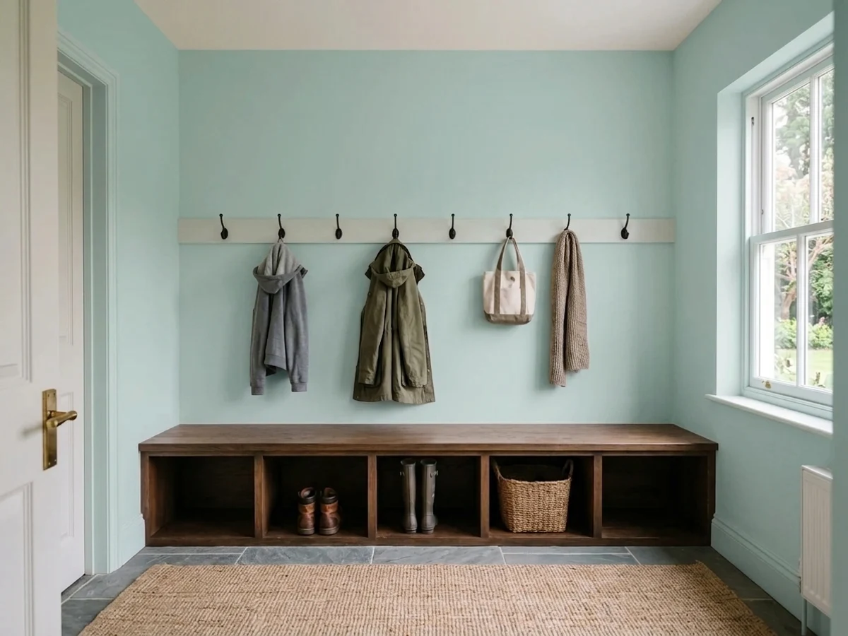
Tidewater is what you reach for when Sea Salt feels like it never quite decides on a color. Sherwin-Williams files it under Blue, but on the wall it reads as a pale, spa-like green-blue with a soft gray cast — closer to seafoam than sky. It holds its color better than most of the coastal-neutral pack, which is exactly why it works in small, quiet rooms and disappoints anyone who wanted a true neutral.
Bedrooms and nurseries · bathrooms and laundry rooms · coastal or cottage palettes · anyone who found Sea Salt too washed-out to register as an actual color
You actually want a neutral gray-greige · your room runs on cool LEDs with no daylight · your floors and trim are honey oak or heavy gold · you're pairing it with a warm-toned traditional room
- Holds real, visible color instead of fading to gray like some 'coastal neutrals'
- LRV 65 keeps small rooms bright without going pastel
- Genuinely gender-neutral — works in nurseries without reading babyish
- Pairs cleanly with white oak, matte black, and unlacquered brass
- A quieter, less-photographed alternative when Sea Salt feels overused
- Reads noticeably bluer in daylight, greener under warm bulbs — sample in both
- Cool LEDs and dim rooms flatten it toward cold gray-blue
- Fights honey oak floors and warm gold hardware
- Far less brand recognition than Sea Salt — fewer real-room photos to check your instinct against
What Color Is Tidewater, Really?
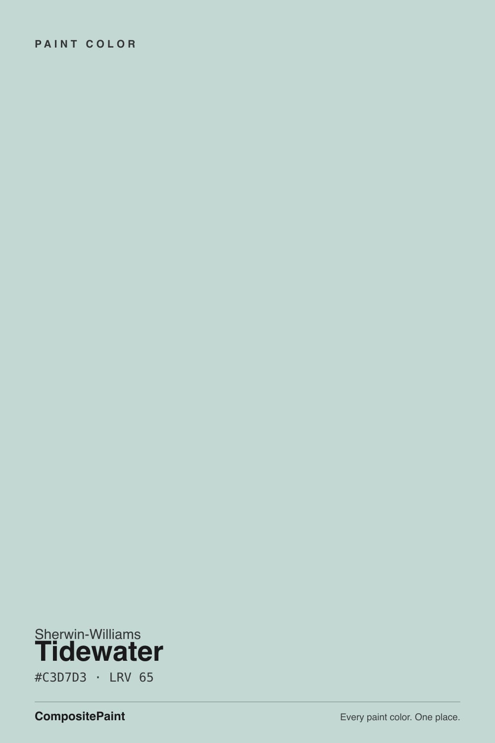
A pale blue-green with a soft gray cast — Sherwin-Williams itself files Tidewater in the Blue family, which surprises almost everyone who actually looks at the chip. Off the fan deck it reads at least as green as it does blue, closer to seafoam or sea glass than sky. That mismatch between the official label and the real-world read is the first thing to know about this color: trust your eyes over the family filter.
It sits in the same Sherwin-Williams coastal-green lineage as Sea Salt (SW 6204) and Rainwashed (SW 6211), and it is the boldest of the three. Sea Salt and Tidewater land almost identically on paper — LRV 63 versus 65 — but side by side Sea Salt goes quiet and gray while Tidewater holds visible color. If Sea Salt has ever struck you as a color that can't commit, Tidewater is the same family finally picking a side.
At LRV 65 it reflects a lot of light without going pale-pastel, which is why it reads as a genuine hue rather than a tint. Its behavior is honestly light-dependent: daylight pulls it toward blue, warm indoor bulbs pull the green forward. Neither read is wrong — but photograph it once under a cool LED and once under a lamp and you will get two different colors. That's normal for this paint, not a defect.
Where It Shines
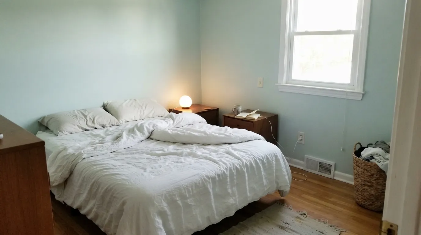
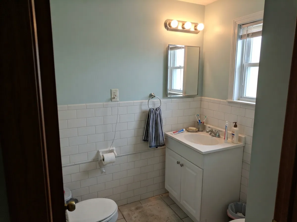
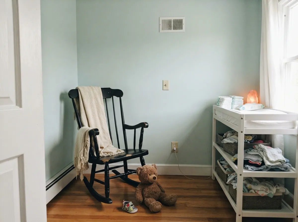
It is built for small, quiet rooms that get real daylight or a warm lamp — the opposite job from the whole-house neutral duty Sea Salt usually pulls. In a bedroom, bathroom, or nursery it holds a genuine spa-like color without tipping into anything as loud as turquoise, and its 65 LRV keeps a small room from feeling closed in the way a deeper coastal green would.
Where It Fails
Almost every disappointing Tidewater story comes down to one of three mismatches, and all three show up before the first coat if you know to look. None of them are the paint failing — they're the paint being asked to do a job it was never built for.
Tidewater is more saturated and more clearly blue-green than its famous sibling. If your goal was a chameleon neutral that recedes into the background, this is the wrong pick — it holds enough color that it registers as a decision, not a backdrop. Go to Sea Salt if quiet is the actual goal.
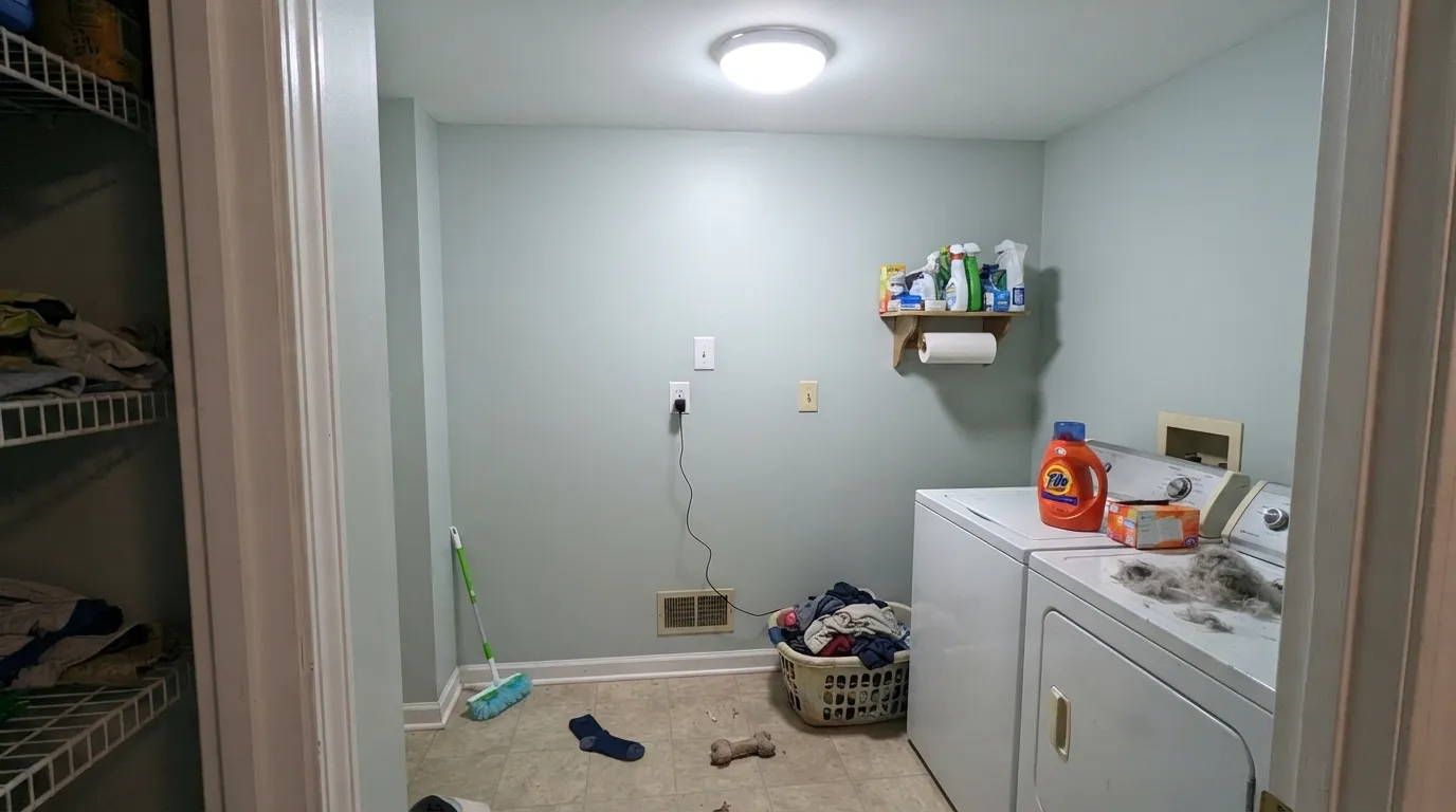
Like every pale, light-dependent color, Tidewater needs help from its light source. Cool white LEDs with no warm lamp nearby drain the green out and leave a flat, slightly cold blue-gray that reads more like an unfinished primer coat than a finished color.
Blue-green sits opposite orange-gold on the wheel, so golden oak floors, brassy yellow-toned trim, and warm gold hardware all fight it — the wood looks more orange, the wall looks more artificial. White oak, weathered gray wood, and matte black or unlacquered brass are the friendlier company.
Room by Room
Real daylight during the day, one warm lamp at night, and it does exactly what a bedroom color should: calm without going cold. Eggshell finish; keep the trim a cool crisp white, not a cream.
With white subway tile, chrome or brushed nickel, and good task lighting it reads spa-clean rather than nursery-pastel. Satin on the walls for moisture; the coastal cliché works here because the color earns it.
One of the honest reasons to reach for it — pale enough to be soothing, colored enough not to read as generic off-white. A black crib, rocker, or hardware keeps it current instead of dating in five years.
Small, low-daylight rooms are the one place a light-dependent color is actually low-risk — the room is small enough that one good fixture does the whole job. Add a warm bulb overhead and it reads reliably green-blue, not gray.
Full walls compete with cabinetry and countertop color; on a single island or a hutch under white cabinets it becomes a genuine, unexpected accent. Satin cabinet enamel; keep counters and backsplash cool-toned.
On shake siding or a beach-house exterior it reads as intentional coastal styling, especially with white trim and a navy door. On a traditional brick colonial with warm trim, skip it — the temperature mismatch reads dated fast.
Your Light Is the Risk
South or east daylight is where the blue-green actually reads as color — full, spa-like, not washed out. Sample here first.
No daylight and no warm bulb strips the color down to a flat, slightly cold gray-blue. This is the "it just looks gray" complaint waiting to happen.
Blue-leaning at midday brightness, it softens and turns visibly greener as the light warms toward evening — most people like the shift, but it is a real change, not a trick of the eye.
2700K lamps pull the green forward and the room turns spa-warm. Cool LEDs keep it colder and closer to blue-gray — pick your bulb temperature on purpose.
Most complaints about Tidewater are a light mismatch. Upload a photo of your actual room and see it on your walls — then ask for the same wall in north light or evening lamps before you buy a single sample.
Need It From Another Brand?
Any paint counter can custom-tint Sherwin-Williams SW 6477 directly. If you would rather stay in one brand's own deck, these are the closest stock matches, measured as ΔE2000. Under 2 is a difference you will not see on the wall.
| Brand | Closest color | ΔE | LRV | |
|---|---|---|---|---|
| Behr | Frosted SilverBNC-07 · Behr | 1.3 | 65 | Color page → |
| Benjamin Moore | White Rain708 · Benjamin Moore | 1.9 | 65 | Color page → |
| Valspar | Aquatic Edge5003-5A · Valspar | 0.3 | 64.8 | Color page → |
| PPG / Glidden | Blue LullabyPPG1143-2 · PPG / Glidden | 1.9 | 65 | Color page → |
| Glidden | Highest Mountain Mist30GG 65/082 · Glidden | 1.0 | 65 | Color page → |
| Dutch Boy | Muted Opal331-2DB · Dutch Boy | 2.0 | 65 | Color page → |
Similar Sherwin-Williams Colors
The nearest shades to Tidewater within Sherwin-Williams's own range, ranked by perceptual color distance — useful when you want the same look a touch lighter, darker, or warmer.
WCAG 2.1: AA is 4.5 : 1 for normal text, 3 : 1 for large text, AAA is 7 : 1.
Tidewater vs the Colors You're Also Considering
Every Tidewater sample board has the same rivals on it. The numbers show the real lightness gap — then it comes down to which risk you would rather live with.
Pick this if Sea Salt has always felt too washed-out to register — Tidewater holds actual color where Sea Salt goes gray.
Sherwin-Williams SW 6204 · LRV 63Sea SaltPick this if you want the safer, more neutral version — Sea Salt mutes down toward gray and works even when you can't commit to green or blue.
Pick this for the paler, brighter version that keeps small rooms feeling open.
Sherwin-Williams SW 6211 · LRV 47RainwashedPick this for a deeper, moodier version of the same family — Rainwashed reads more clearly green-blue and works well as an accent wall or wainscot.
Pick this for the lighter, calmer, far more predictable cousin — Oyster Bay's mood swings aren't worth it in most rooms.
Sherwin-Williams SW 6206 · LRV 35Oyster BayPick this if you want more green and more depth — Oyster Bay is bolder and shifts hard with the light, so sample it in your actual room first.
Inside the Sherwin-Williams deck, Breaktime SW 6463 at LRV 66 is the greener sibling, with hex #C4D9CE pulling clearly toward sage. Little Boy Blu SW 9054 at LRV 67 goes the other way, reading as a proper pale blue at #C7D8DB. Lullaby SW 9136 shares Tidewater's LRV of 65 but at #CBD4D4 it is close to a plain gray, so it is the safer pick if you want almost no color. Meander Blue SW 6484 at LRV 66 is the most saturated of the group and looks like a clearer aqua.
Across brands, Valspar Aquatic Edge 5003-5A at LRV 64.8 has a deltaE of 0.34 and Behr Zero Gravity N450-2 at LRV 65 a deltaE of 0.47, so both are the same color for practical purposes. Benjamin Moore White Rain 708 at LRV 65 sits at deltaE 1.88, which is visually identical in normal room light. Clare Nairobi Blue PNT100-LT-36 at LRV 67 is further out at deltaE 3.37, very close but worth sampling first.
Tidewater Coordinating Colors
The rule for coordinating with Tidewater: keep every neighboring color cool. Crisp whites, near-black accents, and its own deeper same-family cousins all work; warm creams and honey tones fight it. These are the partners that keep showing up in rooms that work:
Tidewater vs. the Sherwin-Williams Coastal Family
Sherwin-Williams files Tidewater under its Blue color family, but almost nobody who has actually painted a wall with it describes the result as blue — most call it seafoam, sea glass, or spa green. Trust the wall over the drop-down filter: this is a color built to read as blue-green with a gray cast, not as a blue in the way Naval or a true navy is blue.
Within Sherwin-Williams's own coastal-green lineage — Sea Salt, Tidewater, Rainwashed, Oyster Bay, running from LRV 63 down to 35 — Tidewater sits at the top of the range and is the most saturated of the pale end. Sea Salt, at almost the identical LRV, mutes down toward gray; Tidewater holds its color. If you have stood at the fan deck deciding between the two, that is the real difference, not the LRV number.
It has not had a Color of the Year moment and it does not carry the brand recognition Sea Salt built over a decade of farmhouse and coastal styling. That is an honest trade: less proven, fewer real-room photos to check your instinct against, but also less overused — in a market full of Sea Salt kitchens, Tidewater is the quieter way to get the same coastal calm.
Tidewater With Wood Tones and Metals
White oak, weathered gray wood, and driftwood-finish furniture are its best company — the cool, low-saturation wood tones let the blue-green stay the main event instead of competing for warmth. Honey oak and any warm gold-toned wood are the one real mismatch: blue-green sits opposite orange on the color wheel, so a golden floor pushes both the floor and the wall toward looking slightly off, not just mismatched.
Matte black, brushed nickel, and chrome are the natural cool-metal partners and read effortlessly modern against it. Brass works too, but the unlacquered, aged kind — a bright, mirror-polished brass can look slightly too warm and try-hard next to a color this quiet; let the metal age in, or choose a satin finish over a high-shine one.
Three Ready Palettes Built on Tidewater
A color is never alone on the wall. These are complete combinations in the 60-30-10 pattern, with the reason each one holds together. Every one opens in the visualizer.
Pure White keeps the crisp, cool edge Tidewater needs — a warm cream trim would fight the blue-green. Naval supplies the one dark note a spa bathroom wants without breaking the coastal mood.
Try this palette in your roomTwo depths of the same green-blue family read as one deliberate palette instead of a color change — Rainwashed grounds the room below a chair rail or on cabinetry while Tidewater stays light above it. Pure White keeps the transition crisp.
Try this palette in your roomA single black accent keeps a pale spa color from reading babyish, and it's the same trick that works in adult rooms — this palette ages with the kid instead of needing a redo at five.
Try this palette in your roomTidewater FAQ
Is Tidewater blue or green?
Officially Sherwin-Williams' catalog puts it in the Blue family, but on the wall it reads at least as green — most owners call it seafoam or spa green before blue. Daylight pulls it bluer; warm indoor bulbs pull the green forward. Both are honest reads of the same paint.
How is it different from Sea Salt?
Almost the same LRV — 65 versus Sea Salt's 63 — but a very different feel. Sea Salt mutes down toward a soft gray-green neutral; Tidewater holds noticeably more visible blue-green color side by side. Pick Sea Salt if you want a chameleon that recedes; pick Tidewater if you want the room to register an actual color.
Is it good for a nursery?
Yes — it is genuinely gender-neutral, calm without being babyish, and light enough (LRV 65) to keep a small room from feeling closed in. A black crib, rocker, or hardware keeps it from reading too soft.
What trim white goes with Tidewater?
A cool, crisp white — Pure White or Extra White in the Sherwin-Williams deck. A warm cream trim fights the blue-green and can make the walls look slightly dingy by comparison; keep the whole trim package cool.
Will it look gray in my room?
It can. A dim room with no daylight and only cool LED bulbs strips the green out and leaves a flat, cold blue-gray. Add a warm 2700K lamp or make sure the room gets real daylight, and the color comes back.
Does it work on exteriors?
Yes, especially on shake-sided or shingle-style coastal homes with white trim and a navy door — it reads as deliberate beach-house styling. On a traditional brick house with warm trim, the temperature mismatch tends to look dated rather than intentional; skip it there.
Have you painted with Tidewater?
Rate it — one tap helps the next reader decide.
Ask a Question