Grant Beige
Benjamin Moore's 1976 landmark beige, reviewed honestly: the real green undertone, the 1990s builder-beige reputation, and where it still quietly wins.

Jessica has spec'd whites and neutrals for more than 300 rooms and keeps a sample wall of painted drawdowns in her studio. Every color review is checked against real reader rooms in the comments and re-tested when a formula changes. About the testing process →
- 1Dorian Gray39
- 2Mindful Gray48
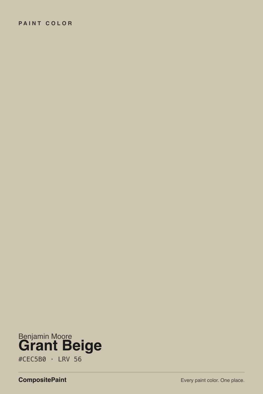
- 3Grant Beige56
- 4Pale Oak69
- 5Shoji White74
The Fast Verdict
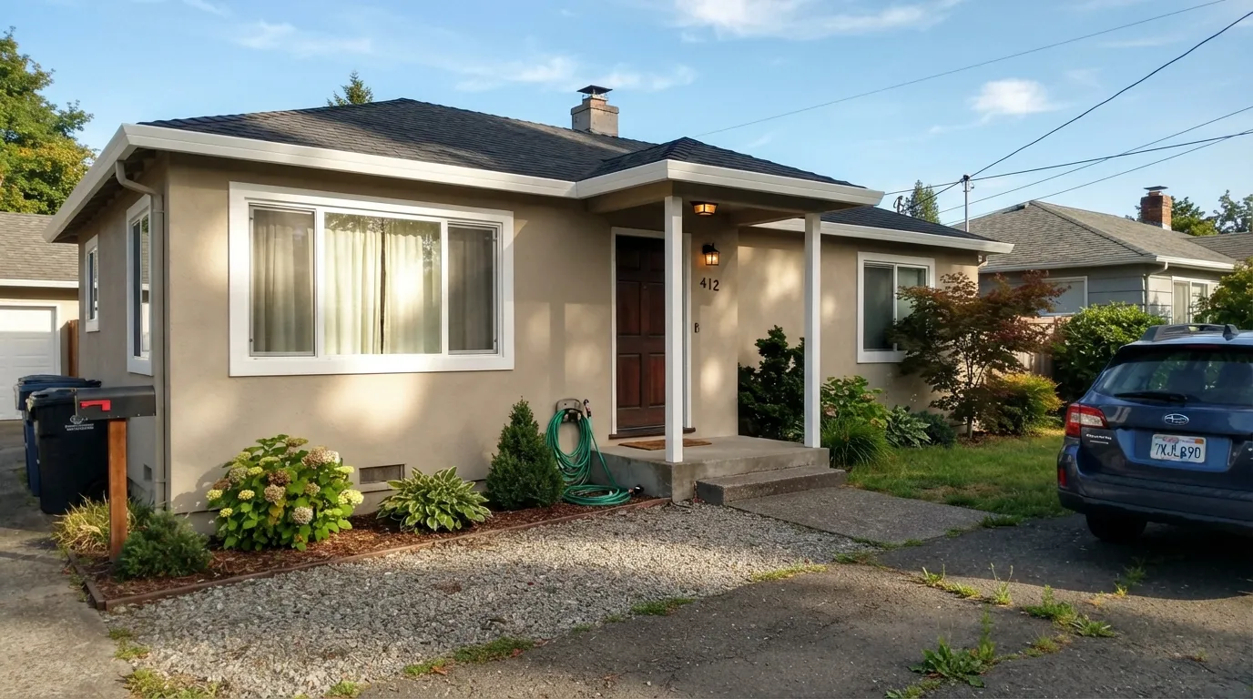
Grant Beige is a warm greige from Benjamin Moore's Historical Colors collection, unveiled in 1976 and inspired by America's landmarks — long before greige was a marketing word. It balances beige and gray in close to equal measure, with a real green undertone that is either its best trick or its biggest surprise depending on the light. It rode the 1990s and 2000s builder-home boom hard enough that it now carries a genuine dated reputation.
But on a ranch or Mediterranean-style exterior, next to honey oak cabinets, or as a period-correct repaint, it still does exactly what it was built to do — and it does it more calmly than most of the beiges chasing its job today.
Ranch, Mediterranean and traditional-style exteriors · kitchens with honey oak you're not replacing · period-correct repaints of 1990s–2000s houses · anyone who wants warm without tipping orange
You want the current gray-forward trend look · your exterior stone or brick leans pink or orange · the wall or siding sits in heavy shade with cool bulbs nearby · you're actively trying to erase a "builder beige" look
- Genuine warm-beige-meets-gray balance — rarely tips peachy or orange
- One of the most road-tested exterior beiges in the American housing stock
- Historical Colors pedigree since 1976 — built for stone, dark wood and stucco, not a fad
- Sits calmly against honey oak cabinets and floors without amplifying the orange
- LRV 56 mid-depth hides dirt and weathering better than a pale exterior white
- Real green undertone shows up plainly in shade, near foliage, or under cool bulbs
- Fights pink- or orange-toned stone and brick instead of complementing it
- Carries a genuine "1990s builder beige" reputation some buyers actively avoid
- An all-beige room or facade with no dark contrast reads flat and dated fast
What Color Is Grant Beige, Really?
Grant Beige is not a trend color — it is older than the word greige. Benjamin Moore released it in 1976 as part of the Historical Colors collection, a deck built around America's landmark buildings, and it spent the next three decades as one of the most-used exterior and whole-house beiges in the country, especially on the stucco and vinyl-sided tract homes of the 1990s and early 2000s. That history is the whole story: it was never picked for a magazine spread, it was picked because it worked on thousands of ordinary houses at once.
The undertone is the part reviewers actually argue about, and the most consistent answer across paint-color sites and designers is green — a quiet, grayed-down green that keeps the beige from tipping peachy or orange the way a straight yellow-based tan does. At LRV 56 it reflects roughly half the light that hits it, so it reads noticeably lighter in open daylight and settles into a deeper, warmer tan under evening light. A minority of reviewers report a faint pink-gray cast in cool north light instead — both are the same paint being honest about a color that sits almost exactly between beige and gray, with nothing strong enough on either side to pin it down completely.
Undertone in one line: warm tan with a quiet green pull, closer to true neutral than most beiges of its era. If your sample looks distinctly olive in a shaded corner or next to hedges, that is the paint doing what it does — not a bad can.
Where It Shines
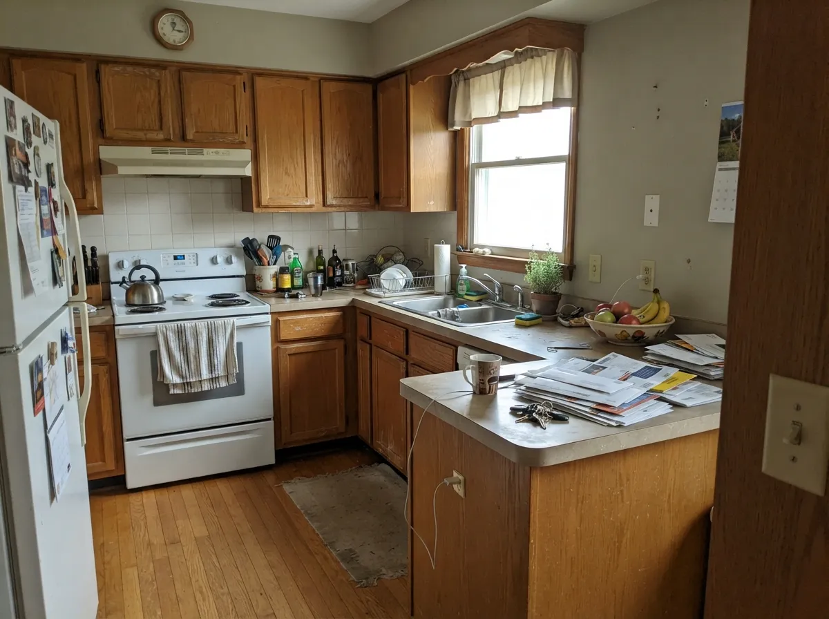
Grant Beige's best job was always outside. On stucco, vinyl siding and stone-and-stucco ranch or Mediterranean-style homes it reads warm and settled instead of glaring, and its Historical Colors pedigree means it was engineered to sit next to natural stone, dark wood shutters and terracotta roofing without a fight. Indoors, its second home is a kitchen nobody has gutted yet: against honey oak cabinets and oak floors, the green-warm undertone meets the wood's own warmth halfway instead of amplifying the orange the way a cooler gray would.
Where It Fails
Almost every complaint about Grant Beige traces back to one of three predictable situations, and none of them are really the paint's fault. If your house or room matches one, this specific beige is not for you — but the fix is usually a different color, not more coats.
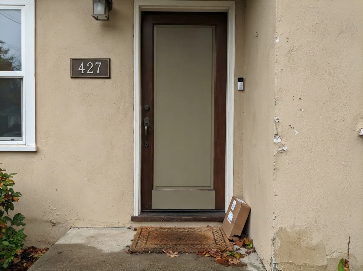
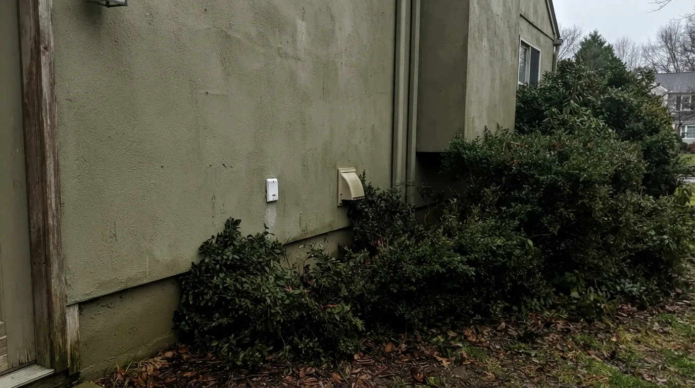
The green undertone that keeps Grant Beige from going orange in the sun is the same undertone that shows up plainly in shade — near hedges, under a covered porch, or on the shaded side of the house it can read closer to muddy olive than beige. Walk the sample around the whole exterior in real light before committing a gallon.
Grant Beige was built to sit next to gray stone, brown roofing and dark stained wood. Against the pink-flecked or orange-toned stone and brick common on 1990s-2000s spec homes, the mismatch is obvious — the stone reads more pink, the siding reads more green. Match the stone's own undertone first, then pick the beige.
The look that made Grant Beige ubiquitous — beige siding, beige carpet, beige counters, honey oak, all at once — is also the look most people now describe as dated. The color hasn't changed; the all-beige, zero-contrast styling around it has fallen out of favor. Give it a genuinely dark trim, door or floor and it stops reading like a spec home.
Room by Room
Stucco, siding, or a full ranch/Mediterranean facade. Part of BM's Historical Colors line since 1976, it was made for this job. Pair with gray or brown stone, dark stained wood shutters, and a genuinely dark door — not builder-grade off-white trim, which lets it read flat.
The green-warm undertone sits calmly against oak cabinets and floors instead of fighting the orange the way a cool gray does. It is the color for someone who isn't refinishing the oak this year.
Works as a traditional, settled backdrop as long as the trim and one piece of furniture are genuinely dark or genuinely white — not another shade of tan. A monochrome beige room is where the dated complaints come from.
Reads warm and calm in daylight; in a shaded corner or under cool LED bulbs it can dull toward green-gray. Warm 2700K bulbs keep it on the beige side of the line.
It carries room to room without clashing, which is exactly why builders used it everywhere at once. Break the monotony with a genuinely dark door, stair rail or piece of millwork so the house doesn't read like a single unbroken beige box.
Cool gray or blue-toned quartz and marble expose the green pull and make both the counter and the wall look slightly off. Fine with warm stone, wood vanities or brass; argue-prone with anything cool and polished.
Your Light Is the Risk
Low warm sun brings the tan forward and settles the green pull — the most flattering hour on siding and exterior walls alike.
Cool, indirect light exposes the green undertone and can push it toward a muddy olive. Sample it on the actual shaded wall, not just the sunny side.
Warmer and tanner at the sun hours, quieter and more gray-green mid-day. The swing is real but gentle — most owners read it as one settled color.
2700K bulbs keep it firmly on the beige side. Cool white LEDs pull it toward gray-green — swap the bulb before you second-guess the paint.
Most complaints about Grant Beige are a light mismatch. Upload a photo of your actual room and see it on your walls — then ask for the same wall in north light or evening lamps before you buy a single sample.
Need It From Another Brand?
Any paint counter can custom-tint Benjamin Moore HC-83 directly. If you would rather stay in one brand's own deck, these are the closest stock matches, measured as ΔE2000. Under 2 is a difference you will not see on the wall.
| Brand | Closest color | ΔE | LRV | |
|---|---|---|---|---|
| Sherwin-Williams | Cargo PantsSW 7738 · Sherwin-Williams | 0.5 | 56 | Color page → |
| Behr | Yuma SandHDC-NT-18 · Behr | 0.6 | 57 | Color page → |
| Valspar | Chopped AlmondsT680 · Valspar | 0.8 | 56.8 | Color page → |
| PPG / Glidden | SynchronicityPPG1021-2 · PPG / Glidden | 2.5 | 56 | Color page → |
| Glidden | Chatham Green40YY 53/119 · Glidden | 0.7 | 53 | Color page → |
| Dutch Boy | Cinder Stone419-2DB · Dutch Boy | 1.1 | 58 | Color page → |
Similar Benjamin Moore Colors
The nearest shades to Grant Beige within Benjamin Moore's own range, ranked by perceptual color distance — useful when you want the same look a touch lighter, darker, or warmer.
WCAG 2.1: AA is 4.5 : 1 for normal text, 3 : 1 for large text, AAA is 7 : 1.
Grant Beige vs the Colors You're Also Considering
Every Grant Beige sample board has the same rivals on it. The numbers show the real lightness gap — then it comes down to which risk you would rather live with.
Pick this for real, unmistakable warmth — Grant Beige holds its tan character where the coolest greiges start to feel gray.
Benjamin Moore HC-172 · LRV 56Revere PewterPick this for the same mid-depth greige with a straighter gray-taupe lean and less green to manage.
Pick this for the more balanced greige — Grant Beige sits closer to true neutral, less obviously "tan."
Benjamin Moore HC-81 · LRV 53Manchester TanPick this for more overt tan and less gray — it shares the same green-flash risk but reads warmer and more yellow overall.
Side-by-side comparison →Pick this for the cooler-balanced greige that argues less with gray stone, stainless and modern fixtures.
Benjamin Moore HC-45 · LRV 58Shaker BeigePick this for BM's other 1976 Historical Colors beige — plainly, warmly tan, with no green to test for.
Pick this for the specific gray-green balance and the deeper, landmark-era Historical Colors pedigree SW's beige doesn't have.
Sherwin-Williams SW 7036 · LRV 58Accessible BeigePick this if your painter works in Sherwin-Williams — a comparable warm neutral without Grant Beige's green undertone to manage.
Manchester Tan HC-81, hex #CFC0A4 at LRV 53, is the comparison people run most. Manchester Tan is three points darker and carries more yellow in its mix, so side by side it reads as the warmer, more traditional tan while Grant Beige looks slightly lighter and more grayed. If your room already gets strong afternoon sun, Grant Beige is the safer of the two.
Across brands the matches are unusually tight. Sherwin-Williams Cargo Pants SW 7738, hex #CDC4AE at LRV 56, sits at a delta E of 0.47, and Behr Yuma Sand HDC-NT-18, hex #D0C6B0 at LRV 57, at 0.57. Both are close enough to call the same color on a wall. Valspar Chopped Almonds T680 at 0.78 and Dutch Boy Cinder Stone 419-2DB at 1.15 are visually identical in normal room light.
Farrow and Ball Oxford Stone No. 264, hex #CFC1AD at LRV 54, is further out at 2.74. It is very close, but sample first.
Grant Beige Coordinating Colors
The rule for coordinating with Grant Beige: stay warm, stay natural, and give it something genuinely dark to play against. It was built for gray-to-brown stone, dark stained wood and stucco, and it goes flat next to too many shades of the same beige. These are the partners that keep it from reading like an unbroken beige box:
Grant Beige's Real Story: A 1976 Landmark Beige That Became Every Subdivision's Default
Benjamin Moore unveiled Grant Beige in 1976 as part of the Historical Colors collection — a deck of shades pulled from America's landmark buildings, meant to read as heritage, not trend. That is genuinely how it started. What happened next is the part most reviews skip: through the 1990s and into the 2000s, Grant Beige became one of the most common exterior colors on new-construction and spec homes across the country, stuccoed and sided onto tract houses by the thousand alongside honey oak cabinets and beige carpet inside.
That ubiquity is exactly why it now carries a real "builder beige" reputation — plenty of people associate it with a specific era of American subdivision architecture they'd rather move past. But the color itself never stopped being a genuinely well-built warm greige. It still shows up deliberately in Mediterranean, ranch and traditional-style architecture, and in restorations of the very houses it was originally painted on. The honest read: this is not a fashionable pick in 2026, and it was never trying to be one — it is a color with three decades of real-world proof that it works, still doing the job it was built for.
Grant Beige on Exteriors
Outside is where Grant Beige earns its reputation, good and bad. Against gray or brown-toned natural stone, dark stained wood, terracotta roofing and stucco, it reads warm and settled without glaring in full sun — the reason it turns up so often on ranch and Mediterranean-style homes. It handles bright southern exposure well; the color that needs testing is the shaded side of the house, where the green undertone under discussion throughout this review shows up most plainly.
The mismatch to avoid is stone or brick with a pink or orange lean — a common combination on 1990s-2000s spec homes, and the reason some of those houses look slightly off even when the siding itself is fine. Match the masonry's undertone before picking the beige, not after. For trim and doors, a warm white (White Dove, Cloud White) keeps the temperature consistent, and a genuinely dark door or shutters — deep brown or a soft near-black like Wrought Iron — does more to modernize the facade than swapping the beige itself ever will.
Three Ready Palettes Built on Grant Beige
A color is never alone on the wall. These are complete combinations in the 60-30-10 pattern, with the reason each one holds together. Every one opens in the visualizer.
Grant Beige's warm greige needs a warm trim white, not a stark cool one, or it reads dingy by comparison — White Dove matches its temperature. Wrought Iron gives a ranch or Mediterranean silhouette real definition without the harshness of true black.
Try this palette in your roomGrant Beige's green-warm undertone sits calmly next to honey oak cabinets and floors instead of amplifying the orange the way a cooler gray would. Cloud White keeps the trim warm too, and Kendall Charcoal gives the kitchen one real dark anchor without touching the cabinets.
Try this palette in your roomBoth beiges come from Benjamin Moore's 1976 Historical Colors collection, so their undertones were built to sit together on the same period-correct house. Van Dyke Brown supplies the deep, wood-toned anchor real Colonial and Craftsman exteriors use instead of flat black.
Try this palette in your roomGrant Beige FAQ
Is Grant Beige gray or beige?
Both, almost exactly in the middle. It's a warm greige with a quiet green undertone — beige enough that nobody calls it gray, gray enough that it never tips orange the way a straight yellow-based tan can.
Does Grant Beige look green?
It can, and that's the real undertone talking, not a bad batch. In shade, near foliage, or under cool LED bulbs the green pull becomes noticeable. In good daylight or warm 2700K light it reads as a settled warm beige.
Is Grant Beige outdated?
It carries a genuine 1990s–2000s builder-beige reputation, fairly earned — it was one of the most-used tract-home exterior colors of that era. It's still specified deliberately today on ranch, Mediterranean and traditional-style homes and by owners restoring period houses. If you want the current gray-forward look, this isn't it; if you want the honest historical beige, it still delivers.
What trim white goes with Grant Beige?
A warm white — White Dove or Cloud White, not a stark cool white. A cold trim white makes the warm greige body look dingy by comparison, the same mismatch that shows up on a lot of dated-looking 1990s exteriors.
Does Grant Beige work with oak cabinets or floors?
Yes, comfortably. The green-warm undertone meets honey oak's own warmth halfway instead of amplifying the orange the way a cooler gray does. It's a genuine option for a kitchen that isn't getting new cabinets.
Is Grant Beige good for exteriors?
It's arguably the color's best job — part of Benjamin Moore's Historical Colors collection since 1976 and used on stucco and siding across the country ever since. Pair it with gray or brown stone (not pink- or orange-toned) and a genuinely dark door or shutters, and check the shaded side of the house before you commit — that's where the green undertone shows most.
Have you painted with Grant Beige?
Rate it — one tap helps the next reader decide.
Ask a Question