Sherwin-Williams Mindful GrayvsSherwin-Williams Dorian Gray
Why this comparison: Same SW strip one step apart — Dorian Gray is the deeper pick that shows up on cabinets. Mindful Gray and Dorian Gray are very close (ΔE 4.49). The difference shows up most in side-by-side comparison and under specific light.

Built from our full reviews of both colors — same measured data, same real-room photos. About the testing process →
The Numbers
Mindful Gray is slightly lighter (LRV 48 vs 39, 9-point delta).
What Each Color Really Is
A warm gray — a greige — but the warmth is dialed way down. Saturation sits at about 12 percent, which in plain terms means there is barely any color in it at all; what little there is leans tan and earthy rather than blue. That is why it looks like an honest gray in the room instead of a beige pretending to be one. Put it beside a true cool gray and its softness jumps out. Put it beside a real beige and it looks positively steely. It lives right on the fence, which is exactly why so many people land on it.
The number that matters is LRV 48, and it is the number people ignore. Repose Gray sits at 58 and Agreeable Gray at 60 — ten to twelve points lighter. That does not sound like much on paper, but on four walls it is the difference between a room that feels bright and a room that feels held. Mindful Gray never darkens a space the way a true charcoal does, and it never washes out either. It just has body. If you have been looking at Instagram photos of airy greige rooms and assuming this is that color, it is not.
A mid-tone greige built on a soft red-brown base — warm, but only just. Saturation sits near 11 percent, so the beige side never announces itself the way a true tan does; it reads as stone or wet sand rather than brown. That low saturation is also why people describe it three different ways in the same thread. Some see taupe, some see a faint purple flash, and outdoors plenty of people see green. All three are true, because there is barely enough color in it to commit to one story.
LRV 39 is the number that decides whether you like it. Repose Gray sits at 58 and Mindful Gray at 48, so Dorian Gray is a full step deeper than the greiges most people already know — closer to Intellectual Gray (36) than to anything in the pale range. On a wall that means real depth: shadows in corners, visible contrast against white trim, a room that feels furnished. In a dim room it means the walls close in, because a mid-tone with no light to reflect behaves like a dark color.
Specs Side by Side
| Spec | Mindful Gray | Dorian Gray |
|---|---|---|
| Brand | Sherwin-Williams | Sherwin-Williams |
| SKU | SW 7016 | SW 7017 |
| Hex | #BCB7AD | #ACA79E |
| RGB | 188, 183, 173 | 172, 167, 158 |
| LRV | 48 | 39 |
| Undertone | red-orange / warm | red-orange / warm |
| Family | Neutral | Neutral |
How Light Changes Them
Strong warm sun brings the greige forward and the room feels soft and grounded all day.
Cool flat daylight strips the warmth out and leaves a heavy gray. The number-one regret.
2700K bulbs push it to taupe; 3000K keeps it gray. Change bulbs before you change paint.
A lawn or trees outside the window bounce green in and tip it toward sage. Test in summer.
Warm sun brings the tan side forward and keeps it stone-colored all day. The room it was made for.
Cool, thin light with nothing to reflect. Warmth drains, the wall reads flat and heavy. Test a big sample.
2700K bulbs make it cozy and taupe. Cool 4000K LEDs push it gray and can expose the purple lean.
Lawn and leaf reflection tips it toward sage in summer. Sample on the shaded side too, not just the sunny wall.
Both Colors in Real Rooms
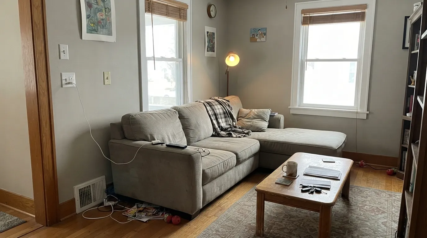
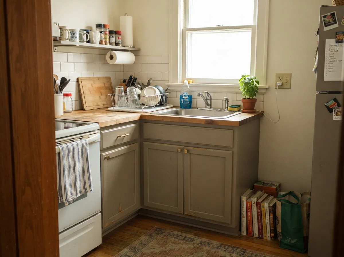
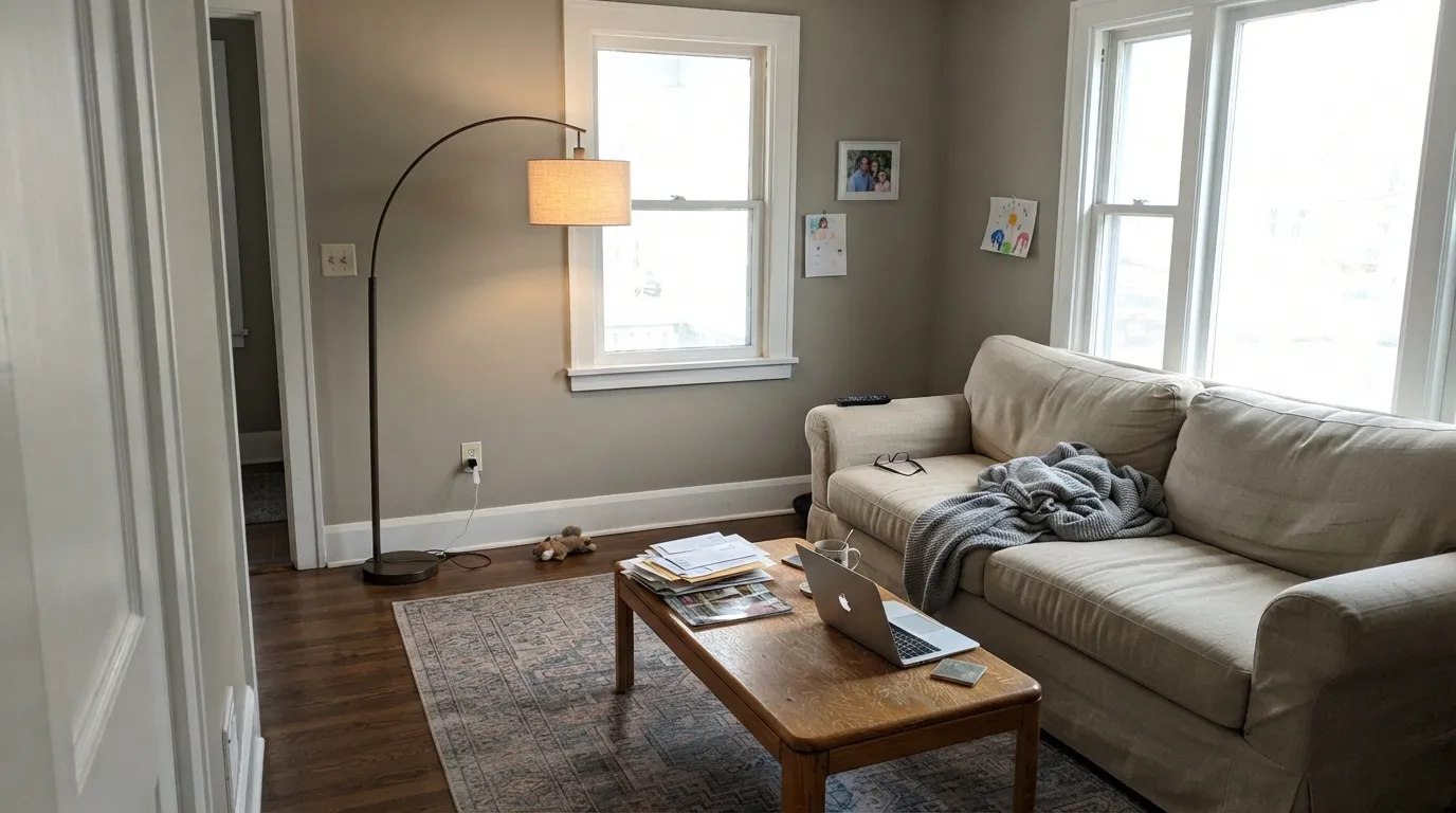
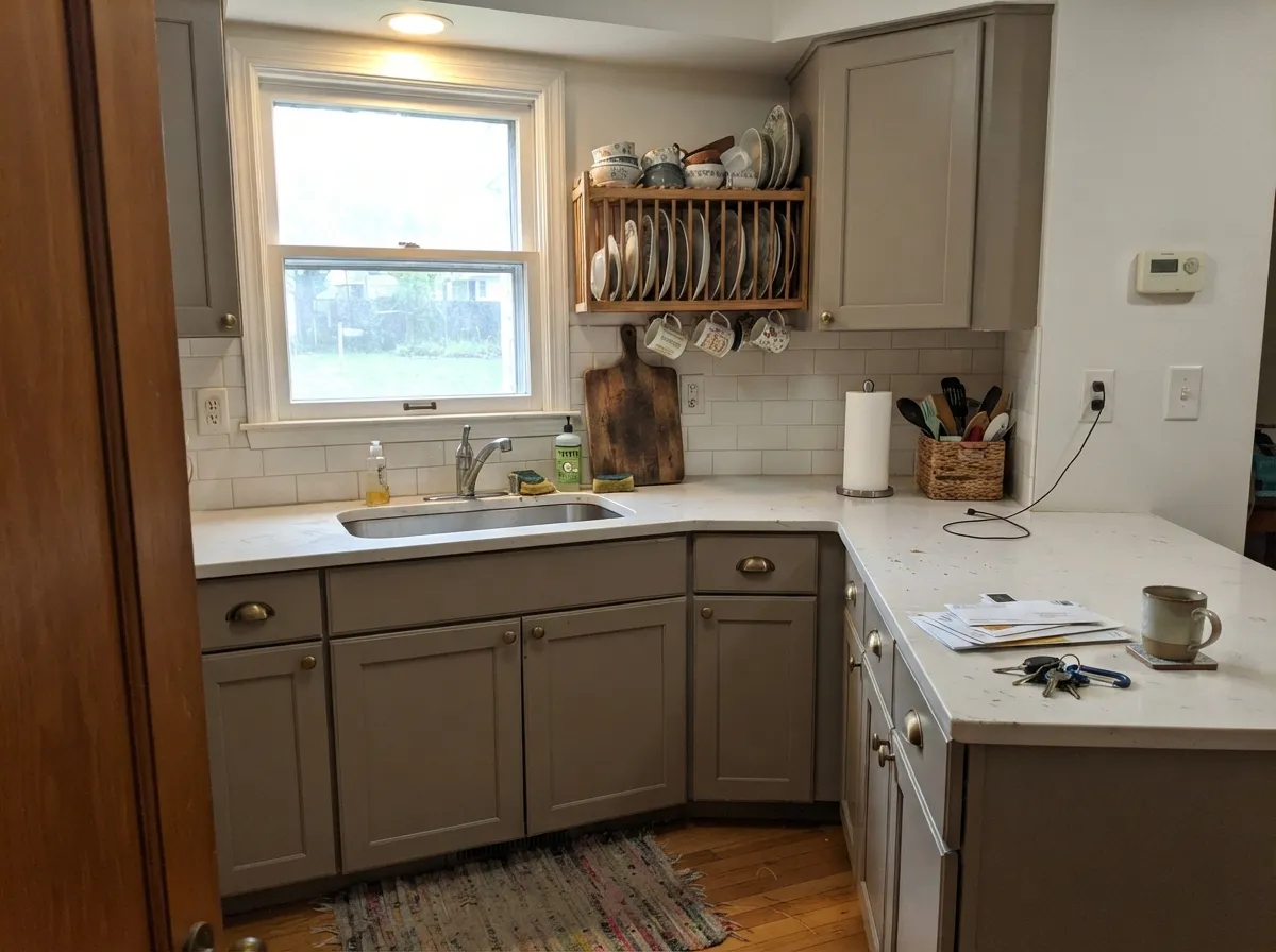
Photos from our full reviews — the same rooms and captions, so you can judge each color where it actually lives, not on a chip.
When to Pick Which
Living rooms and bedrooms with two or more windows · kitchen and bathroom cabinets · a main floor you want grounded rather than airy · exterior siding with white or bronze trim
Your room is small, dim and north-facing · you actually wanted a light, airy greige · your floors and counters are cool gray · you want a true gray with no brown in it
Main rooms with real daylight · craftsman and farmhouse siding · kitchen cabinets and islands · anyone whose last gray kept reading blue
One small north window and no lamps · you want light and airy · your trim is builder cream · you love a crisp, cool gray
No comparison page can see your light. Upload one photo of your room and try both colors on the same walls, seconds apart.
Mindful Gray vs Dorian Gray FAQ
Which is lighter, Mindful Gray or Dorian Gray?
Mindful Gray is lighter: LRV 48 vs 39. Mindful Gray is slightly lighter (LRV 48 vs 39, 9-point delta).
Which is warmer, Mindful Gray or Dorian Gray?
They share the same undertone family — both read red-orange / warm. The difference between them is lightness and depth, not temperature.
How similar are Mindful Gray and Dorian Gray?
Mindful Gray and Dorian Gray are very close (ΔE 4.49). The difference shows up most in side-by-side comparison and under specific light. The only reliable test is seeing both in your own room and light — a side-by-side on a screen or chip flattens the difference.
Can I use Mindful Gray and Dorian Gray together in one house?
Not in the same room, and be careful in the same house. At ΔE 4.49 they are so close that two walls in each will read as a tinting mistake, not a design choice. Pick one, or keep them on different floors where they are never seen together.
Ask a Question