Popular Gray
The Sherwin-Williams greige that isn't actually the popular one anymore, reviewed honestly: where the clay-taupe base turns pink or violet, and what to pick instead.

Jessica has spec'd whites and neutrals for more than 300 rooms and keeps a sample wall of painted drawdowns in her studio. Every color review is checked against real reader rooms in the comments and re-tested when a formula changes. About the testing process →
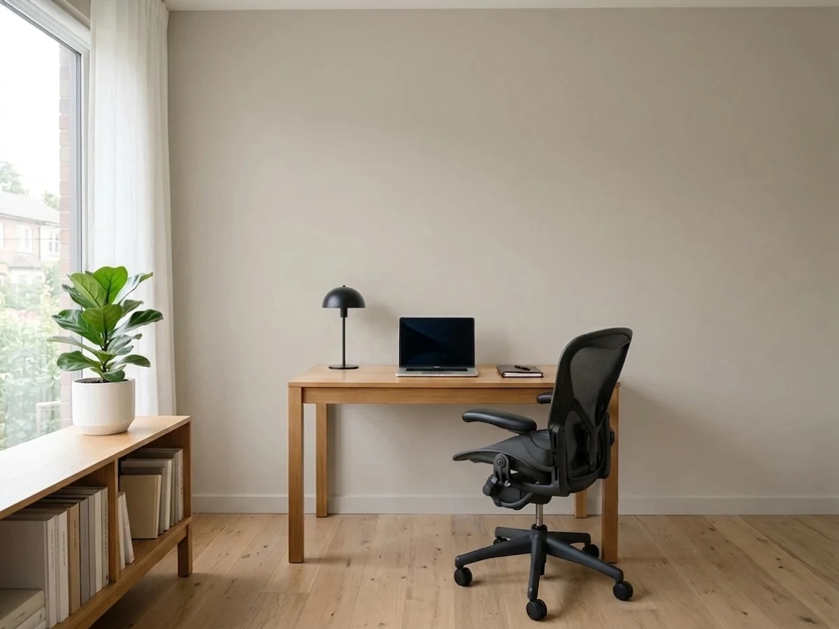
- 1Mindful Gray48
- 2Revere Pewter55
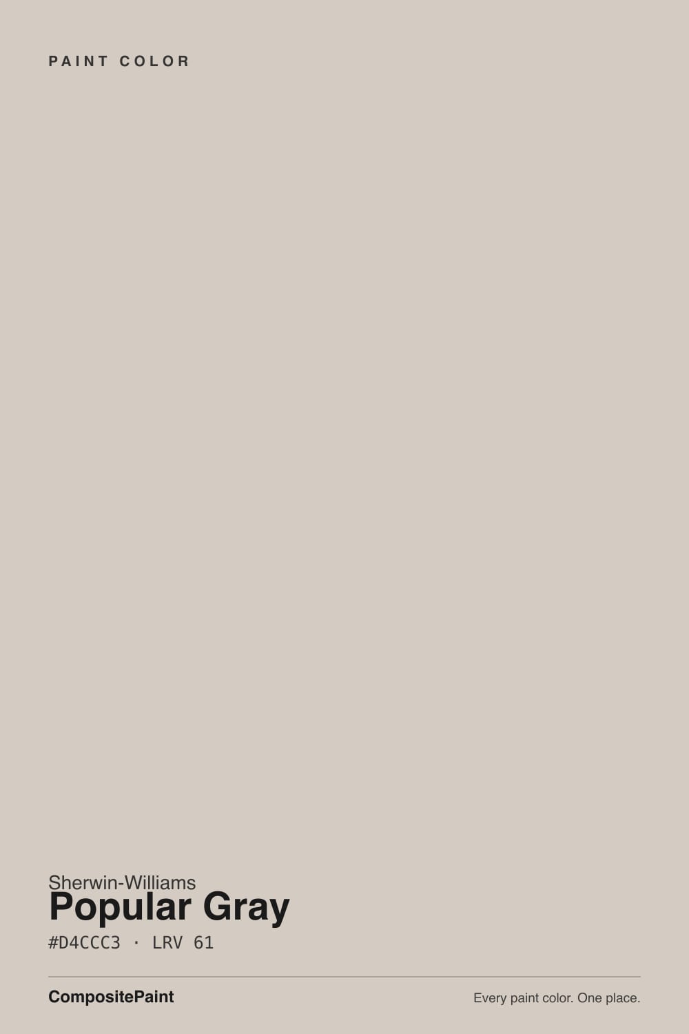
- 3Popular Gray61
- 4Pale Oak69
- 5Shoji White74
The Fast Verdict
Popular Gray is a warm, clay-based greige that never quite sits still: south light pulls it toward soft beige, shade and cool trim push it toward pink or violet. It is genuinely handsome with real daylight, warm wood, and a true (not icy, not creamy) white trim — and it is a more temperamental color than its more famous SW siblings, which is probably why they, not this one, became the color everyone names first.
Living rooms and bedrooms with warm wood and cream fabric · exteriors with stone or brick · anyone who wants more mood than a flat greige without going full taupe · painters who will use a true white trim, not a cream one
You want a color with zero undertone surprises · your trim or door casings run icy blue-white · the room only gets weak north light and stays lamp-free · you are chasing the exact look of a different, more famous SW greige
- Genuinely warm, clay-based greige with more personality than a flat neutral
- Flatters oak, walnut, maple, and pine — most warm wood tones
- One of the stronger SW choices for stone- or brick-adjacent exteriors
- LRV 61 workhorse depth: not too pale, not too heavy, for most rooms
- Reads calm and settled once paired with a true white trim
- Pink or violet undertone flashes more than most SW greiges
- Icy-white or very cool trim triggers the pink cast
- Goes deeper and more violet in dim, north-facing light
- Overshadowed by newer, steadier SW greiges — harder to find real-room photos to sample against
What Color Is Popular Gray, Really?
Popular Gray is a warm greige built on a clay base, and Sherwin-Williams files it, plainly, under Neutral. But the name is doing marketing work its current reputation does not quite back up: ask most renovators to name an SW greige off the top of their head and the answer is Agreeable Gray, Repose Gray, or Mindful Gray — all part of the newer 7000-series palette that took over the "safe greige" conversation years after this one, an older 6000-series color, had already staked out the same ground. Popular Gray never left the deck. It just stopped being the default answer.
At LRV 61 it sits in the same everyday depth as Agreeable Gray (SW 7029, LRV 60) — the workhorse range that reads as neither pale nor heavy. But where Agreeable Gray tends to settle into a fairly even, dependable neutral, Popular Gray keeps moving: paler and more beige in strong south light, measurably more violet in shade, and prone to a pink flash next to the wrong white. That restlessness shows up again and again in homeowner photos of the same wall taken in different rooms of the same house.
Undertone in one line: a warm clay-taupe base first, with a pink or violet flash second, depending on the light and whatever white sits next to it on the trim. If your sample looks pink beside a cool white door casing, or violet in a shaded corner, that is the paint doing exactly what it does — not a bad can.
Where It Shines
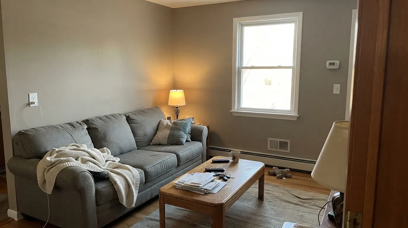
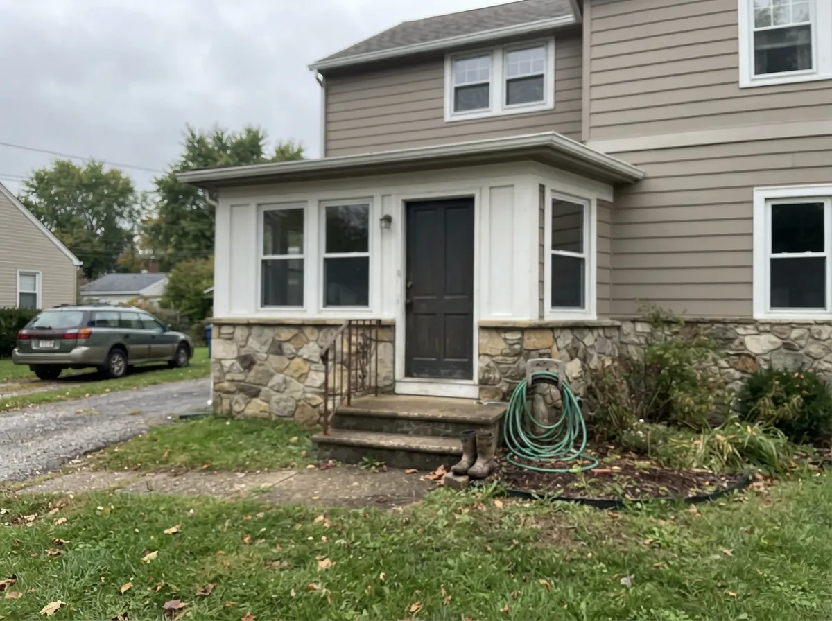
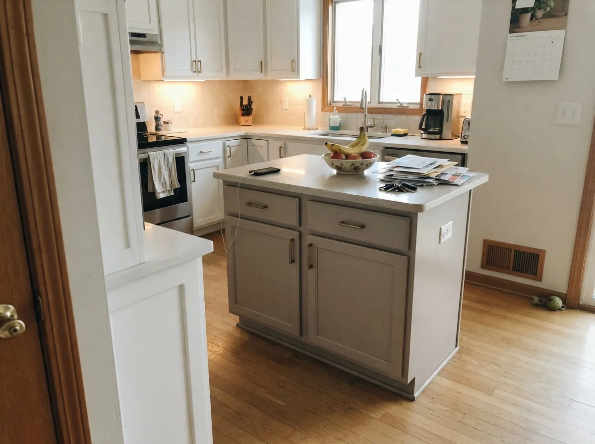
Give it real daylight, warm wood, cream fabric, and a true white trim — not icy, not creamy — and it turns into a genuinely handsome, moody neutral that reads custom rather than default. Its second home is the exterior: against stone, brick, and warm siding trim it looks calm and substantial instead of flat, which is why a striking number of the design-blog photos of this color are front-porch shots, not living rooms.
Where It Fails
Almost every disappointed review of Popular Gray traces back to one of three predictable situations. None of them are the paint failing — they are the paint being an unusually light-sensitive greige applied like it was a flat, dependable one.
The clay base means purple and pink undertones show up more here than in most SW greiges — one reviewer called it "not one of the more subtle" colors about its own undertones. If a calm, balanced neutral with fewer surprises is the real goal, Agreeable Gray is genuinely the steadier choice.
Pair Popular Gray with a stark, blue-leaning white and the pink comes forward fast. The fix is a true white — Pure White or Extra White — not the coolest white in the fan deck and not a cream one either; both extremes push the undertone the wrong direction.
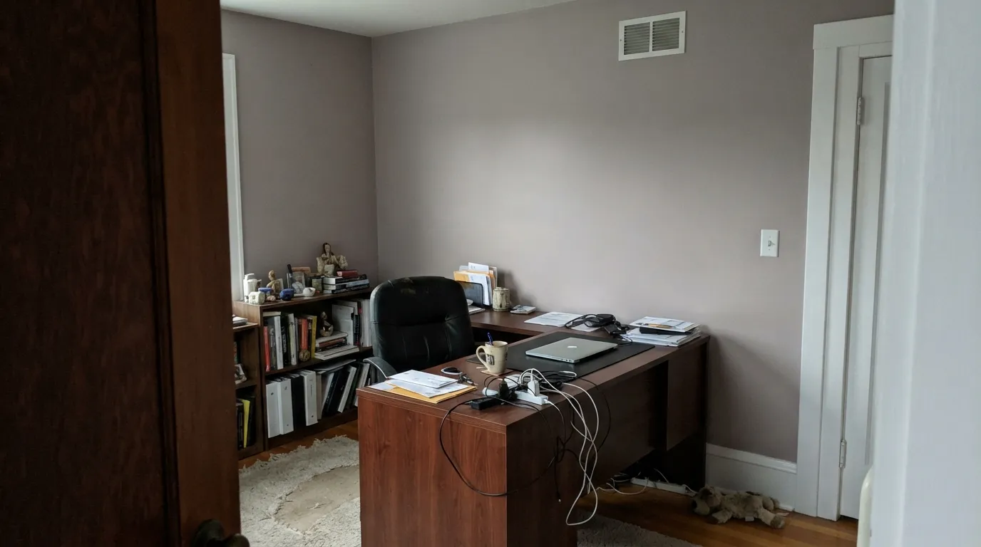
Cool, indirect daylight drains the clay warmth and leaves a deeper, more violet-leaning gray behind — flattering in some rooms, dingy in others depending on the floor and furniture. If the room stays dim, plan on warm bulbs or test a different, less light-dependent neutral.
Room by Room
With real daylight and oak, walnut, or pine furniture in the room, the clay warmth comes through and the color reads settled and a little rosy at the edges. Cream upholstery over a gray sectional is its favorite company.
Under 2700K lamps the clay-taupe base turns cozy rather than moody. Eggshell hides texture; pair with soft white or cream bedding rather than stark white sheets, which can flash the pink undertone.
Reviewers list it as good on cabinetry and vanities, and it works especially well with red oak, golden oak, maple, and pine. Keep the perimeter walls a true white rather than a cream one, or the whole kitchen leans taupe.
Warm marble, wood vanities, and brass fixtures flatter it the same way they flatter any warm greige. Cool blue-gray tile is the one combination worth sampling before committing — the paint will read pinker next to it.
It complements stone and brick and generally reads lighter and calmer outdoors than it does indoors. South- and west-facing walls warm up further; a crisp white trim keeps the whole facade from drifting taupe.
High-traffic transitional spaces suit it well as long as the trim is Pure White or Extra White rather than a cream trim white, which amplifies the taupe side and can leave the walls looking muddy by comparison.
Your Light Is the Risk
Strong, warm daylight pulls it toward soft beige and keeps the clay base honest without tipping into pink. The most forgiving light for this color.
Cool, indirect daylight drains the warmth and pushes the color deeper and more violet-gray — the light where the "is this purple?" complaints come from.
Beige and bright in the morning, noticeably more taupe and clay-toned by late afternoon on a west wall. The shift is real; most owners find it interesting rather than annoying.
Warm 2700K lamps bring the rosy clay forward and settle the color down. Cool white LEDs do the opposite — they flatten it toward a dull violet-gray.
Most complaints about Popular Gray are a light mismatch. Upload a photo of your actual room and see it on your walls — then ask for the same wall in north light or evening lamps before you buy a single sample.
Need It From Another Brand?
Any paint counter can custom-tint Sherwin-Williams SW 6071 directly. If you would rather stay in one brand's own deck, these are the closest stock matches, measured as ΔE2000. Under 2 is a difference you will not see on the wall.
| Brand | Closest color | ΔE | LRV | |
|---|---|---|---|---|
| Behr | Burnished ClayPPU18-09 · Behr | 1.1 | 61 | Color page → |
| Benjamin Moore | Collingwood859 · Benjamin Moore | 1.8 | 62 | Color page → |
| Valspar | Basket of BobbinsV130-1 · Valspar | 1.1 | 61.4 | Color page → |
| PPG / Glidden | My AlibiPPG1018-2 · PPG / Glidden | 1.3 | 61 | Color page → |
| Glidden | My AlibiPPG1018-2 · Glidden | 1.3 | 61 | Color page → |
| Dutch Boy | Shimmering Silver406-2DB · Dutch Boy | 0.0 | 61 | Color page → |
Similar Sherwin-Williams Colors
The nearest shades to Popular Gray within Sherwin-Williams's own range, ranked by perceptual color distance — useful when you want the same look a touch lighter, darker, or warmer.
WCAG 2.1: AA is 4.5 : 1 for normal text, 3 : 1 for large text, AAA is 7 : 1.
Popular Gray vs the Colors You're Also Considering
Every Popular Gray sample board has the same rivals on it. The numbers show the real lightness gap — then it comes down to which risk you would rather live with.
Pick this if Agreeable Gray reads too flat for you and you want more warmth and mood pulling through the wall.
Sherwin-Williams SW 7029 · LRV 60Agreeable GrayPick this if you want the calmer, more balanced greige with far less undertone drama — genuinely the safer bet.
Pick this for real, reliable warmth in a room with decent light; Repose Gray can go chilly where Popular Gray goes cozy.
Sherwin-Williams SW 7015 · LRV 58Repose GrayPick this for a cooler, more modern-reading gray — though it has its own north-light flash toward lavender.
Agreeable Gray SW 7029 sits one point lower at LRV 60, with hex #D1CBC1 against Popular Gray's #D4CCC3. Most people cannot separate them on a chip. On a wall, Popular Gray tends to show a little more pink while Agreeable Gray holds a slightly greener gray, which is why one can look clean in a room where the other looks warm.
Pediment SW 7634 at LRV 61 is almost the same value with a fraction less red. Gossamer Veil SW 9165 at LRV 62, hex #D3CEC4, is a touch lighter and greener, and Modern Gray SW 7632 at LRV 62 is lighter and warmer at once.
Across brands, Farrow & Ball Cornforth White No. 228 at LRV 60 has a deltaE of 1.95, visually identical in normal room light but grayer in character. Magnolia Home Stoneware Pieces JG-55 at LRV 63, deltaE 4.74, is close but visibly different side by side, running lighter and greener.
Popular Gray Coordinating Colors
The rule for coordinating with Popular Gray is narrower than with a steadier greige: stay on true whites, not creams, and lean into deep, confident neutrals or cool-blooded accents rather than anything else warm and yellow. These are the partners that keep it looking intentional instead of undecided:
A Name the Color Hasn't Quite Lived Up to Lately
SW 6071 puts Popular Gray in Sherwin-Williams's older, lower-numbered color generation — the deck that predates the 7000-series palette which introduced Agreeable Gray, Repose Gray, Mindful Gray, and Accessible Beige, the greiges that actually became the design-blog and Fixer-Upper-era default. Popular Gray was already doing the warm-greige job those colors are now famous for; it simply never got the viral moment that made its younger siblings household names.
That makes it a genuinely useful color to know about rather than a trendy one to chase: less crowded in the sample-photo comparisons than Agreeable Gray, but with the same basic warm-neutral job to do — as long as you go in expecting a color with more mood and more undertone movement than the famous ones, not less.
Popular Gray With Wood Tones and Floors
This is a genuinely wood-friendly color. Red oak, golden oak, maple, pine, and mahogany are all listed as good matches, and the clay-taupe base means it does not fight orange-leaning builder oak the way a true gray would — it leans into the same warm family instead.
The one caution is the trim, not the floor: pair warm wood with a cream trim white and the whole room can drift beige-taupe fast. A true white — Pure White or Extra White — keeps the wood and the wall both reading clearly, rather than blurring into one warm mass.
Three Ready Palettes Built on Popular Gray
A color is never alone on the wall. These are complete combinations in the 60-30-10 pattern, with the reason each one holds together. Every one opens in the visualizer.
This is the pairing the design blogs actually photograph: warm greige siding against stone or brick, a true white trim that keeps the facade from drifting taupe, and Iron Ore for the one dark, confident note. The crisp trim is doing real work here — a cream trim would push the whole house warmer than intended.
Try this palette in your roomExtra White is sharp enough to keep the greige from reading taupe without tipping into the icy end that triggers its pink flash. Naval gives the room one deep, cool-blooded anchor that does not fight the clay warmth in the walls — navy and warm greige is a dependable, low-risk combination.
Try this palette in your roomSnowbound on the walls keeps the room bright while the island carries the color; Peppercorn grounds the scheme with a dark neutral that, like Popular Gray, takes on some of the room's own warmth rather than fighting it. Oak or maple floors complete the look this pairing is built for.
Try this palette in your roomPopular Gray FAQ
Is Popular Gray warm or cool?
Warm — it is a clay-based greige, not a true gray. In strong daylight it leans soft beige; in shade or cool light it can swing toward violet or pink. It never reads as a cool, blue-based gray.
Why does Popular Gray look pink or purple in some rooms?
The clay base carries real pink and violet undertones that are more noticeable here than in most SW greiges. Cool, indirect daylight and stark blue-white trim both bring the flash forward; strong south light and a true white trim keep it in check.
How is Popular Gray different from Agreeable Gray?
Both sit around the same LRV — 61 versus 60 — but Agreeable Gray reads as a steadier, more balanced neutral, while Popular Gray moves more with the light and shows more pink and violet. Agreeable Gray is the safer pick if you want fewer surprises; Popular Gray rewards a room that already has warm materials for it to play off.
What trim white goes with Popular Gray?
A true white, not a cream and not an icy blue-white: Pure White or Extra White are the two design-blog favorites. Cream trim amplifies the taupe side; very cool trim can trigger the pink flash. Semi-gloss on the trim, eggshell on the walls.
Is Popular Gray good for exteriors?
Yes — it is regularly listed as a strong exterior choice, especially against stone or brick, and it tends to read lighter and calmer outdoors than indoors. A crisp white trim keeps the facade from drifting taupe.
Does Popular Gray work with oak or other wood floors?
It generally does. It is described as working well with red oak, golden oak, maple, pine, and mahogany. If the floor and trim are both warm, expect the walls to lean a little more beige than gray — sample first if you want a grayer read.
Have you painted with Popular Gray?
Rate it — one tap helps the next reader decide.
Ask a Question