Room Colors · Kitchen
Kitchen Cabinet Color Ideas
ideas, combinations, and real rooms
12 curated picks from real kitchens — with the exact colors, honest reasons why, and the combinations that hold the room together.

Former interior stylist who can spot a green undertone from across a room. Jessica writes the color and mood pieces — what to choose, what pairs, and why your "white" looks pink.
The Fast Answer
Don't want to read 12 picks? These four are the safe answers.

Top Picks for the Kitchen
Pick a color family, tap a shade to see the kitchen in it, then try it on your own room.
The cabinet color that defined kitchen renovations 2022-2026 — works on uppers, lowers, or an island.
The 12 Best Kitchen Paint Colors
Every pick below is a real rendered kitchen, not a chip. The lead color first; the swatches are the full scheme in the photo — walls, furniture, textiles, accent.

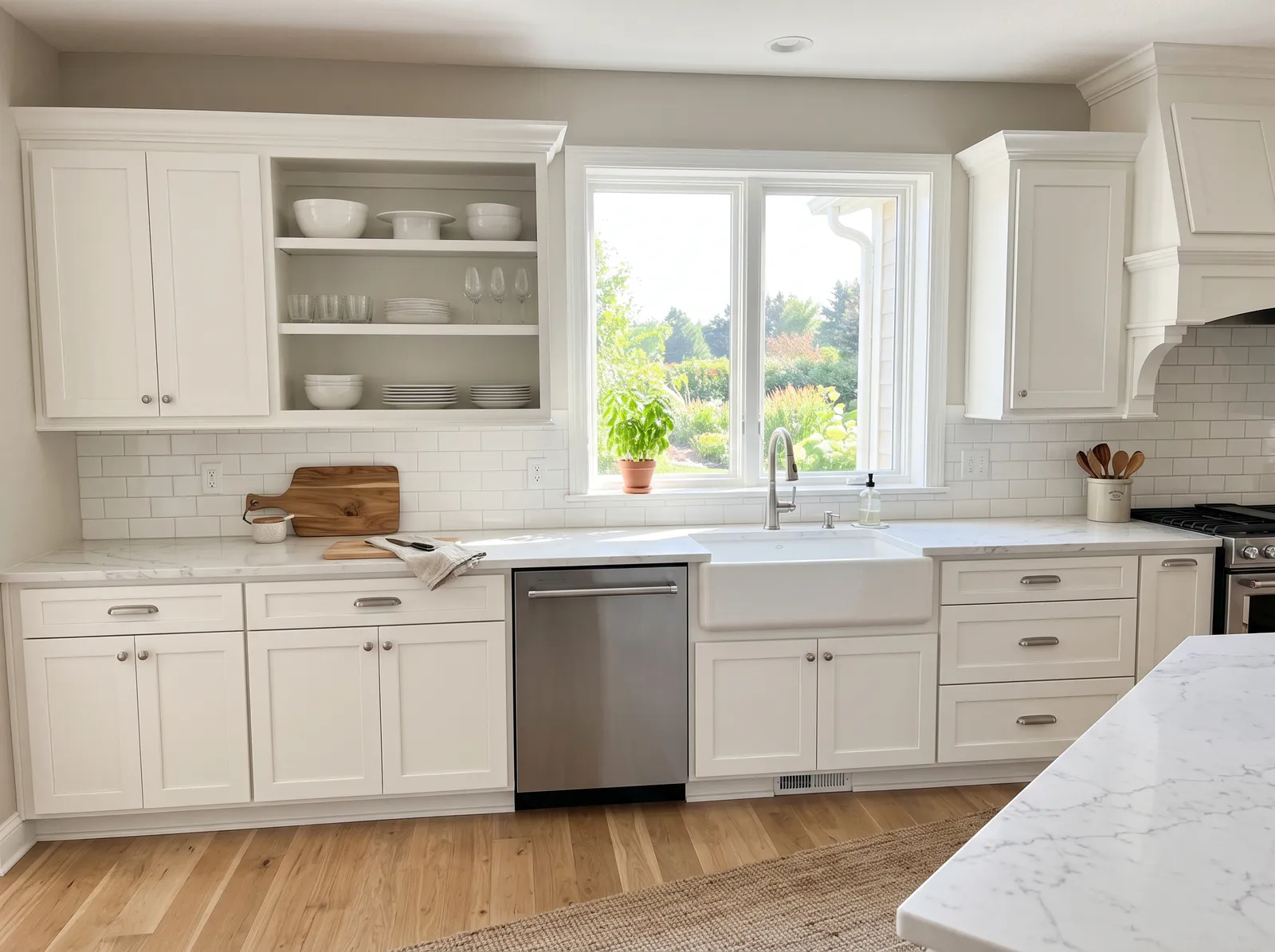
A clean, bright white that makes the whole kitchen feel fresh, open, and easy to keep looking new.
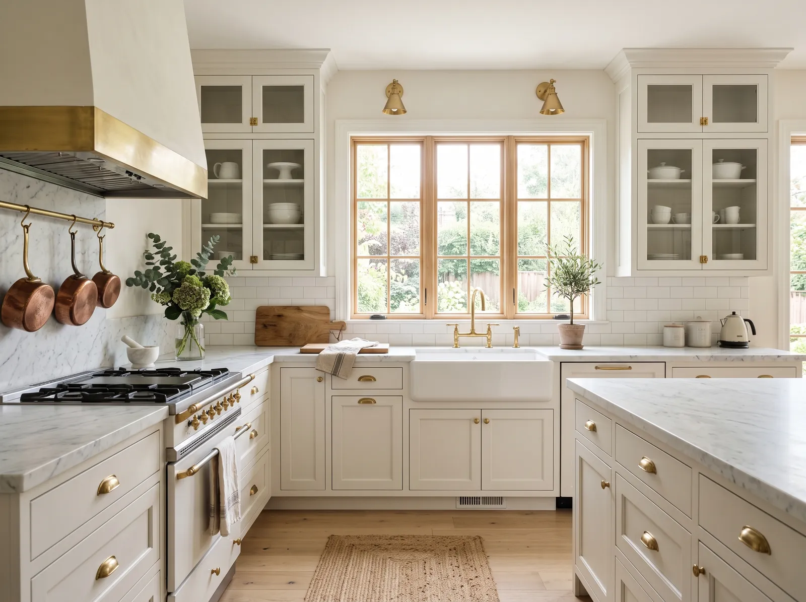
Greige is a beautifully balanced mix of gray and beige that feels instantly welcoming. In this bright kitchen, this soft greige coats the upper walls, while the cabinets and marble countertops shine in a clean, crisp white. A textured jute rug and light oak floors ground the space with natural warmth. The room feels incredibly airy, calm, and bright. The combination works because the warm wood tones and earthy rug keep the white cabinets from feeling too sterile. It is perfect for anyone who loves a classic farmhouse look with a modern edge.
SEE EDGECOMB GRAY ON YOUR WALLS →
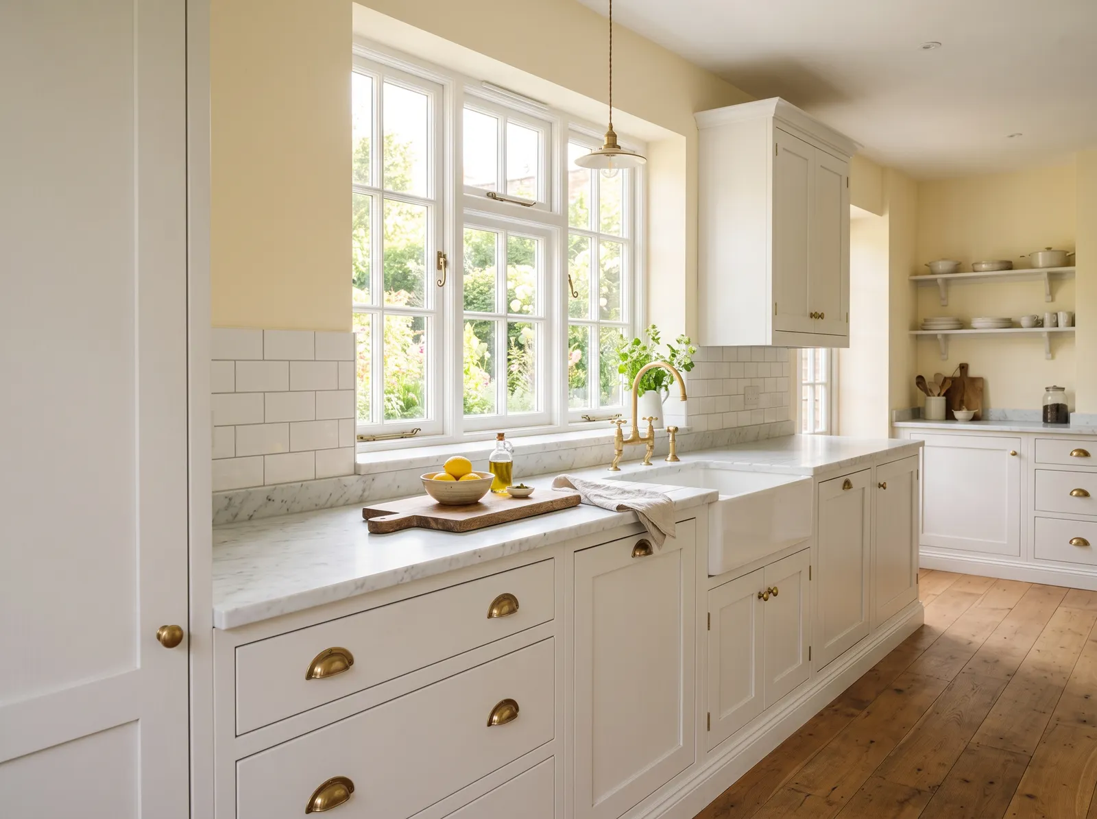
A soft, buttery white that feels cozy and lived-in, warming up the room without looking yellow.
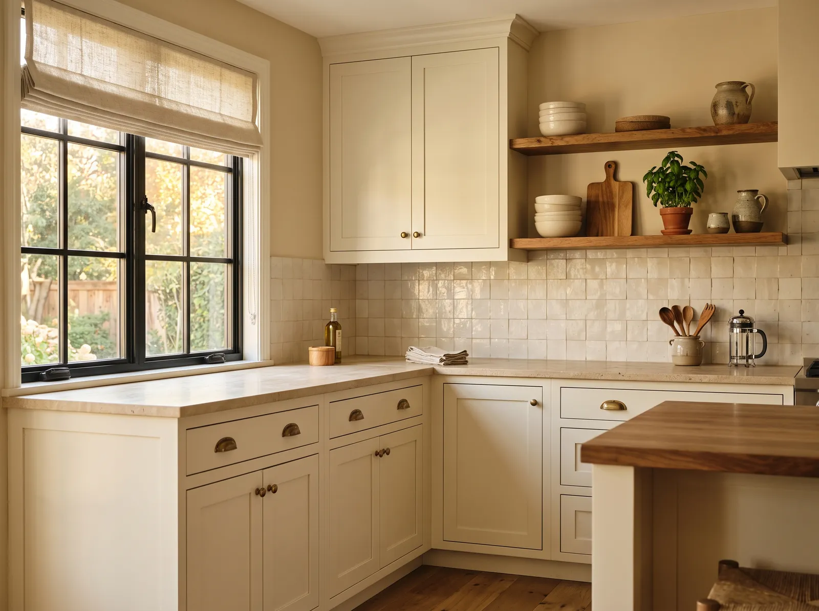
Sandy beige is a wonderfully grounding neutral that instantly makes a space feel lived-in. In this kitchen, that sandy beige wraps the walls, while the cabinets are painted a slightly lighter, creamy off-white. Rich wood tones on the island and open shelves add beautiful depth, paired with a textured linen shade on the window. The entire space feels incredibly cozy, calm, and sun-drenched. This combination works beautifully because layering similar warm, natural tones keeps the room bright without ever looking cold. It is perfect for anyone who loves a classic, rustic cottage look.
SEE IT ON YOUR WALLS →
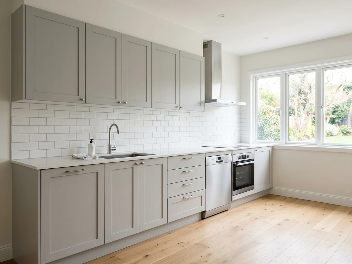
A gentle mix of gray and beige that reads warm and calm, hiding everyday smudges with ease.
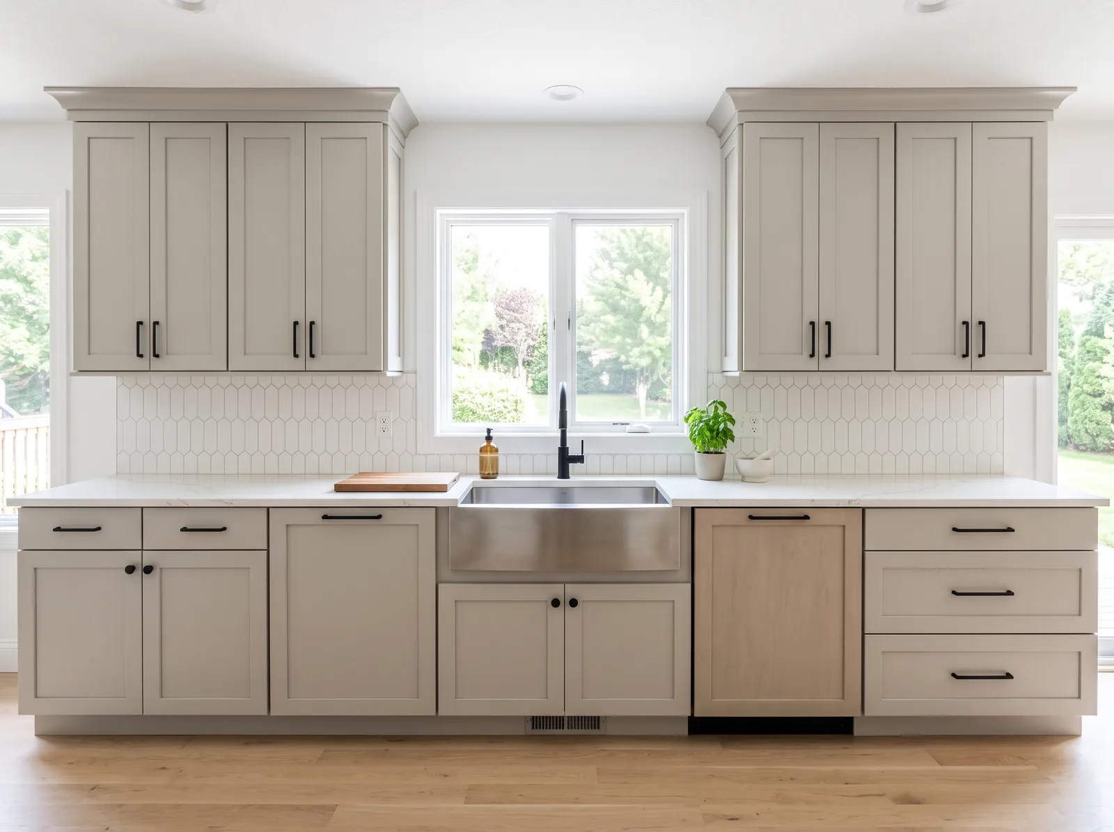
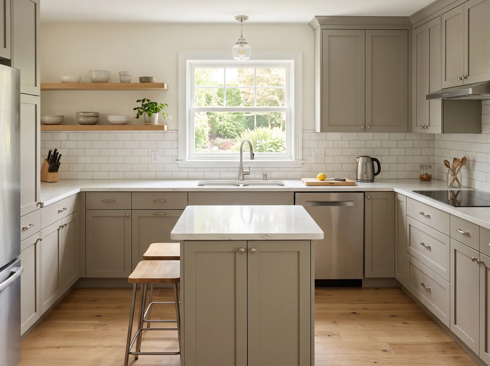
Soft white is a clean, bright neutral that bounces light beautifully. Here, it covers the walls and tiled backsplash, while the shaker cabinets are painted a soothing greige. A single dishwasher panel and the floors introduce light natural wood, anchored by matte black hardware. The space feels incredibly calm, airy, and organized. The combination works because the cool greige cabinets ground the bright white walls without making the kitchen feel heavy. It is perfect for anyone who loves a modern, clutter-free look with a touch of organic warmth.
SEE PURE WHITE ON YOUR WALLS →
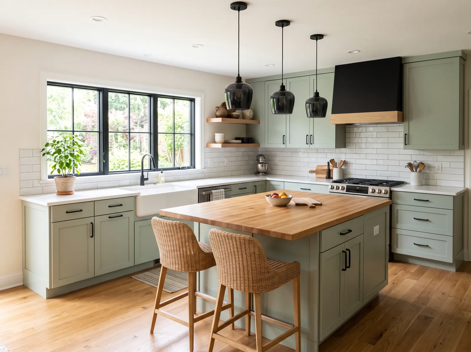
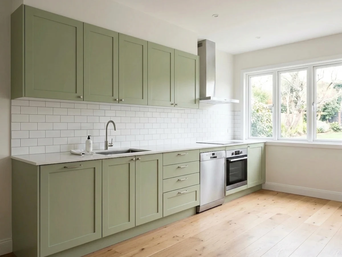
A muted gray-green that brings a calm, garden-fresh feeling and pairs with almost any countertop.
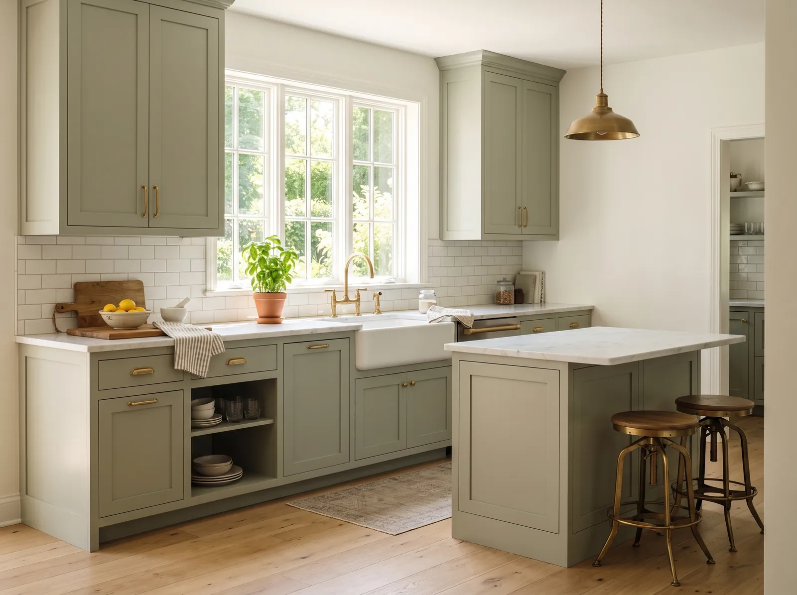
Soft ivory is a clean, bright backdrop that never feels stark. Here, it wraps the walls, letting the beautiful sage green cabinets and matching kitchen island take center stage. Warm wood and brass barstools sit at the island, while a muted gray-beige runner rests on the light oak floors. The space feels incredibly calm, airy, and grounded. This combination works beautifully because the earthy green brings nature indoors while the light walls keep the kitchen feeling spacious. It is perfect for anyone wanting a peaceful, classic kitchen with a touch of modern cottage charm.
SEE ALABASTER ON YOUR WALLS →
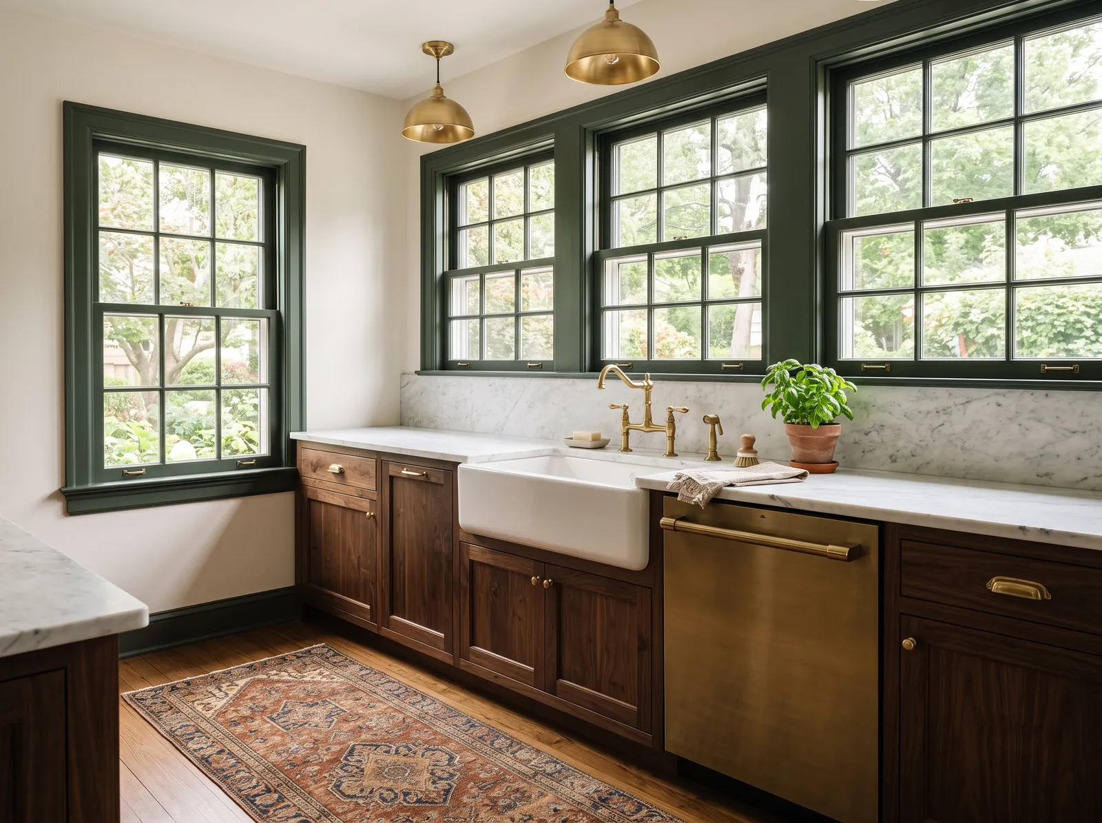
A rich, dark green that feels grounded and elegant, turning a plain kitchen into something special.
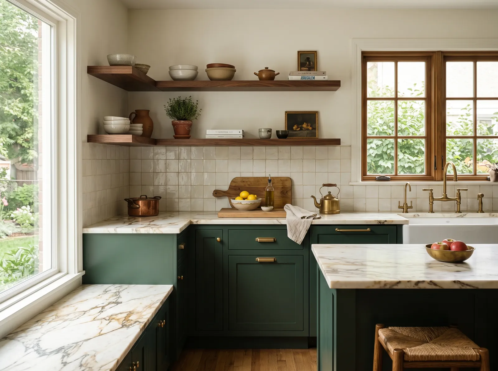
Cream is a wonderfully soft, comforting neutral that instantly makes a space feel lived-in. Here, it wraps the walls, setting a quiet backdrop for rich forest green cabinets and marble countertops. Warm wood shelves, a matching window frame, and a woven stool bring in earthy textures, while brass fixtures add a touch of shine. The room feels incredibly cozy and calm. This combination works beautifully because the deep green anchors the space while the light walls keep everything bright. It is perfect for anyone who loves a classic, nature-inspired kitchen.
SEE CREAMY ON YOUR WALLS →
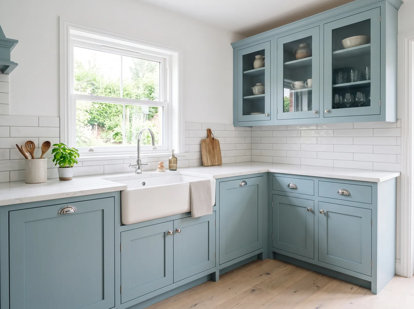
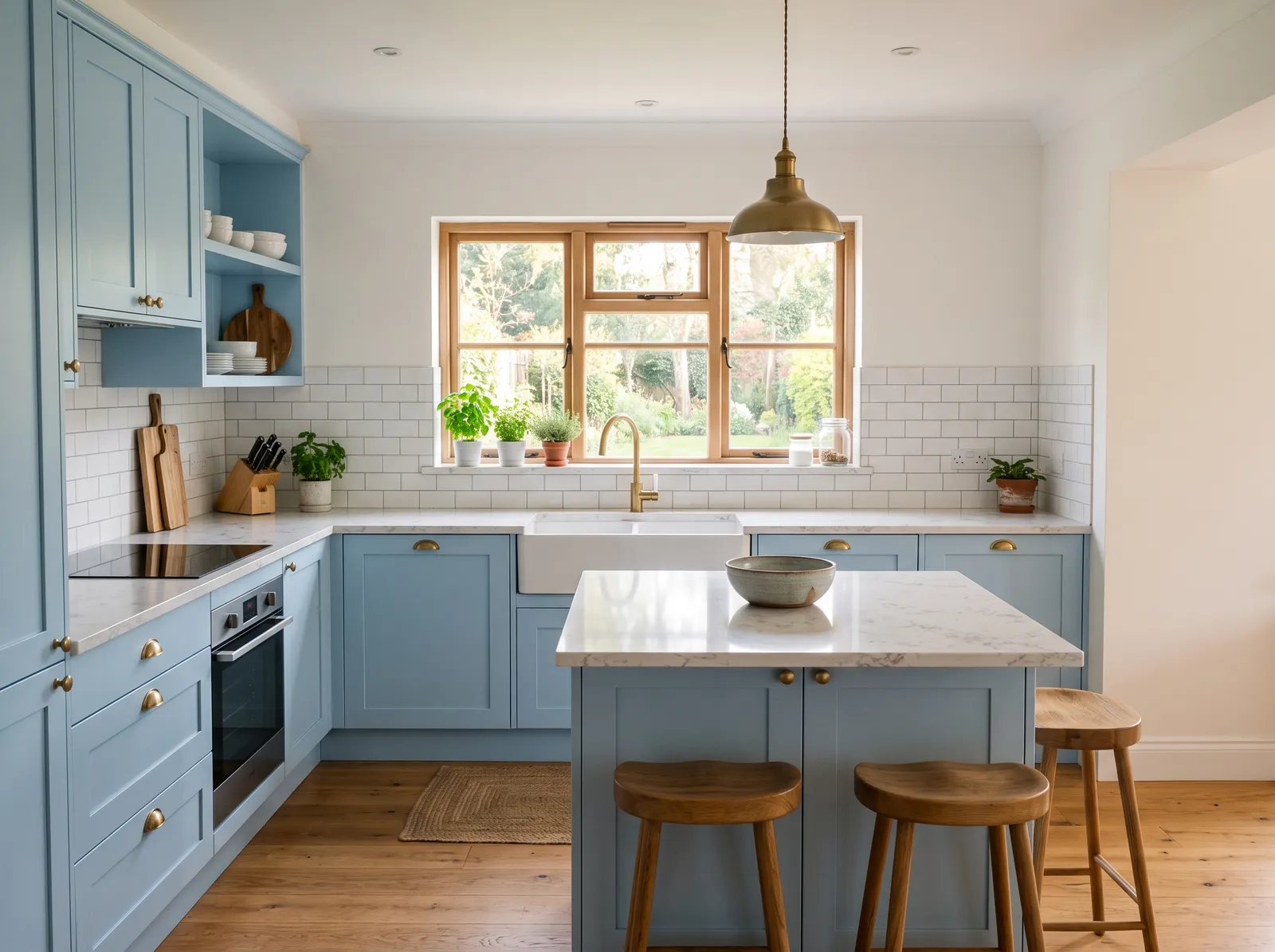
An airy, dusty blue that feels light and happy, like a clear sky on an easy morning.
Pure white is a crisp, clean backdrop that lets other features shine. In this charming kitchen, that bright white covers the walls and subway tile backsplash, while the shaker cabinets are painted in a beautiful, dusty slate blue. A classic white farmhouse sink sits under the window, and light wood floors ground the space. The room feels incredibly fresh, airy, and calm. This combination works beautifully because the cool blue cabinets add a splash of personality without overwhelming the bright, light-filled room. It's perfect for anyone wanting a classic cottage look with a modern twist.
SEE IT ON YOUR WALLS →
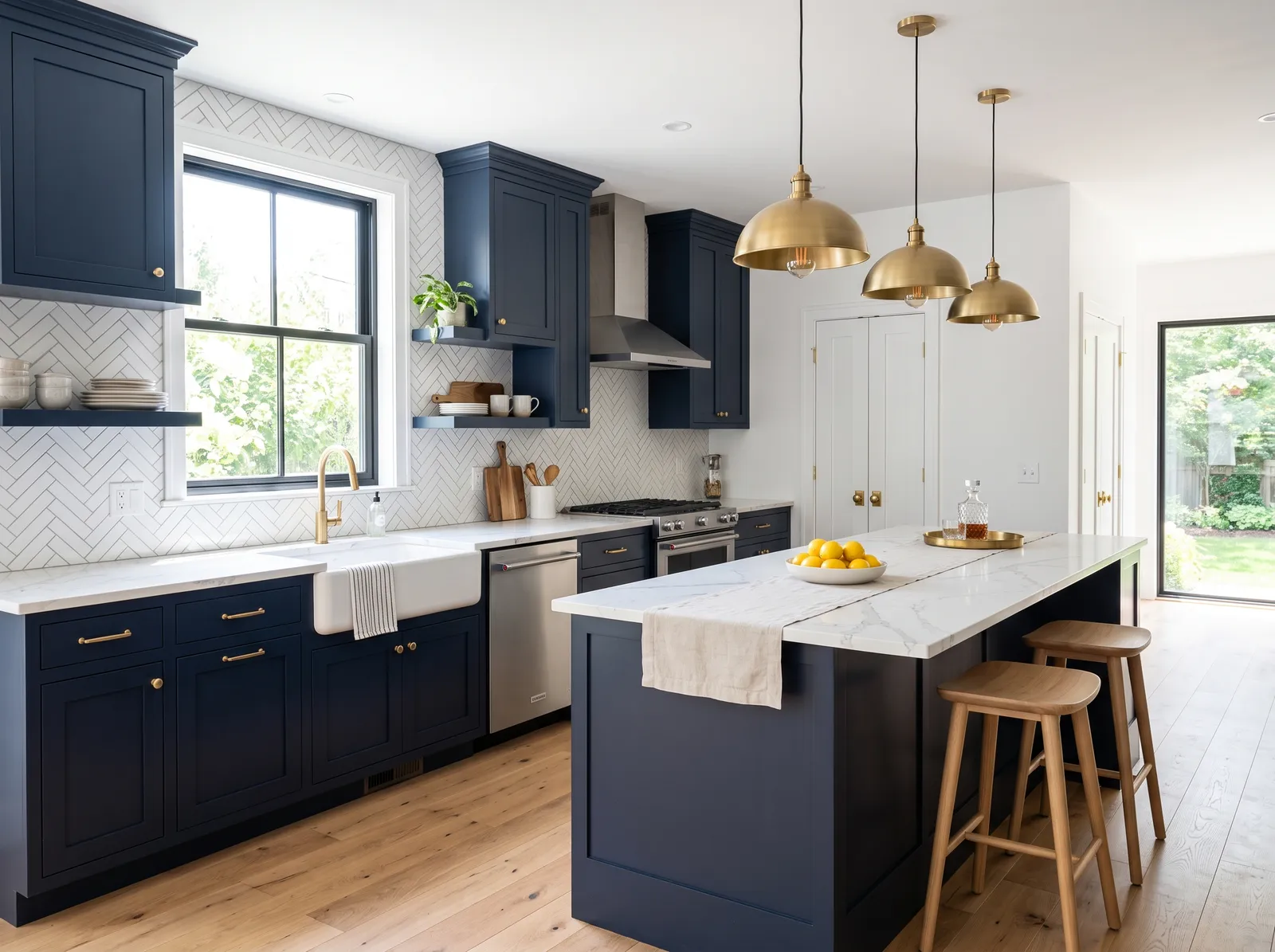
A deep, classic navy that brings drama and richness while still feeling timeless and easy to live with.
Crisp white is a clean, bright backdrop that instantly opens up any room. Here, it covers the walls and herringbone backsplash, contrasting beautifully with the deep navy blue cabinets and kitchen island. Warm wood barstools and light oak floors ground the space, while gleaming gold pendant lights add a touch of glamour. The room feels incredibly fresh, sophisticated, and airy. This combination works because the dark navy anchors the room without making it feel heavy, thanks to the abundant white surfaces. It's perfect for anyone wanting a classic, high-contrast kitchen with a modern coastal twist.
SEE SIMPLY WHITE ON YOUR WALLS →
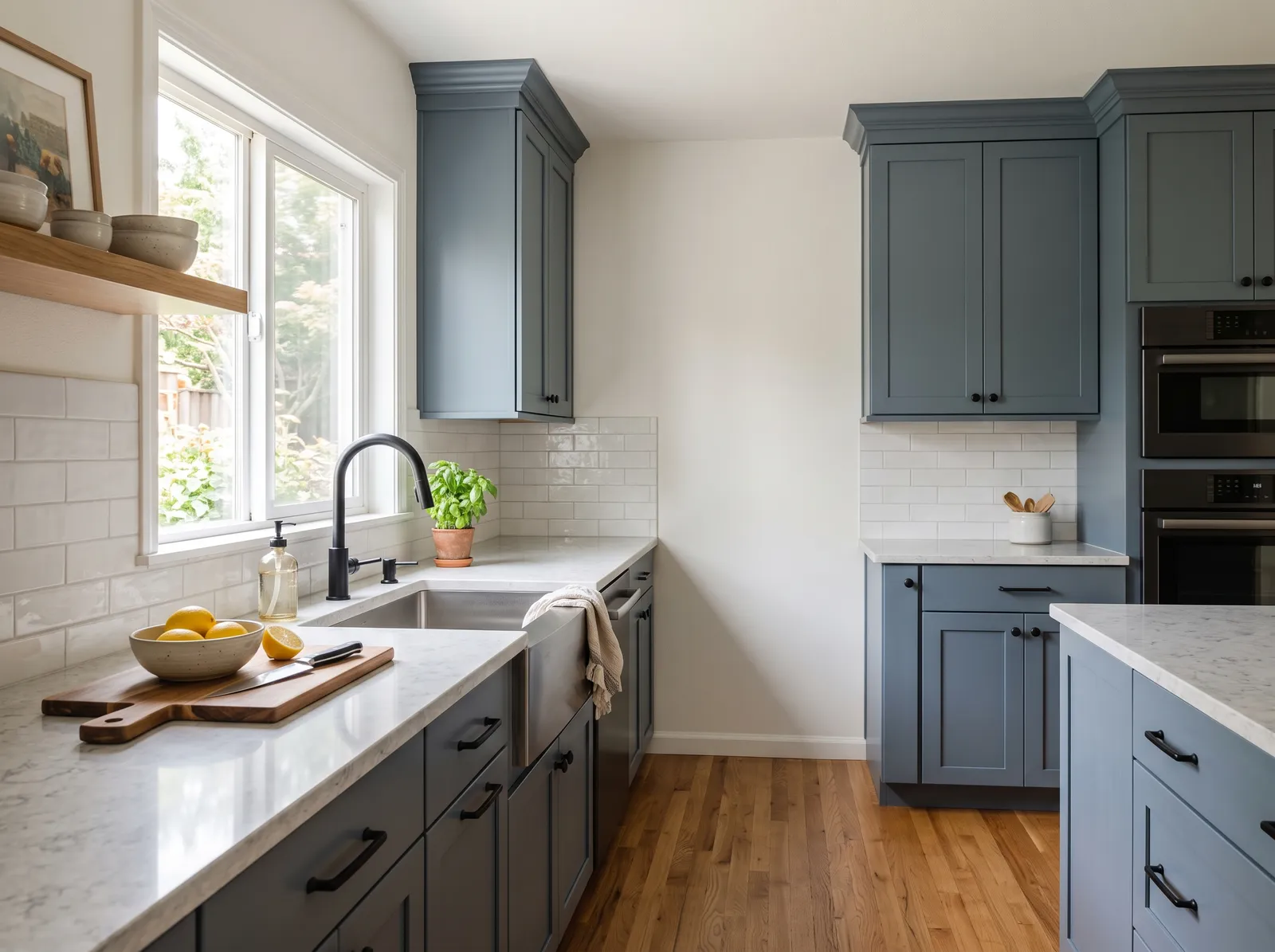
A smoky blue-gray that feels steady and grown-up, soft in low light and never too cold.
Soft white is a clean, bright neutral that makes any space feel instantly larger. In this kitchen, it covers the walls, creating a crisp backdrop for the dusty slate-blue cabinets and white marble countertops. Warm oak floors run underneath, while a wooden cutting board adds a natural touch. The room feels incredibly fresh, calm, and organized. This combination works beautifully because the cool blue cabinets pop against the light walls, while the wood keeps the space from feeling too chilly. It's perfect for anyone who wants a classic kitchen with a serene splash of color.
SEE CLOUD WHITE ON YOUR WALLS →
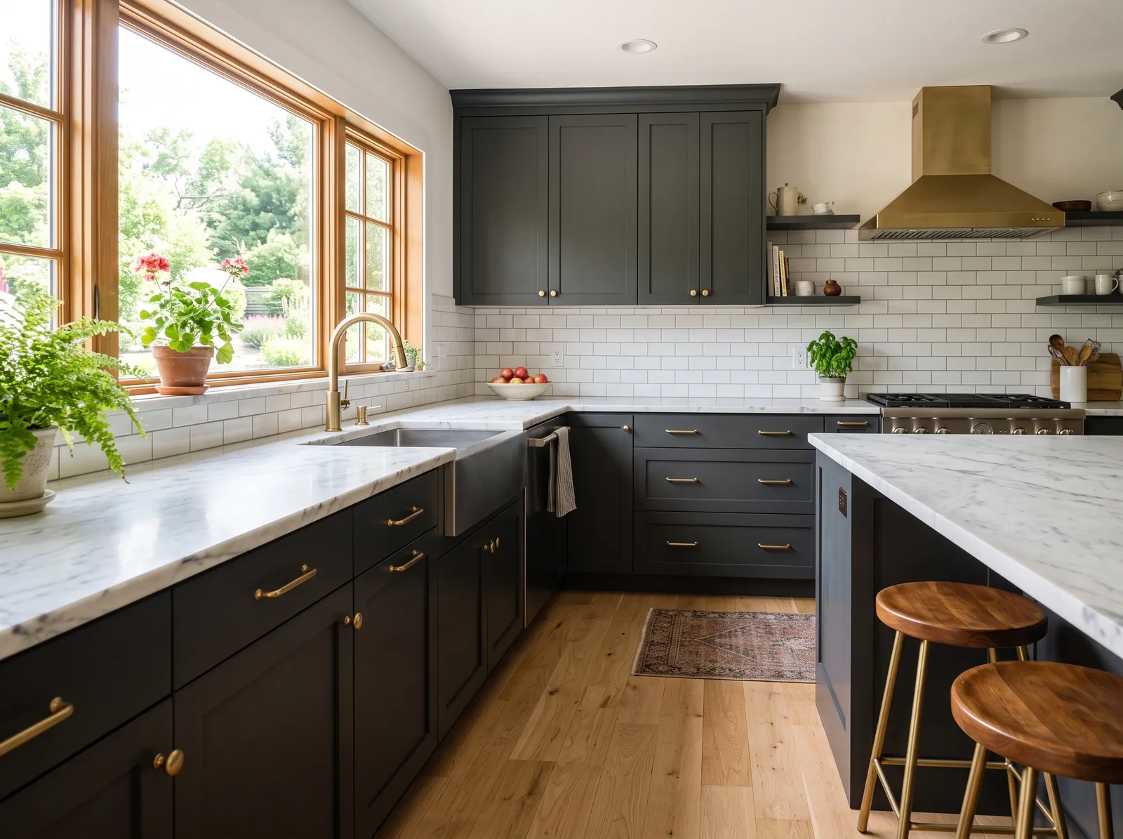
A deep, smoky charcoal with a hint of blue that looks sleek by day and cozy by lamplight.
Soft white is a clean, bright neutral that makes any space feel instantly larger. Here, it covers the walls, providing a crisp backdrop for the dramatic charcoal gray cabinets. Warm wood stools and a small patterned rug ground the room, while brass accents on the faucet and range hood add a touch of glamour. The space feels incredibly balanced, blending modern sophistication with cozy warmth. This works beautifully because the dark cabinets anchor the room while the light walls keep it bright. It's perfect for anyone wanting a classic look with modern drama.
SEE ALABASTER ON YOUR WALLS →
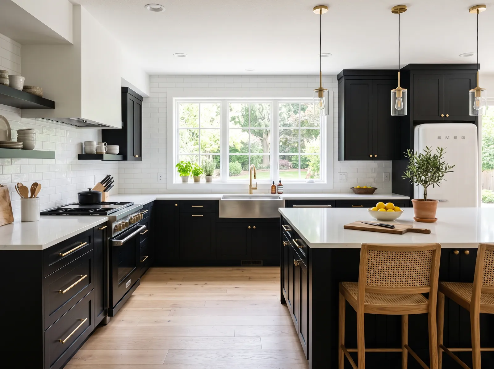
A bold, true black that feels modern and confident, grounding the room and making white counters pop.
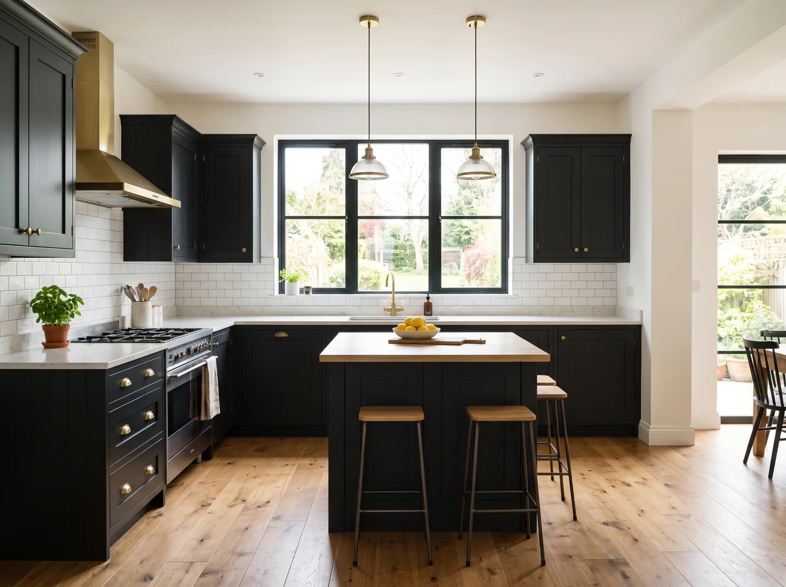
White is a clean, bright canvas that instantly opens up any space. Here, crisp white walls and subway tiles frame dramatic black cabinets, while a large matching island anchors the room. Warm oak barstools with woven cane backs pull up to the white quartz countertop, mirroring the light wood floors. The space feels incredibly balanced, airy, and sophisticated. This high-contrast combination works beautifully because the warm wood tones soften the sharp black-and-white contrast, keeping the kitchen cozy instead of sterile. It is perfect for anyone who loves modern farmhouse style with sleek drama.
SEE IT ON YOUR WALLS →
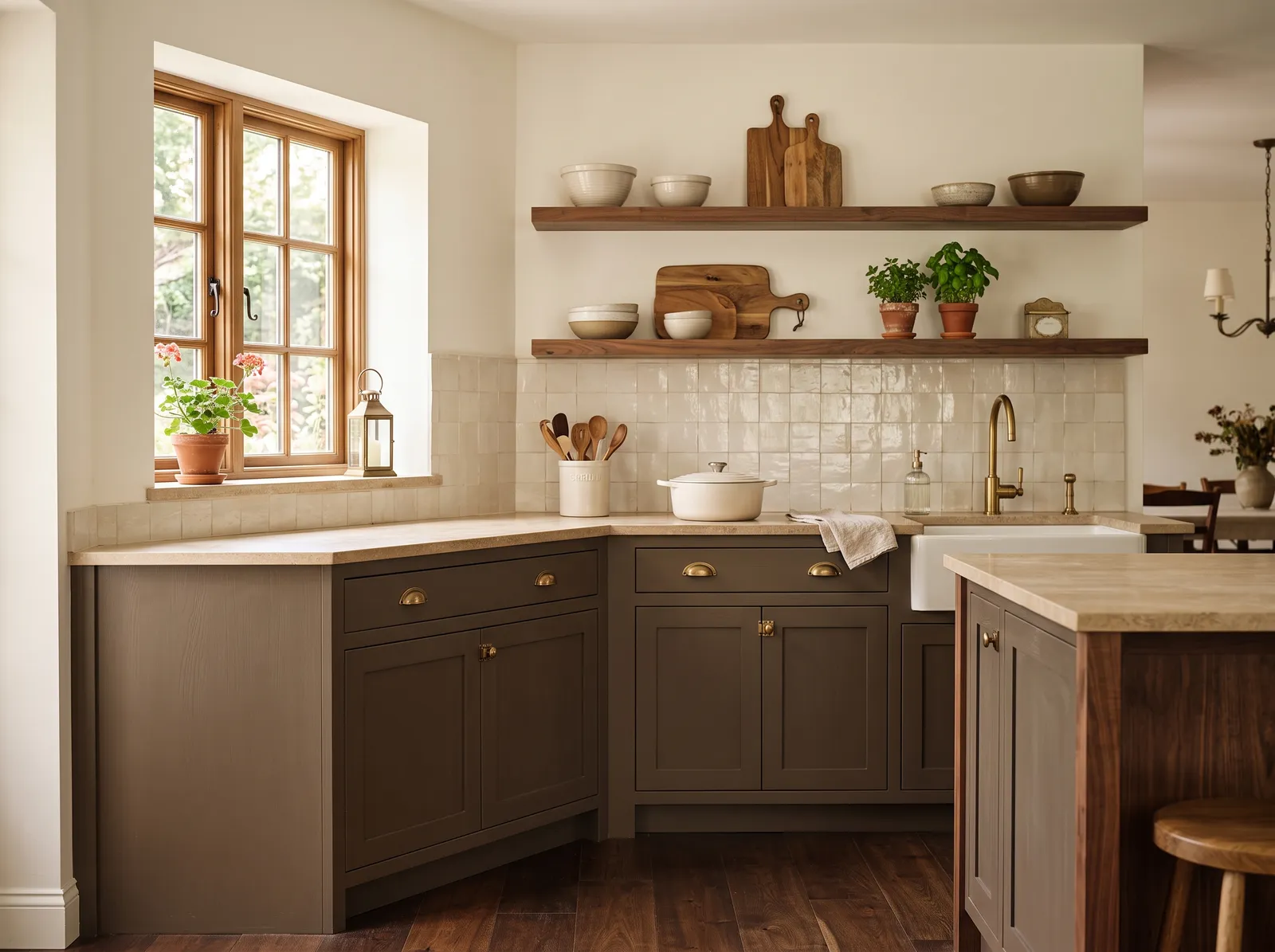
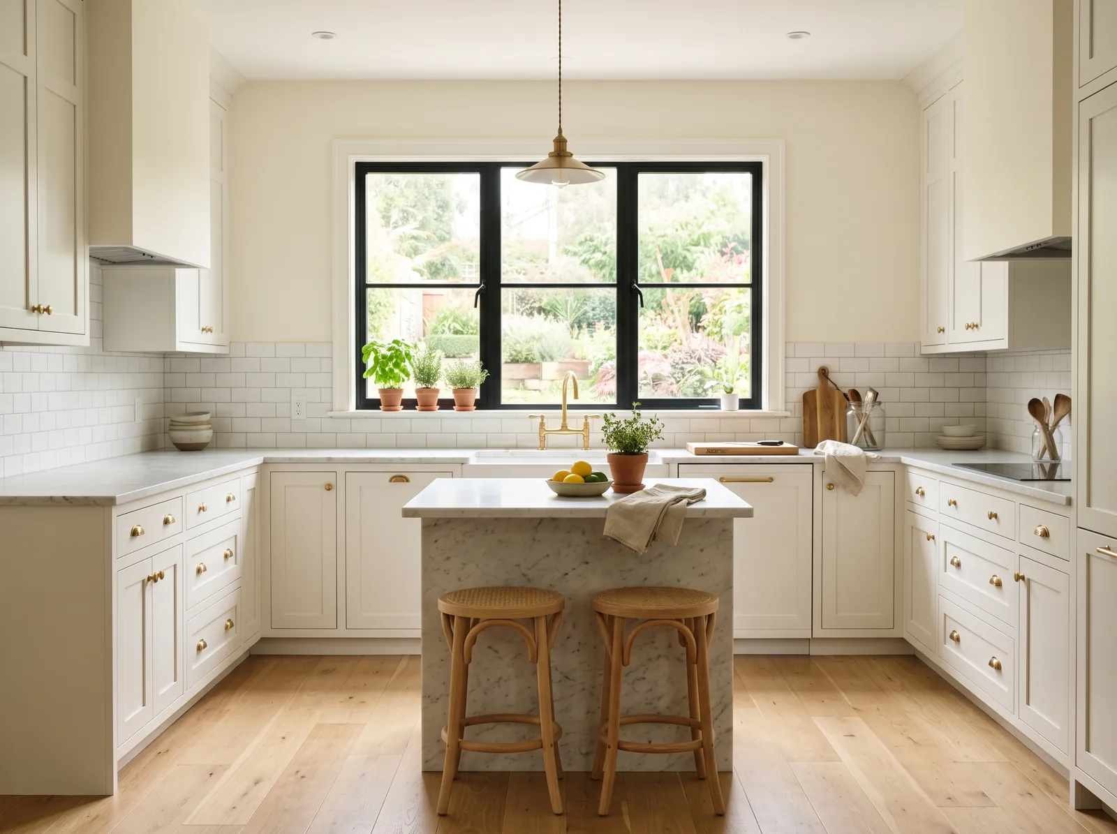
A deep greige-brown that feels earthy and rich, like coffee with cream, and pairs with warm wood.
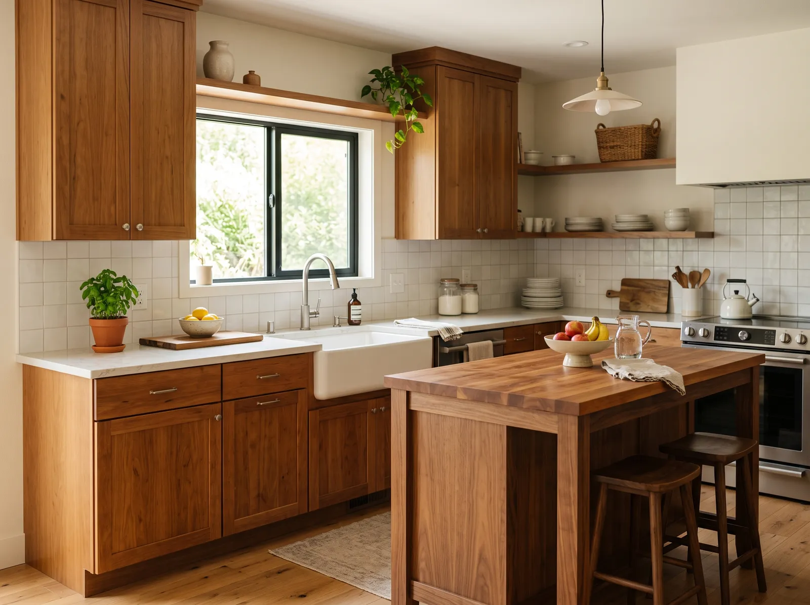
Cream is a soft, buttery off-white that feels instantly welcoming. In this kitchen, that gentle cream covers the walls, while the cabinets are painted a deep, earthy taupe-brown. Warm wood trims the window and forms the open shelving, while beige stone countertops and glossy tiles bridge the two main colors. The space feels incredibly cozy and grounded, like a quiet morning in a countryside cottage. This combination works because the light walls keep the room bright while the dark cabinets anchor the lower half. It is perfect for anyone who loves rustic charm.
SEE SWISS COFFEE ON YOUR WALLS →
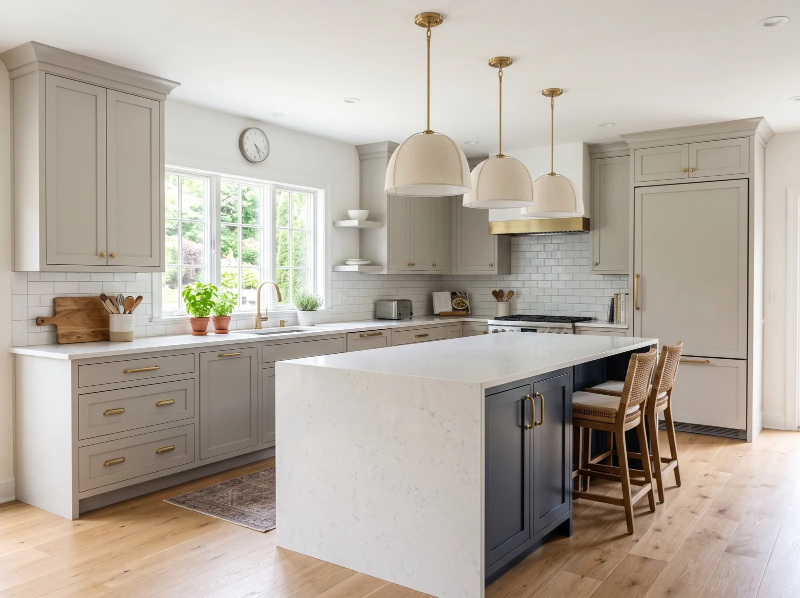
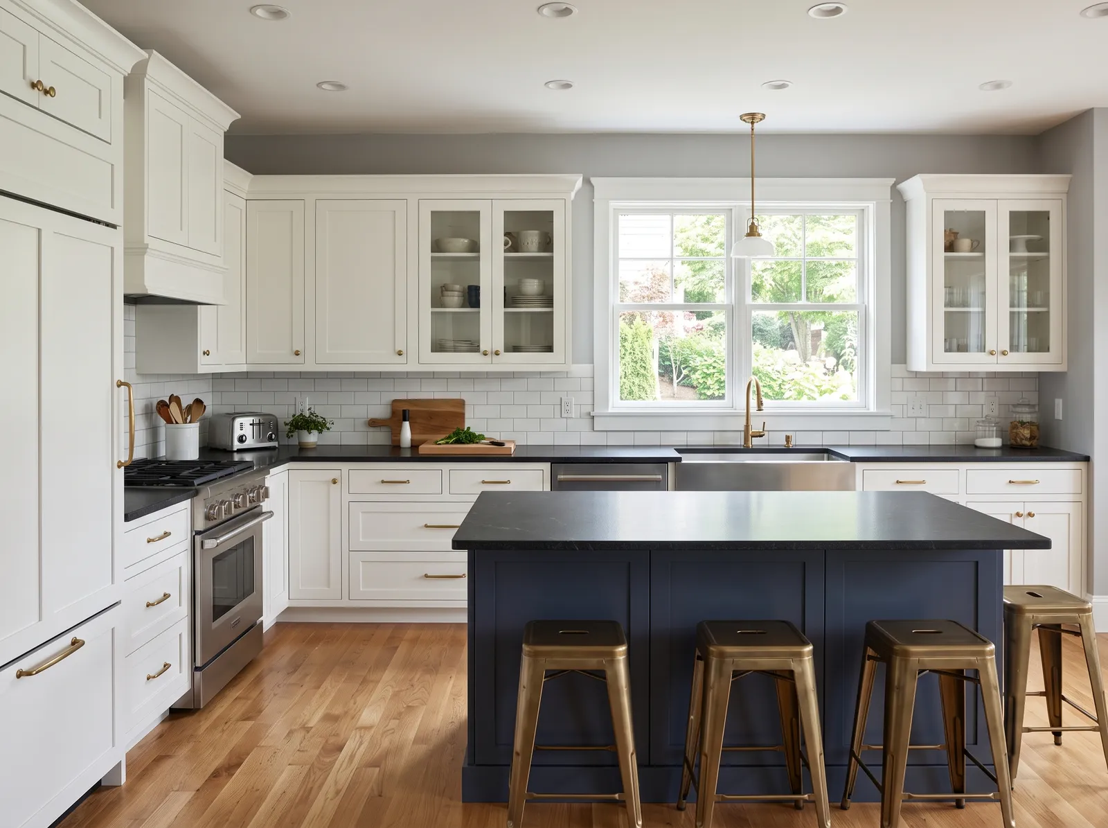
Soft greige cabinets all around with a deep navy island, an easy way to add depth without going dark everywhere.
Crisp off-white is a clean, bright backdrop that lets other elements shine. Here, it covers the walls, beautifully framing the greige perimeter cabinets and the deep navy blue island. Woven rattan barstools add a touch of natural warmth, while a small patterned rug anchors the floor. The space feels incredibly airy, calm, and sophisticated. The combination works because the dark navy island grounds the room, preventing the light greige and white from feeling too washed out. It's perfect for anyone who wants a classic kitchen with a subtle splash of personality.
SEE PURE WHITE ON YOUR WALLS →Kitchen Wall Color Combinations
A wall color never works alone. These are the full schemes from the rooms above — the lead color first, then the supporting colors that make the photo work.
Soft greige cabinets all around with a deep navy island, an easy way to add depth without going dark everywhere.
TRY THIS PALETTE →More Kitchen Color Ideas
Set on a color family already? Each page has its own real rooms and picks.
Light or Dark Kitchen Colors?
Go Light (LRV 60+) If…
The room is small, faces north, or has to work at every hour. Light warm colors make it feel bigger and stay calm in evening light — the light you actually live in.
Go Dark (LRV Under 20) If…
You want the cocoon effect and the room has real daylight. Dark works best on one feature wall — or fully color-drenched in a large room with good windows.
See It. Love It.
Paint It.
Upload one photo of your kitchen and try every color on this page on your own walls — in your own light, before you buy a drop of paint.

Back to NatureBeforeAbout Kitchen Paint Colors
Your cabinets are the first thing you see when you walk into a kitchen, so their color sets the whole mood. Browse twelve cabinet looks below, from crisp white to deep forest green to a moody two-tone, and find the one that feels like home. Each one pairs the cabinet color with a wall shade that makes it sing.
The Questions Everyone Asks
What color should I paint my kitchen?
If you want one answer, start with the safe picks above — Swiss Coffee, Alabaster, Pure White, Simply White. They read well in any light and survive furniture changes. Then check the light: strong afternoon sun wants a step cooler, a north-facing room wants a step warmer.
what is the most popular kitchen cabinet color?
White is still the most popular by a wide margin because it is bright, clean, and goes with any counter or floor. Soft warm whites and creams are a close second for people who want the same look with a little more warmth.
what color cabinets are in style for 2026?
Color is the big trend, especially soft sage green, deep forest green, navy, and warm taupe-brown. Many kitchens use these on the island or lower cabinets while keeping the uppers a light white or greige, which feels fresh without going too dark.
should uppers and lowers be different colors?
They can be, and it is a popular look. The easiest version is light uppers with a deeper color on the lowers or the island, which keeps the room feeling open up top while adding interest below. Stick to one light and one deep color so it stays calm and pulled-together.
what wall color goes with colored cabinets?
A soft white or warm off-white is the safest match for almost any colored cabinet, from sage to navy to charcoal. It lets the cabinet color be the star and keeps the room feeling bright. For green and navy, a creamy white feels especially warm and inviting.
what finish is best for painted cabinets?
Satin or semi-gloss is best in a kitchen. Both wipe clean easily and hold up to splashes and daily use, while flat finishes scuff and stain too fast near the stove and sink. Semi-gloss is the most durable, so it is great for hardworking lower cabinets.
do painted cabinets hold up?
Yes, when they are done right. The secret is good prep: clean off the grease, sand lightly, and use a bonding primer before your color coats. With the right primer and a durable satin or semi-gloss finish, painted cabinets hold up for years of everyday use.
What two-color combination works best in a kitchen?
The reliable pattern is a quiet main color plus one deep accent on a single wall. Keep trim and ceiling in one warm white so the two colors are the only event in the room — the combination cards above show complete schemes from real rooms.
What colors make a kitchen look bigger?
High-LRV, slightly warm colors — LRV 60–75 is the sweet spot. Paint the walls and trim close to the same light color so the corners blur, and keep the ceiling white. Stark cool white actually works against you; it creates hard shadows that show the room's edges.



Ask a Question