Room Colors · Kitchen
Kitchen Colors That Go With White Cabinets
ideas, combinations, and real rooms
12 curated picks from real kitchens — with the exact colors, honest reasons why, and the combinations that hold the room together.

Former interior stylist who can spot a green undertone from across a room. Jessica writes the color and mood pieces — what to choose, what pairs, and why your "white" looks pink.
The Fast Answer
Don't want to read 12 picks? These four are the safe answers.

Top Picks for the Kitchen
Pick a color family, tap a shade to see the kitchen in it, then try it on your own room.
The cabinet color that defined kitchen renovations 2022-2026 — works on uppers, lowers, or an island.
The 12 Best Kitchen Paint Colors
Every pick below is a real rendered kitchen, not a chip. The lead color first; the swatches are the full scheme in the photo — walls, furniture, textiles, accent.

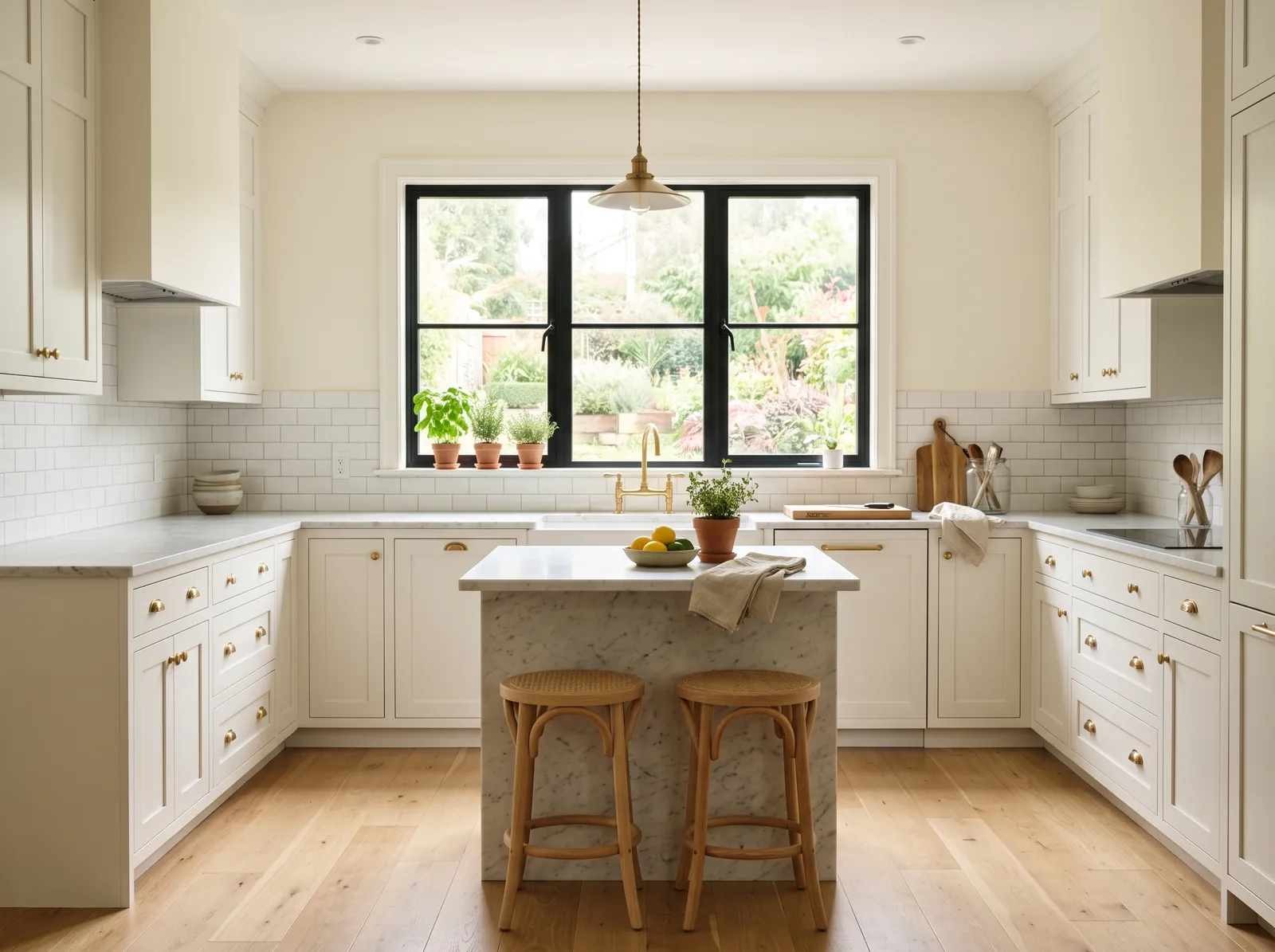
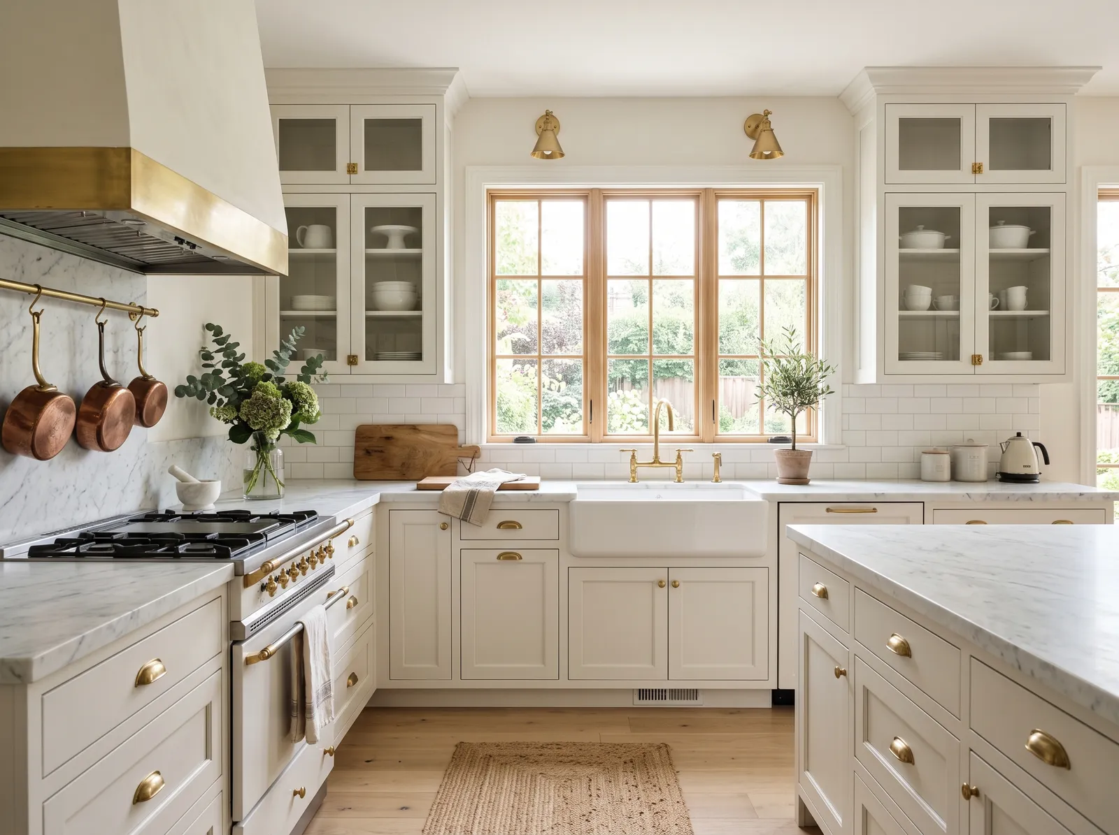
A soft creamy white on the walls keeps everything calm and bright, so the whole kitchen glows in one gentle, restful tone.
Cream is a wonderfully soft and welcoming backdrop for a busy home. In this kitchen, that gentle cream covers the walls and matches the classic shaker cabinets, while a textured jute rug lies on the light wood floor. Gleaming brass hardware and warm copper pots add metallic sparkle, framed by a natural wood window. The space feels incredibly bright, calm, and grounded. This combination works beautifully because the warm metallic accents prevent the monochrome cream from looking flat. It is perfect for anyone who loves a timeless, sun-drenched farmhouse look.
SEE ALABASTER ON YOUR WALLS →
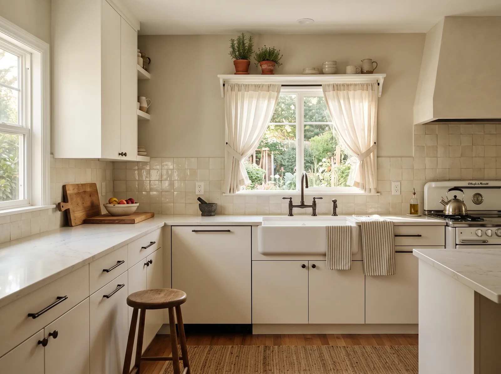
Greige walls add a quiet hint of warmth around white cabinets without ever looking like a real color, so the room feels grounded and easy.
Oatmeal is a comforting, sandy greige that brings instant warmth to a space. In this lovely kitchen, this gentle hue wraps the walls, pairing beautifully with soft cream cabinets, breezy ivory window curtains, and a textured jute rug on the floor. The entire room feels incredibly calm, cozy, and grounded. This combination works so well because layering similar light neutrals creates a seamless, airy look that feels bright yet inviting. It is perfect for anyone wanting a peaceful, cottage-inspired kitchen that feels like a daily retreat.
SEE PALE OAK ON YOUR WALLS →
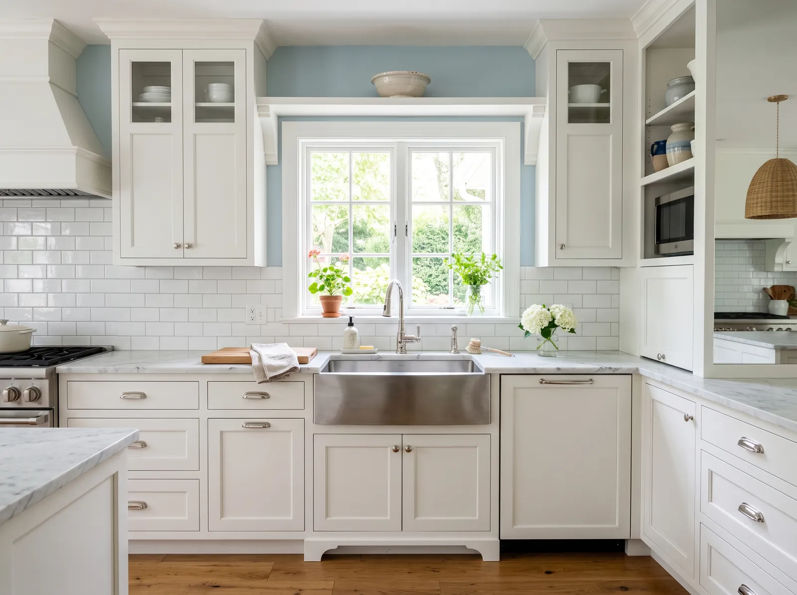
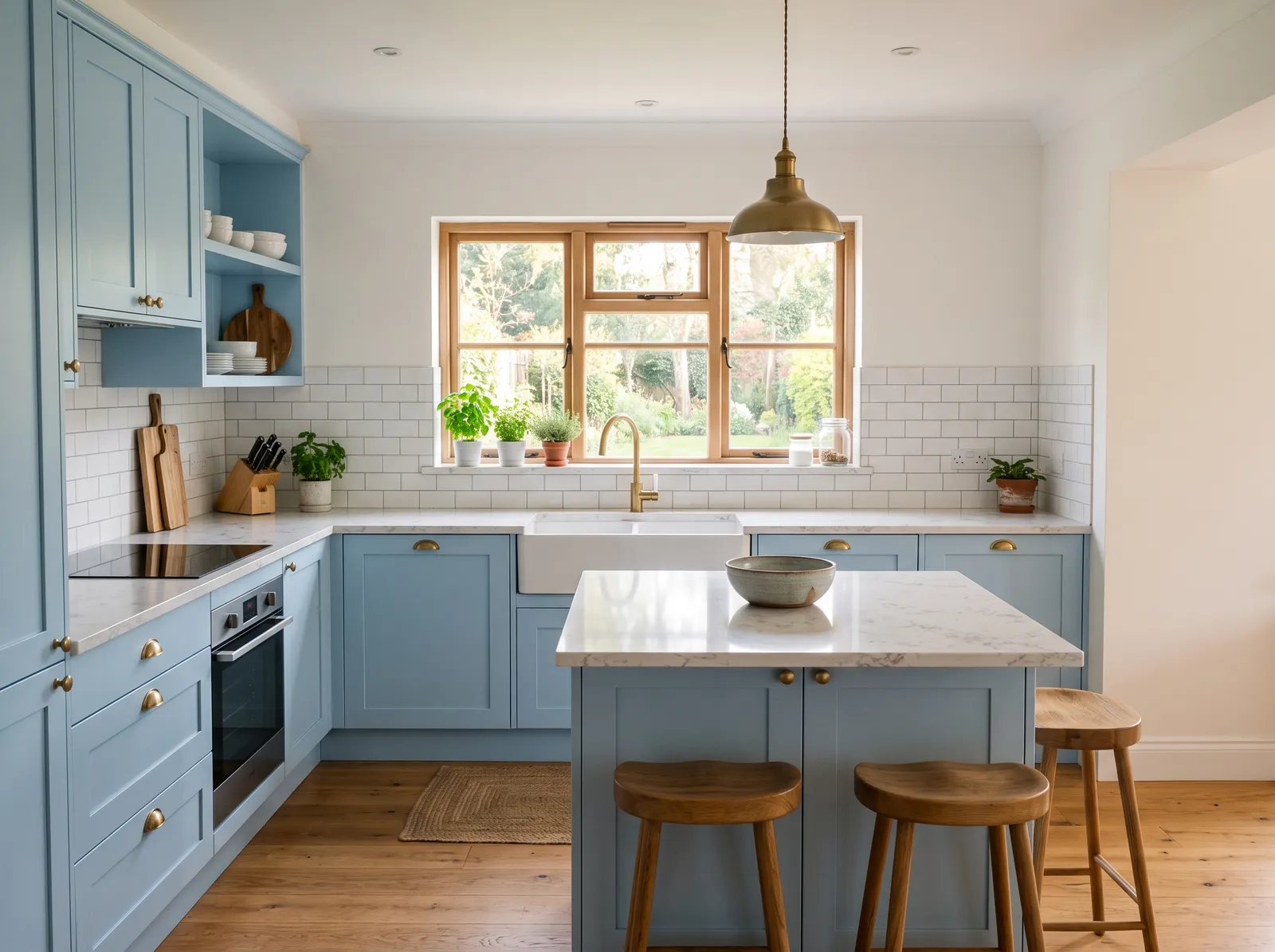
A gentle blue on the walls cools the room down and makes white cabinets look fresh and clean, like a kitchen near the water.
Sky blue is a breezy, light-filled pastel that brings the freshness of the outdoors inside. In this kitchen, that airy blue coats the upper walls, beautifully framing the crisp white cabinets. A stainless steel farmhouse sink anchors the counter, while warm oak floors run underfoot. The space feels incredibly calm, clean, and cheerful. This combination works because the cool blue contrasts gently with the warm wood, keeping the white cabinetry from looking too sterile. It is perfect for anyone wanting a classic, coastal-inspired kitchen that feels like a sunny morning.
SEE YARMOUTH BLUE ON YOUR WALLS →
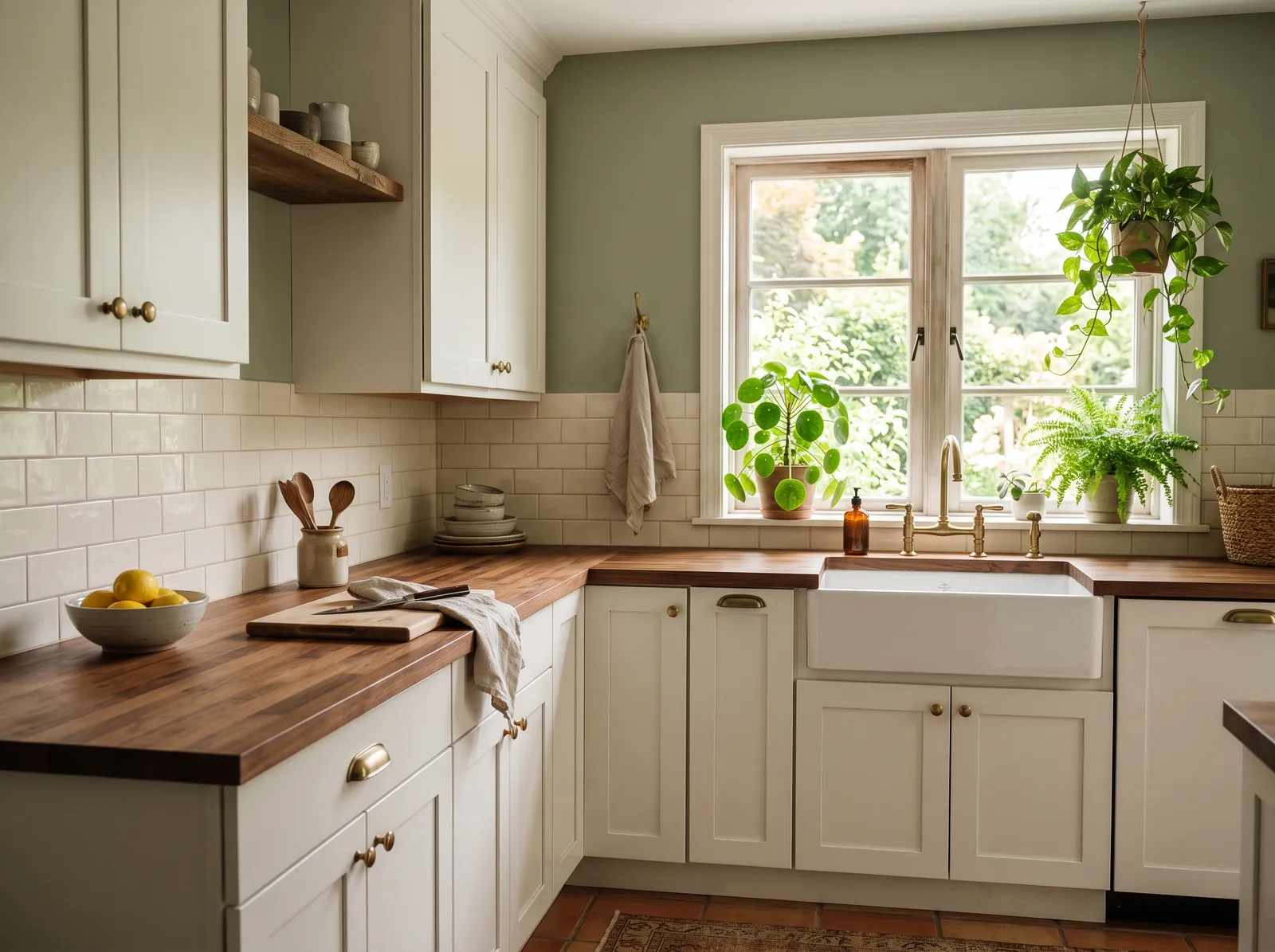
Muted sage on the walls brings a little of the garden indoors and gives white cabinets a soft, earthy backdrop that never feels loud.
Sage green brings a quiet, earthy peace to any room. In this kitchen, that gentle green coats the upper walls, beautifully framing the window. Creamy white cabinets sit below, topped with rich, warm wood countertops that add a rustic touch. Potted green plants trail from the window sill and ceiling, while a patterned rug rests on the terracotta floor. The entire space feels incredibly cozy and grounded. This combination works so well because the organic wood tones naturally balance the cool green and crisp white. It is perfect for anyone wanting a cottage-inspired sanctuary.
SEE EVERGREEN FOG ON YOUR WALLS →
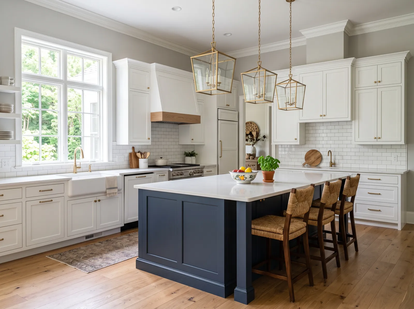
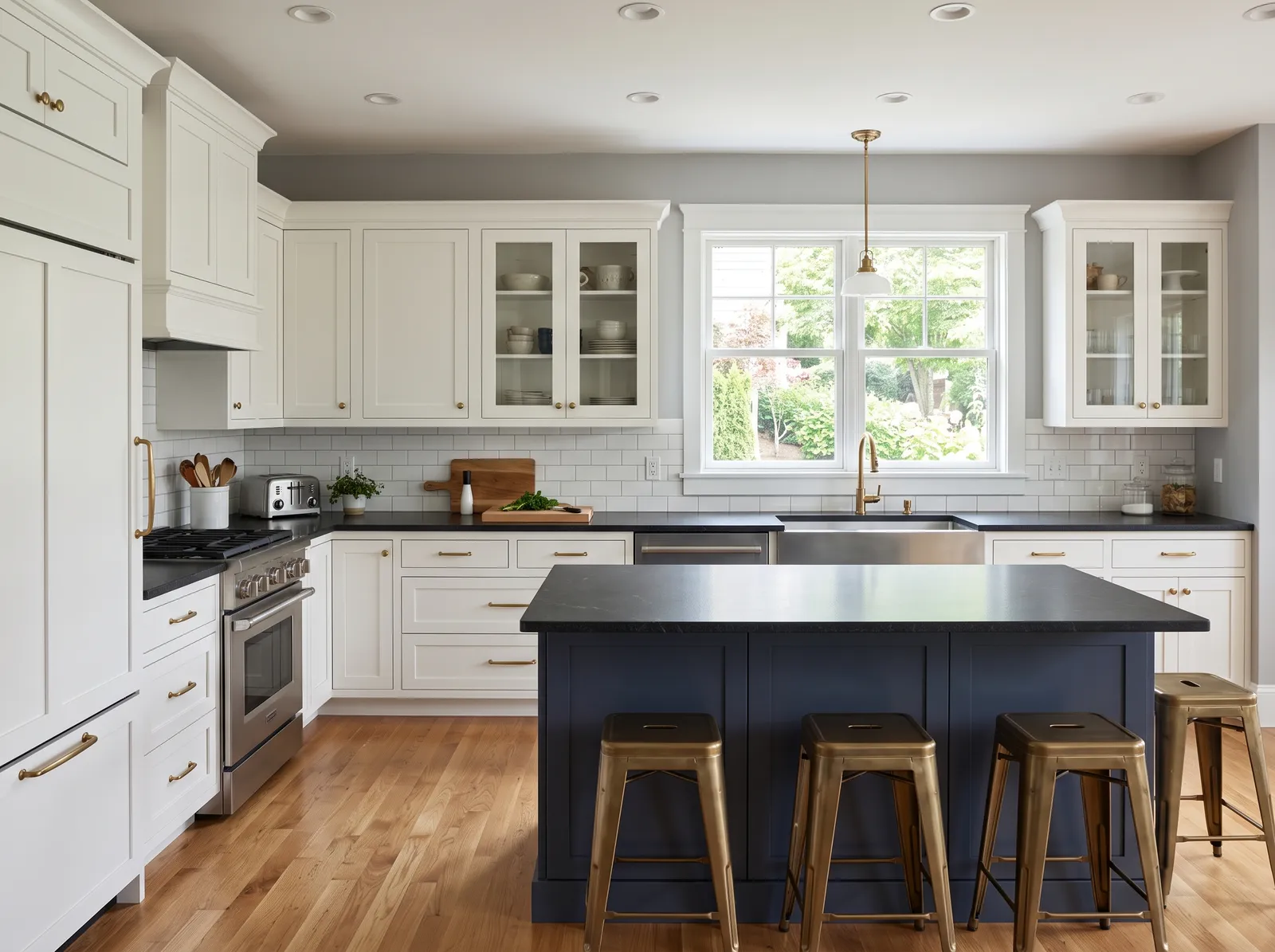
Calm gray walls and a deep navy island wrap white cabinets in a steady, classic mood that feels both fresh and timeless.
Light gray is a cool, clean neutral that makes any space feel instantly updated. In this kitchen, it coats the walls, letting the crisp white perimeter cabinets and the deep slate blue island take center stage. Warm woven counter stools and natural wood floors add organic texture, while a muted vintage-style runner anchors the sink area. The room feels incredibly bright, airy, and welcoming. This combination works beautifully because the dark blue island grounds the airy white cabinetry, preventing the space from looking too sterile. It is perfect for anyone who loves a classic coastal-meets-modern look.
SEE REPOSE GRAY ON YOUR WALLS →
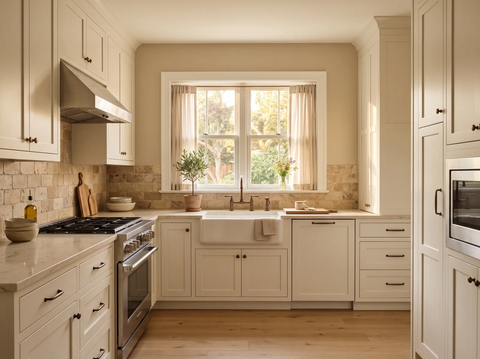
Warm taupe walls wrap the room in a soft, sandy glow that makes crisp white cabinets feel even brighter and more welcoming.
Biscuit beige is a gentle, sandy neutral that brings instant comfort to a room. In this kitchen, that soft beige wraps the walls, while the cabinets are painted a creamy off-white. Light wood floors and sheer tan curtains keep the look airy, while dark bronze hardware and a stainless steel stove add subtle contrast. The space feels incredibly calm, clean, and welcoming. This combination works beautifully because layering similar warm neutrals creates a seamless, spacious look without feeling stark. It is perfect for anyone who loves a timeless, cottage-inspired kitchen.
SEE IT ON YOUR WALLS →
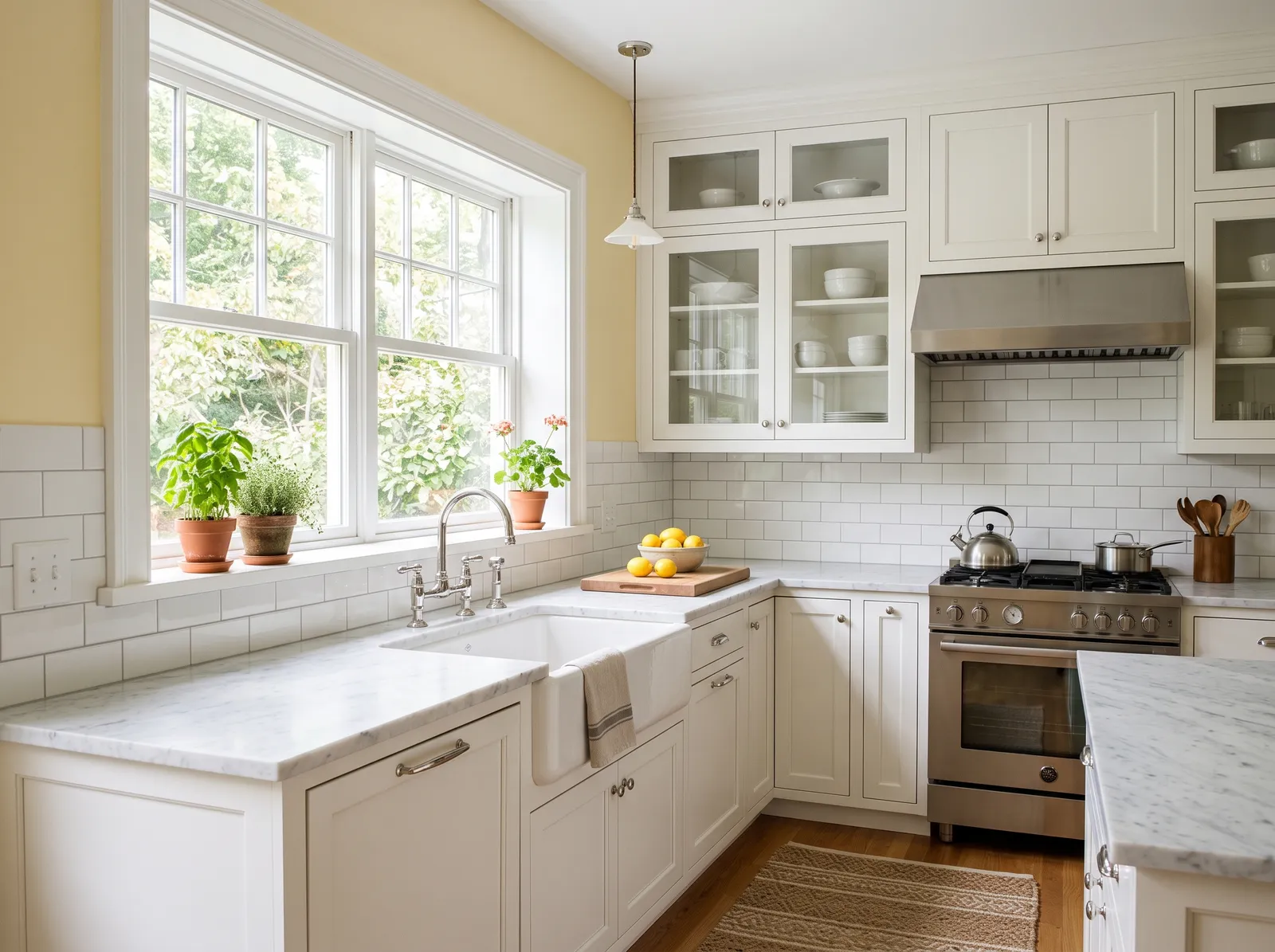
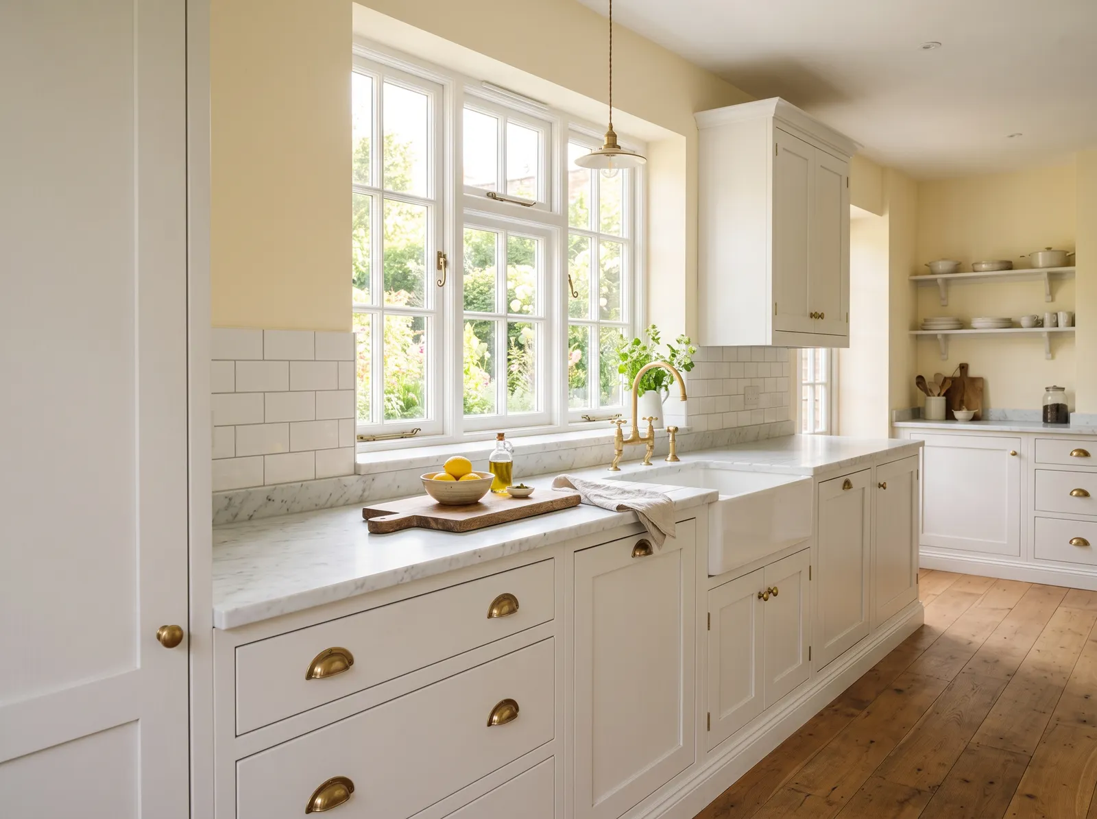
A soft buttery yellow fills the room with sunshine and gives white cabinets a cheerful, old-fashioned warmth you feel right away.
Butter yellow is a cheerful, sunny shade that instantly brings a smile to your face. In this bright kitchen, that happy yellow coats the upper walls, beautifully framing the crisp white cabinets and marble countertops. A textured tan jute rug lies on the wood floor, while small potted green herbs sit on the windowsill. The space feels incredibly bright, welcoming, and full of morning energy. This combination works so well because the clean white cabinetry keeps the yellow from feeling too overwhelming. It is perfect for anyone who loves a classic, sun-drenched farmhouse look.
SEE IT ON YOUR WALLS →
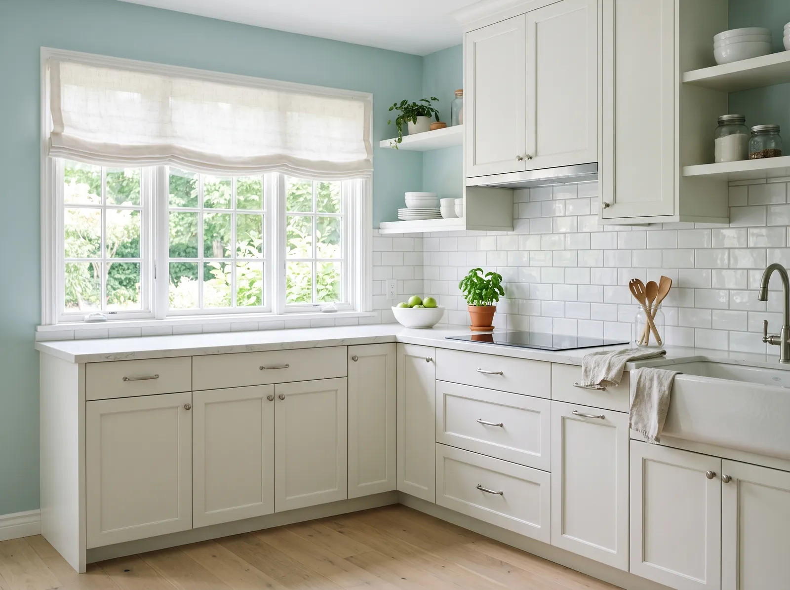
A soft blue-green sits right between calm and fresh, giving white cabinets a spa-like backdrop that feels clean and a little dreamy.
Duck egg blue is a breezy, light-filled pastel that brings the freshness of the outdoors inside. In this lovely kitchen, that soft blue coats the upper walls, beautifully framing the creamy off-white cabinets, white subway tile backsplash, and a matching linen roman shade over the window. The entire space feels incredibly calm, bright, and airy. This combination works so well because the cool blue walls make the warm cream cabinets and light wood floors pop without feeling stark. It is perfect for anyone wanting a cheerful, cottage-inspired cooking space.
SEE PALLADIAN BLUE ON YOUR WALLS →
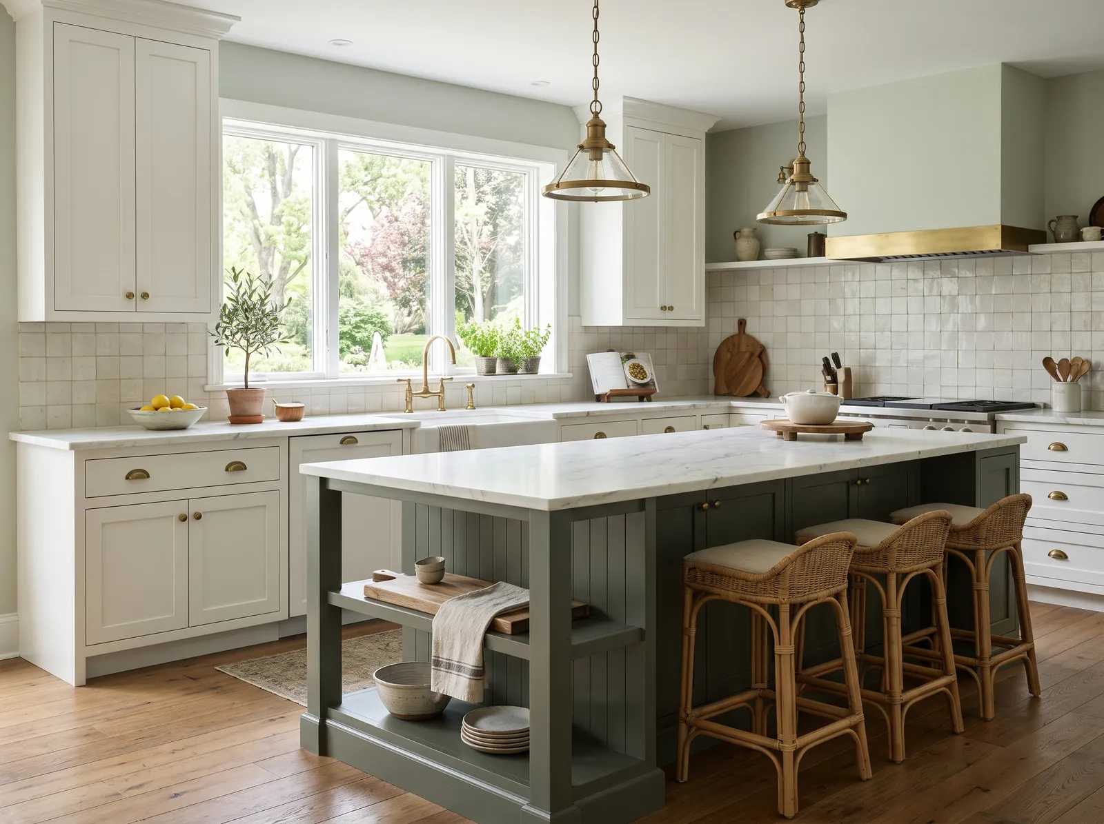
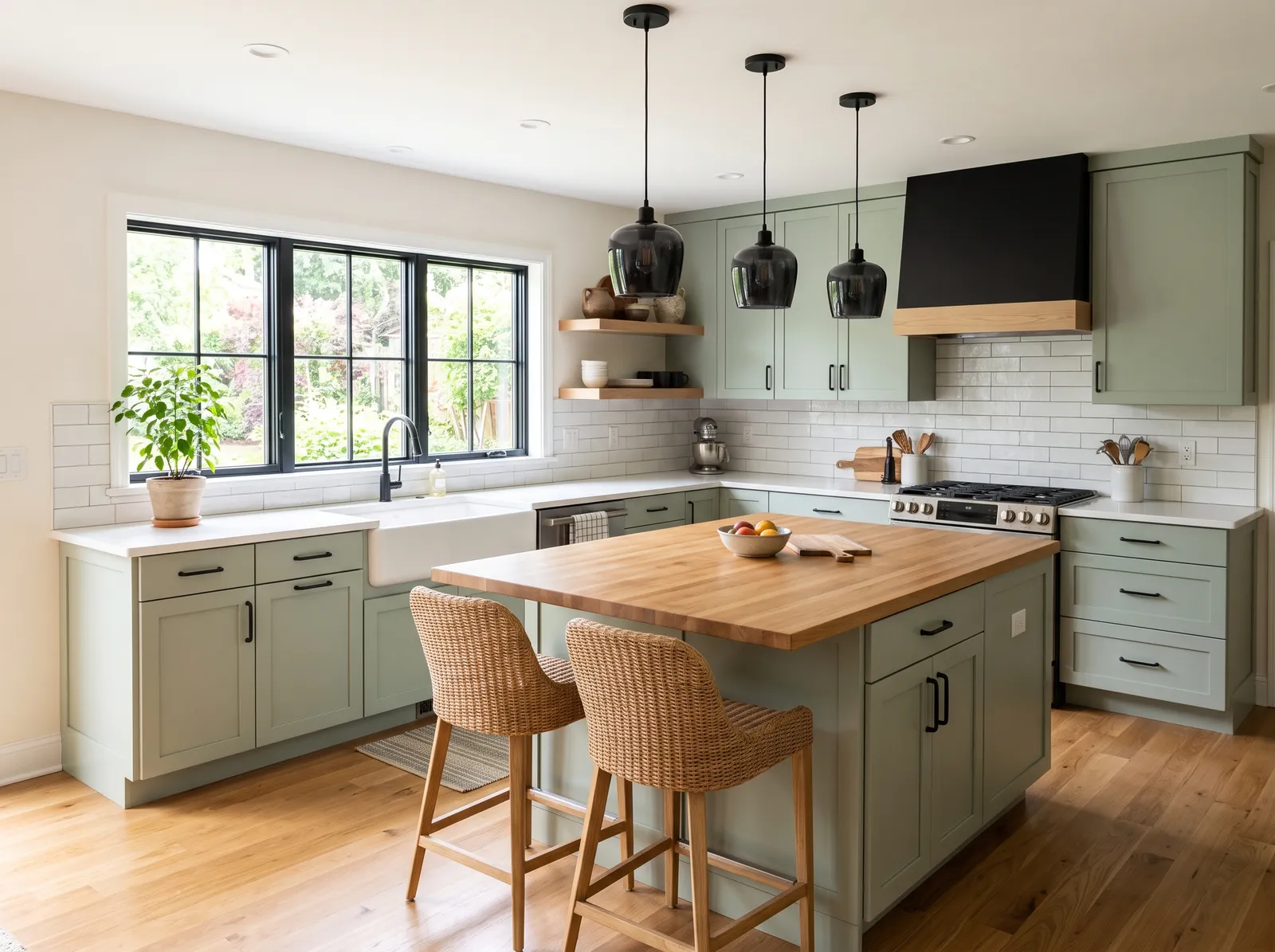
Whisper-soft green walls and a deeper green island layer one easy color in two shades, so white cabinets feel calm and gently nature-touched.
Pale sage is a quiet, earthy green that brings the outdoors inside. In this airy kitchen, that gentle green coats the walls, while the perimeter cabinets wear a clean off-white. The central island anchors your view in a deeper, richer sage green, paired beautifully with warm rattan bar stools and gleaming brass pendant lights. The space feels incredibly calm, fresh, and grounded. This combination works because the natural wood tones and brass accents instantly warm up the cool, leafy greens. It is perfect for anyone wanting a peaceful, nature-inspired heart of the home.
SEE SEA SALT ON YOUR WALLS →
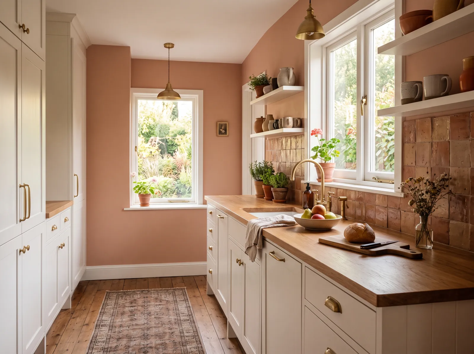
A soft, dusty terracotta warms the room like late sunlight and gives white cabinets a cozy, earthy glow that feels unexpected and lovely.
Terracotta is a soft, earthy clay-orange that instantly grounds a space. In this lovely kitchen, that dusty terracotta shade wraps the walls, contrasting beautifully with creamy off-white cabinets and rich wood countertops. A vintage-style patterned runner grounds the floor, while brass accents add a touch of shine. The entire room feels incredibly cozy and snug, like a sunny afternoon in a cottage. This combination works because the warm wood and clay tones naturally harmonize with the bright cabinetry. It is perfect for anyone who wants a kitchen that feels like a welcoming hug.
SEE SMOKY SALMON ON YOUR WALLS →
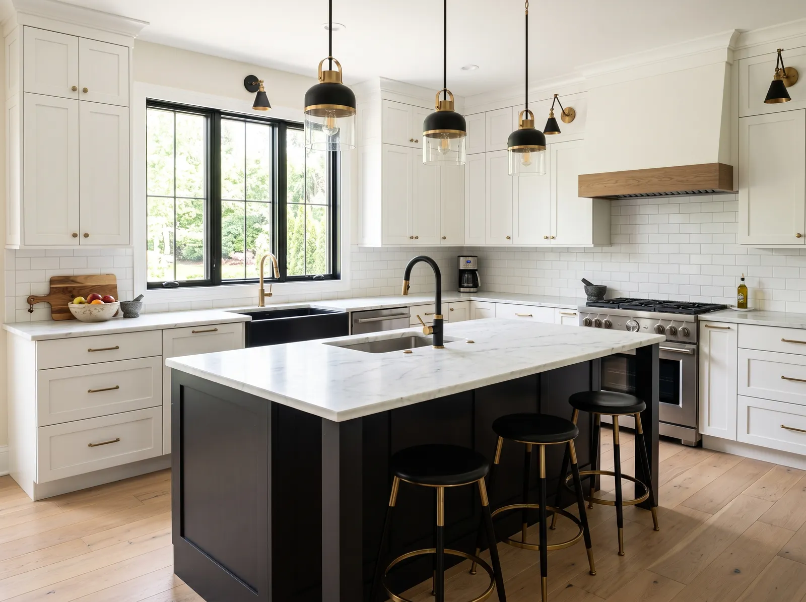
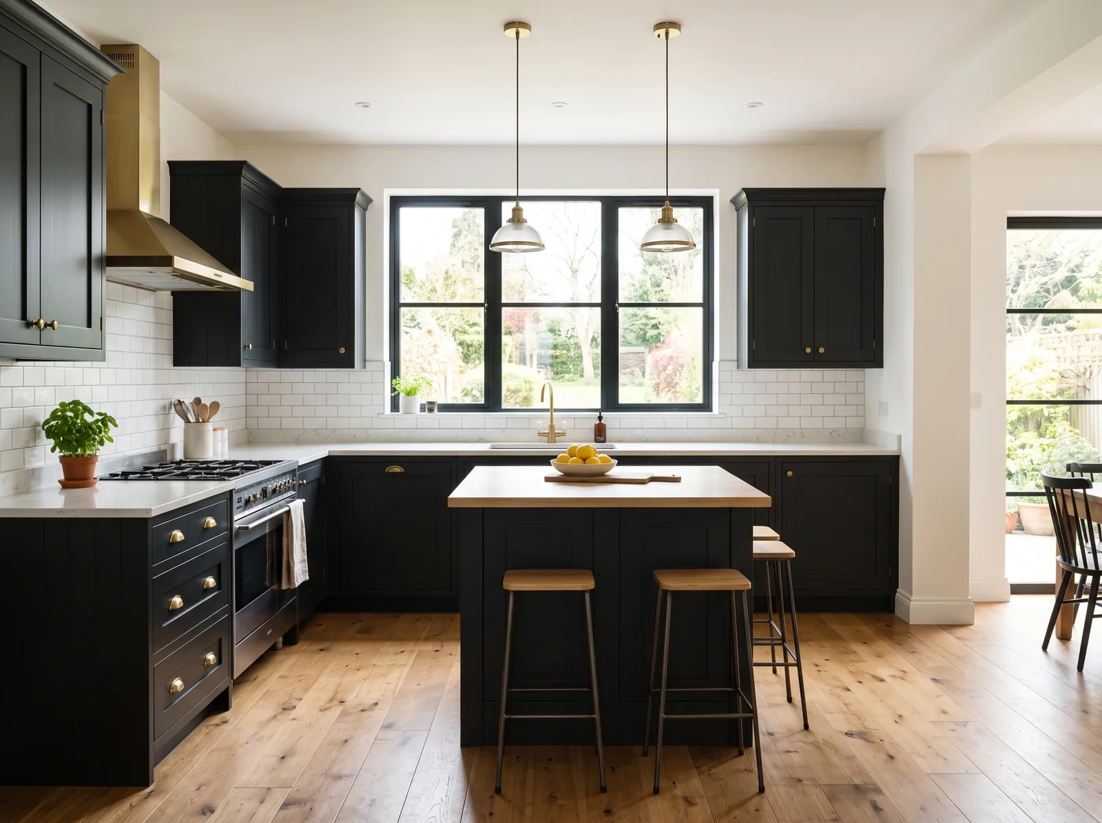
Soft creamy walls keep things warm while a bold black island adds a crisp, modern anchor that makes white cabinets feel sharp and current.
Soft off-white is a clean, versatile neutral that brings a breezy openness to any space. Here, it coats the walls, while crisp white cabinets stretch to the ceiling. A dramatic charcoal black island anchors the center, paired with matching black and brass barstools and elegant pendant lights. Light oak floors ground the room in natural warmth. The space feels incredibly bright, sophisticated, and airy. This high-contrast combination works beautifully because the deep black elements keep the bright white surfaces from feeling washed out. It’s perfect for anyone who loves a timeless, modern farmhouse look.
SEE SWISS COFFEE ON YOUR WALLS →
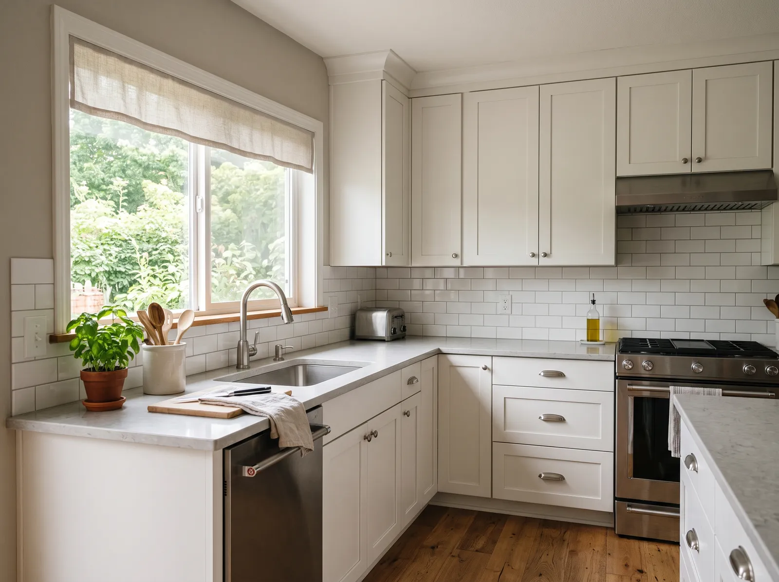
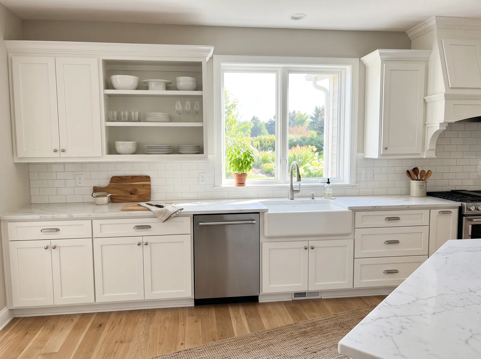
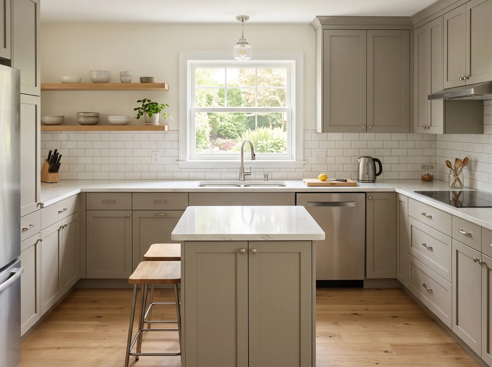
This easygoing greige is the safe favorite for a reason, giving white cabinets a warm, settled backdrop that works in almost any light.
Greige is a soft, versatile blend of gray and beige that brings instant comfort. In this bright kitchen, that soothing greige coats the walls, while the cabinets wear a clean, creamy off-white. Crisp white trim frames the window, which is softened by a natural linen shade, and a vibrant green plant sits on the counter. The space feels incredibly calm, airy, and clean. This combination works beautifully because the light walls keep the kitchen feeling open, while the warm wood floors ground the look. It is perfect for anyone who loves a timeless, clutter-free cooking space.
SEE AGREEABLE GRAY ON YOUR WALLS →Kitchen Wall Color Combinations
A wall color never works alone. These are the full schemes from the rooms above — the lead color first, then the supporting colors that make the photo work.
Calm gray walls and a deep navy island wrap white cabinets in a steady, classic mood that feels both fresh and timeless.
TRY THIS PALETTE →Whisper-soft green walls and a deeper green island layer one easy color in two shades, so white cabinets feel calm and gently nature-touched.
TRY THIS PALETTE →Soft creamy walls keep things warm while a bold black island adds a crisp, modern anchor that makes white cabinets feel sharp and current.
TRY THIS PALETTE →More Kitchen Color Ideas
Set on a color family already? Each page has its own real rooms and picks.
Light or Dark Kitchen Colors?
Go Light (LRV 60+) If…
The room is small, faces north, or has to work at every hour. Light warm colors make it feel bigger and stay calm in evening light — the light you actually live in.
Go Dark (LRV Under 20) If…
You want the cocoon effect and the room has real daylight. Dark works best on one feature wall — or fully color-drenched in a large room with good windows.
See It. Love It.
Paint It.
Upload one photo of your kitchen and try every color on this page on your own walls — in your own light, before you buy a drop of paint.

Back to NatureBeforeAbout Kitchen Paint Colors
White cabinets are the easy part. The real question is what goes on the walls behind them, and that one choice decides whether your kitchen feels warm and cozy or cool and crisp. Here are twelve wall colors that look beautiful with white cabinets, from soft warm whites to gentle greens and a few bold islands. Scroll, picture each one in your room, and pick the mood you want to wake up to.
The Questions Everyone Asks
What color should I paint my kitchen?
If you want one answer, start with the safe picks above — Swiss Coffee, Alabaster, Sea Salt, Agreeable Gray. They read well in any light and survive furniture changes. Then check the light: strong afternoon sun wants a step cooler, a north-facing room wants a step warmer.
what wall color goes with white cabinets?
Almost any color works, but soft warm neutrals are the easiest win. A creamy white, a light greige, or a gentle gray all flatter white cabinets and look good in any light. From there, soft blue, muted sage, and buttery yellow are great next steps if you want a little more color.
what colors make white cabinets pop?
Contrast is what makes white pop. A deeper wall or island color, like navy, forest green, or charcoal, frames the white and makes it look crisp and bright. Even a soft sage or dusty blue gives enough contrast to keep the cabinets from blending into the walls.
should walls be white too with white cabinets?
You can, but pick a wall white that is slightly different from the cabinets so the room has some depth. A warm creamy white on the walls next to white cabinets feels calm and bright without looking flat. If all-white feels too plain, a soft greige gives nearly the same airy look with a touch more warmth.
what island color goes with white cabinets?
Navy, deep green, and black are the three favorites, and all three look great against white cabinets. Navy and black feel crisp and a little dressy, while a deep green feels warm and relaxed. Keep the rest of the cabinets white and paint only the island for the easiest version of this look.
what countertop pairs with white cabinets?
White marble and light quartz are the classic match and keep things bright and flexible. Warm wood counters add coziness and pull the room toward earthy colors. If you want contrast, a darker stone or a black quartz makes white cabinets stand out beautifully.
what is the best finish for a white kitchen?
Use eggshell or satin on the walls so they wipe clean without too much shine. Step up to semi-gloss on trim and especially on the cabinets, since it handles fingerprints and scrubbing best. That little bit of extra shine on white cabinets also keeps them looking fresh.
What two-color combination works best in a kitchen?
The reliable pattern is a quiet main color plus one deep accent on a single wall. Keep trim and ceiling in one warm white so the two colors are the only event in the room — the combination cards above show complete schemes from real rooms.
What colors make a kitchen look bigger?
High-LRV, slightly warm colors — LRV 60–75 is the sweet spot. Paint the walls and trim close to the same light color so the corners blur, and keep the ceiling white. Stark cool white actually works against you; it creates hard shadows that show the room's edges.



Ask a Question