Platinum Gray
Benjamin Moore's Historical mid-gray, reviewed honestly: why it wins on deck boards and siding, where it goes flat indoors, and what to pick instead.

Jessica has spec'd whites and neutrals for more than 300 rooms and keeps a sample wall of painted drawdowns in her studio. Every color review is checked against real reader rooms in the comments and re-tested when a formula changes. About the testing process →
- 1Pewter Green12
- 2Retreat21
- 3Platinum Gray40
- 4Upward57
- 5Sea Salt63
The Fast Verdict
Platinum Gray is a genuine mid-tone gray with almost nothing hiding in it — no blue, no violet, only the faintest green-khaki drift you will never notice unless you hold it against a true neutral. That flatness is boring on a chip and exactly right on a floor. Benjamin Moore sells it as a solid deck-and-siding stain, and that is the clue: this is a color built to sit on horizontal boards and wide siding runs, where a gray with opinions would look wrong by the second season.
Deck and porch floors · painted fences and railings · gray siding with white or black trim · mudroom lockers and cabinets · anyone who wants gray with no undertone surprise
You want a light, airy wall gray · your room is dim and north-facing · you want a gray with visible character · your deck sits under pine or oak that drops constant debris
- About as undertone-free as a real gray gets — no violet flash, no blue drift
- Sold as a solid deck and siding stain, so the deck version is a real product
- Mid value hides both pale pollen and dark mud better than light or charcoal grays
- Reads the same on the sunny and shaded sides of a house
- Works from deck boards to cabinet doors without changing personality
- Much darker than most people expect from the word gray (LRV 40)
- Goes flat and institutional on interior walls without good daylight
- No character — if you want a gray with a story, this is not it
- Solid film on a deck still peels if the moisture underneath is not fixed
What Color Is Platinum Gray, Really?
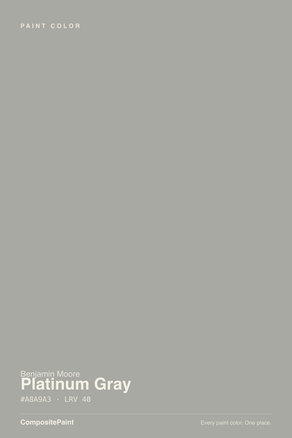
A mid-tone gray from Benjamin Moore's Historical Collection, and one of the most genuinely neutral colors in that entire deck. Break the hex apart and the red and green channels sit within one point of each other with blue only a hair below — that is as close to a dead-flat gray as a real paint ever gets. What it means on a surface is that Platinum Gray does not have a party trick. It will not flash violet in north light the way half the popular light grays do, it will not turn blue against white trim, and it will not go greige next to warm wood. It just sits there being gray, which is the whole reason people who have been burned by a chameleon gray end up here.
At LRV 40 it is a true middle value — noticeably darker than the wall grays most people mean when they say gray, and roughly the depth of a weathered cedar board or a concrete patio slab. Indoors that is a real commitment: four walls of it in a room with one window will read heavy. Outdoors and underfoot it is the sweet spot. Mid-tone grays hide the widest mix of what actually lands on a deck — pale pollen and dust show against charcoal, dark mud and leaf tannin show against pale gray, and a value around 40 splits the difference better than either.
Undertone in one line: essentially none, with a whisper of green-khaki that only appears when a bluer gray is standing next to it. If your sample looks green, that is your lawn or your cedar; if it looks blue, that is open sky bouncing off a horizontal surface. Both are the paint telling the truth about where you put it.
Where It Shines
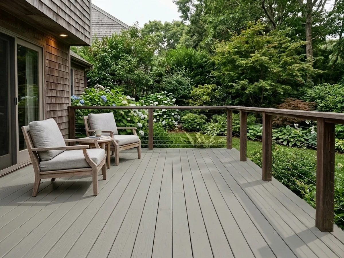
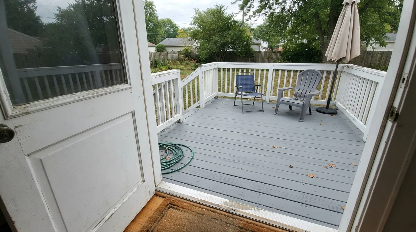
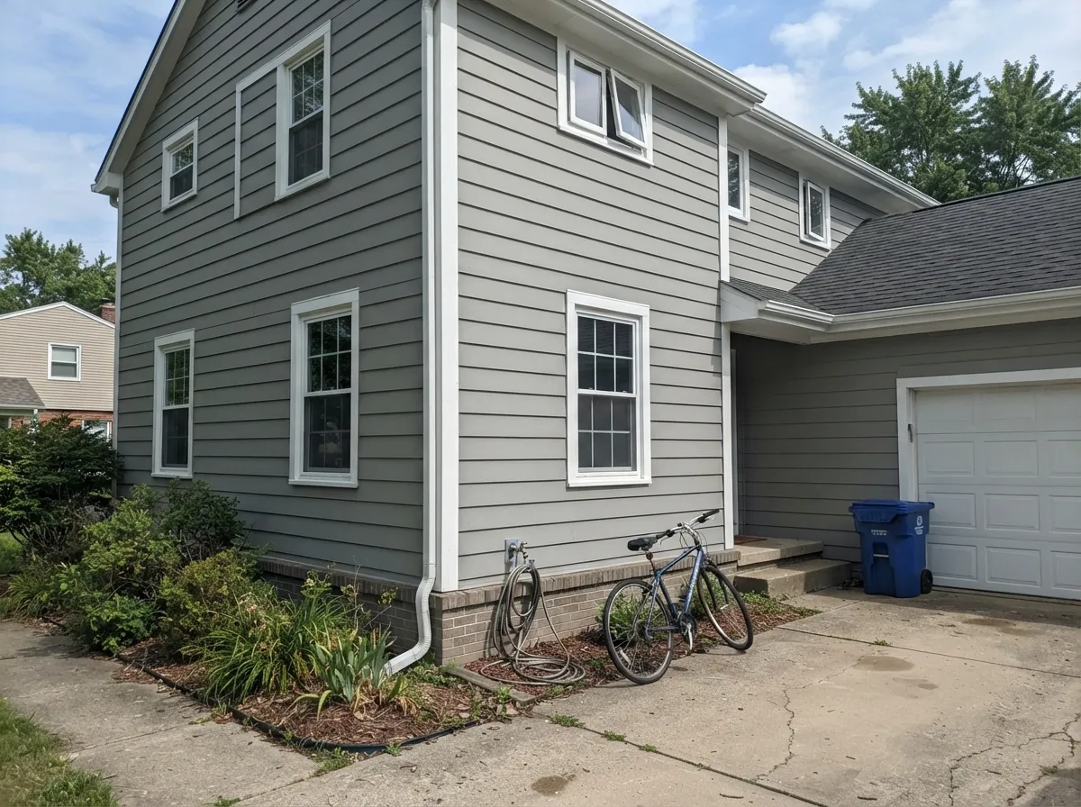
Its best surface is a floor. Benjamin Moore offers this exact color in the Woodluxe water-based deck and siding stain in a solid opacity, which is the strongest signal you get about a color's intended life — solid stain is what goes on tired deck boards and old fence pickets that need covering, not enhancing. On a porch floor with white railings above it, Platinum Gray reads like painted decks have looked for a hundred years. Its second home is the whole exterior: mid-gray siding with crisp white trim and a dark door is the safest exterior scheme in America right now, and this is a version of it that will not drift blue in the afternoon.
Where It Fails
The complaints about this color are almost never about the color itself — they are about people expecting a wall gray or expecting paint to solve a wood problem. All three are predictable before you open the can.
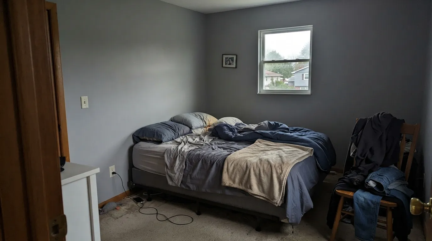
LRV 40 is mid-tone, not light. On a chip under store lights it passes for a soft everyday gray; on four walls it is clearly a color, and in a room with one window it goes heavy and slightly cold by late afternoon. If you want the same honest, no-undertone gray a couple of steps lighter, that is Stonington Gray HC-170 at LRV 59.
This is the single most common bad review of any painted deck, in any color. Solid film on horizontal boards is a vapor barrier: moisture rising from damp ground or from under-ventilated joists pushes it off from behind, and no color or brand survives that. Fix the ground and the ventilation first, prep to bare or sound surface, and never coat wood that is still green or slick from the mill.
Mid-gray hides average grit well, but under pine, oak or maple that drops constantly, the deck will look dirty within days no matter what. Pollen season shows pale-yellow film on it and wet leaves leave dark tannin stains. If that is your yard, go deeper — Chelsea Gray HC-168 at LRV 22 forgives far more between cleanings.
Room by Room
Available as a solid Woodluxe deck and siding stain, which is what most painted decks should be wearing. Low sheen only: gloss on a deck telegraphs every dip in the boards and turns slick when wet. Recoat traffic lanes before the whole deck needs it.
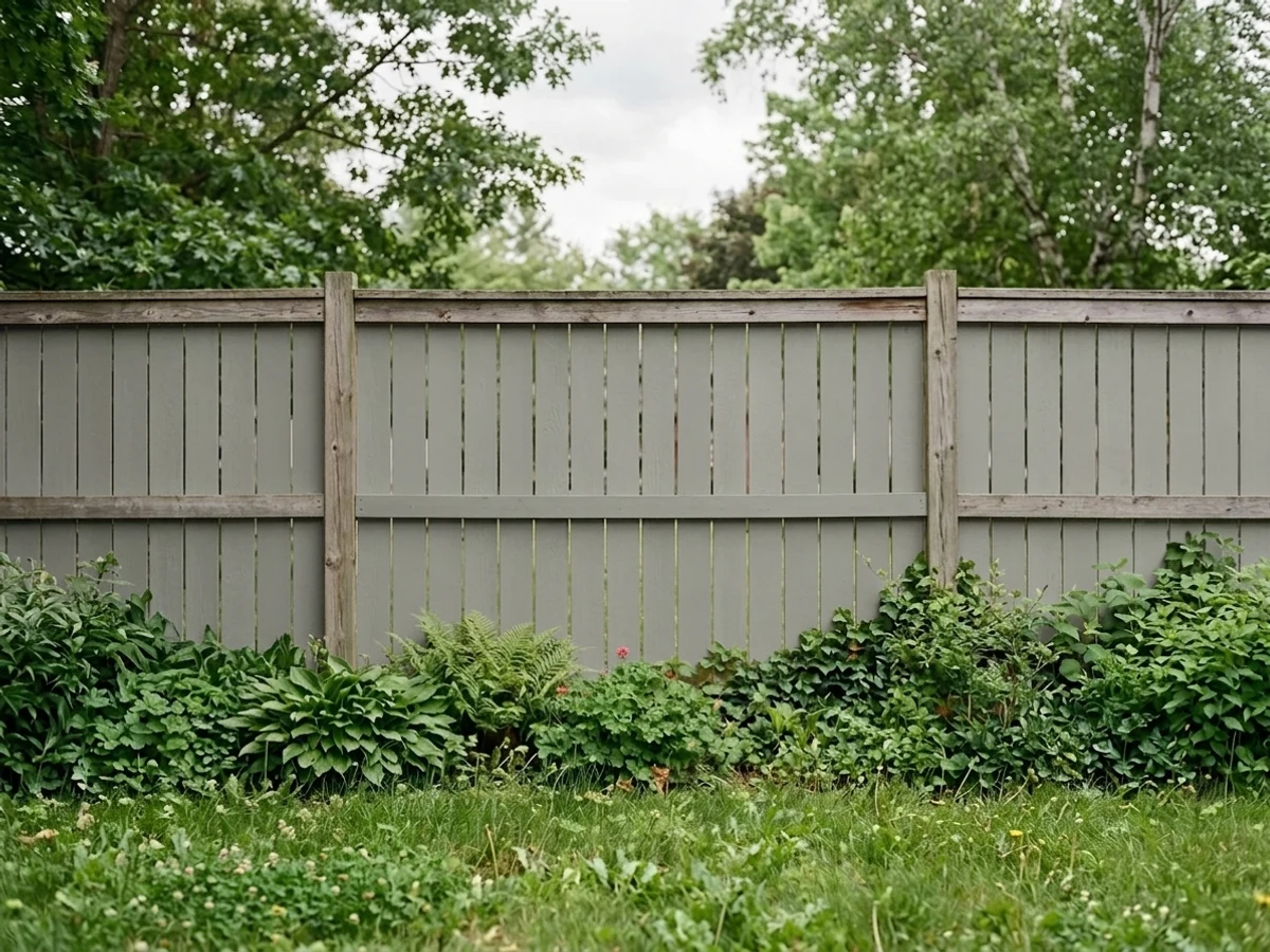
Solid gray on a fence quietly disappears behind planting instead of fighting it, and it ages far better than a stained fence that goes patchy. Pair it with White Dove posts and caps if you want the picket look without stark white.
Mid-gray body, crisp white trim, dark door. Because it carries no blue, it will not go icy on the shaded north elevation the way blue-grays do. Give it the strongest white you can stand — Chantilly Lace OC-65 at LRV 92 keeps the edges sharp.
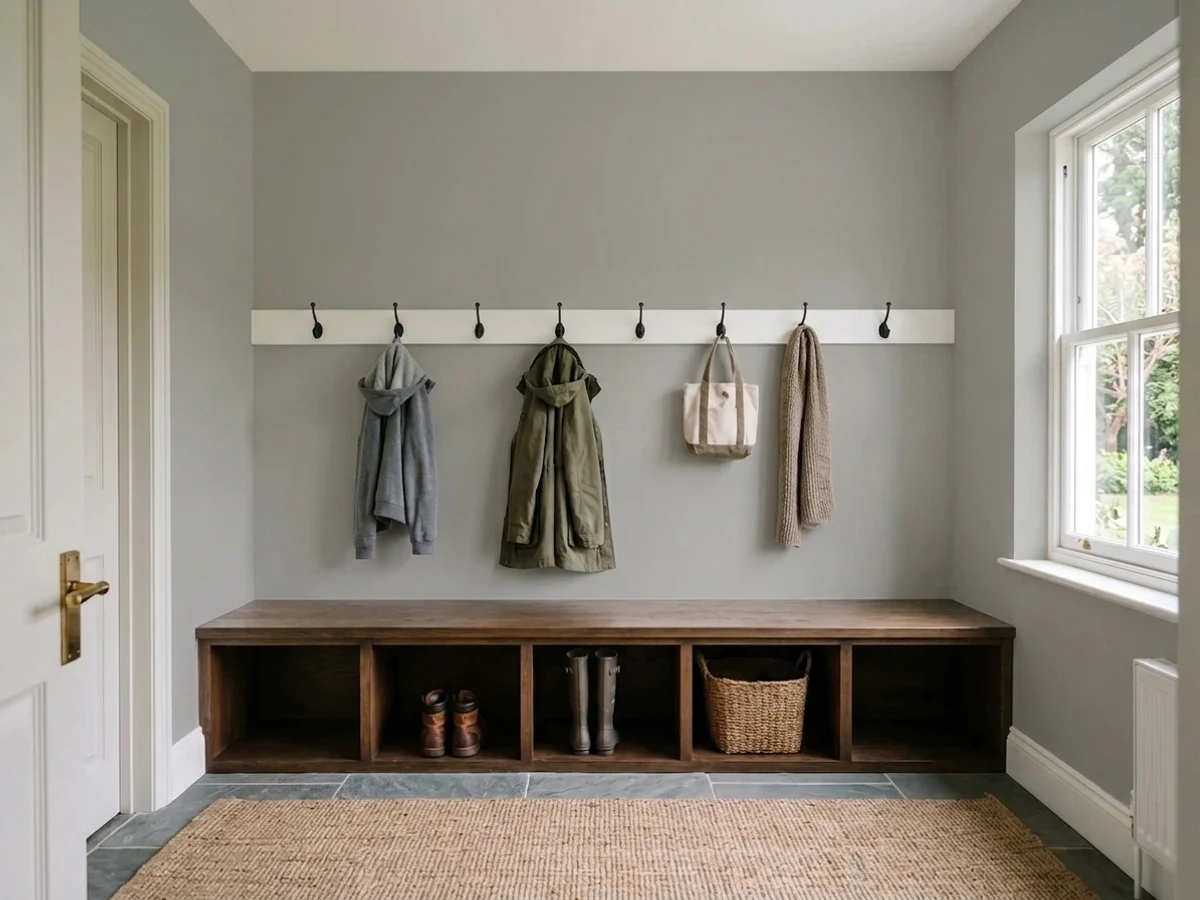
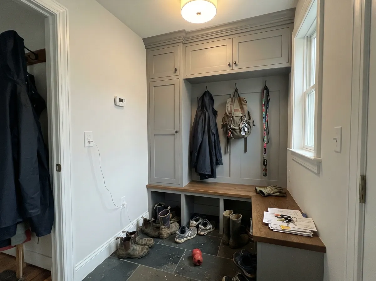
On lockers, benches and lower cabinets it reads utility-grade in the good sense: it hides scuffs, boot marks and detergent splash better than any white. Satin, and keep the walls above it light.
Benjamin Moore sells this color in Advance, its waterborne alkyd cabinet enamel, and it behaves the way a neutral gray should: it does not fight quartz, it does not turn blue against white uppers, and it does not date the way a warm greige cabinet can. Satin finish.
Honest answer: this is a mid-tone. It is handsome in an office, a den, or on a single accent wall with real daylight. In a dim bedroom or a basement it goes flat and institutional. Test a big sample on the darkest wall before committing a room.
Your Light Is the Risk
Full sky light on a deck or a siding run is where it looks intentional — clean, even, and the same gray all day.
Cool low light drains what little life it has and the walls read cold and flat. Indoors it needs a bright room.
Low warm sun lifts it slightly toward a soft stone gray for an hour, then it settles straight back. It moves less than almost any gray in the deck.
2700K bulbs warm it toward a mild greige; cool 4000K LEDs strip it to a hard, cool gray. Indoors, pick your bulbs before you judge the paint.
Most complaints about Platinum Gray are a light mismatch. Upload a photo of your actual room and see it on your walls — then ask for the same wall in north light or evening lamps before you buy a single sample.
Need It From Another Brand?
Any paint counter can custom-tint Benjamin Moore HC-179 directly. If you would rather stay in one brand's own deck, these are the closest stock matches, measured as ΔE2000. Under 2 is a difference you will not see on the wall.
| Brand | Closest color | ΔE | LRV | |
|---|---|---|---|---|
| Sherwin-Williams | Gray MattersSW 7066 · Sherwin-Williams | 0.3 | 39 | Color page → |
| Behr | Silver Gray6694 · Behr | 1.3 | 39 | Color page → |
| Valspar | Stately GraystoneV118-2 · Valspar | 1.1 | 38.9 | Color page → |
| PPG / Glidden | HippopotamusPPG0994-4 · PPG / Glidden | 0.7 | 40 | Color page → |
| Glidden | HippopotamusPPG0994-4 · Glidden | 1.1 | 40 | Color page → |
| Dutch Boy | Ironed Gray436-4DB · Dutch Boy | 2.7 | 38 | Color page → |
Similar Benjamin Moore Colors
The nearest shades to Platinum Gray within Benjamin Moore's own range, ranked by perceptual color distance — useful when you want the same look a touch lighter, darker, or warmer.
WCAG 2.1: AA is 4.5 : 1 for normal text, 3 : 1 for large text, AAA is 7 : 1.
Platinum Gray vs the Colors You're Also Considering
Every Platinum Gray sample board has the same rivals on it. The numbers show the real lightness gap — then it comes down to which risk you would rather live with.
Pick this when you want the blue taken out entirely and the gray to stay put.
Benjamin Moore 2134-50 · LRV 42Gull Wing GrayPick this if you want the same depth with a visible cool, faintly blue lean — better on coastal siding and shutters.
Pick this for a deck or a fence, where green reads as algae from ten feet away.
Benjamin Moore 1495 · LRV 39October MistPick this for the same value with a clear sage-green lean — a softer, greener version of the same idea.
Platinum Gray Coordinating Colors
Because it carries almost no undertone, Platinum Gray is unusually easy to pair — it does not force the rest of the scheme to be cool or warm the way most grays do. Benjamin Moore's own coordinating list points at soft whites and quiet blues, and that is the right instinct: give it one crisp white, one dark, and at most one color. These are the partners that keep working:
Platinum Gray on Decks, Porches and Fences
This is the use worth planning around. Platinum Gray is offered in the Woodluxe water-based deck and siding stain in a solid opacity, which is the category built for wood that has already had a life — gray, checked, previously coated boards that a semi-transparent stain would only make look worse. The value is the reason it works outdoors: mid-tone grays sit almost exactly between the two things that make a deck look dirty. Pale pollen, dust and salt show hardest against charcoal; mud, wet leaf tannin and algae show hardest against pale gray. A gray at LRV 40 never looks perfectly clean and never looks filthy, which in practice means you sweep it and move on.
Two practical rules. First, low sheen, always — gloss on a horizontal board magnifies every cup and dip in the decking and gets genuinely slippery when wet. Second, the paint is not the waterproofing. Solid film on a deck is a vapor barrier, so if the joists sit over damp bare soil or the space underneath cannot breathe, moisture will push the coating off from behind within a season or two and no color choice changes that. Ventilate underneath, lay a ground barrier if you must, and prep down to sound surface before the first coat.
On fences and railings the same neutrality pays differently: gray recedes behind planting, so a Platinum Gray fence reads as background rather than as a painted object, while a stained fence keeps announcing itself as it goes patchy. Cap the posts in White Dove if you want the traditional look without the maintenance of an all-white fence.
Platinum Gray With Wood Tones and Floors
Inside, this is the rare gray that does not pick a fight with wood. Honey oak — the flooring that ruins most cool grays — is survivable here, because Platinum Gray has no blue in it to sit opposite the orange. It will not flatter the oak, and the room will read a little utilitarian, but it does not clash, and that alone puts it ahead of every blue-gray on the shelf. Walnut, white oak and gray-washed floors are all easy, and against pale white oak it looks deliberately Scandinavian.
Outdoors the wood question is different: what matters is what the color sits beside, not underneath. Cedar rails, teak furniture and any warm wood decking read distinctly orange next to it, which most people like — the gray makes the wood look richer. What does not work is butting it against a green-stained or heavily weathered gray-green deck, where the faint khaki in Platinum Gray gets amplified and the whole assembly looks slightly mossy.
Metals are simple: black, oil-rubbed bronze and galvanized all read correctly against it. Brass is the one to sample — polished brass against a dead-neutral gray can look more yellow than you expect, and aged or unlacquered brass handles it much better.
Three Ready Palettes Built on Platinum Gray
A color is never alone on the wall. These are complete combinations in the 60-30-10 pattern, with the reason each one holds together. Every one opens in the visualizer.
The oldest porch formula there is: a mid-gray floor that hides traffic, soft white rails so the structure reads light, and a pale blue-green overhead that keeps the ceiling from looking like a lid. Platinum Gray's flat neutrality is what lets the blue ceiling stay the only color in the scheme.
Try this palette in your roomA neutral gray body needs maximum trim contrast or the whole facade goes soft — Chantilly Lace at LRV 92 gives it. Hale Navy on the door reads almost black from the street and blue up close, which is the cheapest way to make a plain elevation look considered.
Try this palette in your roomEverything below hip height takes the abuse, so it wears the gray; everything above stays light so the room does not shrink. Wrought Iron on the bench and hooks absorbs the black scuffs a mid-gray would eventually show.
Try this palette in your roomPlatinum Gray FAQ
Is Platinum Gray warm or cool?
Neither, really — it is one of the most balanced grays Benjamin Moore makes. There is a faint green-khaki drift in it, but you only see it with a bluer gray held alongside. Against warm greiges it will read cool; against a true blue-gray like Gull Wing Gray it will read warm. On its own it just reads gray.
Can I use it on a deck?
Yes, and that is arguably its best use. Benjamin Moore offers this color in the Woodluxe water-based deck and siding stain in a solid opacity, which is the right product for boards that need covering rather than showing off. Low sheen only, and fix any moisture problem under the deck before you coat it.
Is it too dark for interior walls?
In a bright room, no. At LRV 40 it is a genuine mid-tone, so it is excellent on an office wall, a den or a single accent wall with real daylight, and heavy in a dim bedroom or a basement. If you want the same character several steps lighter, Stonington Gray HC-170 at LRV 59 is the move.
What trim white goes with Platinum Gray?
The crisper the better. Chantilly Lace OC-65 gives the sharpest line and is the right call outdoors; White Dove OC-17 softens it for interior trim and cabinet work. Avoid a cream trim — the yellow makes the gray look faintly green.
Will it show dirt on a porch floor?
Less than the alternatives. Pale grays show mud, tannin and algae; charcoal shows pollen, dust and salt. A mid value around LRV 40 is the compromise that looks acceptable in both seasons. If your deck lives under heavy trees, step deeper to Chelsea Gray HC-168.
Does it work on kitchen cabinets?
Yes. It is sold in Advance, Benjamin Moore's waterborne alkyd cabinet enamel, and its flat neutrality is the selling point — it does not argue with quartz, it does not go blue against white uppers, and it will not read dated the way a warm greige cabinet can. Satin finish, and expect two coats over a bonding primer.
Have you painted with Platinum Gray?
Rate it — one tap helps the next reader decide.
Ask a Question