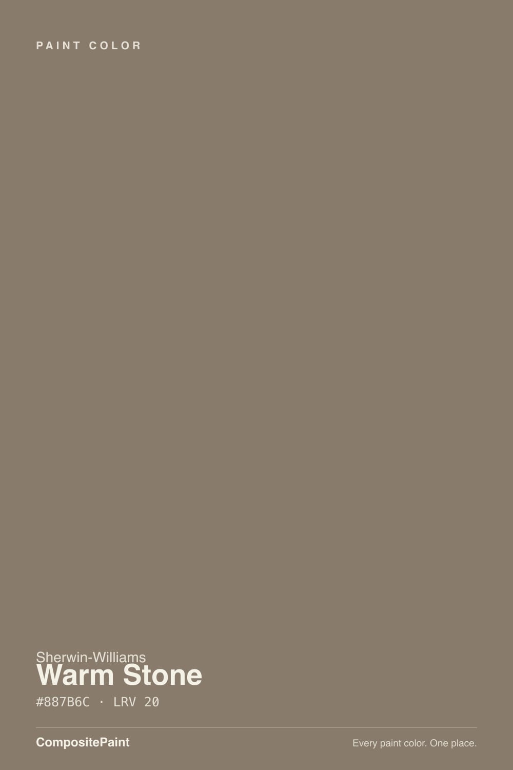
Warm Stone
SW 7032 · #887B6C · LRV 20 — warm red-orange tone, dark — high drama, needs strong daylight or warm bulbs.
- 1Nocturne8
- 2Roycroft Brass15
- 3Warm Stone20
- 4Dorian Gray39
- 5Mindful Gray48
What Color Is Warm Stone, Really?
Warm Stone (SW 7032) is a deep taupe. Its hex value #887B6C sits at 32 degrees on the color wheel, in the orange-brown range, with about 11 percent saturation. The undertone is a warm red-orange, which is what gives it the soft brown-pink cast that separates a taupe from a plain gray. An LRV of 20 puts it at the dark end of the neutral range, deep enough to have real presence on a wall and far darker than the pale greiges most people picture when they hear the word neutral.
It gets picked when a room needs warmth and grounding at the same time. On walls it reads as a soft, enveloping brown that never turns yellow. On cabinets and exteriors it works as an earthy alternative to charcoal, holding its own next to stone, brick, and wood without competing with them. It flatters warm metals, oak, leather, and cream trim, and it makes a comfortable backdrop for art.
The thing to check is the red. At 32 degrees with 11 percent saturation, the warm red-orange can surface more than expected in south or west light, where the walls can go slightly pink or mauve in the late afternoon. In cool north light the opposite happens and it can flatten toward a dull gray-brown. Sample both the sunniest and the dimmest wall before deciding.
Warm Stone is built on a warm red-orange undertone, with a hue at 32 degrees and about 11 percent saturation. That is enough color to keep it from ever looking like a true gray, but not enough to make it obviously brown. The result is a taupe with a soft pink-brown cast that surfaces in strong light and hides in weak light. Context decides which side you see. Next to a clean white the warmth is unmistakable and the wall reads brown. Next to a warm beige it can look grayer and cooler. Beside a red brick, terracotta tile, or a pink-toned wood floor the red in it amplifies and can go mauve, which is the most common complaint about deep taupes. Against cool gray flooring it looks distinctly warm and settled. Test it directly against your floor and any masonry, since those are the surfaces most likely to pull the red forward.
Best Rooms and Uses for Warm Stone
A deep neutral at LRV 20 works best where you want a room to feel wrapped rather than open. Bedrooms, dens, dining rooms, and hallways all take it well, and it makes a good backdrop for artwork because it is warm without pulling attention. In a bright south-facing room it can carry all four walls comfortably. In a small north-facing room it will read close to a dark brown, so plan for that or use it on a single wall. Cabinetry is another strong use, particularly on islands, vanities, and built-ins where a warm dark neutral is wanted instead of black or charcoal. It sits naturally with brass, bronze, and oak. Outside, it is a dependable full body color on homes with stone or brick, since the earthy tone blends with masonry rather than fighting it, and it also works as a shutter and door color on a lighter house.
How Lighting Changes Warm Stone
At LRV 20 Warm Stone reflects a limited amount of light, so it behaves like a dark color rather than a mid-tone neutral. In north-facing rooms the cool, flat daylight mutes the warm red-orange and the color settles into a quiet gray-brown that can feel heavy across four walls. South-facing rooms with strong sun push the opposite way and bring the red forward, which can look rich and enveloping or, in the strongest afternoon light, slightly pink. East rooms are softer in the morning and deepen through the day. West rooms are flat early and warmest at the end of the afternoon, when the pink risk is highest. Bulbs shift it just as much. Warm 2700K lamps make it cozy and slightly redder. Cooler 3500K to 4000K bulbs neutralize the warmth and leave a grayer, more mineral taupe. Look at a large board in both daylight and lamplight before committing.
Most complaints about Warm Stone are a light mismatch. Upload a photo of your actual room and see it on your walls — then ask for the same wall in north light or evening lamps before you buy a single sample.
Need It From Another Brand?
Any paint counter can custom-tint Sherwin-Williams SW 7032 directly. If you would rather stay in one brand's own deck, these are the closest stock matches, measured as ΔE2000. Under 2 is a difference you will not see on the wall.
| Brand | Closest color | ΔE | LRV | |
|---|---|---|---|---|
| Behr | Native SoilPPU7-24 · Behr | 0.9 | 20 | Color page → |
| Benjamin Moore | PorciniCSP-195 · Benjamin Moore | 1.0 | 20 | Color page → |
| Valspar | Mossy Aura6002-2B · Valspar | 3.0 | 20.7 | Color page → |
| PPG / Glidden | Ghost ShipPPG15-20 · PPG / Glidden | 1.3 | 21 | Color page → |
| Glidden | Ghost ShipPPG15-20 · Glidden | 1.0 | 21 | Color page → |
| Dutch Boy | Seasoned Wood441-5DB · Dutch Boy | 0.0 | 20 | Color page → |
Similar Sherwin-Williams Colors
The nearest shades to Warm Stone within Sherwin-Williams's own range, ranked by perceptual color distance — useful when you want the same look a touch lighter, darker, or warmer.
WCAG 2.1: AA is 4.5 : 1 for normal text, 3 : 1 for large text, AAA is 7 : 1.
Warm Stone vs Similar Colors
Within the Sherwin-Williams deck the neighbors are extremely close. Virtual Taupe (SW 7039) at LRV 20 is the tightest sibling and reads a touch more red. Backdrop (SW 7025) at LRV 20 is slightly grayer and cooler. Downing Earth (SW 2820) at LRV 20 and Country Tweed (SW 9519) at LRV 20 both lean a little more yellow-brown, while Adaptive Shade (SW 7053) at LRV 21 and Habitat (SW 9608) at LRV 21 sit marginally lighter and softer. Across brands, Dutch Boy Seasoned Wood (441-5DB) is an exact match at a deltaE of 0. Behr Native Soil (PPU7-24) at 0.93, Benjamin Moore Porcini (CSP-195) at 0.97, and Glidden Ghost Ship (PPG15-20) at 0.98 are all close enough to call the same color. Dunn-Edwards Stone Ground (DEBN25) at 1.82 is visually identical in normal room light. Farrow and Ball Dauphin (No. 54) at 3.77 is close but visibly lighter and more yellow side by side.
Colors That Go With Warm Stone
For trim, a warm white or soft cream is the natural fit. It matches the red-orange warmth and keeps the contrast from feeling abrupt at this depth. A cleaner, brighter white also works and makes the taupe read deeper and more graphic, but avoid a stark blue-based white, which can make Warm Stone look muddy and pull the pink forward. Materials matter more here than accent colors. Oak, walnut, cane, leather, terracotta, aged brass, and bronze all flatter it, and warm-veined stone picks up its undertone. Cool chrome and gray-toned tile can leave it looking dull. For a lighter neutral in an adjoining space, Adaptive Shade (SW 7053) at LRV 21 and Habitat (SW 9608) at LRV 21 hold nearly the same depth with a slightly softer cast, so they work better as a companion on cabinets or a ceiling than as a true contrast. For real contrast, pair it with a light cream above and let the dark neutral sit low in the room.
Coordinated palette
Generated by hue-rotating #887B6C in HSL space. Pair Warm Stone with one accent and one neutral — the swatches below are starting points, not final picks.
Warm Stone FAQ
Is Warm Stone a gray or a brown?
It is a taupe, which sits between the two. The hue at 32 degrees with about 11 percent saturation gives it a warm red-orange undertone, so it never reads as a true gray. In strong light it looks brown; in cool north light it flattens toward gray-brown.
What LRV is Warm Stone?
Warm Stone has an LRV of 20. On the 0 to 100 scale from black to white, 20 is at the dark end of the neutral range. It reflects a limited amount of light, so it behaves like a deep color on a wall rather than a soft everyday neutral.
Does Warm Stone look pink?
It can, in the right light. The undertone is warm red-orange, and in strong south or late-afternoon west light that red can surface and give the walls a faint pink or mauve cast. Red brick, terracotta, and pink-toned wood floors nearby will make it more likely.
Does Warm Stone work in a dark room?
It works if a dark result is what you want. At LRV 20 it will not brighten anything, and cool north light mutes its warmth into a heavier gray-brown. Warm 2700K lamps bring the red-orange back and keep the room feeling cozy rather than dull.
What white trim goes with Warm Stone?
A warm white or soft cream matches its red-orange warmth and softens the contrast at this depth. A cleaner, brighter white also works and makes the taupe look deeper. Skip stark blue-based whites, since the cool contrast can make Warm Stone look muddy and push the pink forward.
Is Warm Stone good for exteriors?
Yes. Its earthy warmth at LRV 20 blends with stone, brick, and wood instead of competing with them, which makes it a dependable full body color on masonry homes. It also works as a shutter and door color on lighter siding, paired with a cream or white trim.
Have you painted with Warm Stone?
Rate it — one tap helps the next reader decide.
Ask a Question