Ecological
Behr's quiet earthy green, reviewed honestly: the light that makes it glow, the light that turns it to mud, and what to pick instead.

Jessica has spec'd whites and neutrals for more than 300 rooms and keeps a sample wall of painted drawdowns in her studio. Every color review is checked against real reader rooms in the comments and re-tested when a formula changes. About the testing process →
- 1Essex Green6
- 2Vintage Vogue12
- 3Ecological22
- 4Evergreen Fog30
- 5Clary Sage41
The Fast Verdict
Ecological is a warm, olive-toned mid-depth green — gray enough to stay earthy, yellow enough to stay warm, never sliding into minty sage or Kelly-green loud. Give it real daylight and warm wood and it looks grounded and expensive on a kitchen island or a front door. Give it a dim north room with no lamps and it goes flat and murky fast. It has no viral origin story or Color of the Year plaque — Behr just quietly keeps featuring it in its own trend content, and on the wall it earns that quiet confidence.
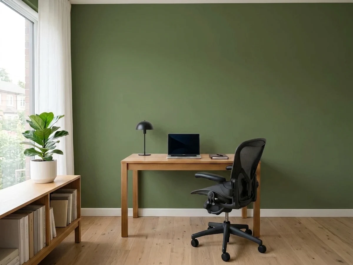
Kitchen cabinets and islands · bathroom vanities · a dramatic bedroom or home-office accent wall · front doors and shutters with decent exterior light
Your room is dim, north-facing, and lamp-free · your trim is a stark cool white · you're painting a windowless powder room · you want a green that looks identical morning and night
- Genuinely earthy, grounded green — not neon, not minty, not costume-y
- LRV 22 holds real color without going murky in a well-lit room
- Flatters walnut, brass, and matte black equally well
- Works as cabinets, a vanity, an accent wall, or a front door — flexible in small doses
- Behr actively promotes and stocks it, so samples and pairing guidance are easy to find
- Goes flat, muddy khaki in dim north light with no lamps
- Reads dated next to a stark cool-toned white trim
- Full sun exaggerates the yellow toward chartreuse, louder than the chip
- No real track record of famous rooms or forum threads to check before committing
What Color Is Ecological, Really?
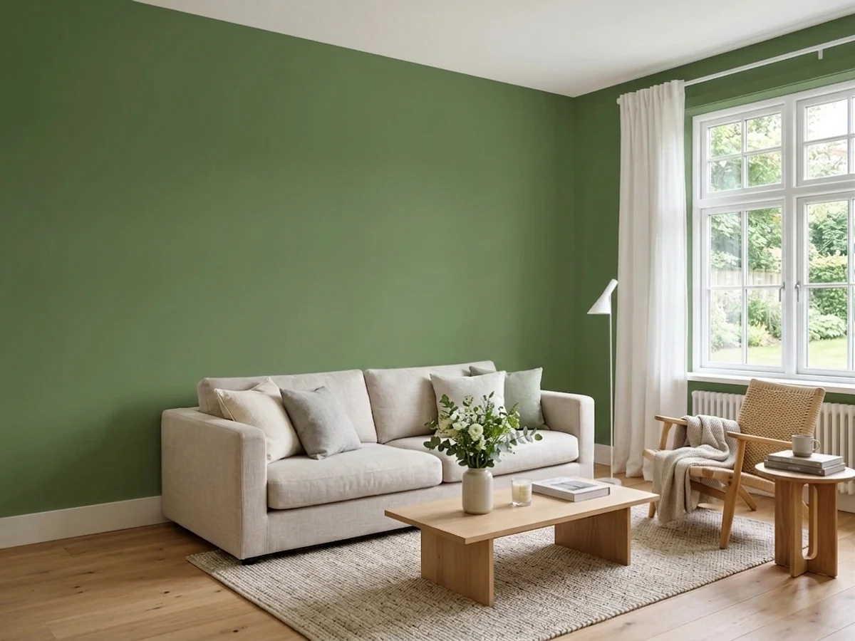
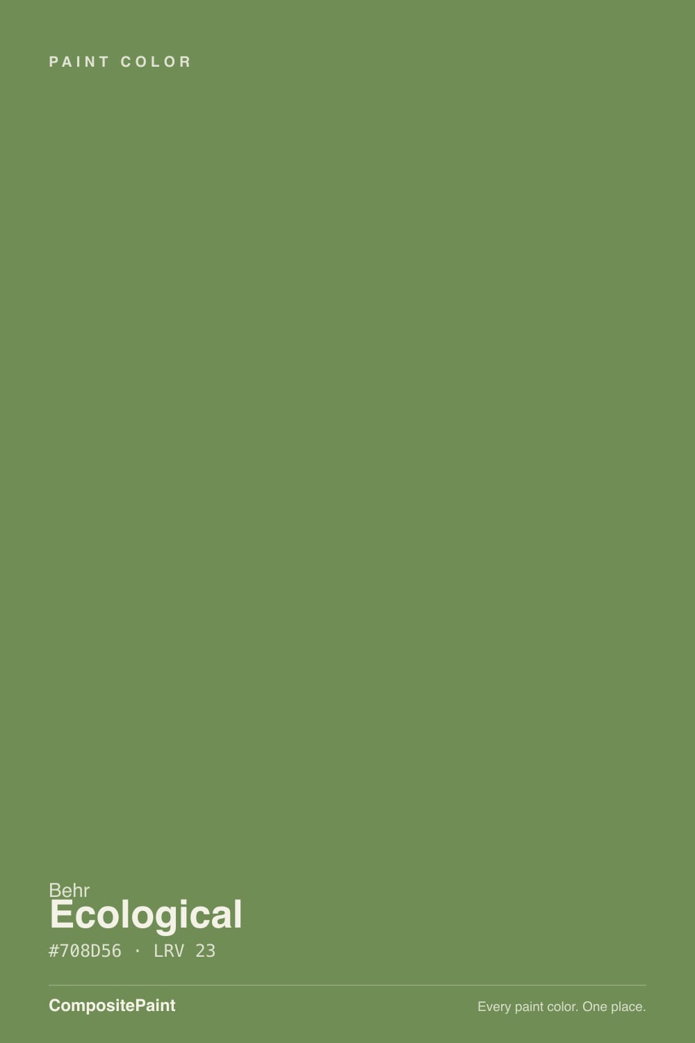
A warm, grayed-down olive green — the gray is what keeps it from reading like a houseplant or a mint. Most yellow-based greens tip either sicky-lime in bright light or dated-avocado next to the wrong white; Ecological's gray base holds it in an earthier, more forest-floor register instead. That's the whole design trick, and it's why Behr keeps reaching for this one in its own trend features (the 2026 "Colorfully Behr" spotlight, the green-exterior roundup) even though it has never had a Color of the Year moment or a viral before/after.
At LRV 22 it sits at medium-dark — close in depth to a cabinet green like SW Dried Thyme (LRV 21), nowhere near the pastel end where BM Saybrook Sage (LRV 56) lives. That depth is why it reads as a real color decision rather than a safe accent: it holds its earthy richness in a bright room instead of washing out, but it also has real shadow to lose in a dim one. Undertone shifts with exposure — south light pulls it warmer and more yellow-green, north light pulls it cooler and grayer — which is normal for a color built on a yellow-gray base, not a flaw unique to this one.
Undertone in one line: warm yellow-green with a gray backbone — never blue, never a true cool forest green. If your sample reads muddy brown-gray, your light is cold and dim; if it reads almost chartreuse, that's strong sun exaggerating the yellow. Both are the same paint being honest about your exposure.
Where It Shines
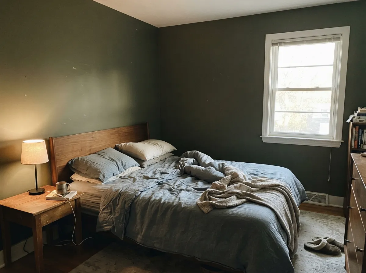
Real daylight and warm materials are what this color was built for. In a south- or west-facing room it holds an earthy, grounded richness that flatters walnut, brass, and black iron hardware without fighting any of them. Its best jobs are contained ones — a kitchen island, a bathroom vanity, a single accent wall, a front door — where the depth reads as a deliberate design move rather than a bet on the whole house.
Where It Fails
The complaints that show up around this color follow three predictable patterns, and none of them are the paint's fault — but if your room matches one, this isn't your green, and a bigger sample will only confirm it.
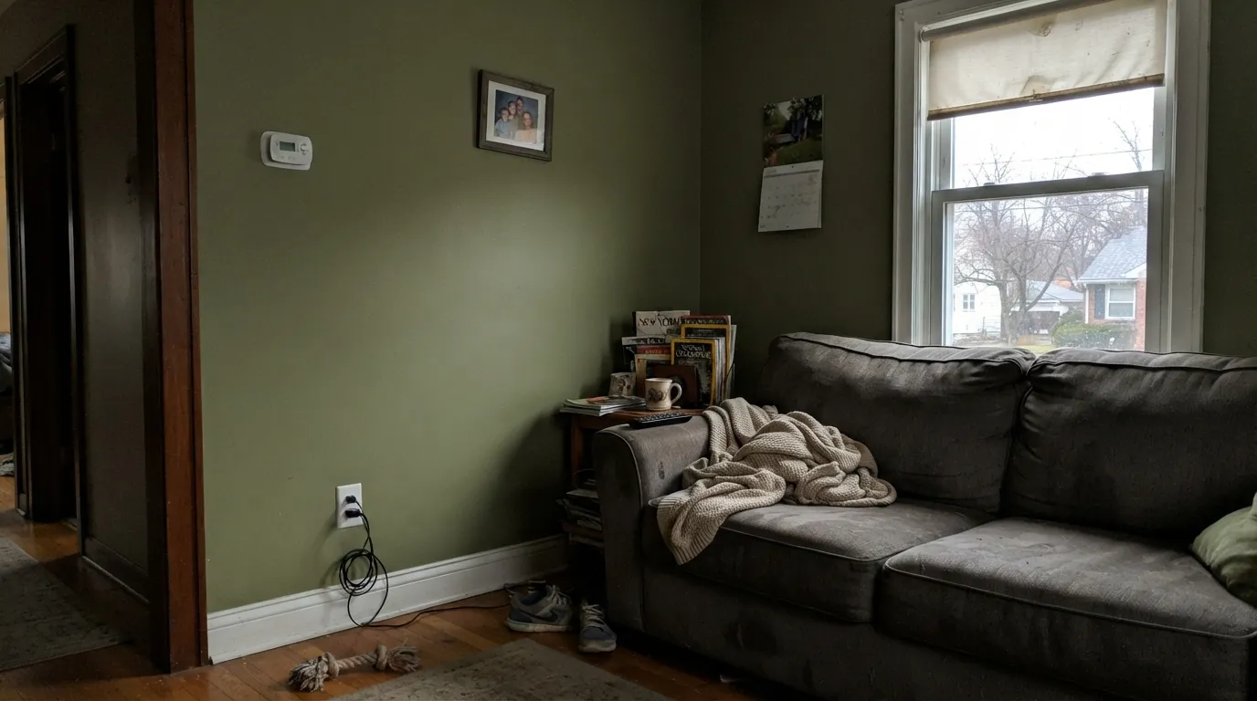
Cold, low light strips the yellow out and leaves the gray base exposed — the olive slides toward a flat, muddy khaki-brown instead of the earthy green on the chip. Add warm 2700K lamps or pick a lighter green like Saybrook Sage that has more room to lose depth before it goes dark.
Ecological's warm yellow-green undertone reads dated — almost avocado — beside an icy blue-white trim. The fix is a soft warm white like SW Alabaster or BM White Dove, not a brighter one; a cooler trim makes the walls look old instead of fresh.
Strong south or west exposure, or exterior siding in direct sun, pushes the undertone hard toward yellow-green — louder and more chartreuse than the chip promises. Sample a large board in the actual exposure before committing a whole wall or a whole house's trim to it.
Room by Room
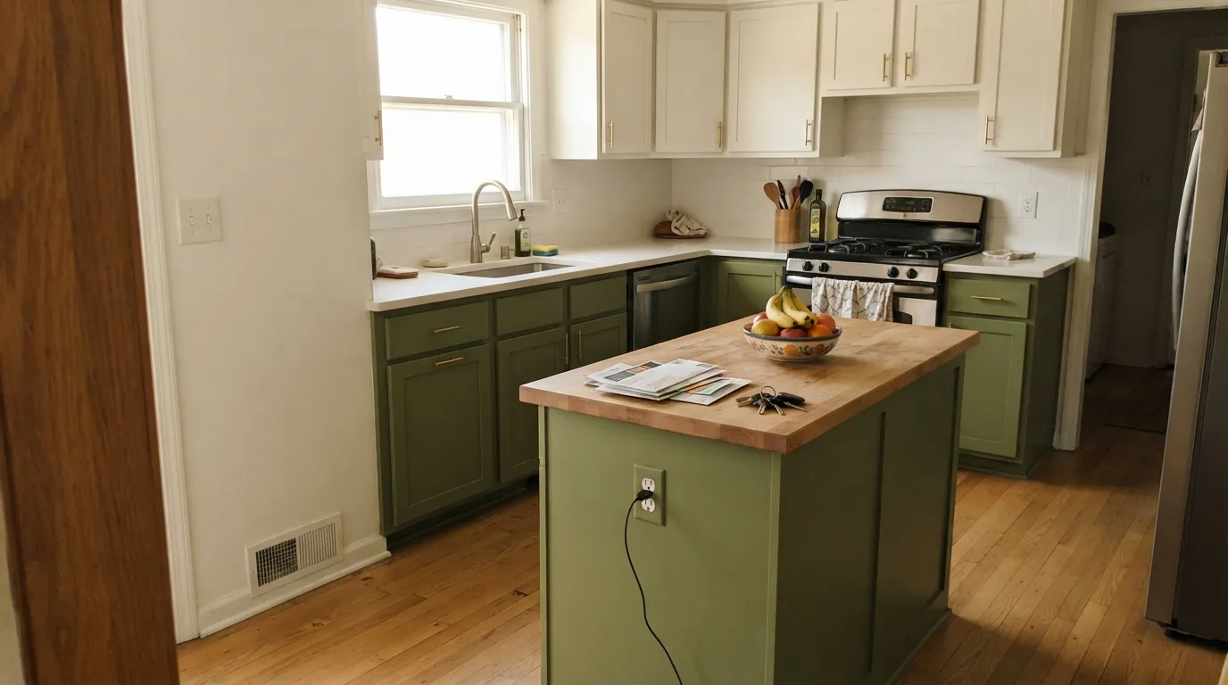
On lower cabinets or an island under a soft white wall it reads earthy and current, and it flatters brass or matte-black hardware equally well. Satin urethane-fortified cabinet enamel; keep upper cabinets or open walls in a warm white so the kitchen doesn't go dark overhead.
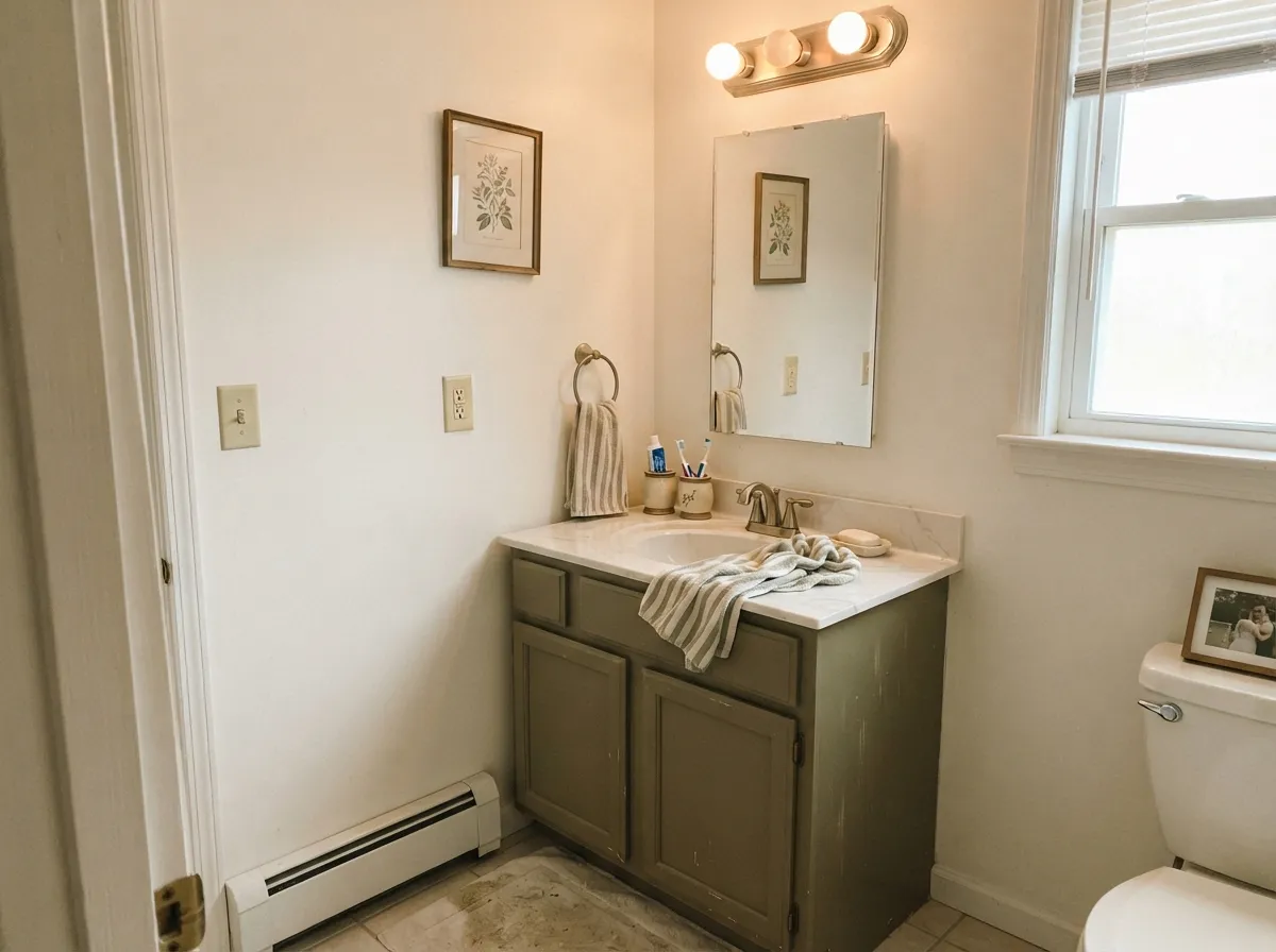
A vanity in a bathroom with a real window is a weekend project that looks custom. A windowless powder room with only overhead fixtures is the one bathroom to skip — it has no daylight to keep the green from going flat.
One wall behind the headboard or the desk, in a room with a real window, is the color's most-recommended use in Behr's own material. Keep the other three walls a warm white so the room doesn't rely on daylight to feel finished.
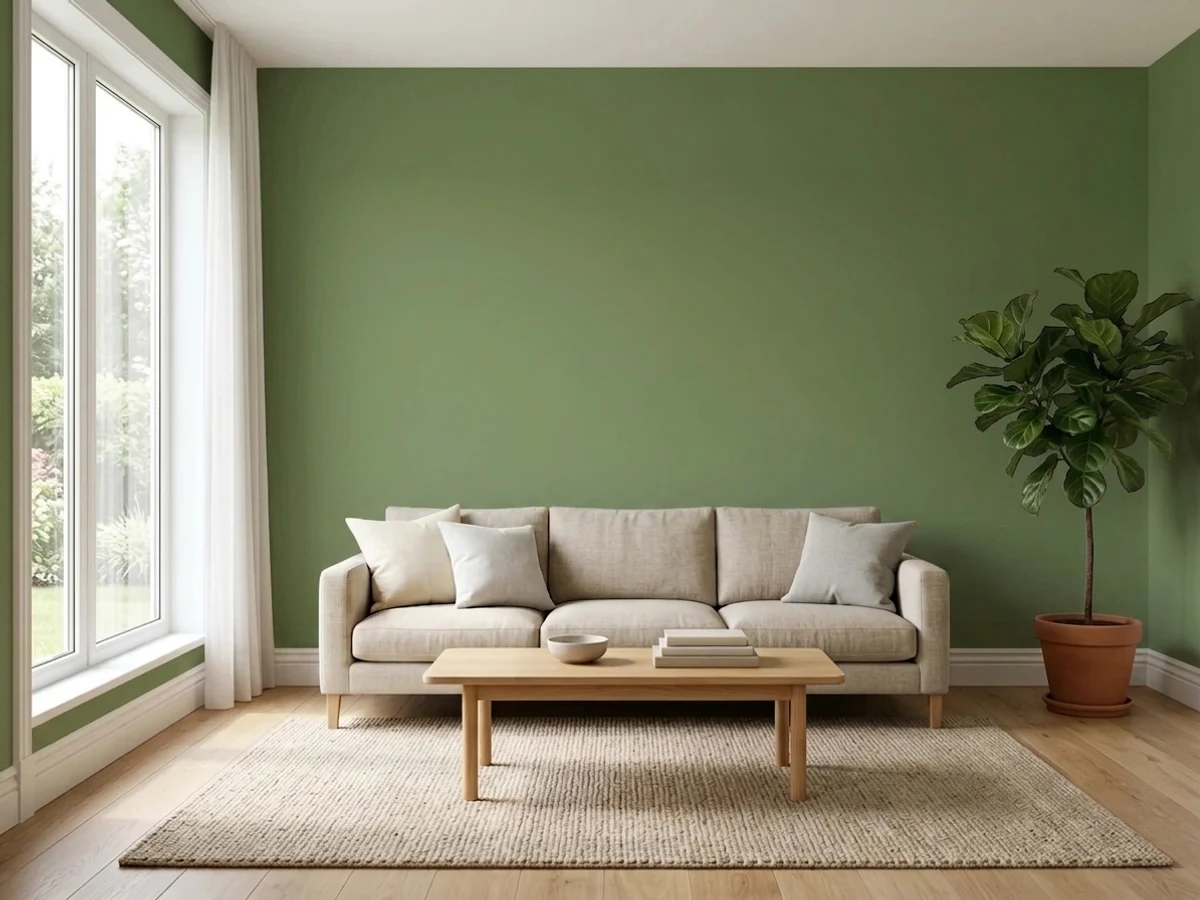
Four walls of Ecological in an open-plan living room is a bigger bet than most readers expect — the color needs consistent daylight all day, and open floor plans rarely get it evenly. A single wall or a built-in is the safer, still-striking version.
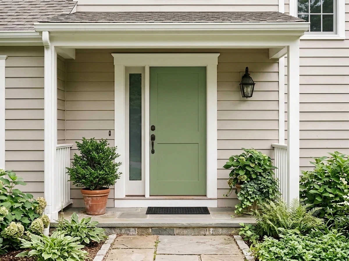
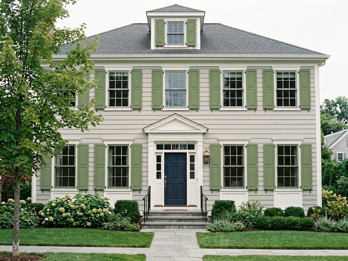
Behr features this color in its own exterior green roundup, and it works: against a white or light-gray body with black or charcoal accents, the door reads intentional and earthy. Skip a deeply shaded north-facing porch — the same dim-light problem follows it outside.
A hutch, a bookcase, or a single door is the lowest-commitment way to test the undertone in your own light before trusting it to a full wall.
Your Light Is the Risk
Full, warm daylight keeps the yellow-green undertone rich and earthy all day — the color at its most confident.
Cool, dim daylight strips the yellow and leaves a flat, muddy khaki-gray. Test a large sample before trusting a north room to this color.
Cooler and grayer in early morning light, noticeably warmer and more olive by late afternoon. Expect the color to move through the day.
2700K warm bulbs push it toward a mossy, cozy olive at night. Cool white LEDs flatten it toward a dull gray-green — swap the bulbs before repainting.
Most complaints about Ecological are a light mismatch. Upload a photo of your actual room and see it on your walls — then ask for the same wall in north light or evening lamps before you buy a single sample.
Need It From Another Brand?
Any paint counter can custom-tint Behr S380-6 directly. If you would rather stay in one brand's own deck, these are the closest stock matches, measured as ΔE2000. Under 2 is a difference you will not see on the wall.
| Brand | Closest color | ΔE | LRV | |
|---|---|---|---|---|
| Sherwin-Williams | ArtichokeSW 6179 · Sherwin-Williams | 0.4 | 21 | Color page → |
| Benjamin Moore | Springfield Sage510 · Benjamin Moore | 2.3 | 23 | Color page → |
| Valspar | Native Henna6001-4B · Valspar | 1.7 | 21 | Color page → |
| PPG / Glidden | WildernessPPG11-26 · PPG / Glidden | 1.9 | 22 | Color page → |
| Glidden | WildernessPPG11-26 · Glidden | 1.8 | 22 | Color page → |
| Dutch Boy | Balsam Sprig325-4DB · Dutch Boy | 1.4 | 22 | Color page → |
Similar Behr Colors
The nearest shades to Ecological within Behr's own range, ranked by perceptual color distance — useful when you want the same look a touch lighter, darker, or warmer.
WCAG 2.1: AA is 4.5 : 1 for normal text, 3 : 1 for large text, AAA is 7 : 1.
Ecological vs the Colors You're Also Considering
Every Ecological sample board has the same rivals on it. The numbers show the real lightness gap — then it comes down to which risk you would rather live with.
Pick this for more visible color and warmth on a wall — Dried Thyme mutes the yellow Ecological keeps.
Sherwin-Williams SW 6186 · LRV 21Dried ThymePick this if you want it grayer and quieter, built specifically for cabinets rather than four walls.
Pick this for warmth — Ecological's yellow undertone is friendlier to golden wood and brass than a cool green.
Sherwin-Williams SW 9679 · LRV 20JuniperPick this if you want the cool-toned version of this depth — Juniper skips the yellow Ecological leans on.
Within Behr, Lucky Clover MQ6-52 (#778C59, LRV 23) is the nearest neighbor and slightly warmer. Green Suede HDC-SM14-2 (#748850, LRV 22) and Green Dynasty MQ4-44 (#748946, LRV 22) both push further into yellow and read more clearly olive. Bahia Grass 430F-5 (#688B5E, LRV 22) goes the other way, cooler and a touch bluer, and Winter Hedge 440F-5 (#6A9264, LRV 25) is the lightest and coolest of the set.
Across brands, Four Leaf Clover DE5593 by Dunn-Edwards (LRV 22, deltaE 1.5) is visually identical in normal room light. Green Knoll 0760 by Diamond Vogel (LRV 21, deltaE 2.59), Catnip 8002-30F by Valspar (LRV 24, deltaE 2.69) and Dill SW 6438 by Sherwin-Williams (LRV 24, deltaE 2.9) are all very close, so sample before switching. Richmond Green 553 by Benjamin Moore (LRV 24, deltaE 4.33) and Succulent Leaves PPG1131-6 (LRV 23, deltaE 4.85) are close but visibly different side by side, both reading cooler and bluer.
Ecological Coordinating Colors
The rule for coordinating with Ecological is simple: stay warm on the whites, and let a near-black or a deep navy carry the contrast. It fights stark cool whites and looks best with soft ones, and it takes hardware in either brass or matte black without complaint. These are the partners that keep showing up in rooms and facades that work:
A Quiet Green, Not a Hype Color
Ecological doesn't have the origin story of a Color of the Year or a color that split the internet — it's simply a color Behr keeps putting in front of people. It has shown up in the brand's own "Colorfully Behr" trend content and in Behr's exterior-green feature pages, which is a real signal of confidence even without a marketing campaign behind it. That quieter path also means there isn't much of a public track record: few Houzz threads, little Reddit debate, no flood of before-and-after posts to check against your own room.
That's worth being honest about rather than papering over. If you want a green with a long, documented history of real rooms to study — good and bad — look at a more established sage or olive in the deck first. If you're comfortable being an early adopter on a color that Behr itself is confident enough to keep promoting, Ecological is a genuinely well-built warm green, not a gamble on the formula.
Ecological With Wood Tones and Floors
Dark wood is this color's best friend: walnut, espresso, and dark-stained oak all deepen the earthy read and keep the room from feeling like two competing greens. Black iron and unlacquered brass hardware both sit comfortably against it — there's no metal it fights the way it fights a cool white.
Honey oak and golden-toned floors are the pairing to sample carefully. Because Ecological already leans yellow, a strongly golden floor can push the whole room toward an olive-yellow cast that reads more dated than earthy. It isn't an automatic clash the way a true green fights a true red, but it's close enough that a large sample above the actual floor is worth the ten minutes before committing a whole kitchen or bedroom to it.
Three Ready Palettes Built on Ecological
A color is never alone on the wall. These are complete combinations in the 60-30-10 pattern, with the reason each one holds together. Every one opens in the visualizer.
A warm soft white keeps the kitchen bright overhead while the island carries all the color; Iron Ore on the hood gives the room one near-black note so the green reads deliberate instead of accidental.
Try this palette in your roomWhite Dove's warmth matches Ecological's undertone instead of fighting it — a cooler white would make the green look dated. Hale Navy adds one deep, cool note so the room doesn't read all-warm.
Try this palette in your roomA light, warm-neutral body lets the door carry the color without competing; near-black shutters frame the green and keep the whole facade from reading too soft. Works best with a porch that gets real daylight.
Try this palette in your roomEcological FAQ
Is Ecological a warm or cool green?
Warm — it's built on a yellow-gray base, not a blue one. In cold north light it reads grayer and can dull down toward khaki; it never turns blue-green or minty.
What white trim goes with Ecological?
A soft, warm white — SW Alabaster or BM White Dove, not a stark cool white. A cool blue-white trim makes the green look dated instead of fresh; that's the single most avoidable mistake with this color.
Is it good for kitchen cabinets?
Yes, especially on an island or lower cabinets under a lighter wall color. Use a satin urethane-fortified cabinet enamel — it handles daily hand contact far better than a wall paint sheen.
Should I paint a whole room in it, or just an accent wall?
An accent wall is the safer, still-striking choice unless the room gets strong daylight all day. Four full walls in a room with mixed or weak exposure is where most of the muddy-color complaints come from.
Does it work on a front door or exterior trim?
Yes — Behr features it in its own exterior green lineup. It reads best against a light body color with real porch daylight; a deeply shaded north-facing entry has the same dim-light problem it has indoors.
Is Ecological a Color of the Year or a big trend color?
No — it has never held a Color of the Year title from Behr or anyone else, and it doesn't have a viral before/after moment behind it. Behr does keep featuring it in its own trend and exterior content, which is a real, if quieter, kind of endorsement. Treat it as a dependable earthy green, not a hype color.
Have you painted with Ecological?
Rate it — one tap helps the next reader decide.
Ask a Question