Room Colors · Neutral Bathroom
8 Best Neutral Bathroom Paint Colors for 2026
ideas, combinations, and real rooms
8 curated picks from real neutral bathrooms — with the exact colors, honest reasons why, and the combinations that hold the room together.

Former interior stylist who can spot a green undertone from across a room. Jessica writes the color and mood pieces — what to choose, what pairs, and why your "white" looks pink.
The Fast Answer
Don't want to read 8 picks? These four are the safe answers.

Top Picks for the Neutral Bathroom
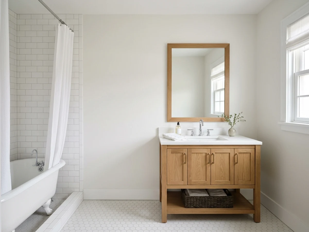
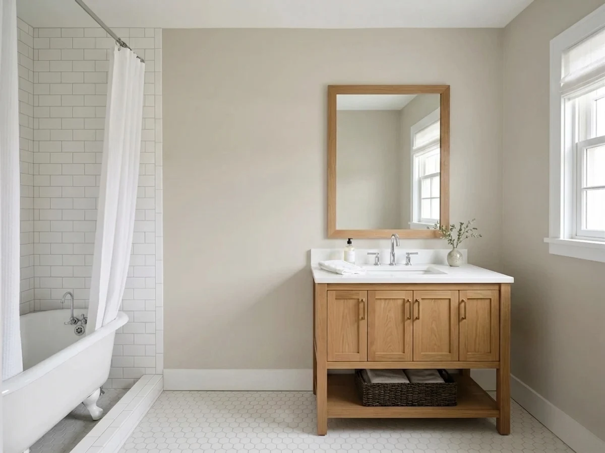
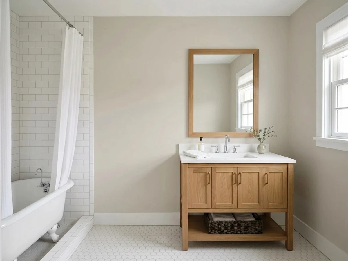
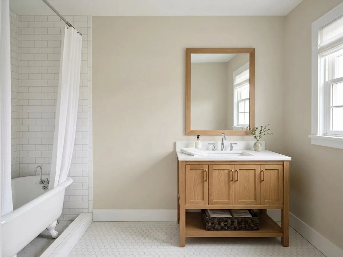
Tap a shade to see the neutral bathroom in it, then try it on your own room.
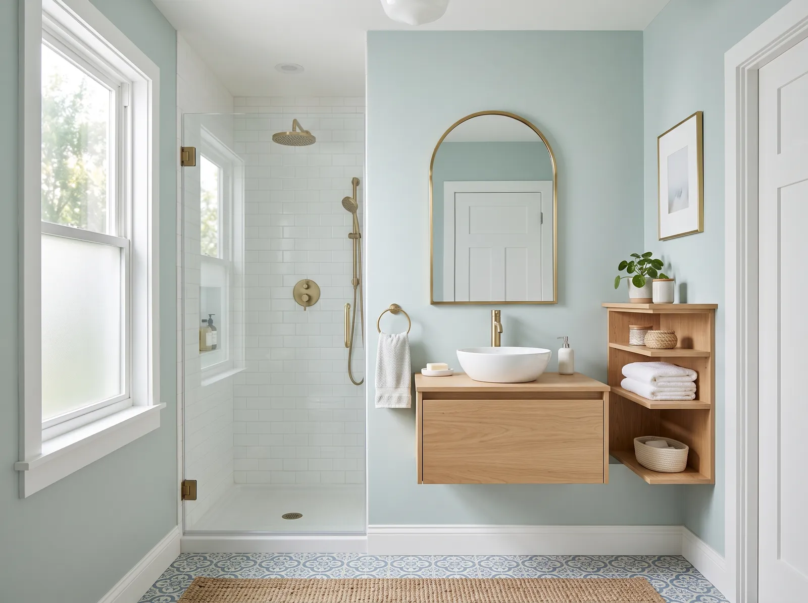
It gives your bathroom a soothing, spa-like feel that never goes out of style.
Neutral Bathroom Color Trends 2026 — What's In, What's Out


- Cool Gray Everything — The flat, blue-leaning gray that filled bathrooms through the 2010s now reads cold next to 2026's warmer neutral palettes.
- Clinical Stark White — Bright, hospital-white walls and trim are losing ground to softer warm whites that feel more like a finished room than a fixture showroom.
- Single Flat Neutral, No Trim Contrast — Painting walls and trim the exact same neutral shade is giving way to a shade or two of contrast for definition in 2026 bathrooms.
The 8 Best Neutral Bathroom Paint Colors
Every pick below is a real rendered neutral bathroom, not a chip. The lead color first; the swatches are the full scheme in the photo — walls, furniture, textiles, accent.

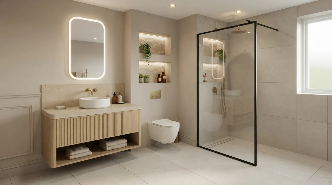
Soft warm greige and glowing backlighting create an ultra-calm, luxurious hotel-spa atmosphere right at home.
Warm greige is a soothing blend of gray and beige. In this bathroom, soft stone-inspired neutrals cover the upper walls and ceiling to complement the sandy wall tiles and fluted oak vanity. The space feels peaceful, inviting, and wonderfully quiet like a luxury hotel. This combination works because uniform earth tones and glowing perimeter lighting instantly soften sharp architectural lines. It is perfect for anyone looking to turn a daily routine into a calming retreat.
SEE IT ON YOUR WALLS →
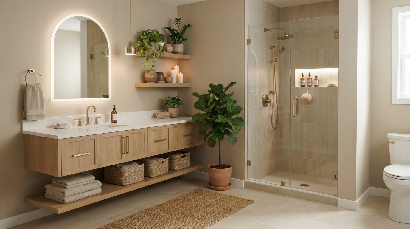
Soft glowing light, warm beige walls, and natural oak create a tranquil spa-like retreat right at home.
Creamy beige is a soft, soothing neutral with gentle golden warmth. In this bathroom, the walls are painted a mellow beige that pairs smoothly with a light oak vanity, white stone counters, and a textured woven rug. The entire space feels deeply peaceful, calm, and cozy. Natural wood tones and brushed brass accents easily complement the sandy backdrop, while hidden lighting gives everything a gentle glow. It is the perfect look for anyone who wants a private, hotel-inspired haven to unwind in.
SEE ASPEN BRANCH ON YOUR WALLS →
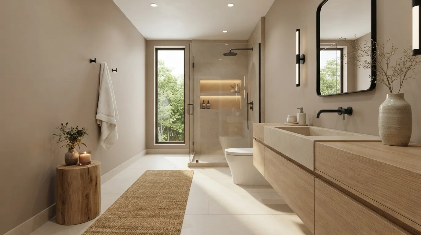
Soft warm sand walls and raw stone fixtures create a tranquil, sunlit spa retreat right at home.
Warm sand is a soft, earthy beige that feels like sun-drenched stone. In this bathroom, the calming tone wraps the walls and ceiling, framing the thick limestone sink and light oak vanity. A textured jute runner rests on the pale floor while matte black fixtures provide crisp definition. The entire room feels quiet, cozy, and relaxing. This look works because layering gentle earth tones with natural wood and stone keeps the space grounded and inviting. It is ideal for anyone seeking a peaceful, hotel-inspired retreat.
SEE IT ON YOUR WALLS →
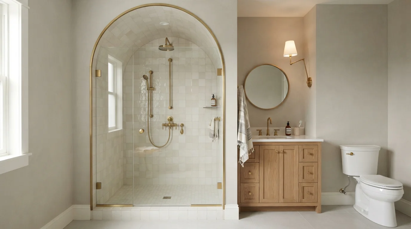
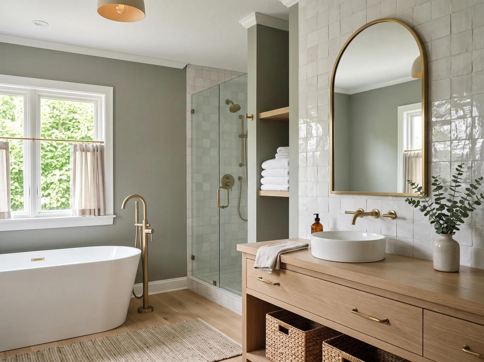
Soft textured walls and shimmering arched tile create an airy, spa-inspired retreat full of gentle warmth and brass glow.
Warm greige is a gentle blend of soft gray and sandy beige. In this bathroom, the textured walls surround a showstopping arched shower tiled in glossy pearl squares, paired with a natural oak vanity and brushed brass fixtures. The space feels peaceful and upscale, like a boutique hotel retreat. The combination works because the warm wood and rich brass keep all the cool, pale tiles from feeling sterile. It is the perfect design choice if you love classic architecture with a calm, modern finish.
SEE IT ON YOUR WALLS →
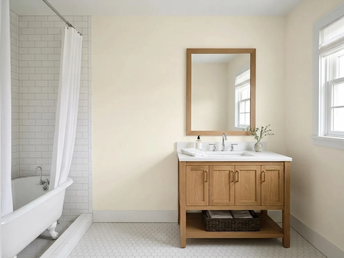
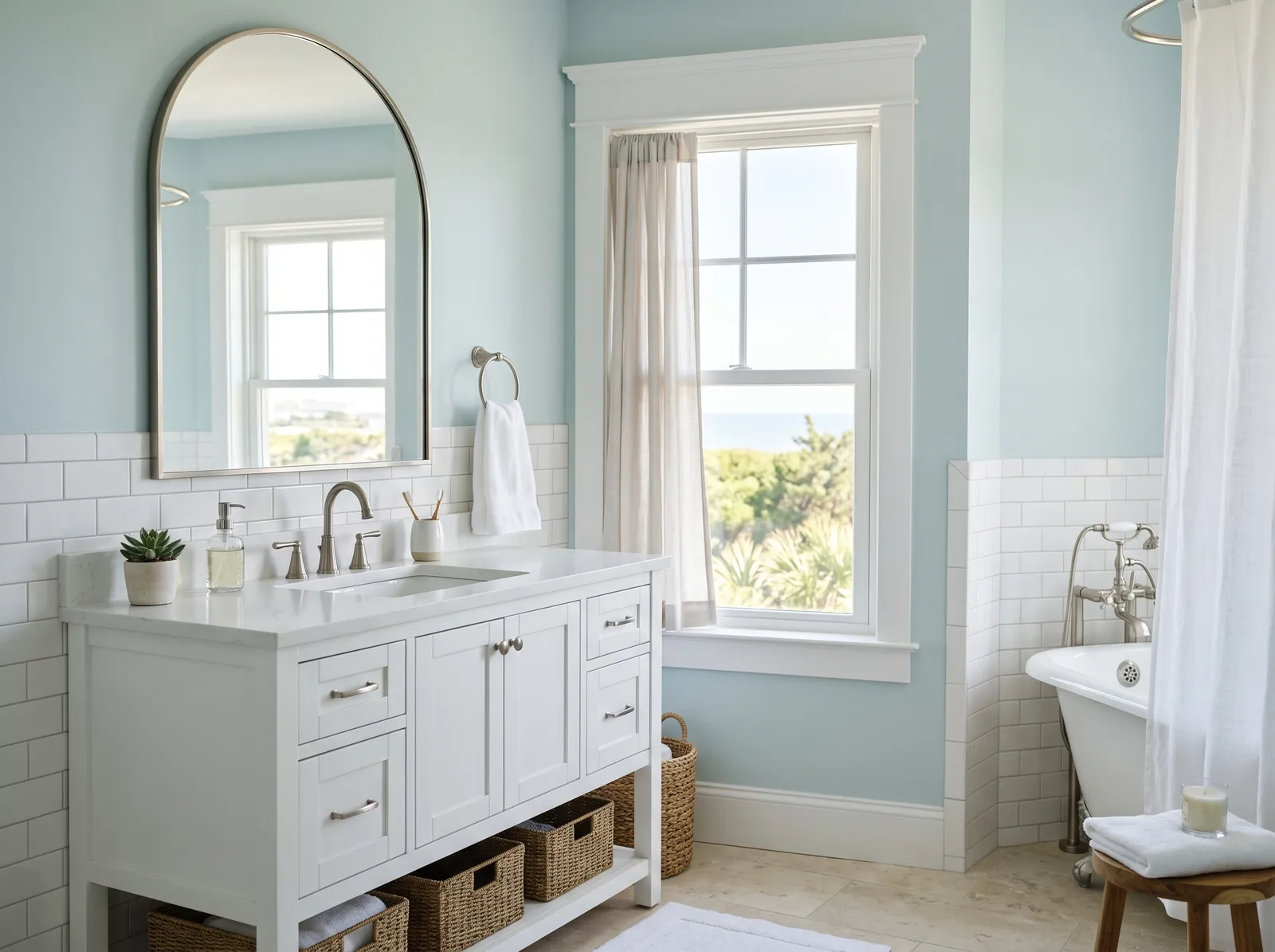
Soft creamy whites and earthy green tiles blend with natural oak to create a peaceful, spa-like sanctuary.
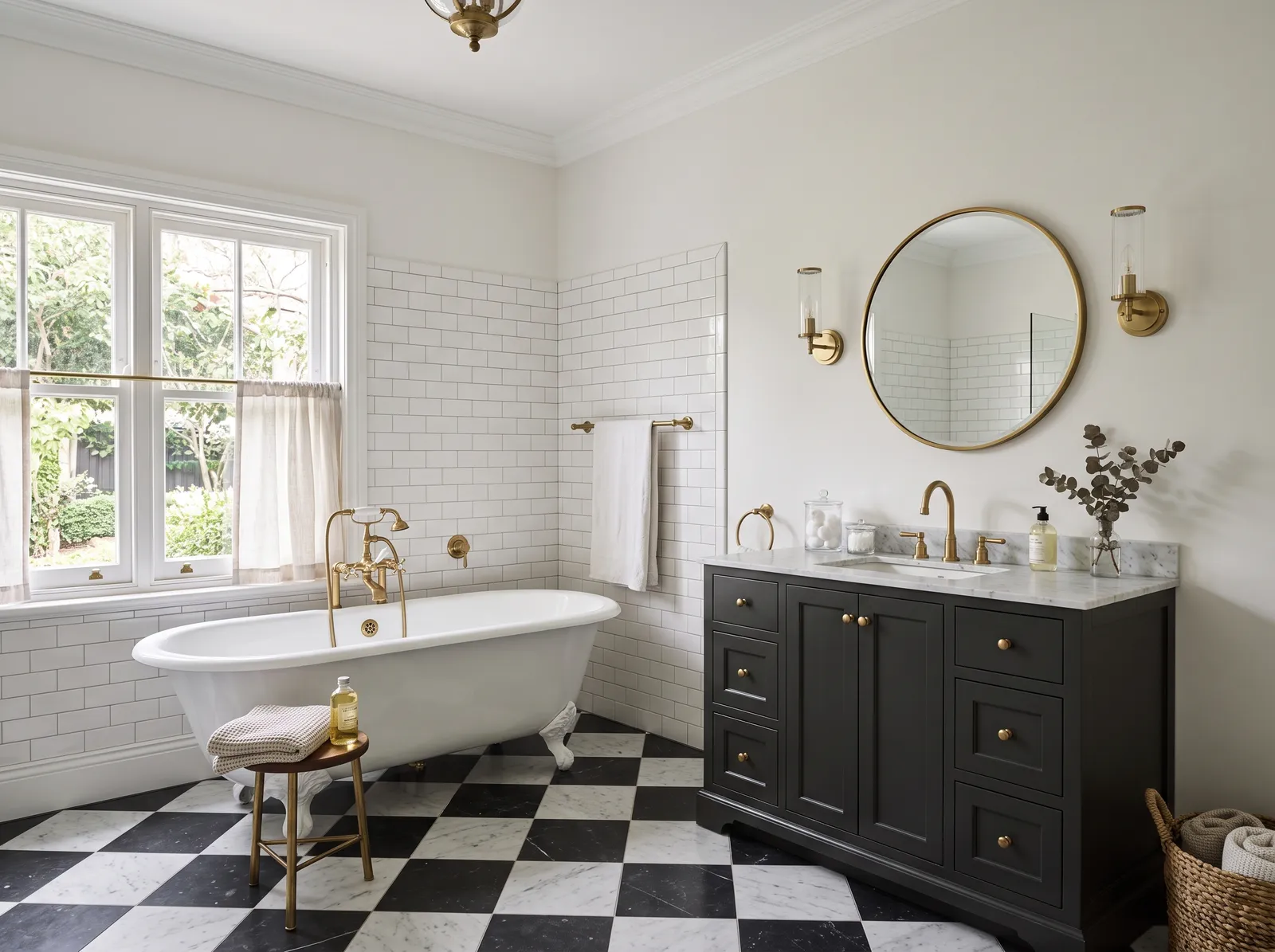
Cream is a soft, comforting off-white with gentle warmth. In this room, creamy white coats the lower beadboard wainscoting, setting a bright base beneath glossy olive-green tile and brass mirrors. A natural oak vanity anchors the layout, paired with a textured jute runner and classic checkerboard stone floors. The entire space feels grounded, tranquil, and effortlessly luxurious. Earthy green and rich natural wood effortlessly harmonize with warm off-white surfaces. It is perfect for anyone who loves an organic, vintage-inspired bathroom that never goes out of style.
SEE WHITE FENCE ON YOUR WALLS →
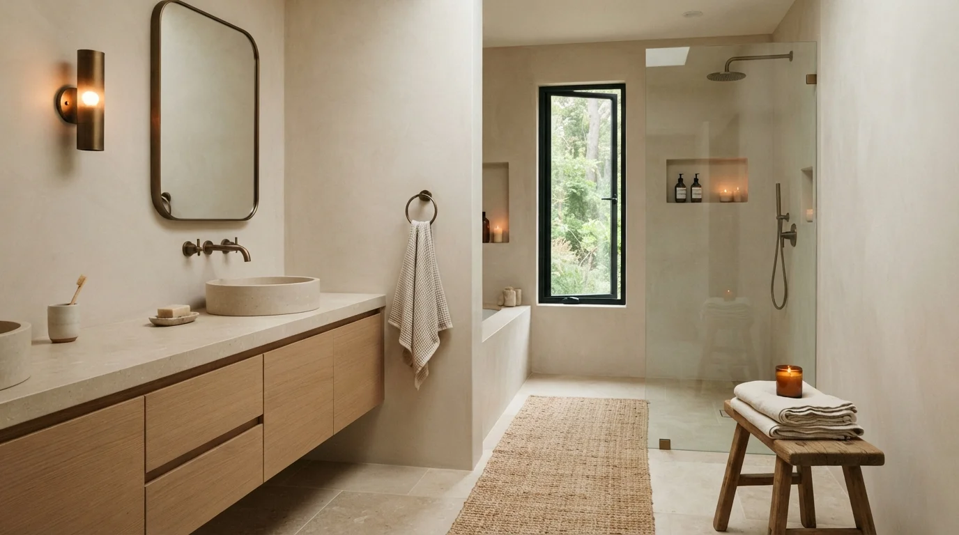
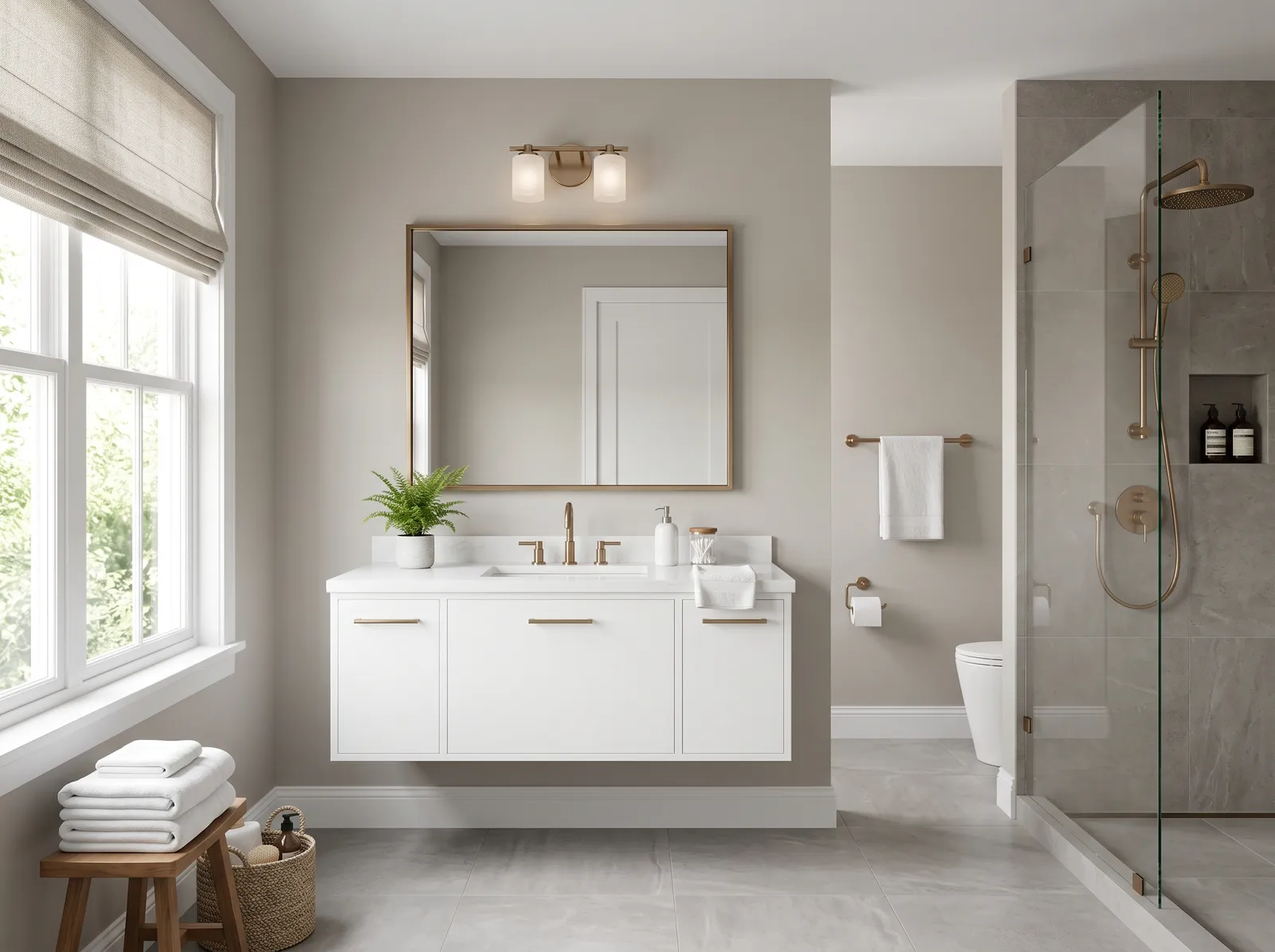
Soft sandy beige walls and natural oak textures create a quiet, spa-inspired escape filled with gentle warmth.
Sandy beige is a soft, earthy neutral with a gentle touch of warmth. In this bathroom, it wraps the walls in a calm, seamless backdrop that highlights the pale oak vanity, textured jute runner, and rustic wooden stool. The space feels deeply restful and uncluttered, just like a high-end wellness retreat. Combining sandy walls with blonde wood and aged bronze works because natural textures always balance each other effortlessly. It is perfect for anyone wanting a minimalist bathroom that still feels warm and welcoming.
SEE IT ON YOUR WALLS →
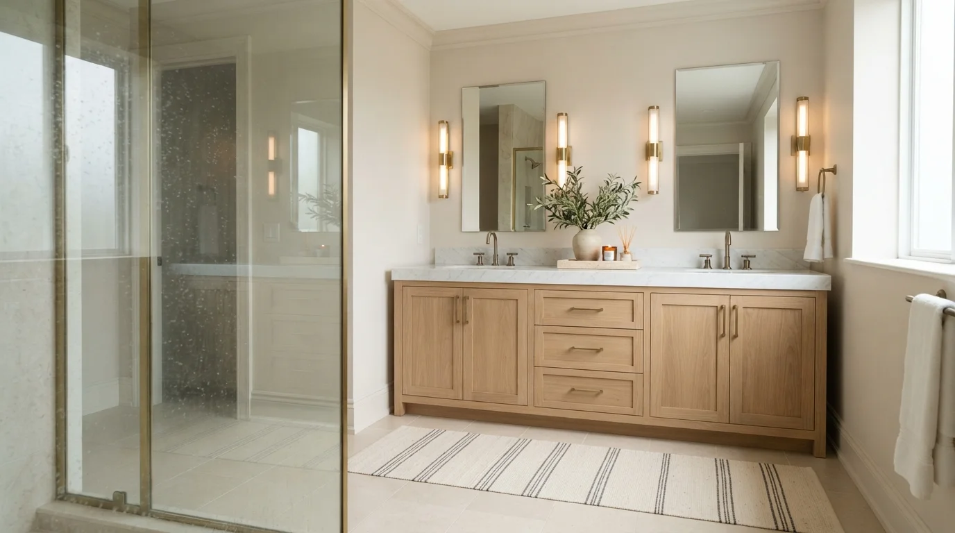
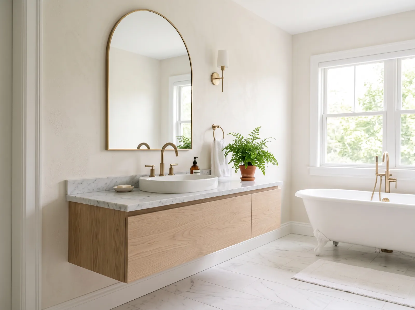
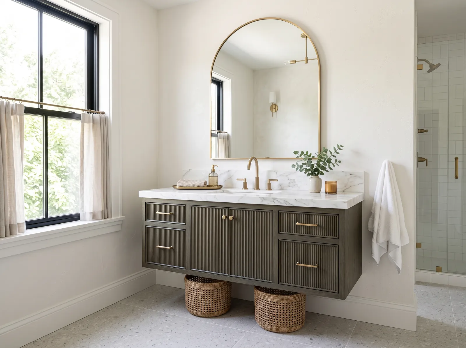
Soft warm beige walls wrap this light oak and marble bathroom in a tranquil, sunlit glow.
Linen beige is a soft, gentle neutral with plenty of warmth. In this bathroom, creamy beige covers the smooth walls behind sleek frameless mirrors, pairing effortlessly with the natural light oak vanity, white marble countertop, and striped floor runner. The space feels peaceful, relaxed, and deeply rejuvenating. This combination works so well because earthy wood tones and glowing brass hardware look naturally balanced against quiet, light walls. It is a fantastic choice for anyone who loves an organic, spa-inspired retreat.
SEE GENTLE LAMB ON YOUR WALLS →
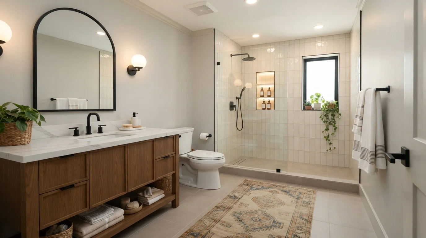
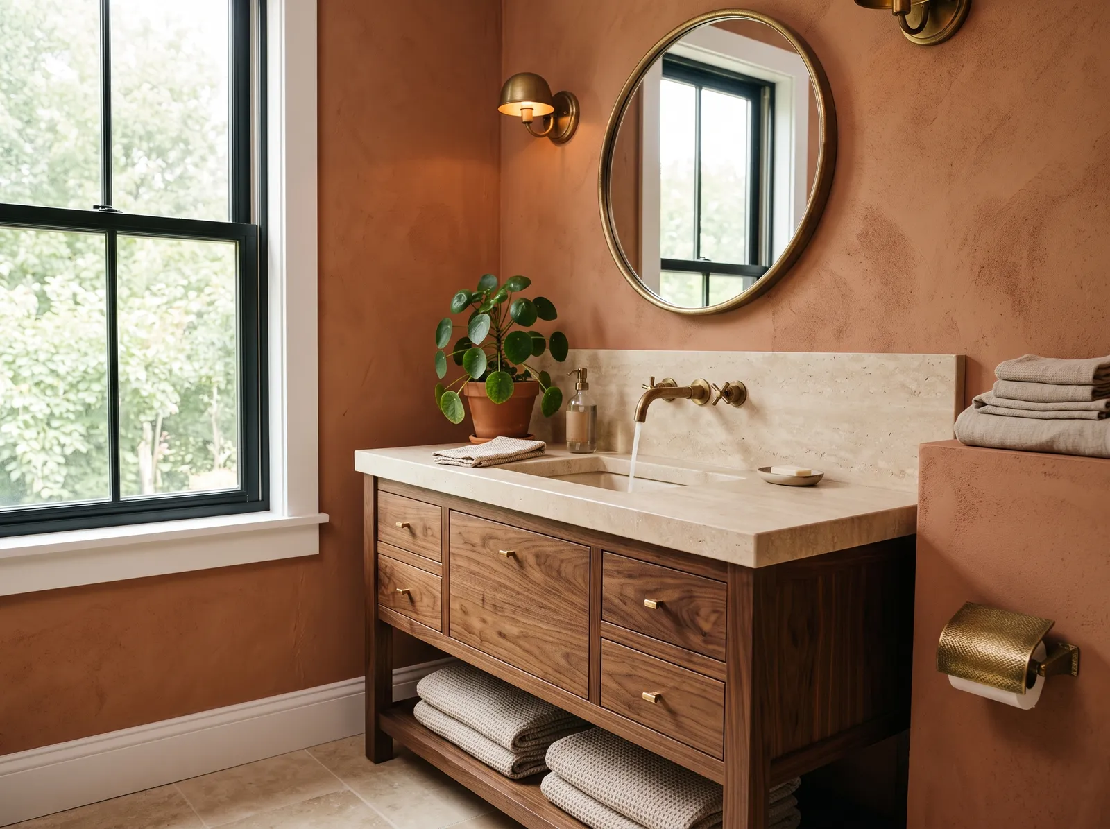
Soft warm neutrals, rich walnut wood, and crisp matte black accents create a deeply soothing, plant-filled bathroom retreat.
Warm greige is a cozy, earthy neutral that sits comfortably between beige and light gray. In this space, creamy greige paint coats the upper walls, perfectly balancing the vertical cream tiles, rich walnut vanity, and textured brown runner rug. The room feels incredibly grounded, fresh, and serene from morning to night. This combination works because matte black fixtures and leafy potted plants provide crisp contrast against the soft, gentle backdrop. It is ideal for anyone looking to build a modern, spa-inspired sanctuary at home.
SEE BOWSTRING ON YOUR WALLS →Neutral Bathroom Wall Color Combinations
A wall color never works alone. These are the full schemes from the rooms above — the lead color first, then the supporting colors that make the photo work.
Soft warm greige and glowing backlighting create an ultra-calm, luxurious hotel-spa atmosphere right at home.
TRY THIS PALETTE →Soft glowing light, warm beige walls, and natural oak create a tranquil spa-like retreat right at home.
TRY THIS PALETTE →Soft warm sand walls and raw stone fixtures create a tranquil, sunlit spa retreat right at home.
TRY THIS PALETTE →Soft textured walls and shimmering arched tile create an airy, spa-inspired retreat full of gentle warmth and brass glow.
TRY THIS PALETTE →Agreeable Gray on the walls with a bright white trim (a Swiss Coffee-adjacent white keeps the two from clashing) and brushed nickel or matte black fixtures is the combination most people land on when they want the bathroom to feel updated without taking a risk. Edgecomb Gray was picked specifically for how it sits next to brushed nickel — pair it with a white or light oak vanity and the warm undertone in the wood keeps the room from feeling cold.
If you want a neutral that can carry a bolder accent — a patterned shower curtain, colorful towels, a piece of art — use Swiss Coffee or Blank Canvas as the wall color and let the accent do the work; both are light enough to stay out of the way. For a bathroom with darker wood cabinetry or a black-framed mirror, Dolphin Fin on the walls (or just as an accent wall behind a floating vanity) picks up the same depth as the wood instead of fighting it, while Repose Gray or Accessible Beige on the remaining walls keeps the rest of the room from feeling heavy.
More Bathroom Color Ideas
Set on a color family already? Each page has its own real rooms and picks.


Light or Dark Neutral Bathroom Colors?
Go Light (LRV 60+) If…
The room is small, faces north, or has to work at every hour. Light warm colors make it feel bigger and stay calm in evening light — the light you actually live in.
Go Dark (LRV Under 20) If…
You want the cocoon effect and the room has real daylight. Dark works best on one feature wall — or fully color-drenched in a large room with good windows.
Most bathrooms are small and short on daylight, so lighter neutrals do more of the work here than in almost any other room. Swiss Coffee and Blank Canvas, both around LRV 79-80, are the picks to reach for in a windowless powder room or a shower/tub combo with a single small window — they keep the room from feeling closed in and won't go dim and flat the way a mid-tone gray can under a single overhead fixture. Agreeable Gray and Edgecomb Gray, both in the LRV 60-63 range, still read as light but carry enough gray or beige to feel more finished than a near-white.
Dolphin Fin (LRV 47) is the one pick on this page built for a darker approach, and it only works when the bathroom has real natural light or a good exhaust fan and larger footprint — think a primary bath with a window over the tub, not a half-bath off the hallway. In that setting it makes polished chrome and brushed nickel fixtures stand out instead of disappearing against a pale wall, and it hides water spots and toothpaste splatter near the sink better than anything on the lighter end of this list.
Your Kind of Neutral Bathroom
Every variant has its own full guide with picks tuned to that room.
See It. Love It.
Paint It.
Upload one photo of your neutral bathroom and try every color on this page on your own walls — in your own light, before you buy a drop of paint.

Revere PewterBeforeSheen And Finish For Bathroom Walls
Bathrooms take on more moisture than any other room in the house, so the finish matters as much as the color. Satin or semi-gloss holds up to steam, condensation, and regular wiping down far better than eggshell or matte, which is why most manufacturers point homeowners toward satin or semi-gloss specifically for bathroom walls. Semi-gloss is the more washable and moisture-resistant of the two and is worth the extra sheen in a full bathroom with a shower, especially behind the toilet and around the sink where splashes land.
Eggshell can still work, but only in a genuinely low-moisture space — a powder room with no shower or tub, good ventilation, and light daily use. In that setting eggshell's flatter finish will hide minor wall imperfections better than satin or semi-gloss, which both show ridges and patch marks more readily under bathroom lighting.
Whichever finish you choose, pair it with a paint rated for bathrooms or add a mildew-resistant primer underneath in a shower-adjacent room — a light neutral like Swiss Coffee or Blank Canvas will show mildew spotting faster than a darker color like Dolphin Fin simply because there's more contrast to see it against.
Testing Under Real Bathroom Light
The single biggest mistake with a bathroom color isn't the shade itself, it's testing it under the wrong light. Paint a swatch of Agreeable Gray or Revere Pewter on the wall and look at it in daylight, then look again after dark with only the vanity bulbs on — warm greiges in particular can shift noticeably between the two, and a color that looked clean at noon can read dingy or greenish under a warm LED at night. Repose Gray's cooler, violet-leaning undertone is one of the more stable choices across that swing, which is part of why it holds up well in bathrooms that get heavy use of artificial light.
If your vanity bulbs are warm white (2700K-3000K), warm neutrals like Edgecomb Gray or Accessible Beige will look richer and cozier. If your bulbs run cooler (4000K and up) or you have a large window, cooler-leaning picks like Agreeable Gray or Repose Gray stay truer to the color chip. Either way, buy the sample size before the gallon — bathroom lighting is unforgiving enough that a chip on the wall is not optional here.
About Neutral Bathroom Paint Colors
A bathroom is the smallest room most people paint, and it's also the one lit worst — a window if you're lucky, plus vanity bulbs that skew warm or cold depending on the bulb you grabbed at the hardware store. That combination punishes bold color and rewards a well-chosen neutral. Sherwin-Williams Agreeable Gray (SW 7029, LRV 60) is the safest all-around pick here because it holds its balance under artificial light instead of drifting green or pink the way some greiges do once the sun goes down and the vanity bulbs take over.
Benjamin Moore Revere Pewter (HC-172, LRV 56) and Edgecomb Gray (HC-173, LRV 63) both lean warmer and read as classic greige — Revere Pewter is the deeper, more saturated of the two, Edgecomb Gray the lighter, creamier version that plays especially well against brushed nickel faucets and mirror frames. If your bathroom runs mostly on bulbs rather than daylight, test these two before committing; warm greiges are the ones most likely to shift muddy under bathroom lighting.
For a true white-adjacent neutral, Behr Swiss Coffee (12, LRV 80) and Blank Canvas (DC-003, LRV 79) both sit near the top of the LRV scale, so they bounce the most light around a small room. Sherwin-Williams Repose Gray (SW 7015, LRV 58) and Accessible Beige (SW 7036, LRV 58) split the difference — Repose Gray runs cooler with a violet undertone that stays steadier than Agreeable Gray under mixed light, while Accessible Beige leans warm and makes a small vanity area feel cozier rather than clinical. Behr Dolphin Fin (PPU18-15, LRV 47) is the deliberate outlier: a darker greige for bathrooms that can take it.

The Questions Everyone Asks
What color should I paint my neutral bathroom?
If you want one answer, start with the safe picks above — Gentle Lamb, Hampshire Taupe, Aspen Branch, Macadamia Brown. They read well in any light and survive furniture changes. Then check the light: strong afternoon sun wants a step cooler, a north-facing room wants a step warmer.
what is the best neutral color for a small bathroom?
A high-LRV neutral works best in a small bathroom because it bounces the most light around a tight space. Behr Swiss Coffee (LRV 80) and Blank Canvas (LRV 79) are the lightest options here and keep a small bathroom from feeling boxed in. If you want a little more depth than a near-white, Agreeable Gray (LRV 60) still reads bright without going stark.
is agreeable gray or repose gray better for a bathroom?
Both work well, but they solve slightly different problems. Agreeable Gray leans warmer and stays balanced under most vanity lighting. Repose Gray runs cooler with a violet undertone and tends to stay the most consistent between daylight and artificial light, which makes it a strong pick if your bathroom has little to no window and relies mostly on bulbs.
what paint finish should i use in a bathroom?
Satin or semi-gloss for any bathroom with a shower or tub — both resist moisture, steam, and mildew far better than eggshell or matte, and semi-gloss is the most washable of the two. Eggshell is only a good option in a low-moisture powder room with no shower and decent ventilation.
do neutral bathroom colors show dirt or water spots easily?
Lighter neutrals like Swiss Coffee or Blank Canvas show water spots and splashes near the sink more readily simply because of the contrast, but they're easier to keep looking clean since scuffs and marks blend in less obviously than on a wall you rarely repaint. A mid-tone like Dolphin Fin (LRV 47) hides everyday marks better but needs regular wiping to avoid a duller finish over time.
can i paint a bathroom a darker neutral color?
Yes, but it works best in a bathroom with real natural light and good ventilation rather than a small windowless powder room. Dolphin Fin (LRV 47) is the darker pick on this page, and it's built for a bathroom large enough to take the depth — it makes chrome and brushed nickel fixtures stand out instead of getting lost against a pale wall.
What two-color combination works best in a neutral bathroom?
The reliable pattern is a quiet main color plus one deep accent on a single wall. Keep trim and ceiling in one warm white so the two colors are the only event in the room — the combination cards above show complete schemes from real rooms.
What colors make a neutral bathroom look bigger?
High-LRV, slightly warm colors — LRV 60–75 is the sweet spot. Paint the walls and trim close to the same light color so the corners blur, and keep the ceiling white. Stark cool white actually works against you; it creates hard shadows that show the room's edges.


Ask a Question