Sherwin-Williams AlabastervsBenjamin Moore White Dove
The two warm whites that have painted more American cabinets than anything else. Alabaster SW 7008 is the softer, creamier one; White Dove OC-17 is a touch brighter and grayer. They are close enough that the brand your painter buys from is a fair tiebreaker.

Built from our full reviews of both colors — same measured data, same real-room photos. About the testing process →
The Numbers
LRV is essentially equal (82 vs 83) — both reflect light the same.
The Real Difference on a Wall
Both are warm off-whites built the same way: warmth first, then a little gray mixed back in so the wall reads soft white instead of cream. The difference is in the gray. White Dove's gray is fairly neutral, so what you see is a quiet, grayed-down warmth that stays put and never tips yellow. Alabaster's gray has a faint green thread in it, and that thread only stays hidden while the warmth is doing its job. In good light you will not find it. In cool light you will.
That is why they part ways in a north room. White Dove in cool flat light loses its warmth and goes flat — readers call it blah or dingy, but it stays white. Alabaster in the same room can come back looking pale yellow-green, which is the review people write when they are convinced the store mixed it wrong. Nobody mixed it wrong; the light cancelled the yellow and left the green half of the recipe on the wall. In south and east light both are lovely, and Alabaster is the one that visibly glows.
Next to other materials they fail in the same way, at slightly different speeds. Put either beside stark white quartz, bright subway tile, a white fridge, or new vinyl windows, and the truly white thing wins and the paint reads dirty — that is the number one bad review for both colors. Alabaster loses that comparison a little sooner because it is warmer and slightly softer. Cool gray marble and gray LVP do the same job from the temperature side, dragging both toward dirty yellow. The fix for both is the same and it is unglamorous: keep the whites in a room on the same team, and use the one-color rule where walls, trim and ceiling are all the same white with only the sheen changing.
Alabaster is the one with a flash risk: in dim north light, or under cool 4000K bulbs, the yellow cancels and a soft green-gray comes forward. White Dove does not flash green or pink — it just goes flat and gray in the same conditions, which is disappointing rather than alarming.
What Each Color Really Is
A warm off-white built on a yellow-beige base, with a small amount of grey mixed back in to keep the yellow from going buttery. That grey is the reason Alabaster became a default instead of a cream: it takes the edge off the warmth so the wall reads "soft white" rather than "antique." The trade-off is that the grey is not a pure grey — there is a faint green thread running through it, and it stays invisible only while the yellow is doing its job. Cancel the yellow and the green half of the mix is what you are left looking at.
At LRV 82 it bounces back most of the light in the room, so it behaves like a white in daily use — but it is not a bright white, and the gap shows the moment a truly bright one is in frame. Extra White SW 7006 sits at 86 and High Reflective White SW 7757 at 93; next to either, Alabaster suddenly has visible body and looks like a color rather than a blank. On its own wall, with nothing brighter nearby, your eye adapts within a minute and simply calls it white. That is the whole reason it photographs so well and why it has been Sherwin-Williams' most-specified white for a decade.
Off-white with a softly warm, slightly creamy character — but the yellow is grayed out, and that is the whole trick. Most creamy whites are built on a yellow oxide base that tips butter-yellow the moment afternoon sun hits it. White Dove carries the same warmth, then mutes it with a drop of grey, so the wall reads "calm and finished" instead of "cream." That balancing act is why it has been one of Benjamin Moore's best-selling colors for over two decades and the default answer designers give when a client says "just a nice white, nothing yellow, nothing cold."
At LRV 83 it reflects most of the light that hits it, but it is clearly not a bright white: put it next to Chantilly Lace (LRV 91) and White Dove suddenly shows its body. That gap is the useful part. On a wall it holds just enough color to soften shadows and flatter wood; on trim it reads as classic painted woodwork rather than plastic-bright. It is a white that behaves like a very quiet neutral.
Specs Side by Side
| Spec | Alabaster | White Dove |
|---|---|---|
| Brand | Sherwin-Williams | Benjamin Moore |
| SKU | SW 7008 | OC-17 |
| Hex | #EDEAE0 | #EFEEE5 |
| RGB | 237, 234, 224 | 239, 238, 229 |
| LRV | 82 | 83 |
| Undertone | yellow / warm | yellow / warm |
| Family | White | White |
How Light Changes Them
The cream comes forward and the room feels sunlit even on grey days. Late sun pushes it slightly buttery.
Cool daylight cancels the yellow and the green-grey base shows. This is where people repaint.
2700K lamps make it cozy cream. 4000K keeps it crisp. Change the bulbs before you change the paint.
At LRV 82 a powder room or hallway still reads bright, and the warmth feels cozy instead of cave-like.
The cream glows softly all day without tipping yellow. Whole-house safe.
Cool grey daylight exposes the grey base; the color goes flat. Test first.
Warm at the sun hours, quiet neutral after. It changes — most people love it.
2700K lamps: creamier, cozier. Cool LEDs: dull — swap bulbs, not paint.
Both Colors in Real Rooms
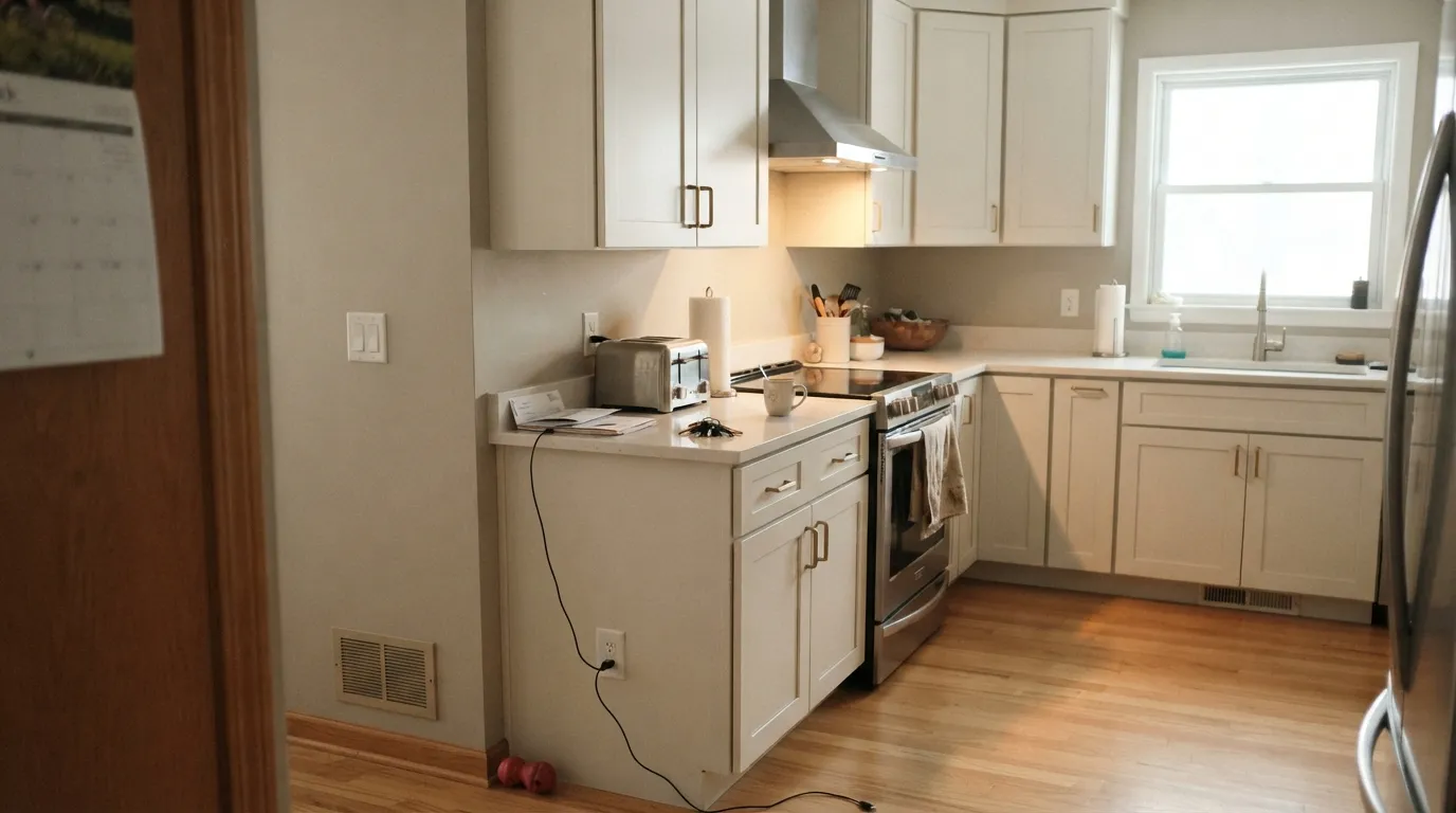
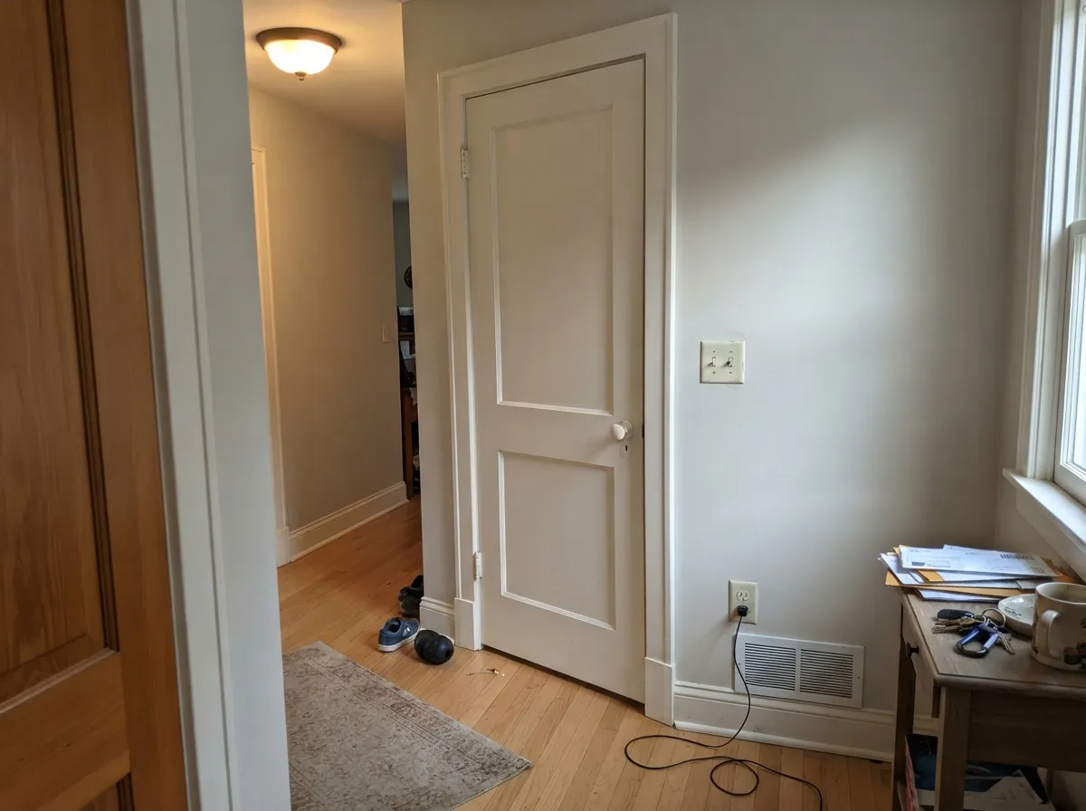
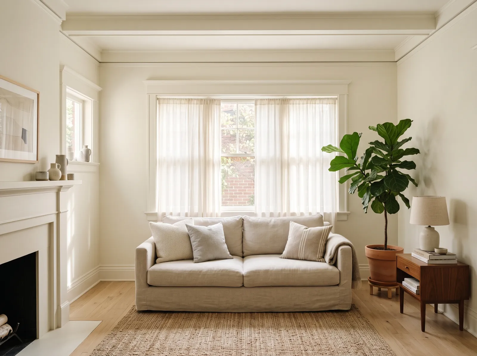
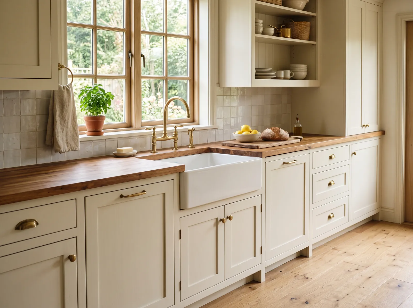
Photos from our full reviews — the same rooms and captions, so you can judge each color where it actually lives, not on a chip.
When to Pick Which
Choose Alabaster if the room gets real daylight and your finishes are warm — oak or walnut, brass, cream-toned stone, beige tile. It is the better cabinet white when you want doors to look soft and custom instead of clinical, and it hides millwork flaws well. It is also the obvious pick if your painter buys Sherwin-Williams.
Choose White Dove if you want a touch more brightness and a white that will not surprise you — its warmth is grayed out, so it never tips yellow and never flashes green. It is the safer answer for a whole house in mixed light and the default trim white over greige, sage or navy walls. Pick it too if your painter works in Benjamin Moore.
No comparison page can see your light. Upload one photo of your room and try both colors on the same walls, seconds apart.
Alabaster vs White Dove FAQ
Which one is safer in a north-facing room?
White Dove. It loses its warmth in north light and goes flat, but it stays a white. Alabaster in a dim north room is the one people repaint, because the green-gray under the yellow comes forward and the walls read pale yellow-green. If the room is north-facing and you want warmth that keeps glowing, Swiss Coffee or Greek Villa SW 7551 does that job better than either of these.
Which is the better kitchen cabinet white?
Both are excellent in satin and both flatter brass, bronze and matte black hardware. The counter decides it. With cream-toned or warm stone, butcher block and wood floors, Alabaster is gorgeous. With cool gray quartz, Carrara-look veining, or a lot of stainless, both will look yellow by comparison and you want a cleaner white — Chantilly Lace OC-65 or Pure White SW 7005.
What trim white goes with each?
The best answer for both is themselves. Walls, trim and ceiling in one white with only the sheen changing is the easiest way to use either color, and it removes the comparison that causes the dirty look. If you want crisper trim, Pure White SW 7005 over Alabaster walls is a small clean step up. Never leave a bright builder-white ceiling above either one.
How do they look at night under lamps?
Both get creamier and cozier under 2700K bulbs, which is what most people want in a living room or bedroom. Under 4000K daylight LEDs they both go crisper, and that is the light most likely to expose Alabaster's green-gray. If your white looks wrong only after dark, change the bulbs before you change the paint — it fixes the complaint more often than repainting does.
Can I color-match Alabaster into Benjamin Moore paint, or the other way around?
You can, but with these two it is worth avoiding. Color-matched Alabaster tends to come out yellower than the real Sherwin-Williams can, and on cabinets or trim you will see it. Since the two colors are doing nearly the same job, the simpler answer is to use whichever brand your painter is buying and skip the match entirely.
Ask a Question