Thunderous
SW's shape-shifting dark neutral, reviewed honestly: the light that turns it green, the light that turns it brown, and the exact jobs it has quietly become famous for.

Jessica has spec'd whites and neutrals for more than 300 rooms and keeps a sample wall of painted drawdowns in her studio. Every color review is checked against real reader rooms in the comments and re-tested when a formula changes. About the testing process →
- 1Urbane Bronze8
- 2Thunderous15
- 3Retreat21
- 4Stardew43
The Fast Verdict
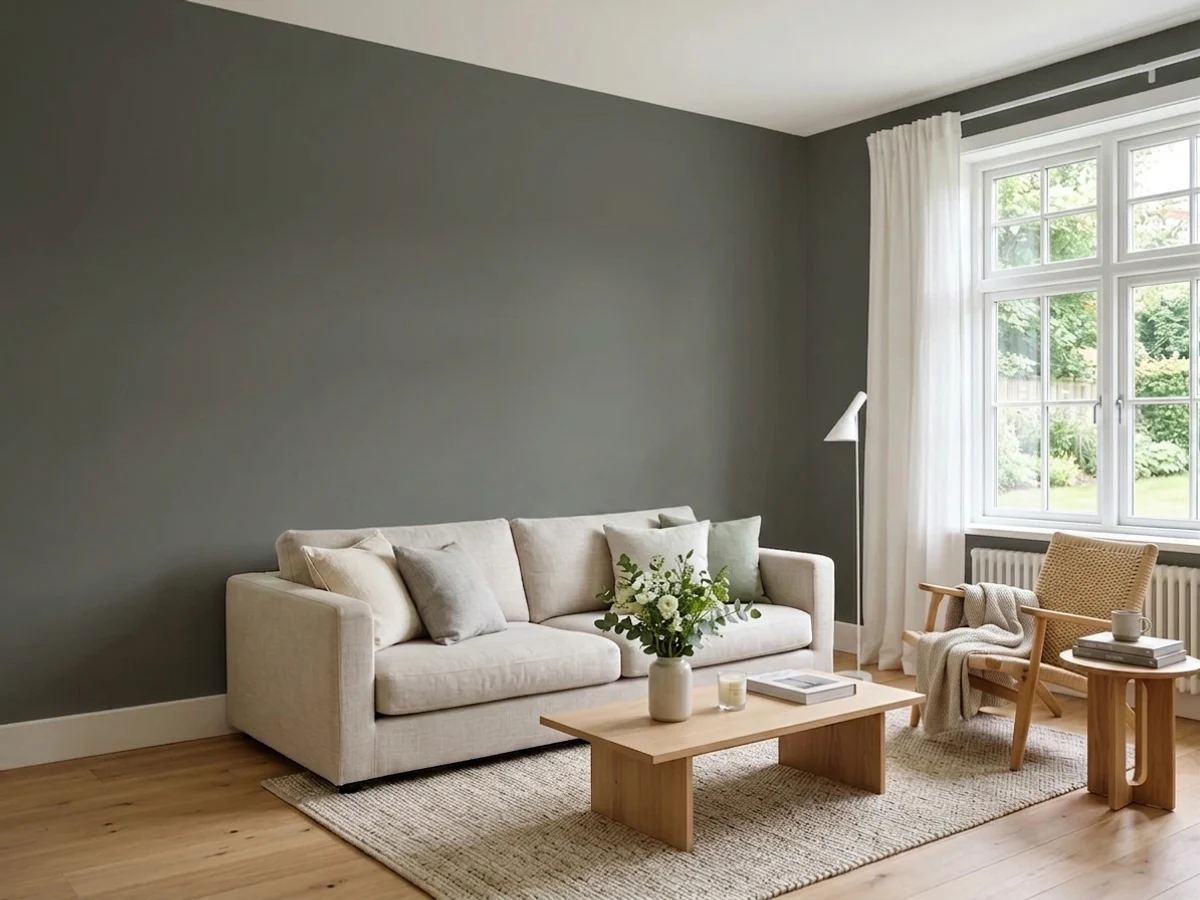
Thunderous is proof that one can of paint can hold three colors. Morning and midday sun pull the green forward, afternoon light warms it toward brown and olive, and evening lamplight settles it into a plain earthy gray. Sherwin-Williams technically files it under green — but nobody on a Reddit thread calls it that. It has quietly become one of the deck's most-requested cabinet and built-in colors for exactly this reason: it never reads as one flat note.
Kitchen islands and lower cabinets · dens, offices, and built-ins · one confident accent wall · exterior doors, shutters, and trim in small doses
You want a color that reads the same in every light · you're wrapping all four walls of a small, dim room · another green already lives in that room · you want a single-note, predictable gray
- A genuine chameleon: reads green in daylight, brown-olive under lamps, balanced gray-green-brown on overcast days
- One of the SW deck's most in-demand cabinet colors right now — works with cream or gray counters, brass or black hardware
- LRV 15 is dark enough to read as a real color decision without a whole-room commitment
- Pairs cleanly with walnut, oak, and hickory — almost no wood-tone clashes
- Works as a single confident dose: a door, an island, a built-in, one accent wall
- Four unbroken walls of a small room read heavier and darker than the swatch promised
- Put another green next to it and the pairing turns muddy or olive instead of grounded
- Small, dim, mirror-less bathrooms make it feel heavy rather than moody
- Its identity shifts so much by light that some buyers second-guess whether they picked the color they think they picked
What Color Is Thunderous, Really?
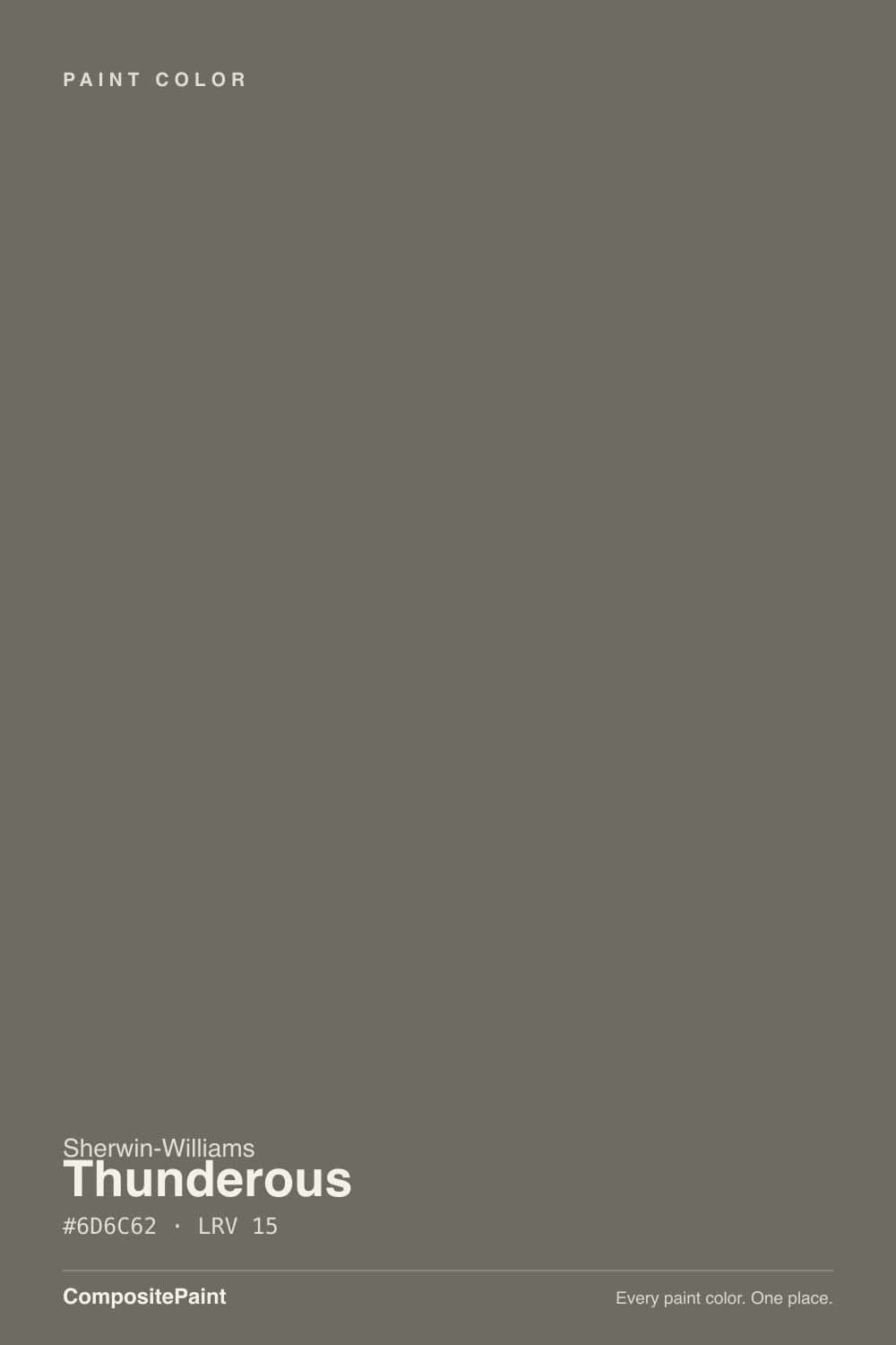
Thunderous is filed under Sherwin-Williams' green paint colors, which tells you something the hex code alone doesn't give away: officially, this is a green. On the wall it rarely announces itself that way — most owners describe a dark, earthy gray-brown that only leans green when the light cooperates. That three-way tension between gray, green, and brown is the entire personality of the color, and it's why review after review reaches for the word "chameleon" instead of settling on one family.
At LRV 15 it sits in genuine dark-neutral territory — noticeably deeper than a daytime sage like Evergreen Fog, but nowhere near the near-black commitment of a true SW cabinet black. That middle depth is doing real work: it's dark enough to read as a deliberate color choice on an island or a built-in, without demanding the kind of full-room commitment a true black or navy asks for. That balance is a big part of why it has become one of the more requested SW cabinet colors of the past couple of years.
Undertone in one line: gray-green in direct daylight, warm brown-olive under artificial light, and a settled, balanced gray-green-brown on an overcast day — genuinely all three, not a trick of your monitor or your paint chip. If your sample reads flat and murky instead of any of those, the room simply isn't giving it enough light to work with yet.
Where It Shines
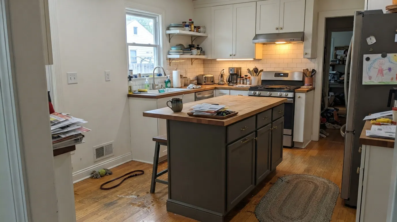
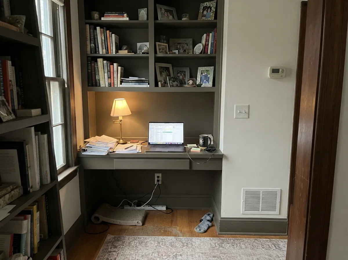
Give it a defined job — a kitchen island, a home-office accent wall, a run of built-ins — and it earns its reputation fast. Cabinets are its best-known role: reviewers report it working with both cream and gray countertops and with brass, black, or nickel hardware alike, which is unusually forgiving for a color with this much undertone movement. Pair it with warm wood (walnut, oak, hickory) and a warm white trim, and it looks custom-mixed straight from the can.
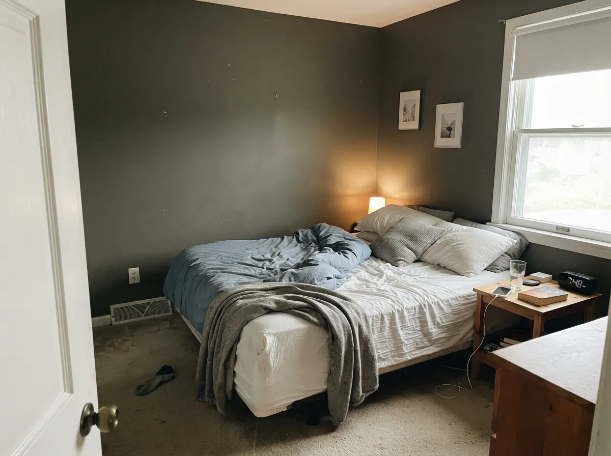
Where It Fails
Almost every regret story about Thunderous comes from asking it to do a job it isn't built for, and the same three mistakes show up across reviews. None of them are the paint's fault — sample bigger and they're easy to see coming.
Reviewers who wrap an entire small bedroom or office in Thunderous consistently report a heavier, more shrinking room than the swatch promised. As cabinets, a built-in, or a single accent wall it reads grounded; as four unbroken walls in a cramped room it reads like a cave. Save it for a defined dose and keep the ceiling or one wall in a warm white.
Put a sage rug, an olive cabinet, or a green tile next to Thunderous and the combination pushes toward muddy olive instead of the grounded gray-green-brown balance it holds on its own. Keep neighboring color notes warm-neutral, rust, or navy — not a second green — and let Thunderous be the only green in the room.
In a small, windowless powder room with nothing to bounce light back, the color reads heavy rather than moody. A real window, a wide mirror, or a lighter vanity top rescues it; without one of those, size the color down to a vanity instead of all four walls, or pick a lighter cousin like Anonymous.
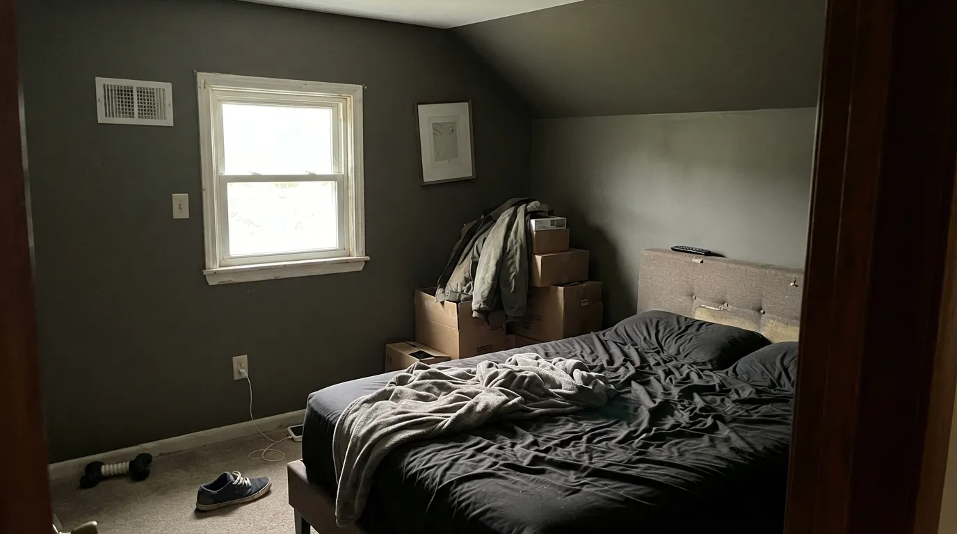
Room by Room
On an island or a full run of lower cabinets it does exactly what buyers hope: a confident, grounded neutral that photographs differently depending on the hour. Satin or semi-gloss cabinet enamel; keep upper cabinets or the walls in a warm white so the dark half has somewhere to land.
This is a lamp-and-lived-in-books room, and Thunderous was made for it. One wall behind a bookcase, or the built-ins themselves, carries the color without a four-wall commitment. Warm 2700K bulbs bring the brown side forward and make the room feel den-like after dark.
A headboard wall in Thunderous with warm bedding and a lamp reads calm and grounded. Wrapping a whole small bedroom in it is the most common regret in the reviews — the room gets heavier and more shrinking than the swatch promised. Keep at least the ceiling and one wall in a warm white.
With a real window or a wide mirror bouncing light back, a Thunderous vanity or half-wall is genuinely handsome. In a small, windowless powder room with no mirror doing that work, the same color reads heavy instead of moody — check your actual light before committing to all four walls.
Full sun on a large surface exaggerates whichever undertone the hour favors, so a whole house in Thunderous can drift more visibly between green and gray than most owners want. On a front door, shutters, or trim against a warm-white body, that same movement reads as a rich, deliberate dark instead of an inconsistent one.
In a larger, well-lit living room it makes a genuinely striking single accent wall or fireplace surround. In a small or already-dim open-plan space it competes with everything nearby — and keep other greens out of the room entirely, since two greens side by side tend to read muddy rather than layered.
Your Light Is the Risk
South-facing or direct sun pulls the green forward and the color reads freshest and most alive — genuinely green-gray, not just "dark neutral."
Without a window's direct sun or a lamp nearby, Thunderous just reads dark and murky. You lose the color movement that makes it interesting, and dim corners can feel heavy instead of grounded.
Morning and midday sun show more green; afternoon light warms it toward brown and olive; by evening under lamplight it settles into gray. The color genuinely changes character across one day.
2700K warm bulbs push it earthy and brown — cozy and den-like. Cool white LEDs flatten it toward a plain gray-green with none of the warmth. Choose warm bulbs for its best after-dark side.
Most complaints about Thunderous are a light mismatch. Upload a photo of your actual room and see it on your walls — then ask for the same wall in north light or evening lamps before you buy a single sample.
Need It From Another Brand?
Any paint counter can custom-tint Sherwin-Williams SW 6201 directly. If you would rather stay in one brand's own deck, these are the closest stock matches, measured as ΔE2000. Under 2 is a difference you will not see on the wall.
| Brand | Closest color | ΔE | LRV | |
|---|---|---|---|---|
| Behr | Bonsai TrunkN380-6 · Behr | 1.3 | 15 | Color page → |
| Benjamin Moore | Sharkskin2139-30 · Benjamin Moore | 1.9 | 16 | Color page → |
| Valspar | Brandenburg Gate8004-27F · Valspar | 0.0 | 15 | Color page → |
| PPG / Glidden | ArmoryPPG1009-6 · PPG / Glidden | 2.0 | 15 | Color page → |
| Glidden | ArmoryPPG1009-6 · Glidden | 2.2 | 15 | Color page → |
| Dutch Boy | Limestone Slate422-6DB · Dutch Boy | 0.0 | 15 | Color page → |
Similar Sherwin-Williams Colors
The nearest shades to Thunderous within Sherwin-Williams's own range, ranked by perceptual color distance — useful when you want the same look a touch lighter, darker, or warmer.
WCAG 2.1: AA is 4.5 : 1 for normal text, 3 : 1 for large text, AAA is 7 : 1.
Thunderous vs the Colors You're Also Considering
Every Thunderous sample board has the same rivals on it. The numbers show the real lightness gap — then it comes down to which risk you would rather live with.
Pick this for the extra shape-shifting: Thunderous moves between green, gray, and brown depending on the light; Pewter Green stays put as green.
Sherwin-Williams SW 6208 · LRV 12Pewter GreenPick this if you want more green and less gray — Pewter Green skips the brown side entirely and reads as a true dark sage on cabinets.
Pick this for real depth — Evergreen Fog is a soft daytime sage; Thunderous is a genuine dark neutral that reads as a color decision, not a wash.
Sherwin-Williams SW 9130 · LRV 30Evergreen FogPick this if Thunderous reads too dark for your room — Evergreen Fog is the same gray-green family at nearly double the LRV, light enough for whole walls.
Pick this when you want the color to keep moving — Anonymous holds one warm-neutral note; Thunderous genuinely shifts between three.
Sherwin-Williams SW 7046 · LRV 20AnonymousPick this for the warmth without the green flicker — Anonymous is a steadier earthy neutral and one of SW's best-behaved exteriors.
Pick this for the gray-green-brown movement — Kendall Charcoal is a single, dependable warm gray; Thunderous is a genuine chameleon.
Benjamin Moore HC-166 · LRV 13Kendall CharcoalPick this if your painter works in Benjamin Moore and you want a straightforward dark warm gray with no green undertone to manage.
Thunderous Coordinating Colors
The safest rule with Thunderous: warm whites, warm wood, and at most one other dark note — and keep other greens out of the room. It pairs with cream more comfortably than with a stark cool white, loves walnut and oak, and takes brass or matte black hardware equally well. These are the partners that keep showing up in the rooms that work:
Thunderous On Kitchen Cabinets
This is the color's real fame, even without a Color-of-the-Year headline: painters and homeowners keep landing on Thunderous for islands and full lower-cabinet runs because it does something most dark cabinet colors don't — it looks good against both cream and gray countertops. That's a genuinely useful trait; most dark greens or navies pick a side and stay there.
Hardware is equally forgiving. Brushed brass pulls the brown side forward; matte black or nickel pulls the gray side forward. Either way, plan on a satin or semi-gloss cabinet-grade enamel, and keep the upper cabinets or the wall behind the island in a warm white — an all-Thunderous kitchen loses the contrast that makes the color read as a decision instead of just dark.
Thunderous With Wood Tones and Floors
Warm wood is this color's best company: walnut, natural oak, and hickory all sit comfortably against Thunderous because the color's brown undertone meets theirs halfway, especially under lamplight. Gray-washed or pale white oak floors work too, in the cooler, more gray-forward version of the pairing.
The one combination to sample carefully is a second green in the same room — a sage rug, an olive cabinet nearby, a green tile backsplash. Two different greens side by side tend to argue rather than layer, pushing both toward a muddier, less deliberate olive. Keep the room's other color notes warm-neutral, rust, or navy instead, and let Thunderous be the only green in the conversation.
Three Ready Palettes Built on Thunderous
A color is never alone on the wall. These are complete combinations in the 60-30-10 pattern, with the reason each one holds together. Every one opens in the visualizer.
Thunderous carries the color on the island while Alabaster's warm undercurrent keeps the room from feeling cold. Extra White upper cabinets and trim add the contrast that makes a dark lower cabinet read intentional instead of heavy.
Try this palette in your roomOne Thunderous wall behind a bookcase reads grounded, not dark, especially under a warm lamp. Pure White keeps the trim from disappearing into it, and Naval gives the room a second, cooler dark note so Thunderous isn't the only depth in play.
Try this palette in your roomFull sun can wash a large dark surface toward green or gray depending on the hour, which is exactly why the color works best outside in doses. A warm white body keeps Thunderous grounded in its brown side rather than drifting cool, and crisp white trim frames the door as the one deliberate dark note.
Try this palette in your roomThunderous FAQ
Is Thunderous gray or green?
Technically green — Sherwin-Williams files it under green paint colors — but on the wall it reads as a dark, earthy gray-brown that leans green mainly in direct daylight. Under warm lamps it settles toward brown; on an overcast day it's a genuine three-way balance. That shifting is the color's whole personality, not a flaw in your sample.
Is Thunderous good for kitchen cabinets?
Yes — it's become one of the more requested SW colors for islands and lower cabinets over the past couple of years. It works with both cream and gray countertops and doesn't fight brass, black, or nickel hardware. Use a satin or semi-gloss cabinet enamel, and keep upper cabinets or the walls in a warm white so the dark half has contrast to sit against.
Can I paint a whole room in Thunderous?
You can, but sample big before you do — the most common regret in reviews is a small room wrapped in it feeling heavier and more shrinking than expected. It performs best as a defined dose: an island, a built-in, one accent wall, a door. Larger, well-lit rooms handle a full wall more comfortably than small ones.
What white goes with Thunderous?
A warm white — Alabaster, Pure White, or Extra White for trim — keeps the pairing calm. A stark cool white fights the color's warm-brown side under lamplight. Avoid a second green in the same room; two greens next to each other tend to read muddy rather than intentional.
Does Thunderous work on exteriors?
In doses, yes — a front door, shutters, or trim against a warm-white body reads as a rich, deliberate dark. A full-siding commitment is riskier: direct sun on a large surface exaggerates whichever undertone the hour favors, so the whole house can drift between green and gray more visibly than a door or trim would.
How dark is Thunderous really?
At LRV 15 it's a genuine dark neutral — noticeably deeper than a daytime sage like Evergreen Fog, but well short of a near-black cabinet color. That middle depth is why it reads as a confident color choice without demanding the full-room commitment a true black or navy asks for.
Have you painted with Thunderous?
Rate it — one tap helps the next reader decide.
Ask a Question