Caldwell Green
A quietly serious hunter green from Benjamin Moore's Historical Colors collection, reviewed honestly: the light it needs to stay green, the exact rooms where it slides toward gray, and what to pick instead.

Jessica has spec'd whites and neutrals for more than 300 rooms and keeps a sample wall of painted drawdowns in her studio. Every color review is checked against real reader rooms in the comments and re-tested when a formula changes. About the testing process →
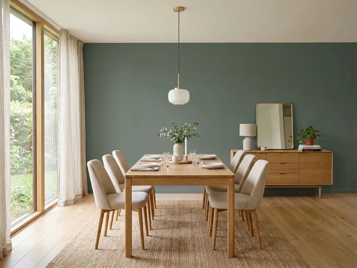
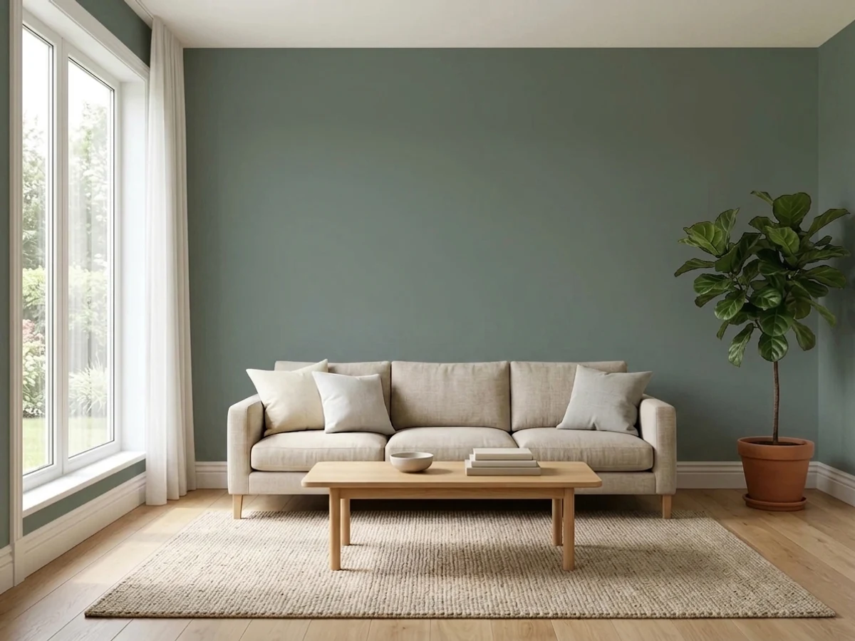
- 1Black Emerald1
- 2Essex Green6
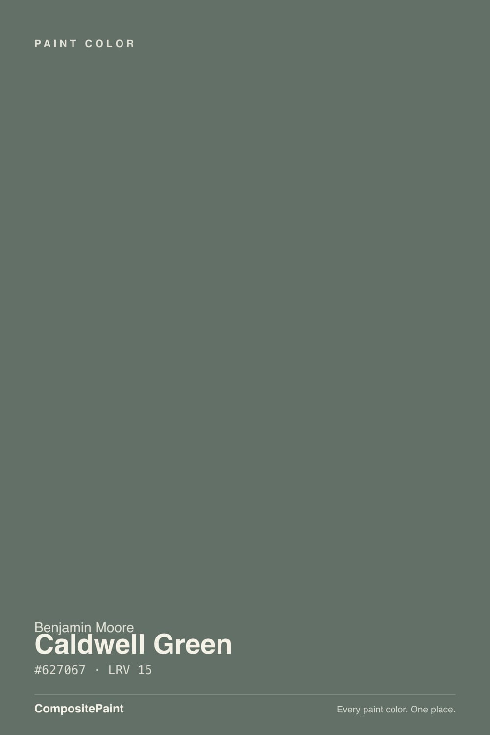
- 3Caldwell Green15
- 4Sage Green22
- 5Evergreen Fog30
The Fast Verdict
Caldwell Green was never built for a moment — it has sat in Benjamin Moore's Historical Colors collection for years with no Color-of-the-Year push and no viral kitchen photo behind it, and that is its whole appeal. It is a grayed hunter green with a slate-blue backbone and a thread of muted gold: serious, library-quiet, and genuinely dark at LRV 15. Give it real daylight, dark wood, and brass, and it reads like an old study. Starve it of light and it slides the wrong way — toward flat charcoal-gray, not the bright grassy green the name might suggest.
Dining rooms and dens built for an old-library mood · kitchen islands or cabinets in a warm-wood kitchen · a front door or garage door on a light-colored house · anyone who wants a hunter green that reads grown-up, not trendy
Your room is dim or north-facing with no lamps · you pictured a bright grassy or kelly green · you want it on all four walls of a small room · you're judging it only from the 2-inch chip
- Grounded historic pedigree, not a trend color chasing a moment
- Flatters dark wood, brass, and leather — the built-in "old library" look
- Genuinely deep, saturated color that holds its own in real daylight
- Works indoors and out — cabinets, doors, dens, and exteriors
- Pairs cleanly with Benjamin Moore's own crisp-white-and-true-gray formula
- LRV 15 means it can go flat and near-charcoal in a dim room
- Shifts noticeably between green, gray, and blue depending on the light
- The 2-inch chip undersells how deep the color reads on a full wall
- Not the pick if you actually want a bright, grassy green
What Color Is Caldwell Green, Really?
A muted hunter green built on a gray-and-slate base with a whisper of gold warmth underneath — not a clean, saturated green, and not meant to be one. Benjamin Moore files it in the Historical Colors collection alongside old-house shades like Essex Green and Cushing Green, which tells you what it is for: rooms that want to feel established rather than decorated. It has no famous moment behind it — no Color of the Year run, no design-blog viral kitchen — which makes it a genuinely honest pick rather than a trend bet.
At LRV 15 it sits between SW Rosemary (LRV 12) — darker, more purely green — and SW Dried Thyme (LRV 21) — lighter, more olive and forgiving. That places Caldwell Green squarely in the deep-but-not-black zone: dark enough to read as a real color statement, light enough that it still shows green in a room with honest daylight. Plan for the finished wall to look noticeably deeper than the paint chip; a small backlit sample always undersells a color this saturated, and Caldwell Green compounds that gap more than most.
Undertone in one line: green first, with slate-blue and gray fighting for second place depending on the light — never a warm, grassy green. Morning sun tends to pull the green forward; flat overcast light pulls the gray-blue forward instead. If your sample reads almost charcoal on a cloudy afternoon, that is the paint being honest about low light, not a bad batch.
Where It Shines
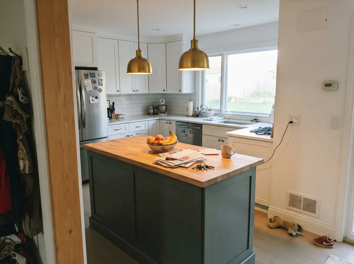
Give it real daylight, dark wood, and brass hardware and it earns the "library" reaction it gets over and over in real rooms — deep, grounded, and old-money quiet rather than loud. Its second home is the built-in green move: an island, a hutch, an interior door, or a front door on a light-sided house, where the color reads intentional and expensive without committing the whole house to it. Pair it with crisp bright white trim — Benjamin Moore's own coordinating advice — and the contrast keeps it from reading murky.
Where It Fails
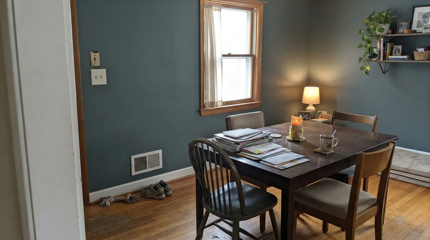
Almost every regret story about Caldwell Green comes down to one of three predictable mismatches. None of them are the paint's fault — but if your room or your expectation matches one of these, this is not your green, and a bigger sample will only confirm it before you commit a whole wall.
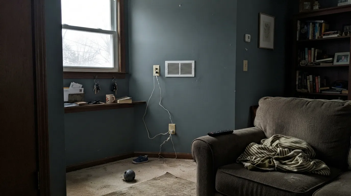
Cool, flat daylight pulls the slate-blue and gray forward and lets the green retreat almost entirely — readers describe the result as "almost charcoal" rather than green. The paint isn't wrong; the room just isn't giving it enough warm light to work with. Add warm lamps or move it to a room with real south or west sun.
A small chip is backlit and surrounded by white, so it always reads lighter and brighter than the finished wall. At LRV 15, Caldwell Green compounds that gap more than a mid-tone color would — the whole room lands noticeably deeper and moodier than the sample suggested. Paint a large board and view it at different times of day before committing four walls.
The name suggests something grassy or vivid, but this is a grayed historic hunter green, not a saturated one — it was built to feel established and quiet, not lively. If you want the vivid version, look at Benjamin Moore's own Green (2044-10) instead; Caldwell Green will read muted and serious by comparison every time.
Room by Room
This is the room that gets the "looks like the inside of an old library" reaction. With a wood table, brass fixtures, and crisp white trim, it reads established rather than dated. Eggshell finish; keep the room's other light sources warm.
Low, warm light flatters it the same way it flatters a library — dark wood shelving and leather furniture are its natural company. It is a good choice specifically because these rooms rarely get harsh midday sun.
On an island or full run of cabinets against bright white walls and warm wood, it is genuinely striking. Benjamin Moore's own pairing advice is a crisp, bright white trim for exactly this reason — a soft off-white lets the green go murky instead of deep. Satin or semi-gloss cabinet enamel.
Beautiful as an accent wall behind the headboard in a room with real daylight or warm 2700K lamps at night. Skip it as a whole-room color in a dim or north-facing bedroom, where it will read flat and heavy rather than cozy.
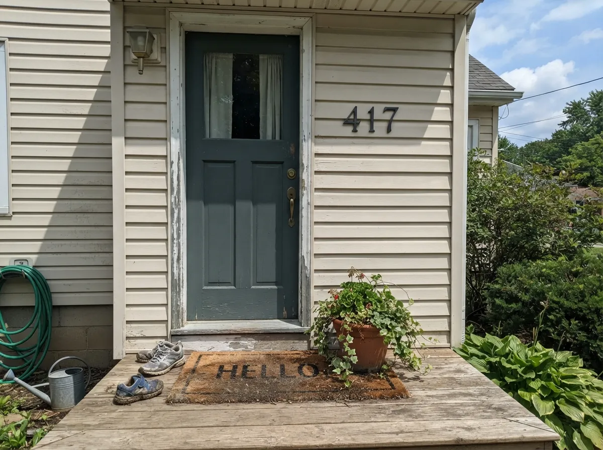
It works well as a front door or garage door color against light siding, and pairs naturally with wood accents. Full sun reads it a shade brighter and greener than it looks indoors; on the shaded side of the house it goes noticeably darker.
Stunning as a single accent wall or a painted built-in; a genuine commitment as four full walls, especially in a room that doesn't get strong daylight most of the day. Treat it the way you would treat navy or black — sparingly, unless the light is on your side.
Your Light Is the Risk
Strong warm daylight keeps the green visible and lets the gold undertone show through — the color reads clearly green, not gray.
Cool, flat light pulls the slate-blue and gray forward and the green retreats — this is where it reads closest to charcoal.
Owners report it leaning greener in direct morning sun and grayer once the light flattens out in the afternoon. Same paint, different hour.
Warm 2700K lamps pull the gold forward and keep it feeling like a library at night. Cool white LEDs push it toward flat, cold gray-green — swap the bulbs before you swap the paint.
Most complaints about Caldwell Green are a light mismatch. Upload a photo of your actual room and see it on your walls — then ask for the same wall in north light or evening lamps before you buy a single sample.
Need It From Another Brand?
Any paint counter can custom-tint Benjamin Moore HC-124 directly. If you would rather stay in one brand's own deck, these are the closest stock matches, measured as ΔE2000. Under 2 is a difference you will not see on the wall.
| Brand | Closest color | ΔE | LRV | |
|---|---|---|---|---|
| Sherwin-Williams | Rocky RiverSW 6215 · Sherwin-Williams | 2.0 | 15 | Color page → |
| Behr | Mountain PinePPU12-19 · Behr | 3.9 | 15 | Color page → |
| Valspar | Puddle JumperT606 · Valspar | 2.4 | 15.3 | Color page → |
| PPG / Glidden | Gunmetal GrayPPG1033-6 · PPG / Glidden | 2.3 | 15 | Color page → |
| Glidden | Gunmetal GrayPPG1033-6 · Glidden | 2.9 | 14 | Color page → |
| Dutch Boy | Zinc-ed426-7DB · Dutch Boy | 4.3 | 15 | Color page → |
Similar Benjamin Moore Colors
The nearest shades to Caldwell Green within Benjamin Moore's own range, ranked by perceptual color distance — useful when you want the same look a touch lighter, darker, or warmer.
WCAG 2.1: AA is 4.5 : 1 for normal text, 3 : 1 for large text, AAA is 7 : 1.
Caldwell Green vs the Colors You're Also Considering
Every Caldwell Green sample board has the same rivals on it. The numbers show the real lightness gap — then it comes down to which risk you would rather live with.
Pick this when you want a touch more gray and a touch more light to work with.
Sherwin-Williams SW 6187 · LRV 12RosemaryPick this for a darker, more purely green cousin with less gray in the mix — and the same real-light requirement.
Pick this when you want the green to clearly win the argument, not the gray.
Sherwin-Williams SW 6208 · LRV 12Pewter GreenPick this if you want the gray to lead and the green to follow — it reads more neutral in low light than Caldwell Green does.
Enchanted Forest 700 at #606E63 and LRV 15 is the closest neighbor, marginally yellower and effectively the same on a wall. Jack Pine, listed as both 692 and CC-660 at #5A7169 and LRV 16, carries more blue, so it reads cooler and closer to a deep teal-green. Millstone Gray 1581 at #6A716A and LRV 16 is the neutral of the group, with the green nearly gone. Rainy Afternoon 1575 at #646B61 and LRV 15 leans olive. Kitty Gray 1589 at #646B68 and LRV 16 is the coolest, closest to a plain dark gray.
Across brands, Farrow & Ball Douter No. 318 at deltaE 1.36 is visually identical in normal room light. Sherwin-Williams Rocky River SW 6215 at 2.04, PPG Gunmetal Gray PPG1033-6 at 2.26, and Valspar Puddle Jumper T606 at 2.4 are very close, worth sampling before you commit. Behr Kindling N200-6 at 4.02 and Dutch Boy Zinc-ed 426-7DB at 4.27 are close but visibly different side by side, both warmer and less green than Caldwell Green.
Caldwell Green Coordinating Colors
Benjamin Moore's own pairing advice for Caldwell Green is a crisp bright white plus a true gray, and that formula holds up in real rooms: the bright white keeps the green from reading murky, and the true gray bridges the two without adding warmth the color doesn't need. Beyond that starting point, it takes to dark near-blacks for contrast and to warm caramel neutrals when you want the whole scheme softer.
A Historic Green With No Hype
Caldwell Green has never had a viral moment. It sits in Benjamin Moore's Historical Colors collection next to old-house shades like Essex Green and Cushing Green, and it has stayed there quietly for years without a Color-of-the-Year run or a design-blog feature pushing it into fashion. That is not a knock — it means the color was never oversold, and it won't feel dated the way a trend-cycle color eventually does.
What it does have is a specific, repeatable reaction: painted in a dining room or den with real light and dark wood, people consistently describe it as feeling like the inside of an old library. That is a narrower promise than "trendy statement green," but it is an honest one, and it is the reason to reach for this color instead of a louder, more saturated green.
Caldwell Green With Wood Tones and Floors
This is a color that genuinely likes wood, and it is less picky about the exact tone than most dark greens. Dark wood — walnut, espresso, aged oak — gives it the classic, old-library depth it's best known for. Lighter wood tones work too, pushing the same green toward a cleaner, more modern read rather than clashing with it, which is unusual for a color this saturated.
The one thing to watch is contrast, not clash: because the paint itself is already dark, a floor and furniture set that are also uniformly dark can make a whole room feel like it's missing a light note. Keep at least one bright surface in the room — trim, a rug, or a light stone counter — so the green has something to read against.
Three Ready Palettes Built on Caldwell Green
A color is never alone on the wall. These are complete combinations in the 60-30-10 pattern, with the reason each one holds together. Every one opens in the visualizer.
A warm trim white keeps the green from going murky, and a charcoal accent on built-ins gives the room one darker note so Caldwell Green doesn't have to carry all the depth alone. Dark wood and brass finish the old-library look.
Try this palette in your roomBenjamin Moore's own coordinating picks for Caldwell Green lean on a crisp bright white and a true gray — Chantilly Lace supplies the crisp white contrast the green needs to stay deep instead of murky, and Stonington Gray bridges the two without adding warmth the green doesn't need.
Try this palette in your roomA light, warm siding color lets the door read clearly green in full sun instead of blending toward black, and soft near-black shutters ground the look without competing with the door for attention.
Try this palette in your roomCaldwell Green FAQ
Is Caldwell Green warm or cool?
It runs cool overall — the base is gray and slate-blue — but it carries a thread of muted gold warmth that keeps it from feeling icy. In warm daylight the gold shows and it reads like a true hunter green; in flat or north light the cool base takes over and it leans gray-blue.
Is it too dark for a small room?
At LRV 15 it is a genuinely dark color, and a small room with limited daylight will feel noticeably smaller and moodier with it on all four walls. It works best as an accent wall, a cabinet or island color, or in a room with more than one light source — not as the sole wall color in a small, dim space.
Is it good for kitchen cabinets?
Yes — it's one of its strongest uses. Pair it with a crisp bright white (Benjamin Moore's own suggestion) rather than a soft off-white, which lets it look deep and intentional instead of murky. Satin or semi-gloss cabinet enamel.
What trim white goes with Caldwell Green?
A crisp, bright white — Chantilly Lace or Simply White — rather than a warm off-white like White Dove, which is closer in value and undertone and can make the green look flat by comparison. If you want a softer look instead of high contrast, a warm white on the trim works too, just expect less pop.
Can I use it on an exterior or front door?
Yes. It works well as a front door or garage door color, especially against light-colored siding, where the contrast lets it read clearly green rather than near-black. Full sun brings out more green; the shaded side of a house will read noticeably darker.
Is the undertone green, gray, or blue?
All three show up depending on the light — green first, with gray and slate-blue trading second place. That is the honest, expected behavior of a grayed historic green this deep, not a sign of a bad sample. Test a large board in your actual room before committing.
Have you painted with Caldwell Green?
Rate it — one tap helps the next reader decide.
Ask a Question