Guilford Green
Benjamin Moore's 2015 Color of the Year, reviewed honestly eleven years later: the light it needs, the two things people expected it to be that it isn't, and what to pick instead.

Jessica has spec'd whites and neutrals for more than 300 rooms and keeps a sample wall of painted drawdowns in her studio. Every color review is checked against real reader rooms in the comments and re-tested when a formula changes. About the testing process →
- 1Evergreen Fog30
- 2Clary Sage41
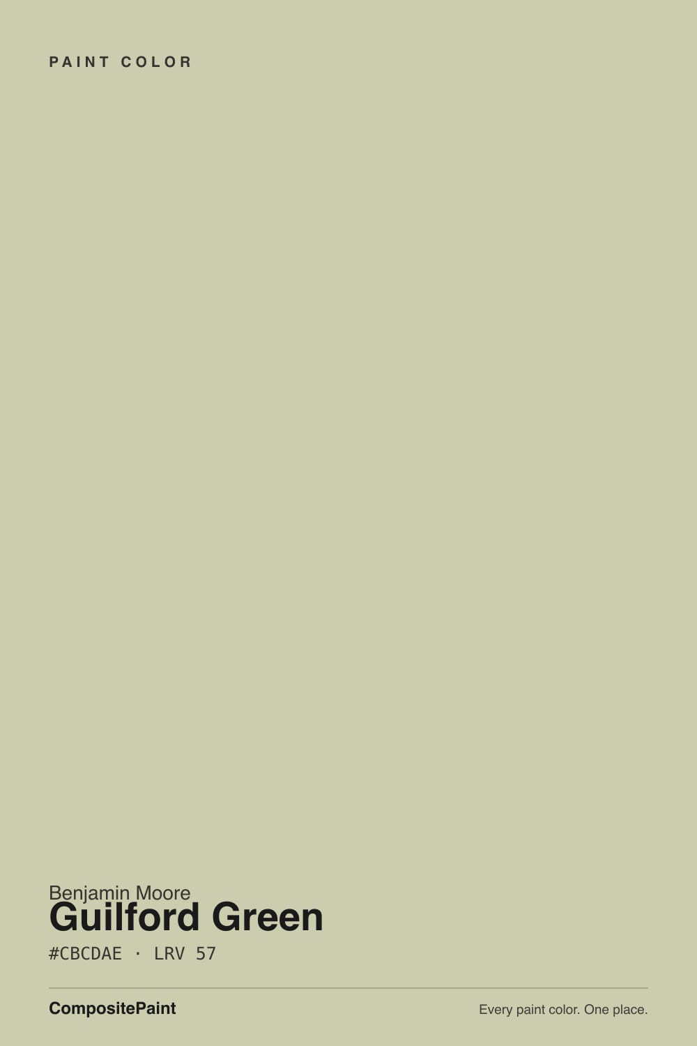
- 3Guilford Green57
- 4Hancock Green66
- 5Alabaster82
The Fast Verdict
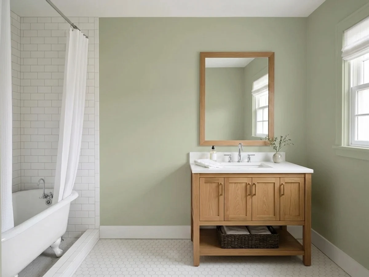
Guilford Green won Benjamin Moore's Color of the Year in 2015, and eleven years on it still behaves exactly like its own fine print: a soft, grayed sage-khaki with a warm yellow-green base, built from the brand's Historical Colors collection rather than a bold new trend shade. It is not the vivid, leafy green the marketing photos implied — it is a quiet, low-saturation putty-green that needs real daylight to show its color and a warm white next to it to look deliberate instead of dull.
Colonial and Craftsman exteriors · kitchen cabinets and islands with brass or warm wood · studies and dens with leather and walnut · anyone who wants a green that reads as a neutral, not a statement
You want a true, saturated grass green · your room is dim and faces north · your trim stays a crisp cool white · you're picking it off the old COTY marketing photos without a sample on your own wall
- A real Color of the Year with a legitimate, documented pedigree — not an invented "famous" claim
- Reads as a neutral first, a green second — easy to live with, easy to trim
- Genuinely at home on Colonial, Federal and Craftsman exteriors
- Flatters brass, bronze, walnut and warm stone
- LRV 57 hides scuffs and fingerprints on cabinets the way a mid-tone neutral does
- Reads far less "green" in person than the 2015 marketing photos suggested
- Goes flat, muddy khaki-gray in a dim north room with no warm light
- Fights a crisp cool-white trim — needs a warm white partner
- Nearly identical to Saybrook Sage, which can make the choice between them feel arbitrary
What Color Is Guilford Green, Really?
A grayed, yellow-green with a warm khaki base — Benjamin Moore's own copy calls it "a gentle green hue with pleasing warm undertones," and that undertone is the whole story. It comes out of the Historical Colors collection, the same family that gave the deck Louisburg Green and Wickham Gray, and it shows: this is not a color built to shout. When BM named it 2015's Color of the Year, the pitch was that green could be the next neutral — livable, versatile, safe to commit a whole exterior to — and Guilford Green delivers exactly that promise, which is a lower bar than the word "green" makes people expect.
At LRV 57 it sits almost exactly where Revere Pewter and Worldly Gray live, and it behaves the same way: reflective enough to avoid feeling heavy, but with enough grayed pigment that in strong daylight it can nearly recede into a warm putty-gray and only reveal its green in shadow, against white trim, or up close. That is the most common surprise in owner photos — people expect a color called "green" to read green from across the room, and at this LRV and this saturation, it often needs the comparison to show up.
Undertone in one line: yellow-green first, khaki-beige second — never blue-green, never true grass. If your sample looks silvery and almost gray, that is bright, cool daylight doing its job; if it looks mustard or olive-drab, that is warm tungsten light or a dim room pulling it the other way. Both are the same paint being honest about the light it's in.
Where It Shines
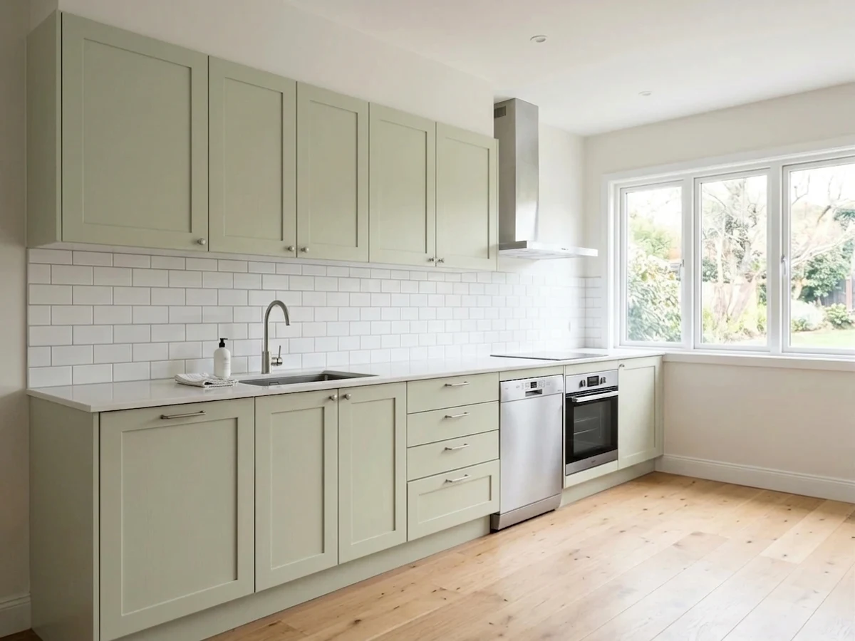
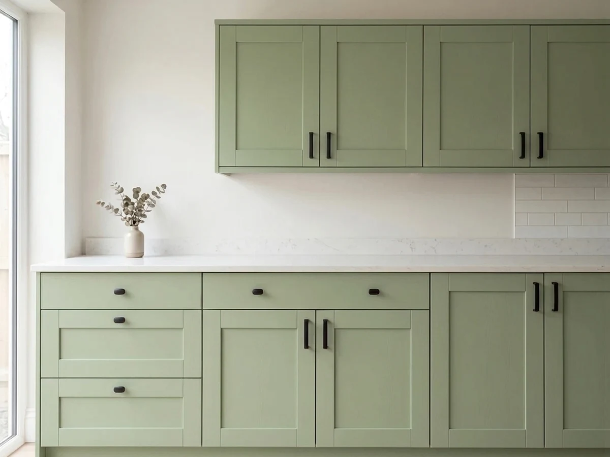
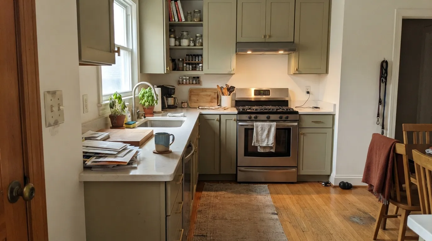
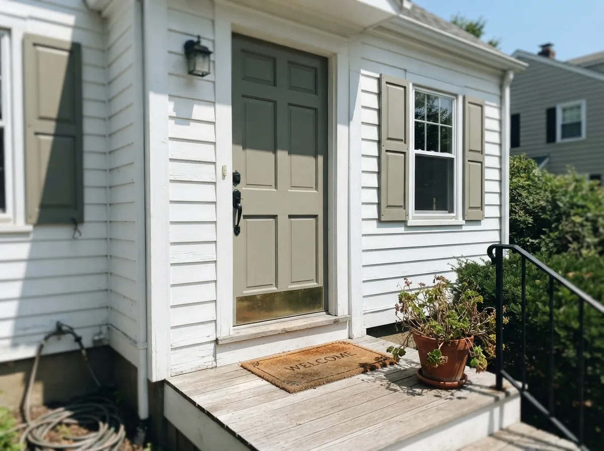
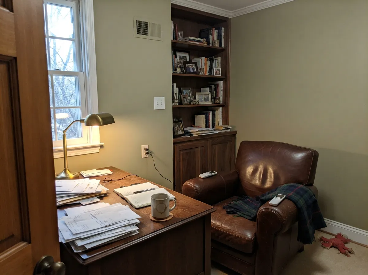
Give it real daylight, warm wood, and brass or bronze hardware and it earns the Color of the Year title. Its original home is the exterior — the Historical Colors line was built for Colonial and Federal-style houses, and Guilford Green on siding with white trim is a genuinely classic, era-appropriate look that doesn't read costume-y the way a bolder green would. Indoors, kitchen cabinets and studies are its best rooms: at this LRV it hides fingerprints and cabinet scuffs the way a mid-tone neutral does, while the green keeps the room from feeling like just another gray kitchen.
Where It Fails
Nearly every disappointed review of Guilford Green traces back to one of three things, and none of them are really the paint's fault — they're a mismatch between the color and the light, the trim, or the expectation someone walked in with.
Cool overcast daylight strips the yellow out and leaves a flat, muddy khaki-gray that owners describe as "dirty" or "institutional" rather than sage. The color didn't fail; the light did. Add warm 2700K lamps or move it to a room with real daylight.
The Color of the Year marketing photos were shot in flattering light and often cropped tight, which reads more vivid than the paint is on a real wall. At LRV 57 with a heavily grayed base, Guilford Green is closer to a warm putty than to a leafy green — if you want the saturation, look at a deeper, less-grayed green instead, not this one.
A bright blue-white trim (Chantilly Lace territory) makes Guilford Green look washed out and slightly sickly by contrast — the two undertones fight. Trim it in a warm white like White Dove or Swiss Coffee instead, and the pairing turns calm rather than off.
Room by Room
Built for Colonial, Federal and Craftsman houses, and it still reads that way: siding in Guilford Green with white trim and black or bronze fixtures is a genuine period-appropriate classic, not a trend bet. Full sun brightens it toward silvery-sage; shaded elevations drift more olive — expect a visible difference between the sunny and shaded sides of the same house.
On cabinets with brass or unlacquered bronze pulls and a butcher-block or warm-stone counter, it looks intentional and a little unusual without being a statement. Satin cabinet enamel; pair with a warm white wall, not a cool one.
Walnut shelving, leather, and a brass lamp bring out the warmth and let the green settle into something closer to olive-bronze. Eggshell on the walls; this is a room that benefits from staying a little dim and lamplit rather than daylight-bright.
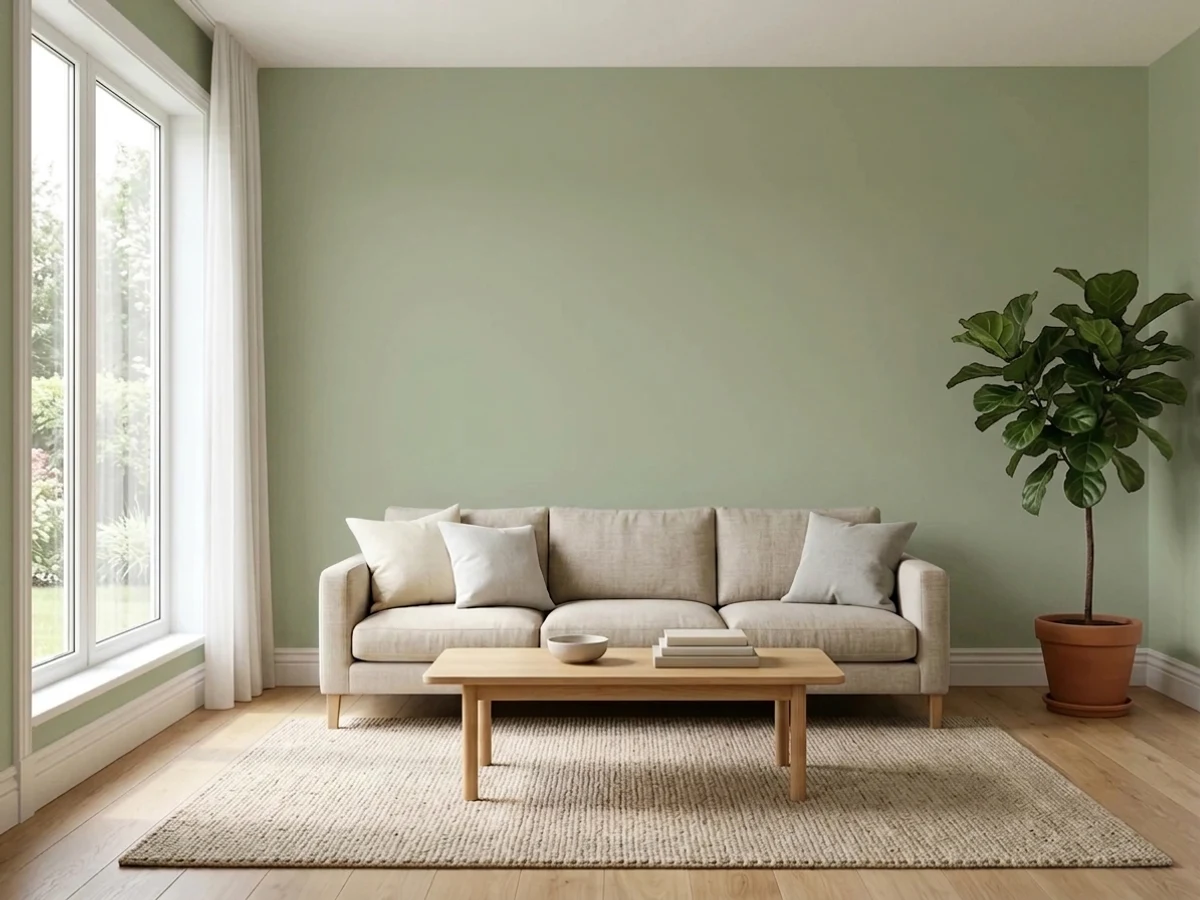
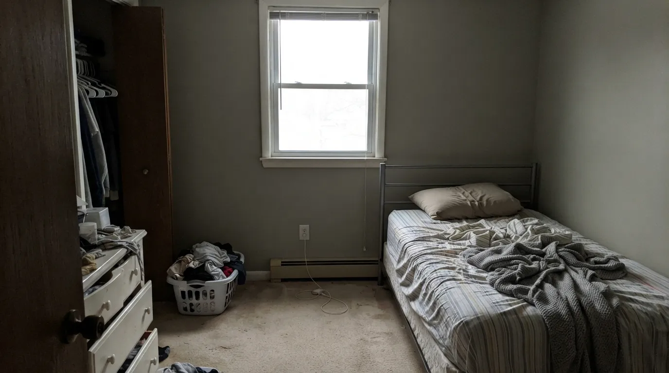
South or west light keeps it a soft sage all day. A north-facing living room with limited lamps is the room most likely to disappoint — sample it there before committing, not in a sunnier room of the house.
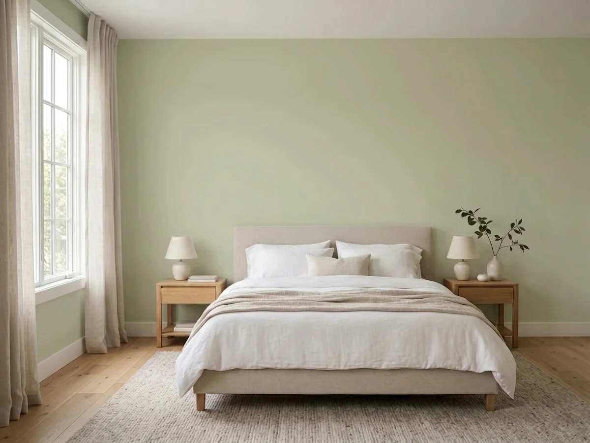
Quiet and restful under warm evening light; it can go a little flat and gray-green during the day in a dim room. Works well with cream or white bedding and warm wood furniture rather than cool grays.
Against warm marble, wood vanities, and brass fixtures it's genuinely pretty. Against cool gray tile or chrome, the green turns flat and the two colors argue — test the sample against your actual stone first.
Your Light Is the Risk
The color reads as a soft, silvery sage — close to the official chip and the COTY photography. Its best, most honest light.
The yellow drains out and leaves a flat, muddy gray-khaki that reads dingy rather than sage. Test here before you commit a whole room.
Cooler and more silvery in morning east light, warmer and more olive-khaki as afternoon west sun comes in. Most owners like the shift; it's gentle, not dramatic.
2700K warm bulbs push it toward mustard-olive at night — cozy in a den, too much in a bright kitchen. Cool LEDs flatten it back toward gray-green, losing the warmth.
Most complaints about Guilford Green are a light mismatch. Upload a photo of your actual room and see it on your walls — then ask for the same wall in north light or evening lamps before you buy a single sample.
Need It From Another Brand?
Any paint counter can custom-tint Benjamin Moore HC-116 directly. If you would rather stay in one brand's own deck, these are the closest stock matches, measured as ΔE2000. Under 2 is a difference you will not see on the wall.
| Brand | Closest color | ΔE | LRV | |
|---|---|---|---|---|
| Sherwin-Williams | AcanthusSW 29 · Sherwin-Williams | 2.2 | 60 | Color page → |
| Behr | HybridS340-3 · Behr | 2.4 | 60 | Color page → |
| Valspar | Apple Blossom Green8003-31C · Valspar | 1.4 | 60 | Color page → |
| PPG / Glidden | Canary GrassPPG1114-3 · PPG / Glidden | 2.5 | 59 | Color page → |
| Glidden | Canary GrassPPG1114-3 · Glidden | 2.6 | 59 | Color page → |
| Dutch Boy | Green Grove327-2DB · Dutch Boy | 1.4 | 60 | Color page → |
Similar Benjamin Moore Colors
The nearest shades to Guilford Green within Benjamin Moore's own range, ranked by perceptual color distance — useful when you want the same look a touch lighter, darker, or warmer.
WCAG 2.1: AA is 4.5 : 1 for normal text, 3 : 1 for large text, AAA is 7 : 1.
Guilford Green vs the Colors You're Also Considering
Every Guilford Green sample board has the same rivals on it. The numbers show the real lightness gap — then it comes down to which risk you would rather live with.
Pick this for the documented Color of the Year pedigree and the slightly warmer, more yellow-leaning cast of the two.
Benjamin Moore HC-114 · LRV 56Saybrook SagePick this honestly, the two are near-twins from the same historical palette — pick Saybrook if you find it first, the difference on the wall is minor.
Pick this when you want the lighter, more neutral, more whole-house-safe version of the same green.
Benjamin Moore 1495 · LRV 39October MistPick this for a deeper, more dependable sage that holds its color better in a dim room — the safer bet if your light is uncertain.
Valspar Apple Blossom Green 8003-31C at #CACFB2 and LRV 60 and Dutch Boy Green Grove 327-2DB at the same hex and LRV are both 1.36 from Guilford Green, so they are visually identical in normal room light, allowing for the three-point LRV difference.
Sherwin-Williams Acanthus SW 29 at #CDCDB4 and LRV 60 is 2.2 away, Farrow and Ball Vichyssoise No. 9909 at #D0D0B7 and LRV 62 is 2.39, and Behr Cilantro Cream PPU9-18 at #CECAAF and LRV 58 is 3.02. All three are very close, but sample first, since Vichyssoise is lighter and Cilantro Cream reads a shade more beige.
Clare All The Sage PNT100-LT-70 at LRV 60 and 3.71, Dunn-Edwards Hidden Hills DE5569 at LRV 57 and 4.1, and Magnolia Home Tapestry Thread JG-105 at #D7CEAB and LRV 62 at 4.61 are close but visibly different side by side, with Tapestry Thread clearly warmer and yellower. Benjamin Moore sells through independent dealers, so bring the SKU.
Guilford Green Coordinating Colors
Benjamin Moore's own coordinating picks for Guilford Green stay inside its own family and its warm-neutral cousins — the rule holds up on real walls: warm whites and warm neutrals agree with it, cool grays and cool whites argue with it. These are the partners that show up again and again, official and otherwise:
The 2015 Color of the Year, Eleven Years Later
Guilford Green's Color of the Year year, 2015, landed in the middle of the greige decade — the era when Revere Pewter and Agreeable Gray dominated every listing photo. Benjamin Moore's pick was a genuine departure: instead of another gray-beige, they bet on a green subdued enough to be argued as a neutral, drawn straight from the historical Williamsburg-adjacent palette rather than invented for the moment.
That restraint is exactly why it hasn't dated the way a louder Color of the Year pick would have. It was never a trend color to begin with — it was a quiet, historical green wearing a trend spotlight for one year — so as sage and olive greens have come back into fashion through the late 2020s, Guilford Green reads as a legitimate original rather than a revival. The tradeoff is the one this review keeps returning to: it was always more subtle than "Color of the Year" implies, and that's still true.
Guilford Green With Wood Tones and Floors
Warm wood is this color's best friend. White oak, walnut, and honey-toned floors all sit comfortably with it — the shared warmth means neither the wood nor the wall has to fight for the room's temperature. Unlacquered brass and warm bronze hardware complete the look the Historical Colors line was designed around.
Cool gray-washed floors or LVP are the pairing to sample first. They pull the green toward flat and slightly dull rather than sage-fresh, the same way cool countertops do. If a cool floor is staying put, lean on a warm rug and warm-toned lighting to bridge the gap rather than expecting the paint alone to carry it.
Three Ready Palettes Built on Guilford Green
A color is never alone on the wall. These are complete combinations in the 60-30-10 pattern, with the reason each one holds together. Every one opens in the visualizer.
This is the pairing the Historical Colors collection was built for — a warm, quiet green body, a warm white trim instead of a cold one, and one soft near-black for the door. Full sun keeps the whole facade reading crisp and period-correct rather than dated.
Try this palette in your roomWhite Dove keeps the room bright and warm-toned so the cabinets never fight for attention with a cool wall; Chelsea Gray on the island supplies the one dark, weighted note the scheme needs, and both partners share the same warm base as the green.
Try this palette in your roomPale Oak in the hallway hands off cleanly into the green den without a jarring color change — both sit on the same warm-neutral side of the wheel. White Dove trim keeps the room from feeling closed in, since a cooler white would fight the green at the edges.
Try this palette in your roomGuilford Green FAQ
Is Guilford Green actually green, or more of a gray-beige?
Both, depending on the light. At LRV 57 with a heavily grayed base, it leans toward a warm putty-gray in bright light and shows its yellow-green side more clearly in shadow or up close. It reads as "green" reliably only when there's a lighter or whiter color right next to it for comparison.
Is it a good exterior color?
Yes — it's arguably a better exterior color than an interior one. It comes from Benjamin Moore's Historical Colors collection, built for Colonial and Federal-style houses, and reads as an era-appropriate classic with white trim and black or bronze fixtures, not a trend color.
What was special about it being the 2015 Color of the Year?
Benjamin Moore picked it to argue that green could work as a whole-house neutral, the way greige had been doing for years. It's a real, documented pick — not marketing hype we're inventing here — but the color itself is deliberately subdued, so don't expect the saturation of a typical Color of the Year announcement photo.
What trim white goes with Guilford Green?
A warm white — White Dove or Swiss Coffee — not a crisp cool white. A bright blue-white trim makes the green look washed out and slightly sickly by contrast; a warm trim lets the two undertones agree.
Is it the same as Saybrook Sage?
Nearly. The two are close siblings from the same Benjamin Moore historical palette, with almost identical hex values and LRVs a point apart. Guilford Green carries the Color of the Year name and a slightly warmer, more yellow lean; Saybrook Sage is marginally more muted. On most walls the difference is hard to see without a side-by-side sample.
Does it work in a kitchen with cool gray countertops?
It's a harder pairing than warm stone or wood. Cool gray quartz or marble pulls the green toward flat and slightly dull; the color is happiest against brass, walnut, butcher block, or a warm-veined stone. Sample it against your actual counter before committing cabinets.
Have you painted with Guilford Green?
Rate it — one tap helps the next reader decide.
Ask a Question