Louisburg Green
A grayed historical sage reviewed honestly: the rooms where it goes rich and library-quiet, the light that turns it flat, and what to pick instead.

Jessica has spec'd whites and neutrals for more than 300 rooms and keeps a sample wall of painted drawdowns in her studio. Every color review is checked against real reader rooms in the comments and re-tested when a formula changes. About the testing process →
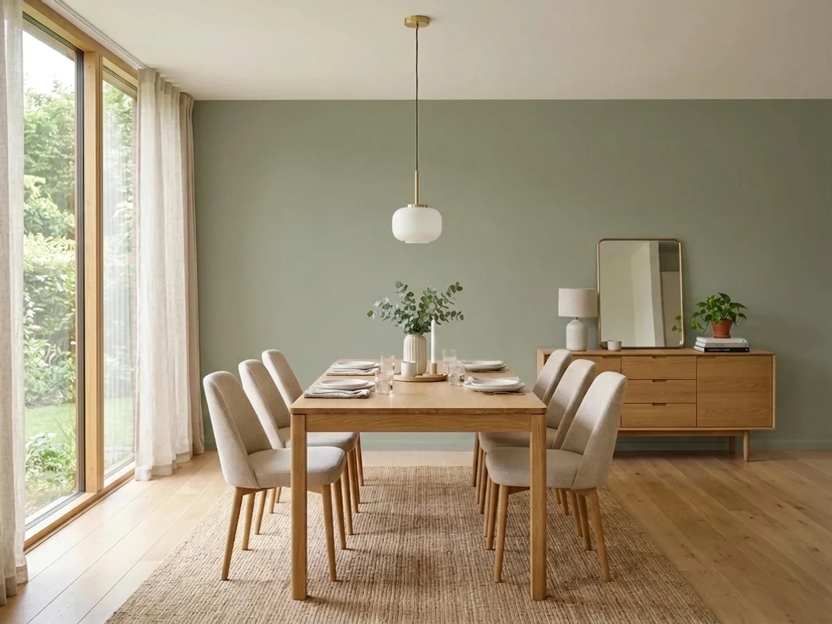
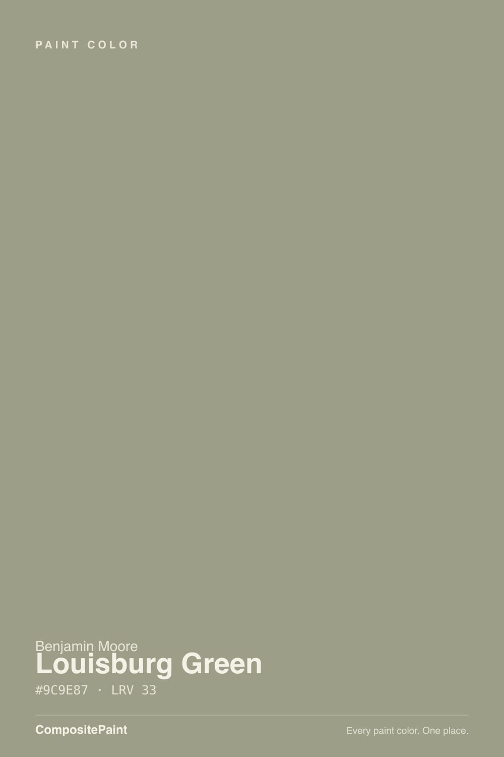
- 1Vintage Vogue12
- 2Sage Green22
- 3Louisburg Green33
- 4Clary Sage41
- 5October Mist47
The Fast Verdict
Louisburg Green is not the bright, leafy sage the name suggests — it is a grayed, faintly blue-cool green from Benjamin Moore's 1976 Historical Color Collection, the shade you find on the paneled library of a 1920s center-hall colonial. At LRV 33 it is a genuine depth color: rich and quiet in good light, capable of going near-black in a dim corner. It has never chased a trend and does not need to; used with intent on cabinets, a den, or a front door, it is one of the most flattering greens Benjamin Moore makes.
Libraries, dens and home offices · kitchen cabinets · front doors and shutters · anyone who wants a real historical green, not a trend sage
You want a bright, grassy green · the room has one small north window and no lamps · your trim is a stark cool white · you want the palest, safest sage in the deck
- A real historical green — grayed, balanced, never leafy-bright or trendy
- Beat six other popular sages in one real homeowner's side-by-side test
- Excellent on cabinets, vanities and front doors in small, confident doses
- Deep enough (LRV 33) to hold real color and read as a genuine green, not a wash
- A quiet workhorse that was never a Color of the Year and doesn't need to be
- Can read close to flat charcoal-green in a dim, north-facing, lamp-free room
- Not the color for anyone who wanted a bright, grassy green
- Argues with stark, blue-white trim — needs a warm white partner
- Too much depth for an all-day, whole-open-plan wall color in most homes
What Color Is Louisburg Green, Really?
A grayed medium-green with a soft, cool cast — gray and a whisper of blue sit under the green, not warm yellow. That is what keeps it out of "leafy" territory and into "paneled study" territory. Benjamin Moore filed it in the Historical Color Collection, 191 shades unveiled in 1976 for the US Bicentennial and pulled from historic landmarks and preserved interiors, and Louisburg Green wears that pedigree honestly: it looks like a color a house already had, not one invented to sell this season.
At LRV 33 it sits solidly in depth-color range — not a pale sage you can use everywhere without a plan, and not a near-black either. In real daylight it reads as a confident, balanced green-gray, neither too blue nor too brown, which is exactly the quality one Houzz homeowner cited for picking it over Svelte Sage, Grassland, Saybrook Sage, Olive Branch, Dry Sage and Rosemary Sprig — six competing greens auditioned and rejected first. That same homeowner asked the honest question before committing: would it feel "dark and oppressive" across an entire living-dining-den run. The answer is light-dependent, and the fails section below explains exactly when.
Undertone in one line: green first, gray second, a whisper of blue third — never yellow, never brown. If your sample looks flat and colorless, that is a dim room pulling the green out of it, not a defect in the paint.
Where It Shines
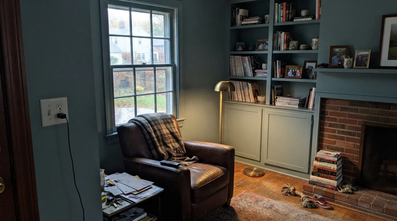
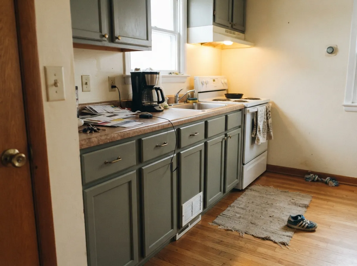
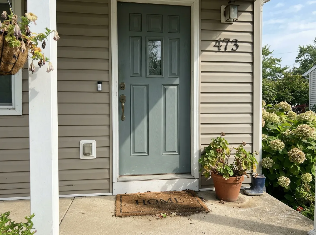
Give it a room with real daylight or a warm lamp at night and it earns the word "historical" without irony — dense, quiet, a little literary. It is a natural for the enclosed room: a den, a library, a study with built-ins, where the goal is atmosphere rather than brightness. Its second home is cabinets — lower kitchen cabinets or a bathroom vanity in Louisburg Green under a warm white wall reads custom and old-house-authentic in a way a trend sage rarely manages, and on a front door it gives a white or pale-gray house one grounded, slightly formal note without going full black.
Where It Fails
Almost every regret story about Louisburg Green comes from one of three mismatches, and all three are predictable before the first coat. None of them are the paint's fault — but if your room or your expectation matches one, this is not your green, and a bigger sample will only confirm it.
The gray base is the whole design of this color, and it caps how saturated it can ever look. If you pictured grass or fresh basil, Louisburg Green will read muted and disappointing next to that mental picture — look at a warmer, higher-chroma green instead, not this one in a brighter light.
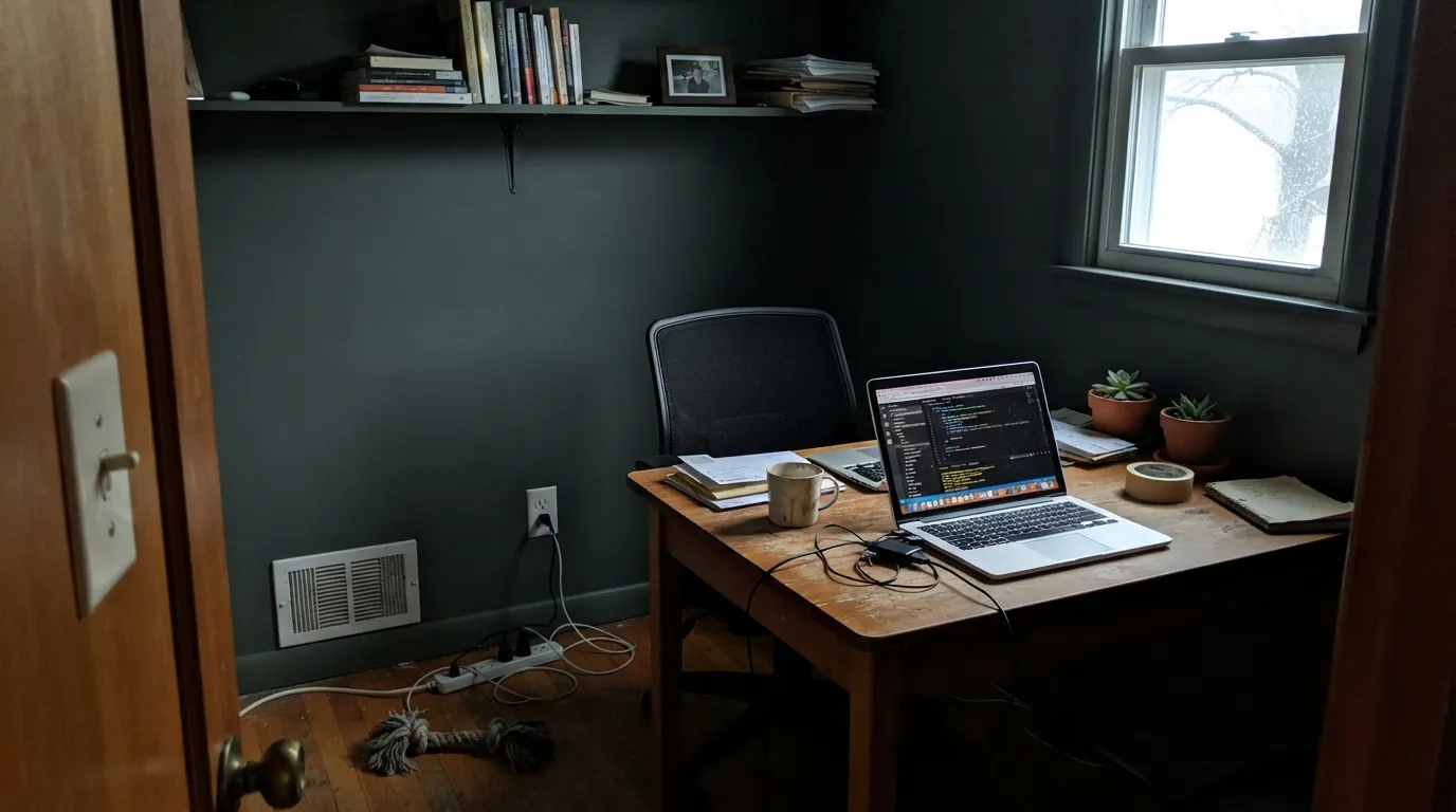
LRV 33 already means the color absorbs more light than it reflects; take away the daylight and it can read close to a flat charcoal-green, not the rich library tone the sample promised. This is the exact fear the Houzz homeowner named before painting — "dark and oppressive" — and it is real if the room stays dim all day. Warm 2700K lamps fix it; an unlit north room does not.
Pair the blue-cool undertone with a bright, blue-white trim (Chantilly Lace territory) and the two colors argue instead of cooperate — the wall can look muddier and the trim can look clinical. A warm white trim like White Dove or Swiss Coffee gives the green somewhere to land.
Room by Room
This is the room the color was built for: built-ins, leather, brass reading-lamp light. Eggshell on the walls, White Dove trim in semi-gloss, warm bulbs at 2700K. The one-Houzz-post proof: a homeowner ran it across a full living-dining-den suite and, with white wainscoting to break up the weight, called it the only green they'd auditioned that actually worked.
Lower cabinets in Louisburg Green under Swiss Coffee or White Dove walls, with brass or unlacquered-brass hardware, is the old-house-cabinet look people search for by mood, not by name. Satin cabinet enamel; expect the color to look noticeably calmer in daylight than it does under cabinet-light alone.
On a white, pale gray or warm-neutral house it reads as one grounded, slightly formal accent — more character than black, less severe than navy. Semi-gloss or gloss exterior finish; expect full sun to lift it noticeably brighter than the chip.
A vanity or a powder-room accent wall in Louisburg Green with warm white tile, marble and brass fixtures is genuinely charming and costs one gallon of paint. A full bathroom of it needs a window — windowless powder rooms should lean on a warm sconce, not overhead LEDs.
Beautiful when the room gets real daylight through the day; riskier as an all-day color in a north-facing or single-window layout. White wainscoting or a lighter ceiling helps carry the depth without the room feeling closed in.
As a full-house color it goes dark and flat in shade the way any LRV-33 green does; it works far better as a door, shutter or trim accent against a lighter siding than as the siding itself.
Your Light Is the Risk
Full daylight shows the balanced, true green-gray at its most confident — neither too blue nor too brown. Sample here first.
Cool, dim daylight drains the green and pushes it toward flat, near-charcoal. The color most readers call "dark and oppressive" happens here, not in a bright room.
Cooler and grayer in early morning east light, noticeably warmer and greener through a west-facing golden hour.
2700K warm bulbs bring the green forward and keep the room feeling like a library. Cool white LEDs flatten it toward gray — change the bulb before you change the paint.
Most complaints about Louisburg Green are a light mismatch. Upload a photo of your actual room and see it on your walls — then ask for the same wall in north light or evening lamps before you buy a single sample.
Need It From Another Brand?
Any paint counter can custom-tint Benjamin Moore HC-113 directly. If you would rather stay in one brand's own deck, these are the closest stock matches, measured as ΔE2000. Under 2 is a difference you will not see on the wall.
| Brand | Closest color | ΔE | LRV | |
|---|---|---|---|---|
| Behr | Shadow TaupeBNC-24 · Behr | 1.4 | 32 | Color page → |
| Valspar | BushelT617 · Valspar | 3.8 | 33.4 | Color page → |
| PPG / Glidden | Zebra GrassPPG1126-5 · PPG / Glidden | 2.2 | 35 | Color page → |
| Glidden | Khaki Green60YY 33/130 · Glidden | 3.4 | 33 | Color page → |
| Dutch Boy | Mossed Thicket424-3DB · Dutch Boy | 2.7 | 35 | Color page → |
| Dunn-Edwards | Flagstone QuartziteDET517 · Dunn-Edwards | 0.9 | 33 | Color page → |
Similar Benjamin Moore Colors
The nearest shades to Louisburg Green within Benjamin Moore's own range, ranked by perceptual color distance — useful when you want the same look a touch lighter, darker, or warmer.
WCAG 2.1: AA is 4.5 : 1 for normal text, 3 : 1 for large text, AAA is 7 : 1.
Louisburg Green vs the Colors You're Also Considering
Every Louisburg Green sample board has the same rivals on it. The numbers show the real lightness gap — then it comes down to which risk you would rather live with.
Pick this for the cooler, more explicitly blue-green, more overtly historical read.
Sherwin-Williams SW 9130 · LRV 30Evergreen FogPick this if your painter works in Sherwin-Williams — a close cousin at nearly the same depth, a touch warmer and more forgiving in dim rooms.
Pick this for real depth and a genuinely historical, library-dark green instead of a pale wash.
Benjamin Moore HC-114 · LRV 56Saybrook SagePick this for a lighter, easier whole-room sage that doesn't need daylight to avoid going flat.
Raintree Green 1496, also sold as CC-560, is the nearest neighbor in the line at #9A9C87 and LRV 32. On a wall the two are hard to separate. River Gorge Gray 1537 at LRV 32 shares the depth but shifts toward gray-brown, so pick it if you want less green. Texas Sage 1503 and Stanley Park CC-602 both sit at #A39F87 and LRV 34, a hair lighter and slightly more yellow, and Dry Sage 2142-40 at LRV 34 pushes the yellow furthest.
Across brands, Farrow and Ball Lichen No. 19 at LRV 34 and Hirshfield's Wainscot Green H0081 at LRV 33 both come in at deltaE 0.61, close enough to call the same color. Dunn-Edwards Flagstone Quartzite DET517 at deltaE 0.94 is in the same group. C2 Lilypad C2-683 at deltaE 1.08 and Behr Shadow Taupe BNC-24 at deltaE 1.43 are visually identical in normal room light. PPG Zebra Grass PPG1126-5 at deltaE 2.16 and Dutch Boy Mossed Thicket 424-3DB at deltaE 2.74 are very close but worth sampling first. Valspar Bushel T617 at deltaE 3.76 is close but visibly different side by side.
Louisburg Green Coordinating Colors
The rule for coordinating with Louisburg Green is simple: warm whites and warm neutrals give it somewhere to land, and near-blacks or warm greiges add the one deeper or lighter note the room needs. Stark cool whites and icy blues are the pairings to skip. These are the partners that keep showing up in rooms that work:
A Historical Color, Not a Trend Color
Louisburg Green is one of 191 shades in Benjamin Moore's Historical Color Collection, unveiled in 1976 for the US Bicentennial and pulled from preserved landmark interiors rather than invented for a season. That is a useful thing to know before you shop it against a viral sage from a recent trend palette: it was never positioned to go viral, was never named a Color of the Year, and has quietly stayed in the deck for decades regardless of what greens were fashionable in a given year.
That honesty is the appeal. Designers and old-house owners reach for it specifically because it reads like a color the house already had — a paneled study, a colonial-revival library, a front door that's been there for decades — rather than a color that announces the year it was painted. If your goal is a green with real weight and a real pedigree rather than the season's most-searched sage, this is the honest version of that request.
Louisburg Green With Wood Tones and Floors
This decision is mostly about temperature. Medium and honey-toned oak floors balance Louisburg Green's cool, gray-blue base nicely — the warm wood keeps the room from feeling cold. Walnut and other dark, warm-brown woods also work, adding richness rather than fighting the green.
The one combination that needs a sample first is very dark, cool-toned flooring — ebonized or espresso-stained boards with a gray or cool cast. Two deep, cool tones stacked together can make a room feel heavier than either color does alone; a lighter ceiling, white trim, or a large warm rug keeps that from tipping into gloomy.
Metals: unlacquered brass and antique bronze are the classic pairing and the reason this color shows up on so many old-house cabinets. Matte black works on hardware and light fixtures. Polished chrome and nickel read a touch cold next to it — not wrong, just crisper and more modern than the color's own character.
Three Ready Palettes Built on Louisburg Green
A color is never alone on the wall. These are complete combinations in the 60-30-10 pattern, with the reason each one holds together. Every one opens in the visualizer.
White Dove keeps the green from feeling closed-in on the millwork, and Kendall Charcoal adds one deeper note so the room reads deliberate, like a real historic library rather than a paint-chip experiment.
Try this palette in your roomA warm cream wall gives the cool green somewhere to land instead of arguing with it, and two-tone cabinets keep the whole kitchen from feeling as dark as the green alone would read on every surface.
Try this palette in your roomRevere Pewter's warm greige keeps the cool green door from feeling stark against the siding, and White Dove trim frames the whole facade without the harsh edge a bright white would add.
Try this palette in your roomLouisburg Green FAQ
Is Louisburg Green actually green, or more gray?
Green first — the gray is a modifier, not the main event. In good daylight it reads as a confident, balanced green-gray; only in a dim, north-facing, lamp-free room does the gray take over and the green fade. If you want a color that's mostly gray with a hint of green, look at a lighter deck color instead.
Is it good for kitchen cabinets?
Yes, especially lower cabinets under a warm white or cream wall with brass or unlacquered-brass hardware. It gives an old-house feel that trend sages don't. Use a satin urethane-fortified cabinet paint, and expect it to read calmer in real daylight than under cabinet-light alone.
What trim white goes with Louisburg Green walls?
A warm white — White Dove or Swiss Coffee — not a stark, blue-leaning white. A cool bright white like Chantilly Lace fights the green's undertone; a warm white gives it somewhere to rest.
Will it feel too dark in a small room?
Only if the room has little real daylight. A real Houzz owner asked this exact question before painting a living-dining-den run and found it worked — with white wainscoting to break up the wall and real daylight through the day. A windowless or north-only room is the one situation where "dark and oppressive" is a fair worry.
Does it work with wood floors?
Yes, especially medium and honey-toned oak — the warmth in the floor balances the green's cool base. Very dark espresso floors plus Louisburg Green walls can read heavy together; a lighter ceiling or trim helps if that's your floor.
Is this the same as Sherwin-Williams Evergreen Fog?
Close cousins, not twins. Both are grayed, mid-depth greens near LRV 30–33, but Louisburg Green leans a step cooler and more explicitly historical, while Evergreen Fog reads slightly warmer and is more forgiving in a dim room. Either is a safe swap if your painter only stocks one brand.
Have you painted with Louisburg Green?
Rate it — one tap helps the next reader decide.
Ask a Question