Filmy Green
A quiet gray-green sold as a whole-house neutral, reviewed honestly: the light where it holds its green, the light where it flattens to plain gray, and what to pick instead.

Jessica has spec'd whites and neutrals for more than 300 rooms and keeps a sample wall of painted drawdowns in her studio. Every color review is checked against real reader rooms in the comments and re-tested when a formula changes. About the testing process →
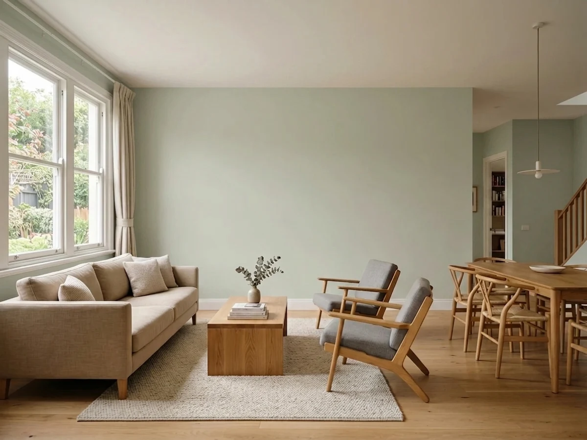
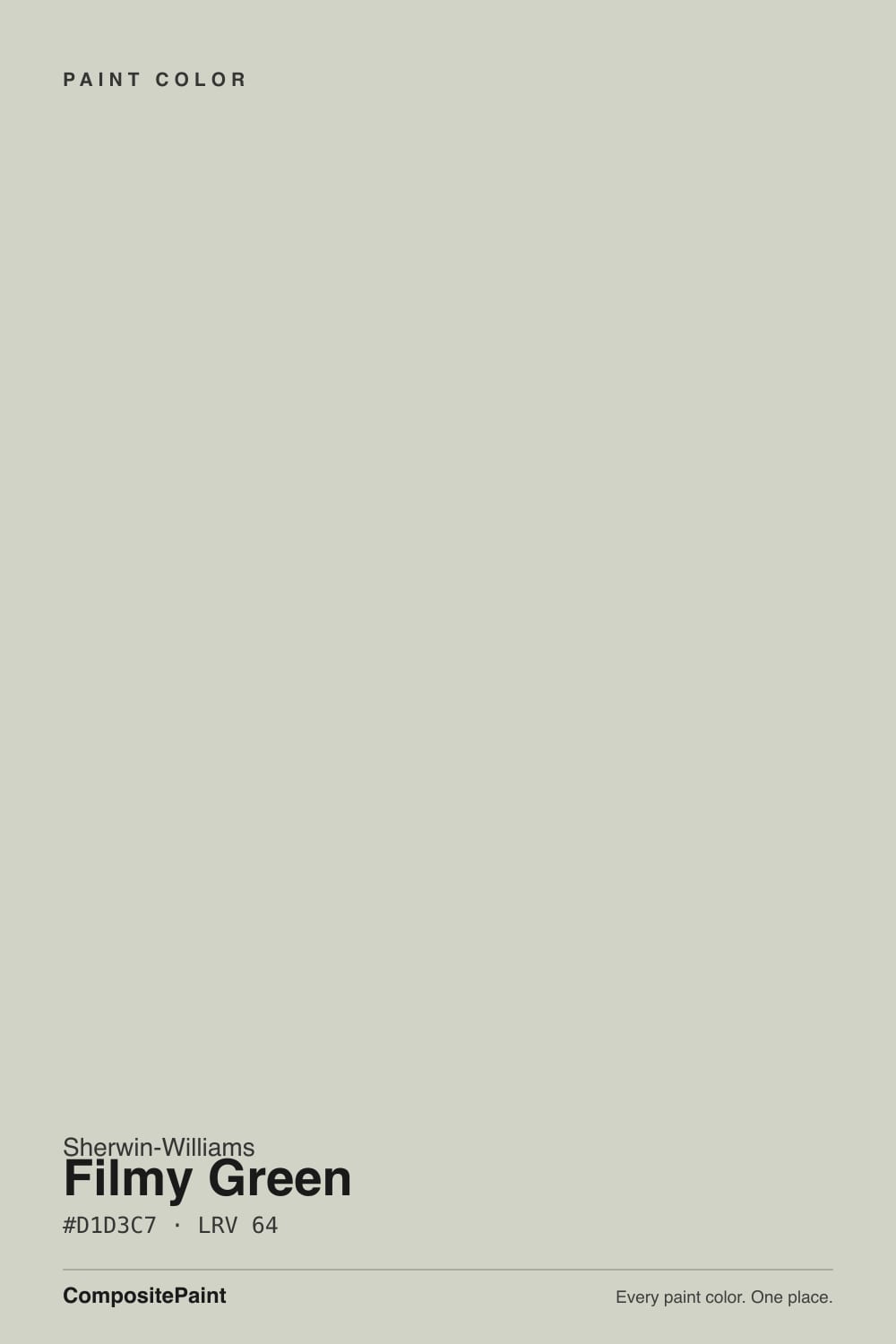
- 1Stardew43
- 2Upward57
- 3Filmy Green64
- 4Glass Slipper70
- 5Spring Thaw83
The Fast Verdict
Filmy Green answers a question a lot of buyers ask without saying it out loud: can a green be this quiet? At LRV 64 it barely reads as a color in some light — a pale, cool gray-green that behaves like a soft neutral with a whisper of sage underneath, not a statement wall. That restraint is the whole appeal: it slides into a whole-house scheme the way a good greige does.
The catch is being honest about how thin that whisper actually is once the light turns cool.
Whole-house walls in rooms with real daylight · kitchen cabinets under white counters · bedrooms and bathrooms that want calm, not drama · anyone circling sage green but not ready to commit to real color
You want a green anyone would name on sight · your room runs cool LEDs with little daylight · you're chasing the deeper, mossier sage look · your trim is a stark blue-white
- Genuinely restful, low-drama gray-green that works as a whole-house neutral
- Reads as "a little bit of color" without committing to a bold green statement
- Flatters light wood, rattan, and wicker — a natural fit for cottage and coastal rooms
- High LRV (64) keeps rooms bright even with a tinted wall
- Pairs cleanly with Pure White trim and warm brass hardware
- So low-chroma it can read as plain gray in bright or cool light
- Buyers expecting a visibly "sage" green are the most common disappointed reviewers
- Needs a warm room or warm bulbs to hold its green cast at all
- Not a statement color — the wrong pick if you want green to read as green from across the room
What Color Is Filmy Green, Really?
Filmy Green sits at the extreme pale, low-chroma end of Sherwin-Williams' green family — so far out that most days it reads closer to a soft gray-green neutral than a green anyone would point at and name. The base is cool: a gray-blue foundation with a thin thread of green running through it, rather than a true sage built on yellow. That low saturation is also why the undertone reads a little differently depending on who's describing it — some see gray-blue, some catch a soft warmth in it — and both are correct, because a color this desaturated genuinely shifts with the light hitting it rather than holding one fixed personality.
At LRV 64 it reflects a lot of light, putting it in the same brightness band as two colors it gets compared to constantly: Sherwin-Williams Sea Salt (LRV 63) and Repose Gray (LRV 58). Side by side, Filmy Green reads slightly greener and Sea Salt reads slightly bluer-gray — a real but subtle difference, which is exactly why third-party color-comparison sites keep putting the two head to head. If you've been served both as "the same color" by two different showrooms, this is why.
Undertone in one line: a cool gray-green that leans on gray more than it leans on green. In warm, direct daylight and next to light wood it holds a soft sage cast; in flat or cool light the green recedes and what's left reads as a plain, slightly cool gray. Neither read is wrong — it is genuinely that light-dependent, more so than most colors this pale.
Where It Shines
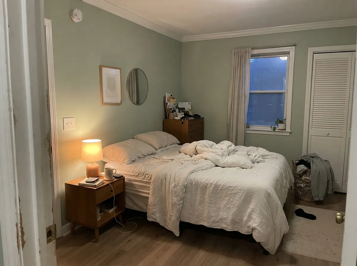
Give it real daylight, light wood, and a white trim and it earns the comparisons to a much pricier "quiet luxury" neutral. It shows up most often on design blogs as bedroom and bathroom advice — a calm backdrop for rooms meant for winding down — and its second life is on kitchen cabinets, where the pale green-gray reads sophisticated rather than trendy against white counters and brass. Cottage and coastal interiors love it for the same reason: rattan, wicker, and pale wood all sit easily next to a color this restrained.
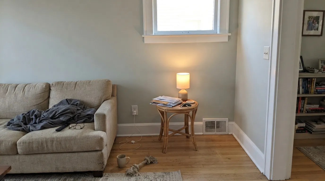
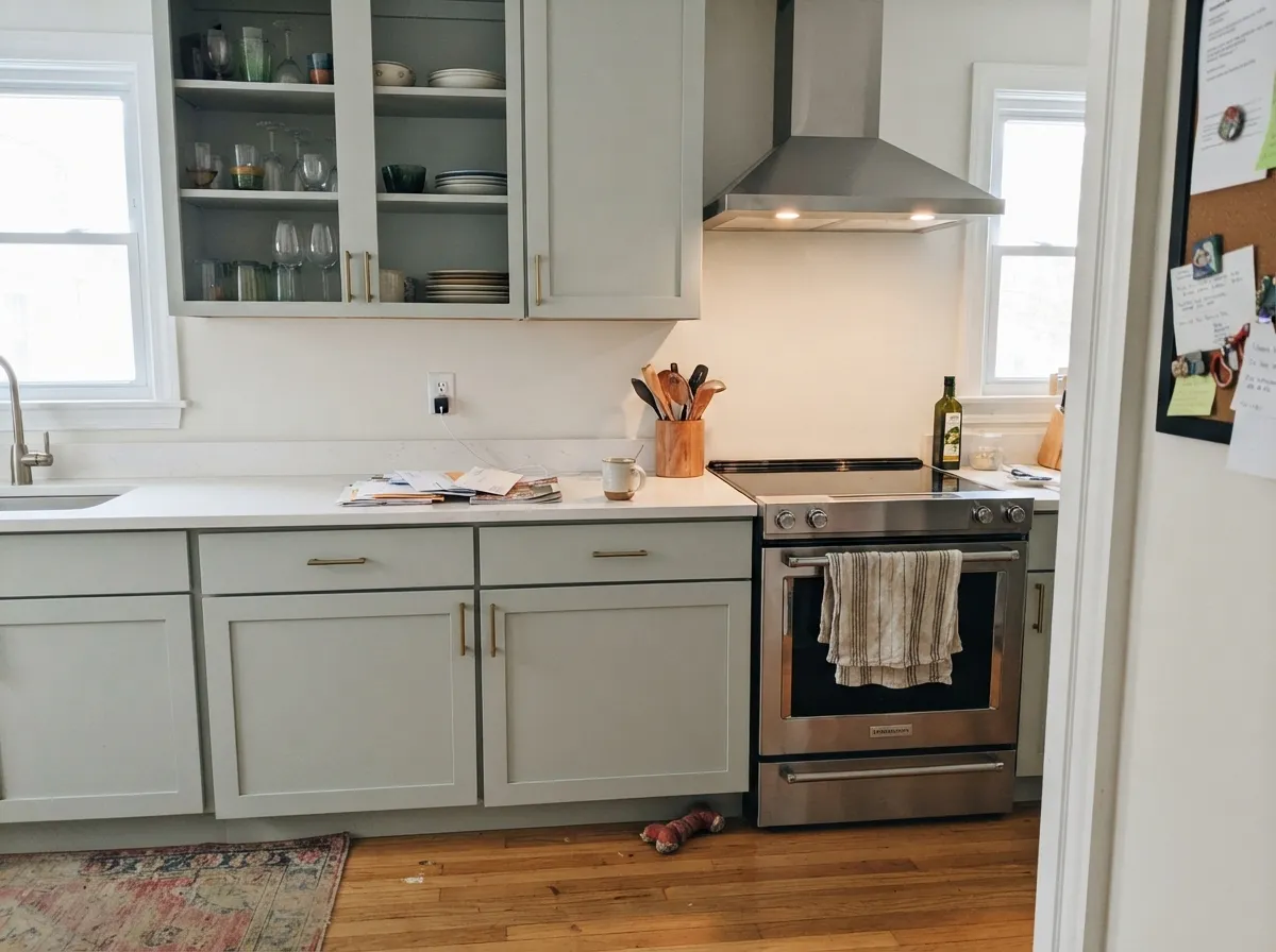
Where It Fails
Nearly every disappointed review of Filmy Green traces back to one of three predictable situations, and none of them are really the paint's fault — the color is simply less saturated than most people expect from a named "green." If your room matches one of these, sampling a bigger swatch will only confirm the problem, not fix it.
The chroma here is so low that on four walls in bright daylight it can look almost gray, with the green only showing up if you compare it directly to a true white. Buyers who saved a photo of a saturated sage kitchen and expected that result are the most common disappointed review. If you want the green to actually read as green from across the room, look at Clary Sage or step all the way to Evergreen Fog instead.
This color needs warmth to hold its undertone — reviewers consistently describe it going flat and gray-blue under cool, low-directional light, and "works best in a warm room" is the recurring advice from paint bloggers who've lived with it. In a dim north-facing room with cool bulbs, expect a quiet gray, not the sage you saw on the fan deck under store lighting.
Like most soft, low-chroma neutrals, Filmy Green looks washed out and slightly dingy beside a cool, high-LRV white — the trim wins the contrast and the wall reads unfinished. Pair it with a warmer white like Pure White rather than a bright, blue-leaning white, and the color settles into itself instead of fighting its trim.
Room by Room
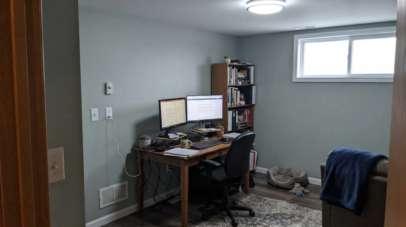
In a room with real windows it reads as a sophisticated, barely-there color that lets furniture and art do the talking. Eggshell finish; keep the trim warm-white, not stark.
On cabinets against white counters and brass hardware it reads calm and current without chasing the loudest sage trend. Satin cabinet enamel; pair with Pure White walls to keep the room bright.
The most common advice for this color online, and for good reason: low, warm evening light is exactly the condition where it holds its green best. Matte or eggshell, warm 2700K bulbs, light or white bedding.
Works well as a full-room color or an accent wall behind a vanity. Reviewers note it can feel like a lot on all four walls of a very small windowless bath — consider one accent wall if your bathroom has no natural light at all.
Calm without being cold makes it a reasonable pick for rooms meant for focus or sleep. Same rule applies: it needs either daylight or warm lamps to avoid reading flat by afternoon.
There isn't much real-world exterior evidence for this specific color yet — it shows up far more often indoors. Full sun will read it brighter and cooler than any interior sample; test a large outdoor swatch before committing a whole facade to it.
Your Light Is the Risk
Direct warm sun brings the green forward and it holds a genuine soft-sage cast. The light this color was chosen for.
Cool, flat light strips the green out and leaves a plain, slightly blue-gray wall. Test in your actual room before trusting the fan deck.
Cooler and grayer in the morning, warmer and greener by midday — a gentle daily shift most owners describe as pleasant, not distracting.
2700K warm bulbs bring the sage back out at night. Cool white LEDs push it right back toward plain gray — swap the bulbs before you swap the paint.
Most complaints about Filmy Green are a light mismatch. Upload a photo of your actual room and see it on your walls — then ask for the same wall in north light or evening lamps before you buy a single sample.
Need It From Another Brand?
Any paint counter can custom-tint Sherwin-Williams SW 6190 directly. If you would rather stay in one brand's own deck, these are the closest stock matches, measured as ΔE2000. Under 2 is a difference you will not see on the wall.
| Brand | Closest color | ΔE | LRV | |
|---|---|---|---|---|
| Behr | Natural SpringQE-33 · Behr | 0.6 | 65 | Color page → |
| Benjamin Moore | Night Mist1569 · Benjamin Moore | 0.9 | 63 | Color page → |
| Valspar | Misty Memory8004-29B · Valspar | 0.7 | 63 | Color page → |
| PPG / Glidden | Frivolous FollyPPG1128-2 · PPG / Glidden | 0.8 | 63 | Color page → |
| Glidden | Frivolous FollyPPG1128-2 · Glidden | 0.6 | 63 | Color page → |
| Dutch Boy | White Rapids425-1DB · Dutch Boy | 2.1 | 63 | Color page → |
Similar Sherwin-Williams Colors
The nearest shades to Filmy Green within Sherwin-Williams's own range, ranked by perceptual color distance — useful when you want the same look a touch lighter, darker, or warmer.
WCAG 2.1: AA is 4.5 : 1 for normal text, 3 : 1 for large text, AAA is 7 : 1.
Filmy Green vs the Colors You're Also Considering
Every Filmy Green sample board has the same rivals on it. The numbers show the real lightness gap — then it comes down to which risk you would rather live with.
Pick this for the version with more green in it, especially against warm wood tones.
Sherwin-Williams SW 6204 · LRV 63Sea SaltPick this if you want the cooler, bluer sibling — Sea Salt reads gray-blue where Filmy Green reads gray-green, and it's the color most often confused with this one.
Pick this for the pale, whole-house-safe version that plays as a neutral rather than an accent color.
Sherwin-Williams SW 9130 · LRV 30Evergreen FogPick this if you actually want green to read as green from across the room — Evergreen Fog is more than twice as deep and commits fully to sage.
Filmy Green Coordinating Colors
Filmy Green sits in a crowded family of pale, cool, low-chroma greens and greiges, so the coordinating rule is simple: stay cool, stay quiet, and save the warmth for a deeper accent rather than the trim. These are the partners that keep showing up alongside it:
Filmy Green's Story: The Quiet Alternative to Sage
Filmy Green has never had a Color of the Year moment and isn't tied to a famous room or a celebrity renovation — it is, honestly, one of the deck's quieter workhorses. Its real reputation is built one design blog and one Pinterest board at a time, usually framed as the answer for someone who likes the idea of sage green but doesn't want a wall that reads as a decision. It shows up in that role constantly, positioned against louder, more saturated sages as the safer, paler pick.
That positioning is honest, and it's also the color's whole identity: Filmy Green competes in an unusually crowded lane of pale, cool gray-greens — Sea Salt, Repose Gray, Silver Strand — and its distinction is being simultaneously paler and slightly greener than most of the field at once. It's not the color you pick to make a statement. It's the color you pick when you want the room to feel a degree calmer without anyone quite being able to say why.
Filmy Green With Wood Tones and Floors
This color was practically built for light wood. White oak, rattan, wicker, and pale ash all sit easily against it, which is why it shows up so often in cottage and coastal-styled rooms — the natural materials carry the warmth the paint itself doesn't have much of. Cool woods (gray-washed oak, driftwood-finish LVP) are also safe; two cool, quiet elements together just read as restrained, not clashing.
The floor that needs a sample first is deep, reddish honey oak. The warmth and saturation of that wood can make Filmy Green's already-faint green look thinner and grayer by contrast, and the pairing can drift toward feeling unfinished rather than intentional. It isn't a hard no — warm brass and a rug help — but test a large swatch above the actual floor before committing a whole room.
Three Ready Palettes Built on Filmy Green
A color is never alone on the wall. These are complete combinations in the 60-30-10 pattern, with the reason each one holds together. Every one opens in the visualizer.
Pure White is the warmer trim white this color needs to avoid looking washed out; Iron Ore's cool near-black anchors the scheme without fighting the wall's cool gray-green base the way a warm black would.
Try this palette in your roomPure White walls keep the kitchen bright while the cabinets carry the color; Chelsea Gray on the island adds weight without introducing warmth that would fight Filmy Green's cool base.
Try this palette in your roomTonal layering inside the same gray-green family reads deliberate rather than mismatched, and the deeper Evergreen Fog gives the room the one point of real color depth Filmy Green is too pale to provide on its own.
Try this palette in your roomFilmy Green FAQ
Is Filmy Green actually green, or is it basically gray?
Both, depending on the light. At this low a saturation and LRV 64, it holds a genuine soft-sage cast in warm daylight and reads as a plain cool gray under flat or cool light. If you need it to look unmistakably green every day regardless of light, it's too subtle a color for that job.
What's the undertone?
A cool gray-blue base with a thin thread of green running through it — never a warm, yellow-based sage. Because it's so desaturated, a few sources describe a faint warm read in strong afternoon sun; that's the light shifting a naturally cool, low-chroma color, not a hidden yellow undertone.
What trim white goes with Filmy Green?
Pure White is the recommended pairing — warm enough that it doesn't make the wall look washed out. A stark, blue-leaning white trim is the most common styling mistake reported with this color; it steals the contrast and leaves the wall looking dingy by comparison.
Filmy Green or Sea Salt — which one should I pick?
They're close enough that some painters treat them as interchangeable, but they aren't. Sea Salt leans bluer and grayer; Filmy Green leans slightly greener and reads a touch warmer against wood. If you're choosing between the two, sample both on the same wall — the difference is subtle but real.
Does it work on kitchen cabinets?
Yes — it's one of its strongest applications. Against white counters, brass or matte-black hardware, and butcher block it reads calm and current rather than trend-chasing. Use a satin cabinet enamel and keep the surrounding walls in a warmer white.
Does it work on an exterior?
There isn't much documented real-world exterior use of this specific color yet — nearly all the evidence is interior. Full sun will read it brighter and cooler than any indoor sample, so test a large outdoor swatch on the actual house before committing a facade to it.
Have you painted with Filmy Green?
Rate it — one tap helps the next reader decide.
Ask a Question