Urban Nature
Behr's grounded olive-sage, reviewed honestly: the warm light that makes it glow, the cool rooms that flatten it, and what to pick instead.

Jessica has spec'd whites and neutrals for more than 300 rooms and keeps a sample wall of painted drawdowns in her studio. Every color review is checked against real reader rooms in the comments and re-tested when a formula changes. About the testing process →
- 1Sage Green22
- 2Evergreen Fog30
- 3Urban Nature51
- 4Soft Fern57
- 5Hancock Green66
The Fast Verdict
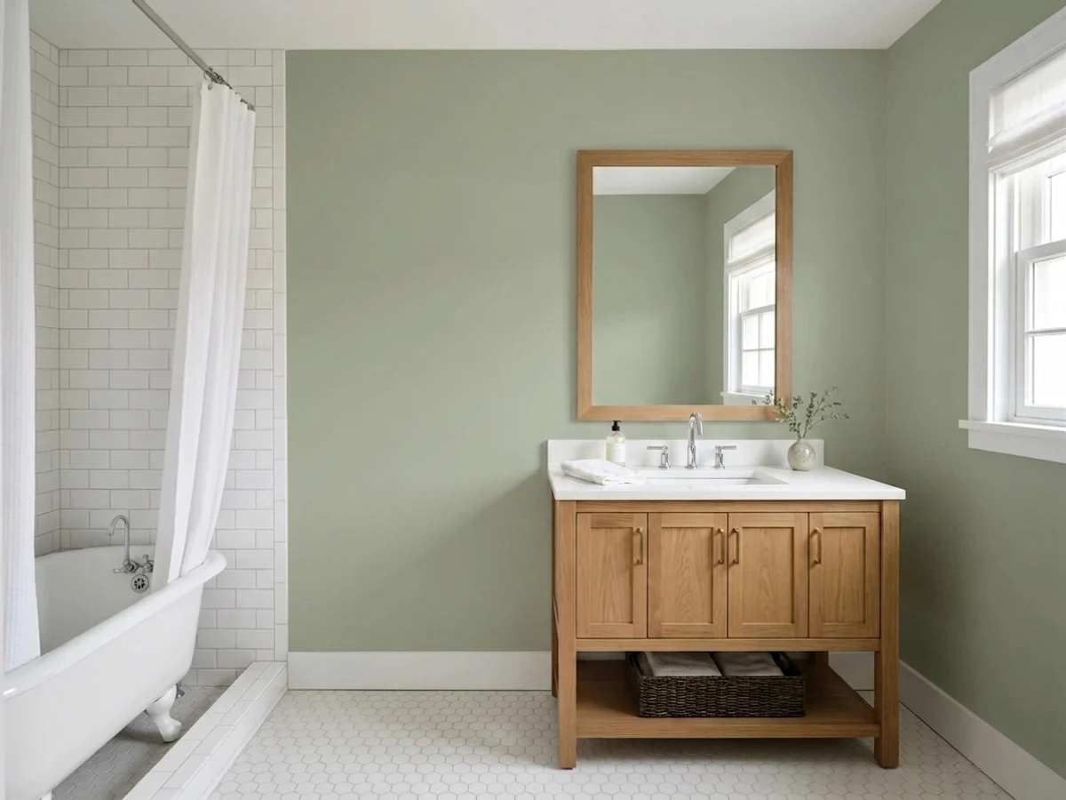
Urban Nature is Behr's answer to the sage-green moment, except it isn't quite sage — it's olive. A warm yellow undertone runs under the gray, so instead of the cool, ashy green everyone pictures when they say "sage," you get something closer to a grounded botanical neutral. That warmth is the whole personality: give it real daylight and it reads calm and expensive next to brass and soapstone; take the daylight away and the gray takes over, leaving a flatter, cooler green that some readers will actually prefer and others will call disappointing.
Kitchen cabinets with soapstone or brass hardware · Craftsman and mid-century exteriors · living rooms and studies with real daylight · anyone who wants a green that reads as a neutral, not a statement
Your room runs on cool LEDs and gets little direct light · your counters or floors are icy Carrara marble or gray-blue quartz · you searched "sage green" wanting something cooler and grayer · you need a color with instant name recognition to sell a design idea
- A genuine warm olive-green that reads as a neutral, not a statement color
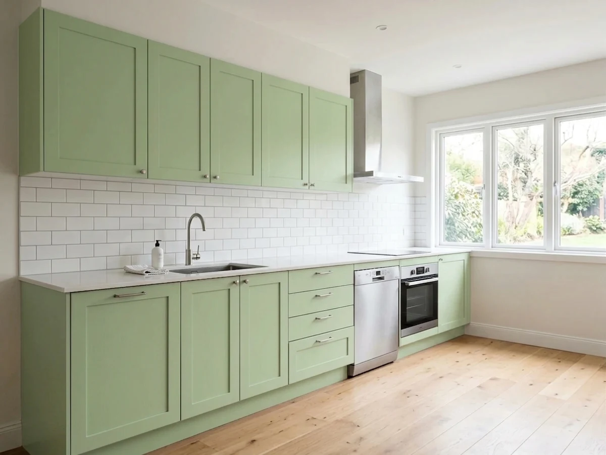
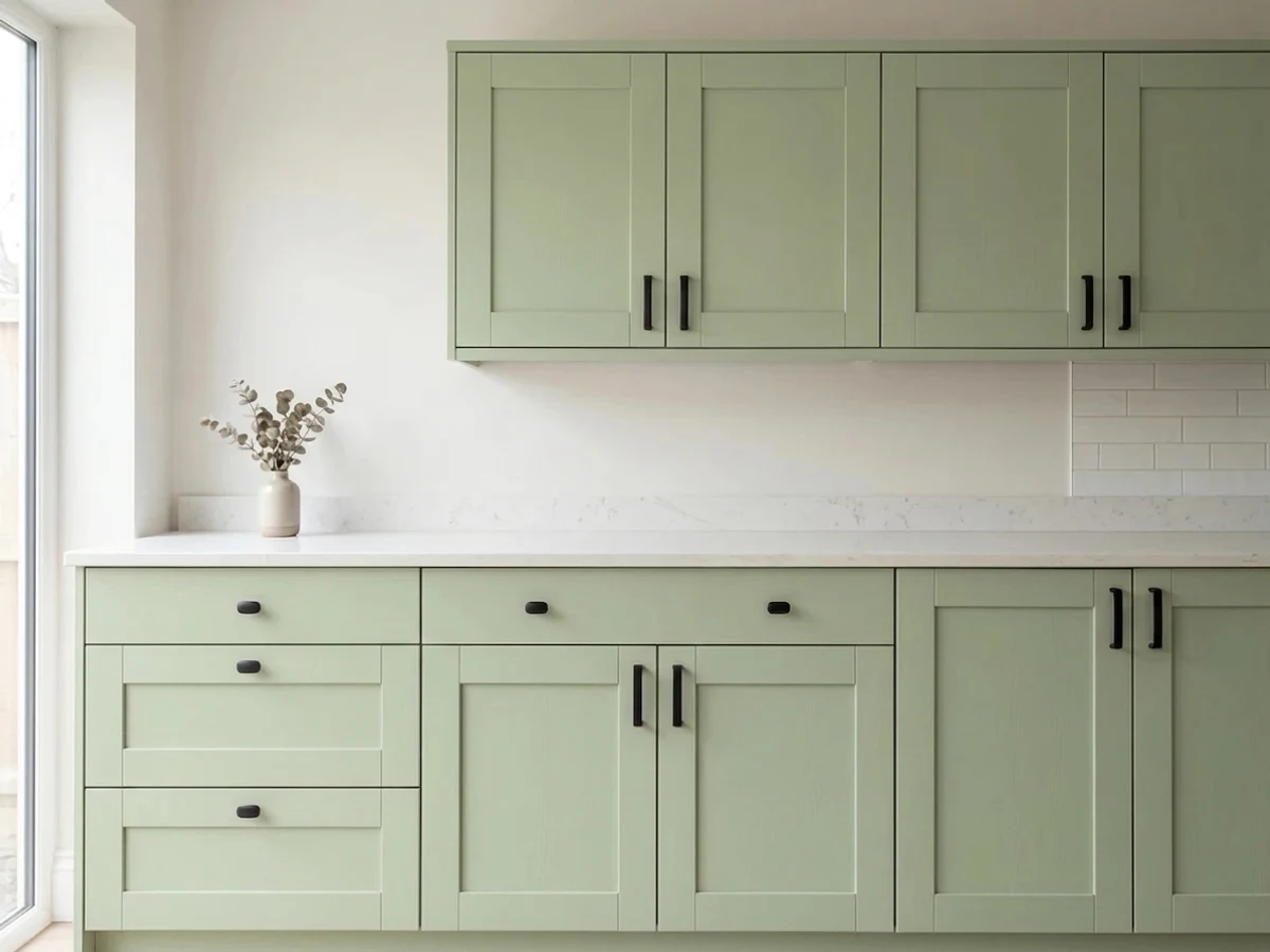
- Kitchen cabinets: pairs beautifully with soapstone, brass, and butcher block
- LRV 51 keeps it light enough to live on four walls, not just an accent
- Reads grounded and intentional on Craftsman and mid-century exteriors
- A dependable, unhyped color — no trend cycle to age out of
- Cool north light or cool LEDs drain the warmth into a flatter, silvery gray-green
- Icy Carrara marble, gray-blue quartz, and chrome fight its warmth instead of complementing it
- Warmer and more yellow than most colors marketed as "sage" — a real surprise for some buyers
- Little name recognition; no Color of the Year moment or viral room to sample blind against
What Color Is Urban Nature, Really?
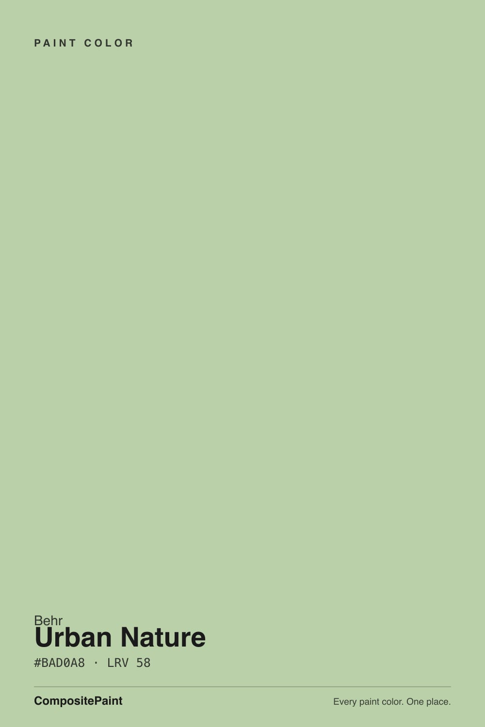
A muted botanical green with a warm yellow undertone and just enough gray to keep it from reading as grass-green. Behr built Urban Nature (S380-3) to sit in the crowded sage-green lane without actually being a sage — most "sage" colors lean blue-gray-green and stay cool in any light; Urban Nature leans yellow-green and stays warm as long as the room gives it something to work with. That's a deliberate trade: it costs the color some of the icy, of-the-moment sage look, but it buys real warmth that plays nicely with wood and brass instead of fighting them.
At LRV 51 it sits in the light-to-mid range — lighter than a true accent green, dark enough to read as unmistakably green rather than a green-tinted white. Compared to a deeper cabinet sage like SW Evergreen Fog (LRV 30), Urban Nature is noticeably lighter and more livable across a whole room; compared to a true sage like BM Saybrook Sage (LRV 56), the two sit almost side by side, with Urban Nature carrying a touch more yellow. That LRV is also why it survives on four walls where deeper greens need to be rationed to an island or a door.
Undertone in one line: yellow-green first, gray second, never blue. If your sample looks silvery or flat, that's cool light or a north exposure talking — not a different can of paint.
Where It Shines
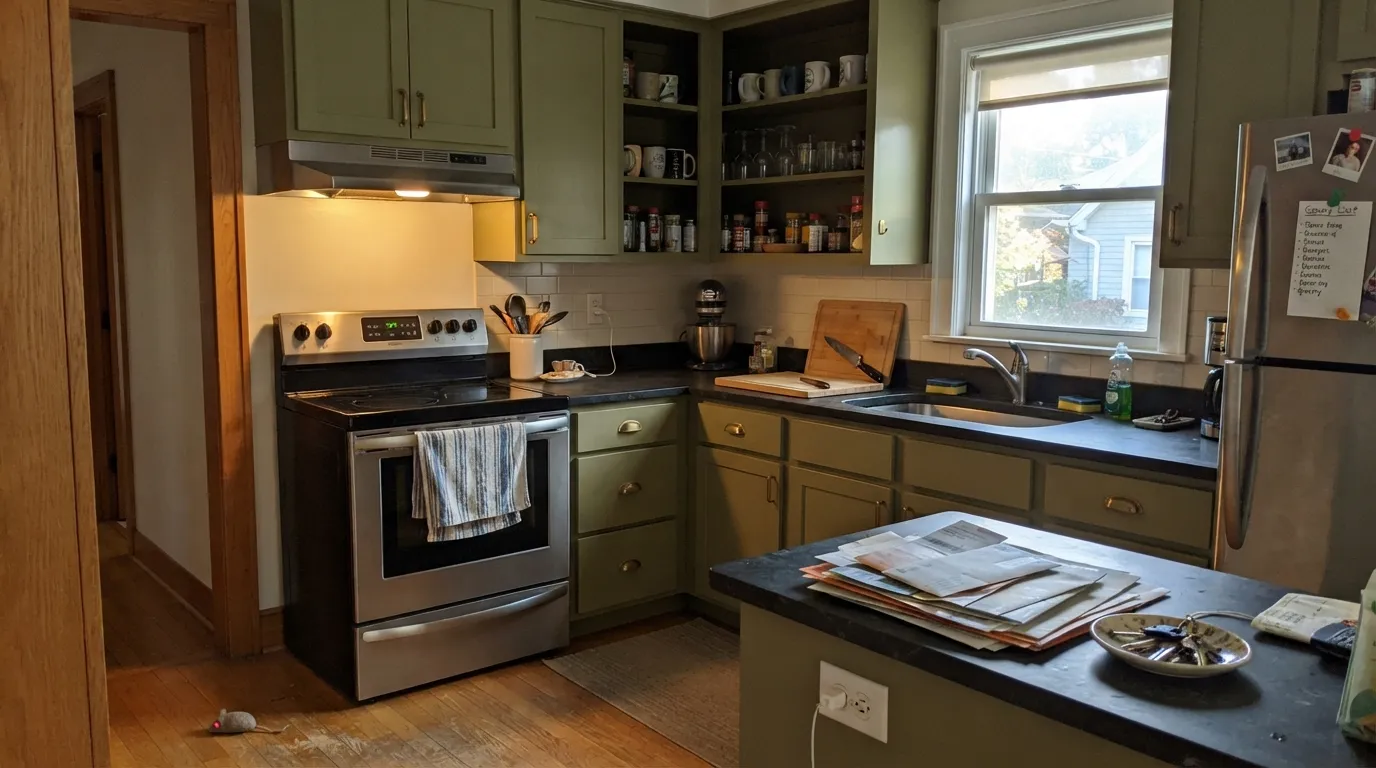
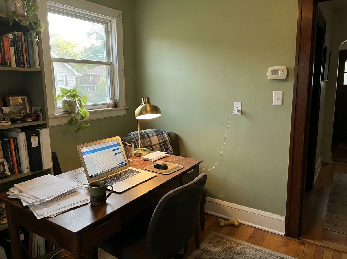
Give it warm daylight or a warm bulb and this is a genuinely good color. Kitchens are its best room — on cabinets it sits beautifully against soapstone, butcher block, and unlacquered brass, and the olive cast keeps it from feeling like a themed "green kitchen." It also does real work outside: on Craftsman and mid-century siding it reads grounded and intentional rather than trendy, which is a rarer trick for a green than brands admit. Indoors on a whole wall — a living room, a study — it needs the same thing: south or west light, warm wood, and a plan for what happens after the sun goes down.
Where It Fails
Almost every disappointed review of Urban Nature traces back to one of three mismatches, and all three are predictable before the first coat. None of them are the paint failing — they're a warm-loving color meeting a cool room, cool materials, or the wrong expectation.
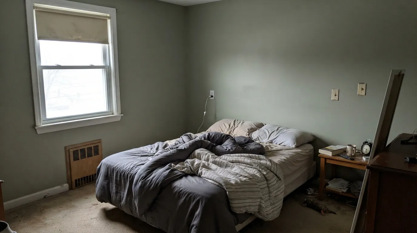
A north-facing room or a run of cool-white LEDs strips the yellow out and leaves a flatter, silvery gray-green that reads more "concrete" than "botanical." The color didn't change — the light feeding it did. Swap to 2700K bulbs first; if the room still stays dim and cool, this isn't the color for it.
Most colors marketed as "sage green" lean cooler and grayer than Urban Nature does. Buyers who sampled it next to a Pinterest board of blue-gray sages are sometimes surprised by how warm and yellow it reads on the actual wall. If a cooler, grayer green is really what you pictured, look at SW Evergreen Fog or SW Sage instead.
Carrara-style white marble, gray-blue quartz, and chrome fixtures sit at the opposite temperature and make Urban Nature's warmth look muddy by contrast, while the wall makes the cool stone look dingy right back. Warm stone — soapstone, honed limestone, warm-veined quartz — is the pairing that actually works.
Room by Room
Soapstone counters, brass or unlacquered-brass hardware, and butcher block all sit comfortably against it. Satin cabinet enamel wipes clean and hides the smudges a flat sheen would show around handles.
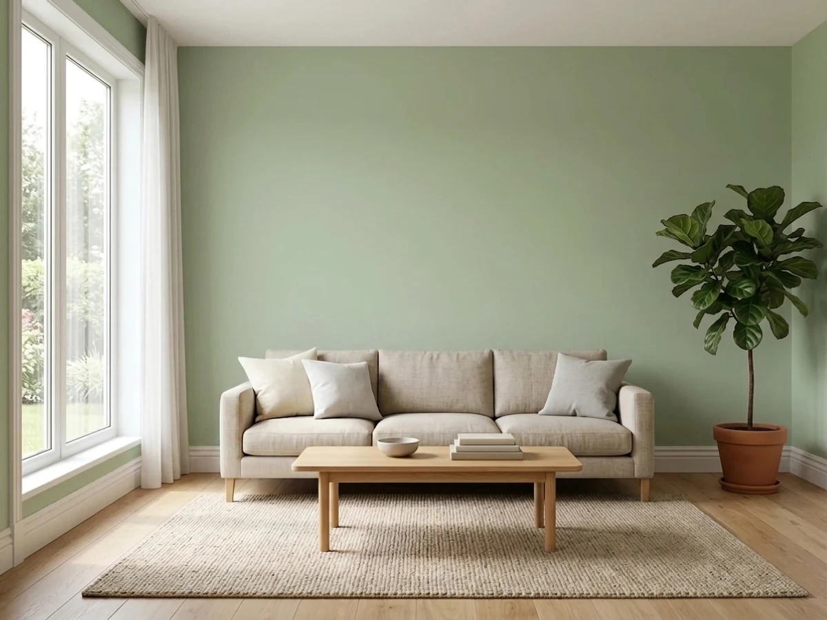
South or west light and warm wood furniture let it read as a calm, grounded neutral rather than a color choice. Eggshell on the walls; keep trim warm-white, not stark white.
For a small room meant to feel calm and enclosed, it does real work — the olive cast reads more like a plant-filled room than a paint color. Works well with walnut shelving and brass lamp light.
On lower wainscoting or a vanity under a warm-white upper wall it adds warmth to what's usually a cold, tiled room. Skip it if your tile and countertop are already cool gray or blue-white.
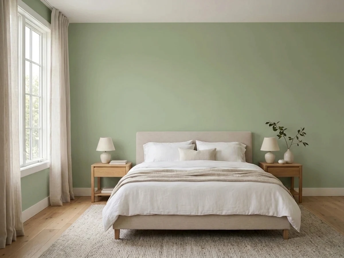
In a warm, sunny bedroom it's genuinely restful. In a dim north-facing bedroom with no lamps, it drifts toward flat and a little dull — add warm bedside lighting or pick a lighter, warmer green instead.
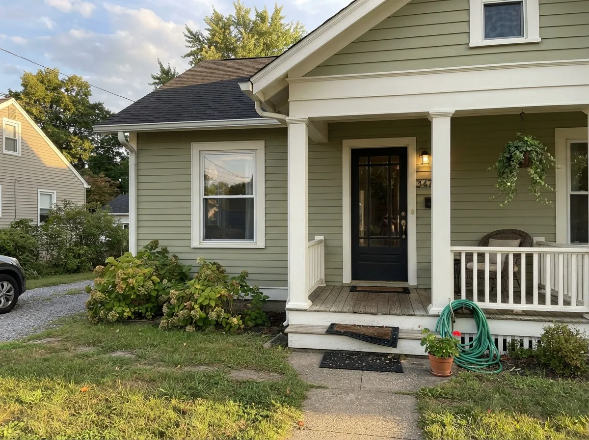
On Craftsman and mid-century siding it reads grounded and deliberate rather than trendy, especially with white or black trim. Full sun brightens it; deeply shaded elevations will read cooler and grayer than the sunny side of the same house.
Your Light Is the Risk
Direct warm light pulls the yellow forward and the green glows like a real botanical color, not a paint chip.
Cool, indirect daylight strips the warmth and leaves a flatter, silvery gray-green. Sample here before committing a whole room.
Cooler and quieter in the morning, noticeably warmer and more olive by late afternoon. The swing is real — most people like it.
2700K lamps push it toward a cozy, enveloping olive at night. Cool white LEDs flatten it back toward gray — change the bulb before you second-guess the paint.
Most complaints about Urban Nature are a light mismatch. Upload a photo of your actual room and see it on your walls — then ask for the same wall in north light or evening lamps before you buy a single sample.
Need It From Another Brand?
Any paint counter can custom-tint Behr S380-3 directly. If you would rather stay in one brand's own deck, these are the closest stock matches, measured as ΔE2000. Under 2 is a difference you will not see on the wall.
| Brand | Closest color | ΔE | LRV | |
|---|---|---|---|---|
| Sherwin-Williams | Softened GreenSW 6177 · Sherwin-Williams | 1.4 | 49 | Color page → |
| Benjamin Moore | Aganthus Green472 · Benjamin Moore | 2.1 | 50 | Color page → |
| Valspar | Sweet Clover8003-30C · Valspar | 1.1 | 49 | Color page → |
| PPG / Glidden | Side KickPPG1126-4 · PPG / Glidden | 1.1 | 53 | Color page → |
| Glidden | Sacred Olive Green70YY 49/106 · Glidden | 3.1 | 49 | Color page → |
| Dutch Boy | Cathedral Spire423-2DB · Dutch Boy | 3.9 | 50 | Color page → |
Similar Behr Colors
The nearest shades to Urban Nature within Behr's own range, ranked by perceptual color distance — useful when you want the same look a touch lighter, darker, or warmer.
WCAG 2.1: AA is 4.5 : 1 for normal text, 3 : 1 for large text, AAA is 7 : 1.
Urban Nature vs the Colors You're Also Considering
Every Urban Nature sample board has the same rivals on it. The numbers show the real lightness gap — then it comes down to which risk you would rather live with.
Pick this for a lighter color you can put on four walls — Evergreen Fog is deep enough to need real light Urban Nature doesn't.
Sherwin-Williams SW 9130 · LRV 30Evergreen FogPick this for the same cabinet-green idea with more gray and less yellow — a deeper, cooler cousin built for islands and doors.
Pick this for the Behr version of the same idea, with a slightly heavier gray base underneath the yellow.
Benjamin Moore HC-114 · LRV 56Saybrook SagePick this for the closest sibling in the deck — same warm-green family at nearly the same LRV, if your painter works in Benjamin Moore.
Washed Olive S350-3, #C3CEA2 at LRV 58, is the same lightness with more yellow in it, so it reads closer to a true olive and less fresh. Flagstaff Green N400-3, #B1D4B5 at LRV 60, moves the other way toward blue-green and looks cooler and slightly minty. Restful 400F-4, #B7CAA2 at LRV 55, is a bit deeper and duller, useful when the room already gets a lot of sun. Creamy Spinach S390-3, #AFD5A5 at LRV 59, is brighter and more clearly leafy.
Across brands, Kompozit Garland Pine 0757 at LRV 58 has a color difference of 0.38, close enough to call the same color. Sherwin-Williams Jardin SW 6723 at LRV 59 and 1.13 is visually identical in normal room light. Benjamin Moore Landscape 430 at LRV 58 and 2.04 and Valspar Fava Bean V060-3 at LRV 59.6 and 2.6 are very close, worth sampling first. PPG Lime Taffy PPG1130-4 at 3.65 is close but visibly different, reading cooler and bluer.
Urban Nature Coordinating Colors
The rule for coordinating with Urban Nature is simple: stay warm. It flatters warm whites, brass, walnut, and its own deeper green cousins — and it argues with icy grays, chrome, and cool-white light. These are the partners that keep showing up in rooms that work:
Urban Nature on Exteriors
Outside is where Urban Nature does some of its best, least-hyped work. On Craftsman bungalows and mid-century ranches it reads as a grounded, botanical neutral rather than a bold color choice — the kind of green that makes a house look like it belongs on its lot instead of announcing a repaint. A clean white trim (Behr White, or a warmer soft white) keeps the facade from reading heavy, and a near-black door or shutters give the classic contrast without adding a third competing hue.
The exposure matters more outside than in. Full sun brightens the olive and keeps it lively; a deeply shaded north elevation or a covered porch will read a full step cooler and grayer than the sunny side of the same house — which is normal, but worth knowing before you judge the color from a single photo taken in the wrong light.
Urban Nature With Wood Tones and Floors
This color was built to sit next to wood, and most warm-to-mid wood tones cooperate. White oak, walnut, and butcher block all read as natural partners rather than competition, and bleached or whitewashed ash keeps the whole room feeling light and current rather than heavy. Brass and unlacquered brass hardware are the easy finish choice; polished chrome and nickel read colder against it than they would against a true neutral.
The one floor to sample carefully is anything cool-toned — gray-washed or ashy LVP with a blue cast can make Urban Nature's warmth look slightly out of place, the same way icy stone does. It isn't a hard clash, just a mismatch in temperature that a warm rug usually solves.
Three Ready Palettes Built on Urban Nature
A color is never alone on the wall. These are complete combinations in the 60-30-10 pattern, with the reason each one holds together. Every one opens in the visualizer.
White Dove keeps the room bright enough for Urban Nature to read as a genuine warm green instead of going murky, and Naval supplies the one dark, grounded note the scheme needs. Brass hardware ties all three together.
Try this palette in your roomA clean white trim keeps the olive-green siding from reading dark or dingy from the curb, and the near-black door supplies the contrast a Craftsman facade wants without introducing a fourth color.
Try this palette in your roomLayering Urban Nature with its closest sibling, Saybrook Sage, on a single accent wall or built-in reads as tonal depth rather than two unrelated greens, and Alabaster keeps the trim warm enough not to fight either one.
Try this palette in your roomUrban Nature FAQ
Is Urban Nature more green or gray?
Green — warm, yellow-leaning green, with just enough gray mixed in to keep it from reading as grass. In cool light the gray becomes more noticeable and it can look closer to a muted gray-green, but on four walls in decent daylight nobody mistakes it for a true gray.
Does it work with cool gray floors or countertops?
Not well. Icy gray-blue floors, Carrara-style marble, and chrome fixtures sit at the opposite temperature and make Urban Nature look muddy while it makes the cool material look dingy. It wants warm partners — soapstone, warm quartz, honed limestone, or wood.
What trim white goes with Urban Nature?
A soft warm white — Benjamin Moore White Dove or Sherwin-Williams Alabaster both work — keeps the pairing calm. A stark, blue-white trim will make the green look slightly dull by contrast; if you want real contrast, go dark (a near-black door or shutters) rather than brighter white.
Is Urban Nature a Behr Color of the Year?
No — it isn't part of Behr's confirmed Color of the Year history. It's a quieter member of the palette: a dependable, unhyped botanical neutral rather than a trend pick, which is arguably why it has aged well without a marketing push.
Does it work as an exterior color?
Yes, and it's one of its better jobs — on Craftsman and mid-century siding it reads grounded rather than trendy. Pair it with a clean white trim and a dark door for the classic look; expect the shaded side of the house to read noticeably cooler and grayer than the sunny side.
What wood tones pair best with Urban Nature?
Warm woods — white oak, walnut, butcher block — flatter it, and bleached or whitewashed ash keeps the look light and modern. Very orange honey oak isn't a clash the way it is with cooler colors, but it does compete for attention; a warm mid-tone wood lets the green stay the star.
Have you painted with Urban Nature?
Rate it — one tap helps the next reader decide.
Ask a Question