Benjamin Moore Revere PewtervsBenjamin Moore Edgecomb Gray
Same Benjamin Moore family, one number apart on the card, and they behave like different colors on a wall. Revere Pewter is the deeper, greener one; Edgecomb Gray is the lighter, warmer step people move to when Revere Pewter feels heavy.

Built from our full reviews of both colors — same measured data, same real-room photos. About the testing process →
The Numbers
Edgecomb Gray is slightly lighter (LRV 63 vs 55, 8-point delta).
The Real Difference on a Wall
These two sit right next to each other in the Historical Collection, and that is the trap — the chips look related, but on four walls they do different jobs. Revere Pewter has weight. It puts a real mid-tone on the wall, so trim reads as trim, art has something to sit against, and the room feels grounded. Edgecomb Gray is a lighter, airier version of the same idea. Most people who repaint from Revere Pewter to Edgecomb Gray are not chasing a different color; they are chasing more light in a hallway or a small room where Revere came out darker than the chip promised.
The undertones part ways in cool light, which is where all the arguments happen. Revere Pewter carries a soft green that is mild in good daylight and obvious in a north room, especially against anything pink or red — salmon carpet, pink-toned travertine, red oak. The wall looks greener, the floor looks pinker, and both look dirty. Edgecomb Gray leans further into tan. Its own green flicker is fainter and usually needs help to appear: cool flat light, or summer lawn bouncing in through a window. On a big sunny wall Edgecomb Gray does the opposite of what the chip suggests and reads plainly beige.
Against trim and floors they need different neighbors. Revere Pewter is happy under almost any white and looks best with a brighter one — Chantilly Lace OC-65 gives it the contrast that keeps it from reading as generic beige. Edgecomb Gray does not like that combination in afternoon sun; against a crisp white it flashes yellow-green, and the standard fix is warmer trim like White Dove OC-17. Both were built for oak, brass and bronze, and both look uncertain next to cool gray marble or blue-gray subway tile.
Green is the shared risk, and Revere Pewter is the one that shows it — mild in daylight, clear in north light, and unmissable beside pink or red-toned floors and tile. Edgecomb Gray's green only surfaces in cool flat light, next to a bright white trim in strong sun, or when a green lawn is bouncing through the window.
What Each Color Really Is
A warm mid-tone gray built over beige, with a soft green shadow underneath it. That green is not a defect and it is not a rumor — it is how the color is mixed. Revere Pewter carries almost no red, and red is what keeps a neutral steady when the light changes. Take the red out and the wall has nothing to hold onto, so it borrows: green from the lawn outside the window, gray from a cloudy afternoon, warm khaki from a lamp at night. That borrowing is the whole personality of this color. It is why one homeowner calls it the coziest beige they have ever owned and the neighbor with the same gallon calls it sage.
LRV 55.5 means it bounces back a little over half the light that lands on it — genuinely mid-tone, not a light neutral. That number is the single most misread thing about it. Edgecomb Gray (HC-173) sits at 63 and Agreeable Gray (SW 7029) at 60, and those seven or eight points are not a technicality. Edgecomb whispers on a wall; Revere Pewter states something. Put a sample board of each side by side and Edgecomb looks like a tinted white while Revere Pewter looks like an actual color, with weight and a shadow line in the corners. Most of the "it came out so much darker than I expected" stories are really people expecting a 63 and buying a 55.
A light warm greige — a gray with real beige in it, not a gray with a hint of beige. The measured hue sits in the orange-tan part of the wheel at 23 percent saturation, which is more color than a true neutral carries. That is why it never looks cold, and also why it can look tan on a big sunny wall instead of the soft gray people expect from the chip. The chip fools people because it is small and surrounded by white card stock; the wall shows the beige.
LRV 63 is the number that decides whether you will like it. Revere Pewter sits at 56, and that seven-point gap is exactly why so many people move here after seeing Revere Pewter go heavy in a hallway. But 63 is not bright — Pale Oak is 67 and Classic Gray is 74, and both of those look noticeably airier on the same wall. Edgecomb Gray is light enough to keep a normal room open and dark enough to go dull when the light runs out.
Specs Side by Side
| Spec | Revere Pewter | Edgecomb Gray |
|---|---|---|
| Brand | Benjamin Moore | Benjamin Moore |
| SKU | HC-172 | HC-173 |
| Hex | #CBC6B8 | #D9D3C4 |
| RGB | 203, 198, 184 | 217, 211, 196 |
| LRV | 55 | 63 |
| Undertone | red-orange / warm | red-orange / warm |
| Family | Neutral | Neutral |
How Light Changes Them
Full sun pulls the warm base forward. Cozy and settled, and it holds its color all day.
Cool light strips the warmth and lifts the green. Expect darker and grayer than the chip.
2700K lamps: soft putty warmth. Cool 4000K LEDs: flat gray — change bulbs, not paint.
Powder rooms and interior halls have no daylight to lift LRV 56. It closes in and looks dirty.
Steady warm light all day keeps it soft and creamy — the version everyone photographs.
Cool flat light drains the warmth and the gray-green side comes forward. Dim north rooms go drab.
Golden and tan at the sun hours, quiet gray after. West rooms can tip peach at sunset.
2700K bulbs push it to plain beige. 3000K to 3500K keeps the gray in it. Swap bulbs, not paint.
Both Colors in Real Rooms
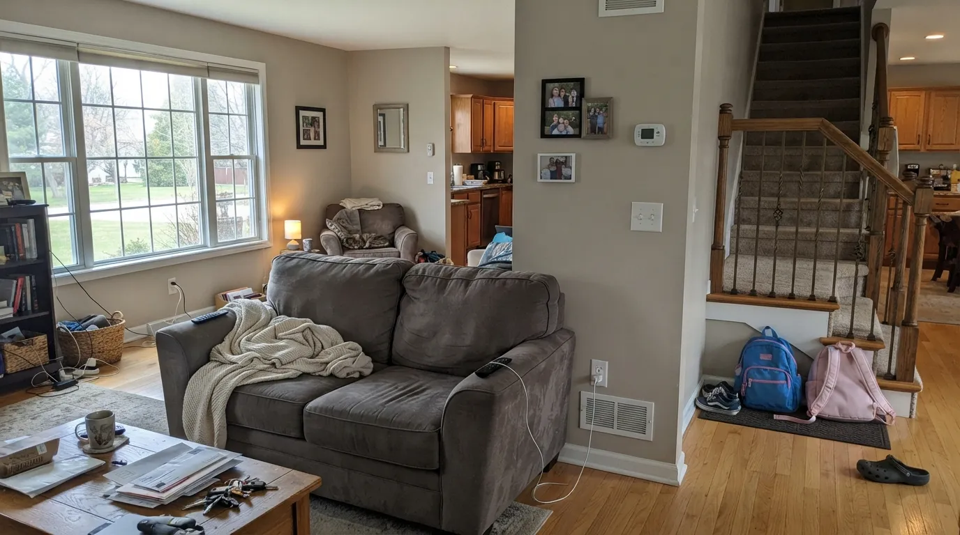
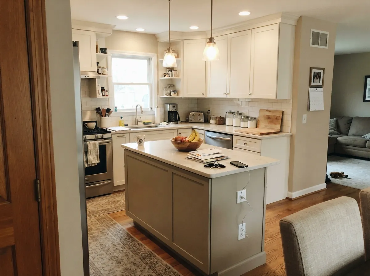
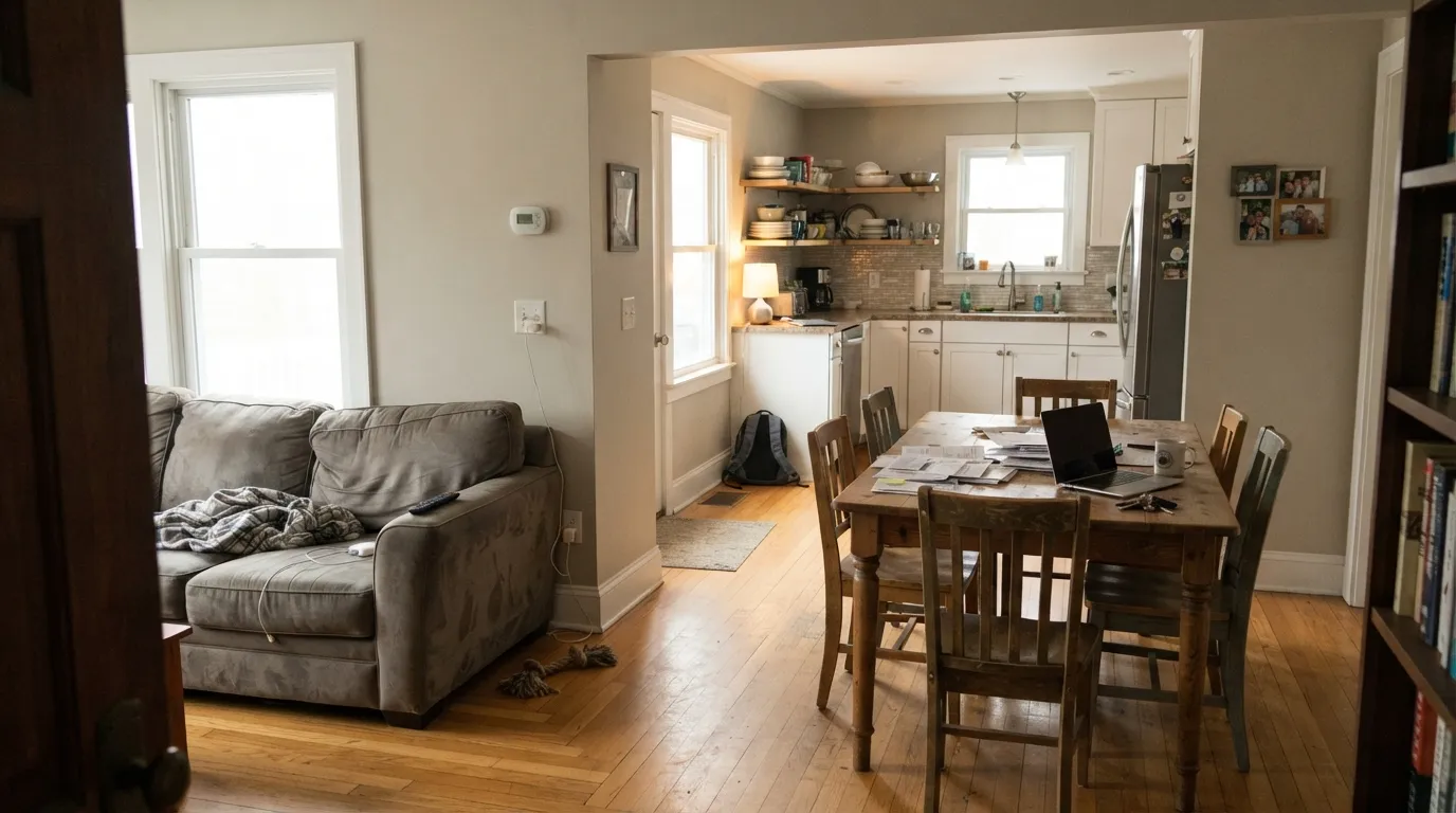
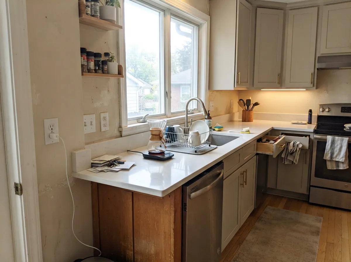
Photos from our full reviews — the same rooms and captions, so you can judge each color where it actually lives, not on a chip.
When to Pick Which
Choose Revere Pewter when the room has real daylight and you want the wall to have some presence. It is the better pick for open main floors with big windows, for rooms where you want white trim to pop, and for cabinets and islands, where the extra depth keeps gray from feeling cold. Skip it in windowless halls and powder rooms.
Choose Edgecomb Gray if you tested Revere Pewter and it came out darker or heavier than you wanted, or if the room only has one or two windows. It is also the easier match for a house full of beige tile, oak and cream trim — it blends in with those instead of arguing with them. Give it daylight; one small north window and it goes muddy.
No comparison page can see your light. Upload one photo of your room and try both colors on the same walls, seconds apart.
Revere Pewter vs Edgecomb Gray FAQ
My living room faces north. Which one?
Neither is ideal, and Edgecomb Gray is the lesser risk because it starts seven points lighter. Revere Pewter in a dim north room is the classic disappointment — it comes out much darker and murkier than the chip, and the green comes forward. Edgecomb Gray in the same room goes dingy rather than dark. If the north room also has just one window, look at Classic Gray OC-23 instead.
Which is better for kitchen cabinets?
Both are strong cabinet colors, and the choice is about contrast. Revere Pewter cabinets read as a deliberate warm gray against a white counter and white walls. Edgecomb Gray cabinets read closer to a warm off-white and need something clearly whiter nearby — white quartz or Simply White OC-117 walls — or they look dingy. Satin enamel and brass or matte black hardware for either.
What trim white should I use with each?
White Dove OC-17 is the safe answer for both, and it is the required answer for Edgecomb Gray, which flashes yellow-green next to a crisp white in afternoon sun. Revere Pewter can take a brighter trim and often wants one — Chantilly Lace OC-65 keeps it from settling into beige. Do not mix the two trim whites in one open space.
Do these work on an exterior?
Edgecomb Gray is the more common exterior body color of the two, and in full sun expect it to read a step lighter and more tan than the chip — plan on tan siding, not gray. Revere Pewter also works outside and holds more of its color in sun, which makes it useful on shaded elevations. Both want dark trim: Kendall Charcoal HC-166 or Wrought Iron 2124-10, with a Hale Navy HC-154 door.
Is Revere Pewter dated now?
It is dated when it is rolled wall-to-wall through a house that is already beige — beige tile, orange oak trim, beige carpet. Then it stops reading as greige and just adds more beige. It still looks current when it has something to push against: bright white trim, a dark island, or used on cabinetry with white walls above. Edgecomb Gray has the same problem in the same house, just a shade lighter.
Ask a Question