Benjamin Moore Edgecomb GrayvsSherwin-Williams Accessible Beige
Edgecomb Gray and Accessible Beige are the two warm neutrals most American main floors end up choosing between, one from each deck. Edgecomb is a greige that leans slightly green-gray; Accessible Beige is a tan with gray folded in, and they go wrong in different rooms.

Built from our full reviews of both colors — same measured data, same real-room photos. About the testing process →
The Numbers
Edgecomb Gray is slightly lighter (LRV 63 vs 58, 5-point delta).
The Real Difference on a Wall
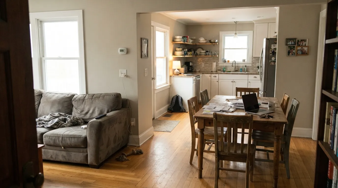
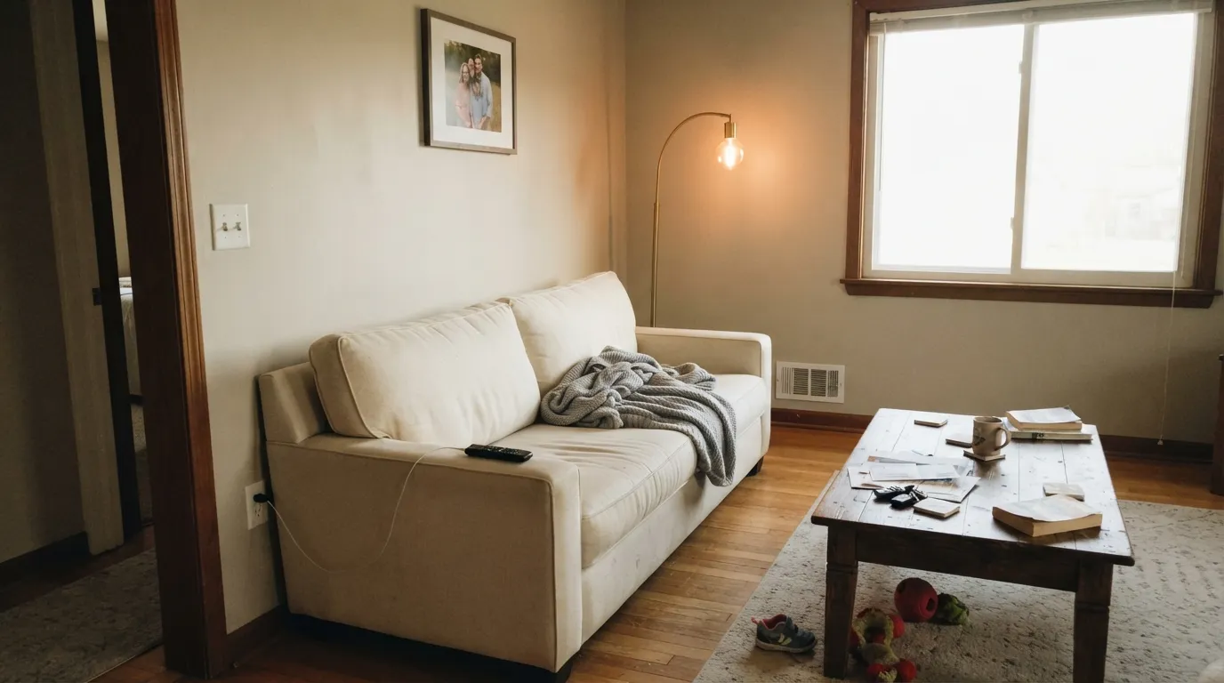
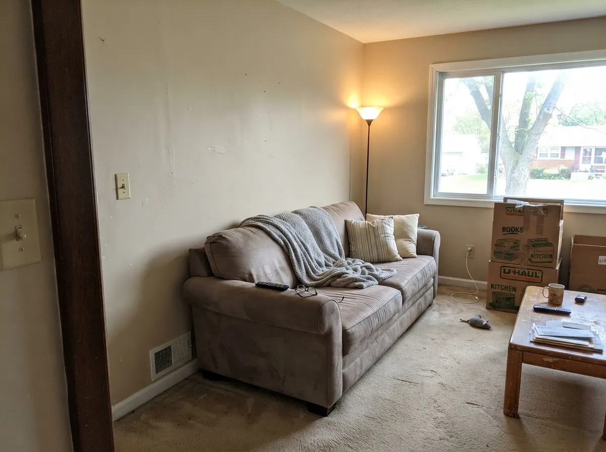
Roll them side by side and the split is clear. With Edgecomb Gray you notice the gray first and the warmth second, so the wall reads soft and slightly cool-leaning greige. With Accessible Beige you notice the tan first. Against each other Edgecomb looks cleaner and lighter while Accessible Beige looks genuinely beige. If your objection to beige is that it feels dated, Edgecomb is the one that solves that. If your objection to gray is that it feels cold, Accessible Beige is the one that solves that.
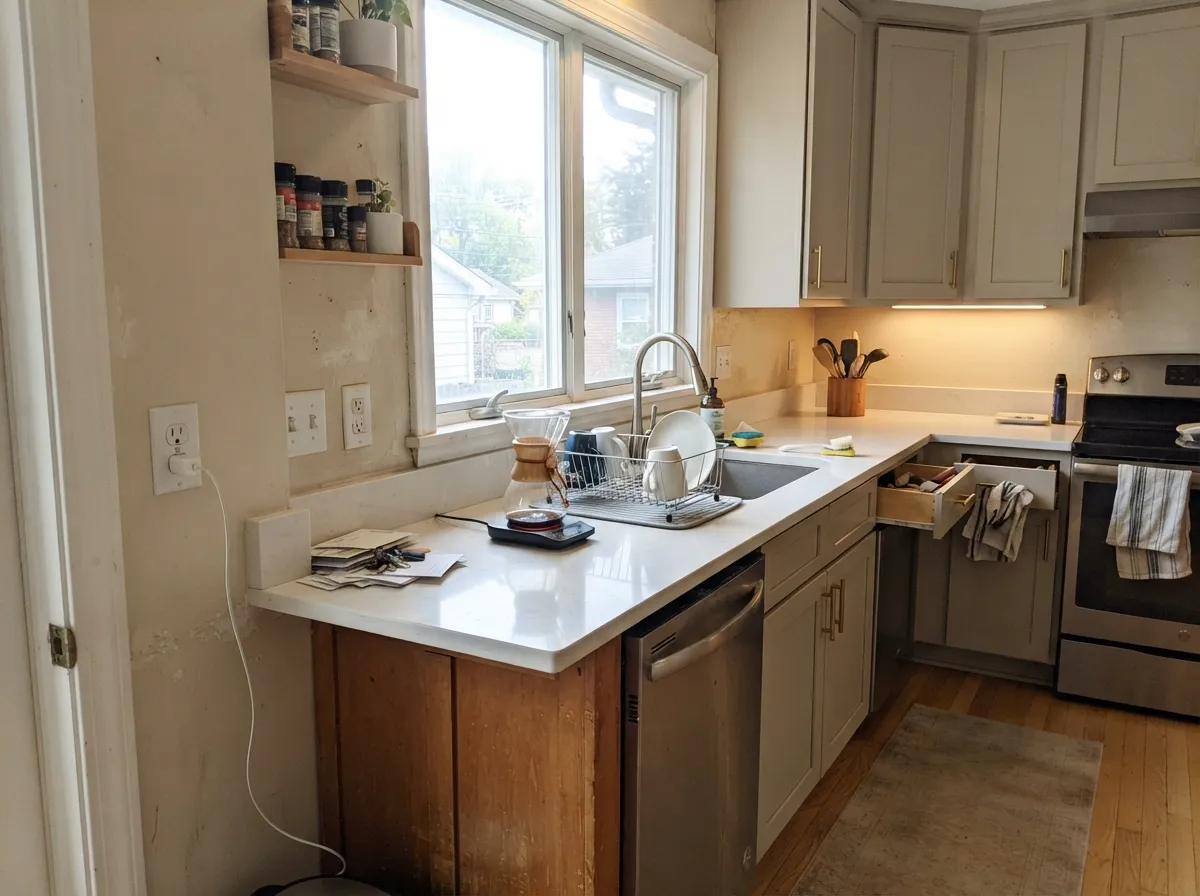
Both need daylight, and both punish you differently when they do not get it. Edgecomb Gray in a room with one small window stops looking soft and starts looking muddy, a brown-gray that reads unwashed. Accessible Beige in that same room loses its warm side entirely and what is left is the gray, which homeowners describe as drab or almost brown. Then in bright light each has its own green problem. Edgecomb goes yellow-green against a crisp white trim in warm afternoon sun, and a window full of lawn wakes up the same side of it. Accessible Beige goes green over red-toned wood, because Brazilian cherry and red oak throw red light at the wall and your eye answers with green.
Neighboring materials matter more here than in most matchups. Edgecomb Gray is built for oak floors, beige tile, cream trim and brass, and it makes builder-grade oak look intentional instead of dated. Accessible Beige wants warm wood, brass and cream furnishings, but it has one famous enemy: a warm white like Alabaster SW 7008 on the cabinets or trim will make the walls look gray and cold by comparison, and people repaint over it within the week. Cool blue-gray counters and tile are bad news for both.
Both can go green, but the trigger is different. Edgecomb Gray flashes yellow-green beside bright white trim in afternoon sun and when a lawn fills the window. Accessible Beige goes green over red-toned cherry or red oak floors, and in a dim north room it drops to a drab gray instead.
What Each Color Really Is
A light warm greige — a gray with real beige in it, not a gray with a hint of beige. The measured hue sits in the orange-tan part of the wheel at 23 percent saturation, which is more color than a true neutral carries. That is why it never looks cold, and also why it can look tan on a big sunny wall instead of the soft gray people expect from the chip. The chip fools people because it is small and surrounded by white card stock; the wall shows the beige.
LRV 63 is the number that decides whether you will like it. Revere Pewter sits at 56, and that seven-point gap is exactly why so many people move here after seeing Revere Pewter go heavy in a hallway. But 63 is not bright — Pale Oak is 67 and Classic Gray is 74, and both of those look noticeably airier on the same wall. Edgecomb Gray is light enough to keep a normal room open and dark enough to go dull when the light runs out.
A tan built on a real gray backbone — which is exactly why people argue about whether it is beige or greige. It sits on the line. The useful way to see it is by how it is put together compared to its rival: Agreeable Gray is a gray that has been warmed up with beige, and Accessible Beige is a beige that has been steadied with gray. The gray is doing a specific job. Old builder beige was mixed with yellow-orange pigment, which is what made it go gold under lamplight and eventually look dated; the gray in Accessible Beige cancels that gold before it can show up. Take the gray out and you have 1998 back.
LRV 58 means it bounces back a little under 60% of the light that lands on it — mid-light, not pale. That number is worth sitting with, because Agreeable Gray is LRV 60, which is effectively the same lightness. If Accessible Beige looks darker to you on the chip, you are reading the extra brown in it, not less light. Against a clean trim white like Pure White at LRV 84 there is a clear step, so trim reads as trim. In a room with real windows it behaves like a light neutral. In a room without them, it stops being light and starts being a mid-tone — same paint, different job.
Specs Side by Side
| Spec | Edgecomb Gray | Accessible Beige |
|---|---|---|
| Brand | Benjamin Moore | Sherwin-Williams |
| SKU | HC-173 | SW 7036 |
| Hex | #D9D3C4 | #D1C7B8 |
| RGB | 217, 211, 196 | 209, 199, 184 |
| LRV | 63 | 58 |
| Undertone | red-orange / warm | red-orange / warm |
| Family | Neutral | Neutral |
How Light Changes Them
Steady warm light all day keeps it soft and creamy — the version everyone photographs.
Cool flat light drains the warmth and the gray-green side comes forward. Dim north rooms go drab.
Golden and tan at the sun hours, quiet gray after. West rooms can tip peach at sunset.
2700K bulbs push it to plain beige. 3000K to 3500K keeps the gray in it. Swap bulbs, not paint.
Strong warm sun all day pushes the tan forward. Soft, creamy, and never orange.
Cool daylight kills the warmth and the gray takes over. Reads taupe, sometimes drab. Sample first.
2700K bulbs make it warm and cozy. Cool LEDs above 3500K flatten it to gray — change bulbs, not paint.
With no daylight it loses its lift and can read dingy or faintly pink-taupe. Go lighter or warmer here.
Both Colors in Real Rooms
Photos from our full reviews — the same rooms and captions, so you can judge each color where it actually lives, not on a chip.
When to Pick Which
Choose Edgecomb Gray if you are working from the Benjamin Moore deck and want the lighter, airier of the two. It is the better choice for a main floor with several windows, for houses full of oak and cream trim, and for anyone who found Revere Pewter too heavy. Pick it if you want a neutral that still reads as greige rather than beige.
Choose Accessible Beige if you want visible warmth and you are fine with the wall reading beige. It is the stronger pick for south and west rooms with real daylight, for resale prep and rentals, and for homes with warm wood, brass and cream furnishings. Pick it if every greige you sampled came out looking gray on the wall.
No comparison page can see your light. Upload one photo of your room and try both colors on the same walls, seconds apart.
Edgecomb Gray vs Accessible Beige FAQ
Which one holds up better in a north-facing room?
Accessible Beige, by a small margin, because its warmth is tan rather than greige and there is more of it to lose before the wall goes flat. Edgecomb Gray in a dim north room is the number one complaint that color gets, walls described as muddy and dingy. If the room is genuinely dark, both are the wrong answer: use Classic Gray OC-23 or Natural Linen SW 9109, which keep their light and cream in cool light.
Can I use either on kitchen cabinets?
Both are used on cabinets constantly and both look good with brass or black hardware. Edgecomb Gray cabinets read soft and slightly cool, so they want a warm counter to lean on. Accessible Beige cabinets read warmer and pair better with cream and tan-veined stone. Satin sheen for either, and always sample against the actual counter slab.
Which trim white goes with each?
This matters more than usual here. Edgecomb Gray wants White Dove OC-17, which shares its warmth and stops the afternoon yellow-green flash you get against a bright white like Chantilly Lace. Accessible Beige wants the opposite, a cleaner white like Pure White SW 7005, because a creamy white such as Alabaster makes the walls look gray. Get the trim wrong and you will blame the wall color for something the trim did.
Which is better on an exterior?
Accessible Beige is the more common exterior of the two and it holds its warmth in big open light, which is where light greiges tend to wash out. Edgecomb Gray outside can go slightly green under a heavy tree canopy for the same reason it does inside. Either one pairs well with white trim and a dark door, but sample on the actual siding facing the actual direction.
Can I run one of these through the entire house?
Yes, and that is exactly what both were built for. The requirement is daylight in most rooms and consistent bulb temperature, 2700K throughout, so the color does not change personality room to room. Where a room has no daylight at all, such as a hallway or powder room, keep the same color but expect it to read a full step deeper and duller, and add lamps rather than switching colors mid-house.
Ask a Question