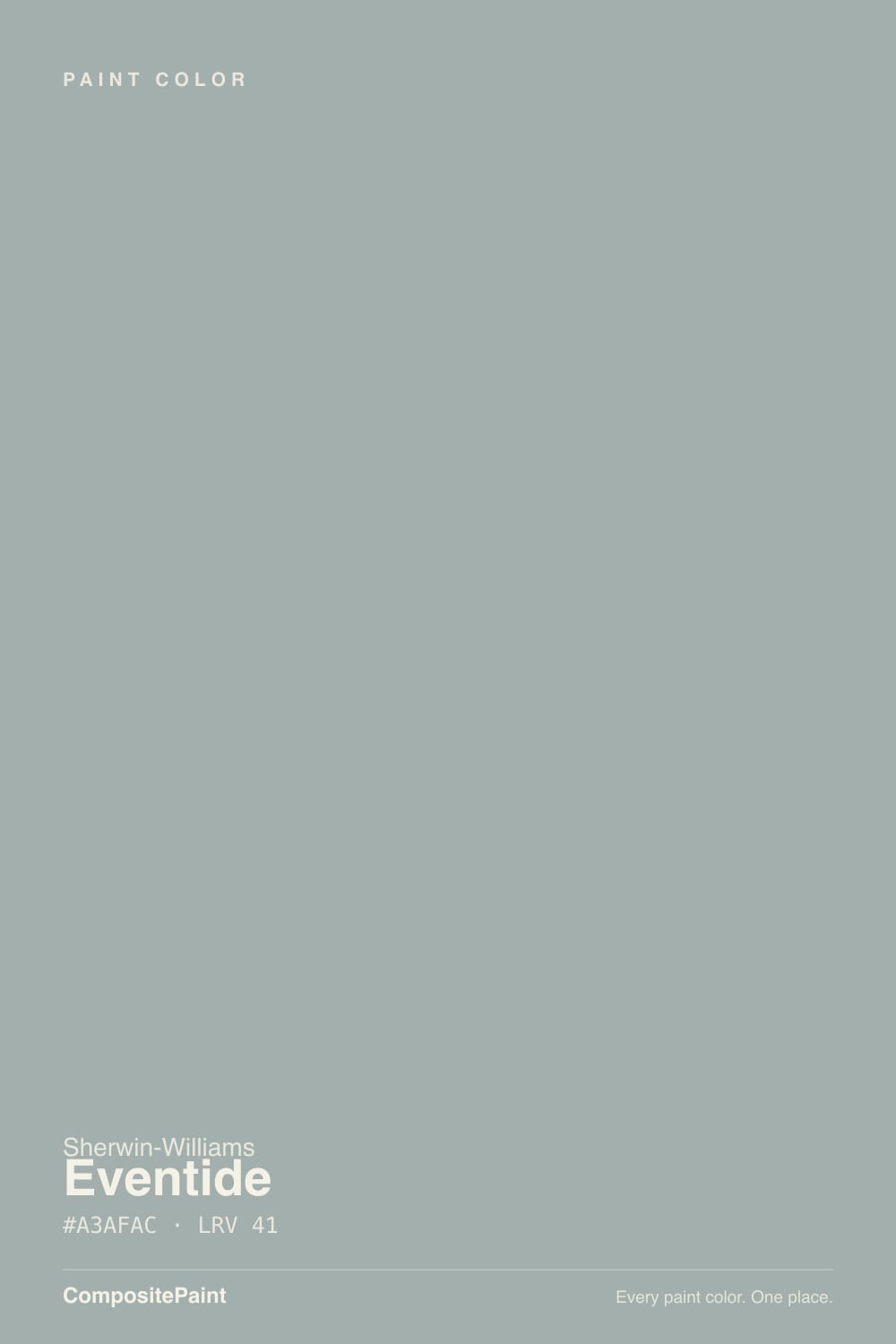
Eventide
The blue-green-gray from Sherwin-Williams that never went viral, reviewed honestly: where the balance holds, the light that flattens it, and the near-twins worth knowing about first.

Jessica has spec'd whites and neutrals for more than 300 rooms and keeps a sample wall of painted drawdowns in her studio. Every color review is checked against real reader rooms in the comments and re-tested when a formula changes. About the testing process →
- 1Pewter Green12
- 2Retreat21
- 3Eventide41
- 4Upward57
- 5Sea Salt63
The Fast Verdict
Eventide is exactly what it looks like on the chip: a cool gray built at the literal midpoint between blue and green, with LRV 41 giving it enough depth to hold that balance instead of washing out. It has never had a Color of the Year run and never will — it shares a shelf with half a dozen brands' near-identical colors, and most people could not pick it out of a lineup against Benjamin Moore's Beach Glass. That is not a knock. It is a quiet, competent sea-glass gray that does the job without asking for credit — buy it for the wall, not the name.
Bedrooms and bathrooms that want calm without committing to "real" blue or "real" green · coastal, modern, and spa-style rooms with decent daylight · anyone who wants a change from the greige everyone already has · rooms with white oak, brass, or matte black already picked out
Your main light is strong west afternoon sun and you want green to show, not just blue · you need a color with one clear, nameable identity · you are already comparing five near-identical blue-green-grays and need a tiebreaker, not one more option · you are shopping for a famous, photographed-a-thousand-times color
- A genuinely balanced blue-green-gray — reads as soft sea glass, not a committed blue or green
- LRV 41 holds real color in decent light without going dark or washing out
- Works for coastal, modern, spa, and transitional rooms alike
- Pairs easily with white oak, brass, brushed nickel, and white trim
- A calm, competent choice for anyone tired of greige but not ready for a loud color
- No strong identity of its own — some buyers find it forgettable next to louder blue-green-grays
- Strong west afternoon sun flattens the green nuance and leaves it reading as plain blue
- Easy to confuse with several near-identical colors in other brands' decks
- Cool LED light at night drains the warmth and leaves it flat and lavender-gray
What Color Is Eventide, Really?
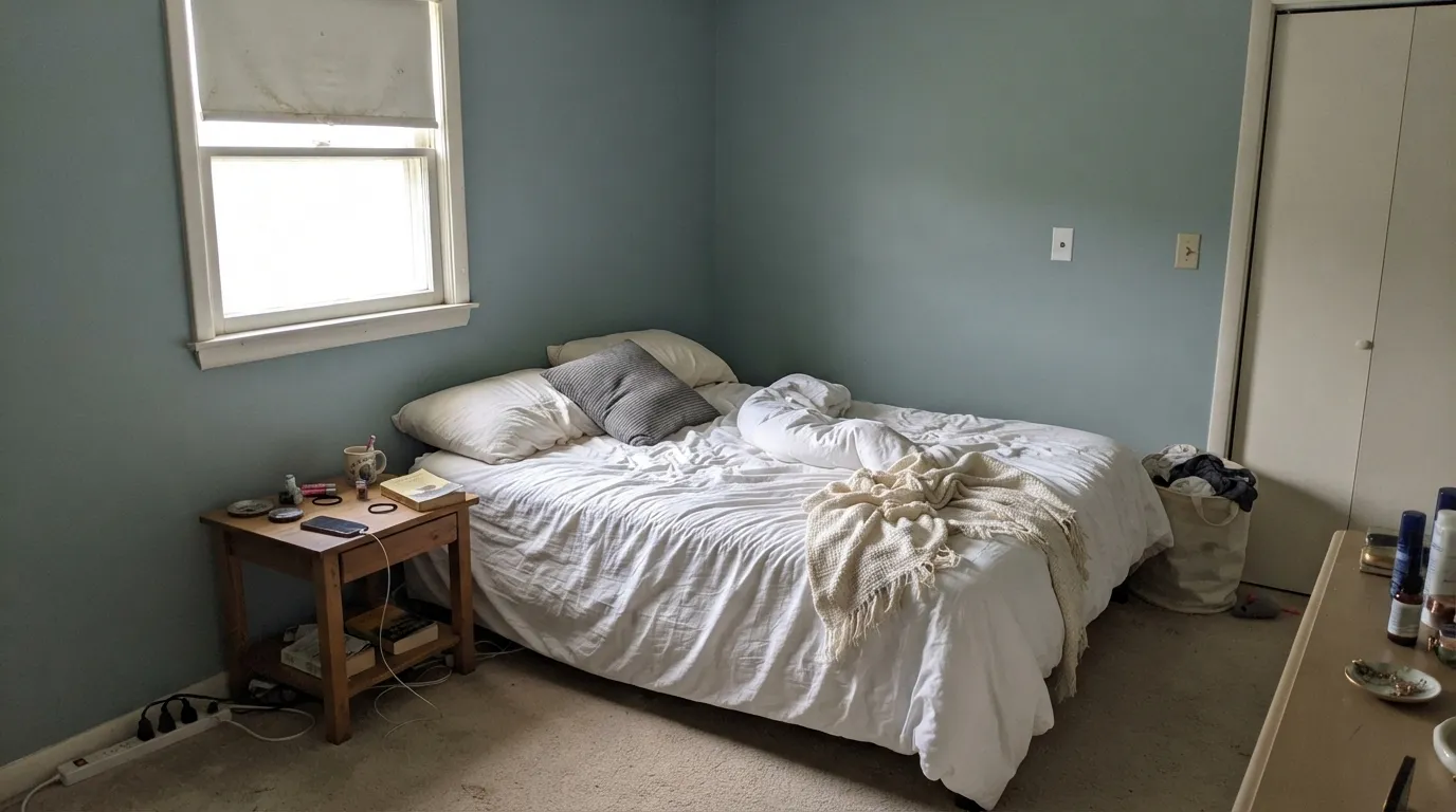
A cool, gray-based color built exactly between blue and green — not committed to either, which is both the appeal and the catch. Sherwin-Williams files it as a quiet neutral, not a headline color; there is no Color of the Year press release and no branded campaign behind it. Look at the online write-ups and you will find real disagreement — some call it a blue-gray, some a green-gray, a few mention a whisper of lavender in certain light. That split is not confused marketing, it is an accurate description of a color sitting dead-center between two families.
At LRV 41 it is a genuine mid-tone: not a pale spa wash, not a moody dark. That depth is what lets the color hold its gray-green-blue balance in a well-lit room instead of flattening into plain gray, and it is also why the color needs real light to do that job — in a dim room it has less to work with than a paler color would.
Undertone in one line: gray-green first, a whisper of blue second, never warm, never yellow. Owners who describe it as "just blue" in a bright west-facing room are not wrong about their wall — strong warm afternoon sun is exactly the light that bleaches out the green nuance and leaves the blue standing alone.
Where It Shines
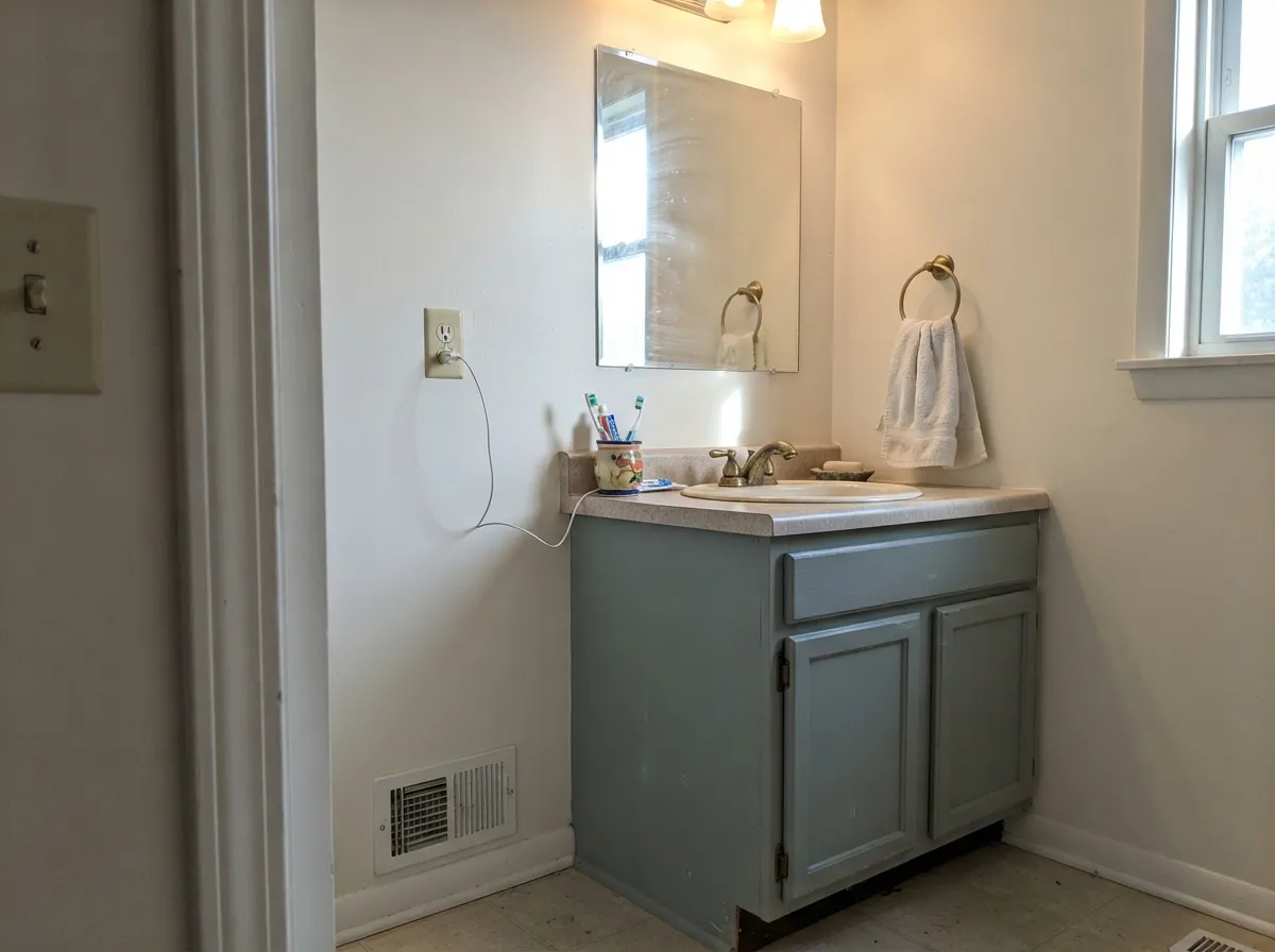
In a room with real, balanced daylight — not blasting west sun, not a dim north corner — this is a genuinely calm sea-glass color that reads as neither cold nor sweet. Bedrooms and bathrooms are its natural home: it is restful without being a mood color, and it does not fight white trim, brushed nickel, or brass the way a stronger blue or green would. It is also an easy answer for anyone tired of greige who is not ready to commit to a color with a strong personality — Eventide changes the room without making a statement.
Where It Fails
The complaint pattern here is small but consistent, and none of it is really the paint's fault — Eventide is an honest color, and each of these is a mismatch between what a shopper expected and what a balanced blue-green-gray actually does.
Owners in west-facing rooms report the color reading like a plain blue, with the gray-green softness gone entirely. Strong warm sun overpowers the subtle green nuance and leaves the blue channel standing alone — the paint is not misbehaving, the light is just too loud for a color this balanced to hold its middle ground.
This exact hex and LRV territory is thick with near-identical colors across brands — Benjamin Moore's Beach Glass sits within a point of the same LRV, and Sherwin-Williams' own Quietude and Stardew live a few clicks away in the same deck. If you fell for a specific photo online, there is a real chance the room you loved was painted in one of Eventide's twins, not Eventide itself. Match the actual chip in your actual light before buying, not a screenshot.
Cold artificial light pushes the same balance toward a flat, slightly lavender-gray with the green warmth drained out — readers who love it in the day report it going "blah" after dark under daylight-temperature bulbs. Swap to warm 2700K bulbs before assuming the color is wrong.
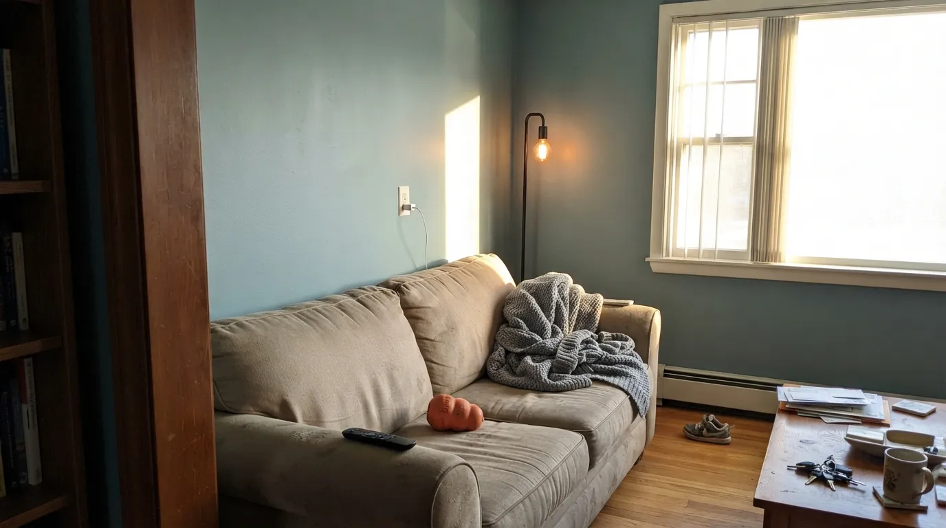
Room by Room
Calm without being a statement color, and forgiving of ordinary furniture. Eggshell on the walls, white trim in semi-gloss, and it settles into the background the way a good bedroom color should.
The spa-adjacent read is real: with white tile, brushed nickel or brass fixtures, and good light, it looks intentional and current without chasing a trend. Satin on a vanity holds up to steam and wiping.
Works well as the cool anchor in a room with warm wood floors and a white sofa, but check the light direction first — a west-facing great room is the one place this color regularly disappoints.
As an island or lower-cabinet color under white uppers it reads coastal without going theme-y. A full kitchen of it is a bigger, riskier bet than the island version.
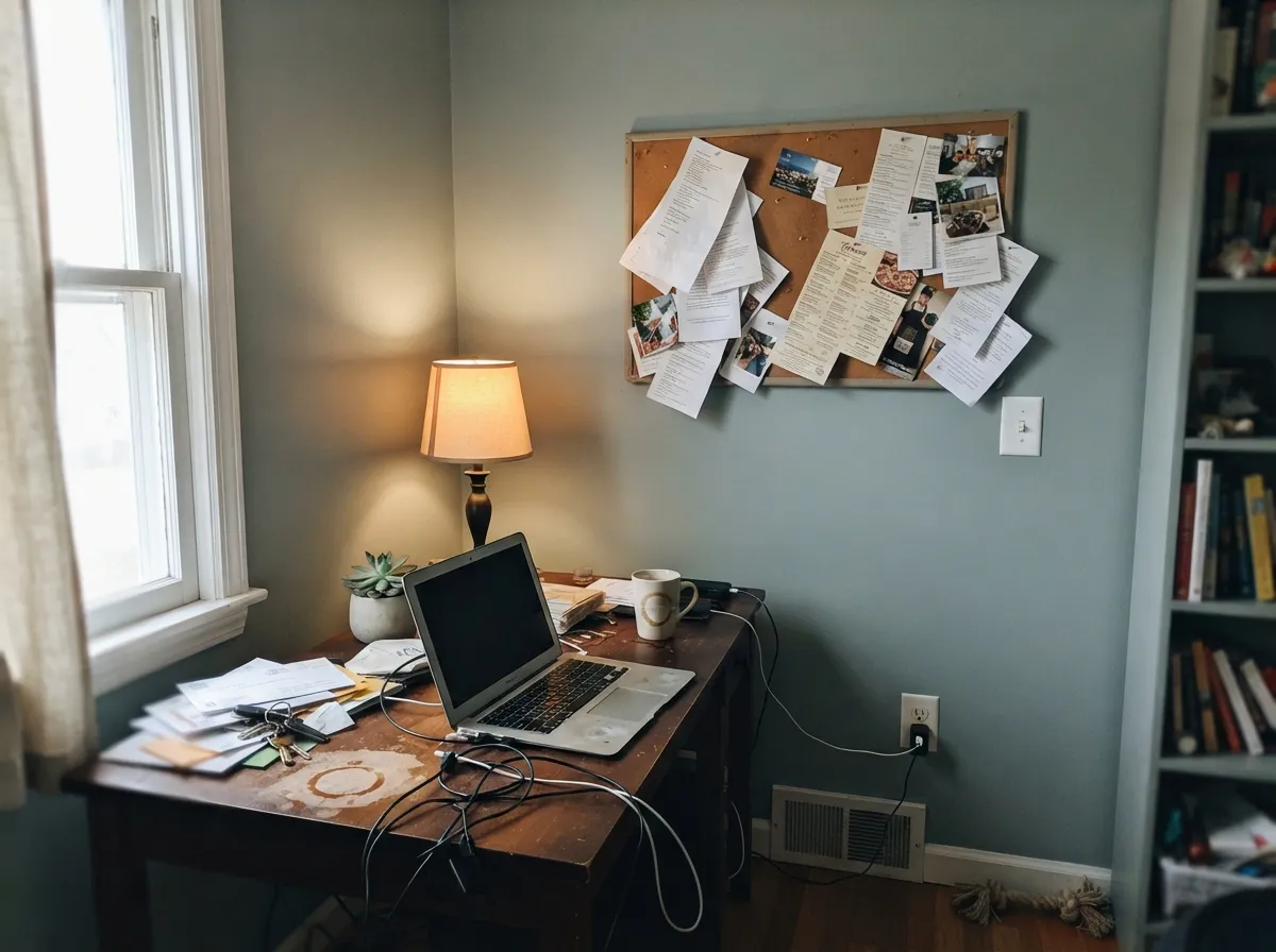
A quiet, focus-friendly color that does not compete with bookshelves or screens. Skip it if the room only gets afternoon west sun through one window.
Sherwin-Williams lists Eventide for exterior use, and the logic holds — full sun should read it more blue than green, the same shift that shows up indoors. We could not verify a strong real-world exterior track record for this color, so sample a large board on the actual facade, in the actual sun exposure, before committing a whole house.
Your Light Is the Risk
Bright, even daylight — north-leaning or filtered — is where the blue and green sit in the truest balance. This is the light to sample in before deciding.
Strong warm sun bleaches the green out and leaves a flatter blue. If your room runs west-facing, test at 4pm before you commit, not at 10am.
Cooler and greener in the morning, gradually warming through the day without ever losing the gray base. A gentle, honest shift most owners like.
2700K warm bulbs keep the gray-green softness alive after dark. Cool daylight-temperature LEDs push it toward a flat, slightly lavender gray — swap the bulb before you blame the paint.
Most complaints about Eventide are a light mismatch. Upload a photo of your actual room and see it on your walls — then ask for the same wall in north light or evening lamps before you buy a single sample.
Need It From Another Brand?
Any paint counter can custom-tint Sherwin-Williams SW 9643 directly. If you would rather stay in one brand's own deck, these are the closest stock matches, measured as ΔE2000. Under 2 is a difference you will not see on the wall.
| Brand | Closest color | ΔE | LRV | |
|---|---|---|---|---|
| Behr | Garden VistaN430-3 · Behr | 2.9 | 42 | Color page → |
| Benjamin Moore | Mount Saint Anne1565 · Benjamin Moore | 0.6 | 42 | Color page → |
| Valspar | Dream Weaver8004-33D · Valspar | 0.0 | 41 | Color page → |
| PPG / Glidden | PolarisPPG10-04 · PPG / Glidden | 1.6 | 40 | Color page → |
| Glidden | PolarisPPG10-04 · Glidden | 1.2 | 41 | Color page → |
| Dutch Boy | Silvered Teal427-4DB · Dutch Boy | 2.4 | 41 | Color page → |
Similar Sherwin-Williams Colors
The nearest shades to Eventide within Sherwin-Williams's own range, ranked by perceptual color distance — useful when you want the same look a touch lighter, darker, or warmer.
WCAG 2.1: AA is 4.5 : 1 for normal text, 3 : 1 for large text, AAA is 7 : 1.
Eventide vs the Colors You're Also Considering
Every Eventide sample board has the same rivals on it. The numbers show the real lightness gap — then it comes down to which risk you would rather live with.
Pick this if your painter or store works in Sherwin-Williams — the two land close enough on the wall that switching decks will not change the room.
Benjamin Moore 1564 · LRV 41Beach GlassPick this if you want the same balanced blue-green-gray mood under Benjamin Moore's numbering — it is the chameleon color spa bathrooms already ask for by name.
Pick this for the slightly greener, quieter version of the same idea, still in the Sherwin-Williams deck.
Sherwin-Williams SW 6212 · LRV 41QuietudePick this if you want the same SW family pushed a shade bluer — Quietude commits to blue more than Eventide does.
Inside the Sherwin-Williams deck, Breezy SW 7616 at LRV 41 shares the same lightness but pushes bluer at #A0AEAF, while Mineral Deposit SW 7652 at LRV 43 is greyer and flatter. Morning Fog SW 6255 at LRV 42 reads noticeably cooler and less green than Eventide's #A3AFAC.
Across brands the closest options are tight. Valspar Dream Weaver 8004-33D matches the hex and LRV exactly, and Benjamin Moore Mount Saint Anne 1565 at LRV 42 falls well under one deltaE. Glidden Polaris PPG10-04 at LRV 41 and Dunn-Edwards Silver Screen DET591 at LRV 41 are visually identical in normal room light.
Behr Veranda Charm PPF-36 at LRV 42 and Magnolia Home Tranquil Waters JG-162 at LRV 43 are very close and worth sampling first. Farrow and Ball Pond Green No. G7 at LRV 41 and HGTV Home's Morning Fog HGSW 1445 at LRV 42 are close but visibly different side by side, one greener and one cooler.
Eventide Coordinating Colors
The pairing rule is simple: keep trim clean and white, keep wood tones on the cooler-neutral side rather than orange-gold, and use one confident dark for contrast rather than several. These are the partners that keep it looking deliberate:
Why Eventide Isn't Famous (And That's Fine)
Eventide has never been a Color of the Year, never had a viral designer moment, and does not show up in the same breath as Sea Salt or Repose Gray. That is not an accident of bad marketing — it is because this exact hex-and-LRV territory is genuinely crowded. Benjamin Moore's Beach Glass sits a point away in LRV. Sherwin-Williams' own Quietude, Stardew, and Pearl-adjacent colors cover nearly the same ground. When five or six brands are all selling a competently balanced blue-green-gray at roughly LRV 41-43, none of them gets to be the famous one — the market splits the attention instead of concentrating it on a single name.
That makes Eventide an honest recommendation rather than a hyped one: a genuinely well-built color that does the job of a calm, cool, mid-tone neutral without asking you to care about its backstory. If you want a color for the wall, not for the story you'll tell about it, that is a real point in its favor, not against it.
Eventide With Wood Tones and Metals
White oak, driftwood-gray floors, and light ash are the natural partners — they share Eventide's cool-neutral lean and never fight it. Walnut works too, as long as it stays on the darker, less orange side; it reads as a deliberate contrast rather than a clash.
Honey oak and orange-toned builder trim are the one real mismatch: their warmth sits directly against Eventide's cool base, and in a room with a lot of that wood the paint can look duller than it should. A large rug or a coat of stain on the wood is a cheaper fix than repainting.
Metals are forgiving — brushed nickel, brass, and matte black all pair well, which is part of why this color shows up so often in bathrooms and coastal-styled rooms. Polished chrome is the only finish that can make it look cold rather than calm.
Three Ready Palettes Built on Eventide
A color is never alone on the wall. These are complete combinations in the 60-30-10 pattern, with the reason each one holds together. Every one opens in the visualizer.
Pure White trim keeps the cool wall color from reading gray and flat; the Naval accent stays inside the same blue-green family instead of fighting it, so the deep note feels chosen, not clashing.
Try this palette in your roomA warm off-white keeps a small bathroom airy while the vanity carries the color; Iron Ore on the mirror frame gives the room one dark, defined note so it reads finished rather than pastel.
Try this palette in your roomThe warm beige and cool Eventide do not need to match — they only need the same white trim running through both rooms to read as one deliberate house instead of two competing color choices.
Try this palette in your roomEventide FAQ
Is Eventide blue or green?
Both, by design — it sits at almost the exact midpoint. In balanced daylight it reads as a soft blue-green-gray; in strong west sun it leans distinctly blue as the green nuance gets bleached out. That is why online write-ups genuinely disagree about which family it belongs to.
Why do different paint sites describe Eventide so differently?
Because it sits at the literal middle of blue and green, small differences in a reviewer's room light or a screen's color calibration tip the description one way or the other. Trust a real sample in your own room over any single write-up, including this one.
What is the difference between Eventide and Beach Glass or Quietude?
On the wall, functionally very little — the hex values and LRVs sit within a point or two of each other. Pick by brand or store convenience rather than expecting a different mood; if you loved a photo, confirm which exact color it actually used before buying.
What white trim goes with Eventide?
Sherwin-Williams Pure White or Extra White, semi-gloss. Either keeps the trim clean and lets the wall carry the color; a warmer cream trim will fight the cool base.
Does Eventide work on exteriors?
Sherwin-Williams lists it for exterior use, and the same light rule applies outdoors: full sun should push it more blue, less green, the same way west-facing interior rooms do. We could not confirm a strong real-world exterior track record for this specific color, so test a large board on your actual facade before painting the whole house.
Is Eventide going out of style?
It was never in style in the loud, trend-cycle sense — no Color of the Year moment, no viral room — so there is little hype for it to fall out of. The quiet blue-green-gray category it belongs to, alongside Beach Glass, Pearl, and Quietude, has stayed steady for years rather than spiking and fading.
Have you painted with Eventide?
Rate it — one tap helps the next reader decide.
Ask a Question