Sherwin-Williams Sea SaltvsBenjamin Moore Palladian Blue
Sea Salt and Palladian Blue are the two spa colors everyone shortlists together. Sea Salt is a green that can turn blue on you. Palladian Blue is a blue that can turn green. Your windows decide which flip you get.

Built from our full reviews of both colors — same measured data, same real-room photos. About the testing process →
The Numbers
Sea Salt is slightly lighter (LRV 63 vs 60, 3-point delta).
The Real Difference on a Wall
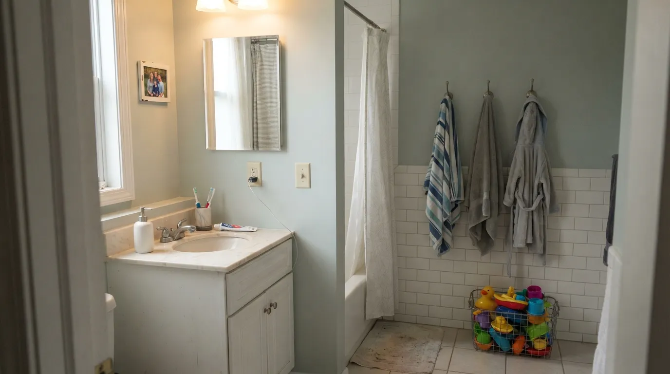
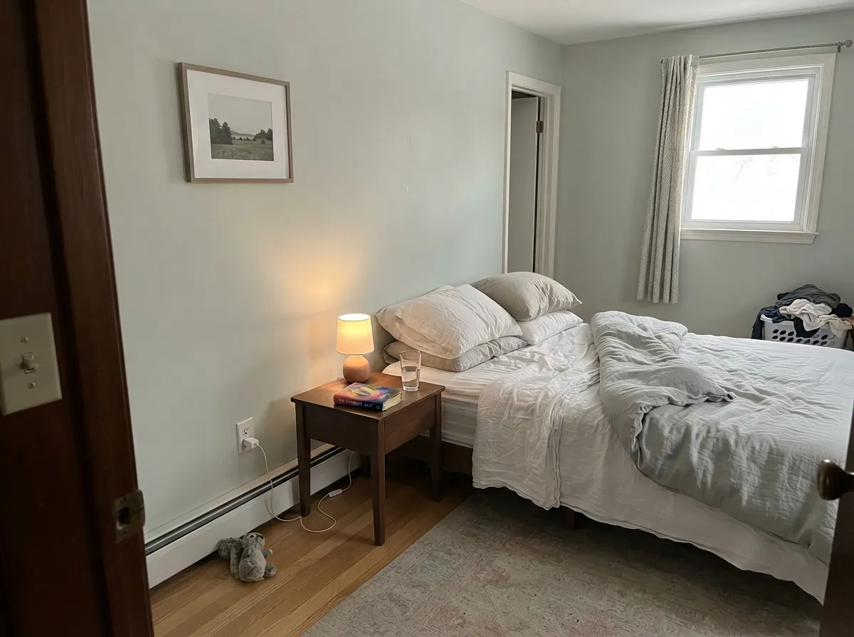
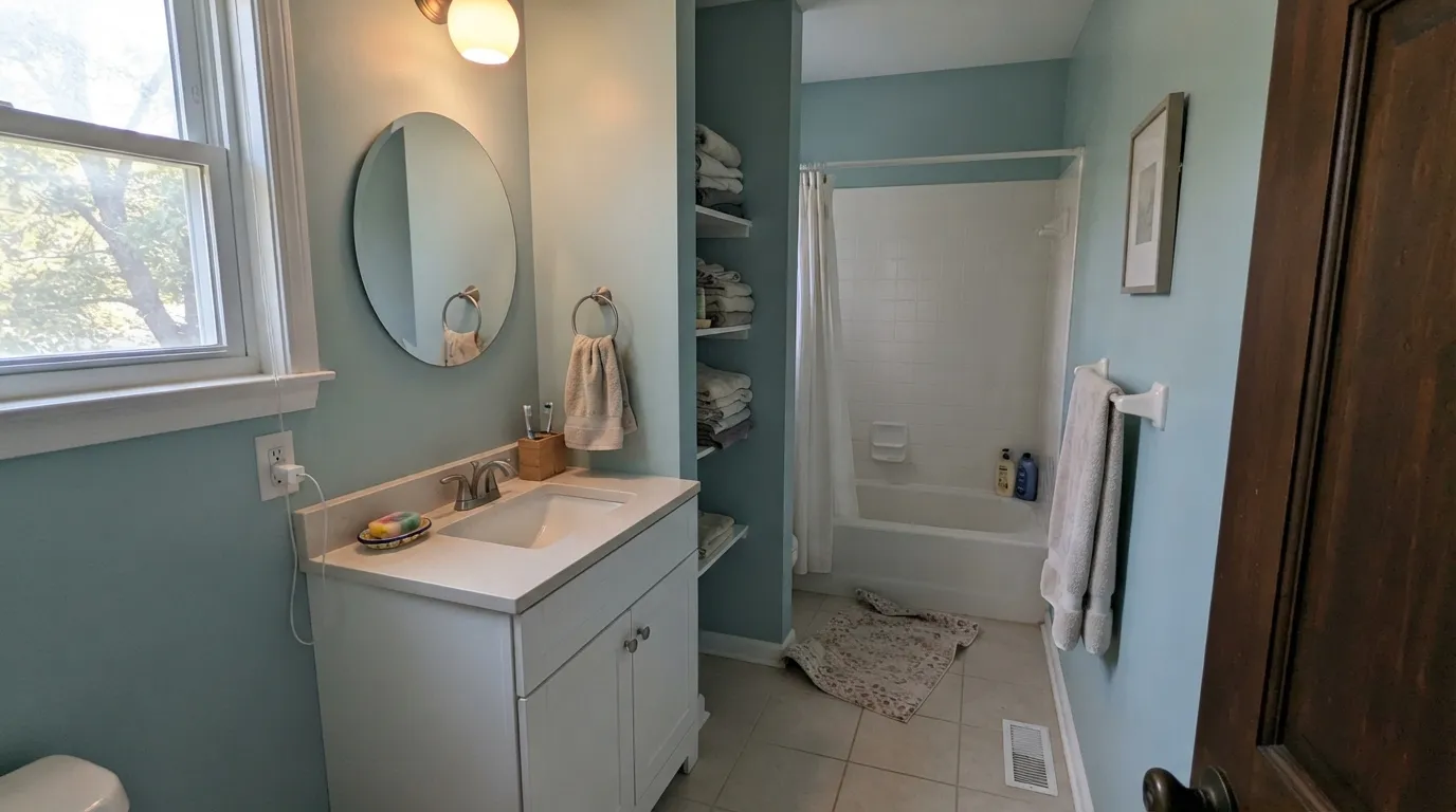
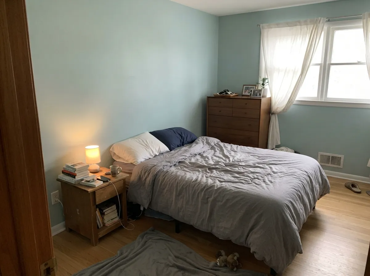
These two cross over, and that is the most useful thing to know about the pair. Sea Salt starts as a soft, dusty green-gray, and the small amount of blue in it steps forward the moment the light turns cool. That is where the famous north-facing bathroom posts come from. Palladian Blue does the opposite. It is at its bluest in cool north daylight and pushes green in warm afternoon sun or under 2700K lamps, where it reads like pale sea glass. So in a north-facing bathroom, Sea Salt can genuinely look bluer than Palladian Blue. Sample both in the actual room or you will pick the wrong one on a chip lit by store fluorescents.
They also carry different amounts of color. Palladian Blue is a visible step deeper and clearly more colored: it looks like somebody chose it. Sea Salt behaves more like a tinted neutral, quiet enough to run from a bathroom into a bedroom and down a hallway without announcing itself. That difference matters most in rooms with no daylight. A windowless powder room in Palladian Blue still reads as a color under lamps. The same room in Sea Salt drains to a plain, slightly muddy gray, and people call it flat.
Both want a clean white beside them, and both punish warm floors. Cream or almond trim is the number one regret with Palladian Blue, because it exposes the yellow in the woodwork instead of softening it, and Sea Salt against warm cream simply reads gray and unwashed. Honey oak, orange-toned wood and beige travertine fight both, with Sea Salt taking the worse beating, since cool green against orange goes muddy fast. Chrome and brushed nickel work with either. Brass looks better on Sea Salt, and rattan, white tile and black hardware flatter both.
The flip is the whole story. Sea Salt turns blue in cool north light and under 4000K bulbs, and Palladian Blue turns green in warm south sun and under 2700K lamps. Neither is a mistint, so sample both on the real wall, once at midday and once after dark.
What Each Color Really Is
Sherwin-Williams files Sea Salt under greens, and that is the honest starting point: it is a soft, dusty green that has been grayed almost all the way down. What makes it behave the way it does is the small amount of blue-black in the mix. That colorant is what keeps the green from ever looking minty, and it is also the thing that steps forward the moment the light in the room goes cool. So there are really three hues sitting on the wall at nearly equal strength — green, gray, and a little blue — and the room picks the winner, not the can.
At LRV 63 it reflects a bit more light than Agreeable Gray, the greige most people already have somewhere in the house. That is a useful way to picture it: the same easy brightness everyone likes about a greige, except this one shows real color instead of disappearing. It is light enough to keep a small bathroom feeling open, and soft enough that it never announces itself as "a green room." The catch is that low-saturation colors like this have very little of their own personality to push back with, so whatever your windows and bulbs hand them, they accept.
A muted blue-green that sits right on the fence between the two families. Most "soft blue" paints are blue with a touch of gray, and they stay blue. Palladian Blue is built differently: there is enough green in the base that in warm light it steps across the line and reads like pale sea glass, then steps back to soft aqua when the light cools. Designers call this a chameleon and they mean it kindly, but it is also the single reason people are surprised by it. The chip in the store is lit by cool white fluorescents, which is the lighting that makes it look bluest.
At LRV 60 it reflects a little over half the light that hits it, so it is a light color with real body. That matters more than it sounds. Put it next to Sherwin-Williams Sea Salt at LRV 63 and Palladian Blue is visibly a step deeper and clearly more colored — Sea Salt looks like a tinted neutral, Palladian Blue looks like a decision. It is light enough to keep a small windowless bathroom feeling open, but it will never wash out to almost-white in a sunny room the way the lighter spa colors do.
Specs Side by Side
| Spec | Sea Salt | Palladian Blue |
|---|---|---|
| Brand | Sherwin-Williams | Benjamin Moore |
| SKU | SW 6204 | HC-144 |
| Hex | #CDD2CA | #C1D1C9 |
| RGB | 205, 210, 202 | 193, 209, 201 |
| LRV | 63 | 60 |
| Undertone | green / cool | green / cool |
| Family | Gray | Gray |
How Light Changes Them
Warm strong daylight brings the green forward. This is the spa look people bought it for.
Cool light strips the green and the blue takes over. Sample it here or skip it.
2700K bulbs warm it back to green. Cool 4000K LEDs push it clinical — change bulbs, not paint.
With no daylight the color drains to a plain gray. Readers call it muddy. Pick something deeper.
Cool daylight keeps the blue visible and mutes it slightly. This is where it looks most like the chip.
Warm afternoon sun pushes the green forward — it reads sea glass, not aqua. Sample here first.
2700K lamps: softer, greener, cozier. 4000K LEDs: cold gray-blue. Change bulbs, not paint.
Enough color saturation to stay a color under artificial light instead of collapsing to gray.
Both Colors in Real Rooms
Photos from our full reviews — the same rooms and captions, so you can judge each color where it actually lives, not on a chip.
When to Pick Which
Choose Sea Salt if you want the calmer version, a color that still behaves like a neutral and can carry a bedroom, a hallway and a bath without feeling themed. It is the better pick for south and east rooms, where the green comes forward the way you saw it in photos. It is also lovely on a vanity or laundry cabinets when you want soft rather than obvious.
Choose Palladian Blue if you want the color to be visible, or if the bathroom has no window and weak light, because it holds together under lamps instead of collapsing to gray. It is also the safer answer in a north-facing room when you specifically want blue rather than sage. Commit to it in one room rather than across a floor.
No comparison page can see your light. Upload one photo of your room and try both colors on the same walls, seconds apart.
Sea Salt vs Palladian Blue FAQ
Which one should I use in a north-facing bathroom?
Palladian Blue, if you want the color to look like the chip. North light is exactly where it stays bluest and most composed. Sea Salt in that same room is the most complained-about combination in this whole category, because the cool daylight pulls its blue forward and people end up with a bathroom that looks nothing like the sample. If you want a soft green that stays green in a north room, neither one, use Oyster Bay.
Will either work with beige tile or honey oak floors?
Not well. Both are cool colors and warm orange-toned floors fight them, but Sea Salt loses harder, going muddy and dated rather than coastal. If the floors and tile are staying, go deeper and warmer: Comfort Gray on the Sherwin-Williams side, or Saybrook Sage on the Benjamin Moore side. Those have enough weight to sit next to warm wood without going dirty.
Which is better on a vanity or kitchen cabinets?
Both are beautiful on a single vanity or a laundry cabinet run, in satin. The difference shows up at scale. Palladian Blue across thirty kitchen doors stops being a soft color and becomes the loudest thing in the room, and the kitchen starts to read themed. Sea Salt scales better because it carries less chroma, so it stays quiet even on a lot of surface area.
What white trim goes with them?
Use a clean white with both. Pure White is the reliable choice, and Chantilly Lace works if you want more contrast. Avoid cream and almond whites entirely here. Palladian Blue makes cream woodwork look yellowed, and Sea Salt beside a warm cream reads gray and tired instead of fresh.
Can I use either one through a whole open-plan floor?
Sea Salt can do it. It reads as a neutral, so it carries across a living room, hallway and bedrooms without feeling like a theme, though the shaded corners will look bluer than the sunny ones. Palladian Blue is a room color, not a house color. Across an open floor it becomes the dominant thing in every view, and it shifts visibly from blue to green as you move from the north side to the south side.
Ask a Question