Home Body
A muted sage-khaki from a small paint brand, reviewed honestly: the light where it reads as a warm neutral, the light where it turns visibly green, and what to pick if you want more certainty either way.

Jessica has spec'd whites and neutrals for more than 300 rooms and keeps a sample wall of painted drawdowns in her studio. Every color review is checked against real reader rooms in the comments and re-tested when a formula changes. About the testing process →
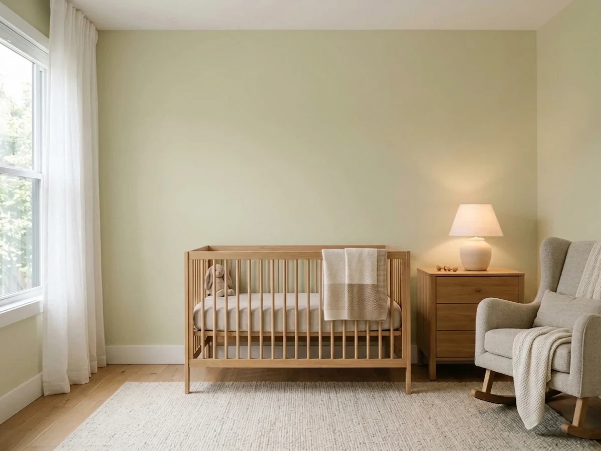
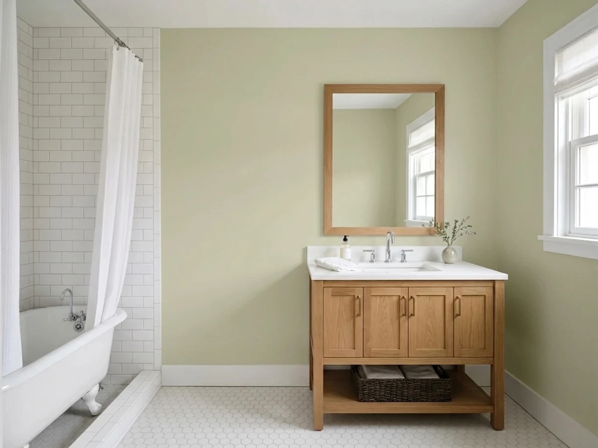
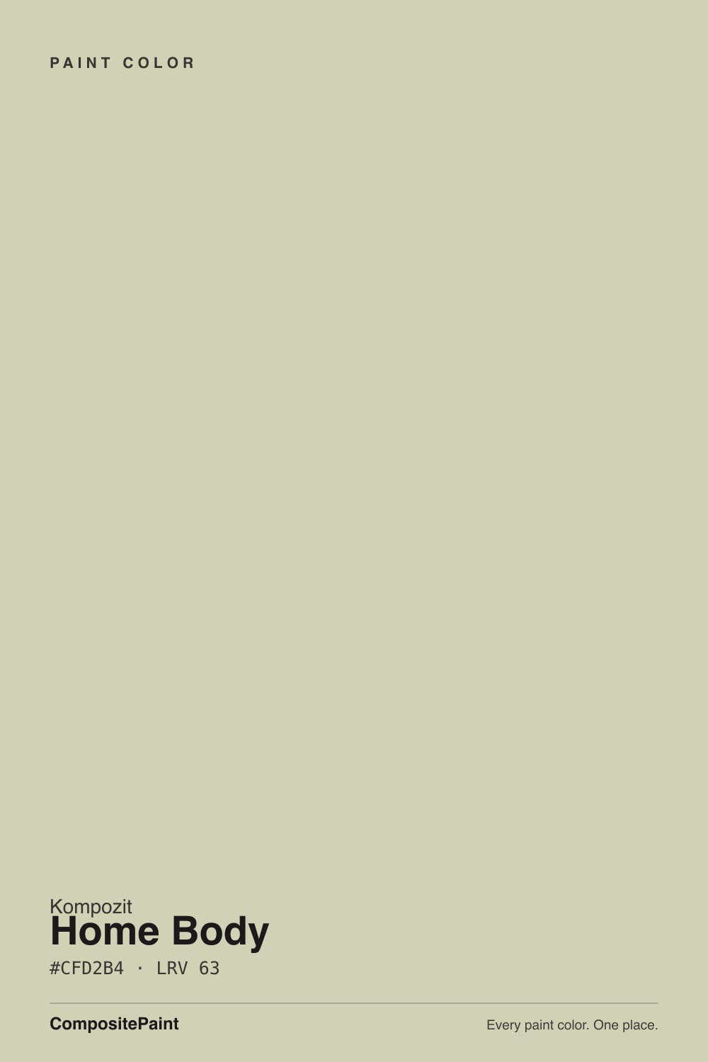
- 1Clary Sage41
- 2October Mist47
- 3Home Body63
- 4Honeydew71
- 5Alabaster82
The Fast Verdict
Home Body sits right on the border between a warm greige and a real sage — and which side you get depends almost entirely on your light. In warm afternoon sun it reads as a soft, earthy green with real presence; under a flat overcast sky it recedes into a quiet putty-gray. At LRV 63 it is light enough to work as a whole-room neutral but has just enough color in it to be a genuine sage, not a beige pretending to be one. Buy it knowing that, and it is a genuinely useful color.
Kitchens with warm wood and brass · exterior siding under white trim · living rooms and dens with real daylight · anyone who wants "sage" without committing to a loud green
You want a true, unambiguous gray or greige · your room runs on cool LEDs with little daylight · you need a color with a long public track record before you trust it · you're pairing it with cool white marble or icy-blue accents
- Reads as a warm, believable neutral in good light while still being a real green when you want it to be
- LRV 63 holds real color without washing all the way out to white
- Flatters brass, warm wood, terracotta, and navy the way an established sage does
- A shared, multi-brand formula (0406) with real tenure in the industry, even though this specific brand's own reputation is new
- Settles into a quietly good exterior color under white trim, without needing a loud accent to work
- Cool north light and cool LEDs flatten it into a dull, muddy gray-green
- Buyers shopping for a true gray or greige will get more visible green than they expected
- Public reputation for this exact color is thin — there is no long history of owner reviews to draw on, unlike a decade-tested Sherwin-Williams or Benjamin Moore color
- Loses definition and can look dingy next to a bright, cool-toned white or cool white stone
What Color Is Home Body, Really?
A muted yellow-green at LRV 63 — warm-based, low-saturation, sitting in the narrow band where a color can honestly be called either a green-leaning neutral or a neutral-leaning green depending on who's looking at it. Our deck lists it at #CFD2B4, which reads as a soft khaki-sage: enough yellow-green to register as color, not enough to compete with a true sage like Saybrook Sage or Soft Fern for attention.
One fact worth knowing before you buy: 0406 "Home Body" is not a color Kompozit invented in-house. The same code and name appear in the decks of several independent regional paint companies — Rodda, Columbia, Home Hardware, and ECOS Paints all carry a matching "Home Body" 0406, and Kompozit's fan deck runs on the same shared color-matching library most small and regional brands license rather than build from scratch. That's not a knock — it means the formula has been tested and sold across multiple companies for years, even if this specific brand's own track record with it is short. It does mean the physical chip can shift a few points between vendors depending on their own base paint and tinting; if your sample looks slightly warmer or cooler than a Kompozit swatch you saw online, that's the shared-formula effect, not a bad batch.
Undertone in one line: warm yellow-green, never blue, never true gray. If your wall reads flat gray, that's cool light draining the yellow out — the paint hasn't changed, the light has.
Where It Shines
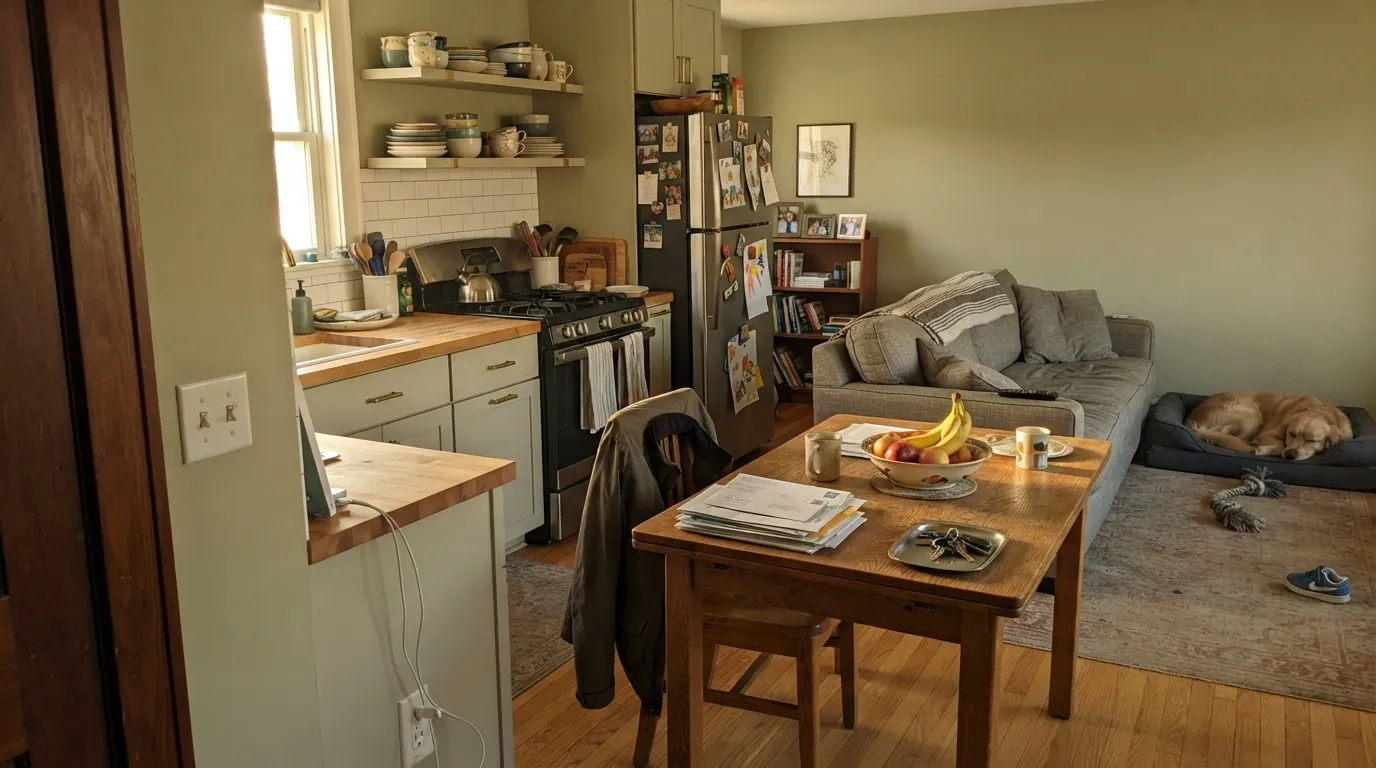
Give it real daylight — south or west sun, or a bright kitchen window — and Home Body earns its name: it settles a room instead of decorating it. It's genuinely good next to warm wood, brass, and the earthy accent colors it was clearly built to sit beside — terracotta, clay-pink, navy. On exterior siding under a crisp white trim it reads as a quiet, modern-cottage green without asking the whole street to notice. It's at its best as a color that supports a room rather than announces itself, which is exactly what "sage that behaves like a neutral" is supposed to do.
Where It Fails
The complaints this color will generate are predictable from the hex and LRV alone, and they cluster around one root cause: it changes more with light than most buyers expect from something this pale and quiet.
Cold light strips the yellow out of a yellow-green undertone faster than almost any other kind of color. Without warm light or warm lamps, Home Body goes flat and slightly muddy — a dull gray-green that reads more like an old dishwater beige than a sage. Warm 2700K bulbs are close to mandatory here, not optional.
On a small chip it can pass for a warm neutral. On four walls in decent daylight, the green shows up — some buyers will be pleasantly surprised, but if you were shopping for "just a soft neutral, nothing green," this is not that color. Test a large sample in your actual light before committing a whole room.
Because it's a low-saturation color to begin with, a brighter, crisper white next to it makes Home Body look dingy rather than warm — the same trap that catches soft warm whites like White Dove. Keep trim a warm white (Swiss Coffee, White Dove) rather than a stark cool one, and be cautious pairing it with cool gray-blue marble or quartz.
Room by Room
In a room that gets honest sun, it's a calm backdrop for wood furniture and warm-toned art. In a dim or north-facing room, step up to something with more built-in warmth, like Guilford Green, or plan on warm lamps doing real work.
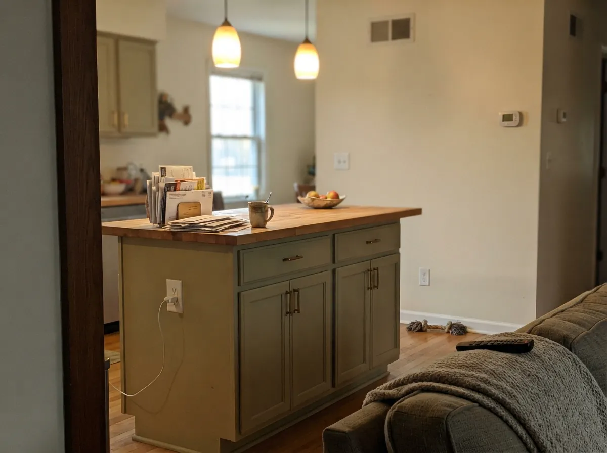
This is close to the color's ideal job. Against cream walls, brass hardware, and butcher block or warm-stained wood, the sage-khaki reads current and expensive rather than dated. Satin urethane-fortified cabinet enamel; avoid pairing with cool white or icy-gray quartz counters.
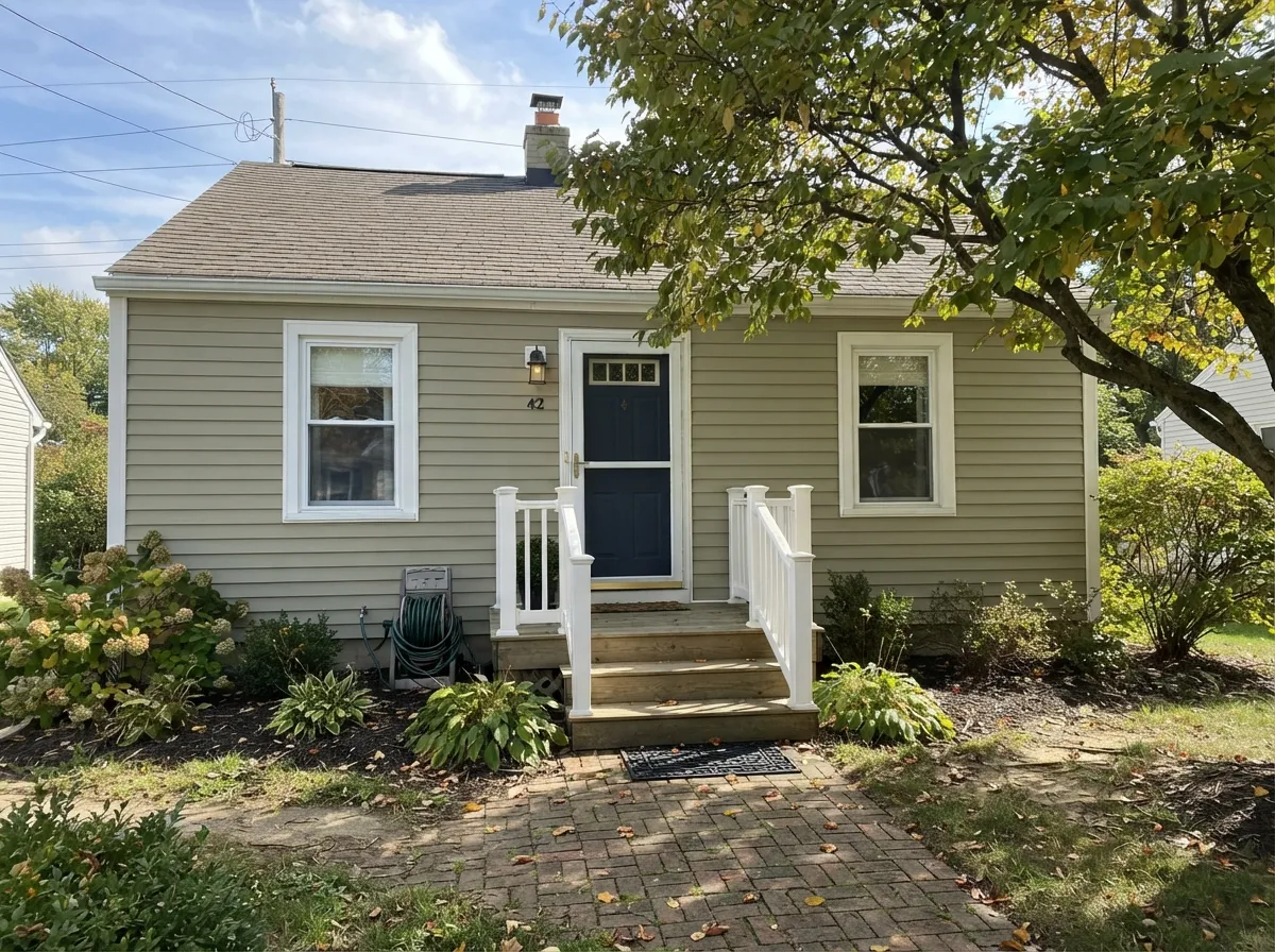
Outdoors, full sun brightens and clarifies it, and it settles into a genuinely good modern-cottage green with white or cream trim. A dark door — navy or near-black — gives the facade the one deep note it needs.
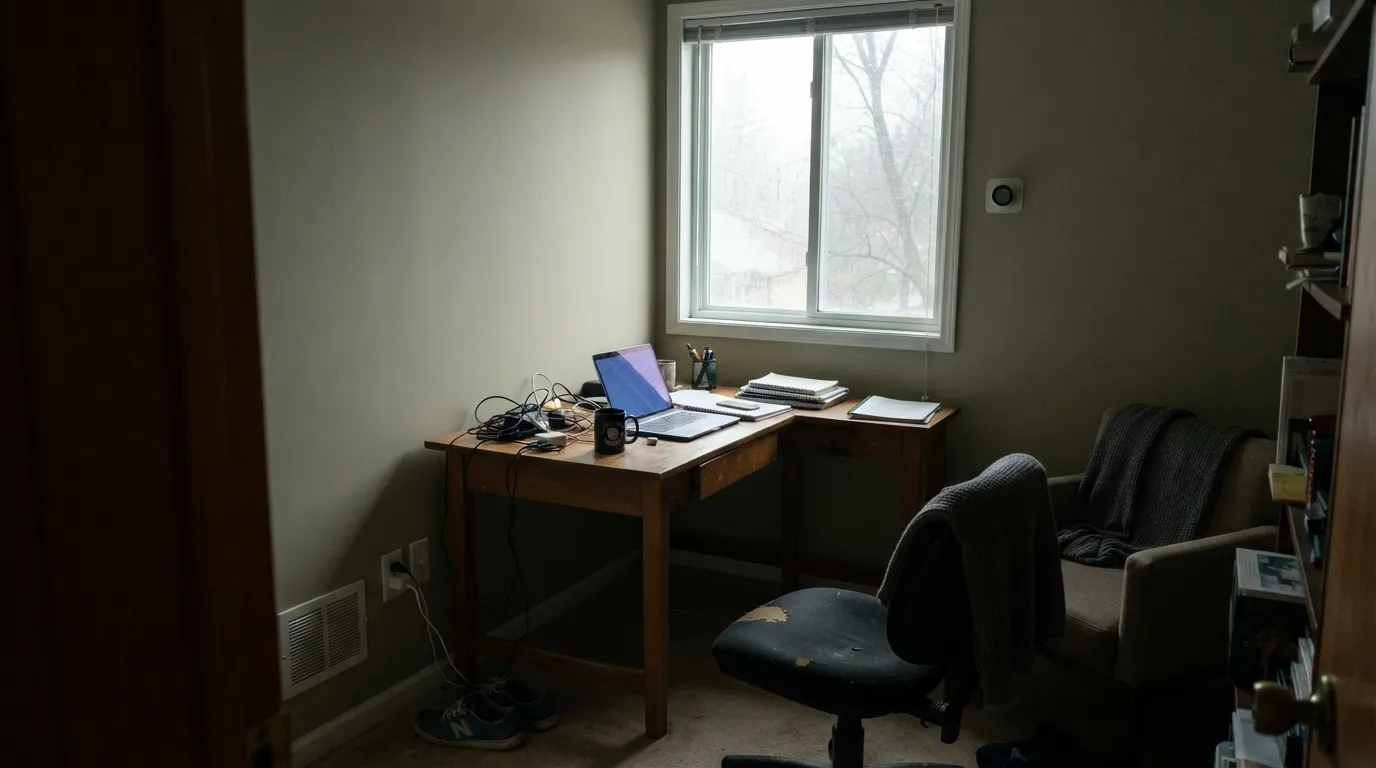
With warm lamps at night and any daylight during the day, it's restful without reading beige or dated. In a dim north bedroom it can feel flat rather than cozy — sample it at both morning and evening before you paint.
Afternoon and evening light flatter it, which suits a room that gets used more at the end of the day. Pair with walnut or leather for the earthy, grounded effect it does best.
Under a warm chandelier or pendant it goes soft and inviting; under cool overhead LEDs with no natural light it can look institutional. This is a lighting decision more than a paint decision.
Your Light Is the Risk
South or west daylight brings the yellow-green forward and the color reads earthy and settled, not washed out.
Cool, flat daylight drains the warmth and leaves a dull, muddy gray-green. Test a large sample here before committing.
Greener and warmer at the sun hours, quieter and more neutral the rest of the day — a gentle shift most people find pleasant, not distracting.
2700K lamps keep the green warm and earthy after dark. Cool white LEDs push it toward flat gray — swap the bulbs before you second-guess the paint.
Most complaints about Home Body are a light mismatch. Upload a photo of your actual room and see it on your walls — then ask for the same wall in north light or evening lamps before you buy a single sample.
Need It From Another Brand?
Any paint counter can custom-tint Kompozit 0406 directly. If you would rather stay in one brand's own deck, these are the closest stock matches, measured as ΔE2000. Under 2 is a difference you will not see on the wall.
| Brand | Closest color | ΔE | LRV | |
|---|---|---|---|---|
| Sherwin-Williams | AcanthusSW 29 · Sherwin-Williams | 2.3 | 60 | Color page → |
| Behr | Meadow GlenECC-12-2 · Behr | 0.9 | 62 | Color page → |
| Benjamin Moore | SpaAF-435 · Benjamin Moore | 2.5 | 64 | Color page → |
| Valspar | Apple Blossom Green8003-31C · Valspar | 1.2 | 60 | Color page → |
| PPG / Glidden | Pickling SpicePPG1122-3 · PPG / Glidden | 0.7 | 62 | Color page → |
| Glidden | Pickling SpicePPG1122-3 · Glidden | 0.3 | 63 | Color page → |
Similar Kompozit Colors
The nearest shades to Home Body within Kompozit's own range, ranked by perceptual color distance — useful when you want the same look a touch lighter, darker, or warmer.
WCAG 2.1: AA is 4.5 : 1 for normal text, 3 : 1 for large text, AAA is 7 : 1.
Home Body vs the Colors You're Also Considering
Every Home Body sample board has the same rivals on it. The numbers show the real lightness gap — then it comes down to which risk you would rather live with.
Pick this for something with less hype and less baggage — Home Body never had a marketing campaign, just the color.
Benjamin Moore HC-116 · LRV 57Guilford GreenPick this if you want the famous-name version at a nearly identical depth — a certified Color of the Year with two decades of real-world reviews behind it.
Pick this if Liveable Green tested too gray for your taste — Home Body carries a touch more visible green in the same light.
Sherwin-Williams SW 6176 · LRV 61Liveable GreenPick this if you want Sherwin-Williams tinting and an even quieter green that leans closer to a true neutral.
Pick this if Saybrook Sage feels like too big a decision — Home Body is the quieter, more neutral-passing version of the same idea.
Benjamin Moore HC-114 · LRV 56Saybrook SagePick this for more color commitment in the same family — clearly sage, with none of Home Body's neutral ambiguity.
Home Body Coordinating Colors
The color's own product description points toward terracotta and navy, or soft pinks and blues, with natural wood and greenery as texture — and the math backs that up. It's a warm, low-saturation color, so it wants warm or richly saturated partners rather than cool, icy ones. These are the pairings that make the most sense:
Home Body's Real Story: One Formula, Several Brands
This is not a color with a Color-of-the-Year moment or a celebrity design-show cameo behind it, and it would be dishonest to pretend otherwise. What it does have is something quieter and arguably more useful: 0406 "Home Body" is a color-matching-library formula that shows up, under the same name and number, in the decks of several independent and regional paint companies — Rodda Paint, Columbia Paint, Home Hardware, and ECOS Paints among them. Kompozit's fan deck runs on the same shared library many smaller brands license rather than developing every color from scratch.
That matters for how you should judge it. A color this widely licensed has been mixed, sold, and lived with by a real number of households across several companies, even though none of them individually built up the kind of famous public track record a Sherwin-Williams or Benjamin Moore bestseller has. Treat it the way you'd treat any solid, unglamorous industry-standard formula: trust the hex and LRV math, sample it in your own light, and don't expect a mountain of owner reviews to lean on yet.
Home Body With Wood Tones and Floors
Warm wood is this color's natural company. Because the undertone is itself warm and yellow-leaning, honey oak, golden pine, and butcher block don't fight it the way they fight a cool gray or blue-gray — they sit comfortably alongside it, and the wood's warmth and the wall's warmth read as one coordinated decision rather than two undertones arguing.
Darker woods — walnut, espresso — work too, just with a more visible contrast rather than a tonal blend; the wall reads lighter and greener against them. The one flooring to sample carefully is a cool gray-washed or gray LVP floor: it pulls attention to the wall's warmth in a way that can make the green read a little stronger than expected, which is fine if that's the look you want, but worth testing first.
Three Ready Palettes Built on Home Body
A color is never alone on the wall. These are complete combinations in the 60-30-10 pattern, with the reason each one holds together. Every one opens in the visualizer.
Vintage Vogue shares the same warm yellow-green undertone at a much deeper value, so the accent reads like a shadow of the wall color instead of a clash. White Dove trim keeps everything warm-neutral instead of tipping cold.
Try this palette in your roomCream walls keep the kitchen bright while the cabinets carry the sage-khaki warmth. The terracotta pantry door is the exact pairing this color's own product description points to — earthy, not matchy.
Try this palette in your roomA warm white trim keeps the facade from reading dingy against the muted siding, and one navy door supplies the single dark, saturated note the scheme needs to look intentional rather than accidental.
Try this palette in your roomHome Body FAQ
Is home body a green or a gray?
Both, depending on your light. It's a genuine yellow-green undertone at a low saturation, so in warm daylight it reads as a soft sage, and in cool or dim light it can pass for a plain warm-gray neutral. It is never a true gray — if you want that, look at a color built as one, like Repose Gray or Stonington Gray.
What trim color goes with home body?
A warm white — White Dove or Swiss Coffee, not a stark, cool white. A bright cool white next to this muted a color makes the walls look dingy rather than warm, the same trap that catches soft neutrals generally.
Does it work with honey oak or golden wood floors?
Yes — better than most true grays or blue-grays would. Because the undertone is itself warm and yellow-leaning, golden oak doesn't fight it the way it fights a cool gray. Walnut and espresso floors work too, just with a slightly less matched, more contrast-driven look.
Is it a good exterior siding color?
It's one of the color's strongest uses. Full outdoor sun clarifies the green rather than washing it out, and with white or cream trim it reads as a quiet, current exterior color. Pair with a dark front door for the contrast it needs to look deliberate.
Can I use it on kitchen cabinets?
Yes, and it's arguably the best single use of this color. Against cream walls and brass hardware it reads as a considered sage, not a beige accident. Use a satin urethane-fortified cabinet enamel, and keep counters warm-toned rather than icy quartz or cool marble.
Why is there so little public information about this color?
It's honest to say so: Home Body is a small paint brand's offering, and this specific listing doesn't have the decade of owner reviews and design-blog coverage that a Benjamin Moore or Sherwin-Williams bestseller has. The 0406 formula itself is shared across several independent regional paint companies, so the color has real history — it's this particular brand's track record with it that's still short. Judge it on its hex, LRV, and undertone math, which are solid, rather than on buzz that doesn't exist yet.
Have you painted with Home Body?
Rate it — one tap helps the next reader decide.
Ask a Question