Liveable Green
Sherwin-Williams' quietest green, reviewed honestly: the light that makes it glow, the light that flattens it to gray, and why it just became a Color of the Month.

Jessica has spec'd whites and neutrals for more than 300 rooms and keeps a sample wall of painted drawdowns in her studio. Every color review is checked against real reader rooms in the comments and re-tested when a formula changes. About the testing process →
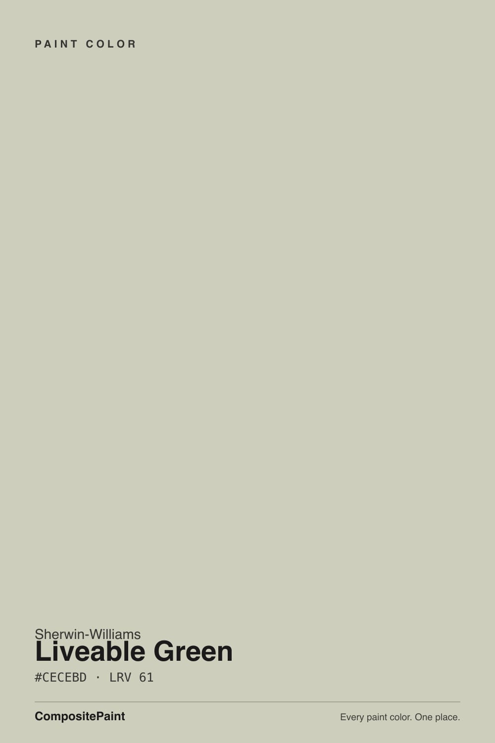
- 1Mindful Gray48
- 2Revere Pewter55
- 3Liveable Green61
- 4Pale Oak69
- 5Shoji White74
The Fast Verdict
Liveable Green is proof a color can carry "green" in its name and still read as a neutral. At LRV 61 it sits closer to a warm, yellow-gray greige than a garden hue — soft, organic, and easy to place in almost any room. Sherwin-Williams made it a Color of the Month in July 2026, a modest honor rather than a crowning one, and that is the honest story here: a dependable, whole-house-safe green-neutral that never asks for attention, not a design-world icon.
Whole-house walls in a home with mixed light · kitchens and cabinets next to warm wood and brass · anyone who wants a hint of green without committing to green · exteriors with white or black trim
You want an obvious, saturated green statement wall · your room runs on cool white LEDs with little daylight · your fixed finishes lean cold (chrome, cool gray stone) · you already tried it next to a stark cool white and it looked murky
- Warm yellow-gray undertone reads as an easy neutral, not a demanding "green wall"
- Whole-house safe — carries through open floor plans without clashing room to room
- Flatters warm wood, oak floors, and brass hardware
- Mid-depth LRV 61 holds its color without going dark or gloomy
- Freshly relevant — named a Sherwin-Williams Color of the Month in July 2026
- Cool daylight and cool-white LEDs flatten it toward plain taupe-gray
- Too subtle for anyone who wants an obvious, saturated green statement
- Fights chrome fixtures and cool gray stone
- Easy to confuse with its own siblings, Softened Green and Clary Sage, when sampling
What Color Is Liveable Green, Really?
A warm, yellow-gray green with the saturation turned way down. Sherwin-Williams files it in the Green family, but on the wall it behaves like a neutral cousin of a sage — its SKU sits directly next to Softened Green (SW 6177) and Clary Sage (SW 6178), three consecutive numbers built around the same idea at slightly different temperatures and depths. Liveable Green is the lightest and warmest of the three: brighter and more yellow-leaning than Softened Green's cooler, grayer green, less overtly herbal than a true sage like Clary Sage.
At LRV 61 it reflects a healthy amount of light without ever reading pale or washed out. That mid-depth is what lets it flex between a full accent color and a background neutral depending on what is next to it — beside warm wood and brass it reads distinctly green-tan; beside a cool white or gray stone it can flatten toward plain khaki-gray. It is genuinely one of the harder colors in this family to describe from the chip alone, because the room decides how much "green" you actually get.
Undertone in one line: warm yellow-gray, never blue, never true olive-brown. If your sample reads flat taupe with no green at all, that is cool daylight or cool-white bulbs washing it out — the color is there, it just needs warmer light to show up.
Where It Shines
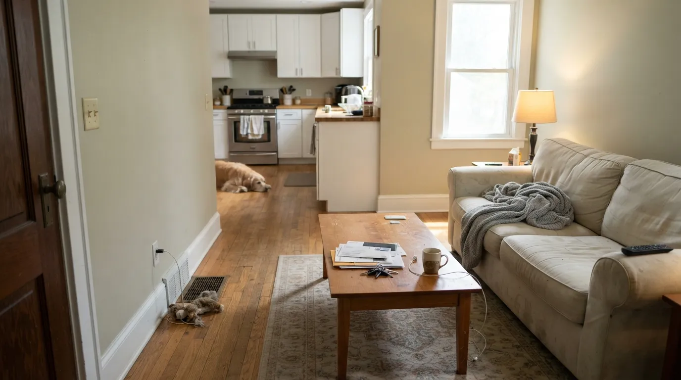
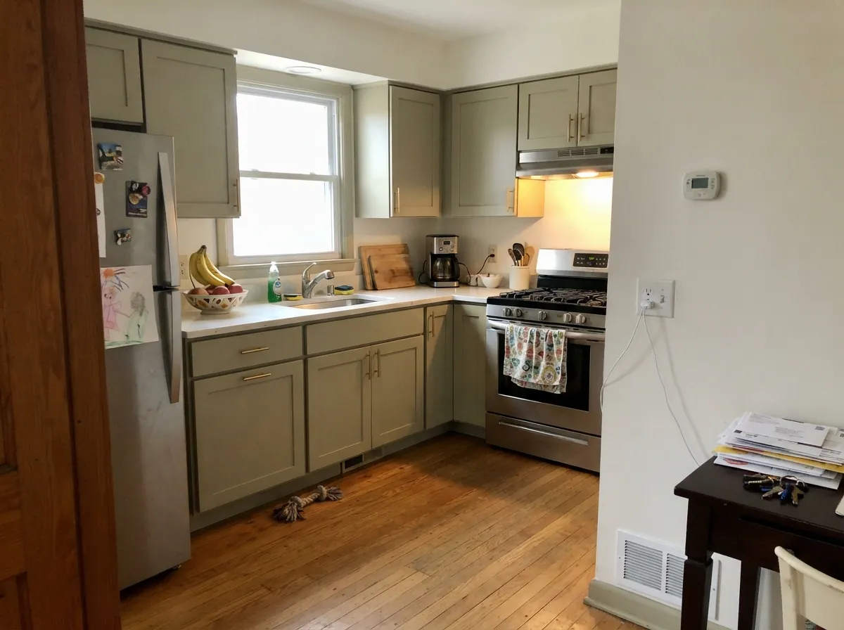
Give it real daylight, warm wood, and warm-toned trim and it does exactly what its name promises: a color you can live in, all day, without it ever feeling loud. It is one of the rare greens confident enough to run through an entire open floor plan — living room into kitchen into hallway — because it never gets aggressive enough to fight with anything. Cabinets are its other strong suit: against warm oak floors and brass pulls it reads as a considered, collected color choice rather than a trend color.
Where It Fails
Almost every disappointed review of Liveable Green comes down to one of three mismatches, and all three are predictable before the first coat goes on. None of them are the paint's fault — but if your room or your goal matches one of these, this is not your color.
In flat, cool, or overcast light the yellow drops out and what is left is a plain warm-gray neutral — barely distinguishable from a greige. If you are chasing an obvious green statement wall, this color will not give it to you; look at a more saturated sage instead.
A bright blue-white trim next to Liveable Green pulls the wall toward murky and olive-drab instead of soft and organic. Warm trim whites — Alabaster, White Dove — keep the pairing calm; a cool white makes the green look dirty by comparison.
Combine low natural light with cold-temperature bulbs and the warmth has nothing to work with — readers describe the result as flat, dingy gray-olive rather than the soft green they expected. Swap to warm 2700K bulbs before you blame the paint.
Room by Room
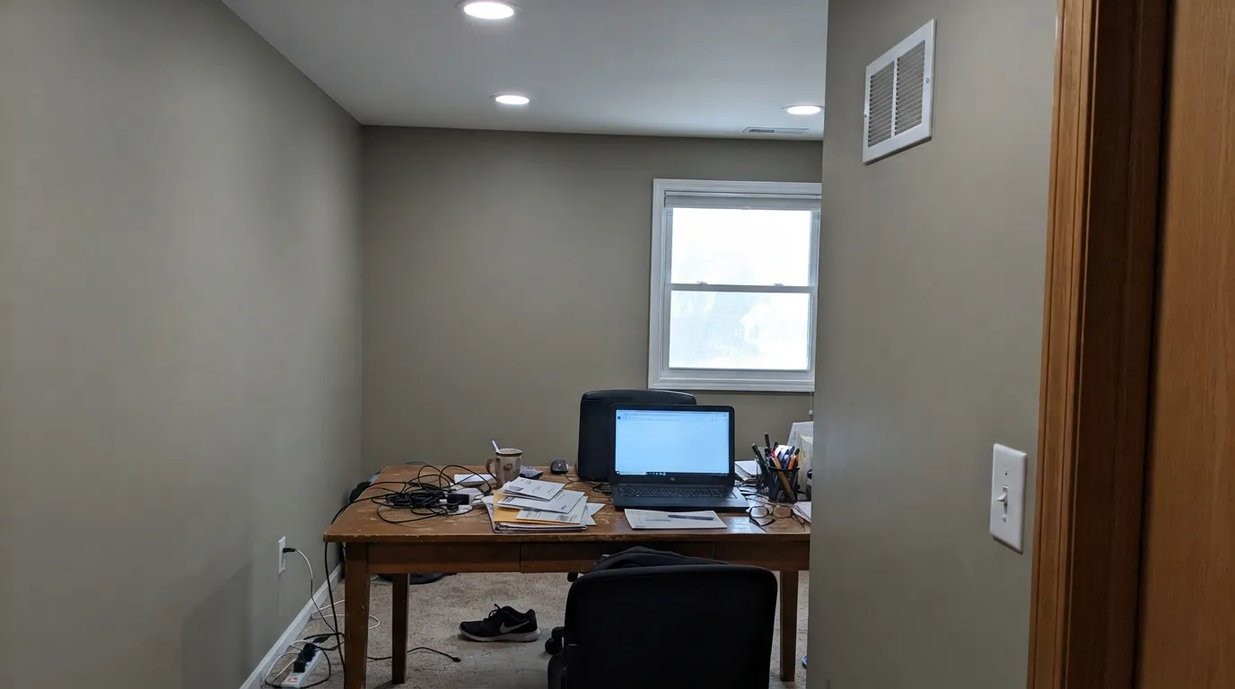
With daylight and warm wood furniture it is a quiet, grown-up backdrop that flatters everything without competing with it. Eggshell finish; keep trim warm, not stark white.
Against oak floors, butcher block, and brass hardware it looks intentional rather than trendy. Satin cabinet enamel wipes clean and hides the everyday marks a busy kitchen leaves behind.
Calm and easy to fall asleep in under 2700K lamplight. Skip it in a north-facing bedroom that relies on cool overhead LEDs — it will read flat instead of restful.
With warm wood vanities and brass fixtures it is soft and spa-like. Against chrome and cool gray tile it loses its warmth and starts to look washed out — sample it against your actual fixtures first.
Works as an interior door or accent trim under a lighter neutral wall, but it is subtle enough that it needs a plainer neighbor to register as a color choice at all.
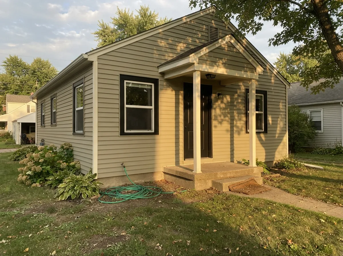
Outdoor light brings out more of the yellow, and black or charcoal shutters and doors give it the contrast it needs to read clearly as green from the street rather than as a plain tan house.
Your Light Is the Risk
Bright, warm daylight pulls the yellow forward and the green reads clearly and sunny. The color's best, most honest self.
Cool, gray daylight strips the yellow out and leaves a flat, muted taupe with barely a trace of green. Test before committing in a dim north room.
Warmer and more distinctly green in morning or evening sun, quieter and more neutral at midday. The shift is gentle, not jarring.
2700K warm bulbs bring the green back after dark. Cool LEDs do the opposite — flat and gray-tan. Change the bulb before you change the paint.
Most complaints about Liveable Green are a light mismatch. Upload a photo of your actual room and see it on your walls — then ask for the same wall in north light or evening lamps before you buy a single sample.
Need It From Another Brand?
Any paint counter can custom-tint Sherwin-Williams SW 6176 directly. If you would rather stay in one brand's own deck, these are the closest stock matches, measured as ΔE2000. Under 2 is a difference you will not see on the wall.
| Brand | Closest color | ΔE | LRV | |
|---|---|---|---|---|
| Behr | Sliced CucumberPPU10-11 · Behr | 1.5 | 61 | Color page → |
| Benjamin Moore | Dusty MillerCSP-755 · Benjamin Moore | 1.2 | 59 | Color page → |
| Valspar | UpstateT659 · Valspar | 1.7 | 62.2 | Color page → |
| PPG / Glidden | Metallic MistPPG1032-1 · PPG / Glidden | 1.9 | 59 | Color page → |
| Glidden | Metallic MistPPG1032-1 · Glidden | 1.4 | 60 | Color page → |
| Dutch Boy | Porcelain Slip423-1DB · Dutch Boy | 2.4 | 60 | Color page → |
Similar Sherwin-Williams Colors
The nearest shades to Liveable Green within Sherwin-Williams's own range, ranked by perceptual color distance — useful when you want the same look a touch lighter, darker, or warmer.
WCAG 2.1: AA is 4.5 : 1 for normal text, 3 : 1 for large text, AAA is 7 : 1.
Liveable Green vs the Colors You're Also Considering
Every Liveable Green sample board has the same rivals on it. The numbers show the real lightness gap — then it comes down to which risk you would rather live with.
Pick this for the warmer, more consistently green-leaning half of the pair.
Sherwin-Williams SW 6177 · LRV 49Softened GreenPick this for the grayer, more ambiguous sibling — Softened Green only firmly commits to "gray" or "green" once the light decides for it.
Pick this for the lighter, less overtly "green" half of the family.
Sherwin-Williams SW 6178 · LRV 41Clary SagePick this for a deeper, more clearly herbal sage that is genuinely easy to live with, if you respect its one lighting weak spot.
Pick this for a color that can run across every wall in the house, not just one surface.
Sherwin-Williams SW 9130 · LRV 30Evergreen FogPick this for real cabinet or accent-wall depth — the deck's best cabinet sage, if you work around its one real weakness.
Pick this if you are already sold on Sherwin-Williams, or want the lighter, more neutral-leaning version.
Benjamin Moore 1495 · LRV 39October MistPick this if your painter works in Benjamin Moore and you want the cross-brand equivalent — just as light-dependent, one shade deeper.
Sedate Gray SW 6169 shares the same LRV of 61 with a hex of #D1CDBF, so it is close but holds less green and reads more like a warm gray. Ancient Marble SW 6162 at LRV 60 sits at #D1CCB9 and pulls further toward beige. Frostwork SW 59 at LRV 62 goes the other way at #CBD0C2 and reads slightly cooler and greener. Useful Gray SW 7050 at LRV 59 is the deeper, more neutral option in the same family.
Across brands, HGTV Home Liveable Green HGSW 3247 has the identical hex at deltaE 0, the same color under another label. Benjamin Moore Dusty Miller CSP-755 at 1.21, Farrow and Ball Eddy No. 301 at 1.22, Glidden Metallic Mist PPG1032-1 at 1.43, and Behr Sliced Cucumber PPU10-11 at 1.47 are all visually identical in normal room light. Valspar Upstate T659 at 1.74 is in the same group. Clare All The Sage PNT100-LT-70 at 2.31 and C2 Paint Smidgeon C2-912 at 2.43 are very close, so sample first. Portola Paints Figueroa at 3.7 is close but visibly different side by side.
Liveable Green Coordinating Colors
The rule for coordinating with Liveable Green is the same as for any warm, muted color: stay warm, and give it either a warm white or a genuine near-black — not a cool in-between gray. It layers well with its own numbered siblings, loves brass and warm wood, and takes a near-black accent without losing its quiet character. These are the partners that keep showing up in rooms that work:
A Quiet Green's Moment: Color of the Month, July 2026
Liveable Green has no big design-world origin story — no Color of the Year campaign, no viral renovation. It has sat in the Sherwin-Williams deck as one of a closely numbered trio of muted greens (Liveable Green, Softened Green, Clary Sage) for years, quietly doing whole-house duty in homes that wanted a green without committing to one. The one real news item is recent and confirmed: Sherwin-Williams named it a Color of the Month for July 2026.
That is worth knowing honestly for what it is — a small, current nod, not a historic honor. It does not change how the paint behaves on a wall. What it does confirm is timing: muted, gray-leaning greens are still the color the industry keeps reaching for as the gray decade fades, and Liveable Green is a low-risk way into that mood without picking a louder, more decisive sage.
Liveable Green With Wood Tones and Floors
This color is built to sit next to warm wood, and it shows. Oak, walnut, and butcher block all read richer and more intentional next to Liveable Green, because the wall's warmth meets the wood's warmth instead of fighting it. Brass hardware is the natural finish partner — nickel and chrome read colder and pull the wall's warmth out by comparison.
The floor that needs a sample first is cool gray LVP or gray-washed wood. Against a cool floor, Liveable Green can lose its green entirely and settle into a flat, slightly murky gray — test a large sample above the actual floor, in the actual room's light, before committing to four walls.
Three Ready Palettes Built on Liveable Green
A color is never alone on the wall. These are complete combinations in the 60-30-10 pattern, with the reason each one holds together. Every one opens in the visualizer.
A warm trim white keeps the green from tipping murky, and one near-black door supplies the single dark note the scheme needs without disturbing the calm neutral walls.
Try this palette in your roomWhite Dove keeps the room bright while the cabinets carry a quiet, considered color; Peppercorn on the island grounds the palette and loves brass hardware.
Try this palette in your roomTwo closely related greens from the same numbered family layer without clashing, and a warm white trim keeps the tonal pairing from reading muddy.
Try this palette in your roomLiveable Green FAQ
Is Liveable Green actually green?
Barely, depending on the light. It is a genuine yellow-gray green, but at LRV 61 with the saturation turned way down, cool or flat light can make it read as plain warm gray. Warm daylight and warm wood bring the green forward; cool light and cool trim mute it.
What is the undertone of Liveable Green?
Warm yellow-gray. It never turns blue or true olive-brown. If your sample looks flat taupe with no green at all, that is cool light or cool-white bulbs, not a different paint.
Liveable Green vs Softened Green vs Clary Sage — which one?
All three sit on consecutive SKUs at Sherwin-Williams and share the same basic idea at different depths. Liveable Green (LRV 61) is the lightest and warmest, reading most consistently green in daylight. Softened Green (LRV 49) is grayer and more light-dependent — it can go either gray or green depending on the room. Clary Sage (LRV 41) is the deepest and most clearly herbal. Sample all three side by side; they are close enough that lighting, not the chip, decides.
Is it good for kitchen cabinets?
Yes — one of its strongest uses. Against warm wood floors and brass hardware it reads considered rather than trendy. Use a satin cabinet enamel; it wipes clean and wears well.
Does it work with cool gray floors or chrome fixtures?
Not its best pairing. Liveable Green is built on warmth, and cool gray stone or chrome fixtures pull that warmth out, leaving the wall looking washed out rather than organic. It is happiest with warm wood, brass, and warm-toned trim.
Was Liveable Green a Color of the Year?
No — Sherwin-Williams named it a Color of the Month for July 2026, which is a smaller, more frequent honor than Color of the Year. It is a solid, dependable green-neutral, not a headline color; treat the recognition as current, not historic.
Have you painted with Liveable Green?
Rate it — one tap helps the next reader decide.
Ask a Question