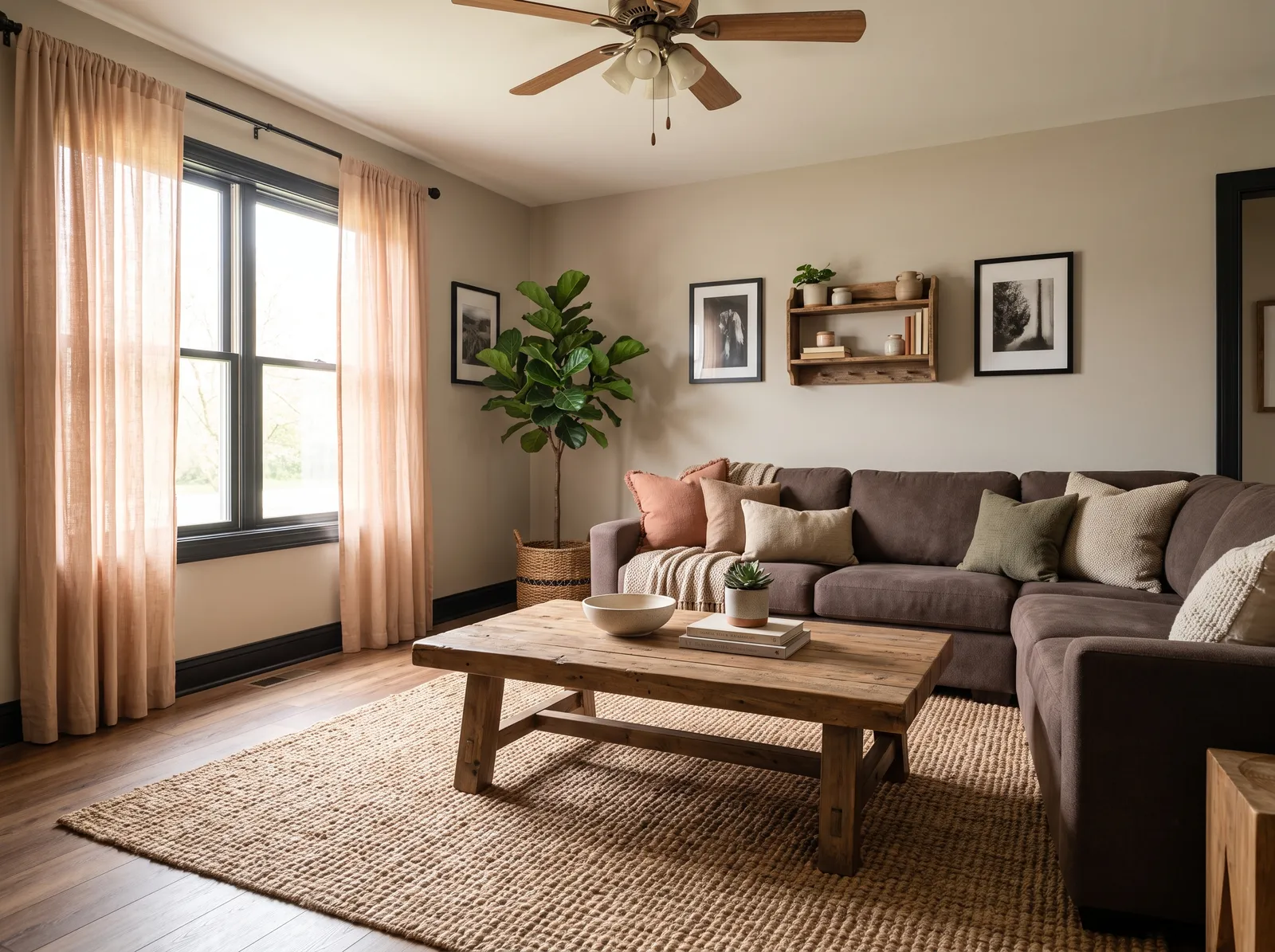
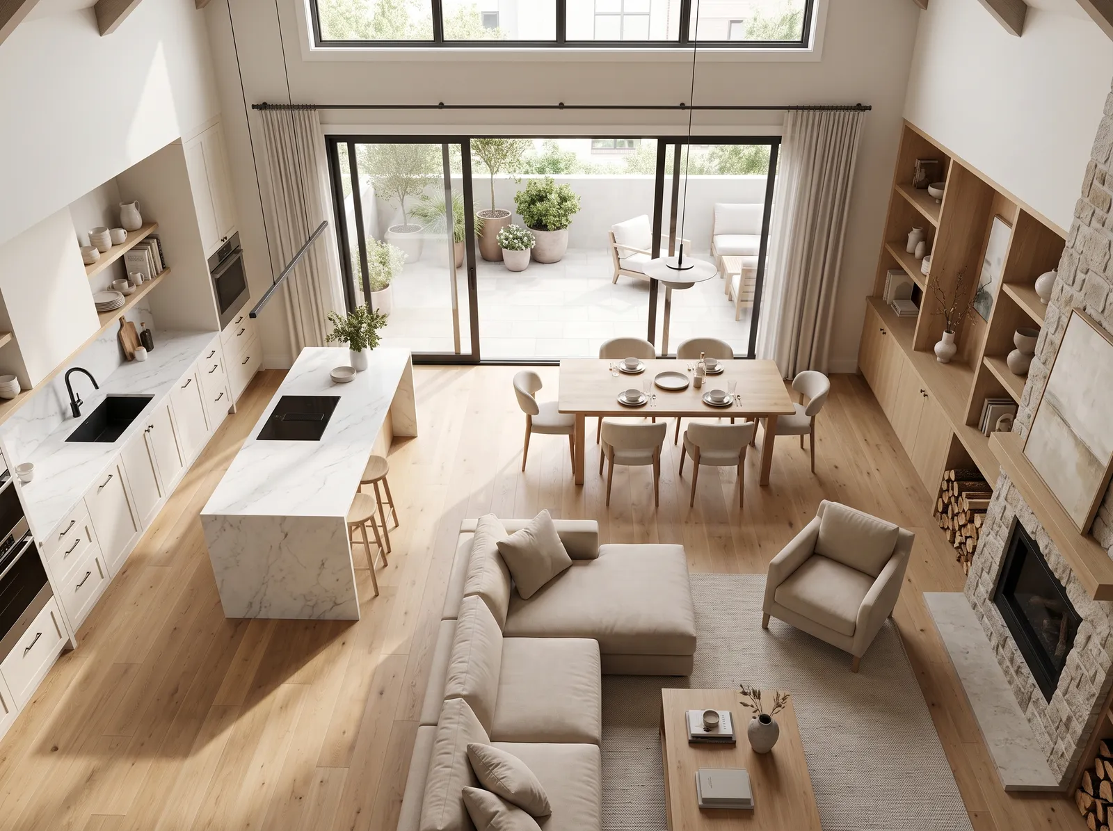
Room Colors · Neutral Living Room
8 Best Neutral Living Room Paint Colors for 2026
ideas, combinations, and real rooms
8 curated picks from real neutral living rooms — with the exact colors, honest reasons why, and the combinations that hold the room together.

Former interior stylist who can spot a green undertone from across a room. Jessica writes the color and mood pieces — what to choose, what pairs, and why your "white" looks pink.
The Fast Answer
Don't want to read 8 picks? These four are the safe answers.

Top Picks for the Neutral Living Room
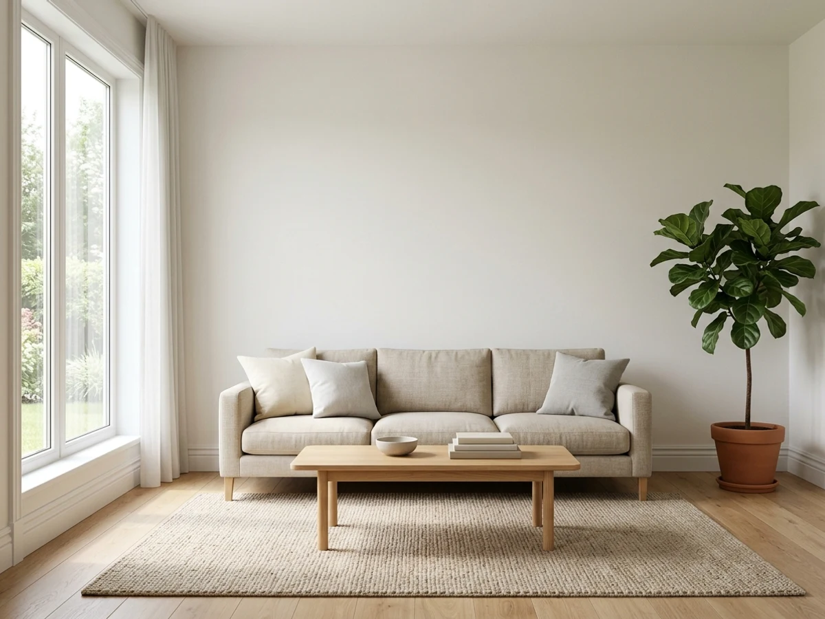
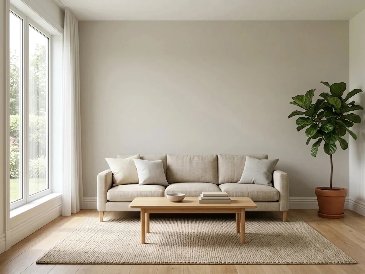
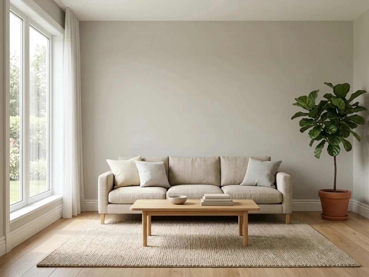
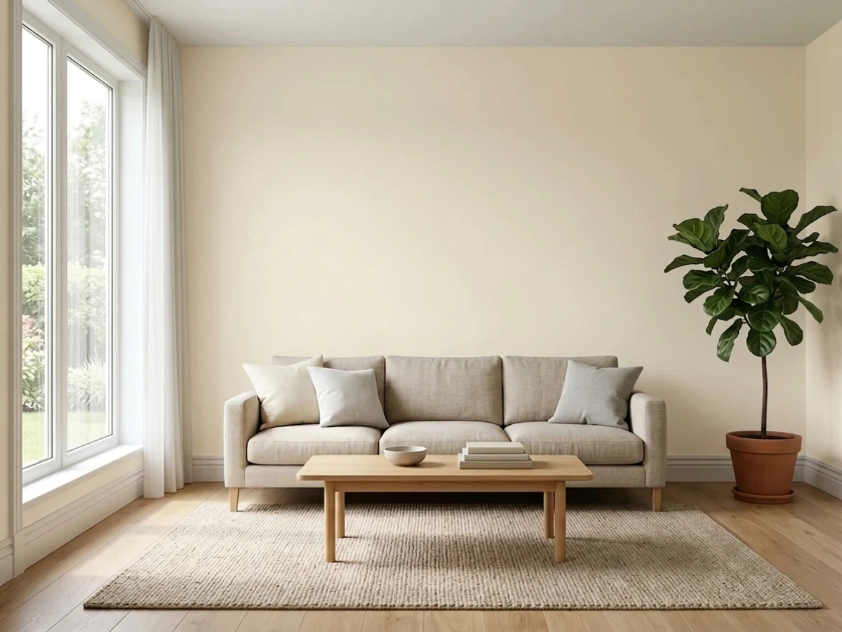
Tap a shade to see the neutral living room in it, then try it on your own room.
Neutral Living Room Color Trends 2026 — What's In, What's Out


- Flat Cool Gray Walls — Cool, blue-gray walls that dominated the last decade feel sterile next to 2026's warmer, more layered neutral palettes.
- All-Gray Everything — Matching gray walls, floors, and furniture in one cool tone reads monotonous compared to 2026's mixed warm-neutral layering.
- Stark White Trim On Cool Walls — Bright, cool white trim against gray walls feels clinical; 2026 favors warmer trim tones that blend with the wall color.
The 8 Best Neutral Living Room Paint Colors
Every pick below is a real rendered neutral living room, not a chip. The lead color first; the swatches are the full scheme in the photo — walls, furniture, textiles, accent.

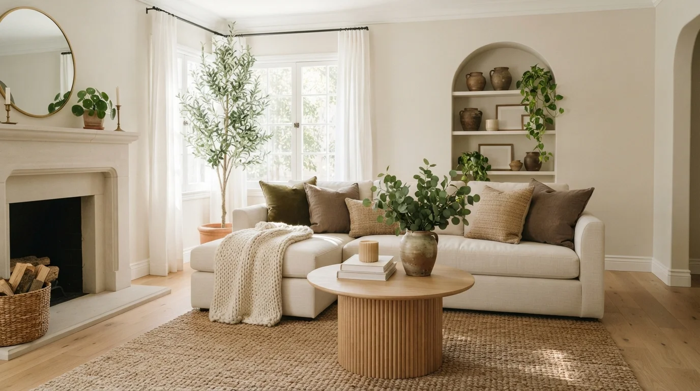
Dappled sunlight warms creamy walls, soft linen seating, natural oak textures, and calming olive green accents.
Warm cream is a soft, comforting off-white with gentle beige notes. In this space, the creamy hue blankets the walls and arched built-ins, framing an off-white sectional and a fluted oak coffee table over a thick woven jute rug. The room feels effortlessly snug and grounded. Layering earthy greens and rich natural woods against light walls keeps everything looking bright yet deeply relaxing. It is ideal for anyone who loves an organic, serene sanctuary that feels like a quiet weekend morning.
SEE WHITE MOCHA ON YOUR WALLS →
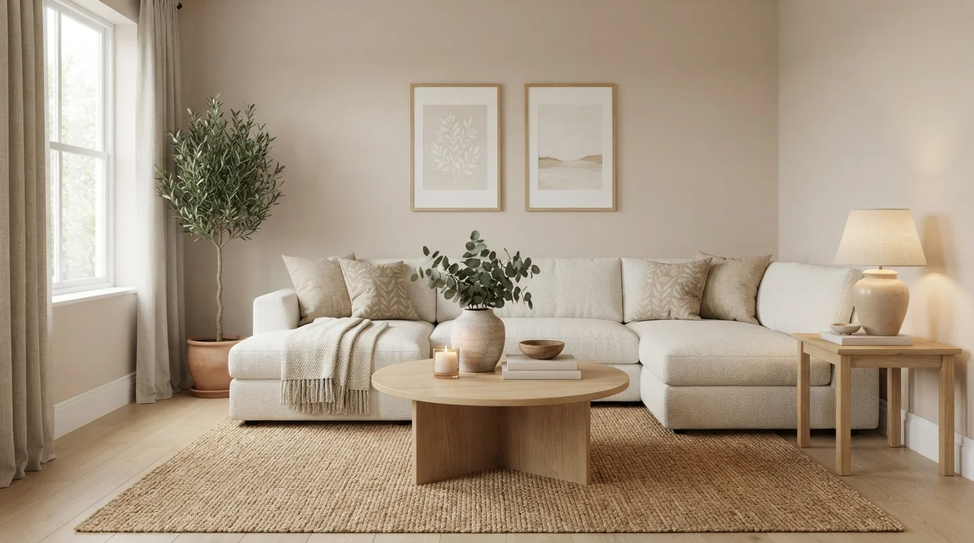
Soft cream walls paired with textured knits and light natural wood create a deeply calming, sunlit sanctuary.
Cream is a soft, warm off-white with an inviting glow. In this space, the walls are painted a gentle cream that pairs seamlessly with an off-white sectional, woven beige throw pillows, and a chunky knit blanket. A round blonde wood coffee table rests on a textured tan rug, balanced by simple botanical art and a lush potted tree. The room feels remarkably calm, airy, and grounded. Sticking to layered neutral textures with light wood keeps the monochrome look cozy rather than flat. It is perfect for anyone wanting a tranquil, clutter-free retreat.
SEE HAZELNUT CREAM ON YOUR WALLS →
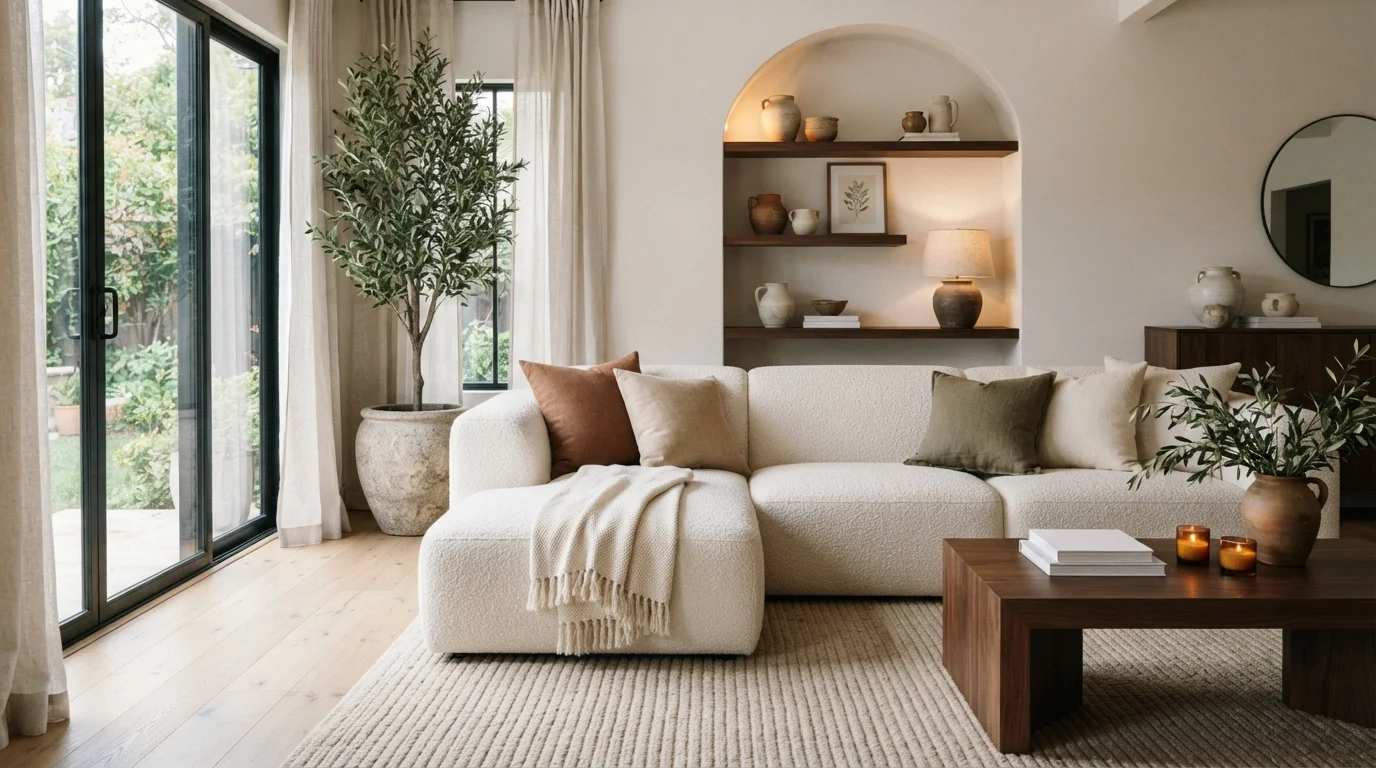
Soft cream walls, plush bouclé textures, and rich wood tones create an intensely cozy, nature-inspired living room sanctuary.
Cream is a soft, soothing off-white with a touch of gentle warmth. In this room, creamy walls wrap around an off-white bouclé sectional, a textured wool rug, and deep walnut wood tables. The room feels deeply calm, grounding, and comfortable to lounge in all day. Pairing gentle light walls with rich wood and leafy green branches works because earthy naturals always complement each other effortlessly. This look is perfect for anyone wanting a relaxed, minimalist space filled with warm texture.
SEE MODEST WHITE ON YOUR WALLS →
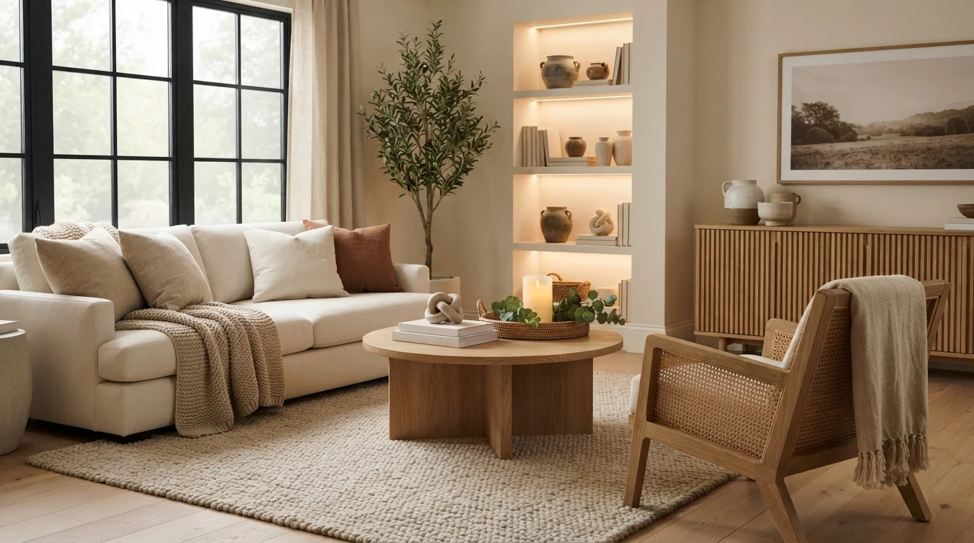
Soft cream walls, light oak accents, and chunky knit textiles wrap this peaceful living room in cozy warmth.
Warm cream is a soft, comforting off-white with gentle beige notes. In this space, it coats the walls, creating a seamless backdrop for the light cream sofa, chunky looped rug, and matching linen drapes. The room feels incredibly snug, grounded, and peaceful. The look works beautifully because layering different textures within the same light neutral family keeps everything calm without feeling flat or sterile. It is the perfect setup for anyone who loves an organic, clutter-free sanctuary to unwind after a long day.
SEE WHITE SAND ON YOUR WALLS →
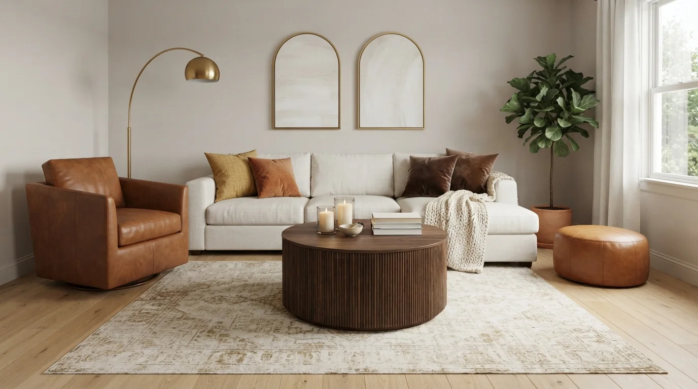
Soft glowing light and rich leather accents blend with creamy linen walls for a wonderfully relaxing evening retreat.
Linen greige is a gentle, warm off-white with a cozy touch of beige. Here, it covers the walls, creating a soft backdrop for the cream sectional, dark fluted coffee table, and rich caramel leather chairs. The room feels snug, peaceful, and instantly inviting. This combination works because earthy wood and leather anchor the pale walls, keeping the neutral space from feeling washed out. It is ideal for anyone who loves calm, layered neutrals with plenty of warmth.
SEE TAUPE MIST ON YOUR WALLS →
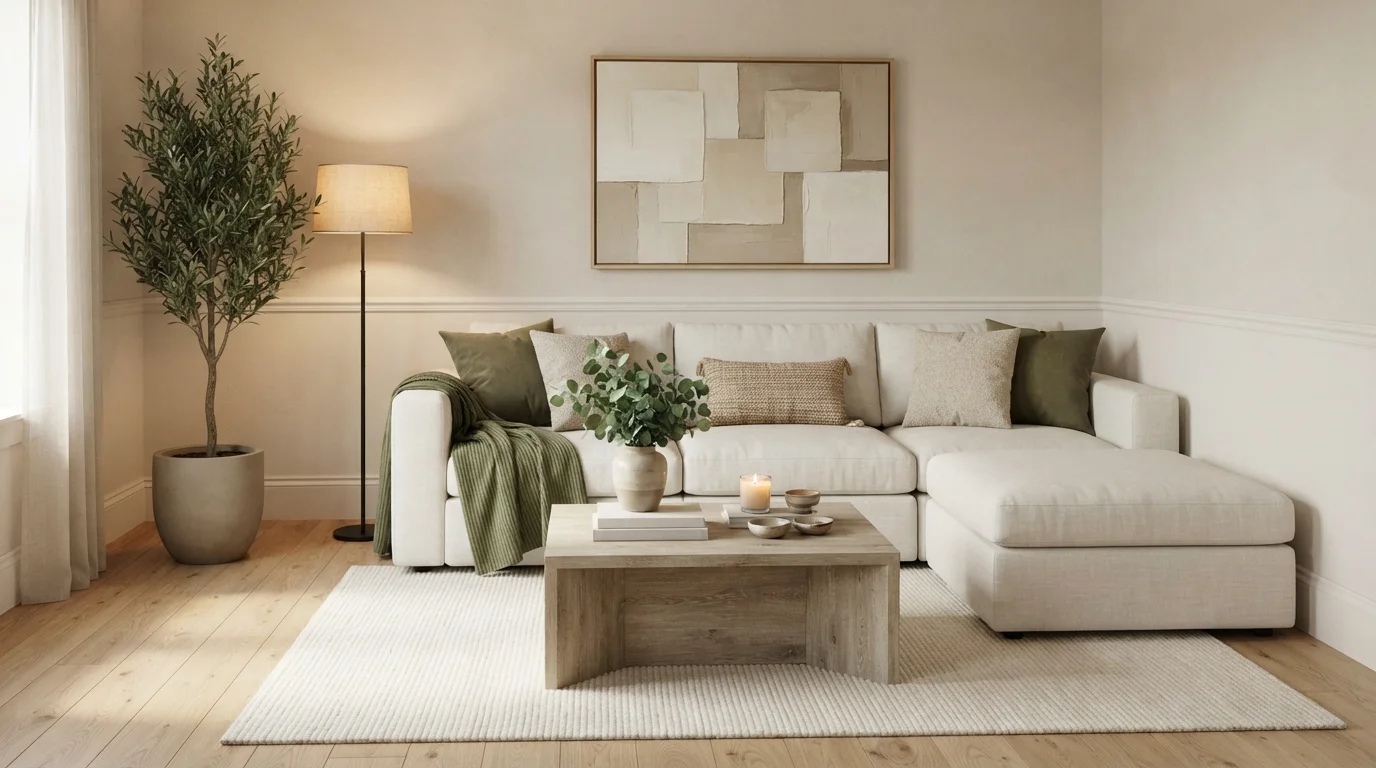
Soft cream walls and plush seating wrap you in calm, grounded by rich olive green textures and warm wood.
Soft warm cream is a gentle, soothing neutral with a touch of cozy warmth. In this room, creamy off-white covers the walls, setting a restful backdrop for an inviting linen sectional, moss green pillows, a soft olive knit throw, and a light wood coffee table over a ribbed rug. The whole space feels peaceful, snug, and deeply welcoming. Naturals go together naturally, letting the earthy greens and wood tones pop without cluttering the view. This look is perfect for anyone wanting a tranquil haven to unwind.
SEE WATER CHESTNUT ON YOUR WALLS →
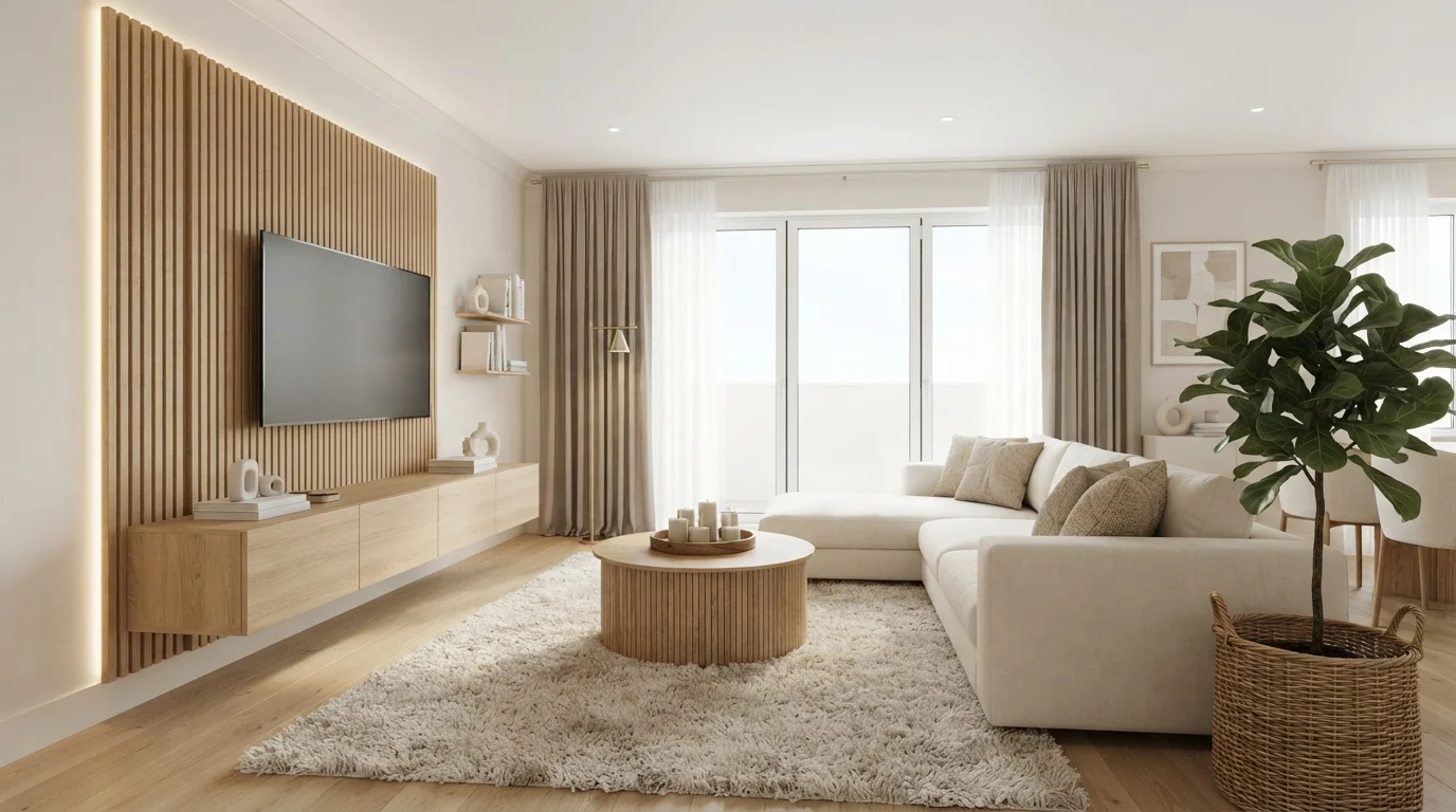
Bask in gentle daylight, glowing wood slats, and cloud-like neutral textures that invite effortless, calming relaxation.
Creamy off-white is a soft, gentle neutral filled with cozy warmth. In this room, that quiet cream covers the smooth walls, blending effortlessly with the light oak slat accent wall, ribbed coffee table, and plush beige sectional sofa. The whole space feels peaceful, open, and super snug. The combo works so well because layering matched light woods with soft, tone-on-tone fabrics keeps a modern space feeling inviting instead of stark. It is the ideal setup for anyone who loves clean lines and a soothing atmosphere.
SEE STONE QUARRY ON YOUR WALLS →
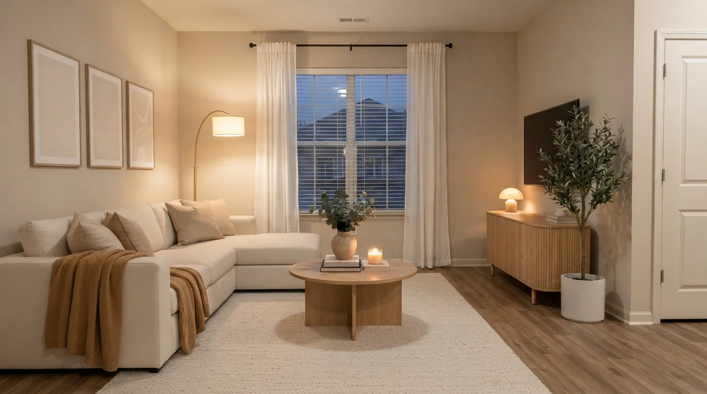
Soft lamp light and layered creamy neutrals wrap this relaxing living room in an inviting, peaceful evening glow.
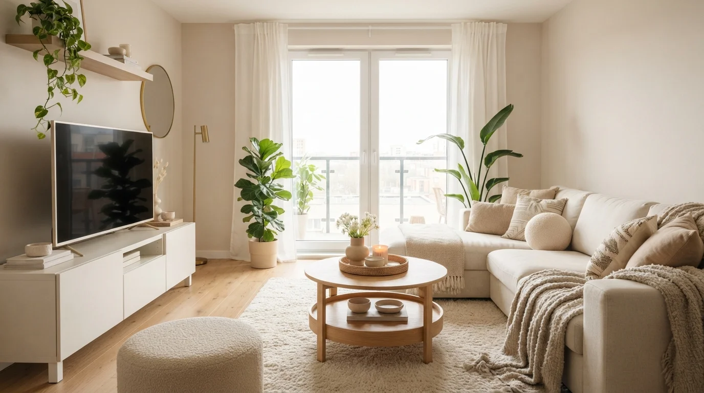
Warm beige is a soft, comforting neutral with a gentle glow. In this space, creamy beige walls set a relaxing backdrop for an off-white sectional, a round oak coffee table, and a plush beige rug. The room feels incredibly cozy, snug, and peaceful. The combo works because layered tone-on-tone neutrals and natural light wood always look clean and effortless together. It is perfect for anyone who loves an uncluttered, modern space designed for quiet evenings at home.
SEE BUFFED TAN ON YOUR WALLS →Neutral Living Room Wall Color Combinations
A wall color never works alone. These are the full schemes from the rooms above — the lead color first, then the supporting colors that make the photo work.
Dappled sunlight warms creamy walls, soft linen seating, natural oak textures, and calming olive green accents.
TRY THIS PALETTE →Soft cream walls paired with textured knits and light natural wood create a deeply calming, sunlit sanctuary.
TRY THIS PALETTE →Soft cream walls, plush bouclé textures, and rich wood tones create an intensely cozy, nature-inspired living room sanctuary.
TRY THIS PALETTE →Soft cream walls, light oak accents, and chunky knit textiles wrap this peaceful living room in cozy warmth.
TRY THIS PALETTE →Agreeable Gray walls pair cleanly with a warm white trim rather than a stark white — something with a hint of the same undertone keeps the transition from looking like two unrelated whites fighting each other, and it lets warm wood floors or a walnut coffee table read as intentional instead of clashing. Revere Pewter works the same way but leans further into its greige base, so it's the stronger match if the room already has a lot of brass, leather, or honey-toned wood in it.
For a living room built around a rug or art collection, Blank Canvas or Swiss Coffee on the walls with Dolphin Fin held back for the fireplace surround, a built-in, or the window trim gives the room a lead-and-support structure instead of one flat neutral box — the near-white walls stay out of the way, and the deeper Dolphin Fin frames the one architectural feature worth noticing. Accessible Beige and Edgecomb Gray both sit close enough in value that either can swap in as the default wall color while the other becomes an accent nook or hallway tie-in, so the whole main floor still reads as one palette.
More Living Room Color Ideas
Set on a color family already? Each page has its own real rooms and picks.
Light or Dark Neutral Living Room Colors?
Go Light (LRV 60+) If…
The room is small, faces north, or has to work at every hour. Light warm colors make it feel bigger and stay calm in evening light — the light you actually live in.
Go Dark (LRV Under 20) If…
You want the cocoon effect and the room has real daylight. Dark works best on one feature wall — or fully color-drenched in a large room with good windows.
Living rooms rarely get one consistent light source all day, so the LRV numbers on this page matter more than the paint chip alone. If the room is small, faces north, or only gets a couple of windows, lean toward the lighter end — Swiss Coffee (LRV 80) or Blank Canvas (LRV 79) will bounce back what little daylight comes in and keep the room from feeling closed off. A room with south- or west-facing windows and a lot of afternoon sun can carry more depth without going dark; Agreeable Gray (LRV 60), Edgecomb Gray (LRV 63), and Repose Gray (SW 7015, LRV 58) all read as calm mid-tones rather than gray in strong light.
Dolphin Fin (LRV 47) is the one pick here worth using deliberately rather than defaulting to. At LRV 47 it's still a mid-tone, not a true dark, but in a living room with low ceilings or minimal natural light it will read noticeably heavier on all four walls than it does as a single accent wall or trim detail around a window bay. Save it for rooms that already get good light, or use it on one wall instead of the whole box.
See It. Love It.
Paint It.
Upload one photo of your neutral living room and try every color on this page on your own walls — in your own light, before you buy a drop of paint.

Revere PewterBeforeSheen and Finish for a Neutral Living Room
Living room walls take more contact than almost any other room — shoulders against the wall near the couch, kids' hands near light switches, the occasional dog. A washable eggshell or satin finish is the standard choice for any of these picks on the main wall surface, since it holds up to a damp cloth without the glare a full satin or semi-gloss would throw across a large open wall.
If the drywall isn't perfectly smooth — patched holes, slight waves from an older build — flat or matte will hide those flaws better than eggshell, which can catch light at an angle and highlight every imperfection. That trade-off matters most with the lighter picks like Swiss Coffee and Blank Canvas, where a high-LRV color on a slightly uneven wall shows texture more than a deeper tone like Dolphin Fin would.
Trim, window casings, and any built-ins should move up to semi-gloss regardless of which wall color is chosen. That contrast in sheen — not just color — is what makes trim read crisp against a soft wall like Revere Pewter or Accessible Beige.
Common Mistakes with Neutral Living Room Colors
The biggest one is buying a gallon off the strip without testing it in the actual room. Agreeable Gray is famous for this exact problem — it's a chameleon color that can read warm gray in one house and flash a faint lavender in another, depending on the bulbs and how much daylight the room gets. A large sample swatch on the wall, checked morning and night, catches this before it becomes a repaint.
The second mistake is matching every neutral in the room to the same white. Trim, ceiling, and walls don't need to be the same color to feel cohesive — they need compatible undertones. Pairing a cool-leaning wall like Repose Gray with a warm cream trim is where rooms start to look accidentally mismatched rather than intentionally layered.
The third is ignoring what's already fixed in the room — the floor, the stone on a fireplace, a built-in bookcase. A warm greige like Revere Pewter next to cool gray tile can pull pink; a cool gray like Repose Gray next to orange-toned oak floors can look chalky. Bring a flooring sample or a photo of the fireplace when picking the swatch, not just the couch fabric.
About Neutral Living Room Paint Colors
A living room earns more daylight hours than almost any other room in the house, which is exactly why neutral wins here more than anywhere else. The wall color has to hold up at 8am with coffee, at 2pm with the blinds open, and at 9pm under lamplight — and it has to keep working when the rug changes, the art changes, or the in-laws visit with an opinion about the couch. Neutral isn't a compromise; it's the color that survives all three.
Most of the picks on this page sit in the mid-60s to high-70s LRV range, which is the sweet spot for a room that gets used all day. Agreeable Gray (Sherwin-Williams SW 7029, LRV 60) is the most popular neutral in the country for a reason — it reads warm gray in most rooms, though under cool LED bulbs or in a north-facing room with little sun it can flash slightly lavender, so it's worth testing a swatch under your actual bulbs before committing a gallon. Revere Pewter (Benjamin Moore HC-172, LRV 56) is the steadier alternative — a warmer, more organic greige that doesn't shift as much room to room, which is why it's stayed a designer favorite for over a decade. Edgecomb Gray (Benjamin Moore HC-173, LRV 63) sits a shade lighter and greener than Revere Pewter, an easy match if the room already leans warm.
For rooms that want more light bounced back, Swiss Coffee (Behr 12, LRV 80) and Blank Canvas (Behr DC-003, LRV 79) are both near-white with a soft cream base — Swiss Coffee reads familiar and cozy, while Blank Canvas is cool and crisp enough to let a bold rug or patterned pillows do the talking. Accessible Beige (Sherwin-Williams SW 7036, LRV 58) is the warmest, coziest option on the list, and Dolphin Fin (Behr PPU18-15, LRV 47) is the one deeper mid-tone here, dark enough to frame windows or a fireplace without turning the room into a cave.

The Questions Everyone Asks
What color should I paint my neutral living room?
If you want one answer, start with the safe picks above — White Sand, White Mocha, Hazelnut Cream, Modest White. They read well in any light and survive furniture changes. Then check the light: strong afternoon sun wants a step cooler, a north-facing room wants a step warmer.
what color should I paint a small living room
Go lighter, not stark white. Swiss Coffee (Behr 12, LRV 80) or Blank Canvas (Behr DC-003, LRV 79) both sit near the top of the LRV scale, which bounces available light around the room without the flat, sterile look of a pure white. A small room with limited windows benefits more from a high-LRV neutral than from a trendy deep color, no matter how good it looks in photos of bigger rooms.
what two colors work well together in a neutral living room
Agreeable Gray (SW 7029) on the main walls with Dolphin Fin (Behr PPU18-15) on a fireplace surround or accent wall is a reliable pairing — both share a similar warm-neutral base, so the deeper tone reads as intentional depth rather than a clashing color. For a softer version of the same idea, pair Revere Pewter (HC-172) walls with a warm white trim instead of a stark white.
how do I make a living room look bigger with paint
Keep walls, trim, and ceiling close in value so the eye doesn't stop at a hard color break — a near-white like Blank Canvas on walls with a matching-toned white on trim reads as one continuous space. High-LRV neutrals (78 and up) genuinely help here, since they reflect more light back into the room than a mid-tone gray ever will, even at the same wall size.
is agreeable gray too gray or too beige for a living room
It depends on the light. Agreeable Gray (SW 7029, LRV 60) has enough warmth to avoid reading cold, but enough blue-gray base to avoid reading beige — that in-between quality is exactly why it's Sherwin-Williams' most popular color. In a room with warm bulbs and natural light it leans gray-beige and neutral; under cool white LEDs it can pull slightly cooler or, in some rooms, faintly lavender. Test a swatch under your own bulbs before deciding.
does revere pewter look pink or purple in a living room
Rarely, and less often than Agreeable Gray does. Revere Pewter (Benjamin Moore HC-172, LRV 56) has a steadier, more organic greige base that holds its warm-gray identity across most lighting conditions. It can look slightly pink next to very cool-toned gray flooring or countertops, since the contrast pulls out its warmth — pairing it with warm wood floors or beige stone avoids that shift entirely.
What two-color combination works best in a neutral living room?
The reliable pattern is a quiet main color plus one deep accent on a single wall. Keep trim and ceiling in one warm white so the two colors are the only event in the room — the combination cards above show complete schemes from real rooms.
What colors make a neutral living room look bigger?
High-LRV, slightly warm colors — LRV 60–75 is the sweet spot. Paint the walls and trim close to the same light color so the corners blur, and keep the ceiling white. Stark cool white actually works against you; it creates hard shadows that show the room's edges.


Ask a Question