Room Colors · White Living Room
8 Best White Living Room Paint Colors for 2026
ideas, combinations, and real rooms
8 curated picks from real white living rooms — with the exact colors, honest reasons why, and the combinations that hold the room together.

Former interior stylist who can spot a green undertone from across a room. Jessica writes the color and mood pieces — what to choose, what pairs, and why your "white" looks pink.
The Fast Answer
Don't want to read 8 picks? These four are the safe answers.

Top Picks for the White Living Room
Tap a shade to see the white living room in it, then try it on your own room.
White Living Room Color Trends 2026 — What's In, What's Out


- Bright Cool White Everything — Stark, blue-leaning white walls that once read fresh now feel sterile next to 2026's warmer, creamier white choices.
- All-White Minimalism — Completely white rooms with no color or texture feel cold in 2026 as homeowners add warm wood, earthy accents, and texture.
- Matching Trim And Wall White — Using the exact same stark white on walls and trim flattens a room; 2026 favors subtle tonal contrast between the two.
The 8 Best White Living Room Paint Colors
Every pick below is a real rendered white living room, not a chip. The lead color first; the swatches are the full scheme in the photo — walls, furniture, textiles, accent.

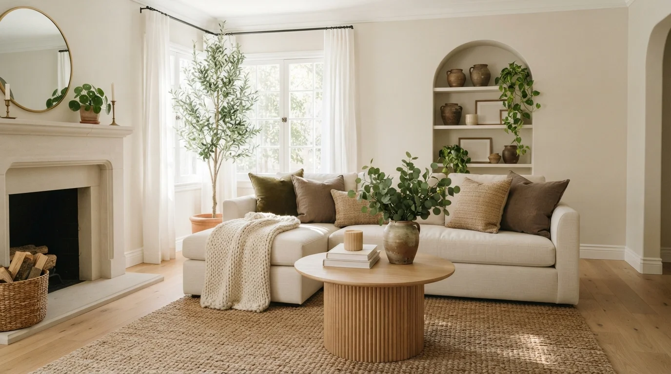
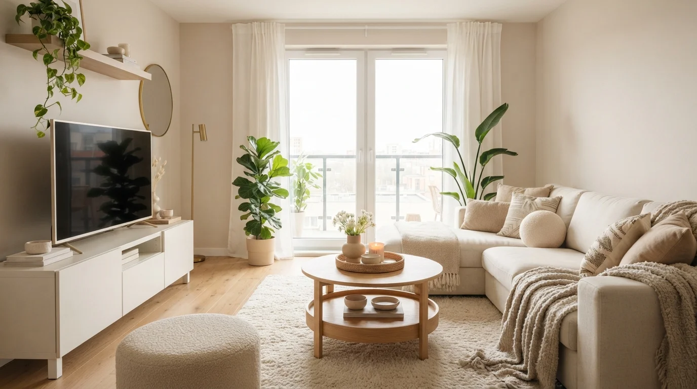
Bask in a soothing, sun-drenched space layered with soft cream textures, pale oak wood, and gentle potted greenery.
Cream is a soft, warm off-white with an inviting, gentle glow. Here, that creamy tone wraps the walls, harmonizing with the plush sectional sofa, textured rug, and matching boucle ottoman. The whole space feels exceptionally calm, bright, and restful. Layering multiple rich textures in the same pale shade with light oak wood keeps the monochrome look cozy rather than flat. It is the perfect setup for anyone who loves an airy, minimalist home that still feels wonderfully comfortable and relaxing.
SEE SAND DOLLAR ON YOUR WALLS →
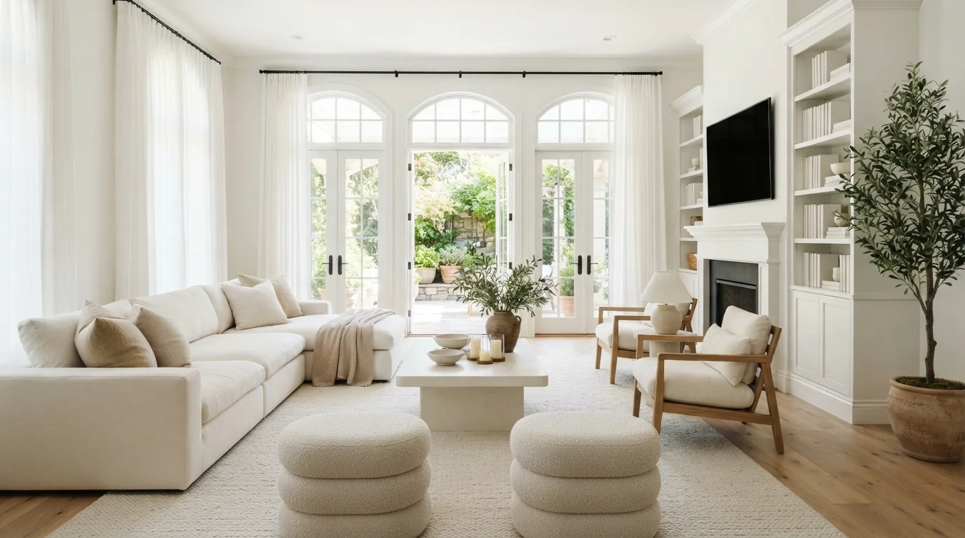
Soft daylight and creamy whites blend with pale oak accents to craft a deeply restful, open sanctuary.
Soft warm white is a clean, creamy neutral that never feels cold or sterile. In this room, the walls, ceiling, and built-in cabinets all wear this luminous shade, pairing seamlessly with the plush white sectional, boucle ottomans, and textured beige rug. The space feels incredibly calm, sunlit, and peaceful. Sticking to tone-on-tone creams alongside natural oak accents keeps the all-white look cozy instead of flat. It is perfect for anyone who loves an uncluttered, bright, and relaxing retreat.
SEE NANO WHITE ON YOUR WALLS →
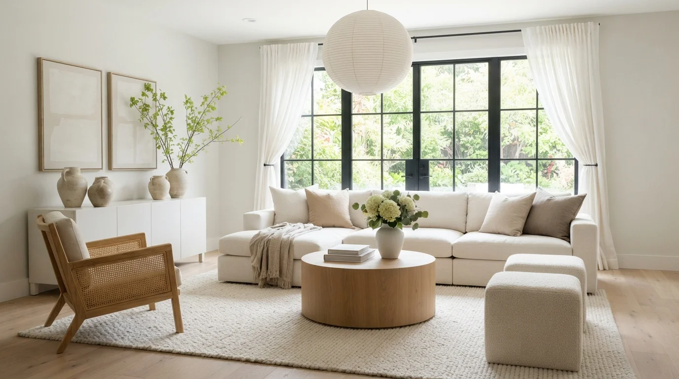
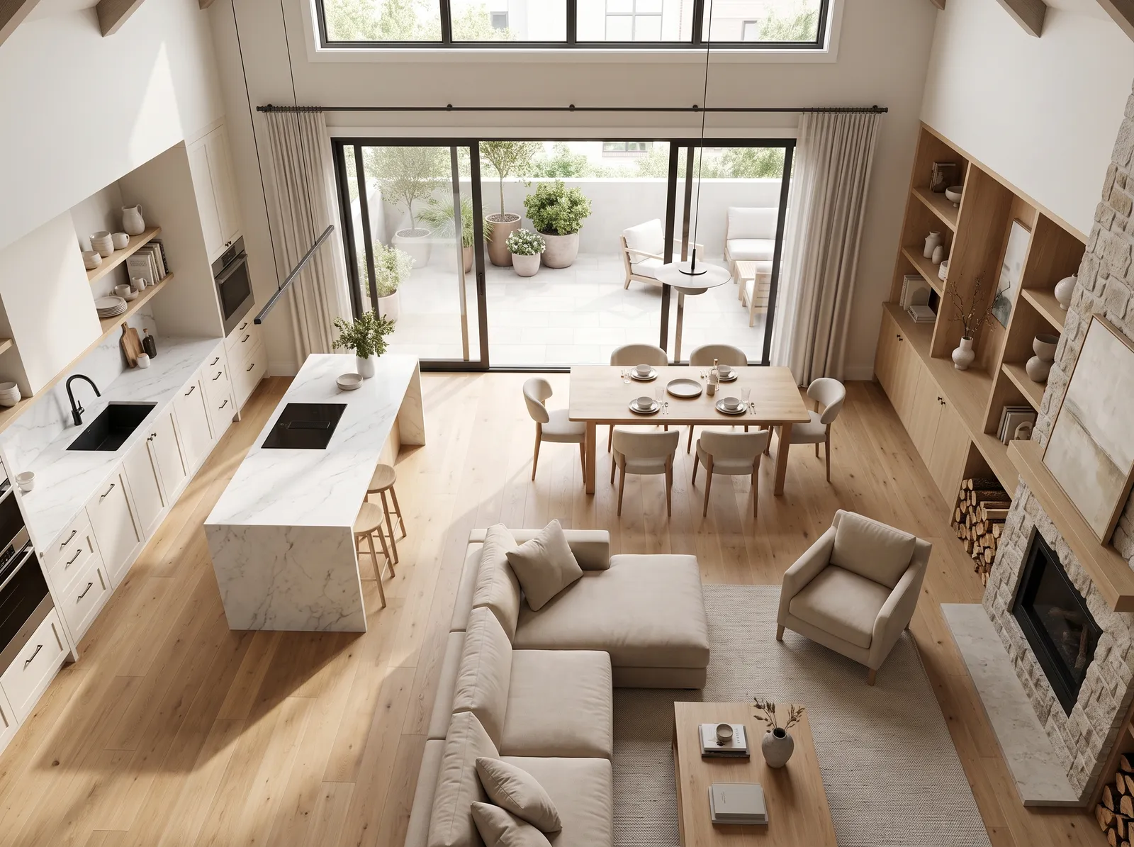
Gentle white walls meet soft textures and pale wood for a sunlit, peaceful living space.
Warm white is a gentle, creamy neutral that brings softness without looking sterile. In this living space, it wraps the walls to highlight a cozy linen sectional, a drum coffee table, and an ultra-plush textured rug. The whole room feels bright, calm, and effortlessly breezy. Layering subtle tone-on-tone creams alongside natural blonde wood adds depth while keeping everything harmonious. It is ideal for anyone who wants a restful, modern sanctuary filled with sun.
SEE FLORAL SCENT ON YOUR WALLS →
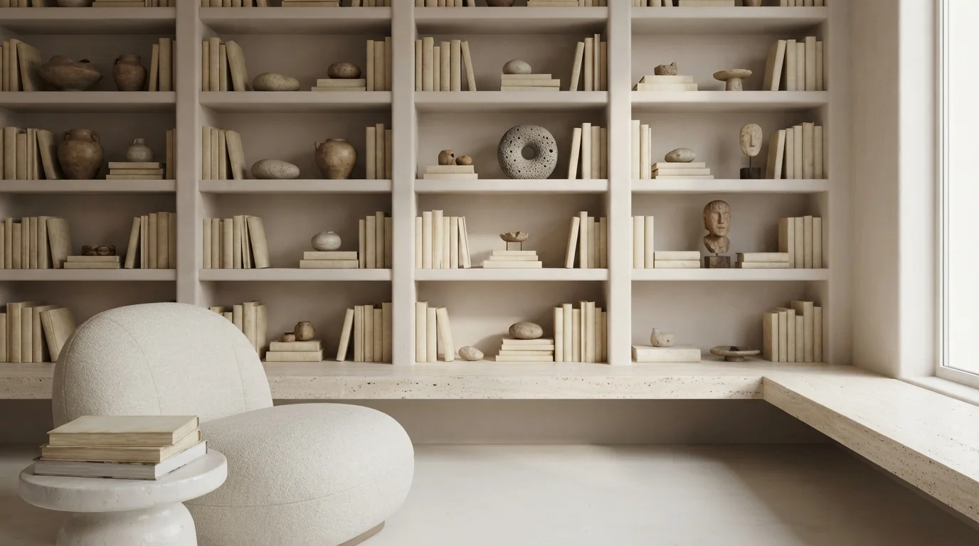
Soft ivory walls and sculptural stone accents wrap this quiet room in a deeply relaxing, sun-drenched calmness.
Chalky off-white is a soft, muted cream with a gentle stone-like warmth. In this photo, the large built-in bookcase wall wears this creamy neutral, matched seamlessly with a curved lounge sofa, raw stone artifacts, and parchment-toned books. The space feels incredibly calm, uncluttered, and serene. This look works because layering subtle textures in one neutral tone keeps the monochrome design from feeling flat or cold. It is perfect for anyone who wants a tranquil, gallery-like reading sanctuary.
SEE CASTLE BEIGE ON YOUR WALLS →
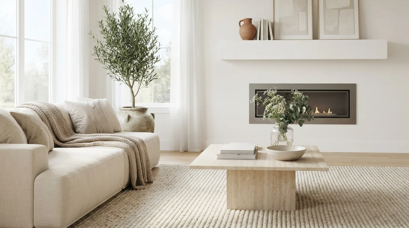
Soft natural sunlight and creamy textures create a quiet, tranquil haven that feels effortlessly peaceful and bright.
Alabaster is a soft, warm off-white with gentle creaminess. Here, this soothing shade wraps the walls and minimalist fireplace wall, pairing effortlessly with the plush cream sectional, stone coffee table, and ribbed woven rug. The entire space feels wonderfully calm, airy, and restful. Layering tactile textures like linen, smooth stone, and cozy wool keeps a monochromatic room from ever feeling stark or flat. It is a fantastic choice for anyone who loves clean modern design with an inviting, lived-in feel.
SEE IT ON YOUR WALLS →
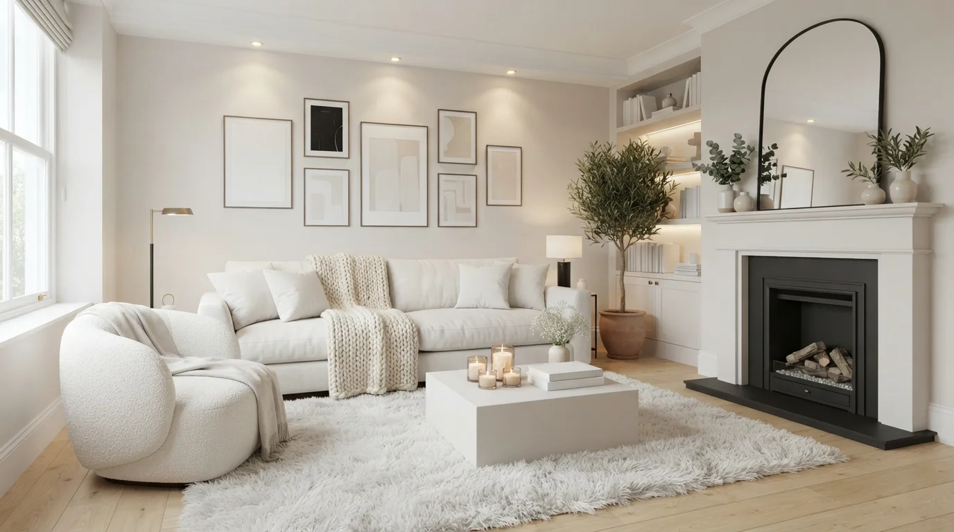
Soft warm lights and layered textures wrap this serene, all-white living space in dreamy, fireside comfort.
Warm off-white is a soft, gentle ivory that instantly warms up a space. In this living room, creamy white coats the walls, fireplace mantel, and custom built-in shelves, while white fabric covers the sofa, plush boucle chair, and low coffee table. The entire room feels remarkably cozy, calm, and quiet. This tone-on-tone combination works beautifully because rich textures like chunky knits, fluffy boucle, and lush green plants keep the room interesting without visual clutter. It is ideal for anyone dreaming of a peaceful, hotel-like retreat.
SEE KITTEN WHITE ON YOUR WALLS →
Bathed in soft natural daylight, layered textures of ivory bouclé and smooth marble create a heavenly, tranquil escape.
Pure white is a crisp, clean, and utterly peaceful neutral. In this living room, pristine white covers the walls and built-in shelving, blending seamlessly with an ivory bouclé accent chair, plush cream sofa, and a ribbed wool rug. The entire space feels incredibly calm, bright, and uncluttered. The monochrome look works because a mix of rich textures—fluffy bouclé, smooth marble, and matte ceramics—keeps everything visually interesting without any visual noise. It is ideal for minimalists craving a serene sanctuary.
SEE SWEET VANILLA ON YOUR WALLS →
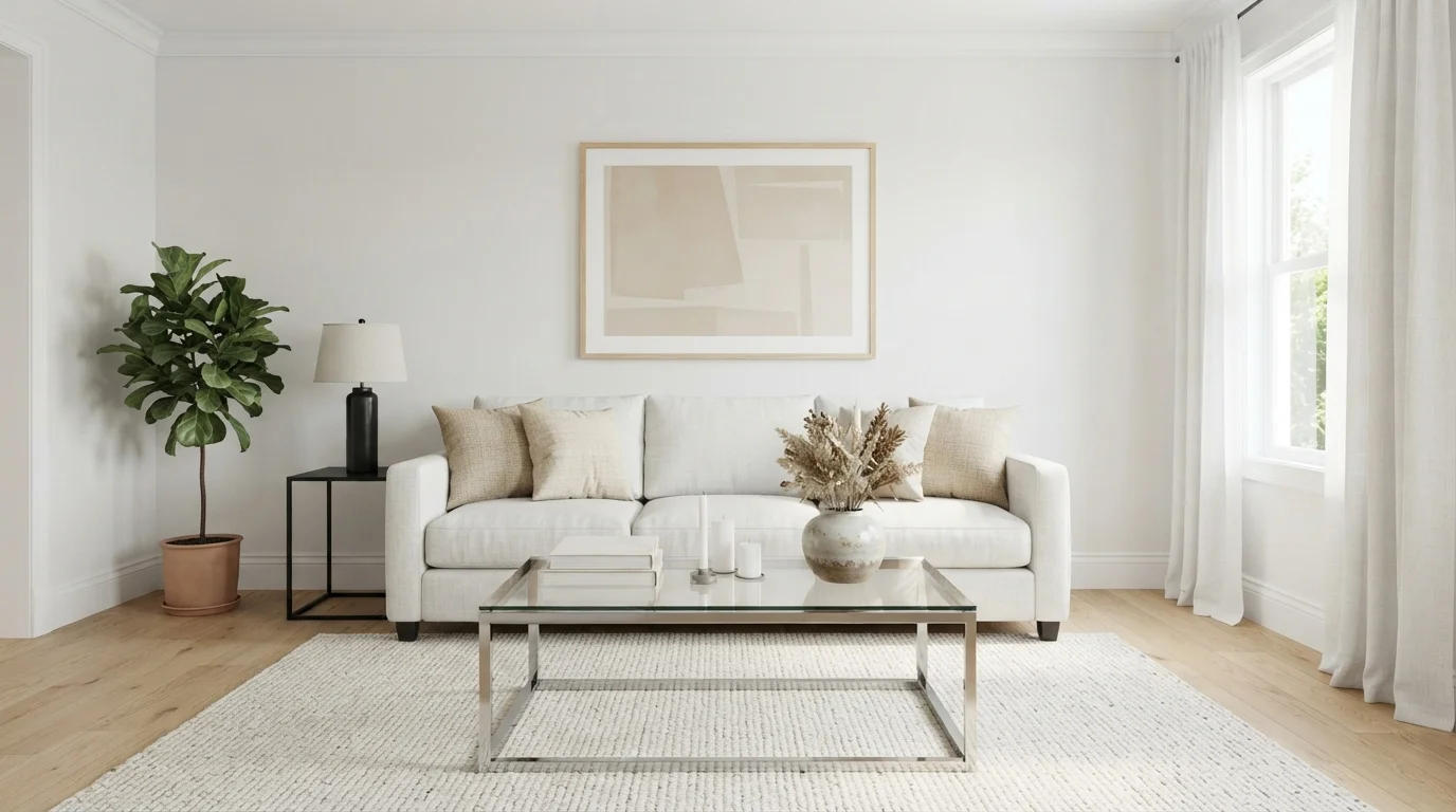
Soft daylight washes over crisp white seating, clear glass, and gentle beige accents for a calm, uncluttered sanctuary.
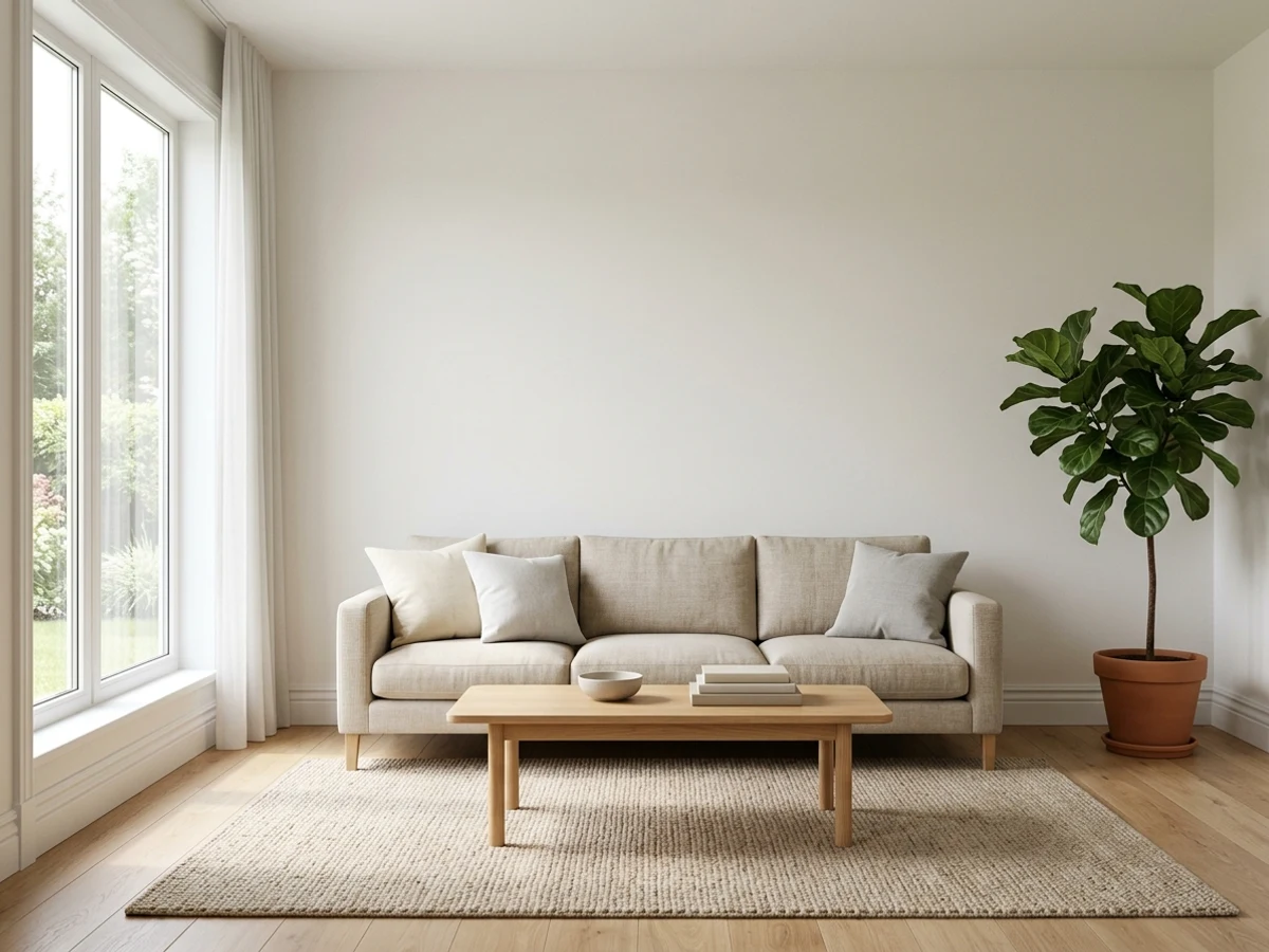
Soft ivory is a gentle, glowing white that keeps rooms bright without feeling harsh. In this space, smooth off-white covers the walls, pairing naturally with a tailored white sofa, textured cream rug, and muted beige pillows. The entire space feels peaceful, open, and relaxing. Stacking light neutrals against glass and blond wood floors works because natural textures add depth without adding clutter. It is ideal for anyone craving a tidy, Scandinavian-inspired retreat that never feels cold.
SEE WHITE DAISY ON YOUR WALLS →White Living Room Wall Color Combinations
A wall color never works alone. These are the full schemes from the rooms above — the lead color first, then the supporting colors that make the photo work.
Bask in a soothing, sun-drenched space layered with soft cream textures, pale oak wood, and gentle potted greenery.
TRY THIS PALETTE →Soft daylight and creamy whites blend with pale oak accents to craft a deeply restful, open sanctuary.
TRY THIS PALETTE →Gentle white walls meet soft textures and pale wood for a sunlit, peaceful living space.
TRY THIS PALETTE →Soft ivory walls and sculptural stone accents wrap this quiet room in a deeply relaxing, sun-drenched calmness.
TRY THIS PALETTE →For a living room with wood floors, wood furniture, or wood built-ins, Cameo White is the safest wall color because it was picked for exactly that pairing — the warmth in it keeps the walls from fighting with the wood tone the way a cooler white like Pure White sometimes can. Pair it with a stained wood trim or a slightly deeper wood-tone accent wall, not white trim, so the room doesn't lose its warmth entirely to white-on-white.
For a more contemporary look, Pure White or White Dove on the walls with the trim painted the same color creates the cleanest, most gallery-like backdrop — this is the combination to choose if the room already has a lot of pattern or color in the furniture and rugs and doesn't need the walls adding more. If you want contrast instead, keep the walls in Alabaster or Snowbound and paint trim, doors, and window casings a true white like Pure White; the two-white layer is intentional and reads as intentional design rather than a mismatch, since Pure White sits close enough in undertone to both to avoid clashing. Bit of Sugar works best as a brightener in a darker corner or reading nook rather than across the whole room, since its higher reflectance is most useful where daylight is weakest.
More Living Room Color Ideas
Set on a color family already? Each page has its own real rooms and picks.
Light or Dark White Living Room Colors?
Go Light (LRV 60+) If…
The room is small, faces north, or has to work at every hour. Light warm colors make it feel bigger and stay calm in evening light — the light you actually live in.
Go Dark (LRV Under 20) If…
You want the cocoon effect and the room has real daylight. Dark works best on one feature wall — or fully color-drenched in a large room with good windows.
Living rooms take the widest swing in daylight of any room in the house — morning light, midday sun through the front windows, then lamp light at night — and white paint shows that swing more than almost any other color. In a room that gets strong, direct light for most of the day, a lower-LRV, warmer white like Alabaster (LRV 82) or Snowbound (LRV 83) keeps the walls from looking blown-out and glare-y by early afternoon. In a north-facing or naturally dim living room, reach for the higher end of this list — Simply White (LRV 91), Polar Bear (LRV 86), or Bit of Sugar (LRV 86) — because they need less help from the room's own light to still read bright rather than flat gray by evening.
The mistake people make is picking the brightest white in the store for a room that's already flooded with south-facing sun. Under that much direct light, a very high-LRV white like Simply White can wash out and look almost clinical instead of soft. That's the room where Cameo White or Alabaster's warmer, slightly lower LRV actually reads more comfortable, not less bright.
See It. Love It.
Paint It.
Upload one photo of your white living room and try every color on this page on your own walls — in your own light, before you buy a drop of paint.

White DoveBeforeChoosing The Right Sheen For A Living Room
Living room walls take more contact than almost any room besides the kitchen — couches get pushed back against them, kids and pets lean on them, and they need to be wiped down more than a bedroom wall ever does. Eggshell is the standard choice for any of these whites on the main wall surface: it has enough sheen to wipe clean but doesn't flash or show roller marks the way satin can under strong window light.
Trim and doors should go a step up to satin or semi-gloss regardless of which wall white you pick, because trim gets touched constantly and needs to survive it. One thing to watch with a brighter white like Simply White or Bit of Sugar: pairing a flat or matte wall finish with glossy trim in the same or a very close white can make the flat wall look chalky by comparison. Keep the sheen jump moderate — eggshell walls to satin trim reads intentional; flat walls to semi-gloss trim reads like two different paints that don't match.
Avoiding A Stark, Cold-Feeling White
The most common complaint about a white living room isn't that it's boring — it's that it ends up feeling clinical or cold, which almost always traces back to picking a white with a blue or gray undertone in a room that gets a lot of cool daylight. None of the picks on this list are true cold whites, which is deliberate: Alabaster, Simply White, and Cameo White all carry warmth specifically so a gathering space doesn't read like a waiting room.
If a white still feels stark once it's on the wall, the fix usually isn't switching to a different white — it's checking what the room's other whites are doing. Cool-toned trim, a blue-white ceiling paint, or bright white light bulbs next to a warmer wall color like Alabaster will make the wall look dingy by comparison, even though the paint itself is fine. Match the trim's undertone to the wall's undertone, or commit to one white across both, before assuming the wall color is the problem.
Testing These Whites Before You Commit
White shifts more with light than any other color family, so a swatch that looks perfect at the paint store can read completely different once it's on your living room wall. Paint a section at least a couple feet wide on two different walls — one that gets direct window light and one that doesn't — and look at it in the morning, at midday, and after dark with the lamps on before buying gallons.
This matters most for the picks in the middle of this list, like Snowbound and Pure White, because they're built to sit neutrally between warm and cool — which also means they're the most sensitive to whatever light and undertones are already in the room. A white that leans slightly warm in your test patch under your actual lighting is a safer bet than one that looked neutral under the store's fluorescent lights.
About White Living Room Paint Colors
A living room is the one space in the house that has to work at 8 a.m. with coffee and at 9 p.m. with the lamps on, which is exactly why white keeps winning here — it is the one color family that reads calm and clean under both. Benjamin Moore White Dove (OC-17, LRV 85) and Sherwin-Williams Pure White (SW 7005, LRV 84) are the two most reached-for shades for this reason: neither one swings noticeably warm or cold as the light in the room changes through the day, so they stay a believable backdrop for whatever furniture, art, or rug pattern you already own.
The rest of this list splits into two honest camps. Alabaster (SW 7008, LRV 82) and Simply White (BM OC-117, LRV 91) lean warm and creamy on purpose — Simply White in particular is the pick people reach for when they want the room to feel cheerful and lived-in rather than showroom-neutral. Polar Bear (Behr 75, LRV 86) and Bit of Sugar (Behr PPL-93, LRV 86) sit at the brighter, more reflective end, which matters in a living room because this is usually the room with the least direct sun exposure relative to its size — a lot of window, but a lot of floor to light up too.
Cameo White (Behr PPU7-13, LRV 84) is the one built specifically for rooms with a lot of wood or leather in play — it carries just enough warmth to sit next to oak floors and tan furniture without looking mismatched, which is a real failure point with cooler whites. Snowbound (SW 7004, LRV 83) is the middle-of-the-road choice when you want something softer than a stark white but don't want the room to skew as yellow as Simply White can in warm afternoon light.
The Questions Everyone Asks
What color should I paint my white living room?
If you want one answer, start with the safe picks above — Sand Dollar, Nano White, Floral Scent, Castle Beige. They read well in any light and survive furniture changes. Then check the light: strong afternoon sun wants a step cooler, a north-facing room wants a step warmer.
what's the safest white paint color for a living room?
Benjamin Moore White Dove (OC-17) and Sherwin-Williams Pure White (SW 7005) are the two safest choices because their LRVs sit in the mid-80s and their undertones are balanced rather than strongly warm or cool. That means they hold up under morning light, midday sun, and evening lamp light without swinging noticeably yellow or gray, which is the biggest risk with a whole-room white.
does painting a living room white make it look bigger?
Yes, but the amount depends on the white's LRV, or how much light it reflects. Polar Bear (Behr 75, LRV 86) and Bit of Sugar (Behr PPL-93, LRV 86) bounce the most light around a room, which is what actually creates the larger, more open feeling — it's the reflectance doing the work, not just the fact that the color is technically white.
should the trim be a different white than the walls?
Either works, but they solve different problems. Painting trim the same white as the walls, like Pure White on both, gives the cleanest, most seamless look and is the safer choice if you're not confident matching undertones. Using a separate true white on trim against a warmer wall color like Alabaster creates intentional contrast, but only works if the two whites don't clash in undertone.
will white walls look stark or cold in a living room?
A true cool-toned white can, especially under overhead LED lighting, but none of the warmer options here are built that way. Alabaster and Simply White both carry enough warmth to avoid the clinical look people worry about, and Cameo White goes further by leaning warm enough to sit comfortably next to wood floors and furniture without feeling sterile.
what white paint works best in a living room that doesn't get much sun?
Pick from the higher end of the LRV range so the wall still reads bright without relying on strong daylight. Simply White (LRV 91) is the brightest option here, with Polar Bear and Bit of Sugar close behind at LRV 86 — all three need less help from the room's own light to avoid looking flat or gray by evening.
What two-color combination works best in a white living room?
The reliable pattern is a quiet main color plus one deep accent on a single wall. Keep trim and ceiling in one warm white so the two colors are the only event in the room — the combination cards above show complete schemes from real rooms.
What colors make a white living room look bigger?
High-LRV, slightly warm colors — LRV 60–75 is the sweet spot. Paint the walls and trim close to the same light color so the corners blur, and keep the ceiling white. Stark cool white actually works against you; it creates hard shadows that show the room's edges.

Ask a Question