Midnight Blue
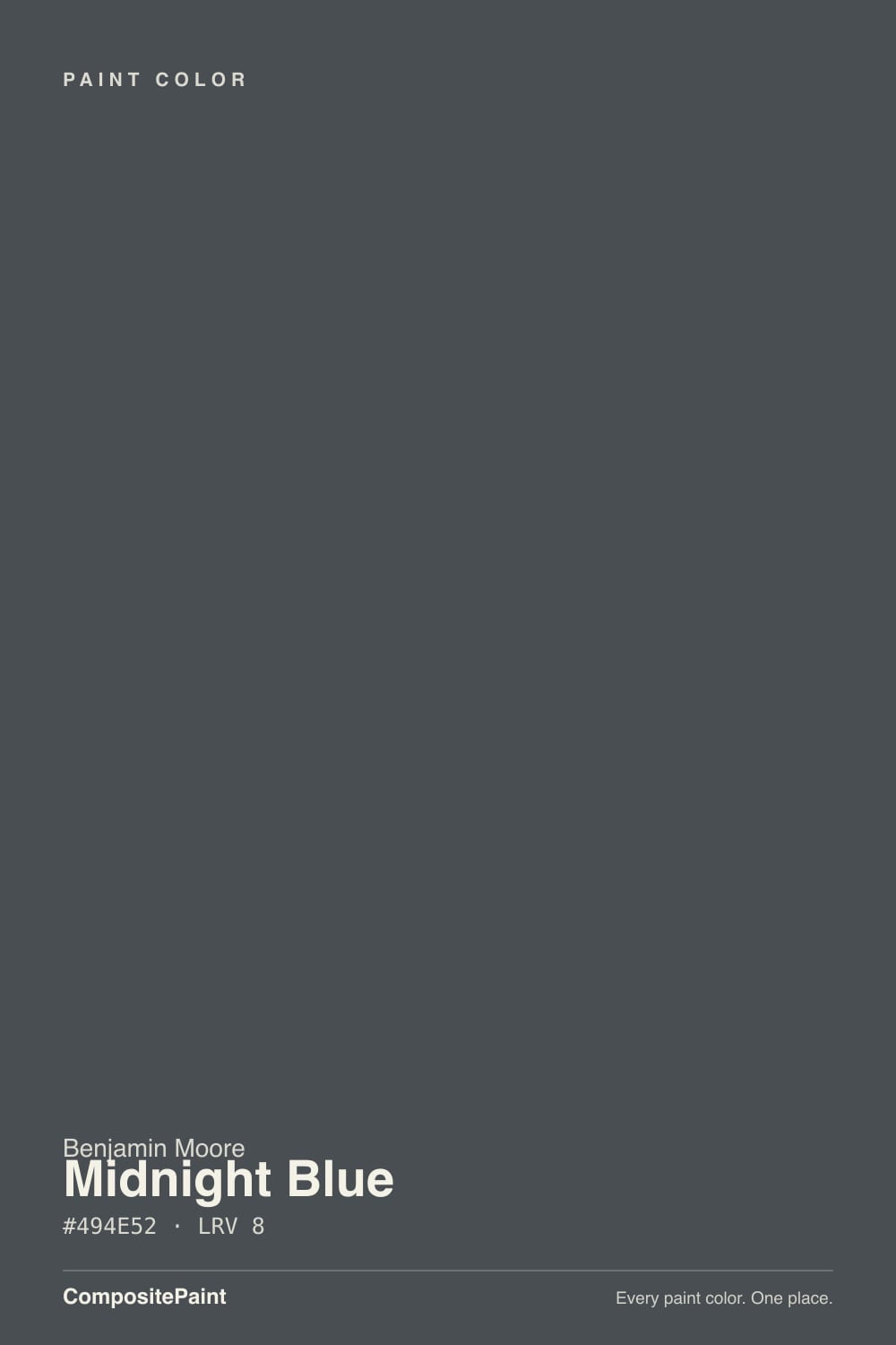
1638 · #494E52 · LRV 8 — cool blue tone, very dark — reads black in most rooms.
- 1Midnight Blue8
- 2Kendall Charcoal15
- 3Retreat21
What Color Is Midnight Blue, Really?
Midnight Blue 1638 is a very dark gray with a cool blue cast, not a navy. Its hex is #494E52 and its LRV is 8, which puts it in near-black territory: at that level a wall absorbs almost all the light that reaches it. The hue reads around 207 degrees, squarely blue, but saturation is only about 6 percent, so there is very little actual blue in the mix.
People choose it when a straight black feels too hard. Midnight Blue gives the same weight and the same crisp edge against white trim, but with a faint cool cast that softens the effect in daylight and keeps the surface from looking dead flat. On cabinets, doors, and small rooms painted out completely, that small difference is what you are paying for.
The catch is the name. Anyone expecting a rich navy will be disappointed, because at 6 percent saturation the blue only appears in specific light and next to warm colors. The other catch is practical: dark, low-LRV walls show roller marks, patch flashing, and drywall waves far more than a mid-tone, so surface prep and a consistent sheen matter more than usual.
Midnight Blue is a near-neutral dark with a blue lean. The hue sits at roughly 207 degrees, which is proper blue territory, but saturation is only about 6 percent. That means the blue is a direction rather than a presence. At #494E52 with an LRV of 8, your eye registers depth first and color second.
The blue shows in three situations. Bright, cool daylight pulls it out. A satin or gloss sheen picks up reflections that read cool. And warm neighbors force it forward: beside a cream white, an oak floor, or brass hardware, the blue-gray cast is clear.
Put it beside a true navy and it collapses into plain charcoal. Put it beside a black and it looks unmistakably blue. That swing is worth testing before you buy a gallon, because the color you get depends almost entirely on what shares the room with it.
Best Rooms and Uses for Midnight Blue
Very dark colors work best when you commit. Midnight Blue suits a powder room, a study, a library, or a small bedroom where walls, trim, and ceiling all go the same tone. Wrapping a small space like that reads deliberate instead of cramped, because there are no edges left to measure the darkness against.
In a larger room it does better as a single wall, on built-ins, or on a kitchen island beneath lighter perimeter cabinets. It is a strong cabinet and door color at an LRV of 8, hiding wear better than a mid-tone, though satin and gloss finishes will show dust and fingerprints.
Outside it works on shutters, a front door, or window sash against a light body color. What it will not do is brighten anything. In a room that already gets little daylight, expect it to read as flat black most of the day and plan the lighting around that.
How Lighting Changes Midnight Blue
At an LRV of 8 Midnight Blue takes light rather than gives it, so the room supplies the character. North-facing rooms, with cool indirect daylight, bring the blue cast forward and keep it reading as a blue-gray charcoal. South-facing rooms flood it with warm light, which cancels part of that blue and pushes it toward a soft black, especially away from the window.
East rooms show the blue in the morning and lose most of it by afternoon. West rooms stay inky and flat until late sun warms the surface.
Bulbs matter more here than in any light color, because there is so little reflected light to work with. Warm 2700K lamps turn it into a warm charcoal and hide the blue almost entirely. Neutral 3500K to 4000K bulbs keep the blue alive after dark. Look at a large sample at night under your own fixtures before deciding, since evenings are when a dark room gets used.
Most complaints about Midnight Blue are a light mismatch. Upload a photo of your actual room and see it on your walls — then ask for the same wall in north light or evening lamps before you buy a single sample.
Need It From Another Brand?
Any paint counter can custom-tint Benjamin Moore 1638 directly. If you would rather stay in one brand's own deck, these are the closest stock matches, measured as ΔE2000. Under 2 is a difference you will not see on the wall.
| Brand | Closest color | ΔE | LRV | |
|---|---|---|---|---|
| Sherwin-Williams | Perle NoirSW 9154 · Sherwin-Williams | 4.2 | 8 | Color page → |
| Behr | Poppy SeedPPU15-20 · Behr | 2.1 | 8 | Color page → |
| Valspar | Hematite4006-2C · Valspar | 1.7 | 7 | Color page → |
| PPG / Glidden | WitchcraftPPG1037-7 · PPG / Glidden | 1.1 | 7 | Color page → |
| Glidden | WitchcraftPPG1037-7 · Glidden | 0.7 | 7 | Color page → |
| HGTV Home by Sherwin-Williams | Rock BottomHGSW 1501 · HGTV Home by Sherwin-Williams | 4.5 | 7 | Color page → |
Similar Benjamin Moore Colors
The nearest shades to Midnight Blue within Benjamin Moore's own range, ranked by perceptual color distance — useful when you want the same look a touch lighter, darker, or warmer.
WCAG 2.1: AA is 4.5 : 1 for normal text, 3 : 1 for large text, AAA is 7 : 1.
Midnight Blue vs Similar Colors
Within Benjamin Moore, Cheating Heart 1617 at LRV 9 and #4B4D4F is a touch lighter and more neutral, with less of the blue lean. French Beret 1610 at LRV 9 and #4C4F52 is the closest sibling, slightly lighter but the same cool direction. Nightfall 1596 at LRV 8 and #4B4E4E trades the blue for a faint green. Lead Gray 2131-30 at LRV 7 and #434E52 is darker and the most clearly blue of the group. Almost Black 2130-30 at LRV 9 and #4F4E53 is the softest and most neutral.
Across brands, Witchcraft PPG1037-7 at LRV 7 is the tightest match at a deltaE of 0.68. Poppy Seed PPU15-20 from Behr at LRV 8 sits at 2.11, very close but worth sampling first. Perle Noir SW 9154 from Sherwin-Williams at LRV 8 is 4.19 and Studio Green No. 93 from Farrow & Ball at LRV 7 is 4.91, both close but visibly different side by side.
Colors That Go With Midnight Blue
The most reliable partner is a crisp white on trim and ceiling. At an LRV of 8 the contrast is close to maximum, so the edge between wall and trim becomes a strong graphic line. If that feels too hard, a warm off-white softens it and also nudges the blue cast forward by comparison.
Warm materials do the rest. Oak, walnut, leather, aged brass, and unlacquered brass all read clearly against it, while chrome and cool nickel can look clinical. Natural stone with visible warmth works better than a cold white quartz.
The Benjamin Moore colors nearest to it are alternates rather than partners, since everything within a point or two is another near-black. If you are matching across decks, Witchcraft PPG1037-7 from Glidden at LRV 7 sits at a deltaE of 0.68 and Hematite 4006-2C from Valspar at LRV 7 comes in at 1.7, visually identical in normal room light.
Coordinated palette
Generated by hue-rotating #494E52 in HSL space. Pair Midnight Blue with one accent and one neutral — the swatches below are starting points, not final picks.
Midnight Blue FAQ
Is Midnight Blue actually blue?
Only slightly. The hue reads around 207 degrees, which is blue, but saturation is about 6 percent, so it behaves like a near-black charcoal with a cool cast. Next to a true navy it looks gray. Next to a black it looks blue. If you want a room that reads clearly blue, this is not the color.
What LRV is Midnight Blue?
Midnight Blue 1638 has an LRV of 8. On a scale where 0 is black and 100 is pure white, that is very dark, and it means the wall absorbs nearly all the light that lands on it. Expect a room painted in it to need more artificial light than you think, especially in the evening.
Does Midnight Blue work in a dark room?
It works if you accept what it does. At an LRV of 8 it will not brighten anything, so a low-light room becomes a genuinely dark room. Many people use that on purpose in a study, library, or powder room, where the depth feels intentional. Add layered lamp light rather than relying on one ceiling fixture.
What white trim goes with Midnight Blue?
A crisp, clean white gives the sharpest line and makes the most of the contrast against an LRV of 8. A warm off-white is the softer option and has the side effect of pushing the blue cast forward by comparison. Either works; the choice is about how hard you want the edge between wall and trim to read.
Is Midnight Blue good for cabinets and front doors?
Yes to both. At an LRV of 8 it hides wear better than a mid-tone, which suits an island, a lower cabinet run, or a front door. Use a satin or semi-gloss for durability, and expect fingerprints and dust to be visible on those sheens. Outside it also works on shutters and window sash against a light body color.
How is Midnight Blue different from Cheating Heart?
Cheating Heart 1617 has an LRV of 9 against Midnight Blue's 8, so it is marginally lighter, and its hex of #4B4D4F is more neutral than Midnight Blue's #494E52. In practice Cheating Heart reads as a straighter charcoal while Midnight Blue keeps a faint cool blue lean in daylight. The difference is small enough that it only shows side by side.
Have you painted with Midnight Blue?
Rate it — one tap helps the next reader decide.
Ask a Question