Illusive Green
A green-gray chameleon reviewed honestly: the light where it actually turns green, the light where it flattens to plain gray, and what to pick instead.

Jessica has spec'd whites and neutrals for more than 300 rooms and keeps a sample wall of painted drawdowns in her studio. Every color review is checked against real reader rooms in the comments and re-tested when a formula changes. About the testing process →

- 1Black Fox7
- 2Pewter Green12
- 3Illusive Green29
- 4Stardew43
- 5Upward57
The Fast Verdict
Illusive Green is exactly as honest as its name: mostly gray, with green that only shows up when the light is right. Sherwin-Williams files it under Neutral, not Green, and that classification is the whole story — this is a gray base with a green whisper, not a green with a gray whisper. Give it real west, east, or south daylight and it turns a genuinely pretty, foggy sage-gray. Give it north light, an overcast day, or a shaded wall and it just reads gray, full stop.
Kitchen cabinets and islands with warm wood floors and black or brass hardware · living and dining rooms with real west, east, or south daylight · a moody home office or den · anyone who wants a color that changes personality through the day instead of sitting still
You want a wall that reads the same green in every light · your only room faces north and stays dim · you're painting a windowless powder room with no strong fixture · you're committing to a full exterior repaint sight-unseen, without a large sample on the actual wall
- A genuine chameleon — swings between gray, green, and a whisper of blue depending on the light
- Cabinet-ready: pairs beautifully with white counters, warm wood, black or brass hardware
- LRV 29 gives real, grounded color without going cave-dark
- Reads sophisticated rather than trendy in the light that favors it
- A gray-lover's way into green without fully committing to a green room
- Overcast light and shaded exterior walls can wash it to plain, green-free gray
- North-facing rooms lose most of the green, going flat and a little cold
- Small windowless rooms can read heavy without a real light source
- Harder to predict from a paint chip than a color with one settled undertone
What Color Is Illusive Green, Really?
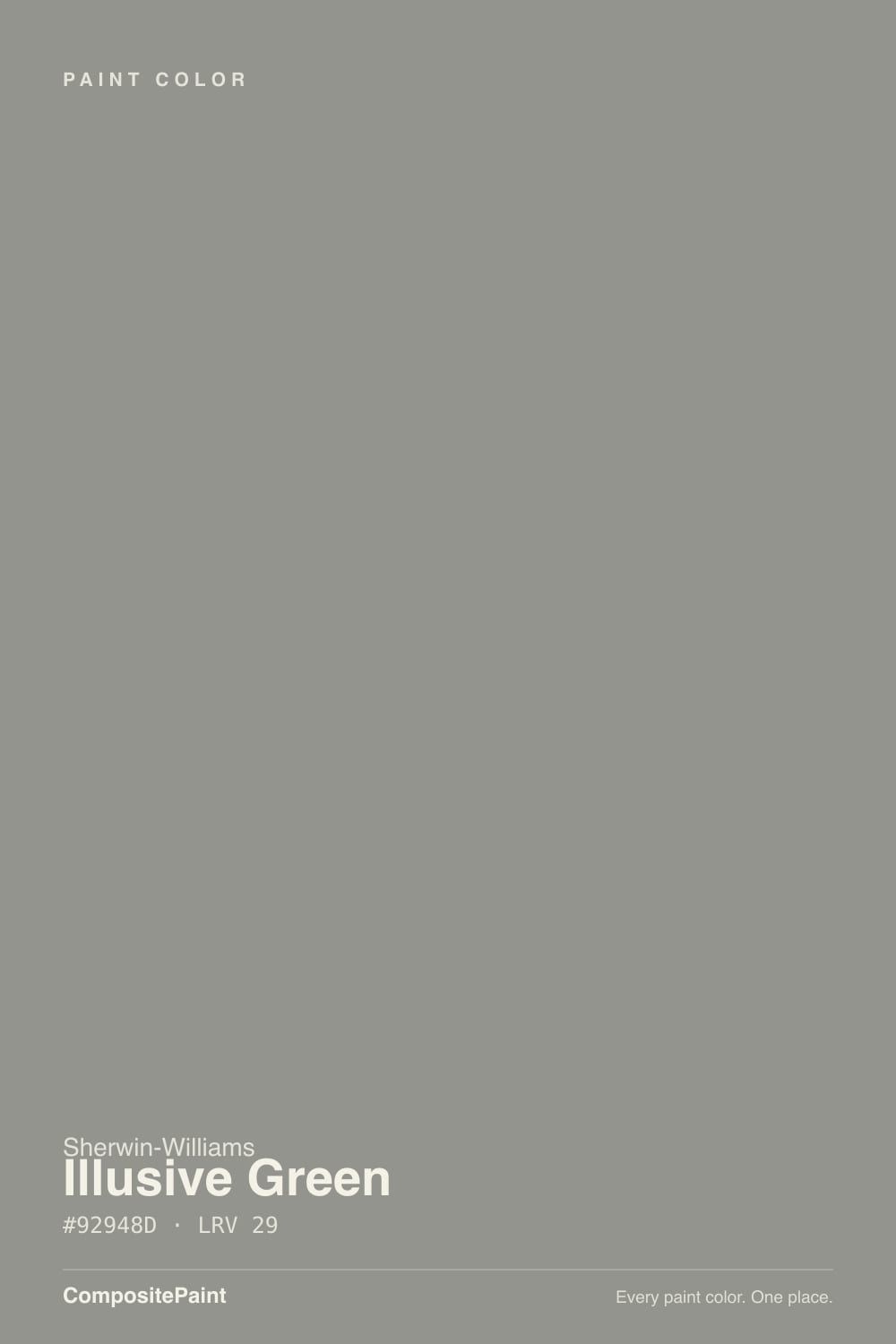
A green-gray with the gray firmly in charge. Sherwin-Williams' own deck files Illusive Green under Neutral Paint Colors, not Green — a small detail that tells you almost everything. Pull it next to a true sage like Evergreen Fog and the difference is obvious: Evergreen Fog reads as a green that happens to be muted, while Illusive Green reads as a gray that happens to have a green whisper folded in, plus a trace of cyan-blue underneath that surfaces in cool light.
At LRV 29 it sits at a genuine mid-depth — close to Sleepy Hollow's weight, a shade lighter than Evergreen Fog. That depth is exactly why the chameleon effect is real and not marketing copy: a paler tint would just look pale in every light, but a color with this much body has room to swing between gray, green, and a faint blue depending on what's hitting it. The tradeoff is the same swing that makes it interesting also makes it unpredictable from a two-inch chip.
Undertone in one line: gray first, green second, a whisper of cyan-blue underneath in cool conditions. If your sample looks like plain gray with no green at all, that is not a bad batch — that is Illusive Green being exactly what its name says in a light that doesn't favor it.
Where It Shines
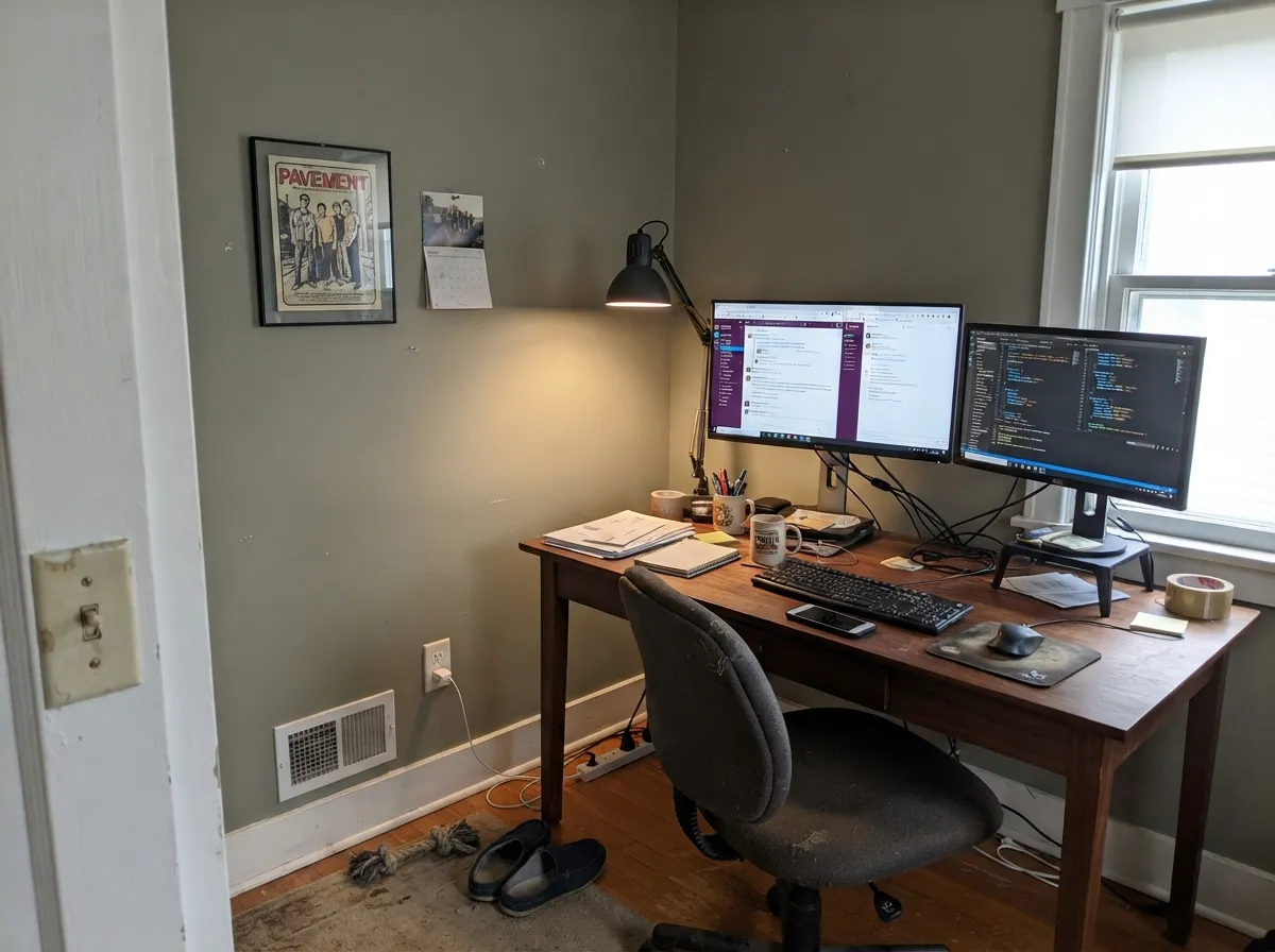
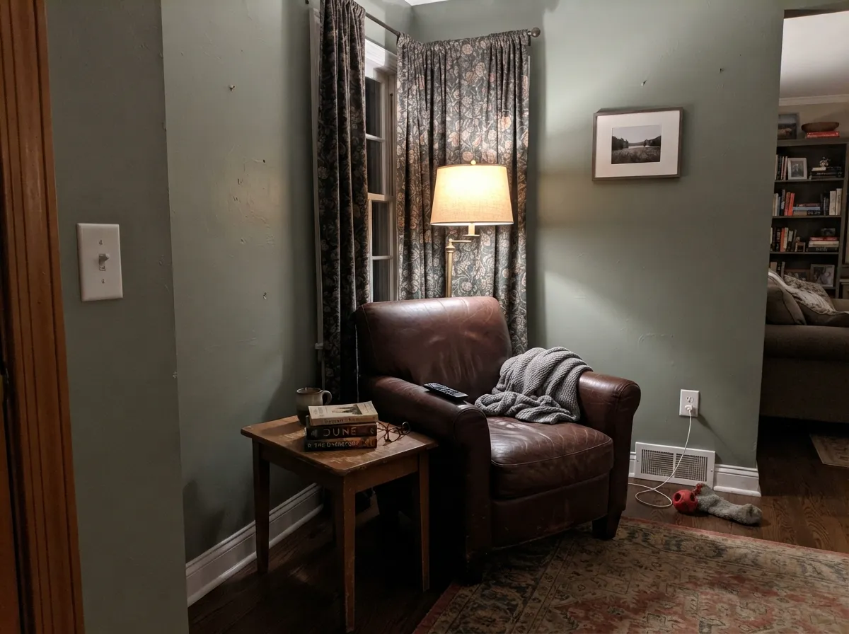
Give it strong west, east, or south daylight and the green genuinely comes forward — a soft, foggy sage-gray that reads sophisticated rather than trendy-green. Its best room is a kitchen: on an island or a full cabinet run, against white counters and warm wood floors, with black or brass hardware, it does the modern-farmhouse job Sherwin-Williams clearly designed it for. It is also a strong choice for a den or home office that wants grounded color without going cave-dark — LRV 29 is deep enough to feel deliberate, light enough to still function as a working room.
Where It Fails
Almost every regret story about Illusive Green traces back to one of three predictable situations, and owner reports online confirm all three. None of them are the paint failing — but if your wall matches one, sample big before you commit a whole room, or an entire house, to it.
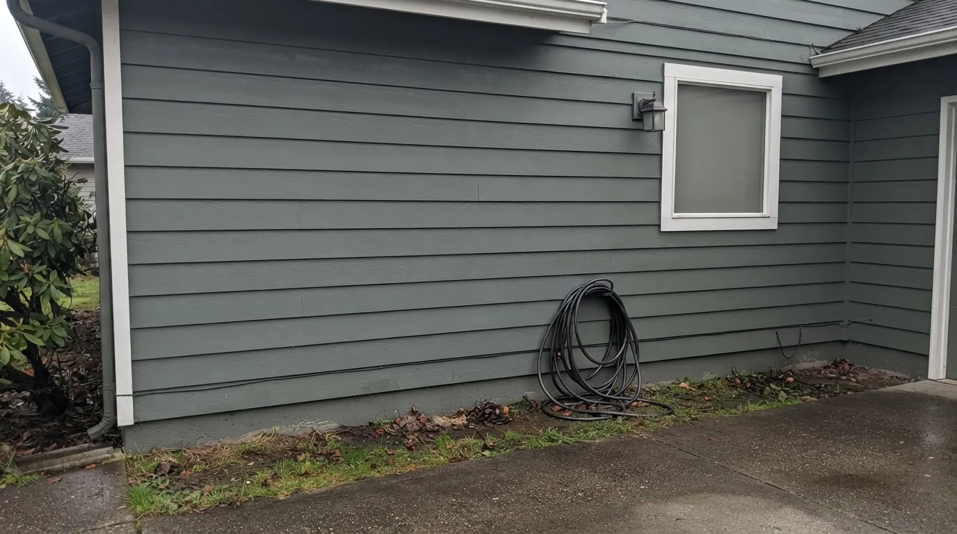
This is a real, documented pattern, not a hypothetical: homeowners buy Illusive Green for the sage, connected-to-nature story, then put a sample on a shaded exterior wall and watch it read as plain gray with no green in sight. Sherwin-Williams itself files the color as gray-dominant. If your wall needs to commit to green in almost any light, pick Evergreen Fog or Retreat instead — both hold their green far more consistently.
Cool north daylight strips out the warmth that carries the green forward, leaving a flat, slightly cold gray. It is the same mechanism behind the exterior complaints above, just indoors: a north bedroom or a shaded elevation of the house will show you the grayest, least green version of this color. Test the actual wall at the actual time of day, not a chip held up in a bright kitchen.
LRV 29 is a genuine mid-depth color, not a pale wash — it needs real light to stay calm rather than heavy. A powder room or closet with no window and a dim fixture can read dark and slightly suppressive instead of foggy and soft. Add a real light source before you add this color, not after.
Room by Room
On an island or a full cabinet run, against white countertops and warm wood floors, with black or brass pulls, this is the modern-farmhouse look Sherwin-Williams built the color for. Satin or semi-gloss cabinet enamel; the daylight shift adds interest without committing the whole kitchen to a loud color.
West, east, or south exposure lets the green come forward through the day; a north-facing room flattens it toward plain gray. Eggshell on the walls, and expect it to read a little different at 9am than at 4pm — most owners who chose it on purpose enjoy that.
LRV 29 gives a focused backdrop without going cave-dark, and it pairs well with walnut desks and black task lighting. Skip it if the room has one small north window and no lamp.
The same cautions as the den apply: warm 2700K lamps keep it cozy and sage-leaning at night, cool bulbs push it toward flat slate. Not the pick if you want a guaranteed-green wall regardless of light.
A window or a genuinely bright vanity fixture keeps it calm and foggy-green. A windowless powder room with a single weak bulb is where the "suppressing" complaint shows up — add real light before you add this color.
Full, direct sun keeps the green visible and the color reads as intended. Shaded elevations, overcast climates, and north-facing facades are the single most common regret in owner reports — the wall simply looks gray, not green. Sample a large board on the actual wall, in the actual light, before repainting the whole house.
Your Light Is the Risk
Real sun brings the green forward into a soft, foggy sage-gray. This is the light to sample in, not the chip under store fluorescents.
Cool, indirect daylight strips out the green almost entirely, leaving the dominant gray base exposed and a little flat. The exterior 'it just looks gray' reports happen here.
Cooler and grayer in the morning, truest gray-green at midday, warmest and most visibly green in late afternoon sun. Watch a sample for a full day before a whole-house commitment.
2700K lamps pull it warmer, closer to a soft sage. Cool white LEDs push it back toward slate gray — the same swing daylight gives it, just after dark.
Most complaints about Illusive Green are a light mismatch. Upload a photo of your actual room and see it on your walls — then ask for the same wall in north light or evening lamps before you buy a single sample.
Need It From Another Brand?
Any paint counter can custom-tint Sherwin-Williams SW 9164 directly. If you would rather stay in one brand's own deck, these are the closest stock matches, measured as ΔE2000. Under 2 is a difference you will not see on the wall.
| Brand | Closest color | ΔE | LRV | |
|---|---|---|---|---|
| Behr | Anonymous780F-5 · Behr | 3.1 | 30 | Color page → |
| Benjamin Moore | RainstormCSP-50 · Benjamin Moore | 1.6 | 30 | Color page → |
| Valspar | Gray Expose5007-2A · Valspar | 2.2 | 30.6 | Color page → |
| PPG / Glidden | Cloudy SlatePPG0996-4 · PPG / Glidden | 2.5 | 29 | Color page → |
| Glidden | Husky GrayPPG0994-6 · Glidden | 1.7 | 30 | Color page → |
| HGTV Home by Sherwin-Williams | FossilizedHGSW 1504 · HGTV Home by Sherwin-Williams | 0.0 | 29 | Color page → |
Similar Sherwin-Williams Colors
The nearest shades to Illusive Green within Sherwin-Williams's own range, ranked by perceptual color distance — useful when you want the same look a touch lighter, darker, or warmer.
WCAG 2.1: AA is 4.5 : 1 for normal text, 3 : 1 for large text, AAA is 7 : 1.
Illusive Green vs the Colors You're Also Considering
Every Illusive Green sample board has the same rivals on it. The numbers show the real lightness gap — then it comes down to which risk you would rather live with.
Pick this if you want the chameleon shift Evergreen Fog doesn't have — a wall that reads a little different morning to night.
Sherwin-Williams SW 9130 · LRV 30Evergreen FogPick this if you want the green to hold steady instead of flickering toward gray — Evergreen Fog commits to sage in nearly any light.
Pick this for a lighter, more gray-forward mid-tone that behaves on four walls, not just a cabinet box.
Sherwin-Williams SW 6207 · LRV 21RetreatPick this for a deeper, more consistently olive-green cabinet color, with its own low-light caution.
Pick this for a mid-depth color that still functions as a whole-room wall color, not just an accent.
Sherwin-Williams SW 6208 · LRV 12Pewter GreenPick this if you want it darker and unmistakably green, and you're keeping it to cabinets or an island rather than open walls.
Tin Lizzie SW 9163 at LRV 30 and hex #939591 is the closest sibling, one step lighter and a touch more neutral, without the yellow-green lean. Summit Gray SW 7669 at LRV 30 and Gray Shingle SW 7670 at LRV 29 behave the same way: same depth, less color in them.
Cornwall Slate SW 9131 at LRV 29 shares the hex neighborhood at #949488 with a slightly stronger green-yellow pull. Evergreen Fog SW 9130 at LRV 30 and hex #95978A is the clear step up in green. Choose it when you want people to see sage, and Illusive Green when you want a neutral that only hints at it.
Across brands, HGTV Home by Sherwin-Williams Fossilized HGSW 1504 shares the same hex #92948D and LRV 29, an exact match. Clare Shade PNT100-MD-14 at LRV 28 and Benjamin Moore Rainstorm CSP-50 at LRV 30 are visually identical in normal room light. Behr Elephant Skin PPU18-16 at LRV 29 is close but visibly different side by side.
Illusive Green Coordinating Colors
The rule for coordinating with Illusive Green: clean whites, not warm creams, and stay within its own green-gray family for accents rather than reaching for a true, separate green. It pairs best with crisp neutrals, warm wood, and black or brass metals — these are the partners that keep showing up in rooms that work:
The Chameleon Story: Why 'Illusive' Is the Whole Point
Sherwin-Williams has a small family of colors built to shift with the light — Sea Salt and Repose Gray are the famous ones — and Illusive Green belongs in that lineage, just weighted further toward gray. There is no Color of the Year run behind it and no single viral room; it is a quiet, useful color rather than a famous one, and that is not a knock. It has stayed in the deck long enough to earn steady, unglamorous use in kitchens and dens rather than a moment of hype.
The name is doing real work: 'illusive' promises a color that plays tricks depending on where you catch it, and the paint delivers on that promise more than it delivers on 'green.' Buy it expecting a mood, not a fixed color, and it performs exactly as advertised.
Illusive Green With Wood Tones and Floors
Warm wood is this color's best partner — oak, walnut, and butcher block all soften its gray edge and let the green show through more consistently, especially on cabinetry. Black hardware sharpens the look into modern farmhouse; unlacquered brass warms it back toward vintage.
Cool gray-washed or gray LVP flooring is the one combination to sample carefully: two cool grays in the same room can read flat and a little lifeless without a warm wood accent or a rug to break it up. If the floor is already cool-toned, bring in warmth somewhere else in the room before committing to Illusive Green on the walls.
Three Ready Palettes Built on Illusive Green
A color is never alone on the wall. These are complete combinations in the 60-30-10 pattern, with the reason each one holds together. Every one opens in the visualizer.
Alabaster keeps the room bright enough that the cabinets can carry real color, and Iron Ore window frames add the one crisp dark line that reads modern rather than country. Warm wood floors and black or brass pulls finish the look this color was built for.
Try this palette in your roomRetreat is the deeper cousin from the same green-gray family, so the built-ins read as a natural extension of the walls instead of a clashing accent. Pure White trim keeps the whole room from sliding into one flat tone.
Try this palette in your roomCrisp white trim and a true black door give the eye something definite to anchor on, so even on the elevations that catch less sun the house still reads intentional. Sample a large board on the sunniest and the shadiest wall before ordering — this is the color where that step actually matters.
Try this palette in your roomIllusive Green FAQ
Is Illusive Green more green or more gray?
More gray. Sherwin-Williams files it under Neutral Paint Colors, not Green, and that is an accurate read of the paint: it is a gray base with a green whisper that shows up in strong daylight, not a green with a gray whisper. Expect it to read as a soft gray more often than a soft green.
What's the best light for Illusive Green?
Real west, east, or south daylight. That is when the green genuinely comes forward into a foggy sage-gray. North light or a shaded wall strips the green out almost completely and leaves plain gray.
Does it work on kitchen cabinets?
Yes — it's arguably the color's best use. Against white counters, warm wood floors, and black or brass hardware it does the modern-farmhouse job cleanly. Use a satin or semi-gloss cabinet enamel.
Will it look too gray on my exterior?
It can, and this is the single most common regret reported online: a shaded elevation or an overcast climate can read as plain gray with no green at all. Sample a large board on the actual house, on both the sunny and shaded sides, before committing to a full repaint.
What white goes with Illusive Green?
A clean, not-too-warm white works best — Alabaster or Pure White for interiors, Extra White for exterior trim. A very warm cream white can fight the color's cool-leaning gray base.
Is Illusive Green a trend color that will date itself?
It isn't chasing a specific trend moment — no Color of the Year run, no viral room — which is exactly why it should age well. Because the gray dominates, it will settle into 'a good neutral' rather than 'that green everyone had in the 2020s' the way a more clearly green color might.
Have you painted with Illusive Green?
Rate it — one tap helps the next reader decide.
Ask a Question