Silver Feather
A pale celadon-green that Behr itself files under greens, not whites, reviewed honestly: where it reads clean and where it just goes chalky.

Jessica has spec'd whites and neutrals for more than 300 rooms and keeps a sample wall of painted drawdowns in her studio. Every color review is checked against real reader rooms in the comments and re-tested when a formula changes. About the testing process →
- 1Superwhite0
- 2Heirloom Shade63
- 3Silver Feather71
- 4Alabaster82
- 5Chantilly Lace91
The Fast Verdict
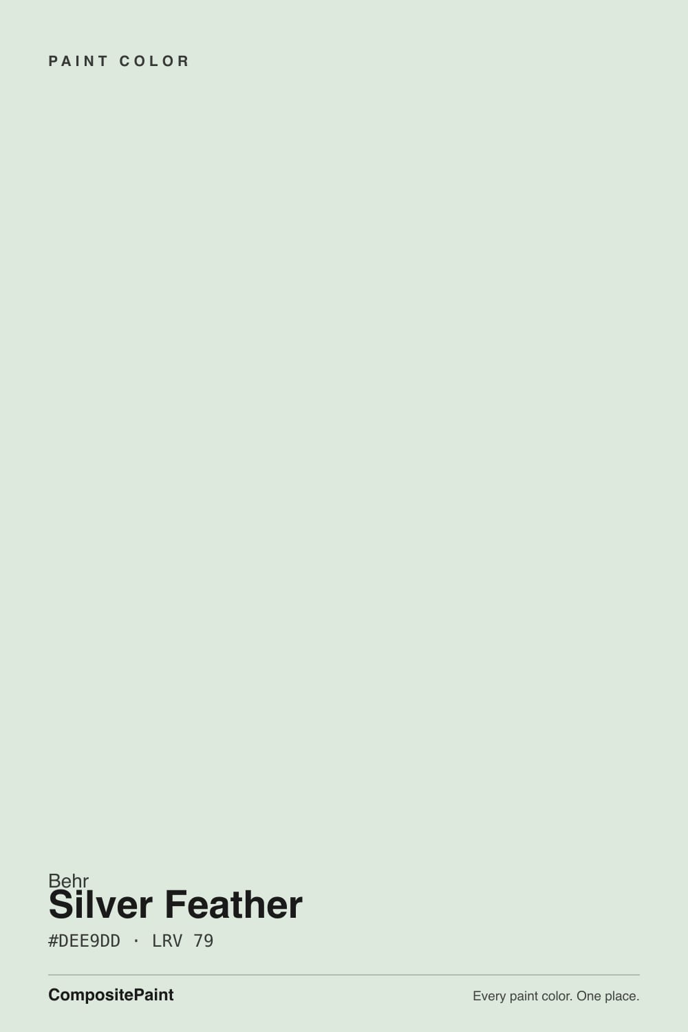
Silver Feather is what happens when a green paint gets diluted almost to the point of disappearing. Behr's own naming puts it in the green family, but at LRV 71 it sits so close to white that most people would call it a very quiet gray-white and never guess there's a color in it at all. In good light it is genuinely pretty — a soft celadon whisper instead of a flat builder white. In poor light, the whisper is the whole problem: there is not enough pigment here to survive a dim room.
Bright rooms that want something more interesting than plain white · kitchens and baths with cool stone, chrome, or nickel · anyone who wants a hint of color without committing to an actual "green room" · whole-house neutrals in a well-lit house
You want a color people will notice and name · your room is dim or north-facing with no supplement light · you're chasing a specific, well-documented color with a track record · your fixtures and stone lean warm gold rather than cool
- Extremely light (LRV 71) — brightens a room the way a white does
- A genuine celadon-green whisper keeps it from reading sterile or flat
- Pairs cleanly with cool grays, whites, chrome, and nickel
- A quieter, less-picked alternative to the standard beige/greige/gray rotation
- Reads as a sophisticated near-white rather than a plain builder color, in good light
- So pale the undertone is easy to miss until compared directly against a true white
- Goes flat and chalky in dim or north-facing rooms
- Fights strong warm gold, brass, and honey-oak tones nearby
- Almost no real-world track record — few painted rooms or reviews to check yourself against
What Color Is Silver Feather, Really?
Behr's own site files Silver Feather under greens, and its own copy describes "nuances of celadon green beneath soft silvery overtones" — which is a fair description of a color built to be barely there. This is not a sage or a spa green; it is a green that has been diluted so far toward white that most people will read it as a quiet neutral first and only clock the green undertone when something whiter sits next to it. It has no Color of the Year run, no viral design-blog moment, and almost no owner reviews online — an honest, under-the-radar Behr color rather than a famous one.
At LRV 71 it sits in the same bright band as the palest whites in the Behr deck, and the comparison is instructive: next to Behr White (LRV 88) or Polar Bear (LRV 86), Silver Feather visibly holds a cooler, slightly green body instead of reading flat and bright. That gap is small but real, the same way White Dove reads warmer than Chantilly Lace at a glance. Because the color sits this close to white, it needs a real side-by-side to prove it is not just a plain neutral — on its own, in a dim room, most people will not be able to name what they are looking at.
Undertone in one line: green first, gray second, warm never. If your sample looks like a flat gray-white with no personality, that is a light problem, not a paint problem — this color needs real daylight to show the celadon whisper it was built on.
Where It Shines
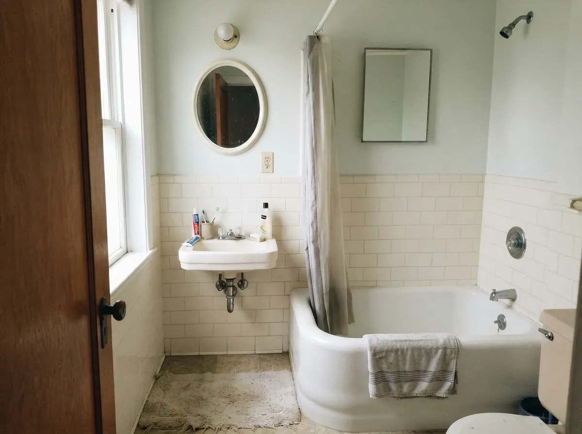
Bright, cool-lit rooms are its home court. With real daylight and white or nickel-toned trim, the celadon shows as a genuinely soft, sophisticated note instead of a flat neutral — the kind of color a guest notices without being able to say why. It is at its best in kitchens and bathrooms with cool stone, chrome or nickel fixtures, and plenty of window light, where the green whisper reads as intentional and calm rather than accidental.
Where It Fails
There is not much of a public track record for this color to draw complaint patterns from — it simply has not been painted, photographed, and argued about online the way the big Sherwin-Williams and Benjamin Moore names have. What follows is the honest read of the color's own math (its LRV, its undertone, its pigment load), not a pile of one-star reviews. All three are predictable before the first coat.
At LRV 71 the color is mostly light, and light is exactly what a low-pigment green needs to show its undertone. Take the light away and there is not much pigment left to carry the color — it goes chalky, flat, and hard to distinguish from a plain builder white, minus the brightness. This is not a color for a room that depends on lamps.
This is a green paint wearing a white LRV. If you picked it off a swatch wall glancing for "the palest gray-white" and didn't clock the name or the green-family listing, the wall can read as slightly murky or off-white next to trim, rather than the crisp white you pictured. Read the undertone before you buy a color this pale — it matters more, not less, at this LRV.
A cool green whisper and strong warm-gold tones pull in opposite directions. Against honey oak floors or gold-veined warm granite, Silver Feather can read slightly gray and flat instead of fresh, while the wood looks a touch more orange by contrast. Cooler woods and stones are a much easier match.
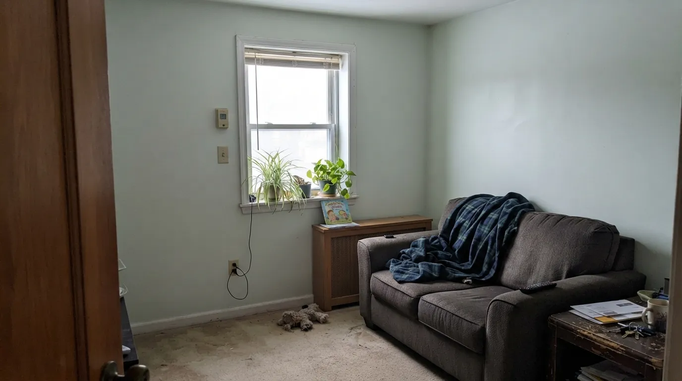
Room by Room
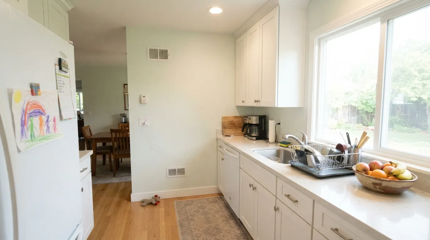
In a bright room it reads as an interesting near-white instead of a flat builder color. Eggshell finish; keep trim in a true white a step or two brighter so the wall doesn't look muddy by comparison.
On cabinets with brass or nickel hardware and light stone counters, the celadon whisper gives shaker cabinets a hint of personality without committing to a full sage kitchen. Satin cabinet enamel wipes clean.
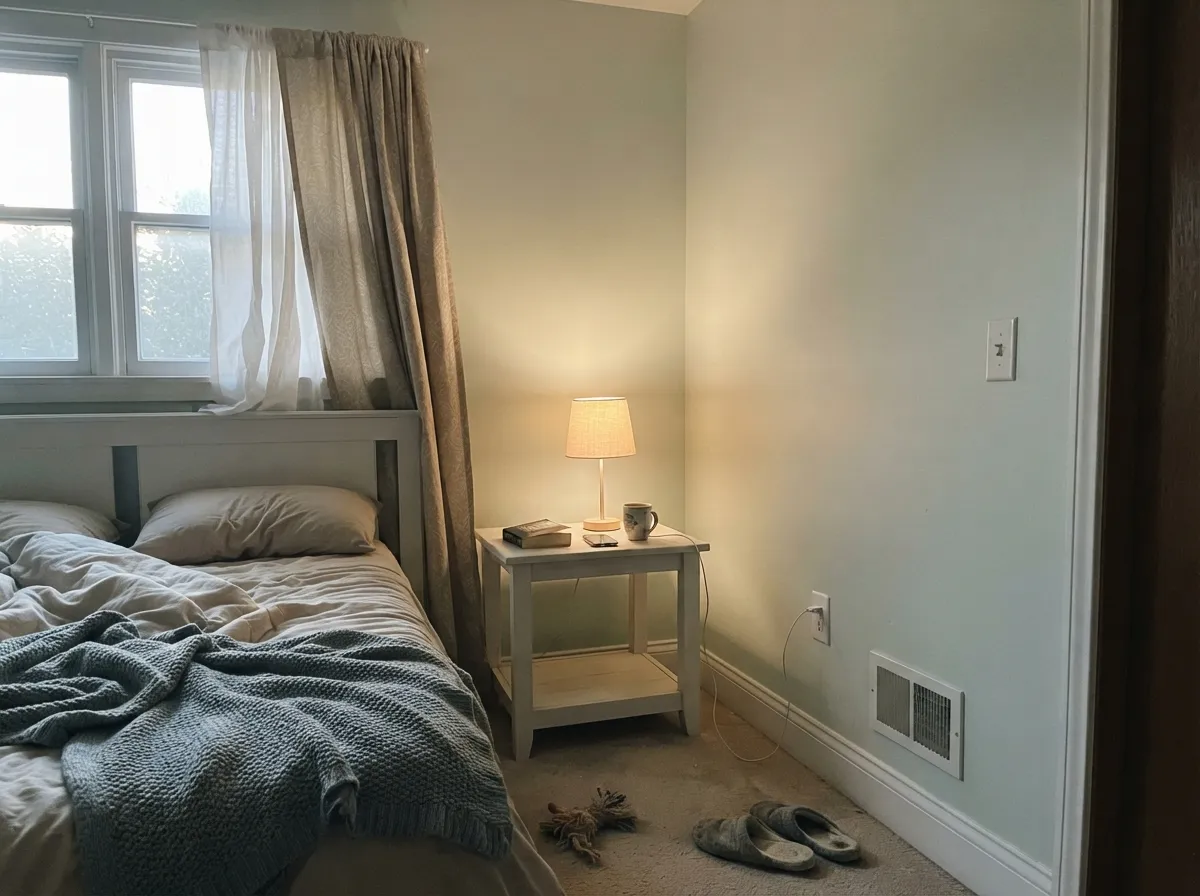
Good in a bedroom that gets real daylight during the day; under warm 2700K lamps at night it softens further and the green all but disappears. If the room is dim all day, this is not the color — step down in LRV to something with more pigment.
White subway tile, chrome or nickel fixtures, and this color are a natural, calm pairing. With warm brass and gold-veined stone the wall can look slightly flat by comparison — test the sample against your actual fixtures before committing.
Used as a trim white against a slightly deeper wall color, it reads softer than a true white without going full cream. Semi-gloss holds up to hands and doorframes.
There is little public record of this color on a house exterior. At LRV 71 in full sun it will likely wash out toward plain white, losing most of the green whisper that makes it interesting indoors. Sample a large board outside before trusting it on siding.
Your Light Is the Risk
South or bright east light lets the celadon whisper show through clearly — the color reads alive, not just pale.
Without real light there isn't enough pigment to carry the color; it flattens into a chalky, characterless gray-white.
Cooler and grayer in early light, a touch softer and greener as the sun moves through afternoon. The shift is subtle, not dramatic.
Warm 2700K bulbs soften it toward a quiet cream-gray and mute the green almost entirely. Cool LEDs keep it grayer and flatter — bright light matters more here than bulb choice.
Most complaints about Silver Feather are a light mismatch. Upload a photo of your actual room and see it on your walls — then ask for the same wall in north light or evening lamps before you buy a single sample.
Need It From Another Brand?
Any paint counter can custom-tint Behr BWC-29 directly. If you would rather stay in one brand's own deck, these are the closest stock matches, measured as ΔE2000. Under 2 is a difference you will not see on the wall.
| Brand | Closest color | ΔE | LRV | |
|---|---|---|---|---|
| Sherwin-Williams | Pacific FogSW 9627 · Sherwin-Williams | 1.1 | 71 | Color page → |
| Benjamin Moore | Winter Orchard1555 · Benjamin Moore | 0.6 | 70 | Color page → |
| Valspar | Luna5005-3A · Valspar | 1.2 | 72 | Color page → |
| PPG / Glidden | AnonymousPPG1128-1 · PPG / Glidden | 0.2 | 70 | Color page → |
| Glidden | AnonymousPPG1128-1 · Glidden | 0.5 | 71 | Color page → |
| Dutch Boy | Baltic Gray437-1DB · Dutch Boy | 2.4 | 71 | Color page → |
Similar Behr Colors
The nearest shades to Silver Feather within Behr's own range, ranked by perceptual color distance — useful when you want the same look a touch lighter, darker, or warmer.
WCAG 2.1: AA is 4.5 : 1 for normal text, 3 : 1 for large text, AAA is 7 : 1.
Silver Feather vs the Colors You're Also Considering
Every Silver Feather sample board has the same rivals on it. The numbers show the real lightness gap — then it comes down to which risk you would rather live with.
Pick this when you want a color so pale it reads almost like a nicer white than an actual green.
Sherwin-Williams SW 6204 · LRV 63Sea SaltPick this if you want the green-gray to actually commit and show as color, not just a whisper — Sea Salt is deeper and more confident.
Pick this for the cooler, paler, quieter option that stays much closer to white.
Behr PPU18-19 · LRV 60Silver DropPick this for a warmer, deeper greige that changes with every room — same brand, more presence, no green.
Within the Behr deck, Alpine Frost BWC-28 at #E2E9D9 and LRV 79 is the yellower option, so it reads a touch warmer. Evening White N460-1 at #DCE8E2 and LRV 78 tips slightly toward blue-green instead. Seagull Gray N360-1 at #DDE6DD and LRV 77 is a shade darker and grayer, and Whispering Waterfall BL-W06 at #E3E6DB and LRV 78 is the most yellow-leaning of the group.
Across brands, Valspar Minty Delight 5006-5A at LRV 78.1 has a deltaE of 0.89 and PPG or Glidden Pine Frost PPG1134-3 at LRV 80 is 0.91, so both are the same color for practical purposes. Sherwin-Williams White Mint SW 6441 at LRV 78 is 1.63 and Benjamin Moore Bath Salts 624 at LRV 77 is 1.93, both visually identical in normal room light. Farrow and Ball Pavilion Blue No. 252 at LRV 78 is 2.56, very close but worth sampling first.
Silver Feather Coordinating Colors
The rule for coordinating with Silver Feather: stay cool, stay quiet, and give it something whiter or darker to read against — on its own next to mid-tone warm colors it tends to disappear rather than clash. These are the partners that give the pale celadon whisper somewhere to go:
A Color With Almost No Track Record
Most colors this deep into an established brand's deck have a story: a Color of the Year run, a designer's signature scheme, a Houzz thread full of arguments about whether it's too gray or too green. Silver Feather has none of that. It is quietly filed in Behr's green family, described in the brand's own copy as "celadon green beneath soft silvery overtones," and then left almost entirely undiscussed — no viral rooms, no famous kitchens, barely a handful of owner reviews to check against.
That is not a knock on the paint. It means this is a genuinely under-the-radar option rather than a proven bestseller, and the honest advice is the same advice that applies to any quiet color: sample it big, in your actual room, in your actual light, before you commit a whole space to it. What you are buying is real — a soft, cool, barely-there green — but you are buying it without the safety net of a thousand other people's rooms to check your own against.
Silver Feather With Wood Tones and Floors
Cooler woods are the easy match: white oak, ash, and gray-washed floors sit comfortably next to the green whisper because neither side is fighting the other's temperature. Walnut and other deep, cool-brown woods work too, giving the pale wall something with real weight to play off.
Honey oak and other warm, golden woods are the harder pairing. Yellow-orange sits opposite green on the color wheel, so a warm floor can make Silver Feather read flatter and grayer than it does on its own, while the wall makes the floor look a touch more orange by contrast. It is not an automatic dealbreaker in a bright room with plenty of daylight, but it is worth testing a large sample above the actual floor first — this is exactly the kind of subtle clash that is easy to miss on a small paint chip and hard to un-see once the whole room is painted.
Three Ready Palettes Built on Silver Feather
A color is never alone on the wall. These are complete combinations in the 60-30-10 pattern, with the reason each one holds together. Every one opens in the visualizer.
Polar Bear trim keeps Silver Feather from disappearing into plain white by giving the eye a true-white reference to measure it against; the near-black island supplies the one dark anchor a palette this pale needs to feel finished, not washed out.
Try this palette in your roomSea Salt is the deeper, more confident cousin of the same green-gray family — giving the whisper in Silver Feather somewhere to resolve into real color on one wall, without the two ever clashing, since they share the same cool undertone.
Try this palette in your roomGray Owl on the vanity is close enough in family to feel deliberate rather than mismatched; the black mirror frame and fixtures give a pale, quiet palette the contrast it needs so the room reads modern instead of flat.
Try this palette in your roomSilver Feather FAQ
is silver feather warm or cool?
Cool. Behr files it under greens, and the undertone is a diluted celadon — never yellow, never pink. It sits so close to white (LRV 71) that the coolness only shows up clearly in real daylight or next to a warmer color.
is behr silver feather basically a white?
Nearly. At LRV 71 it behaves like a light neutral in most rooms, and plenty of people will call it a white without noticing the green. Put it next to an actual white like Behr White or Polar Bear and the difference — a cooler, slightly green cast — becomes obvious.
what trim goes with silver feather walls?
A true white a step or two brighter, like Behr White or Polar Bear, gives the wall something to read against so it doesn't look washed out or muddy. Avoid a warm cream trim — the temperature clash reads as dirty rather than intentional.
does silver feather work in a dark or north-facing room?
Not well. There is very little pigment in a color this light, and without real daylight it goes flat and chalky rather than holding its celadon whisper. Pick a color with more depth — Sea Salt or Gray Owl — for a room that stays dim.
how does silver feather compare to behr silver drop?
They're different colors wearing similar names. Silver Drop is a warmer, deeper greige at LRV 60 that changes noticeably from room to room. Silver Feather is much lighter, cooler, and greener — closer to a tinted white than a true greige.
why haven't i heard of this color before?
Honestly, it's an under-the-radar Behr color — no Color of the Year run, no viral design-blog moment, and very few painted rooms online to compare against. That doesn't make it a bad color, just an untested one; sample it generously before committing to a whole room.
Have you painted with Silver Feather?
Rate it — one tap helps the next reader decide.
Ask a Question