Honeypot
The honey-gold yellow everyone calls cheerful, reviewed honestly: the rooms where it glows, the light that turns it dull, and what to pick instead.

Jessica has spec'd whites and neutrals for more than 300 rooms and keeps a sample wall of painted drawdowns in her studio. Every color review is checked against real reader rooms in the comments and re-tested when a formula changes. About the testing process →
- 1Honey Tea52
- 2Jackfruit62
- 3Honeypot75
- 4Icy Lemonade80
- 5Frittata86
The Fast Verdict
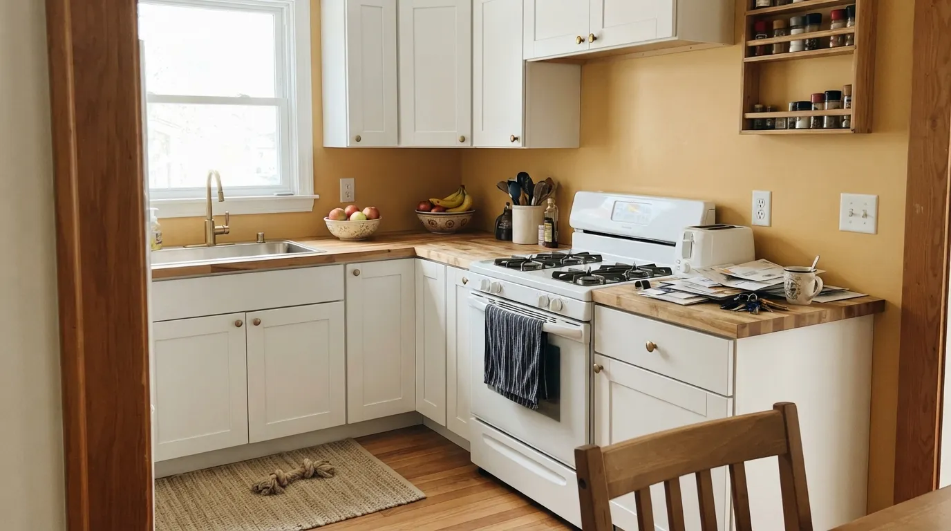
Honeypot is a warm honey-gold yellow that reads like sunshine filtered through amber glass — golden, a little earthy, never the neon-lemon jolt cheap yellows go for. At LRV 75 it holds real color without losing brightness, which is exactly why it works so well in doses: a kitchen wall, a nursery accent, a mudroom that wants to feel like morning. Push it across a whole house and the same warmth that flatters one wall starts to feel like living inside a jar of honey.
One statement wall or a whole kitchen with real daylight · nurseries and kids' rooms as an accent · powder rooms and mudrooms that want a bold small commitment · anyone who wants yellow that reads honey, not lemon
Your room faces north with no lamps · you want it across a whole open-plan floor · your counters or floors are cool gray stone · you want a true pastel, barely-there yellow
- A genuine honey-gold, not a flat lemon or a pastel butter
- Light enough (LRV 75) to still bounce daylight around a room
- Small rooms — nurseries, powder rooms, mudrooms — take it beautifully
- Flatters brass, butcher block, and warm wood without trying
- Reads confident on one wall without tipping into neon
- Goes flat and muddy in north light or under cool LEDs
- Too much warmth for a whole open-plan floor
- Fights cool gray stone and quartz
- Full sun on an exterior pushes it toward orange
What Color Is Honeypot, Really?
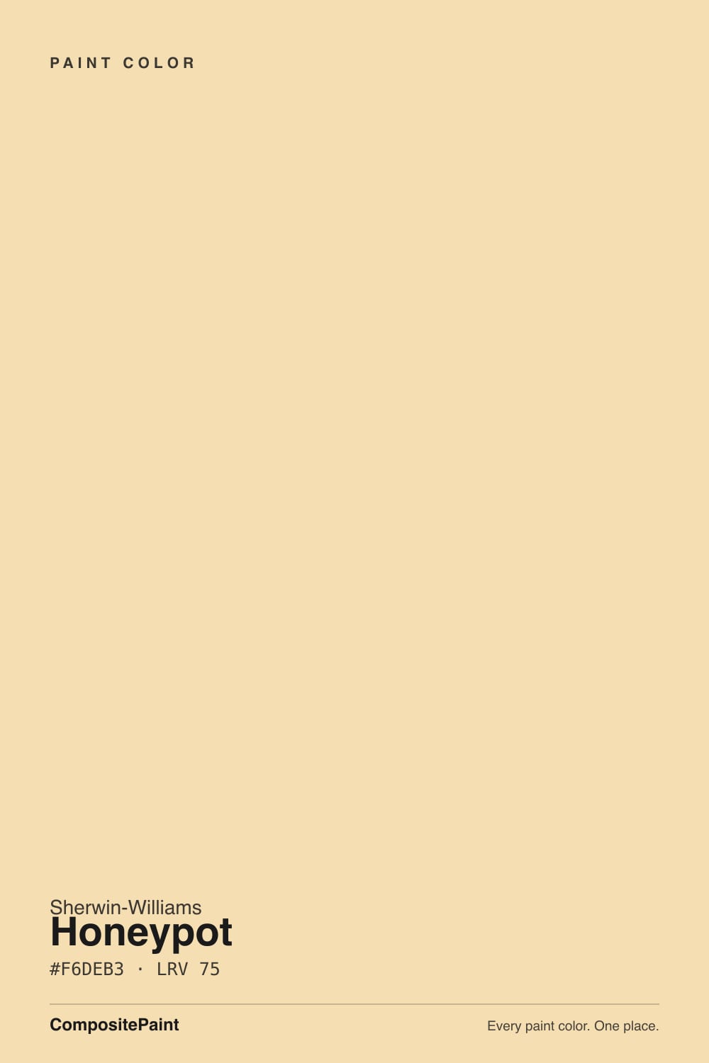
A golden yellow built on an amber base with a whisper of earthy brown holding down the sweetness — this is not a clean, primary-color yellow. That brown is what keeps Honeypot from reading candy-bright or cartoonish; it is the same thing that makes real honey look deep instead of just sweet. Sherwin-Williams files it with its everyday yellow-family picks rather than a splashy trend collection, and the color behaves that way: confident, but not shouting.
At LRV 75 it sits close to Butter Up (SW 6681, LRV 74) and Friendly Yellow (SW 6680, LRV 76) — genuinely light enough to bounce daylight around a room, but with enough saturation that it reads as color, not a tinted white. Put it beside a paler pick like Icy Lemonade (LRV 80) and Honeypot's extra depth is obvious from across the room; that depth is the whole reason to buy it instead of a safer pastel.
Undertone in one line: warm amber-gold with a brown base — never green, never true lemon. If your sample looks sickly or slightly green, that is cool LED light doing it, not the paint; if it looks flat and beige, that is a dim room starving it of warmth.
Where It Shines
Give it real daylight and a plain white backdrop and it earns the name: the wall genuinely looks like it is glowing, especially in a kitchen with white cabinets and warm wood, or in an entry that catches morning sun. It is a color built for a room you want to feel awake in — used as one wall, one zone, or one small room, not spread across a whole open floor plan.
Where It Fails
Almost every regret story about a warm yellow like this follows the same three scripts, and Honeypot is no exception. None of them are the paint failing — they are the paint doing exactly what a saturated warm color does in the wrong conditions.
Cool, flat daylight drains the amber out and leaves a dull, slightly muddy gold that owners describe as dingy rather than sunny. Honeypot needs real warm light to do its job — in a dim north room it just looks tired.
The same golden warmth that feels cheerful on a kitchen wall starts to feel like you are living inside a jar of honey once it covers a hallway, a living room, and a stairwell in sequence. Use it as an accent, a kitchen, a nursery, or a small room — not the whole floor plan.
Honeypot's amber warmth fights cool blue-gray stone the same way it fights cool light — the counters can look chalky and the walls can look jaundiced next to each other. Pair it with warm butcher block, brass, or a warmer-toned quartz instead.
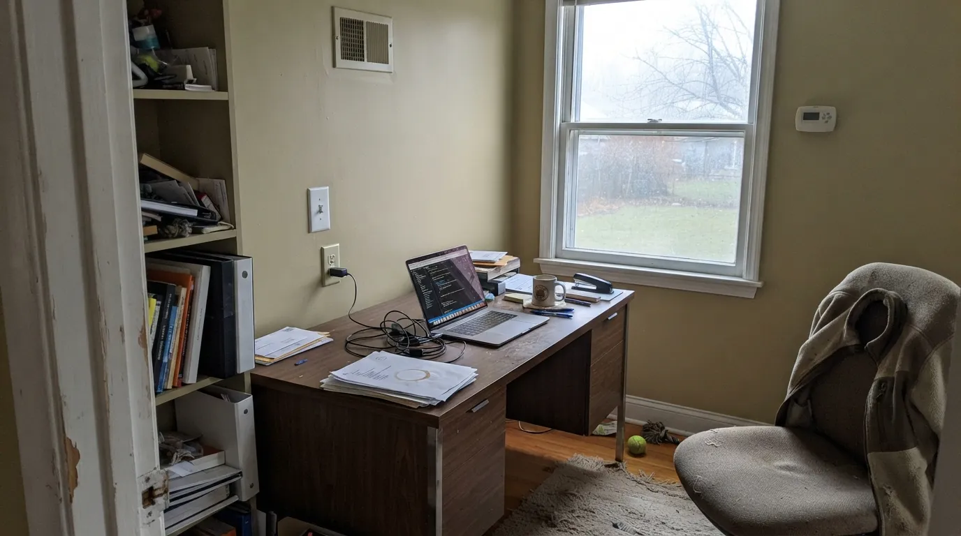
Room by Room
White or pale wood cabinets, brass hardware, butcher block or a warm quartz — this is the room Honeypot was built for. On an island or one accent wall behind open shelving it reads like honey in a jar; wrapped around a small, enclosed galley kitchen on all four walls it can turn heavy by dinnertime. Eggshell on walls, satin on any painted cabinetry.
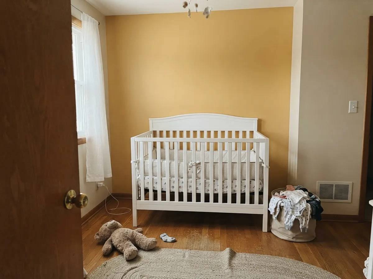
A cheerful, non-primary yellow that photographs well and does not read as loud in person as it sounds on the chip. Best on one wall with a soft white ceiling and trim rather than saturating every wall — a room with warm light takes it beautifully, a room with a single north window does not.
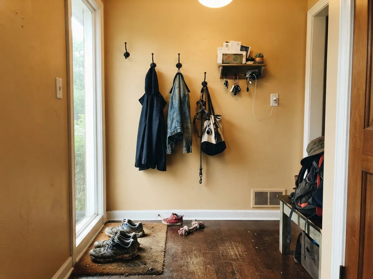
Small rooms take saturated color well, and a powder room or mudroom is where Honeypot gets to be genuinely bold without becoming exhausting over a whole day. Black hooks, hardware, or a mirror frame give it the contrast it wants.
A south- or east-facing entry gets the full effect: morning light plus amber walls reads like the house is greeting you. In a windowless or north-facing foyer it goes flat fast — check the light at the actual door before committing.
This is the room where Honeypot overstays its welcome. Hours of screen time under a wall this saturated get visually tiring, and an open-plan space forces it to negotiate with kitchen cabinets, dining chairs, and whatever the hallway is doing. Save the color for a smaller, more deliberate room.
Full sun pushes any warm yellow toward orange, and Honeypot is no exception — expect a noticeably more golden, less controlled color on siding than the chip promises. If you want yellow outside, sample a much paler version first and watch it across a full day.
Your Light Is the Risk
The amber glows warm and golden all day without tipping orange — this is the light Honeypot was made for.
Cool, flat daylight drains the warmth and leaves a dull, slightly muddy gold. Test a big sample before committing a whole wall.
Direct west or south sun pushes it noticeably toward orange for an hour or two — beautiful if you want drama, surprising if you did not expect it.
2700K bulbs deepen it into a true honey glow. Cool white or daylight LEDs flatten it and can pull out a faint green cast — swap the bulbs before you blame the paint.
Most complaints about Honeypot are a light mismatch. Upload a photo of your actual room and see it on your walls — then ask for the same wall in north light or evening lamps before you buy a single sample.
Need It From Another Brand?
Any paint counter can custom-tint Sherwin-Williams SW 9663 directly. If you would rather stay in one brand's own deck, these are the closest stock matches, measured as ΔE2000. Under 2 is a difference you will not see on the wall.
| Brand | Closest color | ΔE | LRV | |
|---|---|---|---|---|
| Behr | CallaPPU6-12 · Behr | 1.7 | 75 | Color page → |
| Benjamin Moore | Birmingham Cream164 · Benjamin Moore | 0.9 | 70 | Color page → |
| Valspar | Rose of TexasT539 · Valspar | 0.7 | 75.5 | Color page → |
| PPG / Glidden | Belgian WafflePPG1208-3 · PPG / Glidden | 1.1 | 75 | Color page → |
| Glidden | Belgian WafflePPG1208-3 · Glidden | 1.4 | 75 | Color page → |
| Dutch Boy | Sweet Dream212-2DB · Dutch Boy | 1.3 | 75 | Color page → |
Similar Sherwin-Williams Colors
The nearest shades to Honeypot within Sherwin-Williams's own range, ranked by perceptual color distance — useful when you want the same look a touch lighter, darker, or warmer.
WCAG 2.1: AA is 4.5 : 1 for normal text, 3 : 1 for large text, AAA is 7 : 1.
Honeypot vs the Colors You're Also Considering
Every Honeypot sample board has the same rivals on it. The numbers show the real lightness gap — then it comes down to which risk you would rather live with.
Pick this for the amber-honey undertone — Honeypot reads a shade richer and less flatly yellow.
Sherwin-Williams SW 6681 · LRV 74Butter UpPick this if you want the same depth of yellow with the brown dialed back — a cleaner, more straightforward butter.
Pick this when you want more presence — Friendly Yellow can read almost like a cream from across the room.
Sherwin-Williams SW 6680 · LRV 76Friendly YellowPick this for a paler, softer version that only misbehaves in the strongest sun.
Honeypot Coordinating Colors
The rule for coordinating with Honeypot is simple: let something cool anchor the room, because everything else about this color runs warm. It flatters brass, walnut, and butcher block, and it wants at least one crisp white or one deep, cool-leaning dark nearby to keep the room from feeling entirely basted in honey. These are the partners that keep showing up in rooms that work:
The Return of the Yellow Kitchen
Honeypot rides the same wave as the butter-yellow moment that swept design media in the mid-2020s — a reaction to a decade of all-white and all-gray kitchens. The difference is in the base: the palest trend shades tend to sit closer to pastel, while Honeypot's brown undertone gives it more weight, closer to a real jar of honey than a stick of butter.
That extra weight is why it tends to hold up better in a real, lived-in kitchen than the palest trend colors — it reads as a deliberate, grown-up yellow rather than a fad shade that will look dated the moment the trend moves on.
Honeypot With Wood Tones and Floors
Warm wood is Honeypot's best friend — golden oak, pine, and butcher block all deepen the honey tone instead of fighting it, which is unusual for a saturated yellow; most yellows read best against a neutral wood, not a matching warm one. Walnut works too, giving the room a richer, more autumnal cast.
The floors and counters that need a sample first are cool gray-washed or whitewashed wood, and any gray-veined stone. The cool undertone in both pulls against Honeypot's amber base, and in a kitchen the counters usually lose that fight — they can look faintly chalky next to the wall. A warm butcher block or a warmer-toned quartz keeps the whole room speaking the same language.
Three Ready Palettes Built on Honeypot
A color is never alone on the wall. These are complete combinations in the 60-30-10 pattern, with the reason each one holds together. Every one opens in the visualizer.
White cabinets keep the honey from tipping heavy, and a navy island gives the room one grounded, cool note so the whole kitchen does not run warm. Brass hardware and butcher block finish the look Honeypot was made for.
Try this palette in your roomOne Honeypot wall keeps the cheer without overloading a small room; White Dove trim and ceiling let the yellow stay the star. Evergreen Fog on a dresser or door adds a quiet green note without fighting the yellow's warmth.
Try this palette in your roomIron Ore hardware and a painted door give the honey wall the dark anchor it needs so the entry reads intentional, not sugary. Alabaster trim keeps the transition soft instead of stark.
Try this palette in your roomHoneypot FAQ
Is Honeypot warm or cool?
Warm — unmistakably. It is built on an amber-gold base with a touch of earthy brown, never leaning green or true lemon. In cool north light it can go flat and muddy, but it never reads cold.
Does Honeypot work on kitchen cabinets?
Yes, especially on an island or a run of upper cabinets against white lowers — the honey tone flatters brass and warm wood. A full kitchen of Honeypot cabinets is a bigger bet; sample it against your counters first, especially if they are cool-toned stone.
What trim white goes with Honeypot walls?
A clean, slightly cool white like Pure White or Alabaster keeps the contrast crisp without competing for warmth. Avoid a creamy trim white — two warm tones next to each other just blur together.
Will Honeypot look orange in strong sun?
In direct west or south sun for an hour or two, yes — it visibly pushes toward orange. It settles back to honey-gold the rest of the day. If that swing bothers you, test a large sample on the actual wall before committing.
Is it good for a nursery or kid's room?
Yes, especially as one accent wall rather than all four — it photographs cheerfully and does not read as loud in person as the name suggests. Pair with a soft white ceiling and trim so the room has somewhere calm to rest the eye.
How many coats does it need over a darker wall?
Plan on a tinted primer if you are covering a saturated color, then two finish coats. Going from white or a pale color straight to Honeypot usually covers in two coats without extra primer.
Have you painted with Honeypot?
Rate it — one tap helps the next reader decide.
Ask a Question