Icy Lemonade
Sherwin-Williams' own butter-yellow pick, reviewed honestly: the rooms where the green cast saves it, the sun that turns it loud, and what to paint instead.

Jessica has spec'd whites and neutrals for more than 300 rooms and keeps a sample wall of painted drawdowns in her studio. Every color review is checked against real reader rooms in the comments and re-tested when a formula changes. About the testing process →
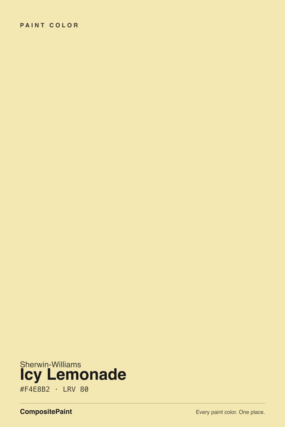
- 1Honey Tea52
- 2Jackfruit62
- 3Icy Lemonade80
- 4Frittata86
- 5Barely Yellow92
The Fast Verdict
Icy Lemonade is butter yellow with the sugar cooled out of it. A pale pastel with a green cast underneath, it reads soft and vaguely mid-century instead of sweet and babyish — which is exactly why it works in rooms where a plain buttercup would feel like a theme. At LRV 80 it looks nearly off-white on the chip and considerably louder than that on four walls in afternoon sun. It is a genuinely good yellow; it just has opinions about your light.
Nurseries and kids' rooms that need warmth without pink or blue · kitchens and dining rooms with real daylight · home offices · cabinets, islands and laundry rooms as a small dose of color
The room takes hard, direct south or west sun all afternoon · it is a dim north room with no lamps · your floors and trim are already golden oak · you want a color nobody will ever notice
- Gender-neutral nursery color that is not another mint or greige
- The green cast keeps it modern instead of babyish
- Light at LRV 80 — brightens dim rooms without going stark white
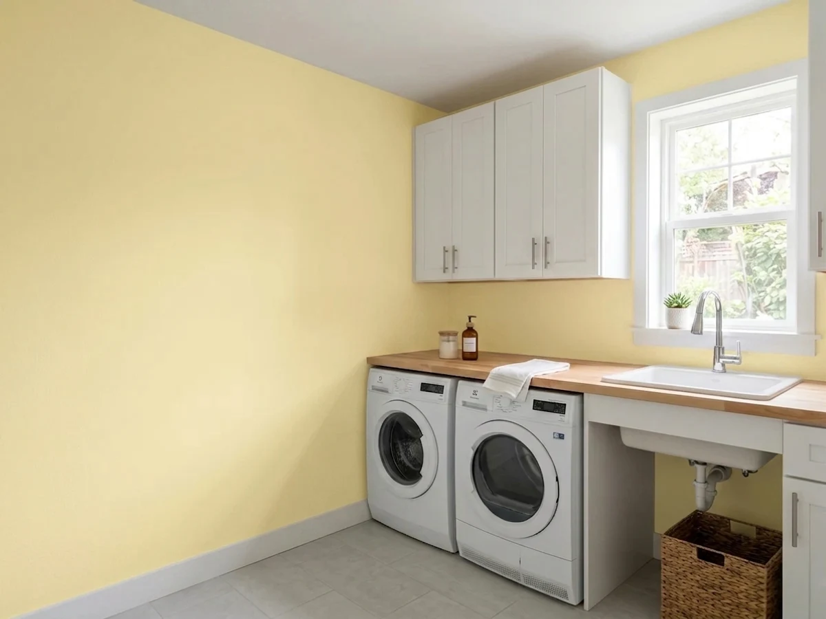
- Excellent in small doses: island, hutch, laundry room, interior door
- Sherwin-Williams' own Color of the Month, so it is easy to sample and match
- Hard afternoon sun saturates it far past pastel
- Flat north light pulls the green forward and it reads dingy
- Disappears into golden oak floors and orange-toned trim
- Yellow carries more trend and resale risk than any neutral
What Color Is Icy Lemonade, Really?
A pale pastel yellow with a cool green cast underneath. Sherwin-Williams says it plainly — the color carries a slight green undertone — and that undertone is the whole reason it is interesting. Take the green out and you land on the buttercup yellow of a 1990s nursery wallpaper border. Leave it in and the color tips slightly sharp and slightly retro, closer to a vintage kitchen canister than to an Easter egg. That is also why Sherwin-Williams filed it under mid-century when it made the color its June 2025 Color of the Month, and why the design press framed it as the cooler, more grown-up end of the butter-yellow trend.
At LRV 80 it sits in off-white territory on paper, and that number fools people. Light and quiet are not the same thing. Yellow is the most reflective hue on the wheel, so a pale yellow bounces its own color back into the room: the ceiling picks it up, the trim picks it up, the carpet picks it up, and the whole space reads a full step more yellow than the little chip at the paint counter ever suggested. Sample it big — a poster-size sample, taped to the wall, looked at in the morning and again at 4pm — or plan on being surprised.
Undertone in one line: yellow first, a cool green second — never gold, never orange. If your sample looks creamy and buttery, that is warm bulbs or west sun doing it. If it looks like faded celery, that is flat north light pulling the green forward. Both are the same paint being honest about the room it is in.
Where It Shines
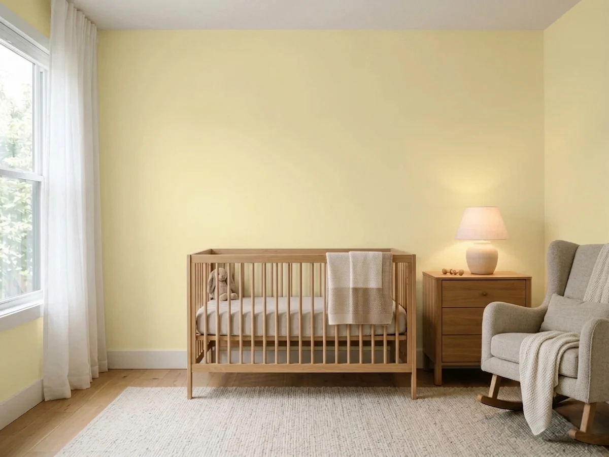
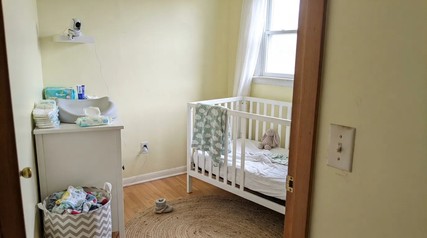
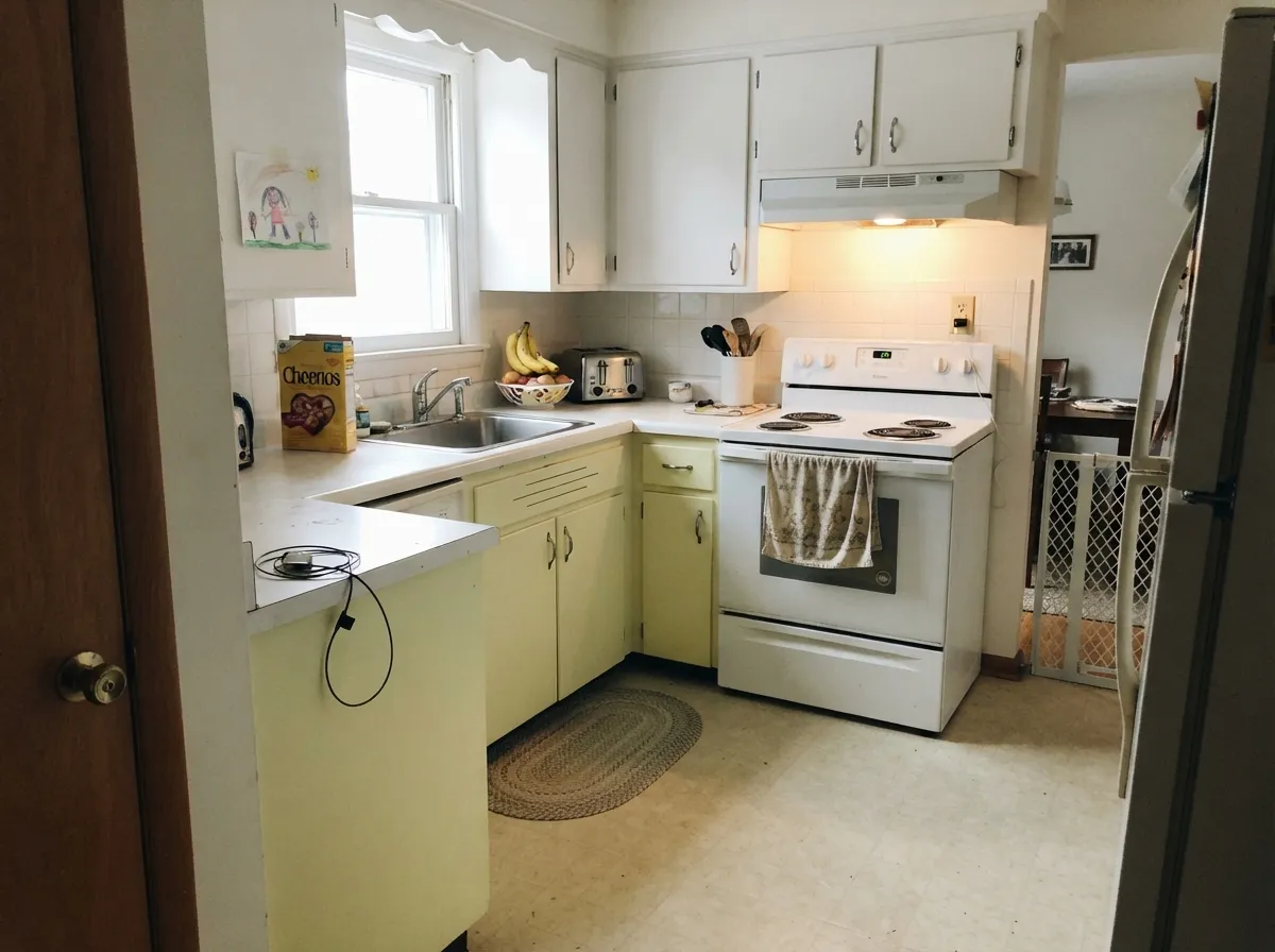
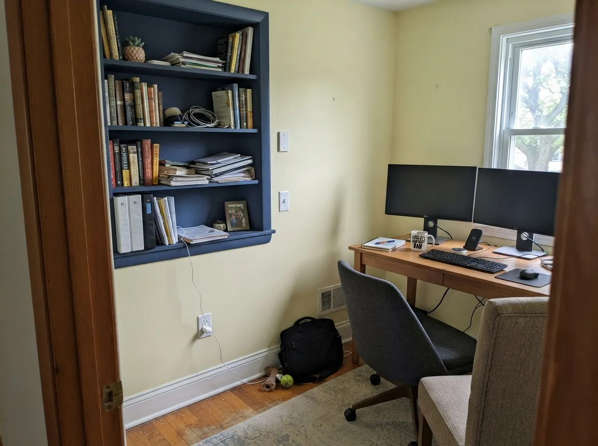
This color is at its best where you want cheer without commitment to a theme. In a nursery it does the job pink and blue do without announcing a gender, and the green cast keeps it from reading like a cartoon sun. In a kitchen it is the retro note designers keep reaching for — on an island, a hutch or a run of lower cabinets under a clean white wall. Home offices and dining rooms are its third home: enough color to make the room feel decided, light enough that it never fights the furniture. Give it real, indirect daylight, clean white trim and one green or navy partner and it looks deliberate rather than trendy.
Where It Fails
Nearly every complaint about a pale yellow comes down to light and neighbors, and Icy Lemonade is no exception. All three failure modes are predictable before you open the can — and if your room matches one, a bigger sample will only prove it faster.
Direct sun does not just brighten a yellow, it saturates it. A room that faces full afternoon sun takes this soft pastel and pushes it to something much closer to a real lemon for two or three hours a day, and the reflected light bounces onto the ceiling and the floor with it. The rooms where people describe pale yellow as suddenly banana-bright are almost always the sunny ones. If your windows face west with no shade, pick a warm off-white and use yellow on textiles instead.
Cool, flat north light kills the yellow and leaves the green cast exposed — the wall reads pale celery, slightly dingy, like a page that has been in a sunny window too long. Designers who dislike pale yellows are usually describing this exact result: too pale and it goes dingy, like discolored linen. If the room is north-facing and dim, a golden-based yellow survives it better than a green-based one, or you skip yellow and go warm neutral.
Golden oak floors, orange-stained oak trim, honey cabinets, brass everywhere — put pale yellow walls on top of that and the room loses all contrast and reads as one gold soup. This color needs something to push against: white or pale-toned floors, painted white trim, a green or navy note somewhere. With wall-to-wall honey oak still in place, this is the wrong yellow, and probably the wrong color family.
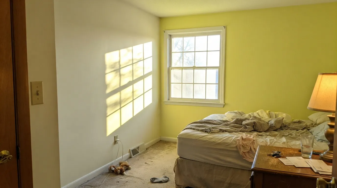
Room by Room
The gender-neutral yellow that is not mint or greige. At LRV 80 it is pastel rather than saturated, which matters: the overstimulation worry attached to yellow nurseries is about bright, high-chroma yellow, not a soft one. Keep the ceiling and trim a clean white, put the bulbs at 2700K to 3000K, and it reads warm and calm rather than sunny-side-up. Scrubbable matte hides wall texture and survives a wipe-down.
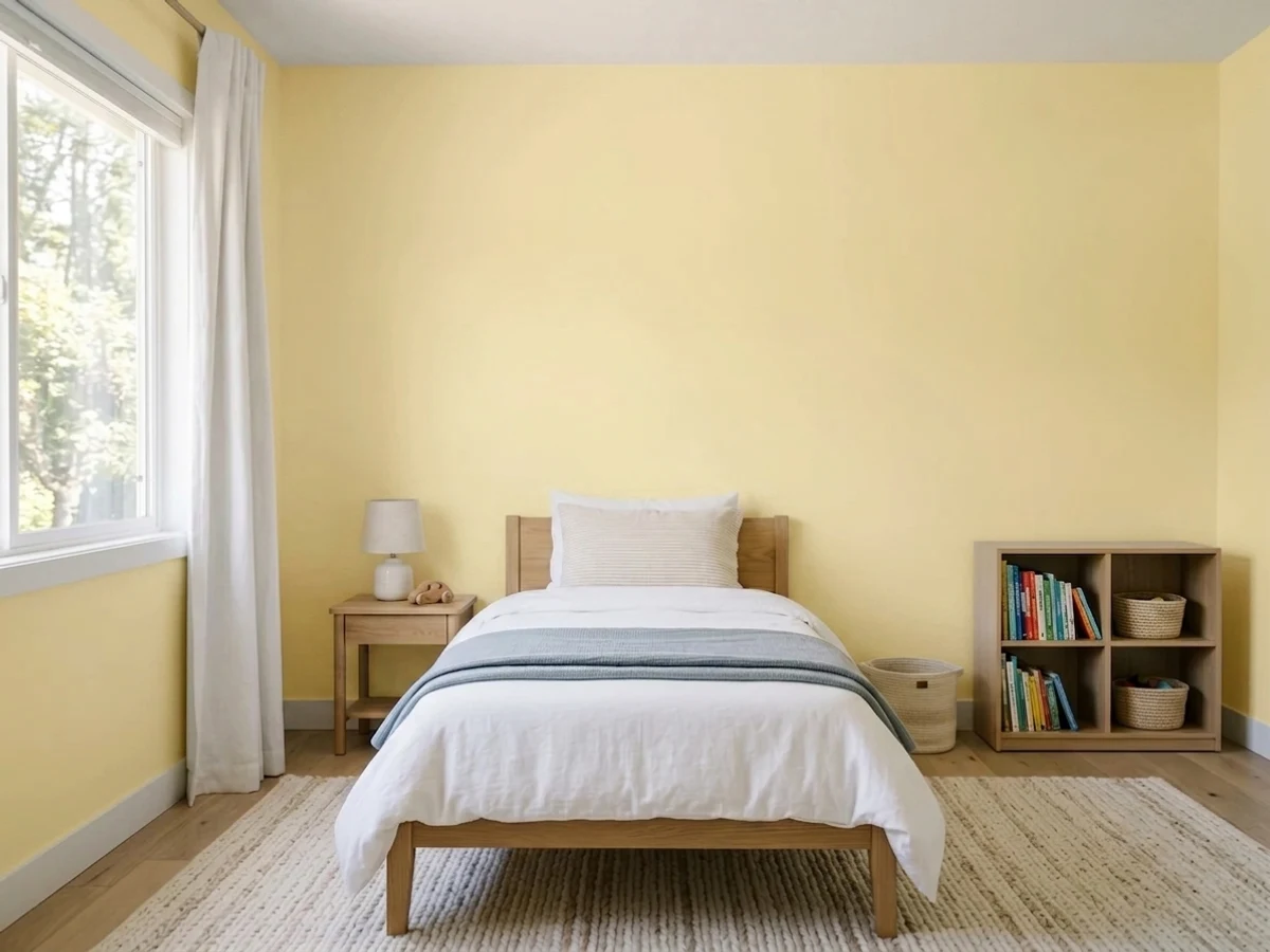
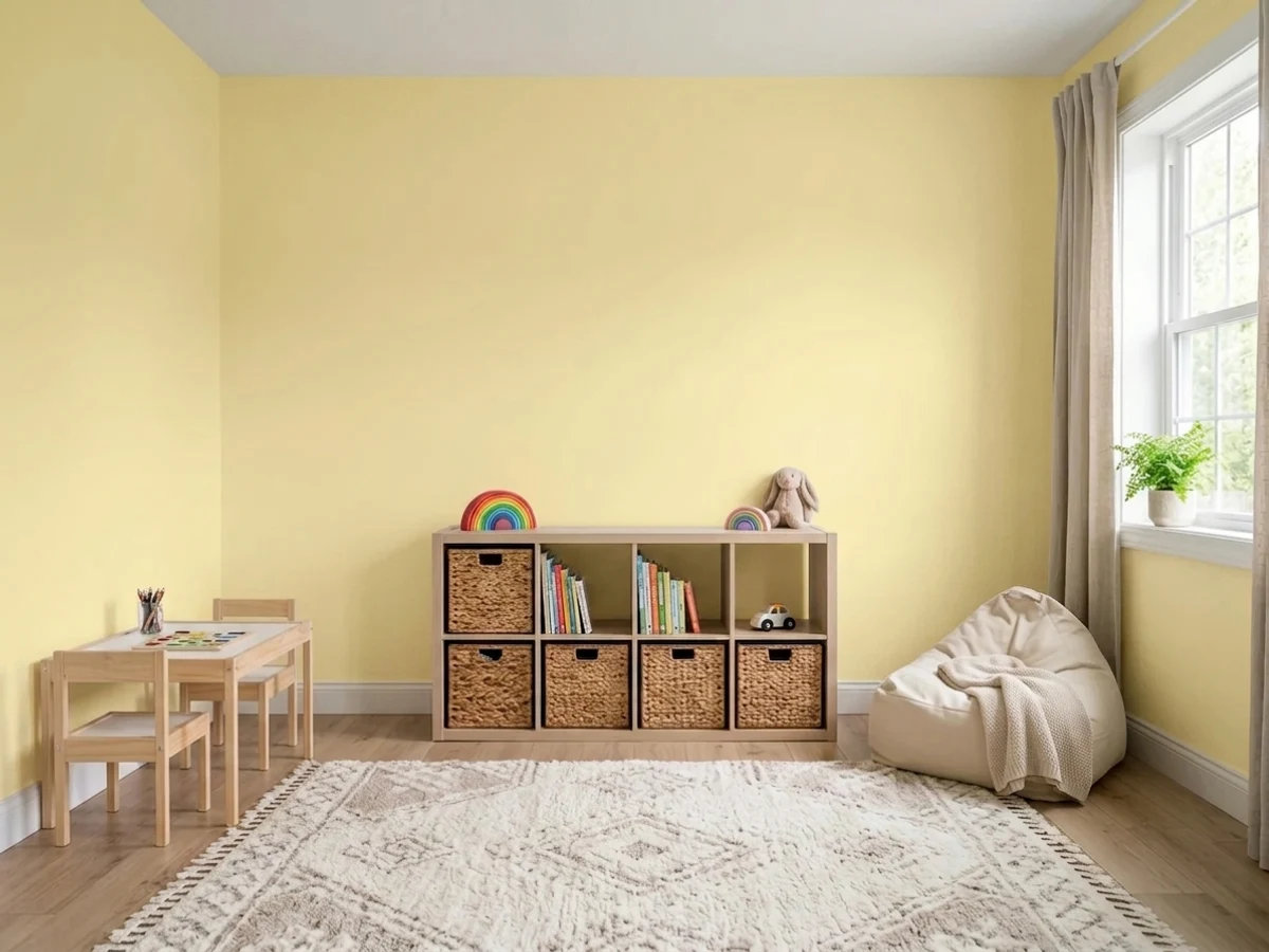
A playroom is where yellow earns its reputation: cheerful, forgiving of primary-colored plastic, and easy to grow out of because it is not tied to an age. In a kids' bedroom used for sleep, pair it with white trim and blackout shades so an afternoon sun-boost does not turn the room into a lightbox at nap time. Eggshell or scrubbable matte on the walls.
Sherwin-Williams lists kitchens first, and the reason is the retro cabinet look: a run of pale-yellow lowers or a painted island under white uppers, with brass or chrome pulls. Full walls of yellow in a kitchen with warm wood and warm counters gets loud fast. Satin urethane-fortified cabinet enamel, and keep the counters and backsplash cool or white so the yellow stays the only warm note.
This is where the mid-century read comes through: pale yellow walls, walnut table, white trim, one green or navy accent. It flatters lamplight and candle light, and it is one of the few colors that makes a windowless-feeling dining room feel like there is a window. Eggshell so the walls wipe.
Sherwin-Williams pitches it as a productivity color, which is marketing, but the practical case is real: a pale yellow behind a monitor reads awake without the eye strain of a saturated wall, and it photographs warm on video calls where gray goes corpse-like. Check it against your ring light before you commit — cool 5000K video lighting pushes the green forward.
A primary bedroom is the weakest case: yellow is a waking color and warm night bulbs push it toward a sallow cream. Bathrooms are a coin flip — it looks fresh against white tile and terrible against beige travertine, and vanity lighting decides which. Outside, pale yellow siding is a whole separate genre with its own rules; this is an interior color and there is no reason to draft it onto a facade.
Your Light Is the Risk
Bright but not direct for most of the day — the yellow stays pastel and the green keeps it clean. This is the light the color was made for.
Cool, flat daylight strips the yellow and leaves the green cast. The wall reads pale celery and slightly tired. Test here before anywhere else.
Quiet in the morning, distinctly stronger at midday, and openly golden for the last hour of sun. Big shift — most people either love the 5pm version or hate it.
2700K warm bulbs turn it creamy and drop the icy part entirely. Cool 4000K LEDs do the opposite and push it green. 3000K is the compromise that keeps it recognizable at night.
Most complaints about Icy Lemonade are a light mismatch. Upload a photo of your actual room and see it on your walls — then ask for the same wall in north light or evening lamps before you buy a single sample.
Need It From Another Brand?
Any paint counter can custom-tint Sherwin-Williams SW 1667 directly. If you would rather stay in one brand's own deck, these are the closest stock matches, measured as ΔE2000. Under 2 is a difference you will not see on the wall.
| Brand | Closest color | ΔE | LRV | |
|---|---|---|---|---|
| Behr | InvigoratingP340-2 · Behr | 1.6 | 81 | Color page → |
| Benjamin Moore | Yellow Lilies346 · Benjamin Moore | 0.9 | 76 | Color page → |
| Valspar | Laughing Liam8001-26B · Valspar | 0.4 | 79 | Color page → |
| PPG / Glidden | Banana BruleePPG1214-3 · PPG / Glidden | 1.3 | 82 | Color page → |
| Glidden | French Lemon50YY 77/285 · Glidden | 1.9 | 77 | Color page → |
| Dutch Boy | Illuminating122-3DB · Dutch Boy | 0.9 | 81 | Color page → |
Similar Sherwin-Williams Colors
The nearest shades to Icy Lemonade within Sherwin-Williams's own range, ranked by perceptual color distance — useful when you want the same look a touch lighter, darker, or warmer.
WCAG 2.1: AA is 4.5 : 1 for normal text, 3 : 1 for large text, AAA is 7 : 1.
Icy Lemonade vs the Colors You're Also Considering
Every Icy Lemonade sample board has the same rivals on it. The numbers show the real lightness gap — then it comes down to which risk you would rather live with.
Pick this when you want the cooler, more modern yellow that does not read as sunshine-cheerful.
Sherwin-Williams SW 6686 · LRV 79Lemon ChiffonPick this for the warmer, goldier version at almost the same lightness — LRV 79 against 80, but no green in it at all.
Pick this when you actually want people to see a color, not wonder whether the wall is off-white.
Behr ICC-90 · LRV 86Butter YellowPick this if you want the trend without the commitment — it is pale enough to pass for a warm white on most walls.
Icy Lemonade Coordinating Colors
The rule for coordinating with a pale yellow is that it needs one clean white and one thing to push against. Clean whites keep it looking fresh; cream and warm off-whites sit too close and make the wall look tired. For the push, Sherwin-Williams pairs it with its own muted sage, which works because it echoes the green already under the yellow — and a deep navy or a near-black does the same job with more contrast. These are the partners worth sampling next to it:
Floors and metals decide the rest. White oak, pale ash, light LVP, painted floors and gray-toned carpet all give the yellow something to sit on. Golden oak and orange-stained trim do the opposite: the wall stops being a color and becomes part of the floor. Walnut is fine because the depth gives contrast. On metals, chrome, nickel and matte black all read clean against it — brass works but pushes the whole room warmer, so use it if you want butter and skip it if you want icy.
Yellow in a Nursery: What the Research Actually Says
If you have searched yellow nursery, you have hit the claim that babies cry more in yellow rooms. It is worth knowing where that came from: a color consultant named Carlton Wagner, of the Wagner Institute for Color Research, told reporters in the 1980s that yellow triggers anxiety in infants. It circulated for forty years and it has never been backed by published research. Treat it as folklore, not a finding.
What is defensible is the part underneath it. A high-chroma, high-value yellow is genuinely intense, and an intense color on four walls of a room meant for sleep will overstimulate anyone, baby or not. The variable that matters is saturation, not hue — and Icy Lemonade sits at the pastel end, with a green cast that dulls the punch further. That is the difference between this and the taxi-cab yellow the myth was built on.
Practical nursery rules, then: keep the ceiling and trim a clean white so the yellow has an edge; use 2700K to 3000K bulbs and a dimmer, because cool LEDs turn the walls green and make everyone look ill at 3am; add blackout shades if the room takes afternoon sun, both for naps and to stop the color from spiking; and choose a scrubbable matte, since flat paint in a nursery does not survive the first year.
Butter Yellow, One Trend Cycle Later
Yellow spent a decade in exile. Then butter yellow crossed over from fashion into interiors in 2025, and every brand needed one: Sherwin-Williams named Icy Lemonade its Color of the Month for June 2025 and pitched it as the mid-century, slightly cooler version, while Behr put an even paler Butter Yellow at LRV 86 into its lineup. The design press covered it as the soft-optimism antidote to a decade of gray.
By 2026 the same press is writing the trend's obituary — the usual verdict being that butter yellow was better suited to a handbag than to a wall, because you cannot swap out a room in a season. That is a fair warning about saturated trend yellows, and a weaker one about this specific color. Icy Lemonade is pale, grayed and greened enough to behave more like a tinted off-white than like an accent, which is what gives it a life after the trend.
The honest bottom line: if you are painting because yellow is having a moment, you are buying at the top. If you want a warm, gender-neutral, light-reflective color for a nursery, a kids' room or a kitchen island and you like it on its own merits, the trend cycle is irrelevant — and repainting one room is a Saturday, not a renovation.
Three Ready Palettes Built on Icy Lemonade
A color is never alone on the wall. These are complete combinations in the 60-30-10 pattern, with the reason each one holds together. Every one opens in the visualizer.
Pale yellow plus sky blue is the oldest gender-neutral nursery pairing there is, and it still works because neither color is saturated enough to shout. Pure White is the important piece: a cream trim would let the walls go muddy, while a clean neutral white keeps the yellow reading fresh. Honolulu Blue is openly playful rather than serious, which is the right register for a room with a crib in it.
Try this palette in your roomThis is Sherwin-Williams' own pairing, and it is a good one: the muted sage picks up the green already sitting under the yellow, so the two read as relatives instead of as two decisions. White uppers keep the room from tipping warm, and the yellow stays a deliberate accent at eye level rather than an all-over wash.
Try this palette in your roomNavy is what stops a yellow room from reading like a preschool. Extra White is the sharpest trim white in the deck, and that crispness is the point here — it draws a hard edge around the yellow so the wall looks chosen. Keep the navy to one plane, since at LRV 4 it eats light fast in a small office.
Try this palette in your roomIcy Lemonade FAQ
Is Icy Lemonade too yellow for a whole room?
In a room with soft, indirect daylight, no. In a room with hard afternoon sun, probably yes — direct light saturates a pale yellow well past pastel, and the bounce puts the color on your ceiling and floor too. The safe version in a sunny room is to keep the yellow on cabinets, an island or one wall, and let the rest stay white.
What white trim goes with Icy Lemonade?
A clean, near-neutral white. Pure White is the easy default and Extra White is the crisper option if you want a sharper edge. Avoid cream and warm off-whites: they sit too close to the yellow, so the trim reads dirty and the wall loses its snap. Semi-gloss on the trim, eggshell on the walls.
Is it a good nursery color?
It is one of the better ones. The old warning that babies cry more in yellow rooms traces back to a single color consultant in the 1980s and was never supported by published research — but the underlying point about saturation is fair. A bright, high-chroma yellow is genuinely overstimulating; a pastel at LRV 80 is not. Keep the ceiling white, use 2700K to 3000K bulbs, and add blackout shades if the room faces the sun.
Does Icy Lemonade look green?
Sometimes, and Sherwin-Williams says so up front — the color has a slight green undertone. In good light the green just keeps it from going sugary. In flat north light or under cool 4000K LEDs it steps forward and the wall can read pale celery. If green is your dealbreaker, a golden-based yellow like Lemon Chiffon is the safer buy.
How is it different from Lemon Chiffon?
They are almost the same lightness — LRV 80 against 79 — so this is a pure hue decision, not a depth one. Lemon Chiffon is the warm, golden, cheerful one. Icy Lemonade is cooler and greener, which makes it read more modern and less like a sunny-kitchen cliche. Sample both side by side; on a chip they look closer than they behave on a wall.
Is butter yellow already over?
The trend peaked in 2025 and the design press has been calling its end since, so if you are buying yellow to be current, you are late. The better reason to buy this one is that it is a grayed, greened pastel rather than a saturated trend yellow, so it ages more like a tinted off-white than like an accent color. That said, yellow will always carry more resale risk than a neutral — worth knowing if you plan to sell within a couple of years.
Have you painted with Icy Lemonade?
Rate it — one tap helps the next reader decide.
Ask a Question