Light Daffodil
The pale yellow that is not buttery, reviewed honestly: the nurseries and kitchens it flatters, the light that turns it celery, and what to pick instead.

Jessica has spec'd whites and neutrals for more than 300 rooms and keeps a sample wall of painted drawdowns in her studio. Every color review is checked against real reader rooms in the comments and re-tested when a formula changes. About the testing process →
- 1Jackfruit62
- 2Lemon Chiffon79
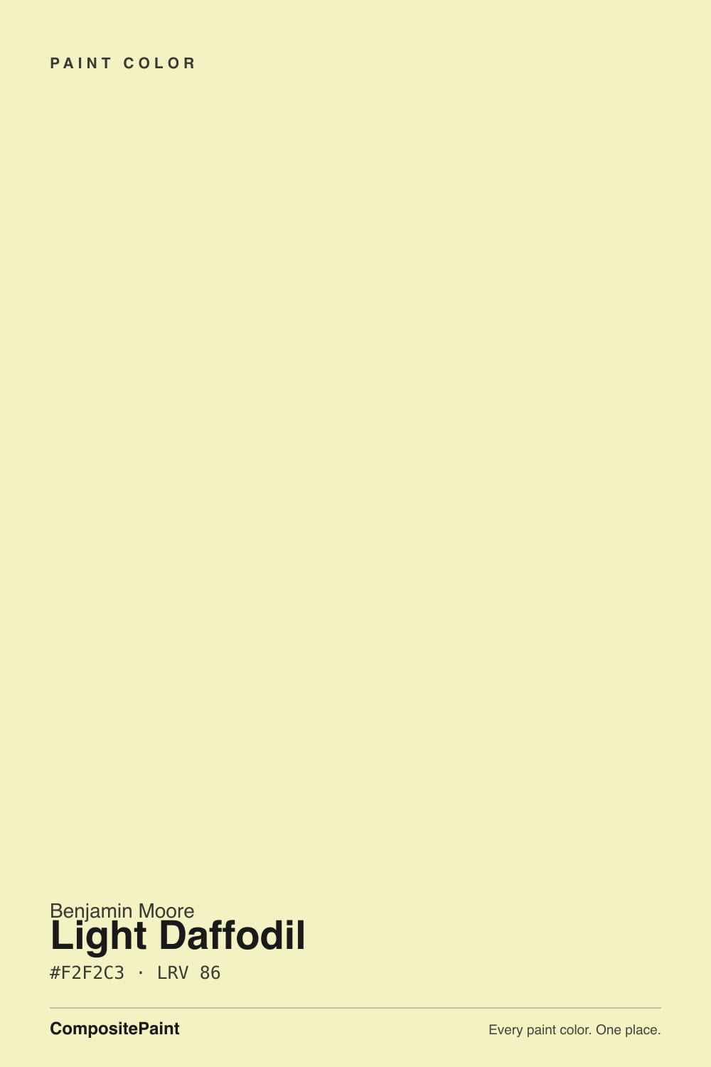
- 3Light Daffodil86
- 4Barely Yellow92
The Fast Verdict
Light Daffodil is the pale yellow for people who do not want a creamy, custardy room. Benjamin Moore's own description calls it a green-tinged yellow, and the mix backs that up: equal red and green with the blue pulled down, so there is no orange in it at all. That makes it fresh and springlike in good light and slightly celery in bad light. At LRV 86 it stays light enough for a whole nursery, but it is a real color, not a warm white — it will read yellow on four walls, and that is the point.
Nurseries and kids' rooms · kitchens with clean white cabinets · laundry rooms and mudrooms that need cheering up · anyone who finds butter-yellow too creamy
Your room faces north and stays dim · there is a lawn or heavy tree cover right outside the window · your trim and woodwork are cream · you want a bathroom mirror that flatters skin
- Genuinely cheerful without going nursery-pastel
- LRV 86 keeps a small or blinds-down room bright
- Gender-neutral — the easy nursery answer before the baby arrives
- The fresh, green-side yellow, not another cream or custard
- Cheap mood upgrade for laundry rooms, mudrooms and back halls
- Reads celery or chartreuse in north light and next to green views
- Buyers expecting warm butter yellow are consistently disappointed
- Fights cream trim, honey oak and every orange-leaning warm white
- Bounces yellow onto skin — a poor choice around a bathroom mirror
What Color Is Light Daffodil, Really?
A pale yellow built on the green side of the family. Most soft yellows people love — the butters, the creams, the custards — carry a little orange, which is what makes them feel warm and edible. Light Daffodil does not: its mix runs equal parts red and green with only the blue pulled back, so it sits right on the line between yellow and chartreuse. Benjamin Moore files it in the Color Preview collection and describes it as a green-tinged yellow, which is unusually honest for a paint chip and exactly what you will see on the wall.
At LRV 86 it is very light — near-white territory on paper — but do not expect it to behave like an off-white. Yellow is the hue that multiplies most between the chip and the finished room; a color that looks like tinted paper on a fan deck reads as a clearly yellow room once it is on four walls and bouncing into itself. That is why so many people describe pale yellows as "way more yellow than I expected." Plan for a room that looks like sunlight, not like a soft neutral.
Undertone in one line: yellow with a green lean and zero orange. If your sample looks fresh and lemony, that is honest daylight. If it looks like celery soup, that is cool light or a green view through the window — the same paint being honest about the room.
Where It Shines
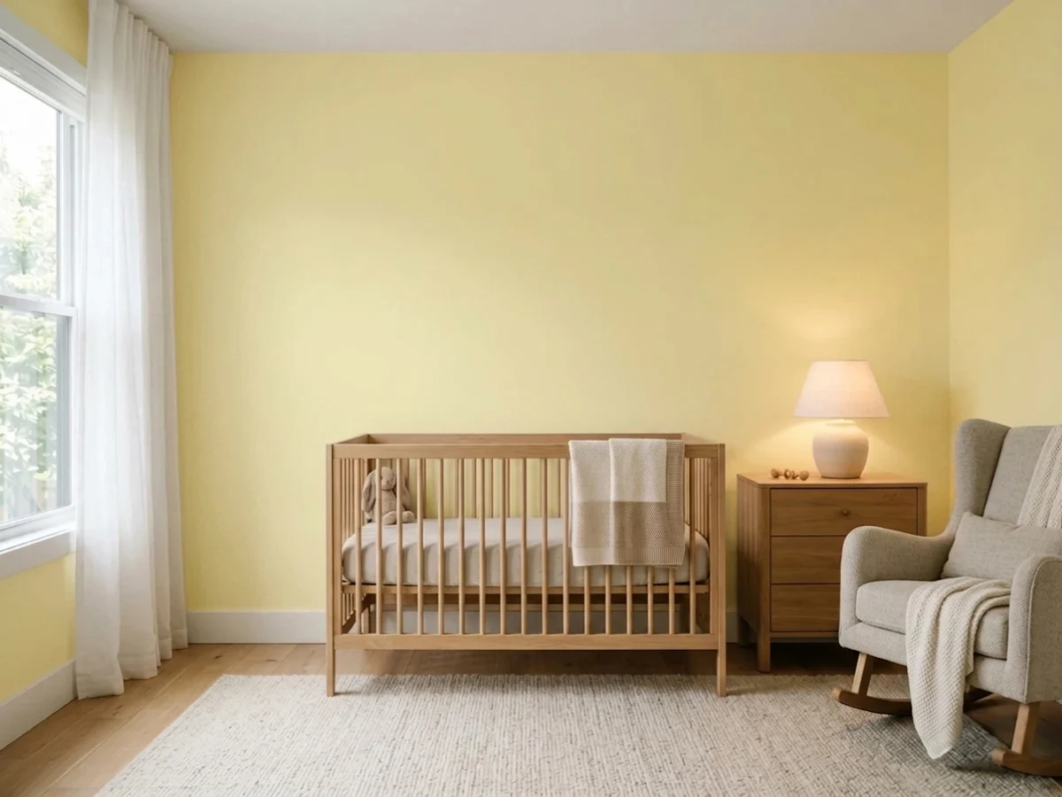
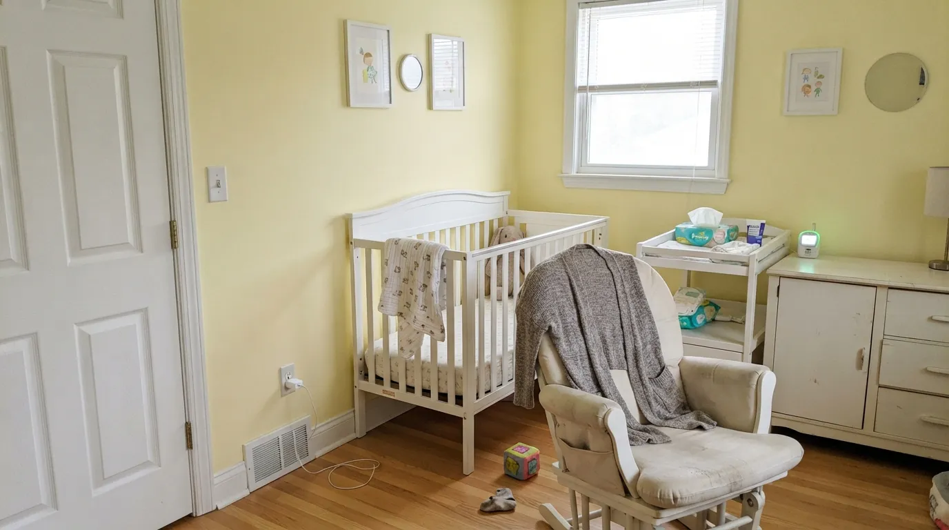
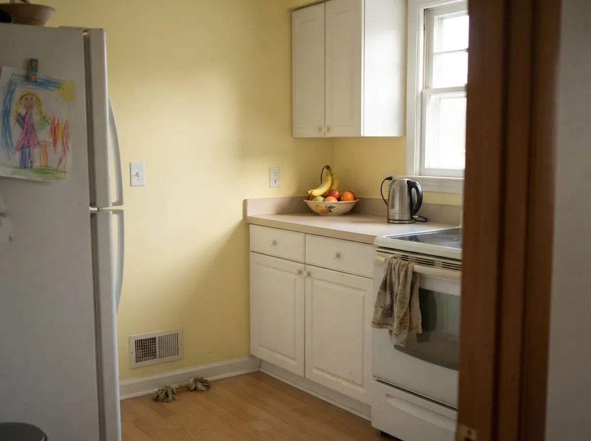
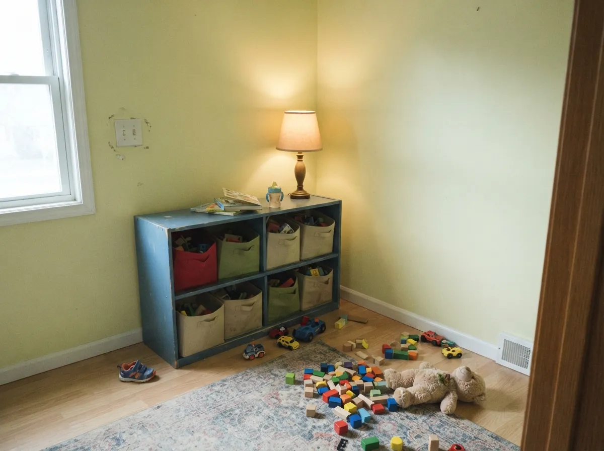
This color is at its best in rooms that are supposed to feel young and awake. A nursery is the obvious home: high LRV keeps the room bright for a windowless afternoon nap, the color is cheerful without being a primary, and it works for any baby without the pink-or-blue conversation. Its second home is the working room nobody decorates — laundry, mudroom, a back kitchen — where a gallon of pale yellow buys more mood than any neutral. Give it clean white trim, white or pale cabinets, a bit of natural wood and real daylight, and it reads fresh instead of dated.
Where It Fails
The bad reviews of pale yellows are remarkably consistent, and all three scripts below are predictable before you open the can. If your room matches one, no number of coats will fix it — the problem is the light or the neighbors, not the paint.
This is the most common mismatch. Shoppers picture warm custard and buy the green-side yellow instead. Next to anything cream, Light Daffodil looks cool and slightly sour — people describe it as celery or dish-soap. If the picture in your head is a warm buttery kitchen, Behr Butter Yellow or Benjamin Moore Hawthorne Yellow is the color you actually want.
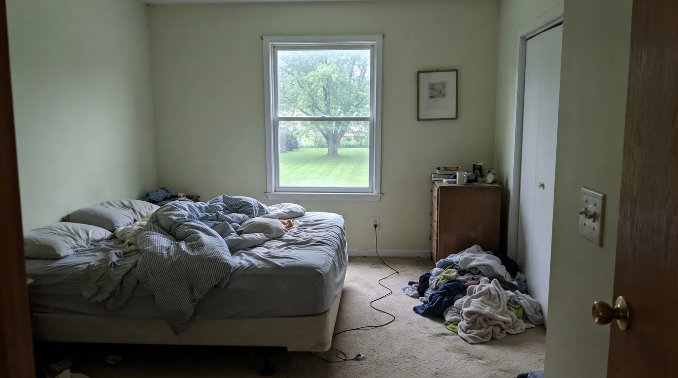
Cool north daylight drains what little warmth this color has and leaves the green standing. Add a lawn, a hedge or a big tree right outside the window bouncing green light in, and a pale yellow room genuinely tips chartreuse. This is the single most reported failure for yellows on the green side, and the fix is a warmer yellow, not more coats.
Two yellows going in different directions is an ugly argument. Cream trim leans orange-yellow, Light Daffodil leans green-yellow, and side by side both look dirty. This color needs a clean, bright, unfussy white on the trim — Chantilly Lace, Simply White or Oxford White — so the yellow reads as a deliberate color rather than a stain.
Room by Room
Bright, gender-neutral and genuinely calm at LRV 86, which matters in a room that gets used with the blinds down. Scrubbable matte on the walls, Chantilly Lace on the trim and crib rail, and one soft blue-green note somewhere — Palladian Blue is the classic — keeps it from tipping into a lemon theme.
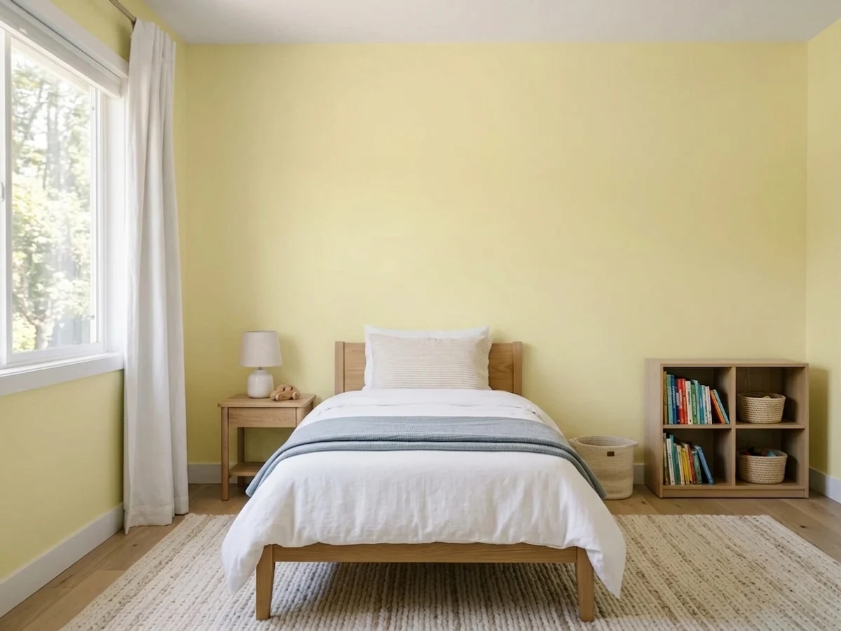
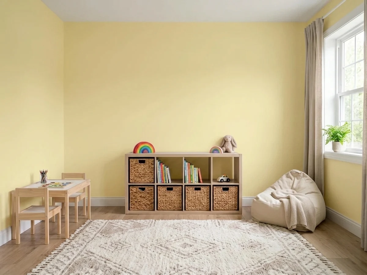
Holds up better than a pastel because there is real color in it, and it lets primary-colored toys and art look intentional instead of clashing. It is also one of the few cheerful colors that a child does not outgrow at eight. Eggshell wipes down; matte hides the wall dents kids create.
Pale yellow walls with white cabinets is an old, good idea, and this version keeps it fresh rather than Tuscan. Simply White or Chantilly Lace cabinets, white or pale counters, warm wood cutting boards. What it does not want is a kitchen already full of honey-oak cabinets — that orange-yellow wood plus this green-yellow wall is the cream-trim problem at full scale.
Warm 2700K bulbs push the green back and let the yellow glow, so an evening dining room is where this color is most flattering. Daytime it is bright and casual rather than formal. Pair with white trim and a dark grounding note like Kendall Charcoal on a sideboard or the back of a hutch.
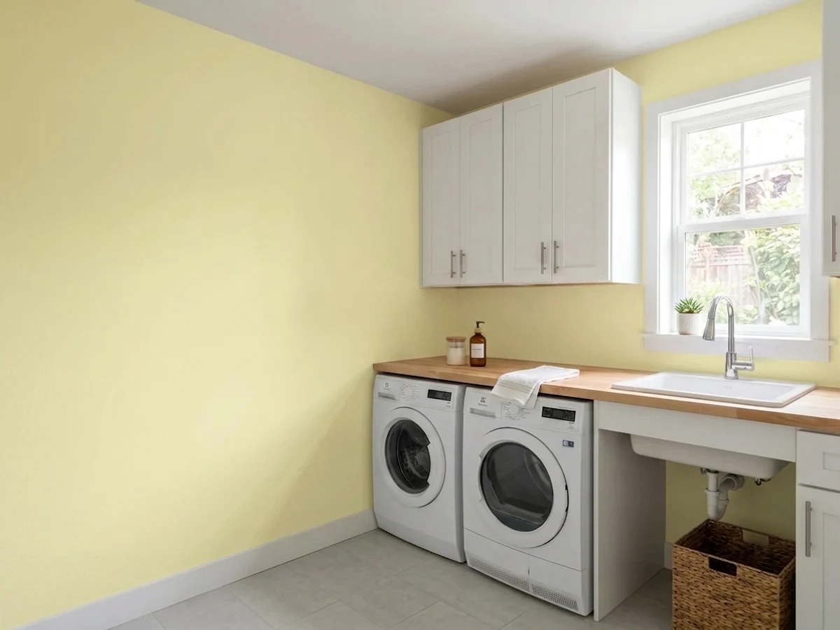
The rooms with no windows and no budget get the most out of a gallon of this. It is bright enough to lift a basement laundry under warm bulbs, and boots, coats and detergent bottles do not look wrong against it. Use eggshell or satin on the walls so it wipes clean.
Benjamin Moore does not recommend 2027-60 as an exterior color, and you should take that seriously — the flag usually means the tint base is not built to hold up to UV outdoors. If you want a soft yellow house or a yellow door, pick from the exterior-rated deck instead.
Your Light Is the Risk
Bright, even daylight is where it reads as a clean happy yellow rather than a green one. Sample here and you will see the version the color is sold on.
Cool gray daylight cancels the warmth and leaves the green exposed — the walls go celery and slightly dingy. The most common regret with this color.
Crisp and lemony in the cool morning, then noticeably warmer and softer as the afternoon sun swings around. It is the same wall being flattered later in the day.
Warm 2700K bulbs are this color's friend — they push the green back and let it glow. Cool 4000K LEDs do the opposite and can make it look faintly fluorescent.
Most complaints about Light Daffodil are a light mismatch. Upload a photo of your actual room and see it on your walls — then ask for the same wall in north light or evening lamps before you buy a single sample.
Need It From Another Brand?
Any paint counter can custom-tint Benjamin Moore 2027-60 directly. If you would rather stay in one brand's own deck, these are the closest stock matches, measured as ΔE2000. Under 2 is a difference you will not see on the wall.
| Brand | Closest color | ΔE | LRV | |
|---|---|---|---|---|
| Sherwin-Williams | NarcissusSW 6707 · Sherwin-Williams | 4.3 | 83 | Color page → |
| Behr | Starbright390E-2 · Behr | 0.6 | 88 | Color page → |
| Valspar | Summer Morning3007-2C · Valspar | 4.7 | 86.6 | Color page → |
| PPG / Glidden | Banana PuddingPPG1212-2 · PPG / Glidden | 2.0 | 84 | Color page → |
| Glidden | August Moon66YY 85/231 · Glidden | 2.4 | 85 | Color page → |
| Dutch Boy | Eco Ivory222-1DB · Dutch Boy | 4.8 | 82 | Color page → |
Similar Benjamin Moore Colors
The nearest shades to Light Daffodil within Benjamin Moore's own range, ranked by perceptual color distance — useful when you want the same look a touch lighter, darker, or warmer.
WCAG 2.1: AA is 4.5 : 1 for normal text, 3 : 1 for large text, AAA is 7 : 1.
Light Daffodil vs the Colors You're Also Considering
Every Light Daffodil sample board has the same rivals on it. The numbers show the real lightness gap — then it comes down to which risk you would rather live with.
Pick this when you want the room to actually look yellow rather than faintly warm.
Benjamin Moore 2023-60 · LRV 90ButterPick this for a paler, softer yellow that sits closer to a tinted white — at LRV 90 it barely commits.
Pick this for something lighter and fresher; Hawthorne Yellow at LRV 71 is a much stronger color on four walls.
Benjamin Moore HC-4 · LRV 71Hawthorne YellowPick this for the warm, golden, historic yellow — it has the orange Light Daffodil is missing and never goes green.
Light Daffodil Coordinating Colors
The rule for coordinating with Light Daffodil is the opposite of the usual warm-white advice: keep the whites clean and the partners cool. Cream and custard tones fight it, while crisp whites, soft blue-greens and one grounding dark make it look chosen rather than left over from the last owner. These are the partners that keep working:
Does a Yellow Nursery Really Make Babies Cry?
If you have searched yellow nursery paint, you have met the claim: babies cry more in yellow rooms. It is worth knowing where it came from, because it has quietly kept yellow out of nurseries for thirty-five years. The line traces to color consultant Carlton Wagner, who said it in 1989; he ran a color-research institute and advised brands, and the quote traveled through decorating magazines and then the internet until it became something everyone knows.
The honest position is that there is no solid research behind it. Nobody has produced a study showing babies cry more in yellow rooms, and the broader color-psychology literature on yellow points in both directions at once. Treat it as one consultant's opinion with a long tail, not a finding.
The real reason to be careful with yellow in a nursery is far more boring: saturation and light. A strong, warm, saturated yellow in a small room with the shades drawn is genuinely intense to sit in for a 3am feed. A pale one at LRV 86 is not. If the color makes you happy when you walk in with the lights low, it is fine for the baby too.
Light Daffodil With Wood Tones and Floors
The floor decides half of this. Pale white oak, maple, birch and light gray-washed floors are the natural fit — they are light and low in orange, so the yellow stays fresh and the room reads Scandinavian rather than country. Walnut and other dark, cool-brown woods also work; the contrast is strong but the temperatures do not fight.
The floor to watch is orange: honey oak, golden pine, red-toned builder oak, and anything with an amber finish. That is the same orange-yellow family the cream trim problem comes from, and next to it Light Daffodil looks green while the floor looks louder and more orange. A big pale rug fixes a lot of it in a nursery or playroom; a whole kitchen of honey oak does not get fixed and you should choose a warmer yellow instead.
Fabrics and metals follow the same logic. White, natural linen, pale gray and soft blue-green all sit well against it. Beige and camel do not — they drag it toward dishwater. Chrome, nickel and matte black are all clean next to it; heavy antique brass is the one metal that can make it look slightly sallow.
Three Ready Palettes Built on Light Daffodil
A color is never alone on the wall. These are complete combinations in the 60-30-10 pattern, with the reason each one holds together. Every one opens in the visualizer.
Chantilly Lace is the point of this scheme: a clean, bright white keeps the yellow looking deliberate, where a cream trim would make it look grubby. Palladian Blue leans green itself, so it sits beside a green-side yellow without arguing, and it keeps the room from reading as a lemon theme.
Try this palette in your roomSaybrook Sage is a green that needs warm company, and a yellow wall is exactly that — the two share a family resemblance, so the kitchen reads garden-fresh rather than color-blocked. Simply White at LRV 91 gives the crisp edge that keeps the yellow from spreading into everything.
Try this palette in your roomYellow and sky blue is the oldest playroom pairing there is, and it still works because neither color is trying to be sophisticated. Oxford White is the plain workhorse trim white that keeps the two apart; use it on the built-ins so the shelves read as architecture rather than more color.
Try this palette in your roomLight Daffodil FAQ
Is Light Daffodil green or yellow?
Yellow, with a real green lean — Benjamin Moore itself calls it a green-tinged yellow. In bright south daylight it reads clearly yellow and fresh. In cool north light, or in a room with a lawn or big trees outside the window, the green comes forward and people call it celery. Sample it on the actual wall in the actual light before you commit.
Is Light Daffodil the same as Pale Daffodil?
No, and it is the easiest mistake to make. Pale Daffodil is 2017-60, a warmer yellow with an orange lean; Light Daffodil is 2027-60 and leans green. They look similar on a screen and behave differently on a wall. Check the number, not the name.
What trim white goes with Light Daffodil?
A clean, bright white — Chantilly Lace at LRV 92, Simply White at LRV 91, or Oxford White at LRV 87. Avoid cream and warm off-whites: they lean the opposite direction from this yellow and make both surfaces look dirty. Semi-gloss on trim, eggshell or matte on the walls.
Is it a good nursery color?
It is one of the better ones. It is light enough to keep the room bright with the shades down, cheerful without being a primary, and it does not need to be chosen around the baby's sex. Use a scrubbable matte, keep the bulbs at 2700K, and if the nursery faces north, sample it there specifically — that is the one exposure that lets it go celery.
Will it just look like an off-white on the wall?
No. LRV 86 makes it very light, but yellow multiplies more than any other hue once it covers four walls and starts bouncing into itself. A chip that looks like tinted paper turns into a room that is unmistakably yellow. If you want a barely-there tint, look at a warm white instead.
Can I paint the outside of my house with it?
No — Benjamin Moore does not list 2027-60 as an exterior color. That flag on a pale yellow usually means the formula is not built for years of direct UV, and the practical result is fading. For a soft yellow exterior, choose from the exterior-rated colors instead.
Have you painted with Light Daffodil?
Rate it — one tap helps the next reader decide.
Ask a Question