Room Colors · Green Trim
8 Best Green Trim Paint Colors for 2026
ideas, combinations, and real rooms
8 curated picks from real green trims — with the exact colors, honest reasons why, and the combinations that hold the room together.

Former interior stylist who can spot a green undertone from across a room. Jessica writes the color and mood pieces — what to choose, what pairs, and why your "white" looks pink.
The Fast Answer
Don't want to read 8 picks? These four are the safe answers.

Top Picks for the Green Trim
Tap a shade to see the green trim in it, then try it on your own room.
Green Trim Color Trends 2026 — What's In, What's Out


- Bright Kelly Green Trim — Saturated, primary-toned kelly green trim is fading as homeowners shift toward muted, earthy olive and sage greens for trim work.
- Minty Pastel Green Trim — Pale, minty pastel green trim is starting to feel dated next to 2026's deeper, more grounded green palette.
- High-Gloss Green Trim On White Walls — The glossy green-trim-on-white-wall preppy look is giving way to matte, warmer green trim paired with warm neutral or earthy walls.
The 8 Best Green Trim Paint Colors
Every pick below is a real rendered green trim, not a chip. The lead color first; the swatches are the full scheme in the photo — walls, furniture, textiles, accent.

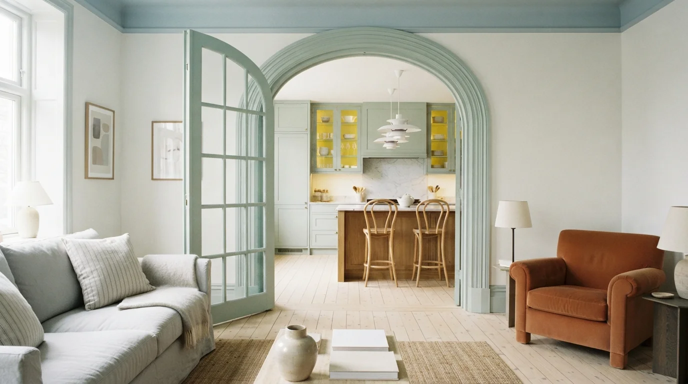
Soft sage green woodwork and a powdery blue ceiling bring breezy, vintage European charm to a sunlit room.
Sage mint is a cool, soothing pastel green with a gentle retro vibe. In this space, the woodwork, arched glass door, and kitchen cabinetry wear a fresh mint green, while the ceiling gets a coat of soft powder blue and the walls stay crisp white. The room feels cheerful, airy, and welcoming. Pairing soft pastel greens and blues with light wood floors works because natural wood grounds the colors and keeps them feeling balanced. It is perfect for anyone who loves breezy Parisian apartment style.
SEE RESTFUL ON YOUR WALLS →
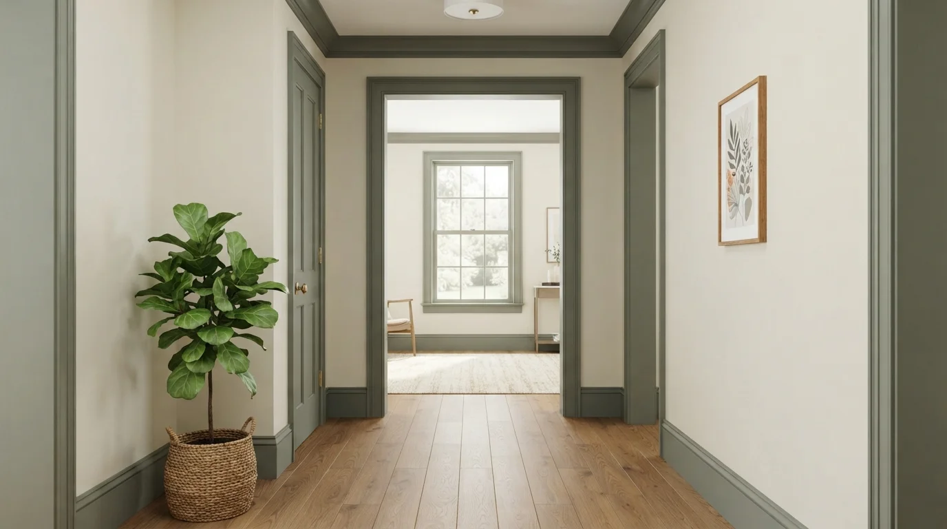
Muted earthy green trim frames soft cream walls, creating a timeless, serene atmosphere grounded by warm oak floors.
Sage green is a muted, earthy gray-green with botanical warmth. In this hallway, rich sage coats the heavy crown molding, baseboards, and door trim against soft cream walls. The room feels calm, graceful, and historic. This combo works because the deep earthy trim gives sharp architectural focus while keeping the airy walls bright. It is ideal for anyone who loves traditional character and wants a subtle, nature-inspired focal point.
SEE LUSH SAGE ON YOUR WALLS →
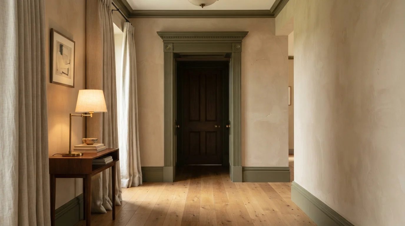
Rich olive green woodwork frames warm beige walls, creating an inviting, tranquil sanctuary bathed in gentle golden lamplight.
Olive green is a soft, earthy forest shade. In this space, that deep muted green covers the classic paneled door, layered doorframe, and baseboards, while the surrounding walls stay a calm, warm beige. The room feels grounded, cozy, and quietly sophisticated. This combination works so well because nature-inspired tones balance each other seamlessly, letting vintage-style trim stand out as a stylish focal point. It is a fantastic choice for anyone who loves timeless architecture with a modern, relaxed twist.
SEE IT ON YOUR WALLS →
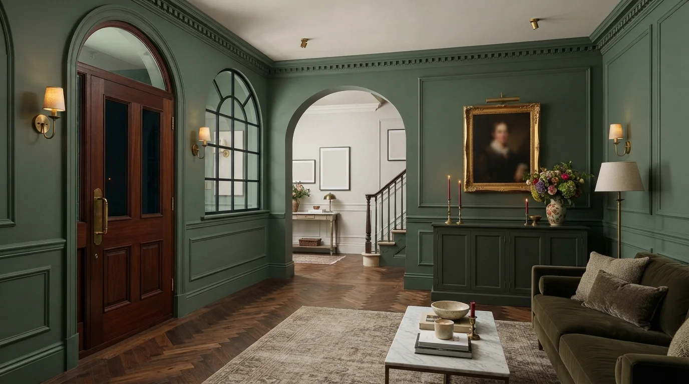
Rich olive-drenched walls and warm herringbone walnut floors create a grounded, timeless atmosphere filled with vintage warmth.
Olive green is a muted, earthy green that brings the quiet calm of nature indoors. In this space, rich olive envelops the paneled walls, detailed crown molding, and graceful archways from floor to ceiling. Deep walnut herringbone floors and a mahogany door anchor the room, while a soft cream ceiling prevents it from feeling too heavy. The whole setting feels intimate, cozy, and deeply grounded. This classic combination works because organic greens and warm woods naturally belong together. It is made for anyone who loves old-world charm.
SEE SEAWEED ON YOUR WALLS →
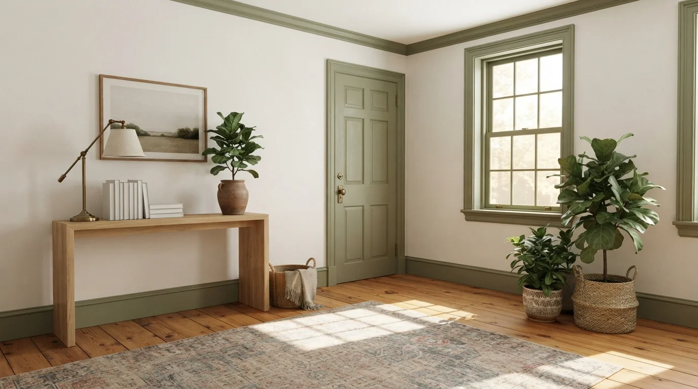
Warm sunlight and soft sage green trim bring an earthy, peaceful charm to a light-filled classic room.
Sage green is an earthy, muted herbal shade with quiet warmth. In this space, soft creamy off-white walls are framed by gentle olive green moldings, baseboards, and doors, paired with warm pine plank floors and lush potted greenery. The room feels remarkably calm, airy, and grounded. This color combination works effortlessly because botanical greens and warm wood tones always feel natural alongside crisp, bright neutrals. It is perfect for anyone looking to add classic historic character to a sunny, traditional space.
SEE IT ON YOUR WALLS →
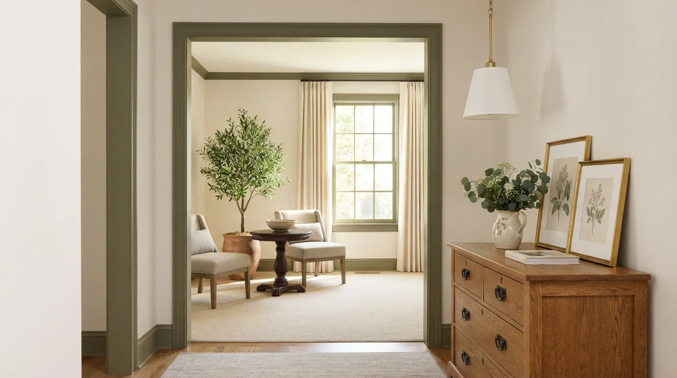
Rich olive green trim frames airy cream walls and warm oak furniture for a grounding, timeless transition between spaces.
Olive green is a deep, earthy moss tone with rich warmth. In this hallway, it coats the bold doorway trim and baseboards to frame soft cream walls, natural oak drawers, and cozy beige carpet. The space feels quiet, grounded, and welcoming. Using a deep green on trim works because natural tones always look balanced against soft white walls and warm wood. It is a fantastic choice for anyone who loves timeless craftsmanship with a calm, garden-inspired twist.
SEE TUSCAN OLIVE ON YOUR WALLS →
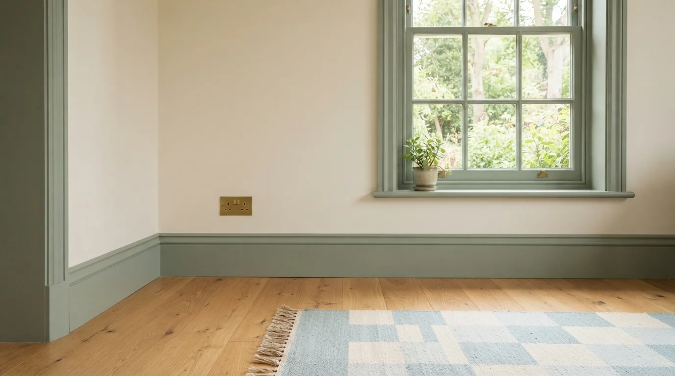
Soft sage green moldings and creamy walls create a quiet, nature-inspired nook filled with gentle morning light.
Sage green is an earthy, muted gray-green. In this cozy corner, soothing sage covers the decorative window casing and tall baseboards, while the main walls stay soft and creamy off-white. A pale blue geometric rug adds a gentle touch of pattern on the floor. The space feels peaceful, relaxed, and deeply grounded. The pairing works because soft green echoes the natural foliage outside your window, creating an effortless indoor-outdoor flow. It is a wonderful choice for anyone who loves classic cottage charm.
SEE INCOGNITO ON YOUR WALLS →
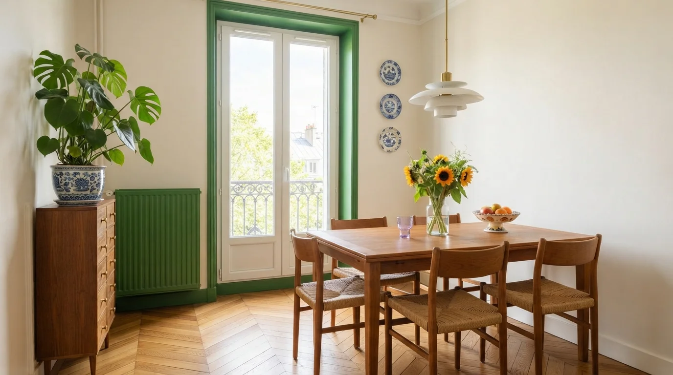
Lively grass-green trim frames sunny balcony windows and warm wood furnishings for a cheerful, vintage-inspired dining space.
Grass green is a bright, lively botanical color that brings natural energy indoors. In this dining room, vibrant green coats the window frames, door trim, baseboards, and radiator, contrasting against soft cream walls. A warm natural wood dining table and rush chairs anchor the center over classic herringbone parquet floors. The space feels cheerful, crisp, and wonderfully welcoming. This combination works because the gentle neutral backdrop lets the punchy green molding shine like an architectural frame. It is a fantastic look for creative homeowners who love historic apartment charm.
SEE WILD FOREST ON YOUR WALLS →Green Trim Wall Color Combinations
A wall color never works alone. These are the full schemes from the rooms above — the lead color first, then the supporting colors that make the photo work.
Soft sage green woodwork and a powdery blue ceiling bring breezy, vintage European charm to a sunlit room.
TRY THIS PALETTE →Muted earthy green trim frames soft cream walls, creating a timeless, serene atmosphere grounded by warm oak floors.
TRY THIS PALETTE →Rich olive green woodwork frames warm beige walls, creating an inviting, tranquil sanctuary bathed in gentle golden lamplight.
TRY THIS PALETTE →Rich olive-drenched walls and warm herringbone walnut floors create a grounded, timeless atmosphere filled with vintage warmth.
TRY THIS PALETTE →Pair the lighter greens with warmer neutral walls: Brook Green or Alabaster trim against a soft white or greige wall keeps the whole room quiet, while the same trim against a deeper wall color — navy, charcoal, or a saturated green — gives you contrast without the trim itself becoming loud. Tate Olive and Ecological read best against wood tones, oak, walnut, or stained doors, because their warm, leafy undertones don't fight with wood the way a blue-leaning green would.
For a monochromatic look, keep walls and trim in the same green family but separate them by at least 20 to 30 points of LRV: Rainy Afternoon walls with Brook Green trim, or Conifer Green walls with Alabaster trim, both let the architecture show without flattening the room into one plane. If you want the trim itself as the statement, go the other direction — white or cream walls framed by North Woods or Secluded Woods on doors, window casings, and baseboards. That's the highest-contrast combination in this group, and it also shows every ding and fingerprint, so it works better on doors than on baseboards that get kicked.
More Trim Color Ideas
Set on a color family already? Each page has its own real rooms and picks.
Light or Dark Green Trim Colors?
Go Light (LRV 60+) If…
The room is small, faces north, or has to work at every hour. Light warm colors make it feel bigger and stay calm in evening light — the light you actually live in.
Go Dark (LRV Under 20) If…
You want the cocoon effect and the room has real daylight. Dark works best on one feature wall — or fully color-drenched in a large room with good windows.
Light trim greens like Brook Green and Alabaster are the safer default in rooms with limited daylight or low ceilings, because an LRV in the high 70s and 80s bounces light back into the room the same way plain white trim does — you get a whisper of color without losing brightness. They also forgive an unmatched wall color, since a near-white green trim reads as neutral next to almost any wall shade you already have.
Darker trim — Ecological, Tate Olive, Conifer Green, Rainy Afternoon, North Woods, and Secluded Woods — works best where the room already gets good natural light, or where you want the trim itself to be the design statement rather than a quiet frame. In a north-facing room or anywhere daylight is scarce, North Woods and Secluded Woods (both LRV 8) can make windows and doors feel like heavy openings instead of architectural detail. Save those two for rooms with south- or west-facing light, or for a single accent door rather than every piece of trim in the room.
See It. Love It.
Paint It.
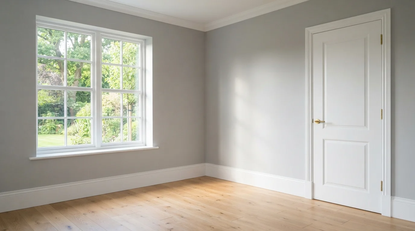
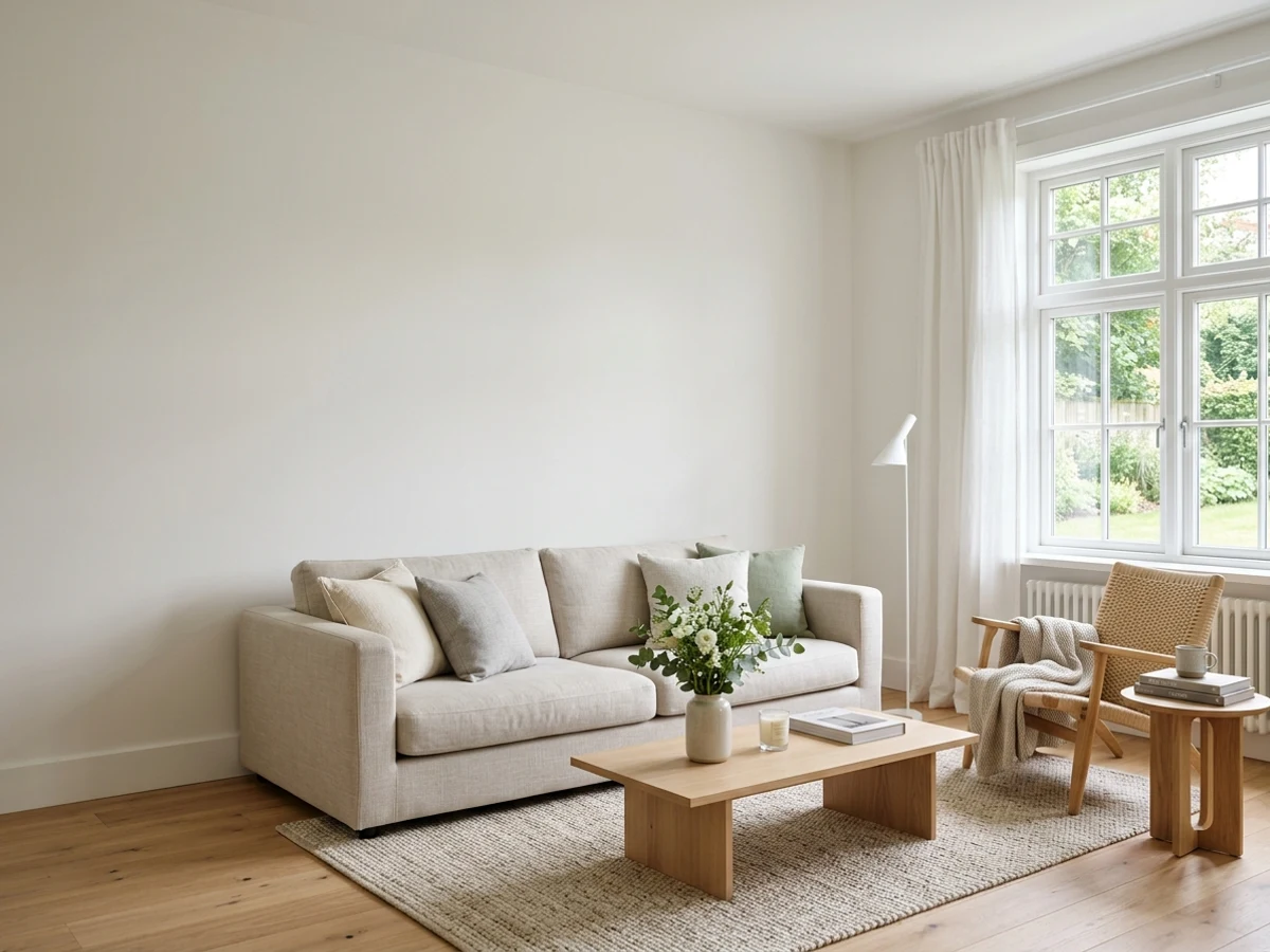
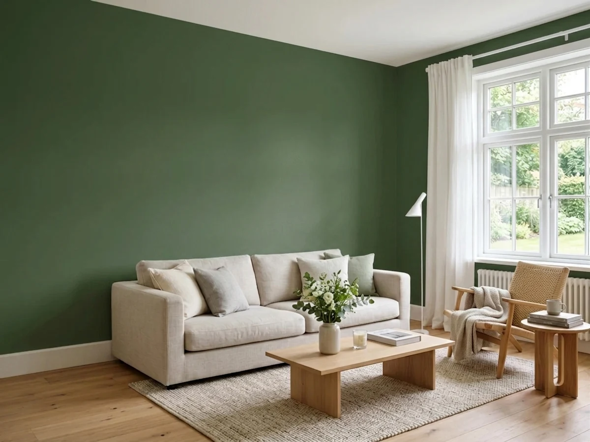
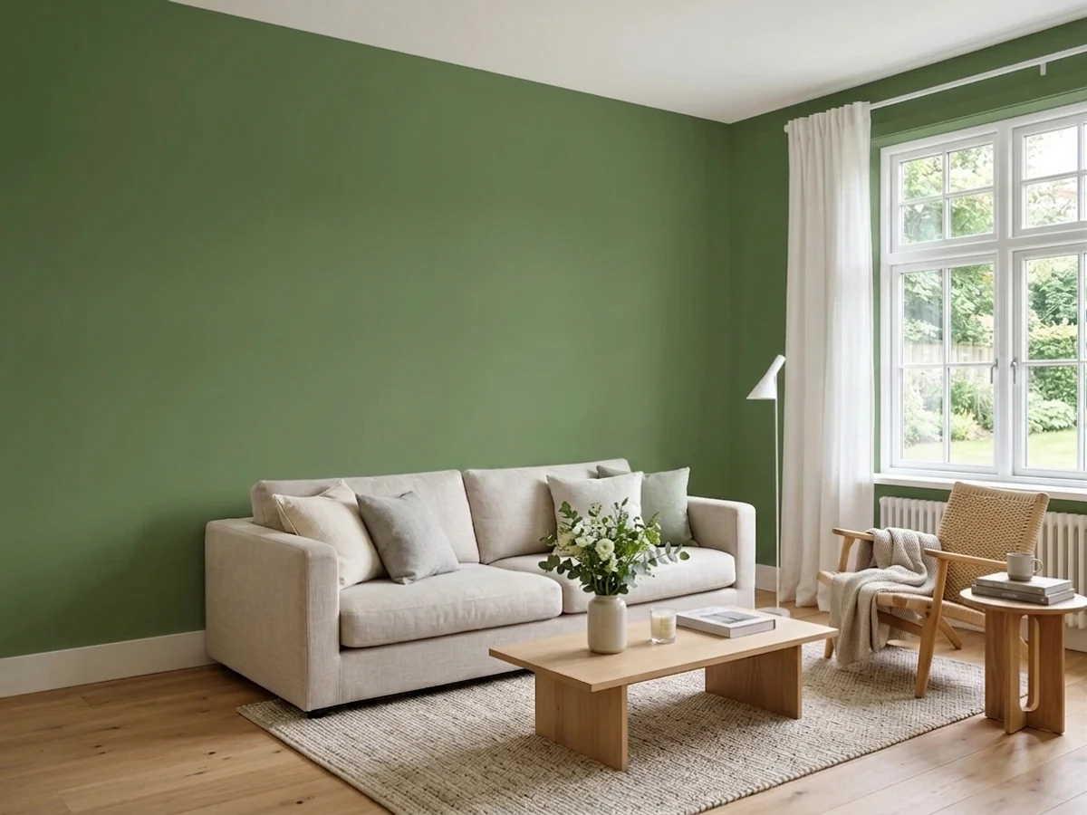
Upload one photo of your green trim and try every color on this page on your own walls — in your own light, before you buy a drop of paint.

Royal OrchardBeforeSheen and Finish for Green Trim
Interior trim in any of these greens should go on in semi-gloss. The extra sheen catches light along the edges of casings and baseboards, which is what makes trim look crisp instead of flat, and it wipes clean when doors and windowsills pick up handprints. Satin is an acceptable step down if you want less shine on older wood that shows every imperfection under gloss.
On exterior trim, move up to a true semi-gloss or gloss, especially with a dark pick like North Woods or Secluded Woods, since a flatter finish on deep colors fades and chalks faster in direct sun. Whatever sheen you land on, keep it consistent across every piece of trim in a room — mixing satin doors with semi-gloss window casings in the same green is the kind of thing that reads as a mistake even when the color itself is right.
Where to Use the Lightest Vs the Darkest Greens
Alabaster and Brook Green are the ones to reach for on baseboards and crown molding that run the full perimeter of a room, since a pale trim color at that scale won't compete with furniture or wall art. They're also the forgiving choice for a first-time trim project, because a mistake in a near-white green is far less visible than a mistake in a dark one.
Save North Woods, Secluded Woods, and even Tate Olive for smaller, isolated surfaces — a single front door, a built-in bookcase, a window seat, or the trim around one focal window. Painting an entire room's baseboards, casings, and crown in one of the darkest shades is a heavier commitment than most rooms need, and it tends to read better done selectively than everywhere at once.
Mistakes to Avoid With Green Trim
The most common mistake is picking the trim green in isolation, away from the wall color and flooring it has to sit next to. Tate Olive's warm, yellow-leaning undertone can look muddy against a cool blue-gray wall, and a cool green like Rainy Afternoon can look chalky next to warm red-toned wood floors. Test the actual trim color next to your actual wall and floor samples before committing to a gallon.
The second mistake is skipping primer on trim that was previously stained, varnished, or painted a dark color. Green pigments, especially the deeper ones like North Woods and Secluded Woods, can look patchy or shift undertone over old finishes without a stain-blocking primer coat first. The third mistake is using flat or eggshell on trim out of habit — trim needs the sheen difference from the walls to read as trim at all, not just a slightly different patch of wall.
About Green Trim Paint Colors
Trim gets painted in inches, not square feet, but that thin ribbon around your doors and windows does the framing work for the whole room, so the green you choose there has to read correctly at close range and from across the room. Brook Green (Behr N410-2, LRV 78) sits close enough to a warm white that it can replace plain white trim without anyone clocking it as a colored choice — it just softens doorways a shade. Alabaster (Behr BXC-62, LRV 82) sits at the very top of the same range for anyone who wants the palest option and treats it more as a creamy backup than a true green.
Move down the LRV scale and the trim starts to do real work. Ecological (Behr S380-6, LRV 23) and Tate Olive (Benjamin Moore HC-112, LRV 22) put actual color into casings and baseboards — Ecological reads as a fresh, leafy accent, while Tate Olive leans warmer and earthier, so it plays better against wood floors and beige or cream walls than against anything cool-toned. Conifer Green (Behr PPU10-19, LRV 18) and Rainy Afternoon (Benjamin Moore 1575, LRV 15) sit in the muted middle, close enough to gray-green that they outline a room without shouting.
At the dark end, North Woods (Behr N410-7, LRV 8) and Secluded Woods (Behr S420-7, LRV 8) turn trim into architecture. Both read almost black-green in low light and need a wall color with enough contrast to keep doors and windows from disappearing into the walls around them. Every one of these mixes on demand at Behr or Benjamin Moore, so the real decision is how much contrast your room's light and wall color can support, not which brand carries which shade.
The Questions Everyone Asks
What color should I paint my green trim?
If you want one answer, start with the safe picks above — Incognito, Restful, Lush Sage, Sandwashed Driftwood. They read well in any light and survive furniture changes. Then check the light: strong afternoon sun wants a step cooler, a north-facing room wants a step warmer.
should trim be the same color as the walls or a different one?
Both work, but they do different jobs. Matching trim to the walls in the same green — say Conifer Green walls with Alabaster or Brook Green trim a few shades lighter — makes a small room feel taller and more continuous. Going with real contrast, like North Woods or Secluded Woods trim against white or cream walls, highlights the architecture instead. Pick contrast if you like your doors and windows to stand out; pick close tones if you want the room to feel calmer.
what wall color goes with green trim?
Light greens like Brook Green or Alabaster trim sit comfortably against almost any wall color, since they read closer to white than to green. Darker trim needs more planning: Tate Olive and Ecological pair best with warm neutrals, cream, or beige walls, while North Woods and Secluded Woods look sharpest against bright white or soft gray walls, which give the deep green enough contrast to read as intentional trim rather than a dark smudge.
what sheen should I use on green trim?
Semi-gloss for interior trim in any of these colors — it's durable, wipes clean, and catches light along the edges of casings and baseboards so the trim reads crisp against flat or eggshell walls. Satin is a reasonable step down if you want less shine. For exterior trim, especially in a dark pick like North Woods or Secluded Woods, use semi-gloss or gloss so the finish holds up to sun and doesn't chalk as fast as a flatter sheen would.
is dark green trim too dark for a small room?
It can be, if the room also has limited daylight. North Woods and Secluded Woods both sit at LRV 8, dark enough to make window and door openings feel heavier in a north-facing or low-light room. In a small room with good natural light, though, dark trim on just the doors or one focal window can add definition without making the space feel smaller. If you're unsure, Conifer Green or Rainy Afternoon give you color at a gentler LRV of 15 to 18.
does green trim work with wood floors and wood doors?
Yes, especially the warmer greens. Tate Olive and Ecological both lean toward yellow rather than blue, which keeps them from clashing with the orange and red undertones common in oak, walnut, and other stained wood. Cooler greens like Rainy Afternoon can look slightly off against very warm-toned wood floors, so test that pairing in your own room's light before committing. Pale options like Brook Green stay neutral enough to work with almost any wood tone.
What two-color combination works best in a green trim?
The reliable pattern is a quiet main color plus one deep accent on a single wall. Keep trim and ceiling in one warm white so the two colors are the only event in the room — the combination cards above show complete schemes from real rooms.
What colors make a green trim look bigger?
High-LRV, slightly warm colors — LRV 60–75 is the sweet spot. Paint the walls and trim close to the same light color so the corners blur, and keep the ceiling white. Stark cool white actually works against you; it creates hard shadows that show the room's edges.

Ask a Question