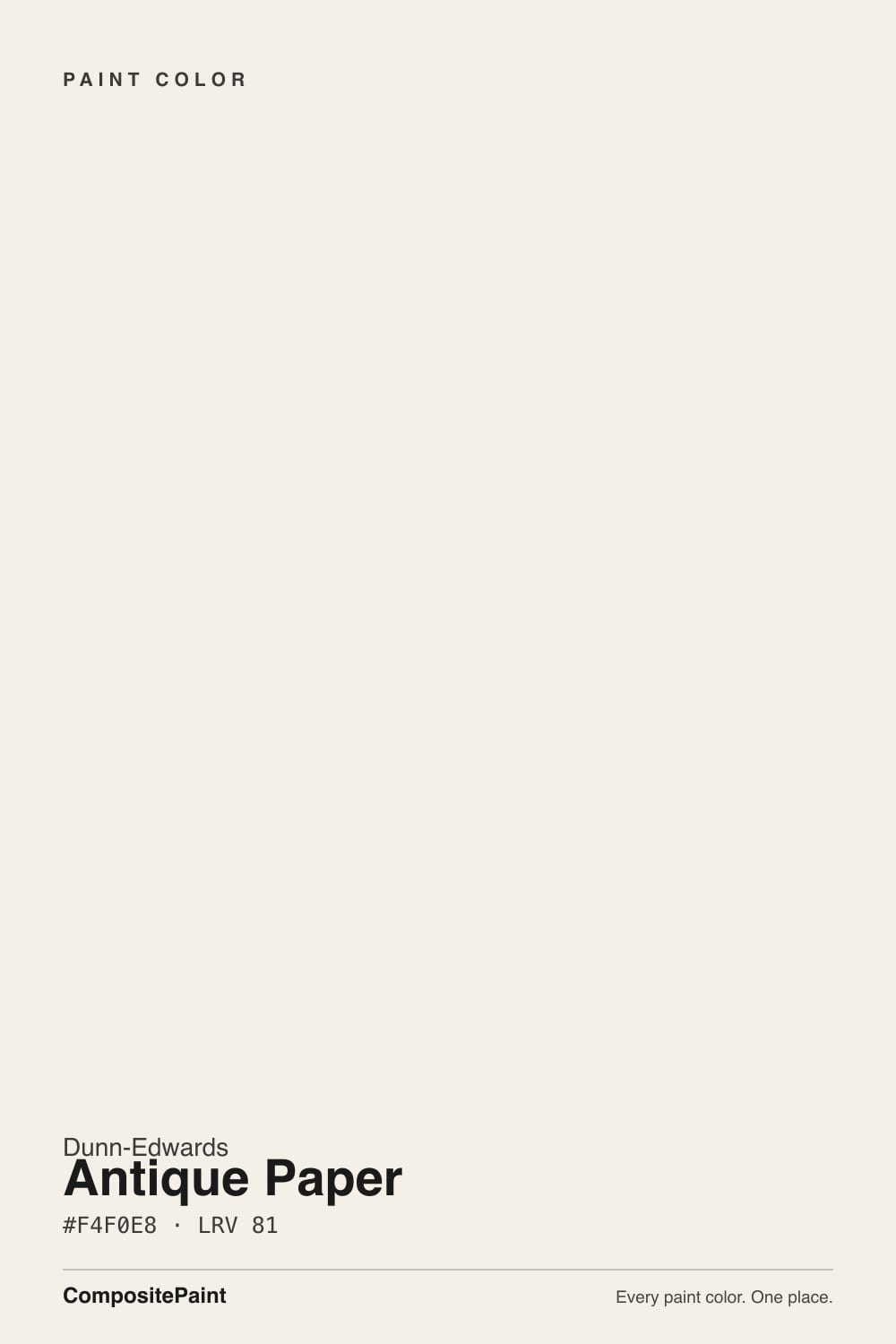
Antique Paper
Dunn-Edwards' parchment wall white, reviewed honestly: the rooms where it reads like paper, the trim that makes it look dingy, and why Whisper belongs on the woodwork.

Jessica has spec'd whites and neutrals for more than 300 rooms and keeps a sample wall of painted drawdowns in her studio. Every color review is checked against real reader rooms in the comments and re-tested when a formula changes. About the testing process →
- 1First Star69
- 2Classic Gray74
- 3Antique Paper81
- 4Extra White86
- 5Chantilly Lace91
The Fast Verdict
Antique Paper is the wall white Dunn-Edwards actually rolls when the job is a whole house, not a gallery. At LRV 81 it is an ivory off-white with almost no chroma — parchment, not cream, not true white. A Los Angeles designer put it on her living-room and kitchen walls with Whisper on the cabinets and trim and called it inviting without being stark. It has sat in the 2006 Perfect Palette and the Multi-Family collection ever since, which is the honest fame: landlords and painters, not magazine covers. Give it daylight and a slightly brighter trim and it behaves. Put it in a north cave, or park Warm White on the casings, and the paper goes dingy.
Whole-house walls in decent daylight · kitchens with Whisper cabinets and oak · living rooms that should feel like paper, not gallery · bedrooms with warm lamps
You want a crisp true white · the room faces north and stays dim · trim is staying Warm White or Chantilly Lace · the main stone is cool grey marble
- Parchment enough to feel finished, still reads as white in a listing
- Whole-house wall white at LRV 81 — more body than Whisper, less yellow than Swiss Coffee
- Documented kitchen pairing: walls here, Whisper on the cabinets
- One-color rooms work; the sheen change is enough
- Kind to raw oak, white oak, linen, and bronze
- Looks dingy the moment Warm White or Chantilly Lace sits on the trim
- Not a true white — shoppers who wanted gallery-crisp will feel tricked
- Dim north light pulls a dirty yellow-green
- Clashes with cool grey marble, Carrara-look stone, and grey LVP
What Color Is Antique Paper, Really?
A yellow-family off-white with the pigment turned almost all the way down. Dunn-Edwards files DE6218 as an ivory, parchment-leaning white, and the Munsell (5.52Y at chroma 0.4) is the honest version of that sentence: yellow hue, barely any body. Color-matchers describe a pale cream-beige rather than a crisp white, with a faint yellow-green warmth that keeps it subdued. It is not Dunn-Edwards Swiss Coffee (the peachy Southwest cream at LRV 83), not Whisper at LRV 87 (the White Dove analog), and not Warm White (the true-white trim can at LRV 93). Antique Paper is the one with enough paper in it to be a wall, not an edge.
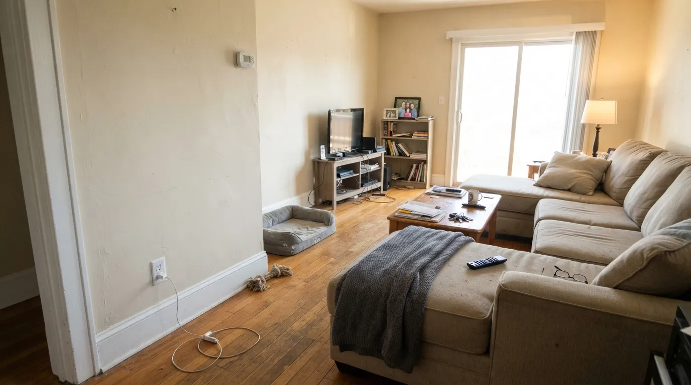
At LRV 81 it sits six points under Whisper and four under White Dove (LRV 85). That gap is the useful part. There is enough body to soften shadows, flatter raw oak, and keep a small kitchen from going empty — the exact airiness a Porter Ranch designer described when friends asked if she had raised the ceiling. On four walls it reads as finished paper, not paint. On trim it can run as a one-color house with only a sheen change; park Warm White next to it and the ivory suddenly has a name, and the name is dingy. The number is low enough that it hides ordinary drywall better than a 93-LRV white, high enough that it still photographs as white in a listing.
Undertone in one line: quiet yellow, ivory first — a faint yellow-green that only speaks up in cool light, never pink, never blue. In south sun it reads as parchment white. In dim north light or under cool LEDs the yellow-green is the whole story, and the wall looks unwashed rather than refined. Gloss sheens make the warmth louder; eggshell keeps it civil. If your sample looks creamy, that is west sun or a cooler neighbor, not a bad batch. If it looks beige, believe the chip: this is paper, not Chantilly Lace.
Where It Shines
Give it real daylight, warm wood, and Whisper on the woodwork, and it does the rare thing an ivory white is supposed to do: look finished without looking cream. Whole-house walls are its actual job — Dunn-Edwards keeps it in the Multi-Family collection because it photographs soft, hides a scuff, and does not glare the way a true white does in a rental. Kitchens are the second home: Antique Paper on the field, Whisper in satin on the boxes, oak and bronze in the room. One color at two sheens — eggshell walls, semi-gloss trim — also works if you do not want a second white in the house.
Where It Fails
Almost every unhappy Antique Paper story is an ivory-white story in a Western can. The parchment is real, it is small on the chip, and three situations make it loud. None of them are a bad mix — but if your room matches one, this is not your white, and another coat will not hide it.
The pairing that wrecks it: Antique Paper walls, Warm White on the trim. Twelve LRV points, and the walls look yellowed, even dirty. Chantilly Lace and Extra White do the same trick with a cooler, sharper edge. Whisper on the woodwork is the intended step — six points, same family, the punch-up a designer actually used. Run Antique Paper on walls, trim, and ceiling and let sheen separate the planes, or give the casings Whisper. Do not split this color with a true white unless you want the parchment named.
On the chip it passes for a soft white. On four walls it is ivory — pale cream-beige, parchment, the color of old stationery. Shoppers who wanted gallery-crisp or even White Dove softness feel tricked. If true white is the goal, Warm White is the Dunn-Edwards can. If you wanted Dove, sample Whisper. Antique Paper is for people who already know they want a wall with a little paper in it.
North light is cool and grey, and Antique Paper has a yellow-green waiting to be invited. The wall goes dingy — not cozy cream, not clean white, a faintly dirty ivory people describe as unwashed. Warm lamps help after dark and do nothing at 2 p.m. Use Dunn-Edwards Swiss Coffee if you want cream that still glows in a cave, or keep this color for rooms with real sun.
Room by Room
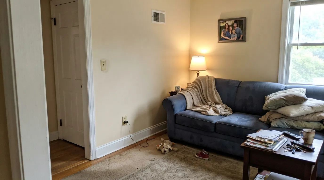
South- and west-facing living rooms are the light this white was mixed for: parchment without going yellow, bright without going empty. Eggshell walls, Whisper on trim in semi-gloss, or the same color on the woodwork if you want a quieter house. A closed, dim living room is the skip — that is where the yellow-green shows.
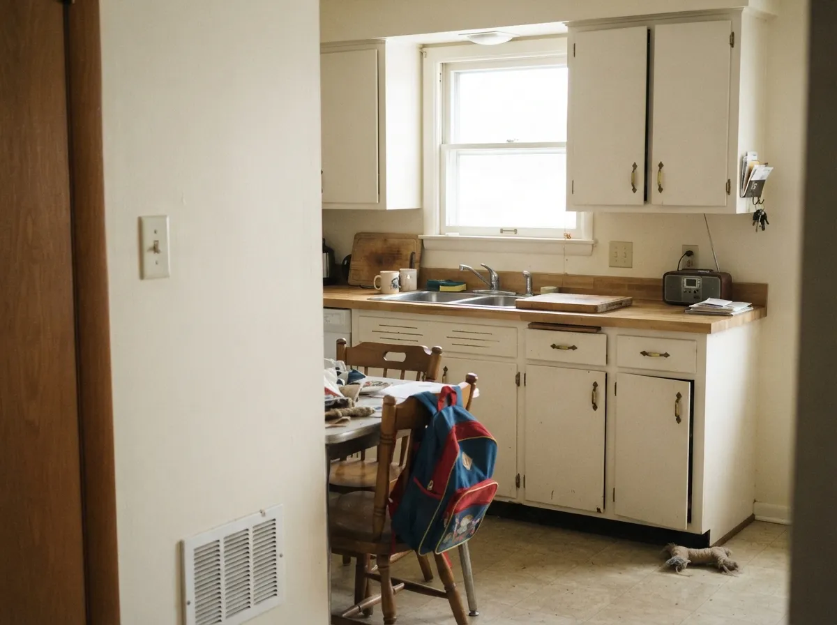
A Los Angeles designer painted her own kitchen Antique Paper on the walls and Whisper on the existing cabinets, and visitors asked if the boxes were new. That is the job: field color, not the millwork. It flatters brass, raw oak, and warm quartz, and it makes a tight kitchen feel taller. Cool grey stone is the sample-first surface. Satin if you put it on an island; eggshell on the walls.
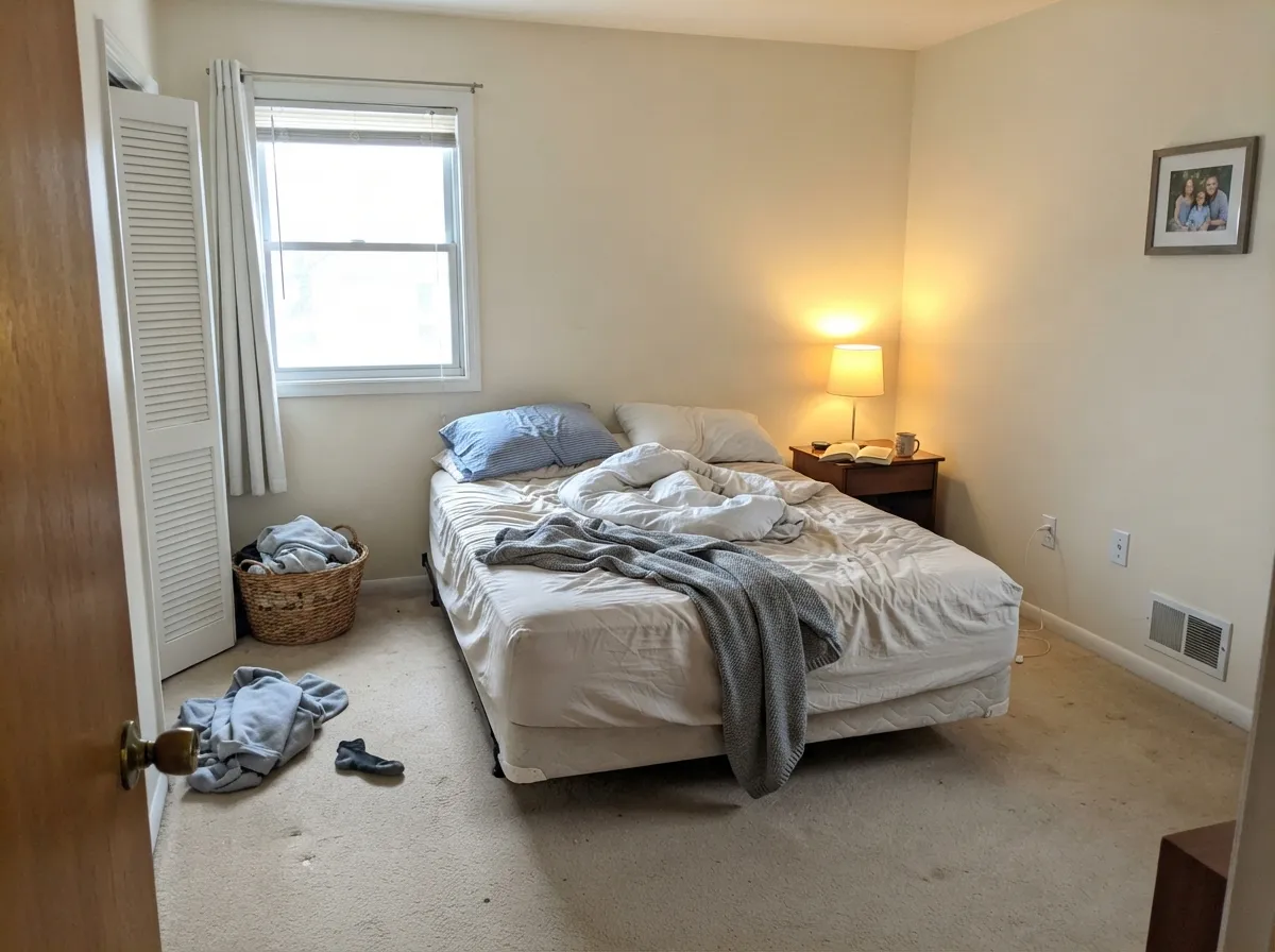
A sunlit bedroom stays soft and restful; under 2700K bulbs it turns a step more ivory at night, which is the point of a bedroom white. A north cave will go dingy. If you want the room to feel like a gallery, this is the wrong can — Whisper is closer to White Dove, Warm White is the bright one.
Warm marble, wood vanities, brass: it looks settled. Grey porcelain, blue-grey subway, chrome-and-Carrara: it argues, and the wall goes yellow-ivory. Satin or a bath-rated eggshell for wipe-down either way.
One-color houses work: Antique Paper walls in eggshell, the same formula in semi-gloss on casings and doors, flat on the ceiling. As a trim white under a mid-tone greige it is softer than Warm White. The pairing that is documented, not theoretical, is Whisper on the woodwork — a small brightness punch, same temperature. Do not use Antique Paper as trim against Warm White walls; the walls will look stark and the trim will look dirty.
Hallways, entries, and open plans are where a parchment white earns the workhorse label: it carries room to room without clashing, hides a scuff better than a true white, and still reads as white in photos. Dunn-Edwards keeps DE6218 in the Multi-Family collection for that reason. A dim interior hall with no borrowed light is the exception — add lamps or pick Swiss Coffee.
Your Light Is the Risk
Hard Western sun is the light this white was mixed for. The ivory stays quiet and the wall reads like paper rather than yellow. Whole-house walls are safest here.
Cool grey daylight invites the yellow-green. The wall goes dingy instead of parchment — the unwashed-ivory read. Do not use it as a four-wall color here.
East light is the cleanest, coolest read. Midday south is honest ivory-white. Late west sun can flash a warmer parchment for an hour; it is the same paint, louder, not a new color.
2700K bulbs keep it civil and faintly ivory — the bedroom read. Cool 4000K–5000K LEDs push the yellow-green forward and make it look tired. Swap the bulbs before you repaint.
Most complaints about Antique Paper are a light mismatch. Upload a photo of your actual room and see it on your walls — then ask for the same wall in north light or evening lamps before you buy a single sample.
Need It From Another Brand?
Any paint counter can custom-tint Dunn-Edwards DE6218 directly. If you would rather stay in one brand's own deck, these are the closest stock matches, measured as ΔE2000. Under 2 is a difference you will not see on the wall.
| Brand | Closest color | ΔE | LRV | |
|---|---|---|---|---|
| Sherwin-Williams | White FlourSW 7102 · Sherwin-Williams | 0.9 | 87 | Color page → |
| Behr | DevonshirePWN-35 · Behr | 1.0 | 87 | Color page → |
| Benjamin Moore | GardeniaAF-10 · Benjamin Moore | 0.6 | 85 | Color page → |
| Valspar | Crisp Cotton7007-4 · Valspar | 0.5 | 87 | Color page → |
| PPG / Glidden | Cotton TailPPG0998-1 · PPG / Glidden | 1.5 | 87 | Color page → |
| Glidden | Fencepost White81YY 87/031 · Glidden | 1.0 | 87 | Color page → |
Similar Dunn-Edwards Colors
The nearest shades to Antique Paper within Dunn-Edwards's own range, ranked by perceptual color distance — useful when you want the same look a touch lighter, darker, or warmer.
WCAG 2.1: AA is 4.5 : 1 for normal text, 3 : 1 for large text, AAA is 7 : 1.
Antique Paper vs the Colors You're Also Considering
Every Antique Paper sample board has the same rivals on it. The numbers show the real lightness gap — then it comes down to which risk you would rather live with.
Pick this for the walls. Antique Paper has the parchment body; Whisper is the punch-up on the woodwork.
Dunn-Edwards DEW340 · LRV 87WhisperPick this if you wanted Dunn-Edwards' White Dove — a slightly brighter, grayed wall white, and the safer default on cabinets and trim.
Pick this if you are already at a Dunn-Edwards counter and want more ivory paper, a little less Dove-soft, on the field.
Benjamin Moore PM-19 · LRV 85White DovePick this if you want the national default — grayed warmth, the safest warm white in that deck.
Pick this for the quieter parchment wall version in a Dunn-Edwards house, with Whisper waiting for the trim.
Sherwin-Williams SW 7008 · LRV 82AlabasterPick this if your painter is in Sherwin-Williams — it is the same LRV neighborhood, and it is the better can when the job is cabinets.
Antique Paper Coordinating Colors
The rule is a slightly brighter white on the woodwork, a real mid-tone for contrast, and one dark note — not a second cream. Antique Paper wants Whisper if you need a trim snap, and it sits comfortably next to Stonish Beige, Revere Pewter, and Light Sage. It argues with any cooler, brighter true white you try to use as trim against it. These are the partners that keep showing up in rooms that work:
A 2006 Workhorse, Not a Famous White
Antique Paper has sat in the Dunn-Edwards Perfect Palette since 2006. It is not a Color of the Year, and it has never had a national campaign. What it has is a job: Western painters keep reaching for DE6218 when they need a wall white with more paper than Whisper and less peach than Swiss Coffee. Dunn-Edwards still files it in the Multi-Family collection, which is the tell — this is the ivory that photographs soft in a listing, hides a hallway scuff, and does not glare under builder lighting.
The room that made it into print is modest and specific. Shalena Smith of Shalena Smith Interiors painted her Porter Ranch living room and kitchen Antique Paper on the walls and Whisper on the ceiling, trim, and cabinets, and friends asked if she had raised the ceiling. She liked it because it was not too bright and not too stark. That is the pattern: a quiet whole-house white, used by people who already shop Dunn-Edwards, not a viral paint.
Antique Paper With Wood Tones and Floors
Warm wood loves it. Raw oak and natural white oak are the pairing Dunn-Edwards itself keeps pointing at — the light, airy character of the floor meets the parchment on the wall halfway. Walnut, butcher block, and cedar sit comfortably for the same reason. Honey oak is kinder here than it is against a true white: Antique Paper softens the orange instead of making the floor look louder. Unlacquered brass and bronze look clean rather than dated.
The flooring that needs a sample first is cool grey LVP or grey-washed wood. Grey plank pulls the yellow-green into relief, and the wall can read slightly nicotine against it. It is not always a dealbreaker — a large rug and warm lamps fix it in most rooms — but tape a big sample above the actual floor in afternoon light before you paint the whole room. Carrara-look quartz does the same trick on a kitchen counter: sample a door or a board against the slab, not against the chip.
Three Ready Palettes Built on Antique Paper
A color is never alone on the wall. These are complete combinations in the 60-30-10 pattern, with the reason each one holds together. Every one opens in the visualizer.
This is the pairing a Los Angeles designer actually painted in her own kitchen: Antique Paper on the field so the room stays inviting, Whisper on the boxes so they read new, one navy note so brass hardware has something to land on. The six-point LRV gap is small on paper and obvious in a doorway.
Try this palette in your roomOne color at two sheens gives depth without a second white in the house, which is how you keep the parchment from looking dirty next to a brighter neighbor. Iron Ore on the door supplies the single dark note a whole-house ivory needs.
Try this palette in your roomRevere Pewter is the greige a parchment trim white was built to frame. Antique Paper on the woodwork is softer than Warm White and less Dove-gray than Whisper, so the handoff stays warm. Hale Navy on the door is the single dark note the main floor needs.
Try this palette in your roomAntique Paper FAQ
Is Dunn-Edwards Antique Paper warm or cool?
Warm, quietly. It is a yellow-family ivory with almost no chroma, so in good daylight most people read it as a soft parchment white rather than a cream. In dim north light the yellow-green shows. It is not a true white, and it is not Swiss Coffee. If you wanted White Dove softness, sample Whisper next to it — Whisper is the grayed, slightly brighter one.
What trim color goes with Antique Paper walls?
Whisper in semi-gloss is the documented answer — a Los Angeles designer used it on cabinets and trim against these walls and called it a punch-up in brightness. Antique Paper itself, in semi-gloss, is the one-color answer if you do not want a second white. Warm White and Chantilly Lace will make the walls look dingy. Swiss Coffee as trim will look yellow against this field.
Should I use Antique Paper or Whisper on the walls?
Whisper if you want Dunn-Edwards' White Dove — grayed, slightly brighter (LRV 87), the safer default on cabinets and as a whole-house white. Antique Paper if you want the parchment wall with more body (LRV 81). The difference is depth as much as temperature. Sample both on the same wall at 4 p.m. and at night under your actual bulbs. The pairing that is proven is Antique Paper on the field and Whisper on the woodwork.
Is it good for kitchen cabinets?
It can work in a one-color kitchen, but that is not its best job. The documented kitchen uses Whisper on the boxes and Antique Paper on the walls. Satin Antique Paper cabinets will read more ivory than white, which is fine against oak and brass and a problem next to cool grey quartz. Use a urethane-fortified cabinet enamel either way.
Will Antique Paper look yellow?
In south and west daylight, no — it reads as parchment, not yellow. In a dim north room, or next to a cooler, brighter white, the yellow-green comes forward and people call it dingy rather than cream. West sun at the end of the day can flash a warmer ivory for an hour. If even that is too much, Whisper is quieter; if you wanted the yellow, Swiss Coffee is the actual cream.
Can I use it whole-house?
Yes — that is the Multi-Family job it was kept in the deck for. Open plans, hallways, bedrooms, and kitchens with borrowed light are its home turf. Skip the interior hall with no window, the north den, and any room where the trim is staying a true white. One color at two sheens, or Whisper on the millwork, and it will carry.
Have you painted with Antique Paper?
Rate it — one tap helps the next reader decide.
Ask a Question