Stonish Beige
The Southwest's default stucco beige, reviewed honestly: the sun it needs to glow, the overcast light that turns it muddy, and what to pair it with so your house doesn't look like the other three on the block.

Jessica has spec'd whites and neutrals for more than 300 rooms and keeps a sample wall of painted drawdowns in her studio. Every color review is checked against real reader rooms in the comments and re-tested when a formula changes. About the testing process →
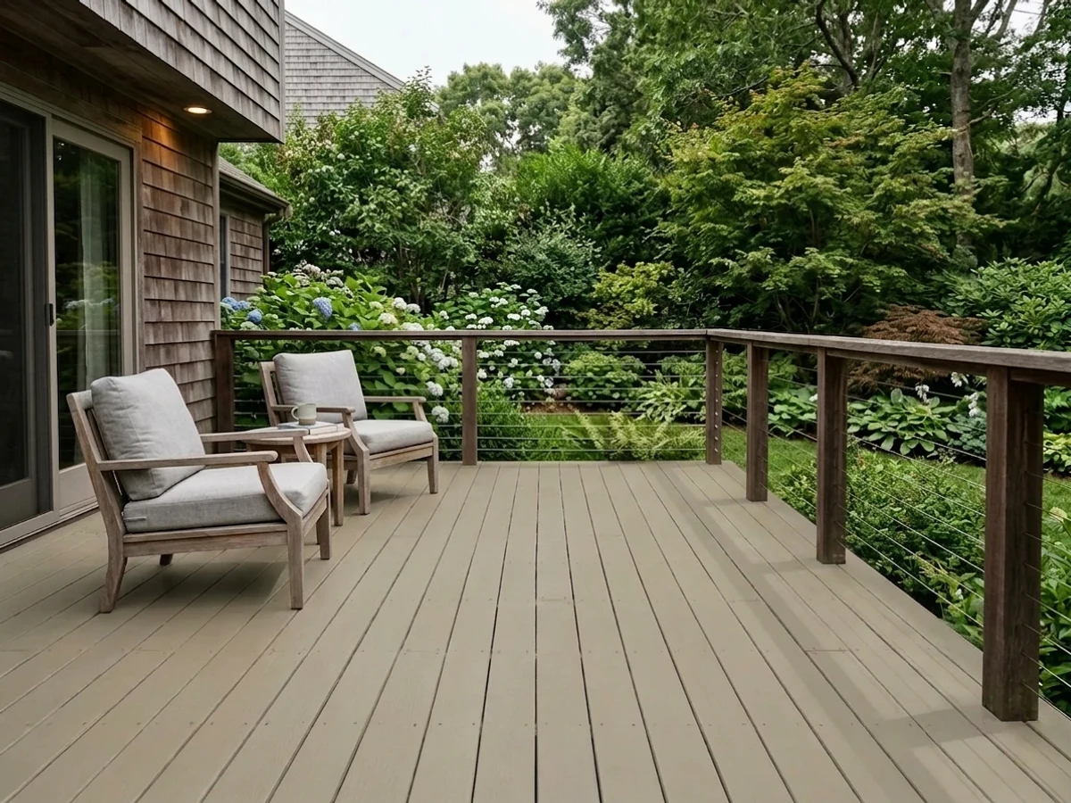
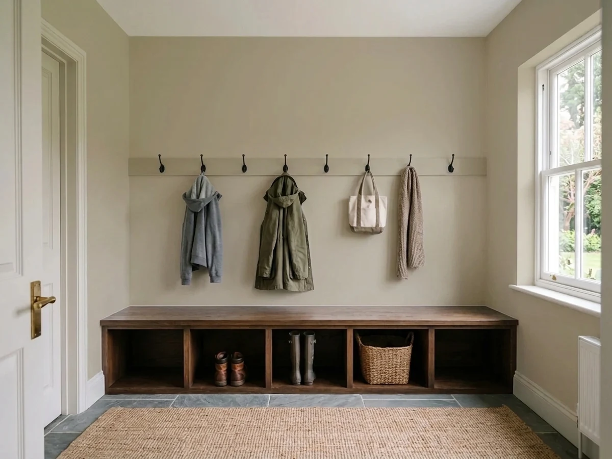
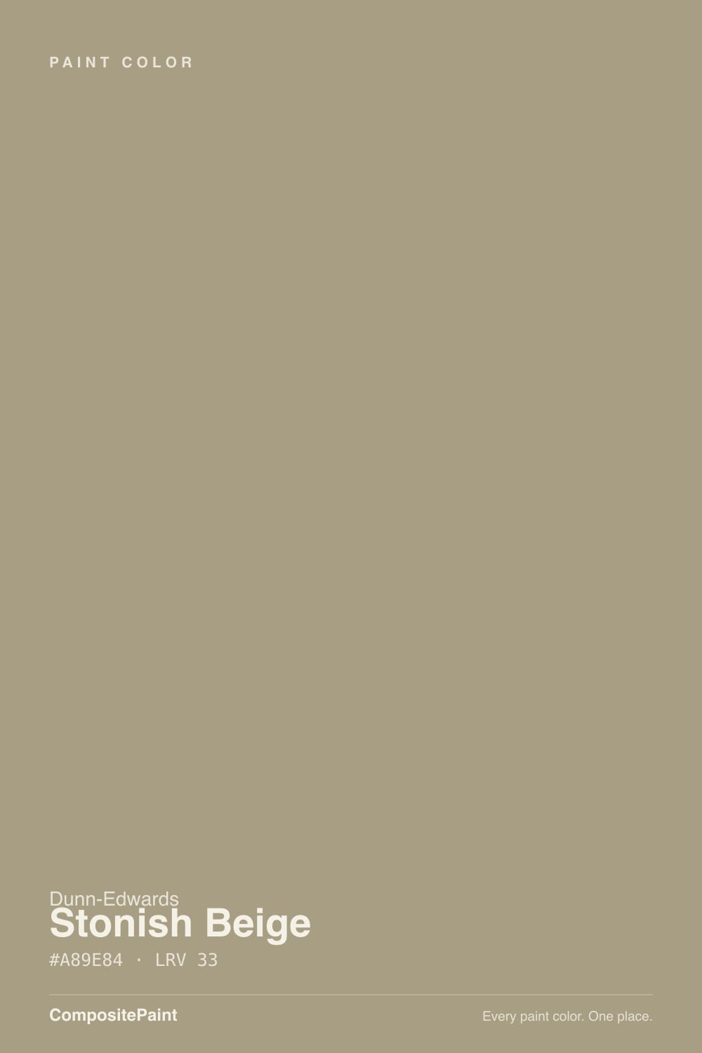
- 1Anonymous20
- 2Dorian Gray39
- 3Stonish Beige44
- 4Agreeable Gray60
- 5Pale Oak69
The Fast Verdict
Stonish Beige is what Dunn-Edwards calls a faded clay with a whisper of red, and on a stucco wall under real desert sun that is exactly right: warm, substantial, and never orange. It has become the default beige for Southwest stucco because it clears the bar an HOA field color actually has to clear — it reads finished against stone and clay tile without going as dark as a true brown or as washed-out as a plain builder tan. Take it out of strong sun and the same clay warmth goes muddy. And because half the block already wears it, the real design decision is what you pair it with, not whether to use it.
Stucco exteriors and block walls across the Southwest · fascia and trim on desert homes · HOA-approved builder palettes · cabinets and built-ins that want warm taupe instead of gray
Your climate is coastal, overcast, or north-light heavy · you want your house to look distinct from every other stucco house on an HOA street · your accents are cool blue-gray or turquoise · you need a color sold outside the Dunn-Edwards Southwest footprint
- Faded-clay warmth reads substantial and finished against stone and clay tile
- The HOA-approved default across huge swaths of the Southwest — near-zero design-review friction
- Evershield's UV-resistant acrylic holds the color under brutal desert sun
- Reads intentional against stucco texture, unlike paler beiges that wash out in shadow lines
- Works indoors on cabinets and built-ins as a warm alternative to gray
- Goes flat and muddy without real direct sun
- So common in Southwest tract developments it can read anonymous
- Fights cool blue-gray and turquoise accents
- A regional Dunn-Edwards color — harder to source or match outside the Southwest
What Color Is Stonish Beige, Really?
Dunn-Edwards' own description nails it: a faded clay color with a whisper of red. That is a more specific claim than most beige names bother to make, and it holds up — the base isn't a straight yellow-tan, it's a brown-taupe pushed just slightly toward red, the same family as adobe and terracotta with most of the saturation dialed out. That whisper of red is why Stonish Beige reads as clay rather than sand, and it is the reason painters and HOA design-review boards across Arizona, Nevada and inland Southern California keep specifying it decade after decade for stucco bodies, block walls, fascia and pop-outs.
At LRV 44 it sits squarely mid-depth — deep enough to read as a real, substantial color rather than a washed-out sand, but nowhere near the commitment of a true brown. On a stucco facade that matters twice: it hides the shadow lines textured stucco throws under strong sun better than a paler beige does, and it holds its own against stone accents and clay roof tile instead of disappearing next to them. It is not a color that whispers from the street — it is a color that reads finished.
Undertone in one line: warm clay-taupe with a red edge, never orange, never gray-cold. If your sample looks flat and slightly brownish-gray, that is overcast or shaded light doing it, not a bad batch. If it looks distinctly reddish in late-afternoon sun, that is the whisper of red doing exactly what Dunn-Edwards built it to do.
Where It Shines
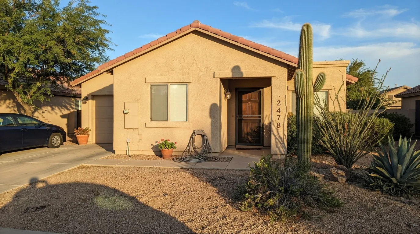
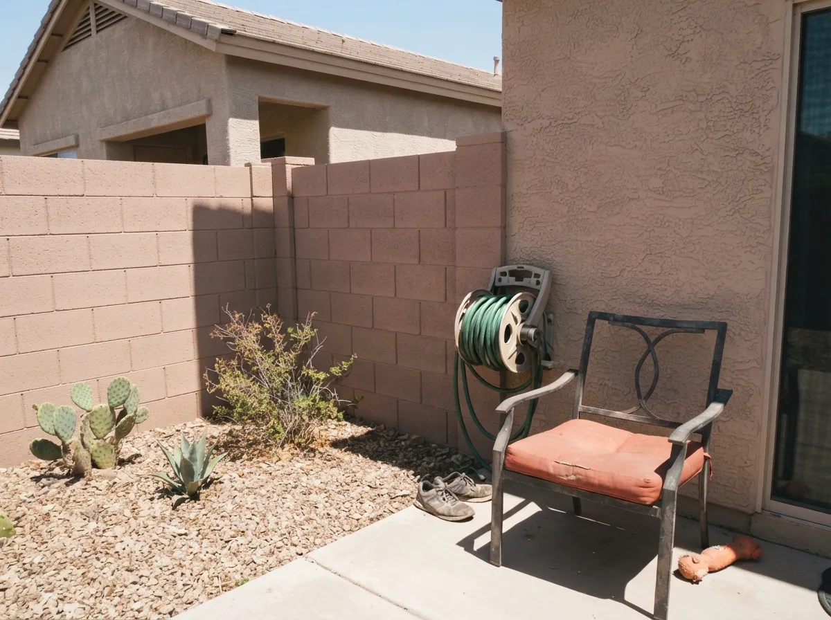
Give it real desert sun and masonry-style materials and Stonish Beige is nearly unbeatable — which is exactly why it dominates Southwest HOA and builder color books. On a stucco body under Arizona or inland-California light it reads warm and substantial next to flagstone, clay roof tile, wrought-iron accents and desert landscaping. Evershield, Dunn-Edwards' exterior line, was engineered specifically for that climate: low-VOC 100% acrylic that bridges stucco's hairline cracks and resists the UV fade that kills weaker paints under that much sun.
Where It Fails
Almost every complaint about Stonish Beige comes from one of three situations, and all three are predictable before the first coat goes on. None of them are the paint's fault — but if your house matches one, this may not be your beige.
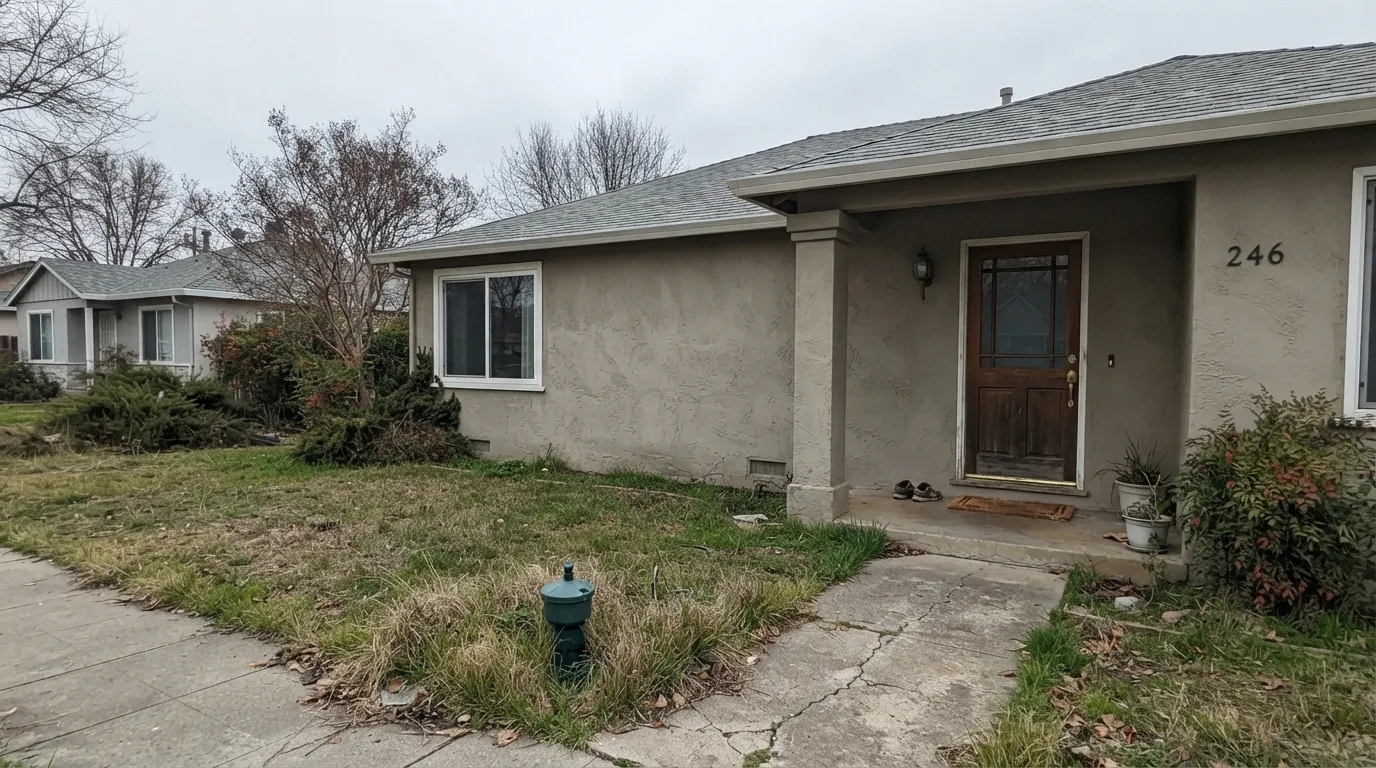
Strip out the direct desert sun and the whisper of red disappears — the wall goes flat, muddy, almost gray-brown. This is the color's one real light dependency: it needs sun to read as clay instead of mud. Test a real stucco panel, not just a chip, before committing on a coastal or north-facing lot.
Stonish Beige is one of the most-used field colors in Southwest HOA and builder palettes, which means entire tracts of stucco homes wear it. That is a feature for design-review approval and a real complaint for anyone who wants their house to look distinct — the fix is contrast in the trim and door, not a different field color.
Southwest desert palettes love a cool turquoise door or blue-gray xeriscape rock, and both fight Stonish Beige's warm clay undertone instead of complementing it. Keep the accents warm — rust, terracotta, aged bronze, near-black — and the whole palette reads intentional instead of mismatched.
Room by Room
Flat sheen (most HOAs require it on stucco anyway), full sun, real masonry accents. This is the color's entire reason for existing, and it delivers.
A shade lighter or the same field color in satin keeps the roofline from disappearing into the wall. Dunn-Edwards Whisper is the standard warm-white trim partner.
Matching the perimeter wall to the house body is the classic Southwest move, and Stonish Beige holds its color on masonry as well as it does on stucco.
The field color on the door reads flat and forgettable. This is a color that wants a contrast door — deep clay, rust, bronze or near-black — not a matching one.
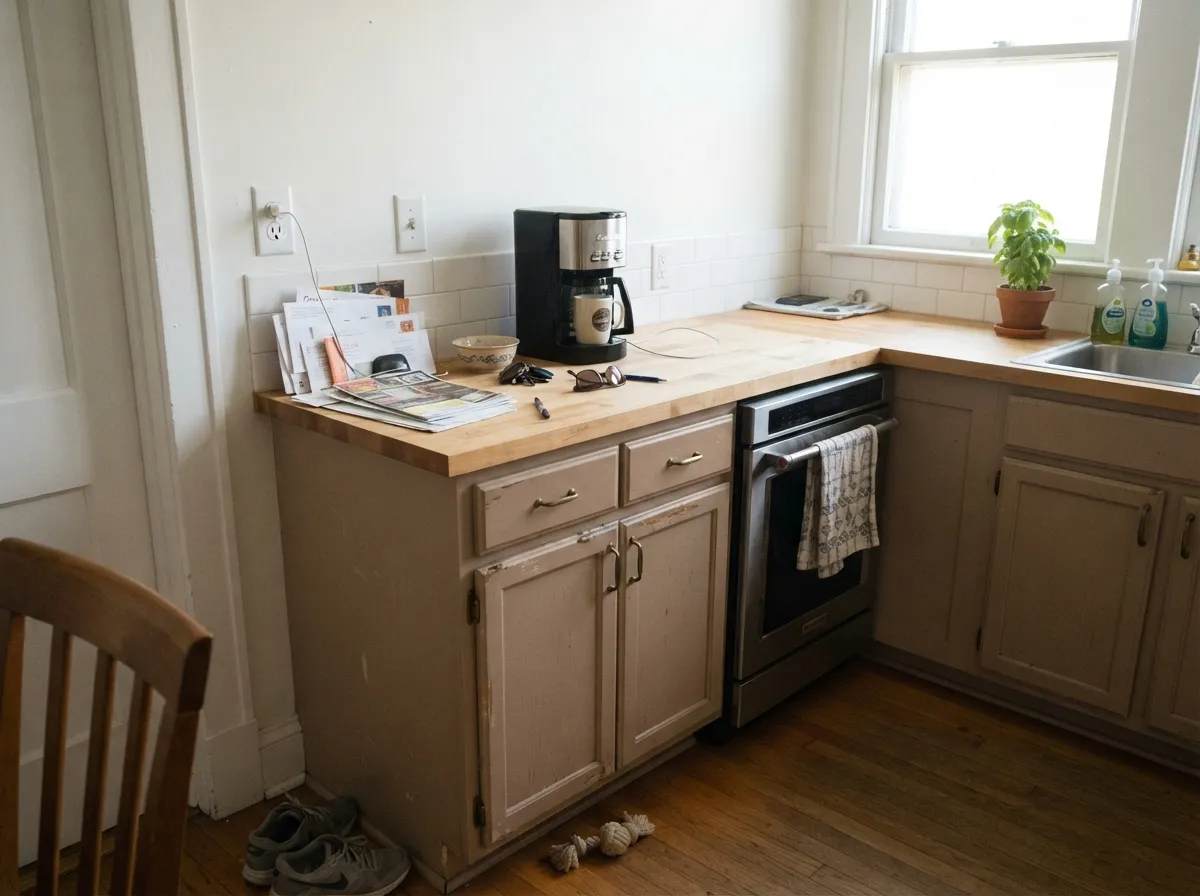
Indoors, away from direct sun, it settles into a warm, quiet taupe that works well as an alternative to a cooler gray greige — but bring a real sample into the kitchen's actual light before committing; a north-facing kitchen will read it flatter than the exterior swatch suggests.
This is an exterior-first color; on most interior walls, away from strong direct daylight, it just reads as a slightly muddy tan. A bright, south-facing sunroom is the one interior exception worth testing.
Your Light Is the Risk
Full, strong sun is where the whisper of red shows up and the color reads as warm clay instead of plain tan. This is the light it was built for.
Take the sun away and the red drops out, leaving a flat, muddy tan-brown. Coastal and north-facing lots should sample big before committing.
Harsh midday desert sun bleaches it slightly lighter and flatter; early morning and late-afternoon light deepen the clay and bring the red edge forward.
On cabinets or built-ins, warm 2700K bulbs deepen the clay warmth; cool LEDs flatten it toward a plain gray-taupe.
Most complaints about Stonish Beige are a light mismatch. Upload a photo of your actual room and see it on your walls — then ask for the same wall in north light or evening lamps before you buy a single sample.
Need It From Another Brand?
Any paint counter can custom-tint Dunn-Edwards DEC716 directly. If you would rather stay in one brand's own deck, these are the closest stock matches, measured as ΔE2000. Under 2 is a difference you will not see on the wall.
| Brand | Closest color | ΔE | LRV | |
|---|---|---|---|---|
| Sherwin-Williams | Bittersweet StemSW 7536 · Sherwin-Williams | 0.4 | 48 | Color page → |
| Behr | Sepia FilterT17-03 · Behr | 0.7 | 48 | Color page → |
| Benjamin Moore | Warm SandCSP-280 · Benjamin Moore | 2.0 | 47 | Color page → |
| Valspar | Tan SuedeP012 · Valspar | 0.3 | 47.2 | Color page → |
| PPG / Glidden | Happy TrailsPPG1084-4 · PPG / Glidden | 1.0 | 49 | Color page → |
| Glidden | Fortress Stone10YY 46/154 · Glidden | 1.1 | 46 | Color page → |
Similar Dunn-Edwards Colors
The nearest shades to Stonish Beige within Dunn-Edwards's own range, ranked by perceptual color distance — useful when you want the same look a touch lighter, darker, or warmer.
WCAG 2.1: AA is 4.5 : 1 for normal text, 3 : 1 for large text, AAA is 7 : 1.
Stonish Beige vs the Colors You're Also Considering
Every Stonish Beige sample board has the same rivals on it. The numbers show the real lightness gap — then it comes down to which risk you would rather live with.
Pick this on an actual stucco exterior — Stonish Beige carries more clay-red and was proven under decades of desert UV.
Sherwin-Williams SW 6073 · LRV 42Perfect GreigePick this if you want the same taupe warmth in a color sold everywhere, not just the Southwest — Perfect Greige is the mainstream color this whole family descends from.
Pick this if plain beige feels too builder-basic — the whisper of red keeps Stonish Beige from reading generic.
Sherwin-Williams SW 7037 · LRV 47Balanced BeigePick this for a true honey-beige instead of clay-taupe — Balanced Beige leans more yellow, less red.
Pick this on stucco specifically — it is the color Southwest painters and HOAs actually specify, and Behr's version was never built for that surface.
Behr PPU5-13 · LRV 52Creamy MushroomPick this for a lighter, pinker taupe you can buy at any Home Depot — no Dunn-Edwards dealer required.
Pick this for the lighter, more classic Southwest stucco read — Anonymous sits close to a full step darker than Stonish Beige's mid LRV.
Sherwin-Williams SW 7046 · LRV 20AnonymousPick this for a deeper, more saturated earthy exterior — Anonymous is one of SW's best exteriors and reads noticeably darker.
Dunn-Edwards has several taupes in the same range, and the differences are subtle but matter on a full wall. Hiking Trails (DESS23) sits a touch lighter at LRV 35 and leans slightly greener, so it can feel cooler and a little more sage in low light. If you want the warmer, more grounded read, Stonish Beige is the safer pick.
Pigeonhole (DEBN57) shares nearly the same LRV of 33 but is a hair deeper in tone, making it a close alternative when you want the same weight with a marginally richer feel.
Wooden Peg (DE6215) is darker at LRV 31 and reads as a deeper, browner taupe, better suited to spaces where you want more contrast or a cozier envelope. In short, choose Stonish Beige for a balanced warm mid-tone, Hiking Trails if you want a cooler green lean, and Wooden Peg if you want to go a step deeper and browner.
Stonish Beige Coordinating Colors
The rule for coordinating with Stonish Beige is simple: stay warm, and spend the contrast on the door. It pairs naturally with warm off-whites on trim, deep terracotta and clay tones on doors and accents, and near-black on ironwork — and it argues with cool blue-gray and turquoise, which fight its clay undertone instead of complementing it. These are the partners that keep showing up on facades that work:
Stonish Beige On Stucco: The HOA Story
This is not a color that went viral — it built its reputation the slow way, one HOA color book and one production-builder palette at a time. Ask a painter in Phoenix, Tucson or the Inland Empire to name a default beige for stucco and Stonish Beige is one of the first answers, because it clears the two hurdles a Southwest field color actually has to clear: it holds its color under UV that would bleach a cheaper pigment within a few years, and it reads finished rather than flat on textured stucco, which most pale beiges do not.
That ubiquity cuts both ways. Dunn-Edwards' own HOA and builder color schemes regularly pair Stonish Beige as the field color with deeper clay and near-black trims — that combination shows up again and again because it works, not because anyone got creative. The honest advice for a homeowner who wants the same reliability without looking identical to the next three houses: keep the field color, and spend the design decision on the door, garage door and trim instead.
Stonish Beige With Stone, Tile and Desert Landscaping
This color was built to sit next to masonry, not a lawn. Flagstone, river rock, clay roof tile and decomposed granite all share Stonish Beige's mineral, sun-faded character, which is why it disappears seamlessly into a xeriscaped Southwest yard instead of fighting it. Terracotta pots, rusted-metal accents and unlacquered bronze hardware read as an extension of the same palette rather than a separate decision.
The one landscaping choice that argues with it is cool blue-gray gravel or slate — a popular modern xeriscape look that pulls in the opposite direction from Stonish Beige's warm clay base. It is not a dealbreaker, but it is worth seeing in person before committing to both at once: warm buff or tan gravel keeps the whole property working as one palette.
Three Ready Palettes Built on Stonish Beige
A color is never alone on the wall. These are complete combinations in the 60-30-10 pattern, with the reason each one holds together. Every one opens in the visualizer.
The trim keeps the field color from looking flat against a light roofline, and the terracotta door echoes the whisper of red already inside the stucco color instead of fighting it — the fastest way to look intentional instead of tract-default.
Try this palette in your roomLayering two Southwest-native neutrals along a perimeter wall — a light cap and a deep pilaster accent — reads deliberate instead of builder-grade, and both hold color under the same UV load as the house itself.
Try this palette in your roomBrings the stucco color's clay-taupe warmth indoors as a cabinet alternative to a cooler gray greige, with a soft warm-white wall and one near-black island anchoring the room so the taupe doesn't go muddy without direct sun.
Try this palette in your roomStonish Beige FAQ
Is Stonish Beige a good stucco color for a Southwest house?
Yes — it is one of the most-used Dunn-Edwards stucco colors in Arizona, Nevada and inland Southern California for exactly that reason. The mid LRV (44) reads warm and substantial without going as dark as a true brown, it holds up well against strong desert UV in the Evershield exterior line, and it pairs naturally with stone, clay tile and desert landscaping.
Is Stonish Beige warm or cool?
Warm — Dunn-Edwards describes it as a faded clay with a whisper of red, and that is accurate. It never reads orange and never goes gray-cold; the closest description is a muted, sun-faded terracotta.
Does it look different in cloudy or overcast light?
Yes, and this is the color's real weakness. Without direct sun the whisper of red drops out and the wall reads as a flat, slightly muddy tan-brown. It is built for strong, direct light — coastal or north-facing lots should sample a large stucco panel before committing.
Isn't Stonish Beige too common? Every house in my HOA has it.
It genuinely is one of the most-used field colors in Southwest builder and HOA palettes, so that complaint is fair. The fix isn't a different field color — it's contrast: a deep clay, rust or near-black door and trim will make an otherwise-identical stucco house read distinct.
Can I use Stonish Beige indoors, like on cabinets?
Yes, in doses. Away from direct sun it settles into a warm, quiet taupe that works well on cabinets and built-ins as an alternative to a cooler gray greige. Bring a real sample into the room's actual light — a north-facing kitchen will read it flatter than the exterior swatch suggests.
What trim and door color goes with Stonish Beige?
Dunn-Edwards Whisper (a warm off-white) or Swiss Coffee are the standard fascia and trim partners. For the front door, skip the matching field color and go with contrast — deep clay, rust, aged bronze or a near-black — the field color on its own door reads flat.
Have you painted with Stonish Beige?
Rate it — one tap helps the next reader decide.
Ask a Question