High Sierra
The warm greige that looks like Revere Pewter's twin and Worldly Gray's cousin, reviewed honestly: why it never became a household name, and where it quietly does the job anyway.

Jessica has spec'd whites and neutrals for more than 300 rooms and keeps a sample wall of painted drawdowns in her studio. Every color review is checked against real reader rooms in the comments and re-tested when a formula changes. About the testing process →
- 1Dorian Gray39
- 2Mindful Gray48
- 3High Sierra53
- 4Agreeable Gray60
- 5Pale Oak69
The Fast Verdict
High Sierra is a warm, mid-depth greige from Sherwin-Williams' Emerald Designer Edition — a real curated collection, not a Color of the Year, not a name anyone made famous. On the wall it sits close enough to Revere Pewter and Worldly Gray that most people can't tell the three apart, just a shade deeper and a touch grayer than both. There's no story to sell here — no viral room, no forum thread — just a competent warm neutral that does its job in good light and goes quiet, not dramatic, when the light isn't.
Open-plan main floors with warm wood and real daylight · kitchens wanting a greige that isn't quite beige · anyone who liked Revere Pewter or Worldly Gray on a chip and wants the version their painter already has mixed · whole-house neutral hunters who don't need a brand name for the listing description
You want a color with its own reputation to point to · your room is dim and north-facing with no warm light plan · you're choosing between named greiges for a resale story · your trim is already a stark, blue-white
- Sits at the workhorse mid-LRV depth of the whole neutral family — warm without going pale, deep without going dark
- Nearly identical to two colors people already love (Revere Pewter, Worldly Gray) at a slightly deeper, more grounded read
- Genuinely rated for interior and exterior use, not just a wall color
- Flatters warm wood, stone, and linen exactly the way Sherwin-Williams says it should
- Quiet enough to run through an entire house without needing an accent wall to break it up
- No brand recognition — nothing to point to if you want a color with a story behind it
- Goes flat and muddy in a dim, north-facing room like every color in its family
- Close enough to Revere Pewter and Worldly Gray that picking it over them is mostly a coin flip
- Needs warm-leaning trim; a stark cold white makes it look dingy by comparison
What Color Is High Sierra, Really?
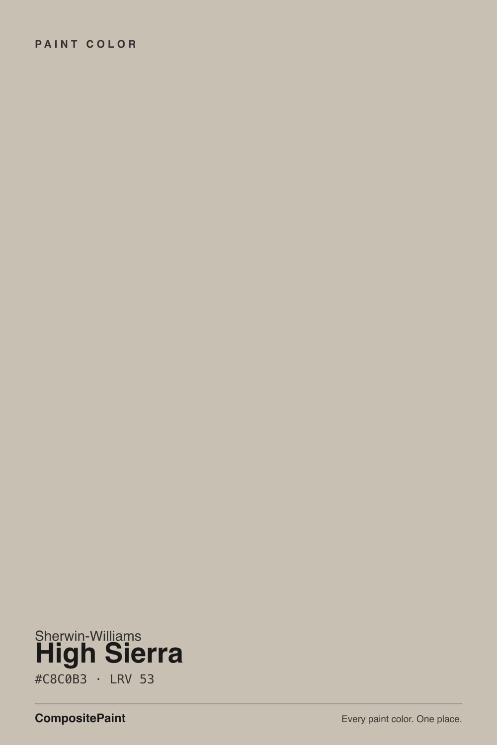
SW 9588 sits in Sherwin-Williams' Emerald Designer Edition, in a curated set the brand calls Warm + Welcoming — real design-team work, but not a headline color. At hex #C8C0B3, RGB 200/192/179, it is technically one of the more crowded members of the warm-greige family: it lands almost exactly on top of two colors homeowners actually search for by name, Revere Pewter and Worldly Gray. That closeness is High Sierra's whole story. It does the same job as the famous ones. It just never got famous doing it.
At LRV 53 it sits a shade deeper than Worldly Gray (LRV 57) and Revere Pewter (LRV 56) — close enough on a wall that most people won't clock the difference at first glance, but that extra depth is what keeps High Sierra from washing pale in a bright room the way its lighter cousins can. This whole neutral family runs from roughly LRV 30 (a deep mushroom) to LRV 75 (a barely tinted off-white); High Sierra sits right in the workhorse middle of that range — warm enough to feel finished, light enough to keep a room open.
Undertone in one line: warm greige, taupe-leaning, with the yellow grayed down just enough to stay out of true-beige territory. It doesn't announce a strong single personality the way a green-gray or a mauve does — it reads as "good neutral wall" before it reads as any specific hue, which is exactly the job it was built for. If a sample looks slightly pink or slightly green on your wall, that's bounce light from the room, not the paint doing anything unusual — the base itself is a straightforward warm gray-tan.
Where It Shines
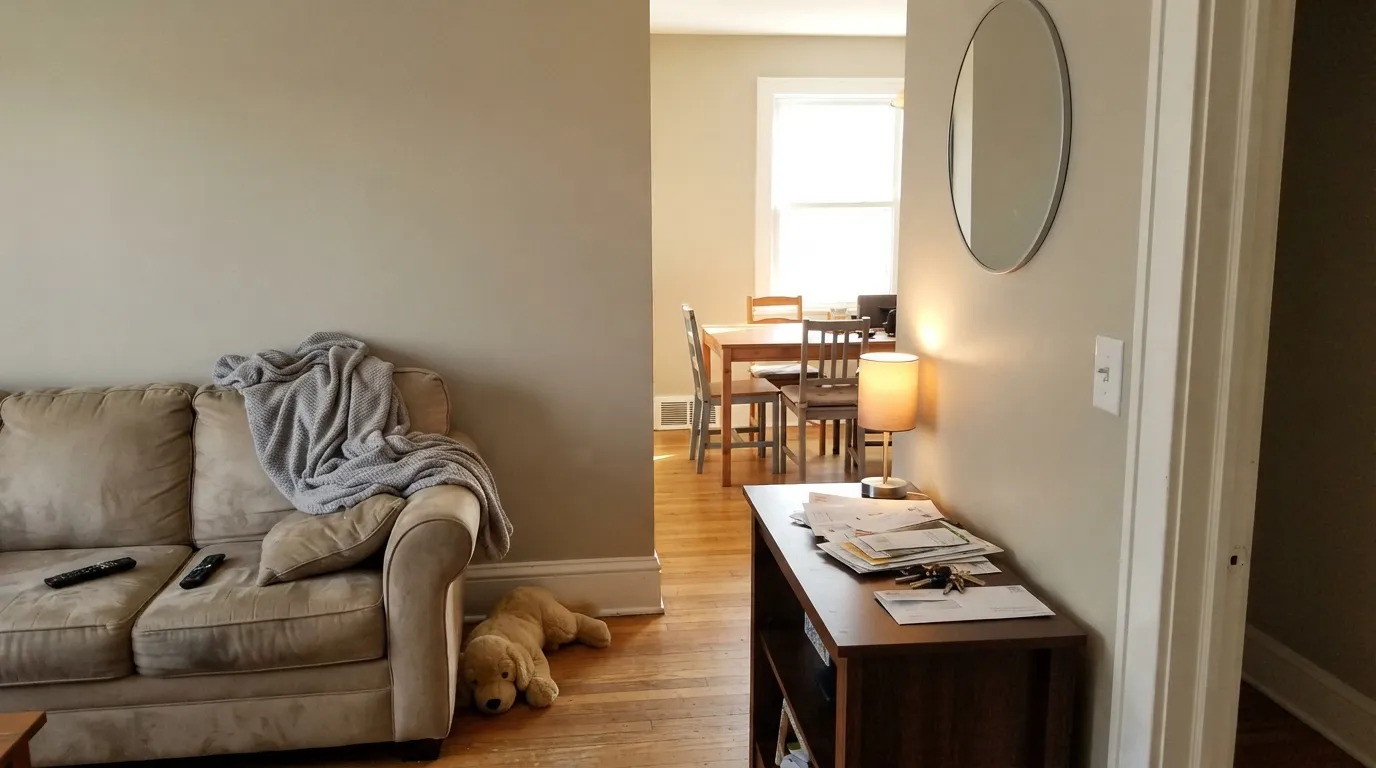
Give it real daylight, warm wood, and stone or linen textures and High Sierra does exactly what a good workhorse neutral should: it disappears into "finished" instead of demanding attention. It runs an open floor plan without picking a fight between rooms, and Sherwin-Williams itself lists it for everything from bedroom walls to kitchen cabinets to ceilings — a color built to be used everywhere in a house, not staged for one hero room.
Where It Fails
There's no dramatic failure story with High Sierra — the complaints are quieter than that, which fits the color. Three situations account for almost all of the disappointment, and none of them are the paint doing something unusual.
Every warm greige in this depth range behaves the same way in cool, low light — the warmth drains and what's left reads flat and slightly muddy rather than moody. High Sierra's extra depth compared to Worldly Gray (LRV 53 versus LRV 57) means it goes darker still in that light, closer to a flat taupe-gray than the calm neutral the chip promised. Test a real sample on the actual wall before committing a whole floor to it.
The honest frustration with High Sierra isn't the paint — it's the search results. Look it up and you mostly find templated color-chip sites recycling the same generic undertone list for every color in the deck; there's no viral before-and-after, no design blogger with a signature room. If you want a color you can point to with a story — a Color of the Year, a name your painter recognizes on sight — this isn't it. If you just want a warm neutral to behave correctly on your wall, that's exactly what it does.
Like every warm neutral at this depth, High Sierra needs warm-leaning trim to look its best. Put a blue-white baseboard under it and the wall can start to look dingy by comparison — the fix is the trim can, not a different wall color. Greek Villa or Alabaster keep the handoff soft; a cold bright white will not.
Room by Room
In good daylight, against wood furniture and a stone or linen texture somewhere in the room, it reads calm and put-together. Eggshell on the walls, the same color on trim in semi-gloss if you want the one-color-room look.
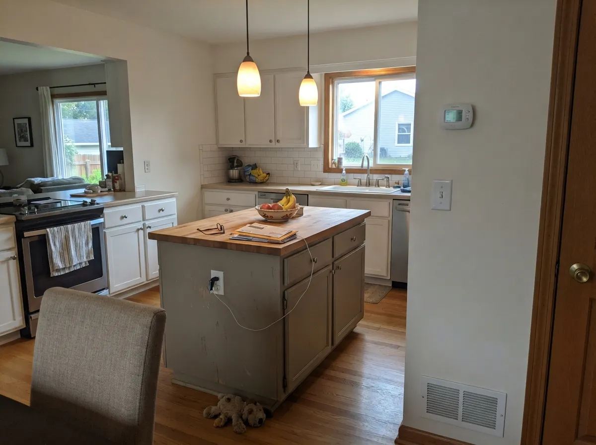
Sherwin-Williams lists it for kitchen walls and cabinets both. On lower cabinets or an island it reads as a soft, furniture-like greige — warmer than a true gray, quieter than a full beige.
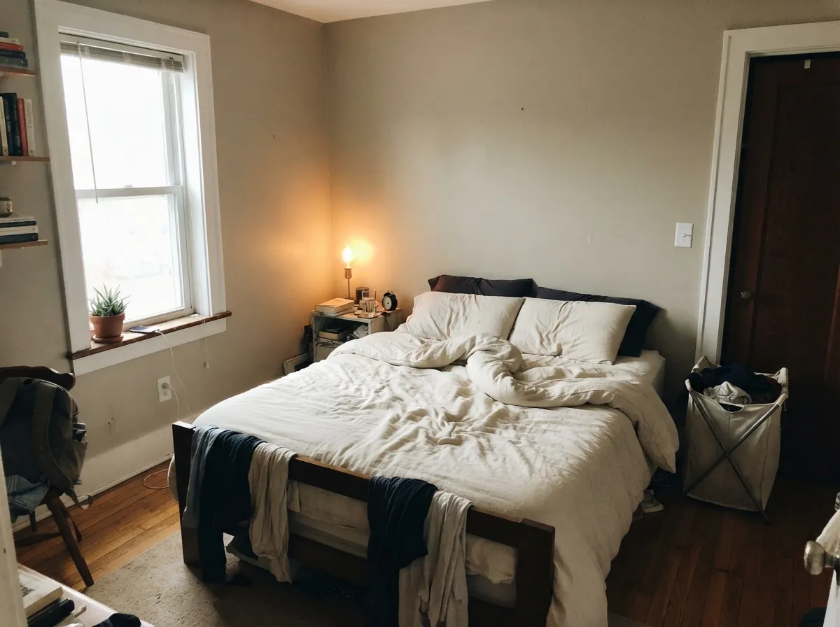
It stays calm rather than dramatic, which is the point for a bedroom. Matte or eggshell hides wall texture; pair with a warm white trim so the edges soften instead of cut.
This is where a mid-LRV, low-drama neutral earns its keep — it can run from an entry into a living room into a hallway without arguing with the light change room to room. The least exciting recommendation in this review and the truest one.
With warm-toned tile, wood vanities, and brass it's genuinely nice. With cool gray or blue-white tile, the warmth in High Sierra starts to look slightly off against the cold stone — sample it against your actual tile first.
Sherwin-Williams rates High Sierra for interior and exterior use, and the depth and warmth would sit fine against brick or warm siding trim. But there's no name-recognition here either — no well-known exterior before-and-after to point to, so treat it as reasonable, not tested by a crowd.
Your Light Is the Risk
Full daylight brings out the warm side without pushing it toward beige. The most flattering, most honest read of the color.
Cool daylight drains the warmth and the gray base comes forward, reading darker and flatter than the chip. Test on the actual wall.
Softer and lighter at sunrise, richer and warmer as the light lowers in the afternoon. A gentle shift, not a different color.
2700K bulbs lean it warmer and cozier at night; cool LEDs pull it back toward flat gray. Swap the bulb before you swap the paint.
Most complaints about High Sierra are a light mismatch. Upload a photo of your actual room and see it on your walls — then ask for the same wall in north light or evening lamps before you buy a single sample.
Need It From Another Brand?
Any paint counter can custom-tint Sherwin-Williams SW 9588 directly. If you would rather stay in one brand's own deck, these are the closest stock matches, measured as ΔE2000. Under 2 is a difference you will not see on the wall.
| Brand | Closest color | ΔE | LRV | |
|---|---|---|---|---|
| Behr | Penthouse ViewT16-06 · Behr | 1.8 | 53 | Color page → |
| Benjamin Moore | Ashen Tan996 · Benjamin Moore | 1.5 | 51 | Color page → |
| Valspar | Feathers of a DoveM111 · Valspar | 1.8 | 53.9 | Color page → |
| PPG / Glidden | AshenPPG1023-3 · PPG / Glidden | 0.6 | 53 | Color page → |
| Glidden | AshenPPG1023-3 · Glidden | 1.0 | 53 | Color page → |
| Dutch Boy | Bluffwood405-2DB · Dutch Boy | 1.7 | 53 | Color page → |
Similar Sherwin-Williams Colors
The nearest shades to High Sierra within Sherwin-Williams's own range, ranked by perceptual color distance — useful when you want the same look a touch lighter, darker, or warmer.
WCAG 2.1: AA is 4.5 : 1 for normal text, 3 : 1 for large text, AAA is 7 : 1.
High Sierra vs the Colors You're Also Considering
Every High Sierra sample board has the same rivals on it. The numbers show the real lightness gap — then it comes down to which risk you would rather live with.
Pick this for a hair more depth and a slightly grayer lean — High Sierra holds up a little better in a very bright room.
Sherwin-Williams SW 7043 · LRV 57Worldly GrayPick this if you want the color with actual name recognition — it's nearly identical, one LRV point lighter, and the one your painter will already know by name.
Pick this if your painter carries Sherwin-Williams and you want the same warm-gray depth without switching brands.
Benjamin Moore HC-172 · LRV 56Revere PewterPick this if you're already working in Benjamin Moore — Revere Pewter is the same idea in that deck, slightly lighter and warmer, and the greige every showroom keeps a fan deck open to.
Pick this if Accessible Beige felt too warm or too beige on your sample — this is the same family with the yellow dialed back.
Sherwin-Williams SW 7036 · LRV 58Accessible BeigePick this if you want it warmer and lighter — Accessible Beige leans further into true beige and reads noticeably tan next to High Sierra's grayer cast.
Pick this for a lighter, airier version of the same grayed-warm neutral that still holds its color in daylight.
Sherwin-Williams SW 7016 · LRV 48Mindful GrayPick this if you want to go a step deeper and grayer still — Mindful Gray reads as a true mid-tone gray-greige rather than High Sierra's lighter warm cast.
High Sierra Coordinating Colors
The rule for coordinating with High Sierra is the same as for any warm greige: stay warm on the trim, save the cold colors for a deliberate dark accent. It pairs cleanly with warm creams, soft near-blacks, and its own family of warm-gray neighbors. These are the partners that keep it looking finished rather than dingy:
The Nearly Identical Greige Family
High Sierra belongs to Sherwin-Williams' Emerald Designer Edition, in a curated grouping the brand calls Warm + Welcoming — real design-team work, not a Color of the Year and not a color a magazine ever put a name to. That matters more than it sounds like it should, because the paint itself sits in a genuinely crowded neighborhood: at hex #C8C0B3 it lands within a couple of points of Worldly Gray (LRV 57) and Revere Pewter (LRV 56), two colors homeowners search for by name constantly.
The honest read: if you've already fallen for Revere Pewter or Worldly Gray on a chip, you have effectively already met High Sierra — it's the same warm-greige idea, a touch deeper and grayer than either. There's no reason to feel like you're settling for the lesser-known option. It's the same performance without the brand recognition, which for most walls is not a real trade-off at all.
High Sierra With Wood Tones and Floors
Warm wood is this color's easiest pairing: oak, walnut, and butcher block all sit comfortably against High Sierra because the wood's warmth and the paint's warmth meet in the middle instead of fighting. Stone and linen textures — the two materials Sherwin-Williams itself calls out for this color — do the same job, giving the wall something to sit quietly behind rather than in front of.
Cool gray or gray-washed floors are the one pairing that needs a real sample first. Against a cold floor, High Sierra's warmth can start to look slightly out of step, the same way it does against stark white trim. It isn't a hard clash the way a true beige would be, but a warm rug or a few brass fixtures usually settle the argument in the room's favor.
Three Ready Palettes Built on High Sierra
A color is never alone on the wall. These are complete combinations in the 60-30-10 pattern, with the reason each one holds together. Every one opens in the visualizer.
Greek Villa's warm cream keeps the walls from looking dingy the way a stark white trim would; Iron Ore supplies the one dark note the scheme needs without introducing a second undertone to manage.
Try this palette in your roomAlabaster on the perimeter keeps the kitchen bright; High Sierra on the island adds the grounded, furniture-like weight islands want without going as dark as navy or black. Iron Ore on the pantry door gives the room one crisp near-black accent.
Try this palette in your roomWhite Dove trim stays soft instead of stark against High Sierra's warm greige; Kendall Charcoal on one wall or a nightstand gives the room a single grounded dark note without fighting the warmth.
Try this palette in your roomHigh Sierra FAQ
Is High Sierra warm or cool?
Warm — a greige with the yellow grayed down rather than a true gray or a true beige. It leans taupe more than it leans tan, and it never reads cold or blue, even under cool light; in cool light it just goes flatter and quieter, not blue.
What's the actual difference between High Sierra and Worldly Gray?
One LRV point. Worldly Gray sits at LRV 57, High Sierra at LRV 53, and the hexes are close enough that most people can't tell them apart on a wall. The practical reason to pick one over the other is usually just which one your painter already stocks — Worldly Gray is the better-known name if that matters to you.
What trim color goes with High Sierra?
A warm white or cream — Greek Villa or Alabaster both work well in semi-gloss. Avoid a stark, blue-leaning white; it makes the warm greige walls look dingy by comparison instead of clean.
Does High Sierra work for kitchen cabinets?
Yes — Sherwin-Williams lists it for both kitchen walls and cabinets. It reads best on an island or lower cabinets under a lighter perimeter color like Alabaster, rather than as the only color in a small kitchen.
Will it look too dark or too gray in my room?
At LRV 53 it's a genuine mid-depth color, not a pale wash. In a bright, south-facing room it stays warm and readable; in a dim north-facing room with no warm bulbs, it can go noticeably darker and flatter than the paint chip suggests. Sample it on the actual wall before committing.
Is High Sierra good for exteriors?
Sherwin-Williams rates it for exterior use and the depth would sit reasonably against brick, stone, or warm siding trim. There just isn't a well-known exterior project to point to the way there is for more famous exterior greiges — treat it as a sound, untested-by-the-crowd choice rather than a proven one.
Have you painted with High Sierra?
Rate it — one tap helps the next reader decide.
Ask a Question