Sherwin-Williams Agreeable GrayvsBenjamin Moore Revere Pewter
The two greiges that taught America the word. Agreeable Gray is the lighter, cleaner one with a violet streak; Revere Pewter is deeper, more traditional, and leans green. Which one you can buy locally matters almost as much as which one you like.

Built from our full reviews of both colors — same measured data, same real-room photos. About the testing process →
The Numbers
Agreeable Gray is slightly lighter (LRV 60 vs 55, 5-point delta).
The Real Difference on a Wall
The first real difference is weight. Agreeable Gray keeps a room open and reads like a light neutral with a hint of color. Revere Pewter puts a mid-tone on the wall — it holds shadow, it makes white trim look like a deliberate choice, and it makes a room feel settled rather than airy. In a hallway or a small bedroom that gap decides everything. Revere Pewter in a windowless space closes it in; Agreeable Gray in the same space still reads light.
The second is which way each one drifts when the light stops helping. Agreeable Gray leans violet. In a dim north room the warmth drains out and what is left is a drab gray with a faint fleshy purple in it. Revere Pewter leans green. Same north room, and it comes back darker than the chip with a soft green in it. So the fixed finishes decide the winner more than taste does. Pink or red-toned floors, salmon carpet, pink travertine: Revere Pewter is out, because green against pink makes both look dirty. Cool gray-violet LVP or quartz: Agreeable Gray is the one that flashes green against them, which surprises people who expected the purple problem instead.
Third, they want different rooms around them. Revere Pewter is at its best with oak, brass, bronze and a bright trim white, which is why it looks right in traditional and transitional houses. Agreeable Gray is more flexible and more modern — it carries an open plan without ever committing to a period. It is also more forgiving to live with, because it changes less between the sunny end of a room and the shaded end. And there is the practical layer: Agreeable Gray is Sherwin-Williams, Revere Pewter is Benjamin Moore. If your painter buys from one store and touch-up cans matter to you over the next ten years, that is a legitimate tiebreaker, not a cop-out.
They flash in opposite directions, which is the useful thing to know. Agreeable Gray drifts violet in dim or north light and throws green beside cool gray-violet tile and counters. Revere Pewter drifts green in the same north light and turns unmistakably green next to pink or red-toned floors.
What Each Color Really Is
A warm gray built on a taupe base, not a beige one — and that distinction explains almost everything about how it behaves. Beige-based neutrals carry yellow, so they stay warm no matter what the light does. Agreeable Gray carries a soft brown-violet instead, which is why it reads gray first and warm second, and why the warmth can switch off when the light turns cool. Sherwin-Williams sells it as the agreeable one because it refuses to commit to an undertone, and that refusal is both the reason it goes on more American walls than almost any other color and the reason a small share of people hate it.
At LRV 60 it reflects a bit more than half the light that lands on it, which puts it in the mid-light band — light enough to open a room, not light enough to act as a bright neutral. The number looks close to Revere Pewter (HC-172) at 56, but on a wall the gap feels bigger than four points because Revere Pewter also carries green and reads a full step heavier and more traditional. Put Agreeable Gray beside a real off-white like Alabaster (SW 7008) at LRV 82 and the comparison is honest: this is a color, not a pale wash, and it will hold visible shadow in corners and behind furniture.
A warm mid-tone gray built over beige, with a soft green shadow underneath it. That green is not a defect and it is not a rumor — it is how the color is mixed. Revere Pewter carries almost no red, and red is what keeps a neutral steady when the light changes. Take the red out and the wall has nothing to hold onto, so it borrows: green from the lawn outside the window, gray from a cloudy afternoon, warm khaki from a lamp at night. That borrowing is the whole personality of this color. It is why one homeowner calls it the coziest beige they have ever owned and the neighbor with the same gallon calls it sage.
LRV 55.5 means it bounces back a little over half the light that lands on it — genuinely mid-tone, not a light neutral. That number is the single most misread thing about it. Edgecomb Gray (HC-173) sits at 63 and Agreeable Gray (SW 7029) at 60, and those seven or eight points are not a technicality. Edgecomb whispers on a wall; Revere Pewter states something. Put a sample board of each side by side and Edgecomb looks like a tinted white while Revere Pewter looks like an actual color, with weight and a shadow line in the corners. Most of the "it came out so much darker than I expected" stories are really people expecting a 63 and buying a 55.
Specs Side by Side
| Spec | Agreeable Gray | Revere Pewter |
|---|---|---|
| Brand | Sherwin-Williams | Benjamin Moore |
| SKU | SW 7029 | HC-172 |
| Hex | #D1CBC1 | #CBC6B8 |
| RGB | 209, 203, 193 | 203, 198, 184 |
| LRV | 60 | 55 |
| Undertone | red-orange / warm | red-orange / warm |
| Family | Neutral | Neutral |
How Light Changes Them
Warms up and looks its softest and lightest. Can wash toward a pale beige at midday — most people love it anyway.
The warmth drains out. Gray, sometimes violet, often just dingy. Sample this room first — or go warmer.
2700K lamps push it cozy and beige. 4000K daylight bulbs pull the gray out and can trigger the violet. Swap bulbs before you repaint.
One color, two rooms, two looks: warm and beige by the south windows, gray and cool in the shaded corner. Fine if you expect it, jarring if you don't.
Full sun pulls the warm base forward. Cozy and settled, and it holds its color all day.
Cool light strips the warmth and lifts the green. Expect darker and grayer than the chip.
2700K lamps: soft putty warmth. Cool 4000K LEDs: flat gray — change bulbs, not paint.
Powder rooms and interior halls have no daylight to lift LRV 56. It closes in and looks dirty.
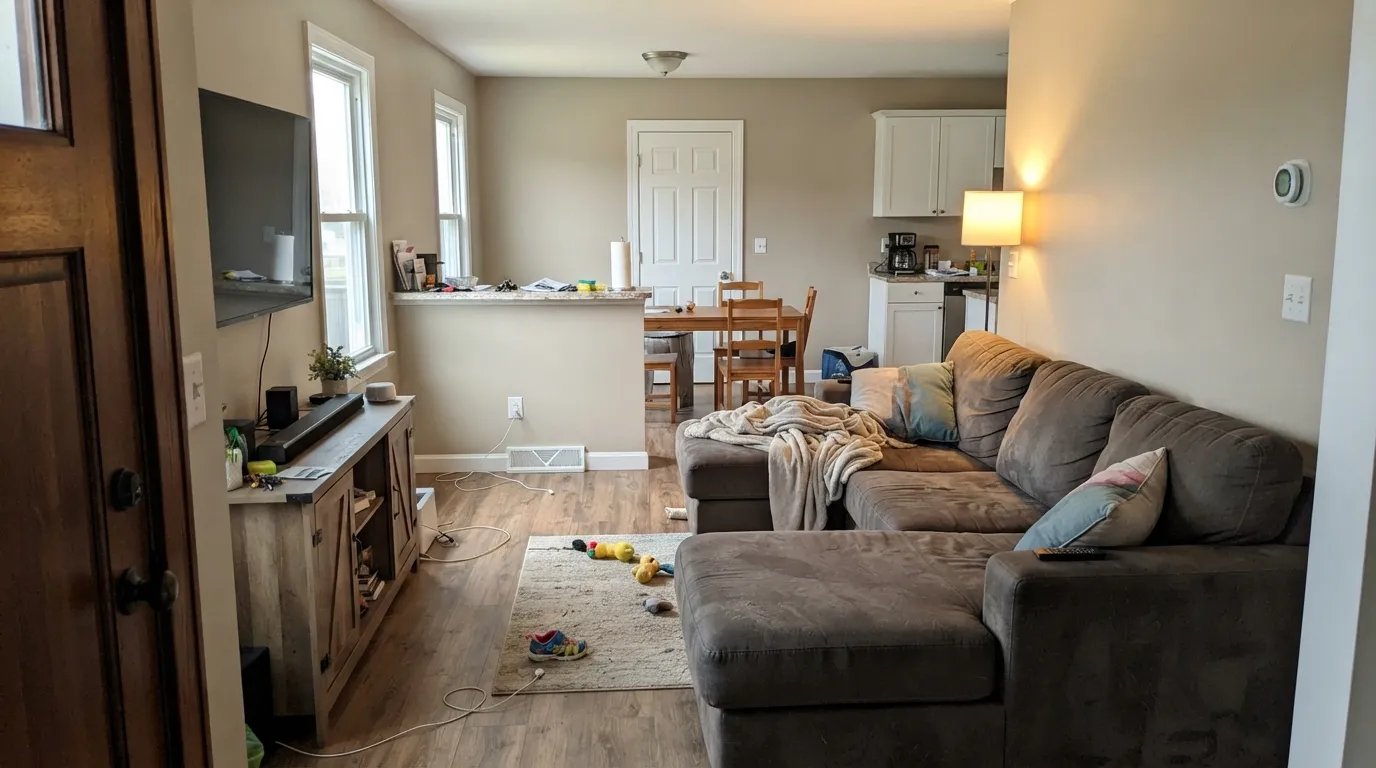
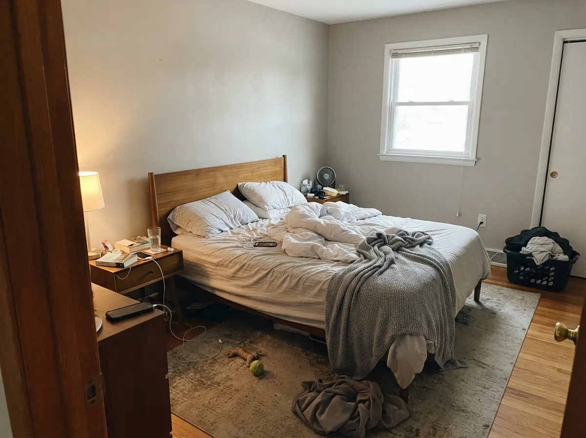
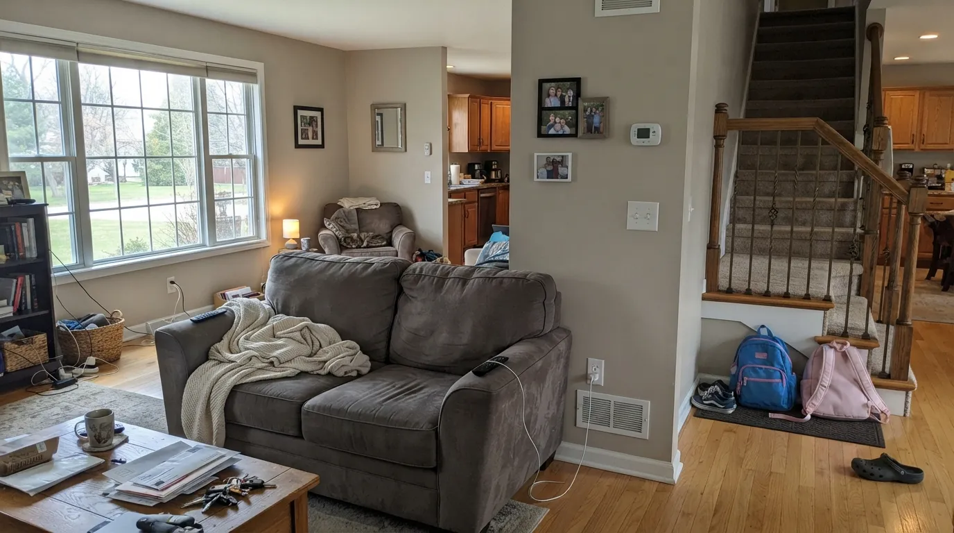
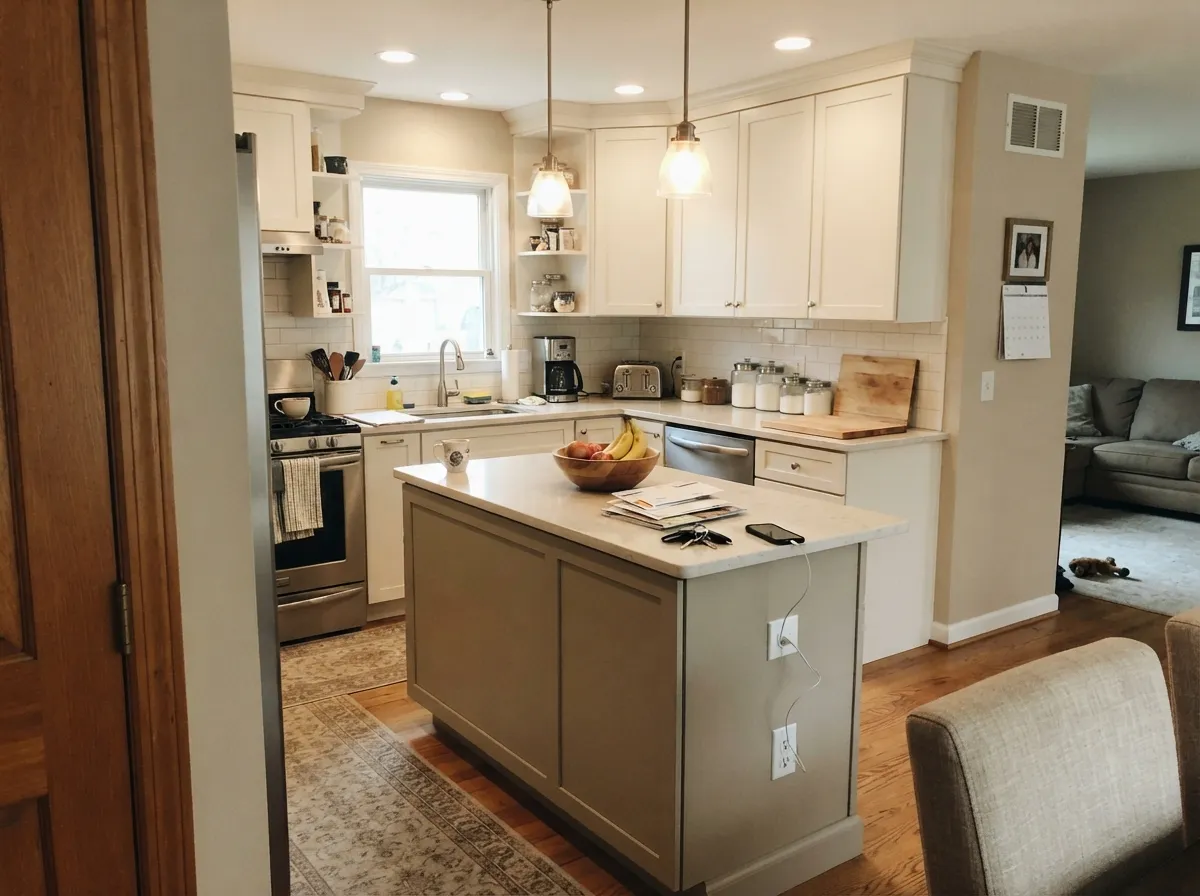
Both Colors in Real Rooms
Photos from our full reviews — the same rooms and captions, so you can judge each color where it actually lives, not on a chip.
When to Pick Which
Choose Agreeable Gray if you want the room to stay light, if you are painting several rooms with different window directions, or if your house leans modern and you do not want a period look. It is also the better bet in small rooms and hallways, where Revere Pewter gets heavy. Check your flooring first — if it is cool gray-violet, keep looking.
Choose Revere Pewter if the room has good daylight and you want depth on the wall instead of a light neutral. It is the stronger pick for traditional houses with oak floors, brass and bronze, for kitchen islands and cabinets, and for anywhere you want bright white trim to stand out. Avoid it in dim north rooms and next to anything pink.
No comparison page can see your light. Upload one photo of your room and try both colors on the same walls, seconds apart.
Agreeable Gray vs Revere Pewter FAQ
Which one for a dim north-facing room?
Agreeable Gray, mostly because it starts lighter and stays lighter. Revere Pewter in a dark north room is the color's best-known failure — much darker than the chip, flat, murky. Agreeable Gray in that room does not fail so much as go dull, with a faint violet cast in the worst corners. If the room really has no light, both are compromises and a warmer, lighter neutral will serve you better.
I have honey oak floors. Which one?
Revere Pewter, if the room has daylight. It was practically designed for oak and brass, and it makes older orange-leaning floors look intentional instead of dated. Agreeable Gray also works with oak and is the safer choice if the room is dim or if the floors are on the pinker side of honey — Revere Pewter's green will pick a fight with any pink in the wood.
What trim white goes with each?
Pure White SW 7005 with Agreeable Gray, staying inside the Sherwin-Williams deck. Chantilly Lace OC-65 or White Dove OC-17 with Revere Pewter — Chantilly Lace for crisp contrast, White Dove for a softer line. Do not put a creamy antique white against Agreeable Gray; that pairing is the single most common reason people say the walls look dirty.
Can I get one color-matched into the other brand's paint?
You can, and it is usually a small compromise rather than a disaster on walls. Matches are built from a scan, so they land close but rarely exact, and greiges are the hardest family to match because their undertones are so thin. If the color is going on cabinets or trim where you will see it up close every day, buy the real can from the real brand.
Which is better for a whole house?
Agreeable Gray, on balance. It stays lighter in the small rooms, changes less between window directions, and does not need daylight to look good. Revere Pewter can run a whole house too, but only one with good windows throughout — it punishes interior halls, powder rooms and north bedrooms. A common compromise is Revere Pewter on the main living space and its lighter sibling Edgecomb Gray HC-173 everywhere else.
Ask a Question