Sherwin-Williams Pure WhitevsSherwin-Williams Alabaster
Pure White and Alabaster sit almost on top of each other on the fan deck and behave nothing alike on a wall. Pure White stays clean. Alabaster puts real cream in the room.

Built from our full reviews of both colors — same measured data, same real-room photos. About the testing process →
The Numbers
LRV is essentially equal (84 vs 82) — both reflect light the same.
The Real Difference on a Wall
The gap between these two is temperature, not brightness. Both are bright enough to read as white from the doorway. Pure White has a small warm lean, just enough that it never feels like a hospital, but in most rooms people still call it plain white. Alabaster's warmth is cream you can point at. Paint two big boards and hold them side by side: Pure White looks like copy paper, Alabaster looks like the inside of an eggshell. That difference is subtle on a chip and obvious on 400 square feet.
They also fail in opposite ways. Alabaster fails by changing color. South and east light bring the cream forward and it glows, late sun turns it faintly buttery, and then you move it to a dim north room and the cool light cancels the yellow and the soft green-gray underneath comes up. That is where the mistint calls come from, and the store did not make a mistake. Pure White does not go green in that same north room. It just goes quiet and a little cold, sometimes with a faint blue cast if your windows have blue-tinted low-E glass. One color turns on you, the other loses its personality.
What sits next to them decides the rest. Alabaster wants warm company: oak, walnut, brass, cream-toned stone, unlacquered hardware. Put it beside stark white subway tile, a white fridge, cool gray LVP, or Carrara-look quartz and it reads dirty, because something in the room is genuinely whiter than it is. Pure White handles mixed and cool finishes without complaint. Its one weak spot is different: if a brighter builder white stays on the ceiling or the existing trim, Pure White is close enough to look soiled rather than deliberate. Both colors ask you to choose your trim, tile and stone at the same time as the paint.
Alabaster is the one that turns. Cool north light cancels its yellow and a soft green-gray surfaces, which is why people swear the can was mixed wrong. Pure White never goes green here, it just flattens, and behind low-E glass it can pick up a faint blue cast.
What Each Color Really Is
A soft white with the smallest possible drop of warmth in it, and the reason it works is how little of that warmth there is. Most warm whites are built on a yellow oxide base you can see on the chip; Pure White carries a trace of yellow cut with a touch of gray, so on a wall it reads as white first and warm second. Painters describe it as the least warm of the warm whites, and that is exactly right. It is the white you pick when cream would be too much and a cool white would be too cold.
At LRV 84 it puts most of the light back into the room, but it is not a bright white and it does not pretend to be. Stand it next to High Reflective White (LRV 93) and Pure White suddenly shows its body: you can see the color sitting in it. Even Extra White, only two points higher on paper, looks noticeably cleaner and cooler beside it. That small gap is the useful part. On trim it reads as painted woodwork instead of plastic, and on a wall it softens shadows in a way a bright white cannot.
A warm off-white built on a yellow-beige base, with a small amount of grey mixed back in to keep the yellow from going buttery. That grey is the reason Alabaster became a default instead of a cream: it takes the edge off the warmth so the wall reads "soft white" rather than "antique." The trade-off is that the grey is not a pure grey — there is a faint green thread running through it, and it stays invisible only while the yellow is doing its job. Cancel the yellow and the green half of the mix is what you are left looking at.
At LRV 82 it bounces back most of the light in the room, so it behaves like a white in daily use — but it is not a bright white, and the gap shows the moment a truly bright one is in frame. Extra White SW 7006 sits at 86 and High Reflective White SW 7757 at 93; next to either, Alabaster suddenly has visible body and looks like a color rather than a blank. On its own wall, with nothing brighter nearby, your eye adapts within a minute and simply calls it white. That is the whole reason it photographs so well and why it has been Sherwin-Williams' most-specified white for a decade.
Specs Side by Side
| Spec | Pure White | Alabaster |
|---|---|---|
| Brand | Sherwin-Williams | Sherwin-Williams |
| SKU | SW 7005 | SW 7008 |
| Hex | #EDECE6 | #EDEAE0 |
| RGB | 237, 236, 230 | 237, 234, 224 |
| LRV | 84 | 82 |
| Undertone | yellow / warm | yellow / warm |
| Family | White | White |
How Light Changes Them
Warm sun all day keeps it soft and glowing. It creams up slightly, never yellow.
Cool daylight cancels the small warm lean. It can go flat or faintly blue — sample first.
2700K lamps make it soft cream. 3500–4000K keeps it a true white. Swap bulbs, not paint.
LRV 84 does the work — a powder room or hall still reads bright and open.
The cream comes forward and the room feels sunlit even on grey days. Late sun pushes it slightly buttery.
Cool daylight cancels the yellow and the green-grey base shows. This is where people repaint.
2700K lamps make it cozy cream. 4000K keeps it crisp. Change the bulbs before you change the paint.
At LRV 82 a powder room or hallway still reads bright, and the warmth feels cozy instead of cave-like.
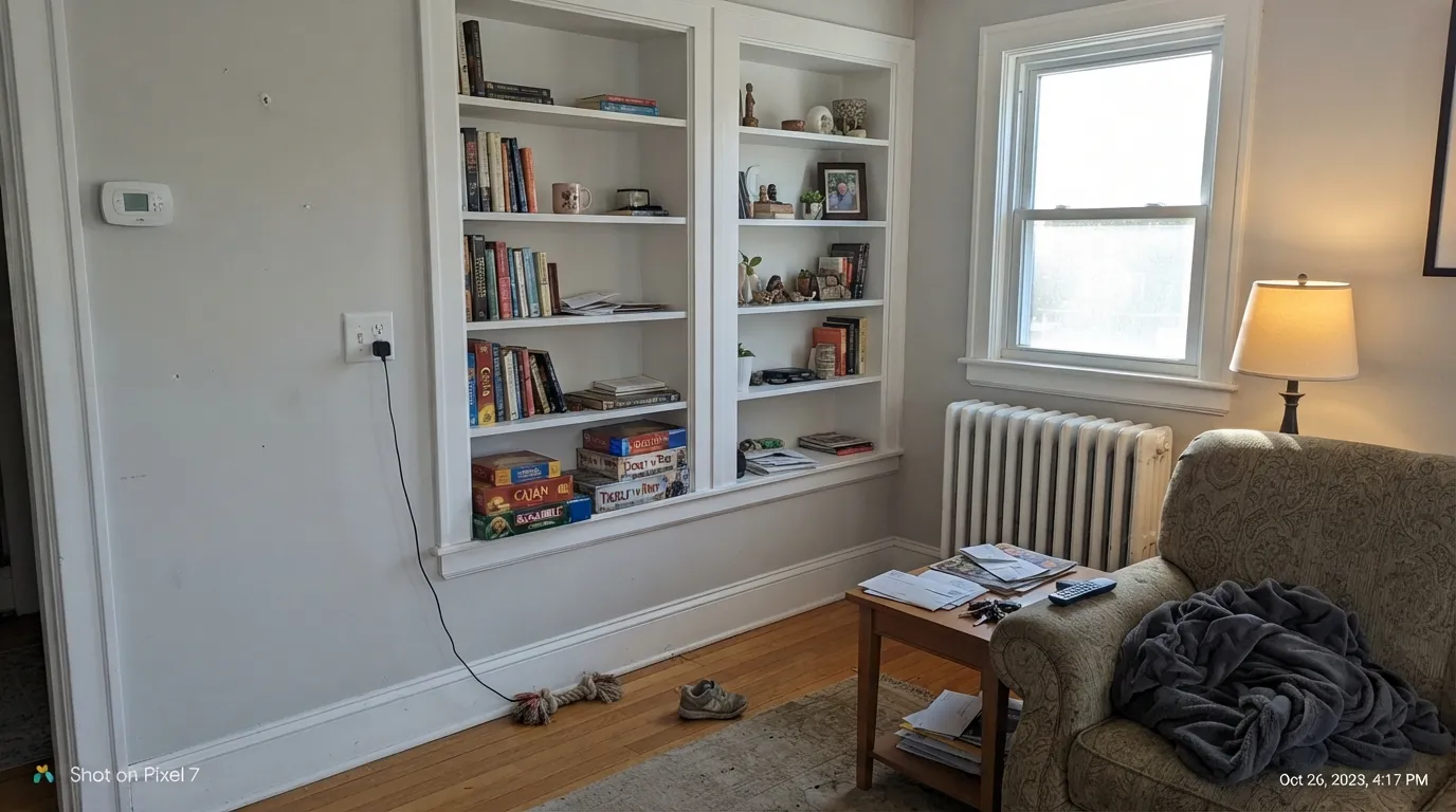
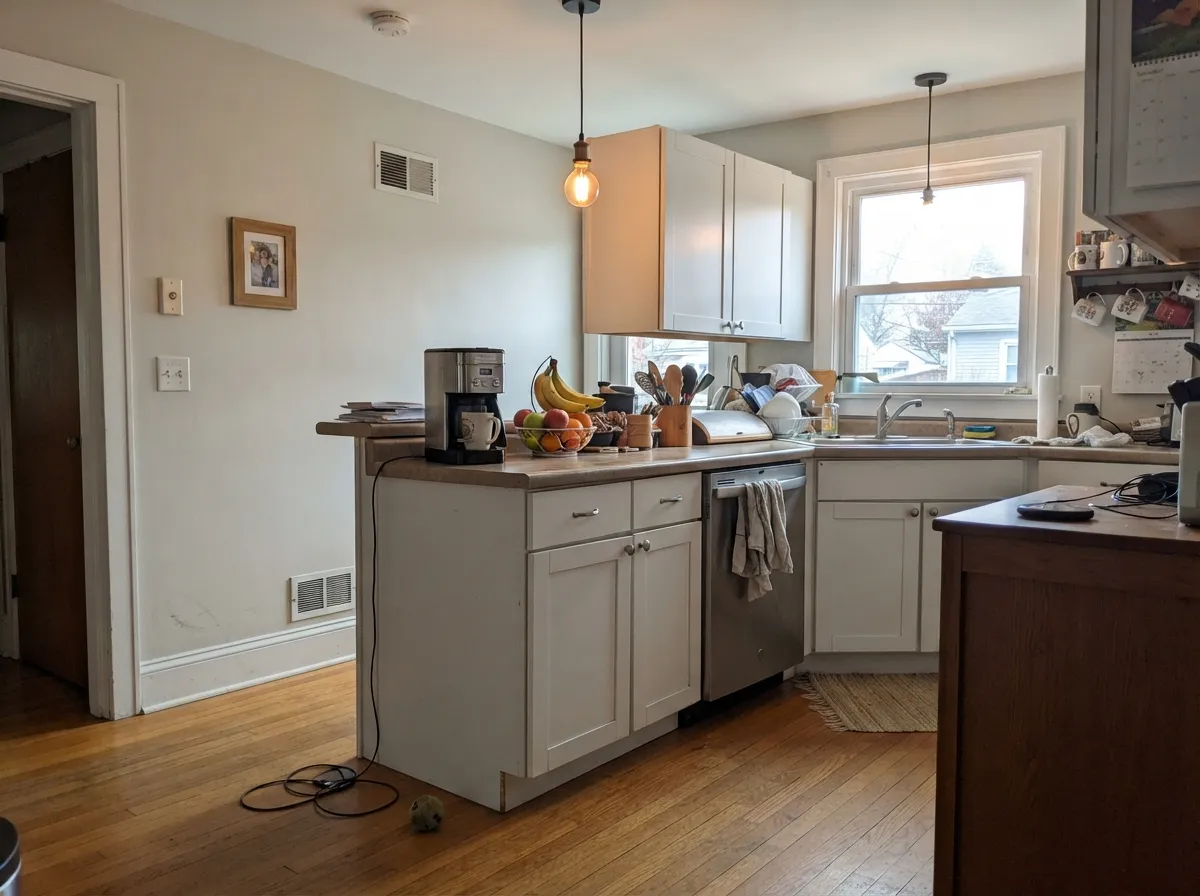
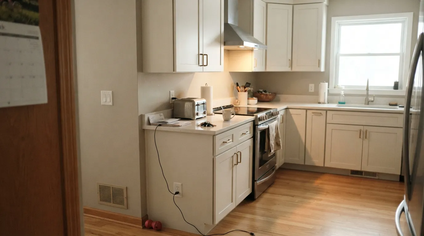
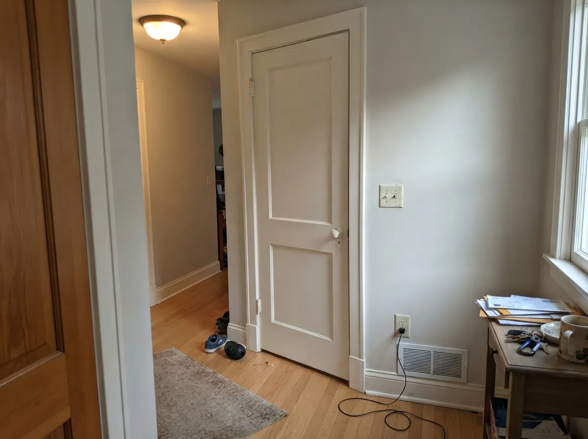
Both Colors in Real Rooms
Photos from our full reviews — the same rooms and captions, so you can judge each color where it actually lives, not on a chip.
When to Pick Which
Choose Pure White if your fixed finishes are cool or mixed, meaning gray floors, white quartz, stark tile, or bright vinyl windows. It is also the safer of the two in a north-facing room, because it dulls instead of shifting green. And it is the better whole-house white when your rooms face different directions and you want one color to behave everywhere.
Choose Alabaster if the room has south or east light and the finishes are warm: oak floors, brass, cream stone, wood beams. It is the better cabinet white by a clear margin, since the softness makes stock doors look custom instead of builder-grade. Pick it when you want the room to feel lived-in and calm rather than crisp.
No comparison page can see your light. Upload one photo of your room and try both colors on the same walls, seconds apart.
Pure White vs Alabaster FAQ
Can I use Pure White trim with Alabaster walls?
You can, but it rarely looks like a decision. The two whites are close enough in lightness that the trim does not read as brighter, it reads as a cooler, slightly different white, and the walls start to look faintly dirty next to it. If you want real contrast, go up to Extra White or High Reflective White on the trim. If you want calm, paint the trim Alabaster too and let the sheen do the separating.
Which one works in a north-facing room?
Pure White, by default, because it does not shift green the way Alabaster does in cool light. It will still look flat and slightly cold in a dim north room, so keep the bulbs at 2700K. If the room is both north-facing and dim and you actually want warmth, skip both of these and use Greek Villa or Creamy, which hold their cream when the daylight goes gray.
Which is better for kitchen cabinets?
Alabaster is the more popular cabinet choice and it earns it. The softness hides small door and rail imperfections, forgives handprints, and sits beautifully with brass, oak floors and cream-toned counters. Go Pure White instead if your counters are cool gray quartz or a Carrara look, because Alabaster against cool stone reads yellow and tired. Spray either one in satin.
Will Alabaster look yellow next to my white quartz?
Most likely it will look dingy rather than yellow, which is worse. Alabaster reads as white right up until something genuinely whiter sits beside it, and modern white quartz wins that comparison easily. If the counter is already installed and it is a cool bright white, use Pure White on the walls and cabinets, or keep Alabaster and choose a cream-toned stone.
Can I paint one of them on walls, trim and ceiling in the whole house?
Both are made for exactly that, and it is the cleanest way to use either. Pure White is the safer whole-house pick when your rooms face different directions, since it looks the same from the sunny living room to the shaded bedroom. Alabaster whole-house is lovely in a warm home with decent daylight, but check your north rooms first. Flat on the ceiling, eggshell on walls, semi-gloss on trim, same color throughout.
Ask a Question