Sherwin-Williams Accessible BeigevsSherwin-Williams Agreeable Gray
Accessible Beige and Agreeable Gray sit on almost every shortlist together. Accessible Beige is a beige steadied with gray. Agreeable Gray is a gray warmed with beige. On a chip that sounds like nothing, and on a wall it decides the whole room.

Built from our full reviews of both colors — same measured data, same real-room photos. About the testing process →
The Numbers
LRV is essentially equal (58 vs 60) — both reflect light the same.
The Real Difference on a Wall
Start with how they are built, because it explains everything else. Accessible Beige is a tan sitting on a real gray backbone, with a whisper of pink and no yellow at all. That gray is doing a job: old builder beige was mixed with yellow-orange pigment, which is why it turned gold under lamplight and eventually looked dated. Agreeable Gray is the reverse. It is a warm gray on a taupe base with a faint violet in it, so it reads gray first and warm second. In a room with real daylight, Accessible Beige shows warmth you can see and Agreeable Gray just quietly steps back.
They are effectively the same lightness, which surprises people. If Accessible Beige looks darker on the chip, you are reading the extra brown in it, not less reflected light. What differs is presence. Accessible Beige holds visible color, so a room looks like it was painted a color. Agreeable Gray holds less, which is exactly why it goes on more American walls than almost anything else and also why some people call it boring. Both hold shadow in corners and behind furniture, so neither one acts like a pale off-white.
Your fixed finishes decide the winner more than your taste does. Red-toned floors, meaning Brazilian cherry, red oak, or a red stain, throw red light back at the wall and your eye answers with green, and Accessible Beige is the one that pays for it, looking like pea soup in the morning and fine again by lamplight. Cool violet-gray tile, quartz or LVP does the same thing to Agreeable Gray. Cream ruins both, in different ways: next to cream trim Agreeable Gray goes blue-gray and dirty, and Accessible Beige next to a warm white like Alabaster suddenly looks cold and gray, which is the most heartbreaking version of this mistake. Both want a clean trim white.
They flash in opposite directions. Agreeable Gray goes faintly violet in dim north light and can flash green beside cool violet-gray tile or quartz. Accessible Beige flashes green over red-toned wood floors in strong daylight and drains to a drab taupe in a north room.
What Each Color Really Is
A tan built on a real gray backbone — which is exactly why people argue about whether it is beige or greige. It sits on the line. The useful way to see it is by how it is put together compared to its rival: Agreeable Gray is a gray that has been warmed up with beige, and Accessible Beige is a beige that has been steadied with gray. The gray is doing a specific job. Old builder beige was mixed with yellow-orange pigment, which is what made it go gold under lamplight and eventually look dated; the gray in Accessible Beige cancels that gold before it can show up. Take the gray out and you have 1998 back.
LRV 58 means it bounces back a little under 60% of the light that lands on it — mid-light, not pale. That number is worth sitting with, because Agreeable Gray is LRV 60, which is effectively the same lightness. If Accessible Beige looks darker to you on the chip, you are reading the extra brown in it, not less light. Against a clean trim white like Pure White at LRV 84 there is a clear step, so trim reads as trim. In a room with real windows it behaves like a light neutral. In a room without them, it stops being light and starts being a mid-tone — same paint, different job.
A warm gray built on a taupe base, not a beige one — and that distinction explains almost everything about how it behaves. Beige-based neutrals carry yellow, so they stay warm no matter what the light does. Agreeable Gray carries a soft brown-violet instead, which is why it reads gray first and warm second, and why the warmth can switch off when the light turns cool. Sherwin-Williams sells it as the agreeable one because it refuses to commit to an undertone, and that refusal is both the reason it goes on more American walls than almost any other color and the reason a small share of people hate it.
At LRV 60 it reflects a bit more than half the light that lands on it, which puts it in the mid-light band — light enough to open a room, not light enough to act as a bright neutral. The number looks close to Revere Pewter (HC-172) at 56, but on a wall the gap feels bigger than four points because Revere Pewter also carries green and reads a full step heavier and more traditional. Put Agreeable Gray beside a real off-white like Alabaster (SW 7008) at LRV 82 and the comparison is honest: this is a color, not a pale wash, and it will hold visible shadow in corners and behind furniture.
Specs Side by Side
| Spec | Accessible Beige | Agreeable Gray |
|---|---|---|
| Brand | Sherwin-Williams | Sherwin-Williams |
| SKU | SW 7036 | SW 7029 |
| Hex | #D1C7B8 | #D1CBC1 |
| RGB | 209, 199, 184 | 209, 203, 193 |
| LRV | 58 | 60 |
| Undertone | red-orange / warm | red-orange / warm |
| Family | Neutral | Neutral |
How Light Changes Them
Strong warm sun all day pushes the tan forward. Soft, creamy, and never orange.
Cool daylight kills the warmth and the gray takes over. Reads taupe, sometimes drab. Sample first.
2700K bulbs make it warm and cozy. Cool LEDs above 3500K flatten it to gray — change bulbs, not paint.
With no daylight it loses its lift and can read dingy or faintly pink-taupe. Go lighter or warmer here.
Warms up and looks its softest and lightest. Can wash toward a pale beige at midday — most people love it anyway.
The warmth drains out. Gray, sometimes violet, often just dingy. Sample this room first — or go warmer.
2700K lamps push it cozy and beige. 4000K daylight bulbs pull the gray out and can trigger the violet. Swap bulbs before you repaint.
One color, two rooms, two looks: warm and beige by the south windows, gray and cool in the shaded corner. Fine if you expect it, jarring if you don't.
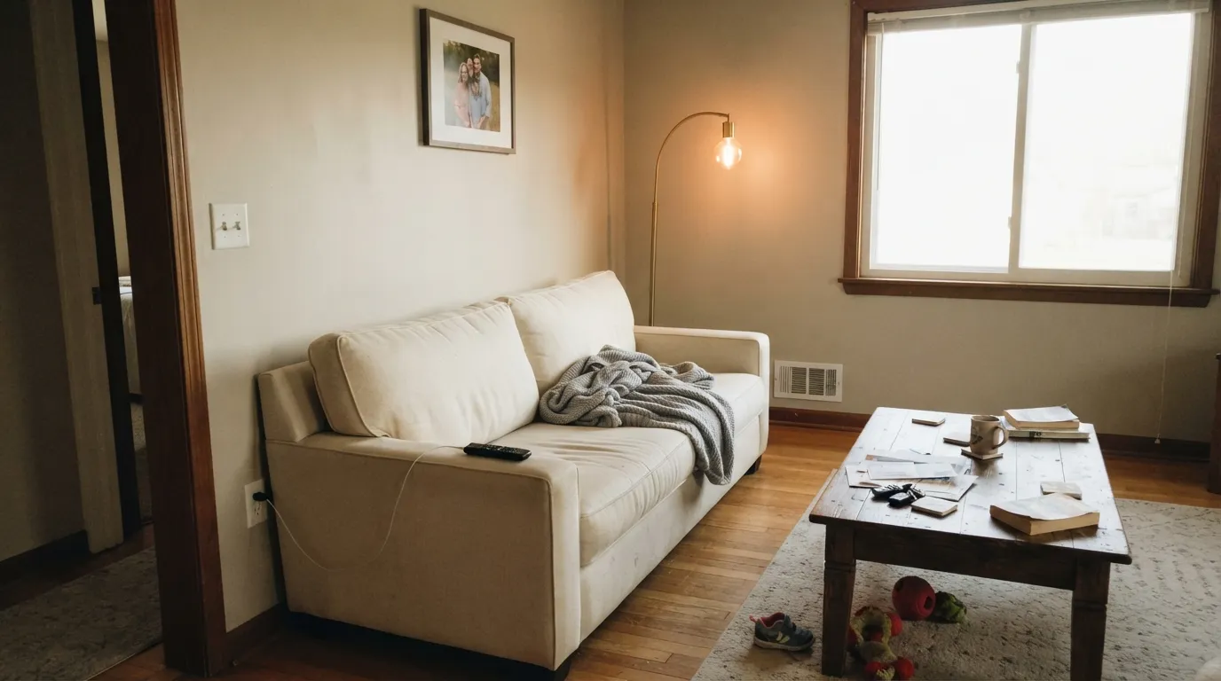
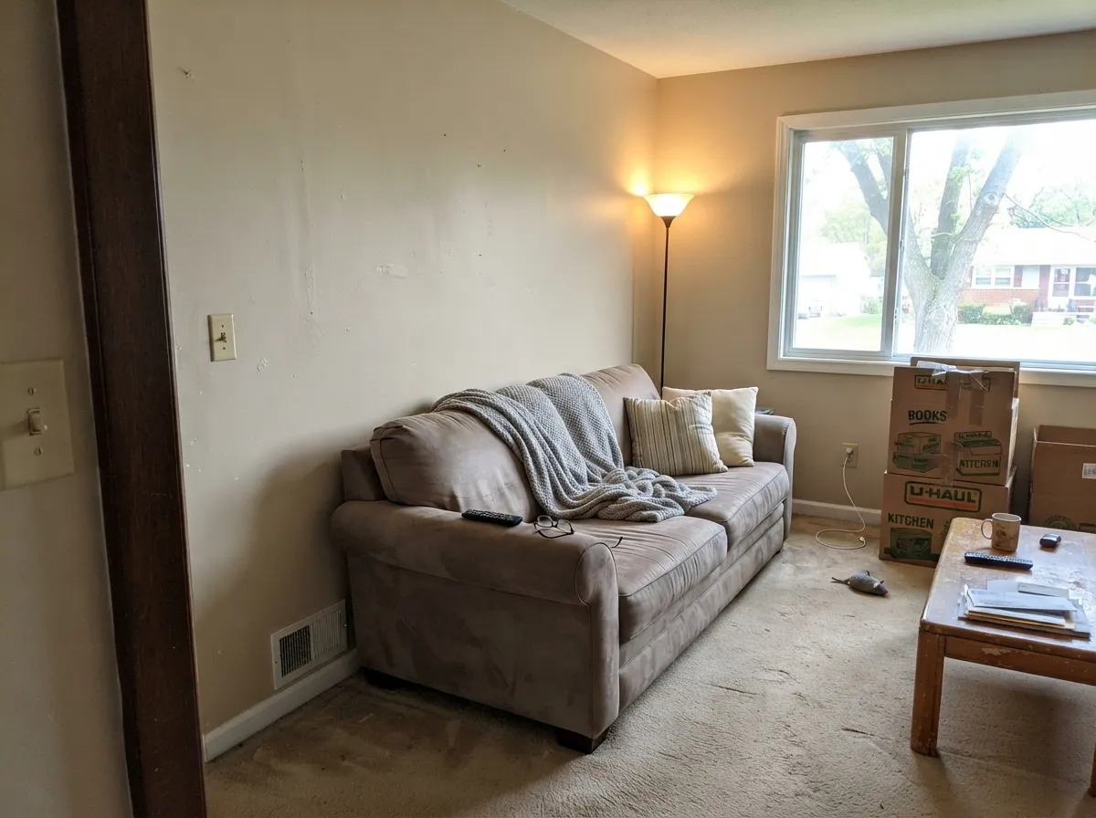
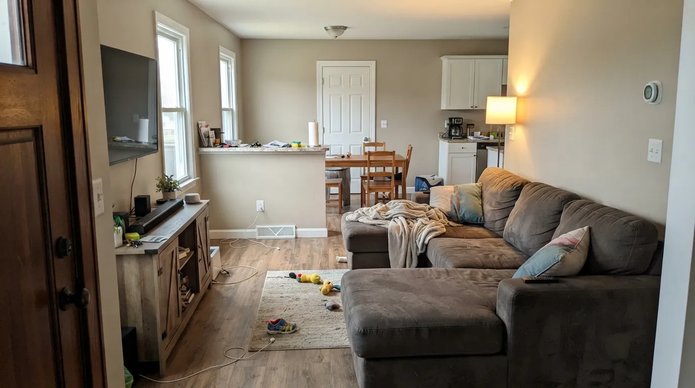
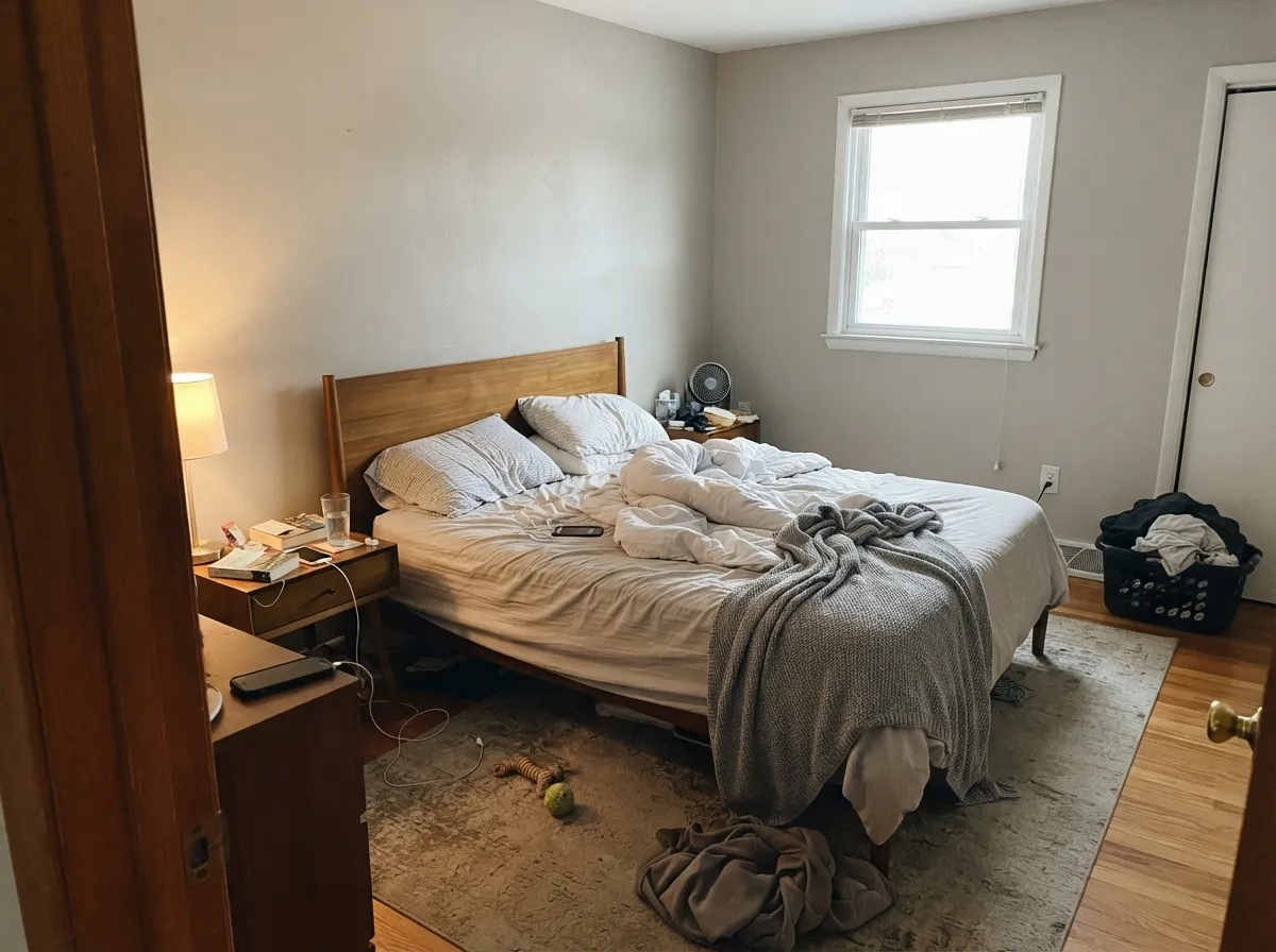
Both Colors in Real Rooms
Photos from our full reviews — the same rooms and captions, so you can judge each color where it actually lives, not on a chip.
When to Pick Which
Choose Accessible Beige if you want to actually see warmth on the wall, and if the house has oak, walnut, brass, leather or cream in it. It is the better pick for south and west rooms with real daylight, where the tan comes forward and never goes orange. Pick it if plain gray has always felt cold to you but you do not want 1998 beige back.
Choose Agreeable Gray if your fixed finishes are mixed or lean slightly cool, or if you want the walls to step back and let the furniture and art lead. It is the safer answer with cool white quartz, matte black hardware and modern lighting. Pick it when the goal is a house that reads clean and finished rather than a house with a color in it.
No comparison page can see your light. Upload one photo of your room and try both colors on the same walls, seconds apart.
Accessible Beige vs Agreeable Gray FAQ
Which one is better in a north-facing room?
Both struggle, in different ways. Accessible Beige loses its warmth and goes drab taupe, and Agreeable Gray goes flat with a soft violet cast that designers call its fleshy side. Of the two, Accessible Beige with 2700K bulbs keeps more warmth. If the room has little daylight at all, the better move is to go warmer from the start with Natural Linen, which holds its cream in cool light.
Which trim white should I use?
Pure White with both, and it is not a close call. Do not put Alabaster or any creamy white next to Accessible Beige, because the cream makes the wall read cold and gray, and people repaint over exactly that. Cream trim next to Agreeable Gray is just as bad in the other direction: the wall goes blue-gray and dirty and the trim looks jaundiced.
Which works better on kitchen cabinets?
Agreeable Gray is the more common cabinet color of the two and it holds up well with brass or matte black hardware and cool white counters. Accessible Beige on cabinets reads distinctly warm and needs warm counters and warm floors to make sense. If your quartz is a cool white, Agreeable Gray is the safer choice by a clear margin.
Can I use one of them for the whole house?
Both are made for it, and both will look like two colors in one house. Expect warm and beige beside the south windows and grayer in the shaded corners. Agreeable Gray shifts more visibly across exposures because it holds less color of its own. That is fine if you expect it and jarring if nobody warned you, so sample in the darkest room first, not the brightest.
What do they look like at night under bulbs?
At 2700K, Accessible Beige turns warm and cozy tan, and Agreeable Gray leans beige and soft. Above about 3500K both flatten out, Accessible Beige toward plain gray and Agreeable Gray toward gray with the violet showing. If your walls look wrong only after dark, change the bulbs before you change the paint.
Ask a Question